

 Web design is a subtle science that is lost to most who are not in the field. The amount of choices that go into building the perfect presentation for the content the client has to offer are so vast, that often the best way to demonstrate the full scope of this spectrum is to showcase a particular type of focused site. Through the multitude of examples one can begin to see how thematically similar yet still so different and complex these designs are.
Today, we intend to do just that. By showcasing a handful of portfolio websites, we can see how the depth of design choices and techniques can really separate these examples all built to showcase the work of an artist or designer. Even with their common mission, and even at times structural parallels, they still stand apart and each in their own unique ways encapsulate what a portfolio should be.
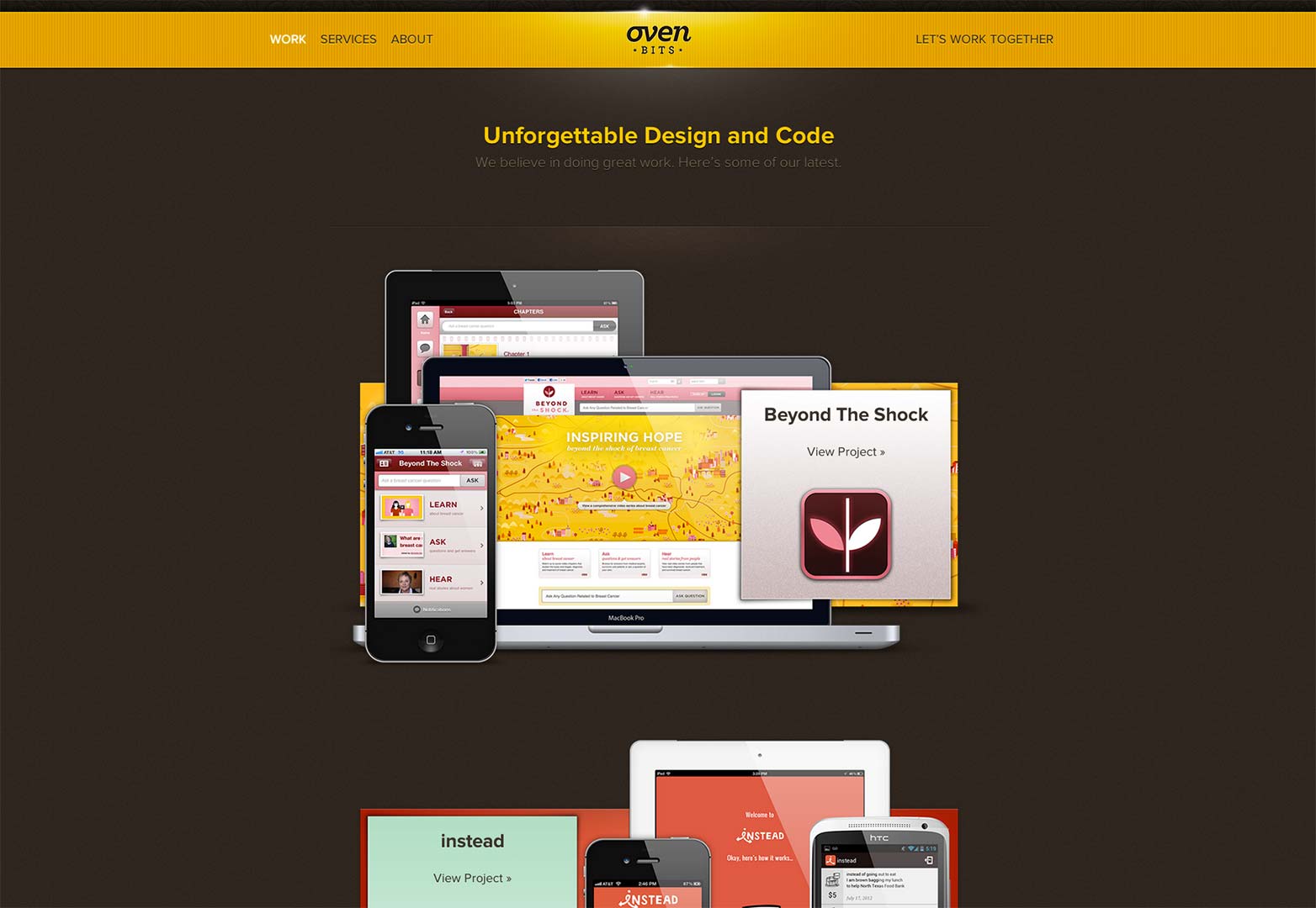
Oven Bits
Oven Bits is the home and portfolio of the creative web and mobile design agency of the same name. The portfolio adheres brilliantly to the first rule of any portfolio design. To compliment and highlight the work being showcased without in any way stealing focus from it.
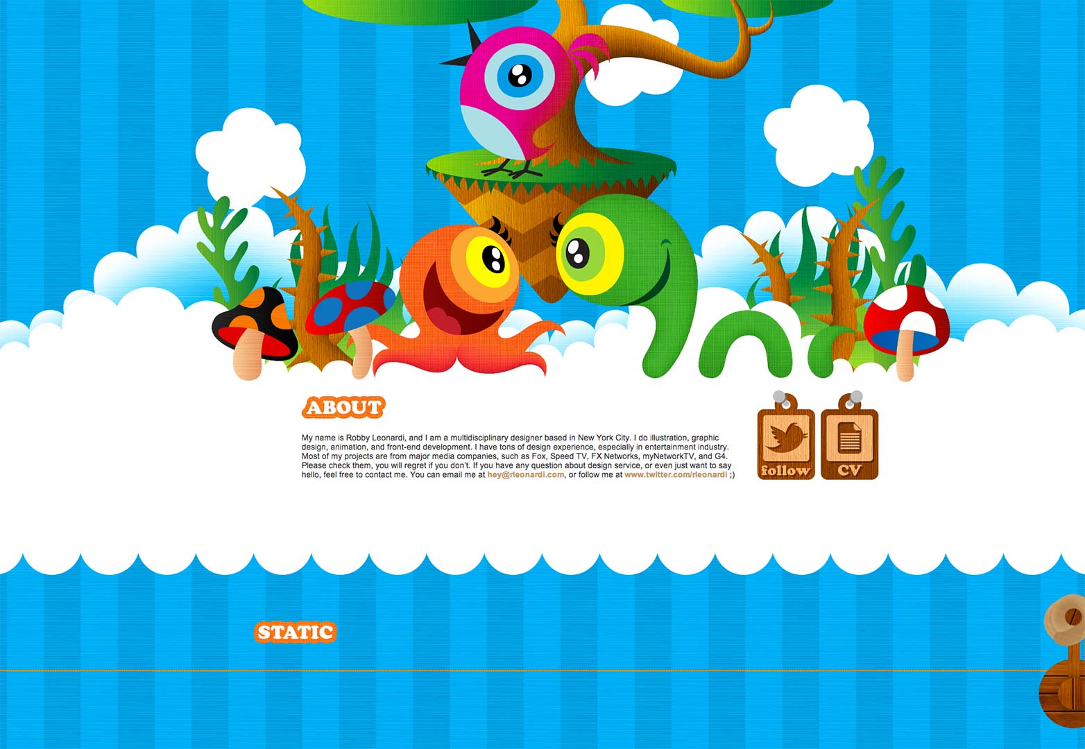
Robbie Leonardi
Robbie Leonardi's portfolio is a bright and bold example of how an illustrator and front end web developer can showcase their skills more potently through the colorful and over-sized presentation of the work they have done for their clients, than strictly with the examples of the work itself. However, there are some issues with the site not fitting completely in my laptop browser window which cut off the info for each piece.
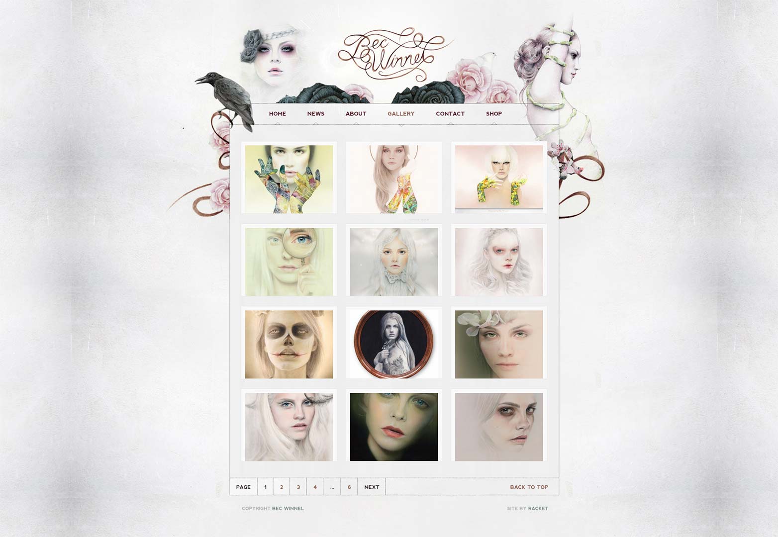
Bec Winnel
Bec Winnel's portfolio is breathtakingly subtle in its presentation. It perfectly incorporates the artist's work into the design, furthering how well the design compliments the tone and technique of the artist herself. The soft, delicate nature of the paintings translates flawlessly through the design.
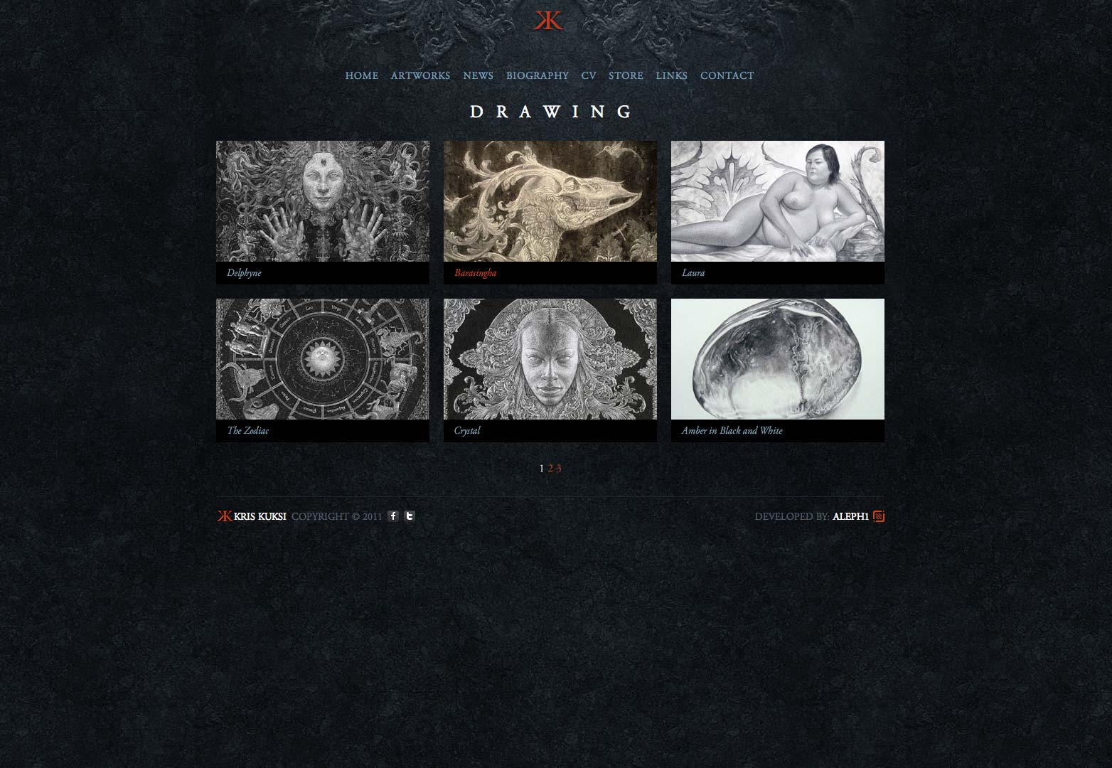
Kris Kuksi
Kris Kuksi has a portfolio which is classically styled and textured to accentuate the diverse and intricate nature of the artist's own creative voice. It does so with such lightness, that the design, while so complimentary and well done, really does fade from the radar as the works stand out. Quite literally in some instances, as the portfolio pieces open in full screen giving total focus to each piece being highlighted.
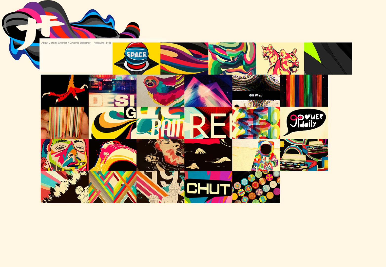
Jeremi Chenier
The portfolio of graphic designer Jeremi Chenier puts a minimalistic approach to work, with fantastic execution showcasing his bold and colorful gallery of designs. This stark contrast between the simplistic nature of the site and the depth and richness of his work creates a powerful presentation.
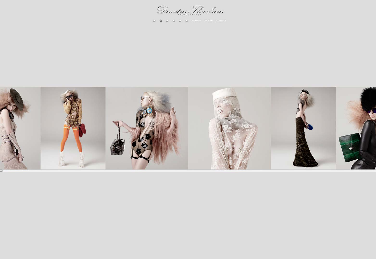
Dimitris Theocharis
Dimitris Theocharis' photography portfolio is the epitome of minimalism in web design from the lightweight navigation down to the images that don't resize, but instead scroll along a single plane. All the focus is strictly and tightly placed squarely on the work of the artist. The unassuming, pale color scheme allows the deep colors of the images to really pop.
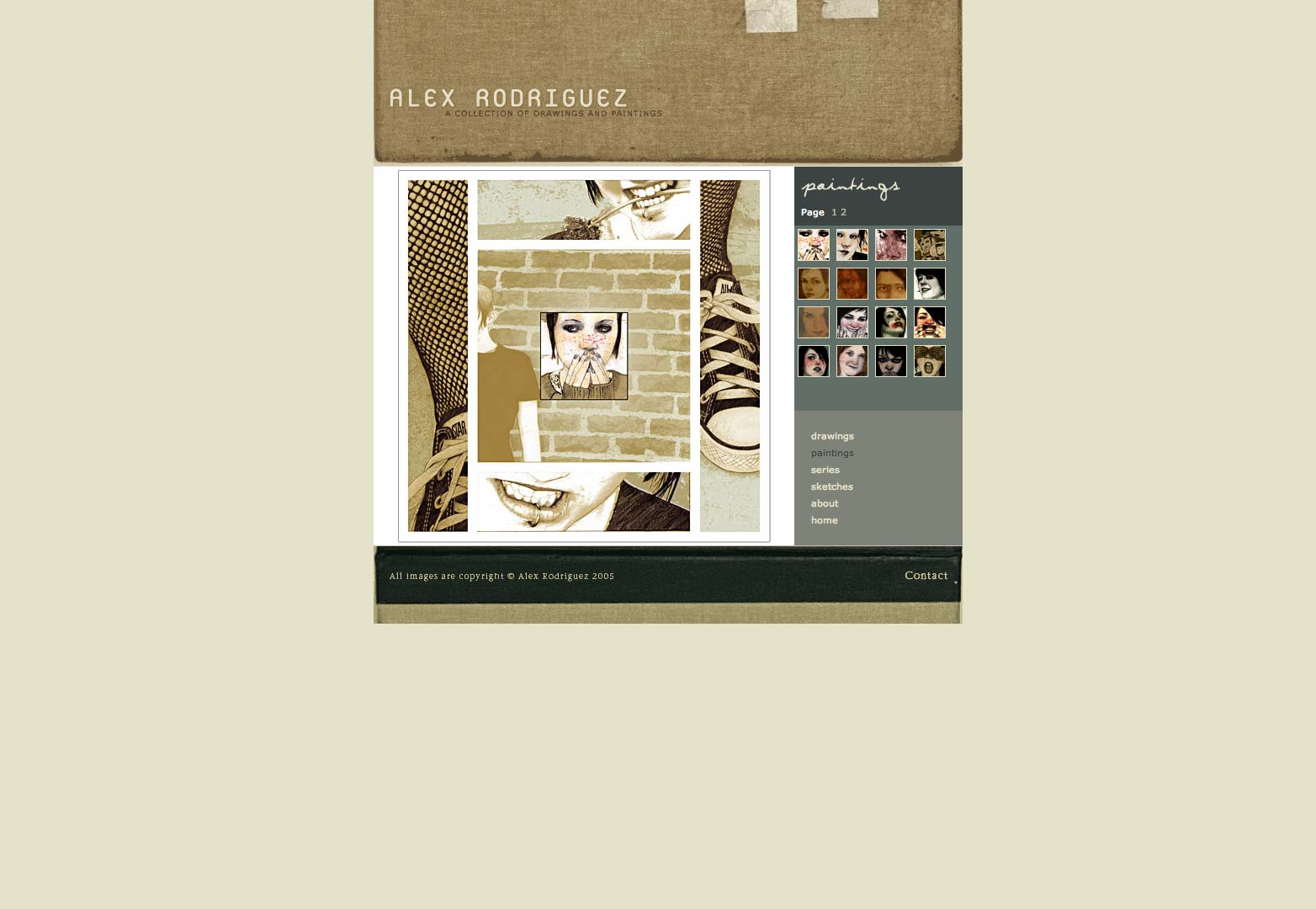
Alex Rodriguez
Alex Rodriguez's digital home for the painter's traditional art is crafted with the same attitude and muted tones that fill the artist's work. The textures even manage to help feed and carry the melancholy that exudes from the painter's vivid and daring gallery.
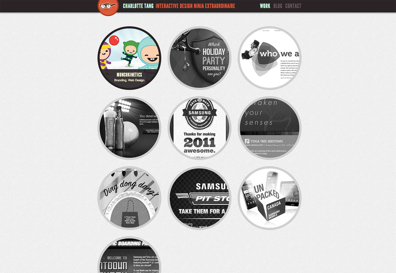
Charlotte Tang
Charlotte Tang has the portfolio one would expect a self-proclaimed interactive design ninja extraordinaire to have. This clean, and oh so sharp design doesn't rely on JavaScript loaded delivery of the individual portfolio pieces. Instead, each piece is given its own page with closeups and info to really allow the user to interact and engage with various elements from each piece.
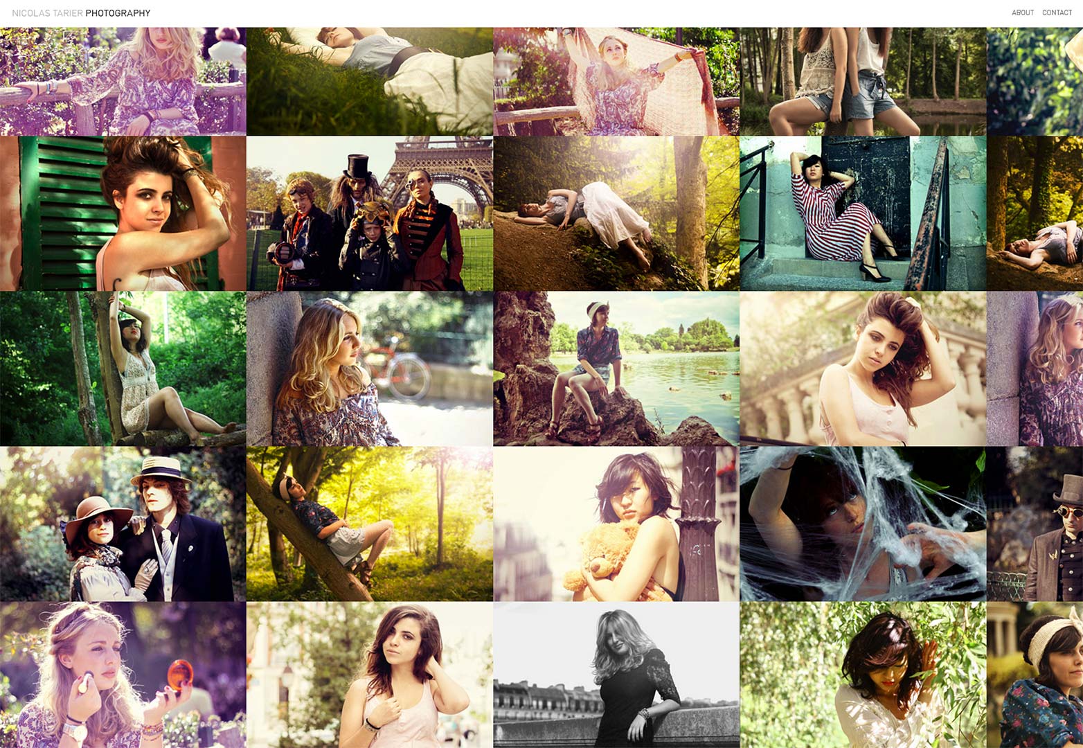
Nicolas Tarier
The portfolio of photographer Nicolas Tarier is large and bold, removing almost all instances of whitespace from the design to give the work and user complete and unfettered access to one another. The large single loaded image displays work brilliantly to place focus onto the work itself.
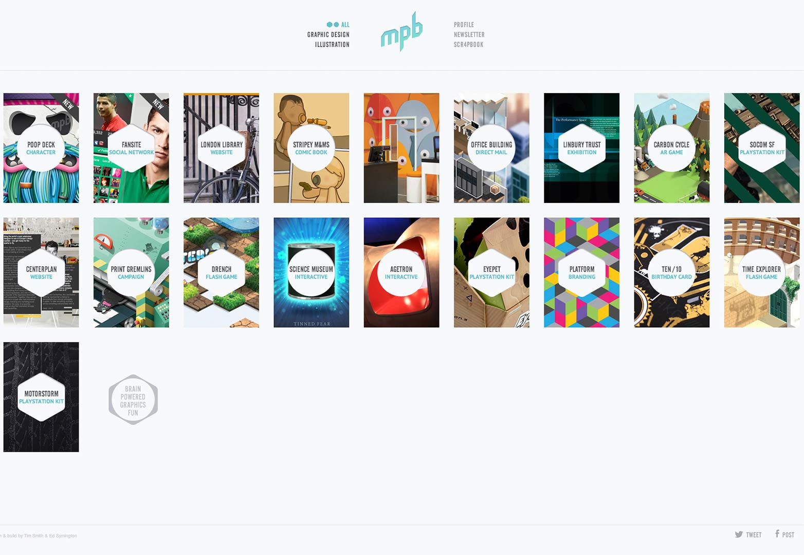
My Poor Brain
My Poor Brain is the digital home and portfolio of London based Graphic Designer and Illustrator, Tim. The design, much like the work and man behind it, relies on no bells and whistles to highlight the work. It speaks for itself, and the design simply steps aside and allows that to happen. It is straightforward and places the onus of the presentation on the work, just as it should.
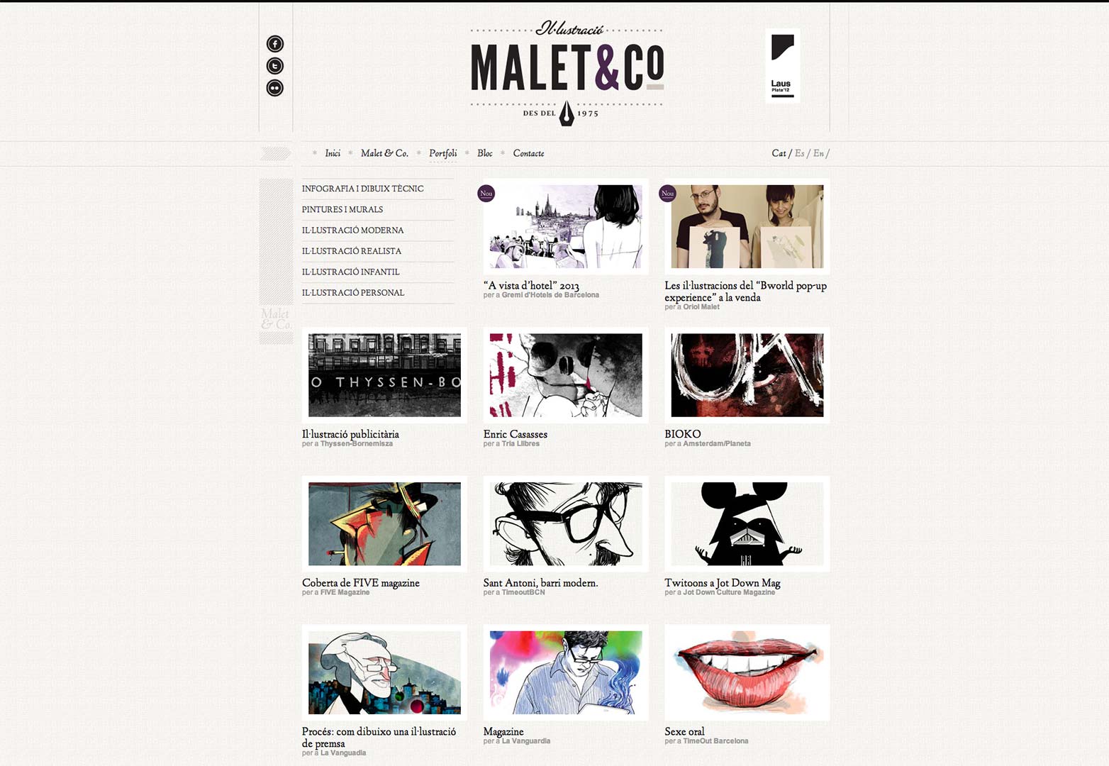
Malet & Co.
The portfolio for the Illustration Agency Malet & Co. pours whitespace all throughout the design to let the work pop right up off of the background. The pages that deliver each of the pieces keeps the minimalism firmly in place so that at no time does the user's focus break from the illustrations presented.
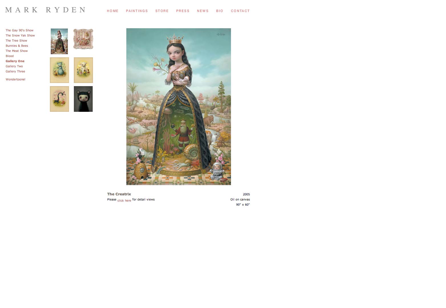
Mark Ryden
Mark Ryden's portfolio is as bells-bare and frills-free as they come, but when one has an established name and reputation backing it, the work speaks volumes on its own. Any elements beyond the navigation would simply get in the way. The emotive and often solemn work has a much greater impact against the sparse surroundings.
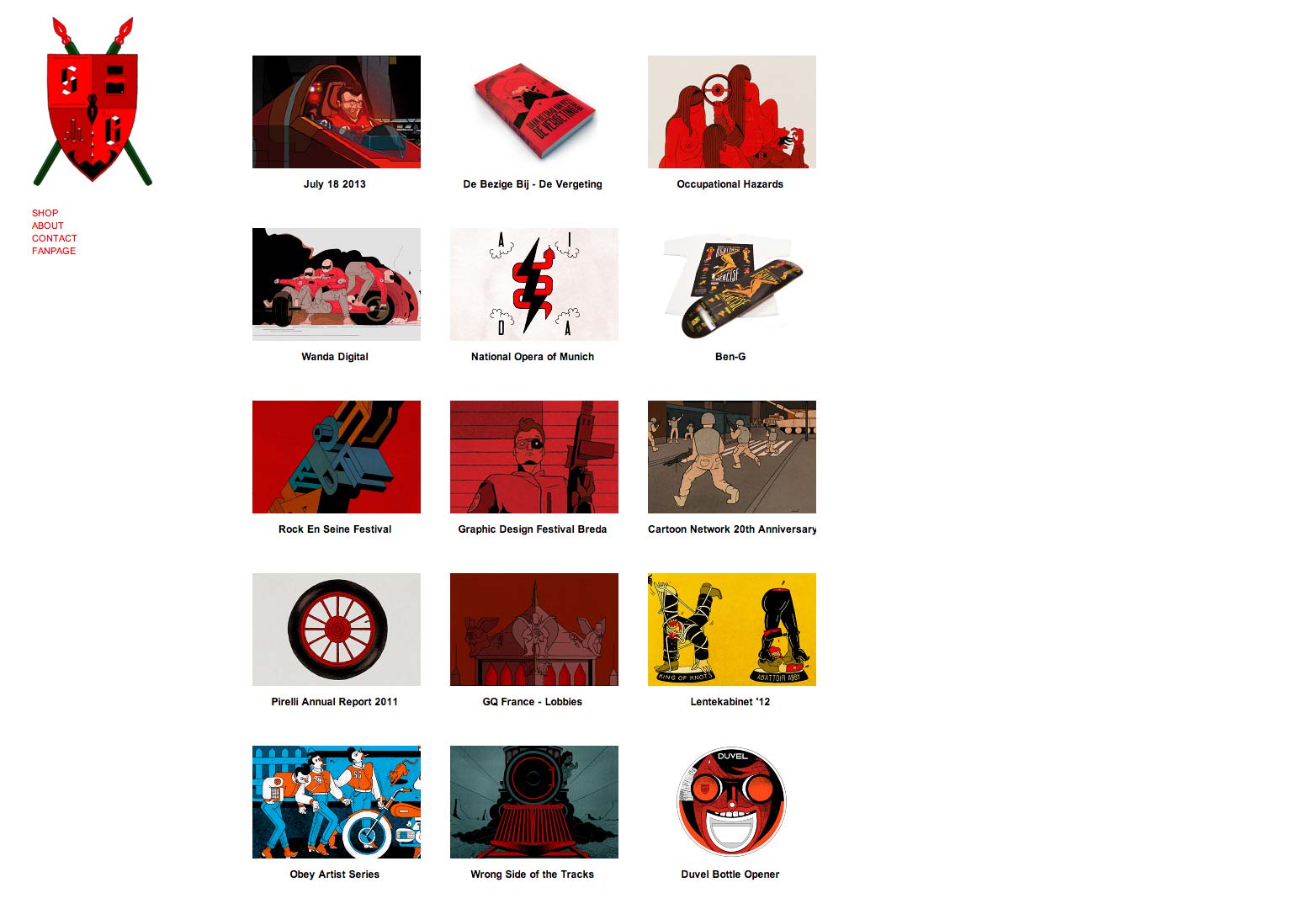
Stefan Glerum
Stefan Glerum's porfolio is another fine example of the site design stepping aside and allowing the illustrative works being featured to boldly shine free of its grip. The audacious pieces each reside on their own individual pages where they can be further explored and examined in detail.
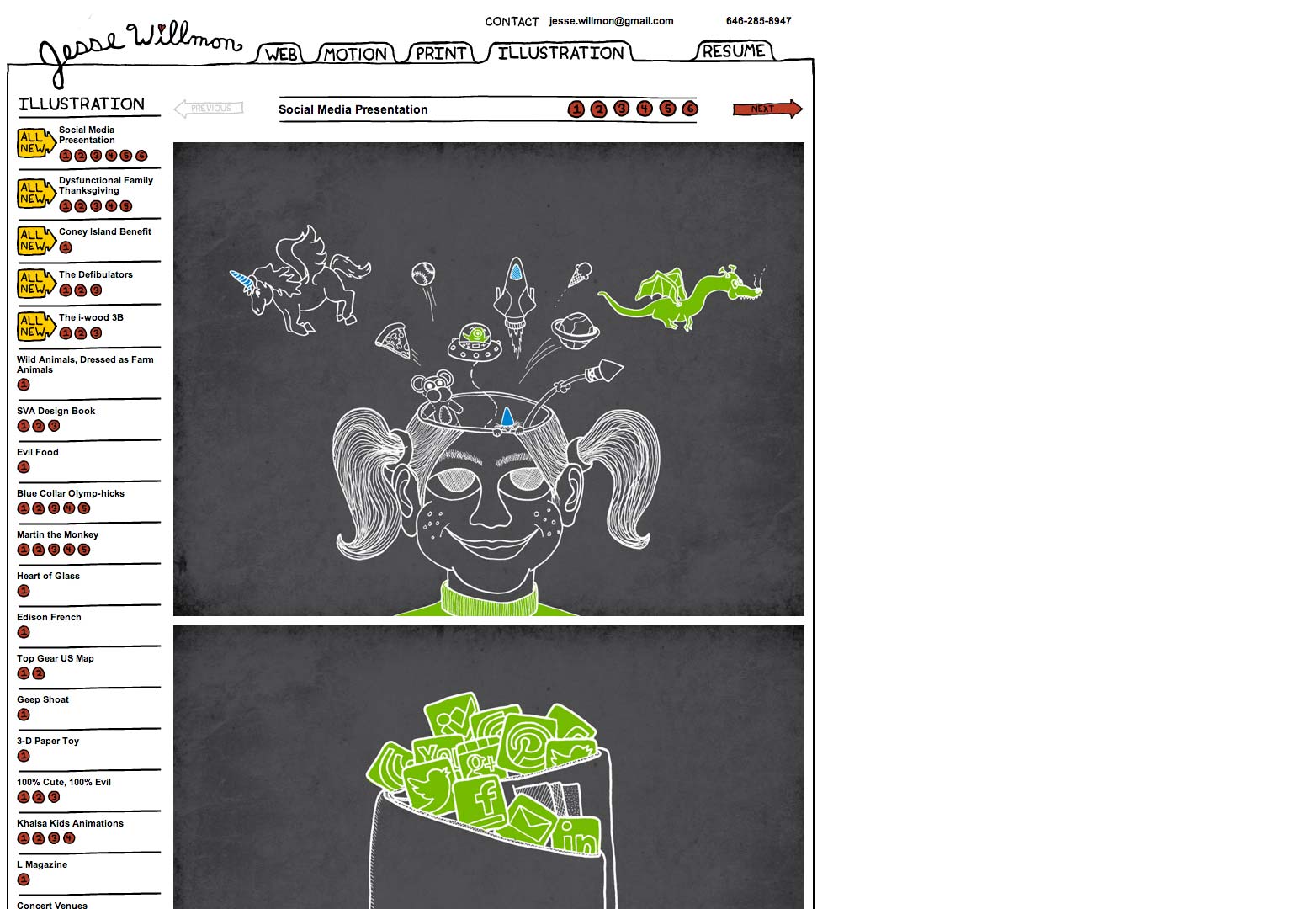
Jesse Willmon
Jesse Willmon's design and illustration portfolio is one of the more unique design presentations that we have seen throughout the showcase. Unique enough to earn a place in the post, even if the project navigation extends far below most of the project images featured in the portfolio. The playful nature of the site wonderfully compliments the designer's own style and voice.
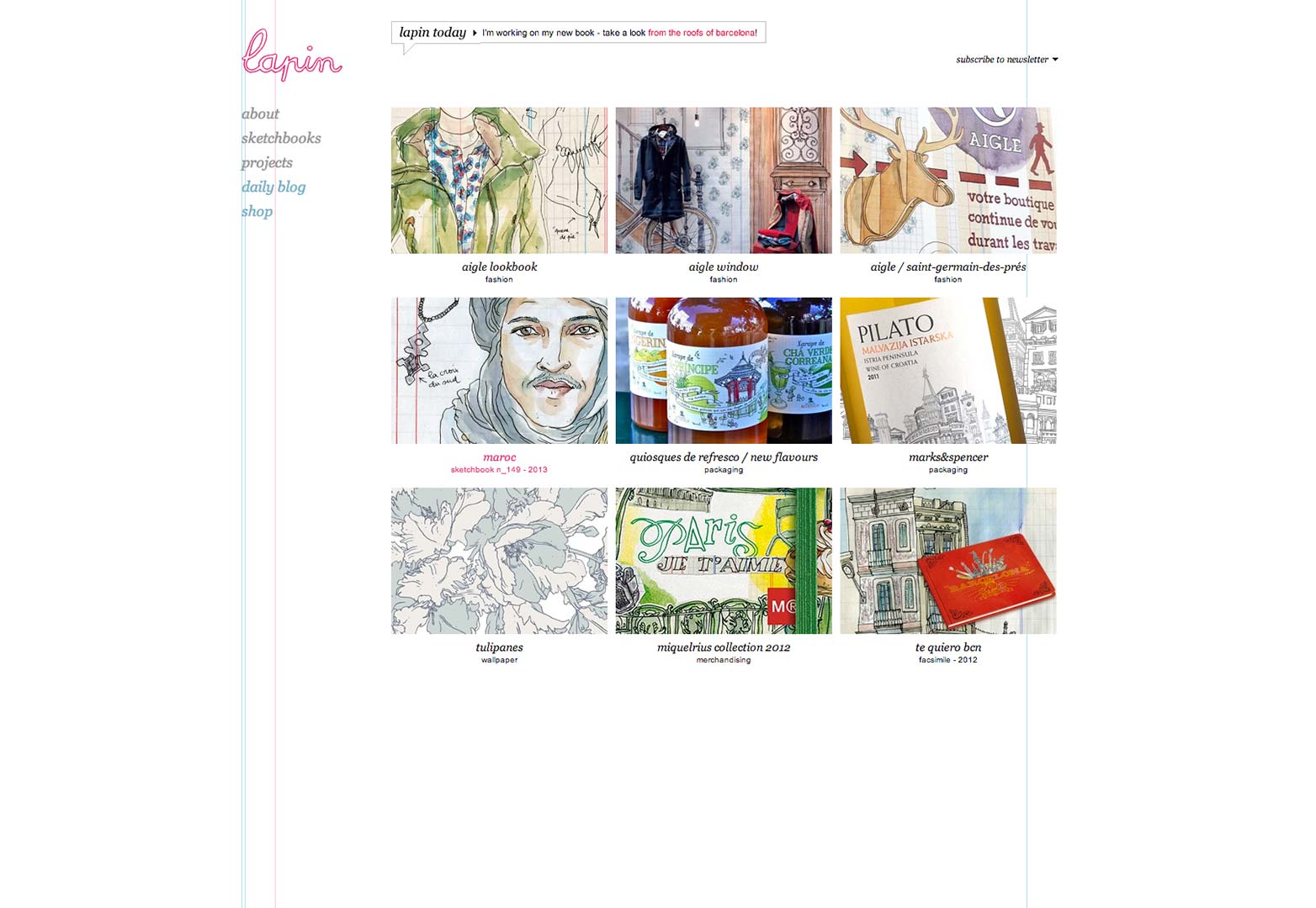
Lapin
The portfolio of French illustrator and artist Lapin is as clean and sharply designed and organized as the artist's intricate illustrations. A perfect companion to the style and spirited tone of the artist's work, as the design subtly serves up its offerings to the user.
Which of these portfolios did you find most inspiring? Does yours belong here? Let us know in the comments.
Rob Bowen


Read Next

15 Best New Fonts, July 2024

20 Best New Websites, July 2024

Top 7 WordPress Plugins for 2024: Enhance Your Site's Performance

Exciting New Tools for Designers, July 2024

3 Essential Design Trends, July 2024

15 Best New Fonts, June 2024

20 Best New Websites, June 2024

Exciting New Tools for Designers, June 2024

3 Essential Design Trends, June 2024

15 Best New Fonts, May 2024

How to Reduce The Carbon Footprint of Your Website
