

 Over the past few years, soaring mobile usage has sparked an evolution, or perhaps revolution, in the way that we approach delivering content to online users. The ultimate goal is a fluid, mobile and device-agnostic web, and one school of thought has emerged as the widely favoured means to this end: responsive design. However, while the responsive zeitgeist has gathered steam, email design and development has struggled to keep pace.
This is due, in part, to the fact that HTML emails are a notoriously tricky medium for developers to work with. Archaic email client technology and a lack of standards have rendered many of the rules of modern, semantic code useless. But email is still a key marketing channel too important to be overlooked: over a six-month period in 2012, Litmus reported an 80% increase in email opens on mobile devices. In the same year, Campaign Monitor revealed that, for the very first time, their mobile email open rate had actually surpassed desktop and webmail.
Obviously it’s important to conduct proper analysis of your audience before taking the decision to invest in mobile-optimization. But a well-executed responsive email design can ensure an excellent user experience for both desktop and mobile users – and with widespread 4G just around the corner, the trend towards mobile is inexorable, so why not future-proof?
Square peg, round hole
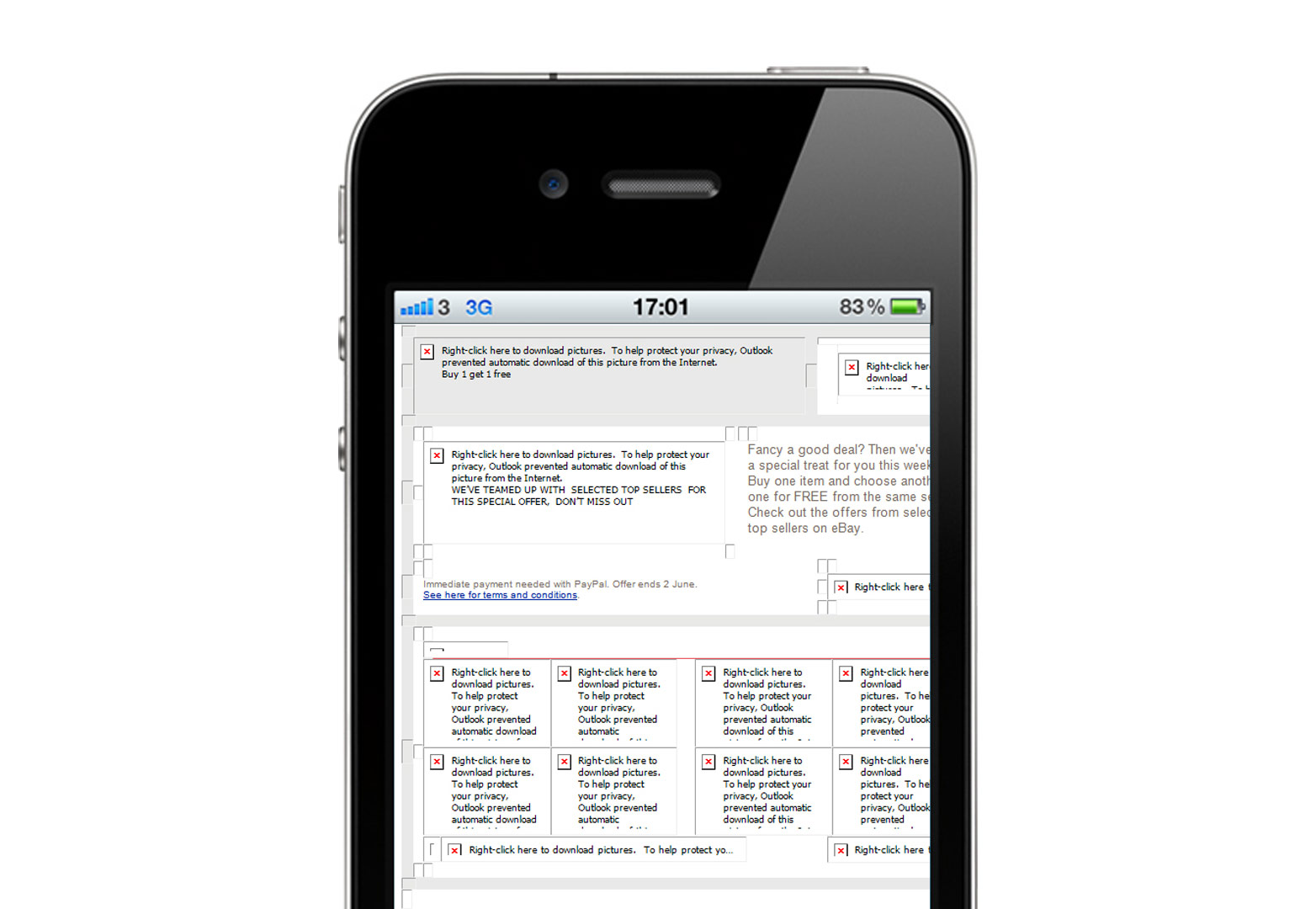
If you’ve ever had the misfortune of opening a fixed-width email on a mobile device then you’ll understand the need for responsive email design. Screen-bursting, multi-column layouts can appear zoomed out so that font sizes are reduced to the point of illegibility. Users may zoom in but are then constantly and infuriatingly required to scroll horizontally left-to-right and back again in order to read content. Links appear small and congested, with no regard for fat fingers on touch-screen displays. And low-contrast designs on small viewports, dimmed to save power, often become unreadable. Clearly, mobile optimization is important but what’s the best way to go about it?
Mobile best practice
Before writing a single line of code, consideration of design features can vastly improve the user experience for those on mobile, although arguably these are advisable concessions regardless of screen size.
- Clear, concise content: small screens mean it’s more important now than ever to engage the user as efficiently as possible.
- Single-column layout: simplicity is key. Layouts no wider than 640px will degrade gracefully. A single-column ensures no content will be completely lost outside the viewport when zoomed in.
- An engaging subject line: this is one of the email marketer’s most effective weapons in an overcrowded inbox. Keep it short and snappy.
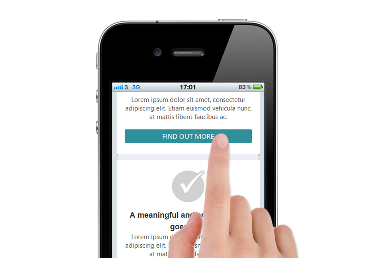
- Large call to action (CTA): don’t punish fat fingers! Apple’s iOS Human Interface Guidelines recommend a minimum ‘tappable’ target area of 44x44 points.
- Generous font sizes: make sure your message can be easily read.
- Pre-header: another key area when it comes to visibility in the inbox. Try to avoid simply displaying ‘view in browser’ text.
- Left-aligned text: there are a number of reasons for aligning important elements to the left-hand side of the content area. (Eye tracking research suggests that western users focus the majority of their attention on the left-hand side of email content. This is hardly surprising since we read text from left to right. Certain operating systems, notably android, will not scale content to fit the screen, therefore displaying only the left half of an email. From an ergonomic perspective, the majority of users will find it easiest to interact with elements in the bottom left/middle of their hand-held screen.)
- Vertical hierarchy: diminished screen real estate places more credence than ever on the idea of ‘the fold’. Significant CTAs should be placed as near to the top as possible; if they are not seen immediately, perhaps they will not be used.
- Use images carefully: don’t assume that images will be seen. iPhone’s native email app will display images by default but many clients won’t.
These tips can improve the user experience for mobile customers, but you can, and probably should, optimize further. Thanks to growing CSS3 support among mobile email clients, responsive email design is now possible.
Getting started
As I mentioned earlier, HTML emails suffer from a woeful lack of standards – to the uninitiated, much of what follows will be a journey back in time to the early days of web development. Layouts must be arranged with tables due to the out-dated HTML rendering engines of some email clients and CSS must be applied inline. Several email clients will completely disregard any style declarations made in the <head> section of the document.
There are some fantastic email boilerplates available, I recommend Sean Powell’s excellent HTML Email Boilerplate as a starting point, but for the sake of demonstration, let’s begin from scratch.
For those of you that like to follow along with the code, you can download a template for this article from here.
Doctype
Hotmail and Gmail will automatically insert the XHTML 1.0 Strict doctype. It’s therefore not a bad idea to use it but it’s important to thoroughly test your email with and without a doctype as many email clients will simply strip it out altogether.
<!DOCTYPE html PUBLIC "-//W3C//DTD XHTML 1.0 Strict//EN" "https://www.w3.org/TR/xhtml1/DTD/xhtml1-strict.dtd">
Email on Acid has conducted extensive research on email doctypes here.
Media queries
We can now insert a viewport meta tag to make sure our email is correctly displayed on mobile devices. It’s also a good idea to specify the content-type and a title tag too. These will be ignored by many email clients but are a good idea if you’re planning on providing a link to a ‘browser version’ of your email.
Since the content-type will most likely be ignored, it’s advisable to encode all special characters within your email as HTML entities.
Also, we’ll include a couple of sensible style resets to ensure our email is rendered how we want it to be across platforms.
<head>
<meta name="viewport" content="width=device-width, initial scale=1.0"/>
<meta http-equiv="Content-Type" content="text/html; charset=iso-8859-1">
<title>Email subject or title</title>
<style type="text/css">
.ExternalClass {width:100%;}
img {display: block;}
</style>
Note that the viewport meta tag has negative implications for Blackberry.
Now we can insert our media queries; how many depends on the level of specificity you wish to deliver to each device. In this example we are going to use just one — making the reasonable assumption that most devices with a screen size no greater than 600px are modern, mobile and touch-screen and will benefit from mobile-optimized styling. Furthermore, we are going to assume that by following the universal mobile best practice techniques, outlined earlier, mobile users on larger devices receiving the desktop layout will encounter no major usability issues.
We are using media queries in the same way we would when building a website; if the viewport size is within the constraints set in the media query then apply that style.
@media only screen and (max-width: 600px) {
 table[class="hide"], img[class="hide"], td[class="hide"] {
 display:none!important;
 }
 }
In the example above we are telling some elements with a class of "hide" to display:none on screens narrower than 600px. The !important property ensures that any inline style is overridden. This is the basic principle of responsive email design: overriding inline style declarations made in the body of the HTML document with !important style declarations made in the <head> section, and targeting these style overrides to specific screen sizes with media queries. A glaring exception is the gmail app that will ignore any style declarations in the <head> section. However, conscientious left-aligning of content should ensure a satisfactory user experience for gmail fans in your mailing list. Obviously this isn’t an ideal solution but at present, responsive email design is as much about considered compromises as it is about cutting edge techniques.
It is worth noting that we are targeting our HTML elements with CSS attribute selectors to overcome a rendering quirk of Yahoo! Mail.
So we can see that media queries are a useful tool for selectively displaying content but we can also use them to manipulate other features of our layout. Perhaps most importantly, we can constrain the column width of our email — the key to a great mobile experience.
@media only screen and (max-width: 600px) {
 table[class="content_block"] {
 width: 92%!important;
 }
}
We have now stated in our media query that all tables with a class of "content_block" should scale to 92% width on devices with a screen size of up to 600px. Now all we have to do is specify a width attribute inline (600px) for any table with a class of content_block and we have a fixed width container that then scales proportionally on screens under a certain size. Provided that the width attributes of the child elements of this container are all specified as percentages, this is a basic responsive email template.
Take care when disabling webkit automatic text size adjustment on the body tag, as a rule of thumb, try to keep font sizes above 12px minimum.
Buttons
Calls to action (CTAs) are usually the most important part of a marketing email. They should be eye-catching, well-placed and above all, usable. The criteria for a great CTA are different depending on whether it is to be selected by a cursor or a finger. This is a powerful function of responsive email; to provide users on smaller touch-screen devices with finger-friendly buttons that are not affected by image blockers.
Unfortunately, such buttons cannot be displayed universally as they rely on padding properties that are not supported in some desktop email clients.
@media only screen and (max-width:600) {
a[class="button"]{
 display: block;
 padding: 7px 8px 6px 8px;
 -webkit-border-radius: 5px;
 -moz-border-radius: 5px;
 border-radius: 5px;
 color: #fff!important;
 background: #f46f62;
 text-align: center;
 text-decoration: none!important;
}
}
The style declarations above will transform tags with a class of "button", like the one below, into large, engaging, coloured buttons that span the width of the content area, so long as the device screen width is not greater than 600px. CSS3 support shouldn’t be a problem as we can assume the mobile technology we are targeting is reasonably modern.
<a href="#" style="color:#f46f62; font-weight: bold; text-decoration: underline;">Click me!</a>
The inline styling is sufficient for mouse users that may select links with greater accuracy but overriding these styles to make links large and clear for touch-screen users decreases the likelihood of interaction mistakes. Importantly, this approach does not rely on images and so avoids the usability issues that image blockers would otherwise present.
In conclusion
Responsive email design is still a compromise. The baffling array of different devices, email clients and rendering engines present designers and developers with a daunting task. But as technology progresses it’s becoming easier to provide users with appropriate layouts that they can effortlessly consume and interact with. Growing support for media queries in email has changed the landscape of mobile email optimization and provides us with a platform to drastically improve the user experience on more devices. It is now up to us, the designers and developers, to experiment with creative ways to reach the mobile audience.
Have you designed for email? Did you use a responsive approach? Let us know in the comments.
Featured image/thumbnail, via mattw1ls0n
Jack Filose


Read Next

15 Best New Fonts, July 2024

20 Best New Websites, July 2024

Top 7 WordPress Plugins for 2024: Enhance Your Site's Performance

Exciting New Tools for Designers, July 2024

3 Essential Design Trends, July 2024

15 Best New Fonts, June 2024

20 Best New Websites, June 2024

Exciting New Tools for Designers, June 2024

3 Essential Design Trends, June 2024

15 Best New Fonts, May 2024

How to Reduce The Carbon Footprint of Your Website
