

 User experience is greatly important in the development of a website these days. A great user experience makes sure someone visit your site and enjoy every portion of it. User experience also makes sure you can maneuver around a site and find everything you're looking for. Think about how you like the experience you partake in at a Starbucks or a Barnes and Noble bookstore. These places were made with the customer experience in mind.
UX (user experience) for web design is a combination of such skills as user interface design and interaction design. It's about making things that make sense. Some of our favorite developments in UX include the ability for more information to appear as you scroll down a page, rather than having to click the next or "load more" buttons. Another is the ability to hit left and right navigation keys on your keyboard rather than having to click through pagination. This is effective because it makes web browsing easier and more intuitive.
Today we've found 15 great sites that really understand and take the time out to create a wonderful user experience. They've used great design, development, navigation and much more to create sites with almost perfect UX. Let's jump right in.
Andrew Jackson
Andrew is a freelance designer based out of London. His portfolio site is absolutely wonderful. Its navigation is almost based solely off the navigational keys on the keyboard and is set up so that every time you move in a direction, there's something there. You can move from project to project or within different parts of a specific project. In addition, the site isn't cluttered and you know exactly where you should be.
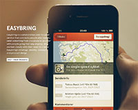
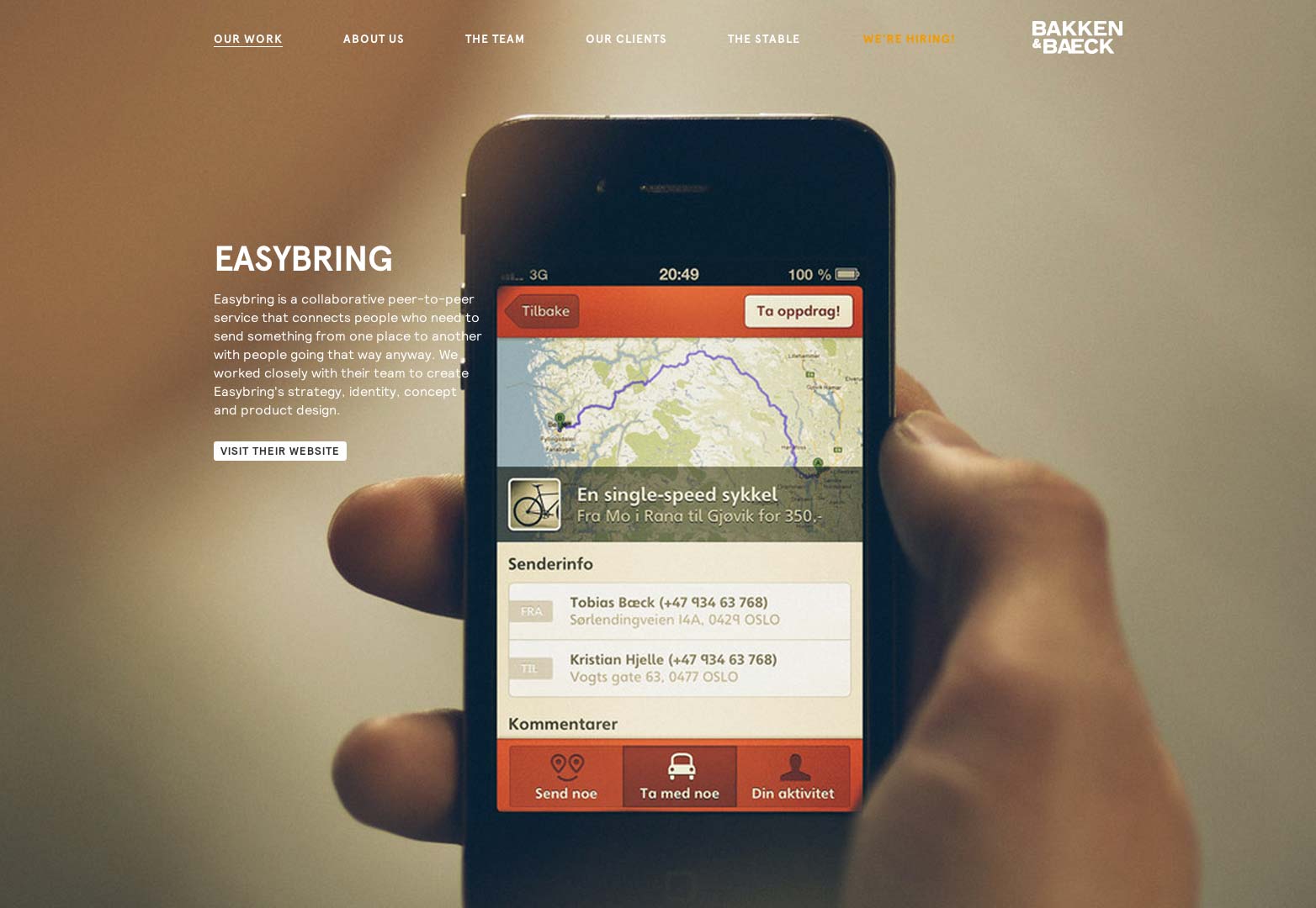
Bakken & Baeck
Bakken & Baeck is a small agency based in Norway that claims to turn good ideas into great products. They help back up this claim by showing you some of their work. Again, you can scroll through the pages and portfolio work by using the navigational keys on the keyboard. They also focus you in on what you're to see, which helps you maneuver and know where you're going on this website.
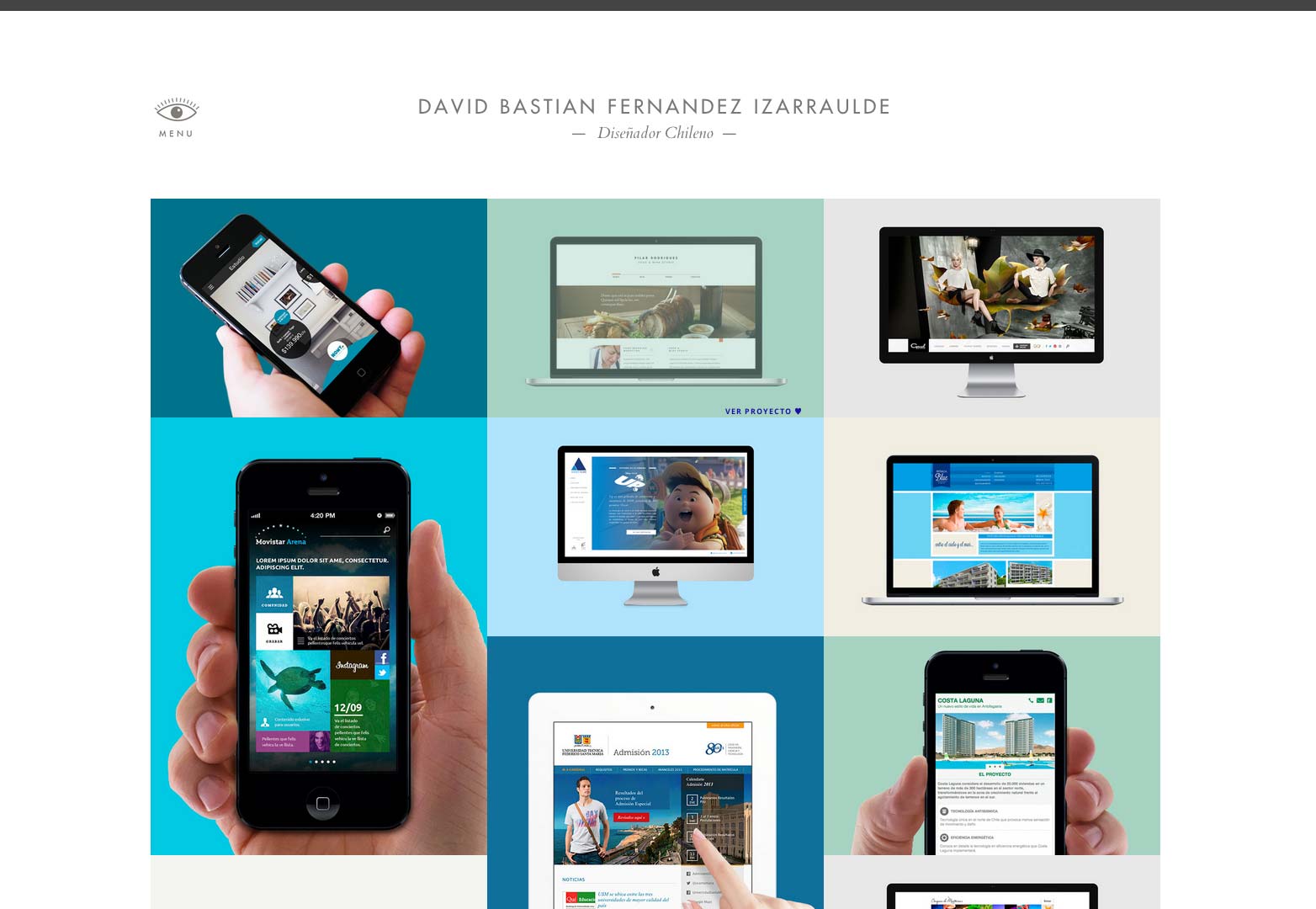
David Bastian
David is a designer from Chile. Right off that bat, we have to notice David's use of a grid and a flat color user interface for his portfolio design. It's so clean and easy to navigate it almost feels like something's missing. There seems to be no page to page navigation, however, David was extremely smart by creating out a fly out menu to the left of the site. It's unobtrusive and easy to distinguish and even easier to use.
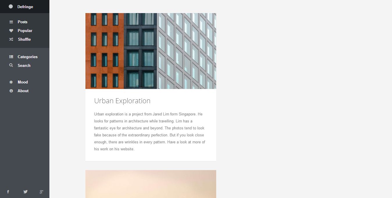
Defringe
Defringe is a site that puts together a bunch of different creative things. There seems to be a pretty free sense of what's being covered as they offer posts on things such as architecture, photography, design and more. Defringe is a responsive web design that has the capability of being viewed with a left menu. I like this left menu because it uses motifs from music playing software to allow you to get around the site. this makes sense because, again, there's no main focus other than to be inspired by various works.
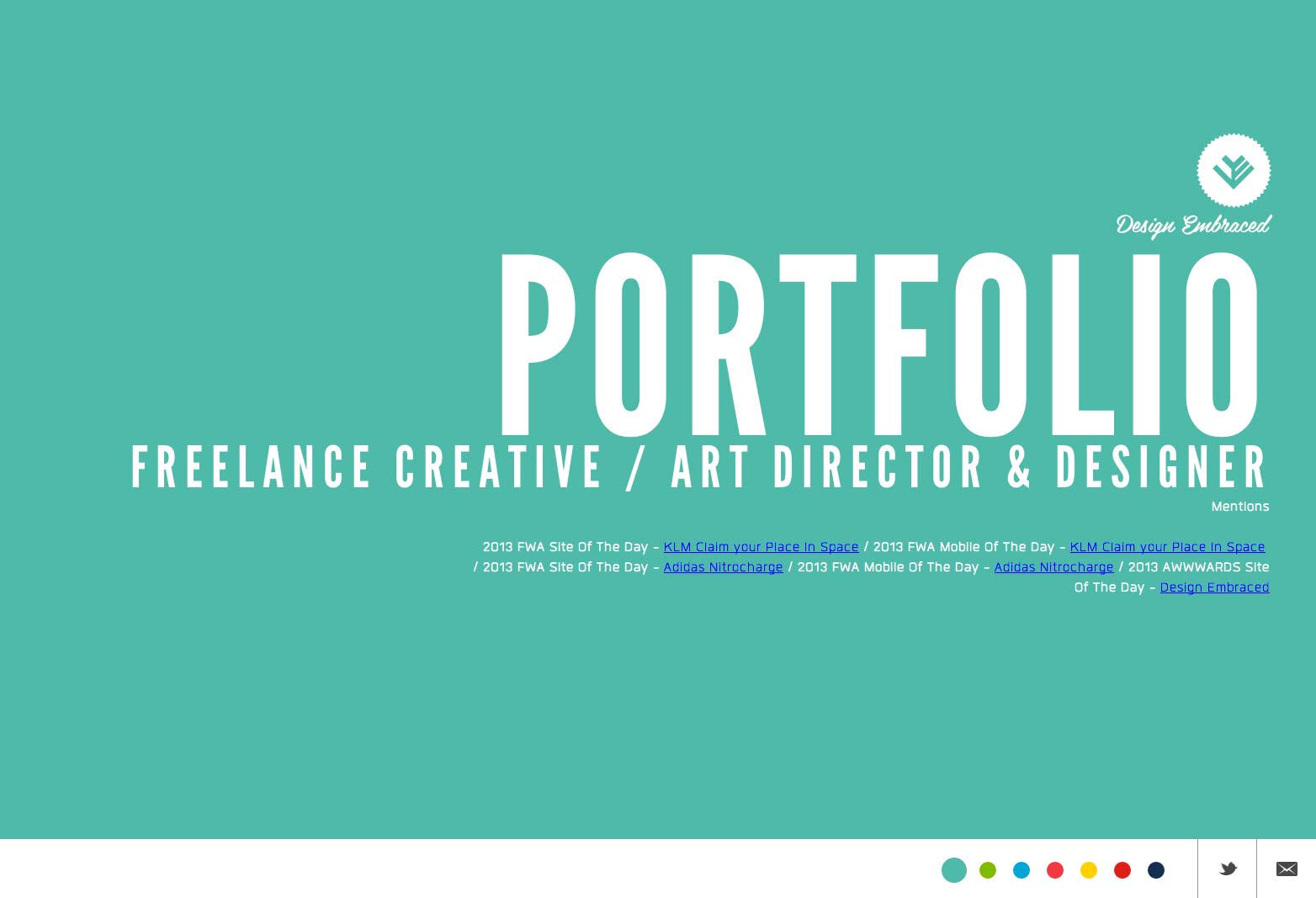
Design Embraced
Design Embraced is the home of Art and Creative Director Anthony Goodwin. For his navigational method, he uses the left and right navigational buttons as well as the scrolling wheel available on most computer mice. This web design is a bit more exciting thanks to the use of color and large headlines. The work is still easily seen in an extremely clean environment that focuses on the work.
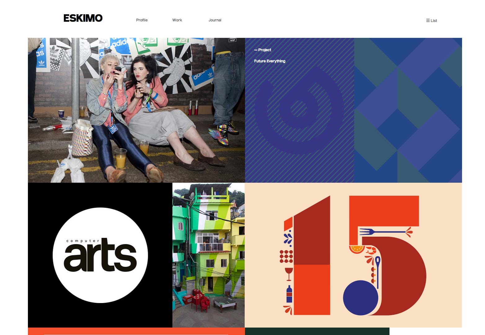
Eskimo
Eskimo Creative is an award winning agency based in Manchester. As a creative agency, they have to be just that in every experience they offer. Online, they do a great job of creatively presenting their work without going overboard. Viewers know exactly how to get around the site. Of importance is the transition between pages and how it's smooth rather than a hiccup in the loading process. That makes a huge difference when you are trying to appeal to someone's creative side.
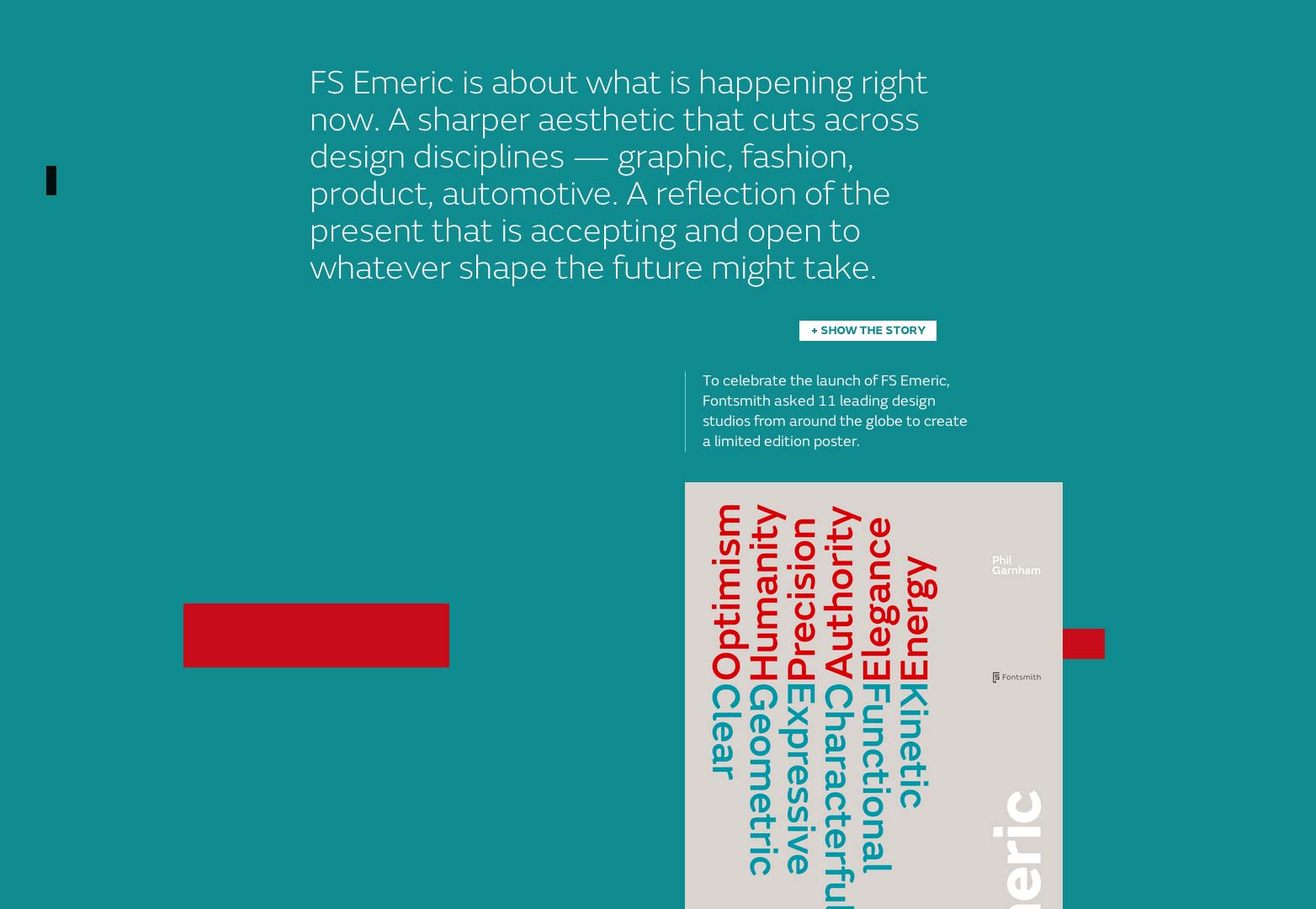
FS Emeric
This is a website dedicated to the launching of a brand new font from Fontsmith. The font is said to be based off the future needs of different disciplines in design. Because of this, you have a creative typeface with some standard basics in fonts. This website is extremely creative and somewhat futuristic in it's approach. The navigation is easy, it's interesting and offers many wonderful insights into the creation of this font.
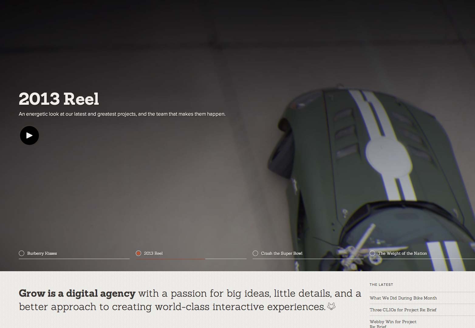
Grow Interactive
Grow is an award winning digital agency rooted in Norfolk that has a passion for big ideas and little details. The user experience over at Grow is amazing because everything feels so connected. There's a consistent feel from the colors and photography used, to the transitions and development used for this website plus the navigation is easy and always there. This is a perfect example of a well thought out website.
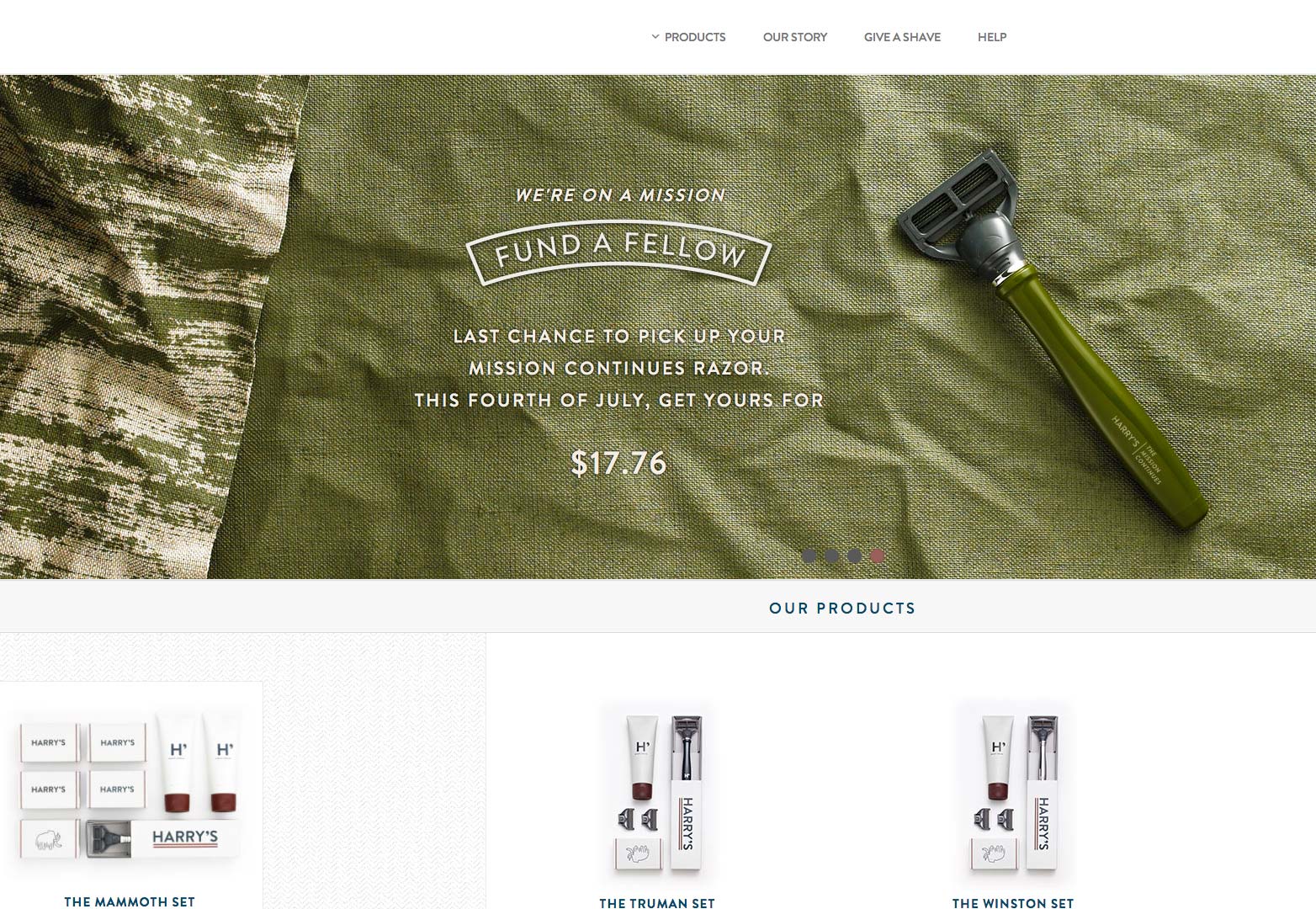
Harry's
The people over at Harry's make high quality razors at affordable prices. They have a wonderfully clean website that focuses on the quality and ease with which one can use a razor. What caught my eye was the products drop down menu. Instead of providing me a menu with just words on it, Harry's allows us to see the products and pricing right there. We don't have to go to an e-commerce page to get to where we want to go, it's available right there.
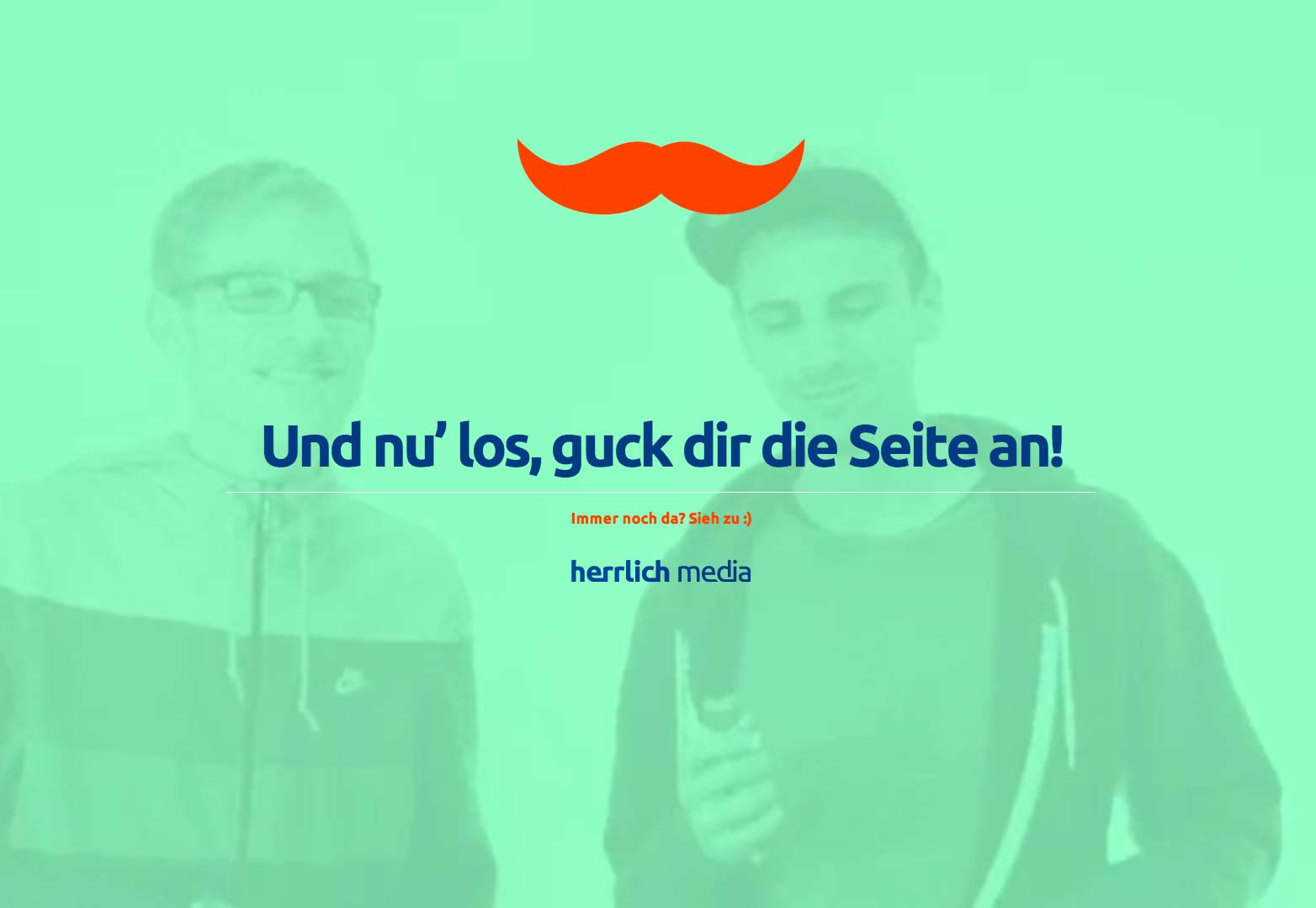
Herrlich Media
I've heard many people echo the sentiment that art and design easily transcend the boundaries created by different languages. Herrlich Media's website is a wonderful example of this. As you may try to translate the page into broken English, you can still tell very easily what the purpose of the site is, where you need to go and you get a good idea of what happens at this small agency. The user experience is fun and fulfilling as well.
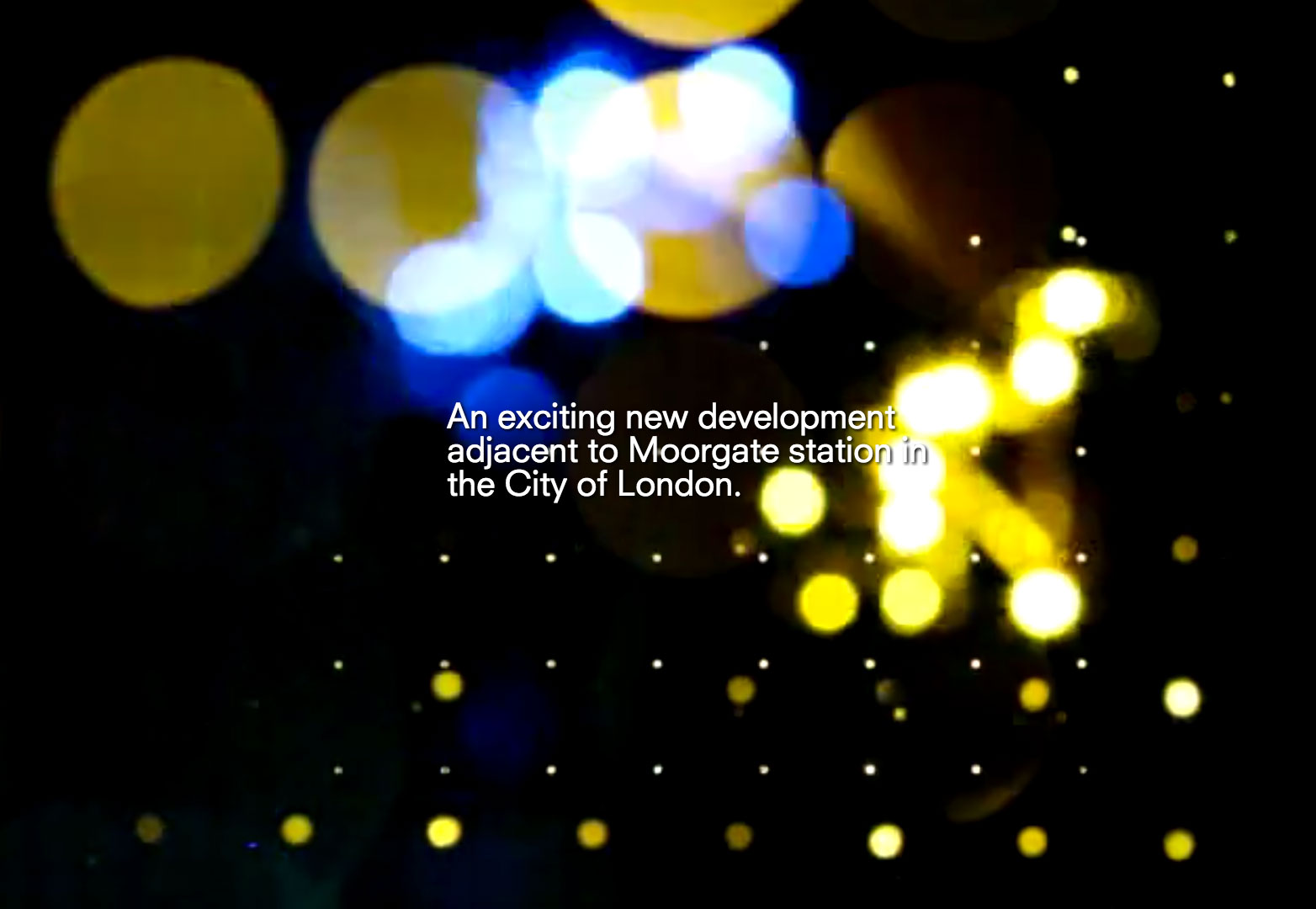
Moorgate Exchange
It's no secret that I believe video is the future of web design, and this is a great example of why. The video on this home page creates an atmosphere and experience for any one person who comes to visit this site. Also, when you get to the site, there's no confusion about what the Moorgate Exchange is; we're immediately are told what it is and where it's located. Continuing with the site is as simple as pushing the up and down keys and all the information is easy to see.
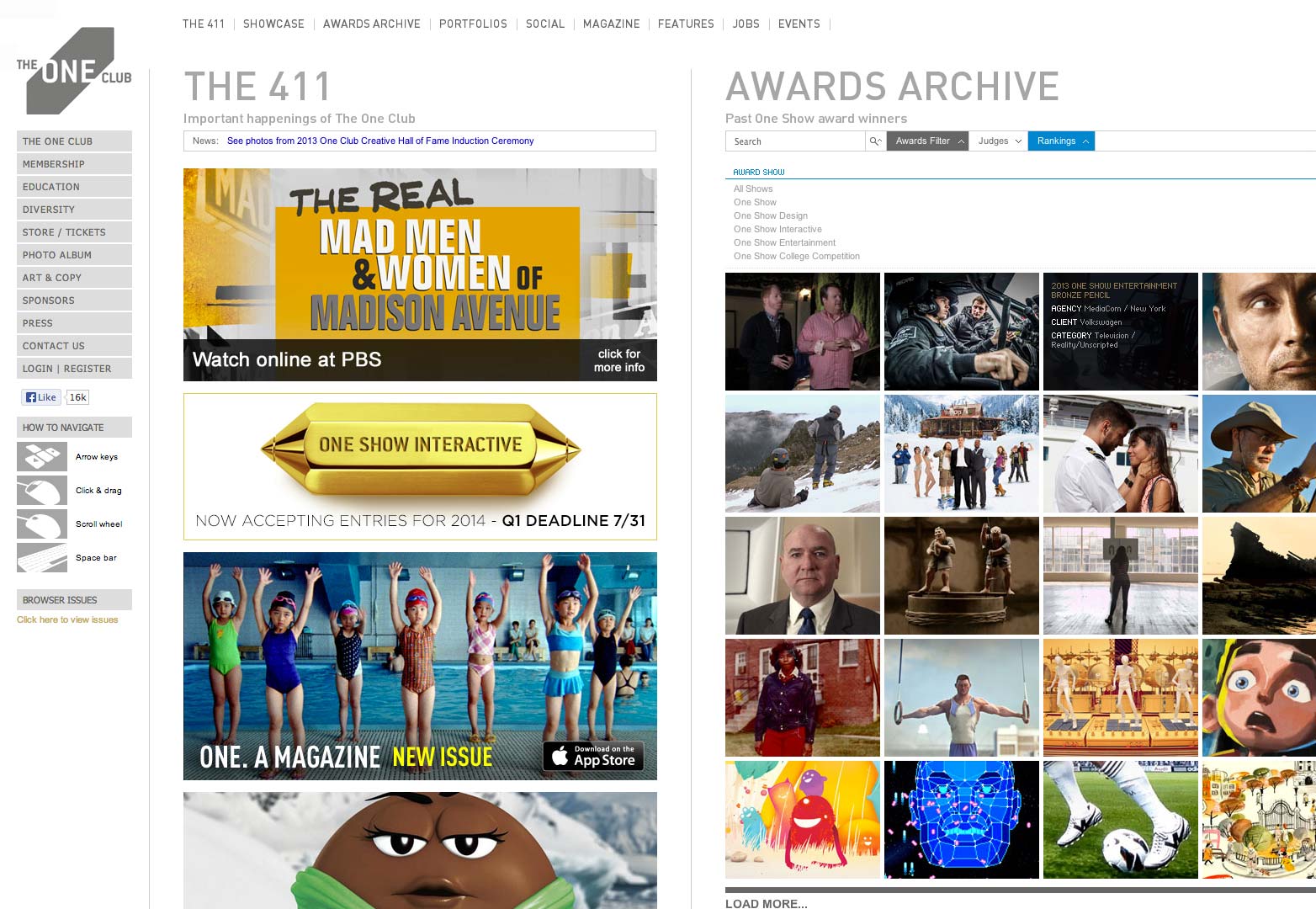
The One Club
The One Club is a website and organization that caters to young professionals in the advertising and creative arenas. They employ some really unorthodox versions of navigation, mainly with the implementation of horizontal scrolling from page to page. This helps create an experience that says the One Club is all about innovation and what's next, rather than what's hot for now.
Ony Agency
Ony is a Russian agency that combines high expertise in branding with digital experience. It's hard not to believe this when they have such a wonderful experience for their own website. The transitions are smooth, the navigation is easy and understandable and the design work is clean and simple. Everything makes sense and is detailed and well planned.
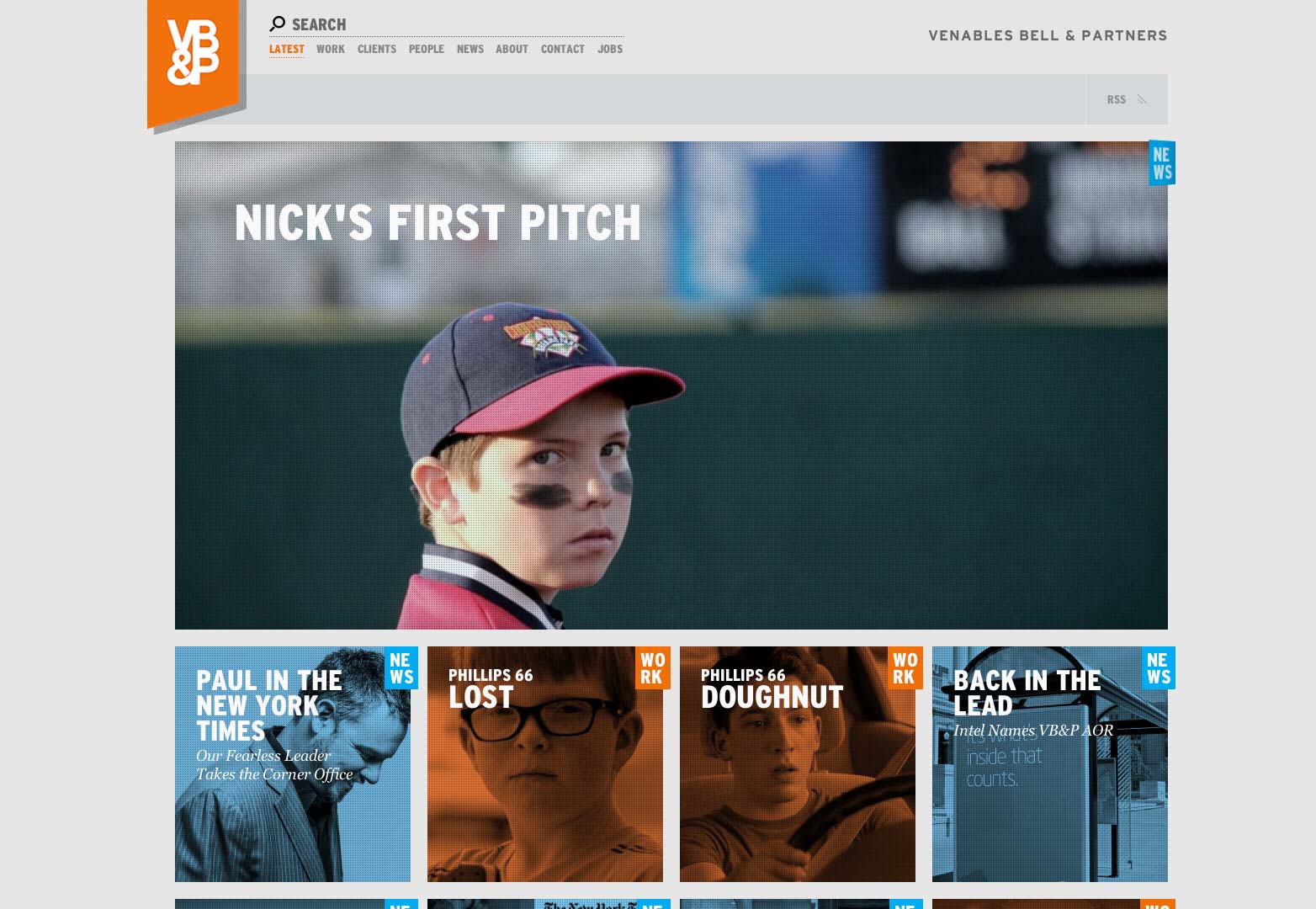
Venables Bell & Partners
To simply put it, this website is lots of fun to interact with. There are lots of fun hover effects, scrolling effects and visual graphics that really make this site a pleasure to look at and share. Venables Bell & Partners has created a site with a wonderful user experience that makes users want to share it and get others involved.
Conclusion
UX is as simple as making an online, digital world as human friendly as possible. Think about your favorite websites and even apps and think about what makes them easy to use and what could make them easier. Try to apply these things to your next project. The design and the development will come along easily when you really plan on creating a beautiful experience first and foremost.
Which of these sites is your favorite? Do you have a favorite UX-rich site that we missed? Let us know in the comments.
Kendra Gaines


Read Next

15 Best New Fonts, July 2024

20 Best New Websites, July 2024

Top 7 WordPress Plugins for 2024: Enhance Your Site's Performance

Exciting New Tools for Designers, July 2024

3 Essential Design Trends, July 2024

15 Best New Fonts, June 2024

20 Best New Websites, June 2024

Exciting New Tools for Designers, June 2024

3 Essential Design Trends, June 2024

15 Best New Fonts, May 2024

How to Reduce The Carbon Footprint of Your Website
