

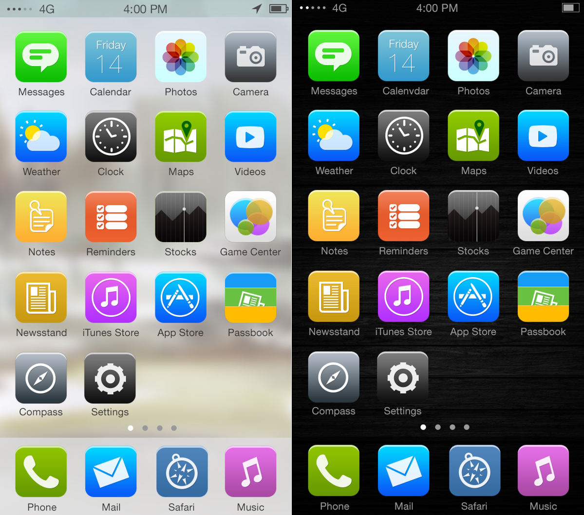
By this time, I can assume you've formed some type of opinion of the iPhone's newest operating system. Some love it, lots (of designers) hate it, but either way, I'm sure you have an opinion about it.
The design community seems to have a pretty unanimous opinion that the new look of iOS7 is a bit of a fail. From the extremely colorful icons to the inconsistent stylistics, I'm sure there's something out there a great software user interface designer can point out for fixing.
What should iOS7 look like?
Complaining about the design of iOS7 gets us nowhere. I live by the idea that one shouldn't complain about a situation unless they have a fairly good solution. Well, a whole bunch of designers obviously agree, because they've been redesigning elements of the new operating system.
Some of these changes are subtle corrections whilst others are bold designs completely rethought from scratch. Fortunately, designers have given us alternatives to stack against the designs of Jony Ive. Let's jump right in.
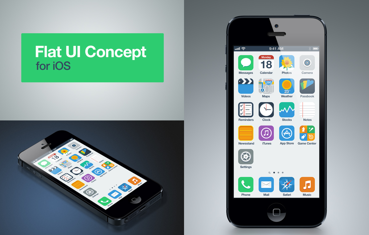
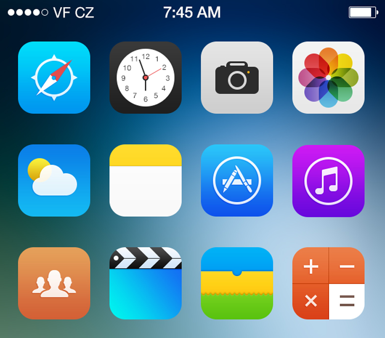
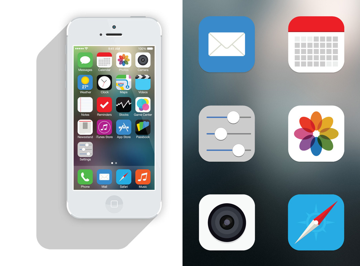
Anton Kovalev
As we know, the designers at Apple decided to completely ditch their skeuomorphic design and go with something a bit flatter. Apple kind of redefined 'flat' as they just used some different gradients. This designer created a flat UI that sticks with the concept from top to bottom. The consistency in colors is also important because it gives the icons a cohesive feel.
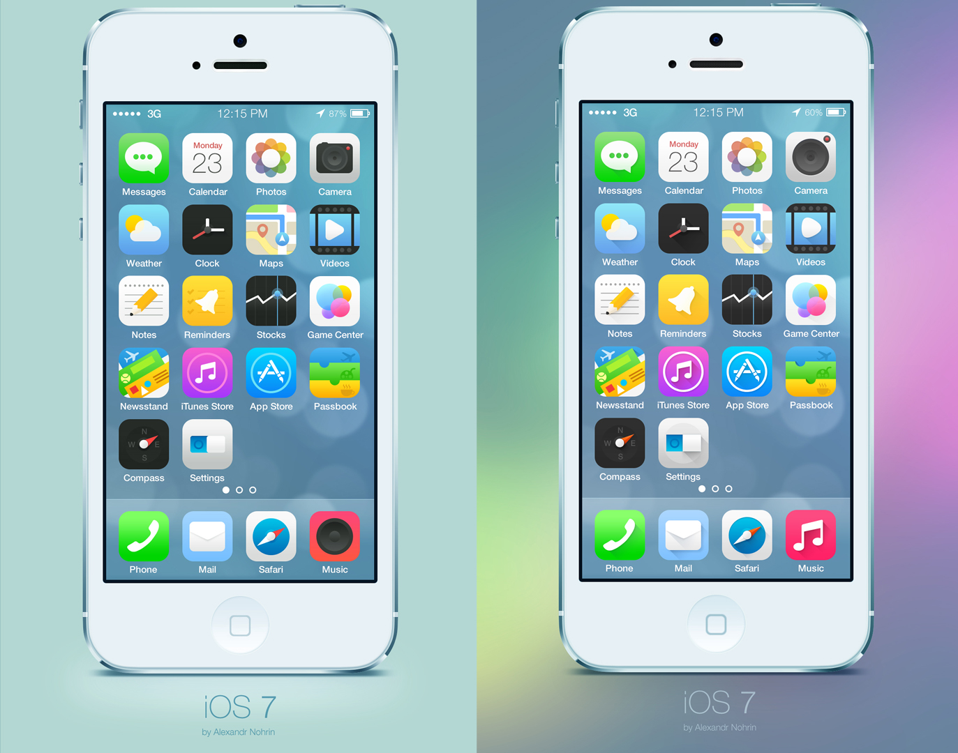
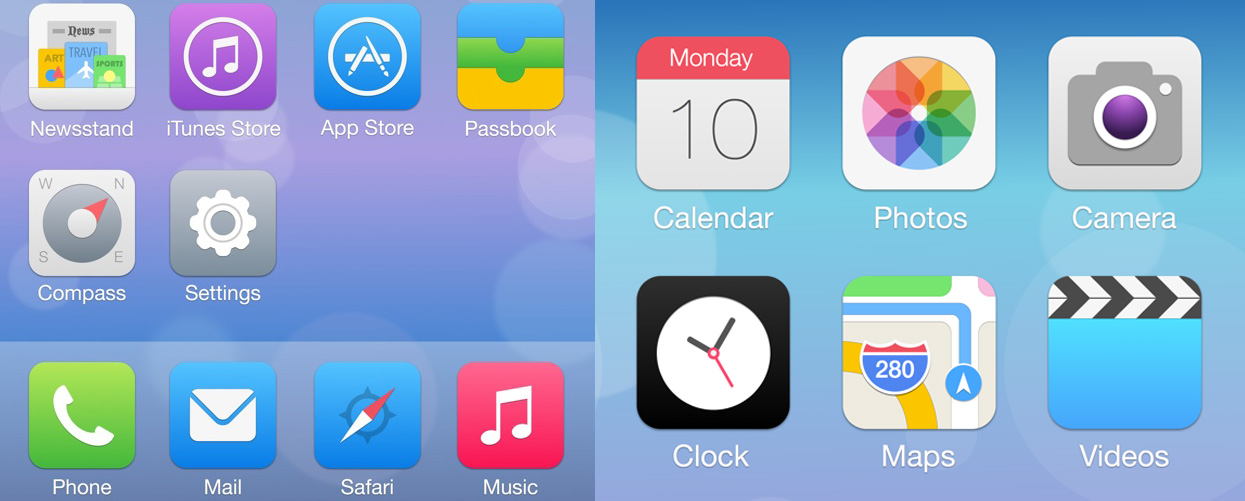
Alexandr Nohrin
This redesign doesn't stray too far away from what Jony Ive has already deemed his new software design. A major issue with the icons of iOS 7 were the gradients and how inconsistent they were. Some were from light to dark, others were from dark to light and others just seemed to be pretty random. Nevertheless, this designer found a way to make it fairy cohesive while taking a stab at redesigning some of the other icons.
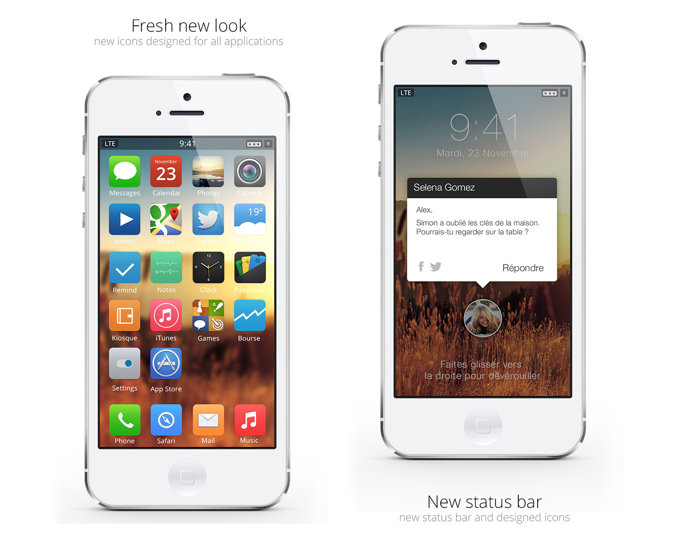
Ariel Verber
We talked about flat design and how Apple has tried to use it better. This redesign isn't just flat, but it's extremely simple as all the icons are essentially white and a single colored background. This is even a different layout for the iPhone where the clock is put on top of the icons. This is just a completely rethought design.
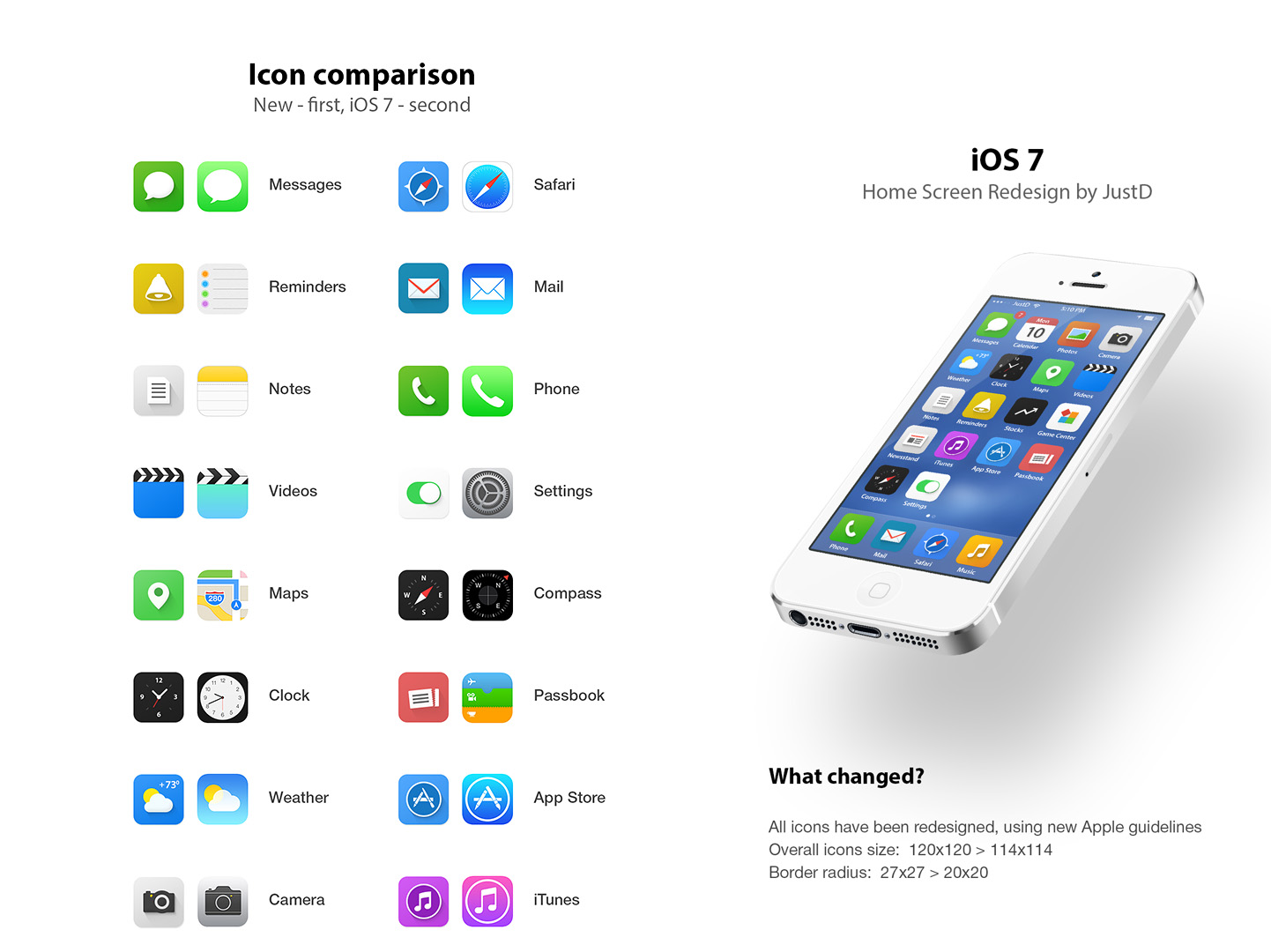
Jackie Tran Anh
Again, this is a pretty safe redesign of iOS7 that tries some different things with new and rethought icons. The icon backgrounds seem to still be a bit less consistent, however there seems to be a rather smooth feel for the actual icon.
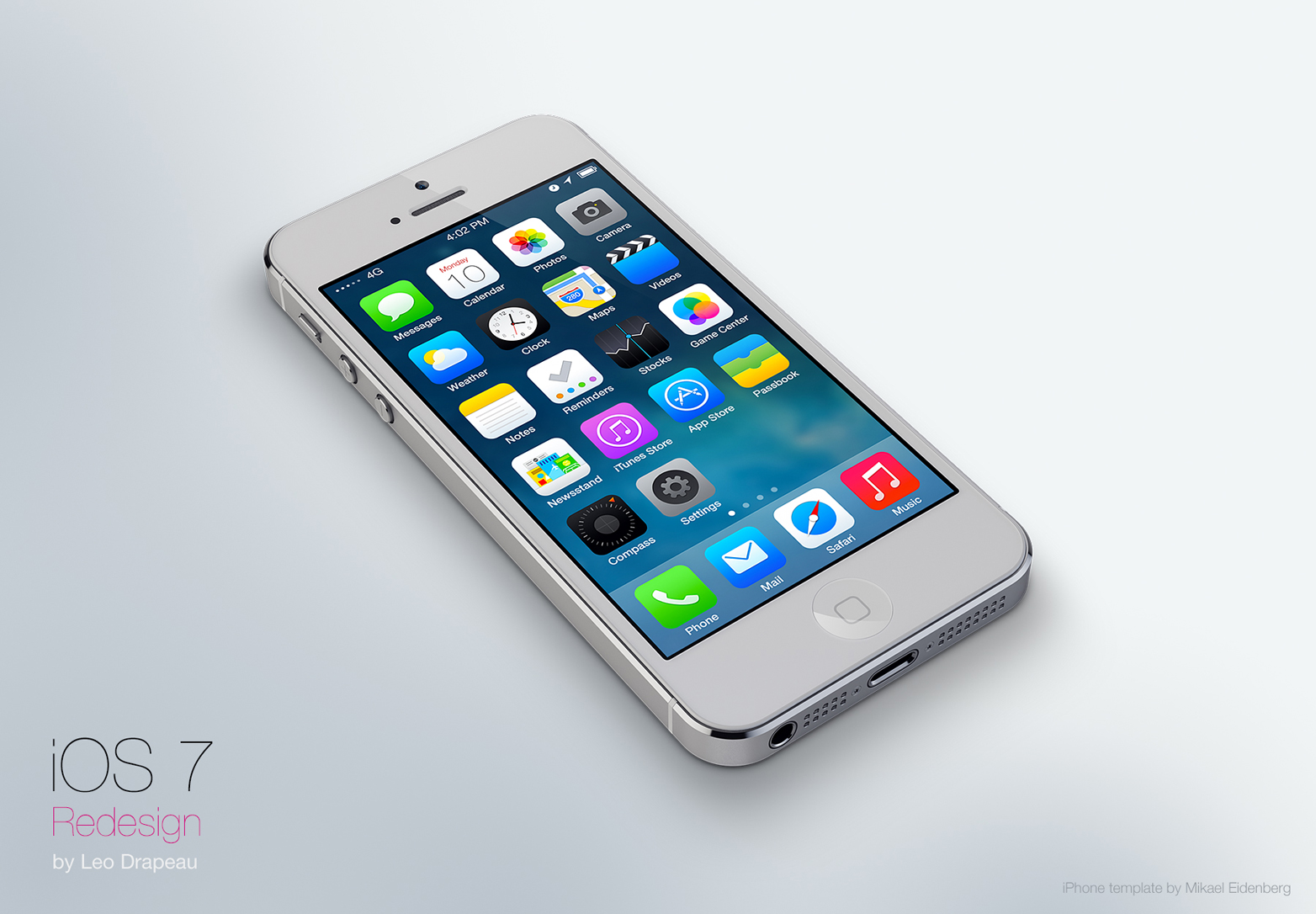
Leo Drapeau
I really like this set of icons because they decided to use a coherent style for the icons. Of major importance is the new, redesigned look of the compass and stock icons that really seem to stand out on iOS 7 because they don't feel as minimal and structured as the others. This designer did just that.
Pascal Assaleh
These icons for iOS7 seem to be extremely precise. Each icon's background has a subtle gradient that adds a bit of depth to it that makes it more like a button. There's also a very thin shadow under the actual icon. I'd be very interested to see how this redesign looks and feels in the hand. It seems like it could offer a wonderful experience.
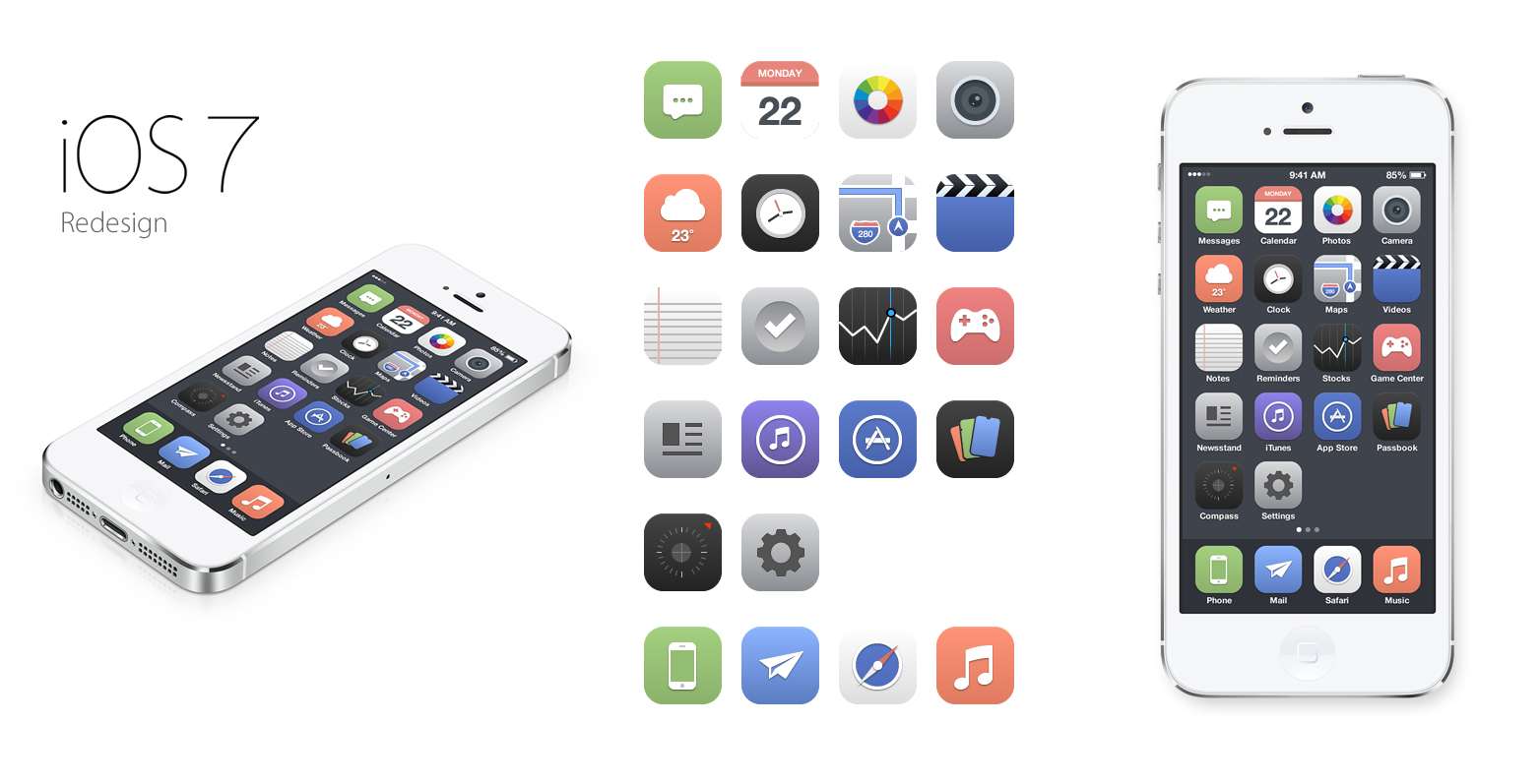
Nicole Calace
Of course, we will continue to see lots of designs that utilize flat color, so here's another. First, the design of the icons is really nice and almost gives off a bit of a vintage feel with the color choices and the ultra-simplicity of the design. I like how each icon was given that added shine at the top to give a little bit of something else.
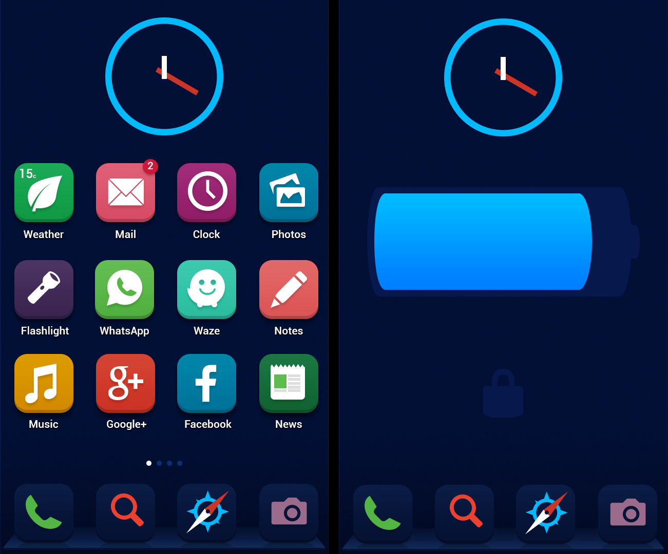
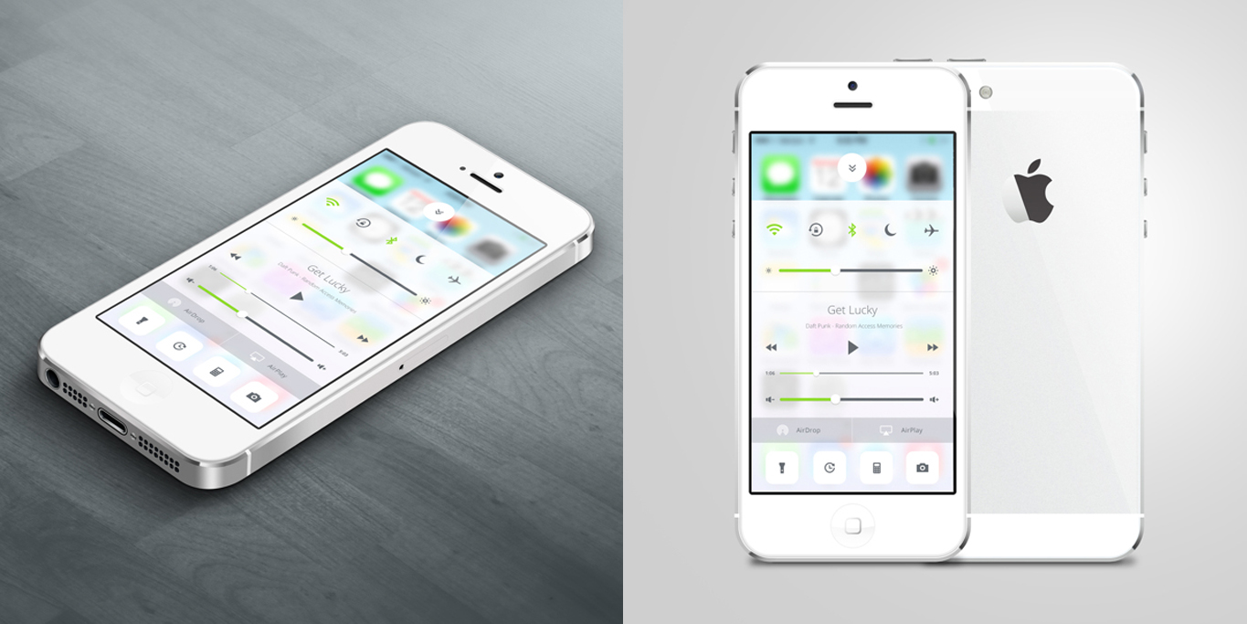
Sam Nissinen
Lots of people took to the icons to redesign for Apple, but there are many other things that could be redesigned for iOS7. One of my personal dislikes was the control panel. It originally seems a bit busy while being monotonous. This designer does a great job of cleaning that up by adding some color and by using smaller, neater icons.
Venkatesh Aiyulu
This design seems to stray away just a bit from what's new in iOS 7. Obviously, this designer decided to re-imagine it on a leash and came up with some wonderful stuff. The chunkier icons and subtle gradients are pretty consistent throughout all the icons.
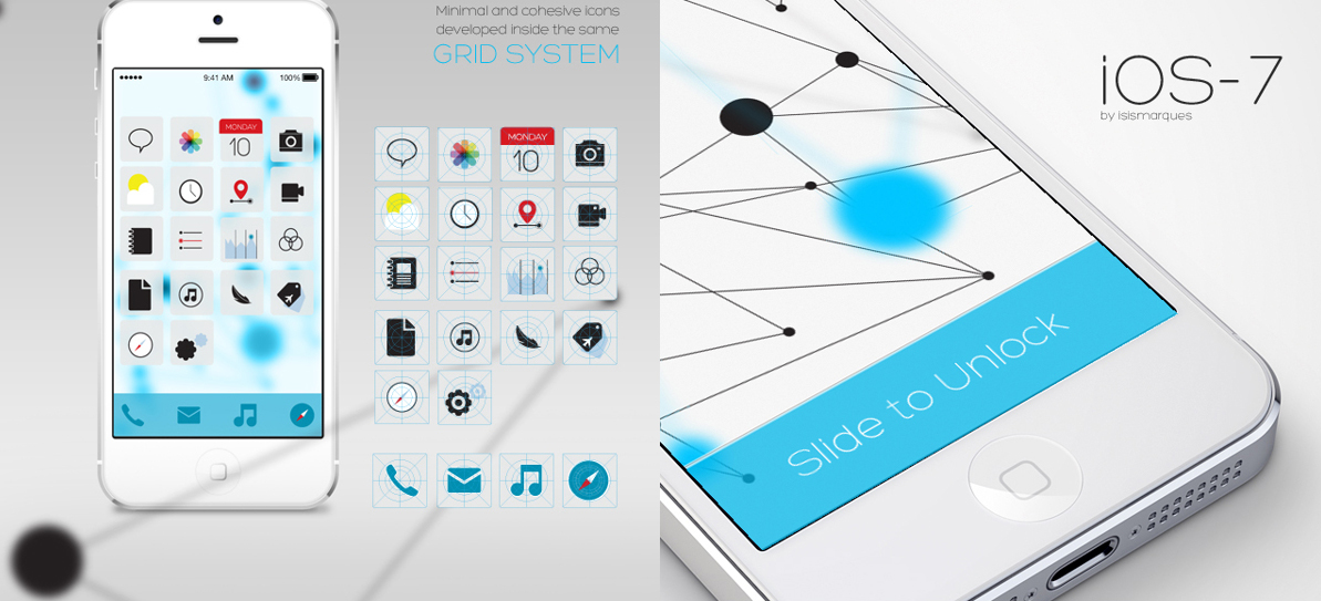
Isis Marques
How do you fix a set of icons that people keep saying isn't cohesive enough? Well, you put them on the same color and then you use the same style to make them. These minimalist icons attempt to give users an easy way to use iOS7. While they lack some excitement, it's hard to argue how well all these icons go together.
Naxo Garcia
I like this set of icons because the designer didn't really dismiss the feel of the new icons. These are still bright and have flat elements. It's just easier to see the completeness in thought. One of the things you have to consider when doing something like this is how much to keep and how much to drop.
Andrei Brink
I love this attempt at a flat UI because it's especially unwaivering (no gradients or shadows) and has a very mature look. It's really hard, in my opinion, to create a flat concept and keep it looking adult rather than "toy-ish." There's a lot of detail to these icons that really give it that extra notch of beauty that it needs.
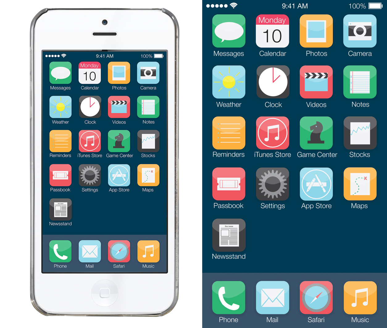
Ida Swarczewskaja
With some slight variations (except for the total re-design of the compass icon), this is one of the many re-imagined concepts that just attempts to build on top of what Apple already has. I think with another stab that the newsstand icon, this could really be a legitimate redesign for the new operating system.
Alexis Jossart
I absolutely love this redesign because it doesn't seem to be caught up on trends of the moment, but about what really looks good on a smartphone and what makes sense. The icons are gorgeous (especially the Twitter and the Camera ones). The other screens for the redesign are super clean and well thought out for users. This is an overall great redesign.
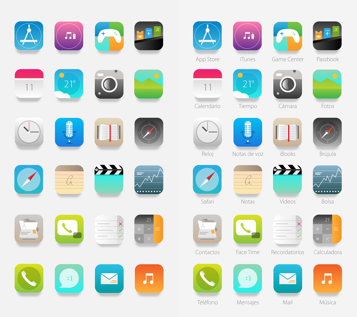
Dmitry Kovalenko
First off, I like how the designer took all the icons and simplified them. He used richer colors for his icons and then added this beautiful drop shadow underneath it all to really set it off. The new icons just seem to be a more mature version of what's already been created by Apple.
Conclusion
While many of the reviews on the completely redesigned iOS 7 are extremely mixed, it doesn't take away from the fact that we must give Apple some credit. I remember reading somewhere about how difficult it is to launch a new product or launch a rebrand. The idea is that not everyone's going to love it at first, and you're sure to hit some hiccups every now and again. Doing something new and different is a process, one that isn't necessarily considered a hit over night. Because of this, I have to give tremendous respect to Jony Ive for taking the extremely popular iOS in a different direction, one that many of us never thought we'd see. Hopefully, on the way to perfecting iOS 7, some criticisms are accepted and built upon. Until then, let's enjoy something new!
Which of these redesigns is your favourite? Do you prefer Apple's version? Let us know in the comments.
Kendra Gaines


Read Next

15 Best New Fonts, July 2024

20 Best New Websites, July 2024

Top 7 WordPress Plugins for 2024: Enhance Your Site's Performance

Exciting New Tools for Designers, July 2024

3 Essential Design Trends, July 2024

15 Best New Fonts, June 2024

20 Best New Websites, June 2024

Exciting New Tools for Designers, June 2024

3 Essential Design Trends, June 2024

15 Best New Fonts, May 2024

How to Reduce The Carbon Footprint of Your Website
