 “Stop resizing that browser, you’re gonna wear it out!” How many times have you heard that one? Well okay, maybe not so many times, but if you develop responsive design web sites, you know what I’m talking about: with every DOM or CSS edit you’re dragging that browser edge back and forth, testing your changes and looking for anything broken.
Ultimately, most of this effort is an attempt to emulate the screen size of different devices.
If you’re doing corporate development, you may have a variety of devices provided by the company to test on. Where I work we have an iPad, iPod, one or two other tablets, laptops and desktops. If you don’t have that luxury, you have to use whatever is at hand.
In my home we have two different laptops, two different Android devices, a Kindle and a Nexus 7. These are the devices I use to test my freelance development, but clearly this isn’t an exhaustive collection. No iOS devices at all, and although I’m a bit of an early adopter, I don’t plan on buying every new phone/phablet/tablet as it hits the market.
So what is a developer to do? Thankfully, there is a growing number of browser-based tools available that emulate the screen sizes of a wide variety of devices. Different tools come with different feature sets and varying levels of utility, of course. We’ll look at several of them here.
For testing purposes, I used the first truly responsive site that I made, PajamasOnYourFeet.com. This site is based on the Brownie HTML5 template, very graciously provided to the development community for free on EGrappler.
Am I Responsive?
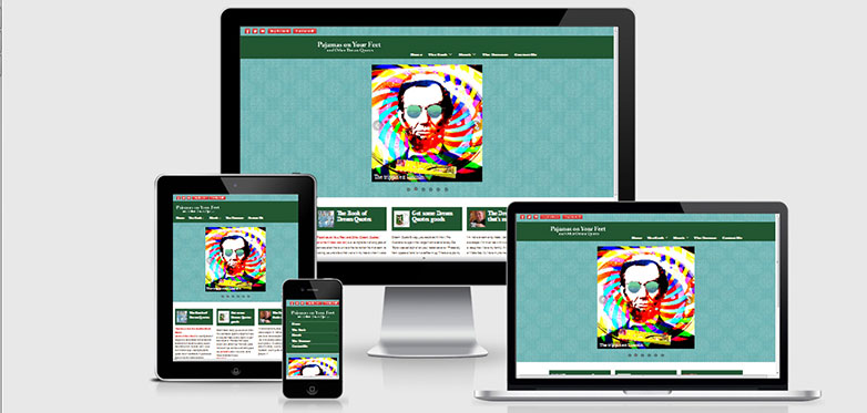
Am I Responsive? is a dead simple, instant view of your site as it would display on four different devices. All four are iOS, and the developer explains that focus on the site. It offers no controls and no choices, just a very simple, elegant presentation.
Viewport sizes are
- Desktop — 1600 x 992px scaled down to scale(0.3181)
- Laptop — 1280 x 802px scaled down to scale(0.277)
- Tablet — 768 x 1024px scaled down to scale(0.219)
- Mobile — 320 x 480px scaled down to scale(0.219)
Quoting the developer, “This is not a tool for testing, it is really important that you do that on real devices. This instead is a tool for quick screenshots (for me) and to visually allow people to ‘get’ what you mean in client meetings.”
Two very nice features are the ability to drag the “devices” wherever you want on the screen, and the ability to embed your test site in a link you can share. In Firefox, at least with the structure of the test site, the side scrollbar on the iPhone doesn’t display, but it does in IE and Chrome.
deviceponsive
deviceponsive is similar to Am I Responsive? in that it simply and cleanly displays your site, with no controls or options available as far as the devices are concerned. All devices are shown at once on one long page. It does have the interesting feature that you can customize the site header by editing a header background color and embedding your own logo, and then share via screen capture. This lets you brand the site, in a way, when you share screenshots with a customer.
Devices and screen sizes emulated in this site are
- Macbook — 1280 x 800
- iPad portrait — 768 x 1024
- iPad landscape — 1024 x 768
- Kindle portrait — 600 x 1024
- Kindle landscape — 1024 x 600
- iPhone portrait — 320 x 480
- iPhone landscape — 480 x 320
- Galaxy portrait — 240 x 320
- Galaxy landscape — 320 x 240
As with most of these tools, scrollbars are displayed on the smaller devices. On the actual device they would not display, but to allow scrolling the test view on a non-touch scroll device, some concessions must be made.
responsive test
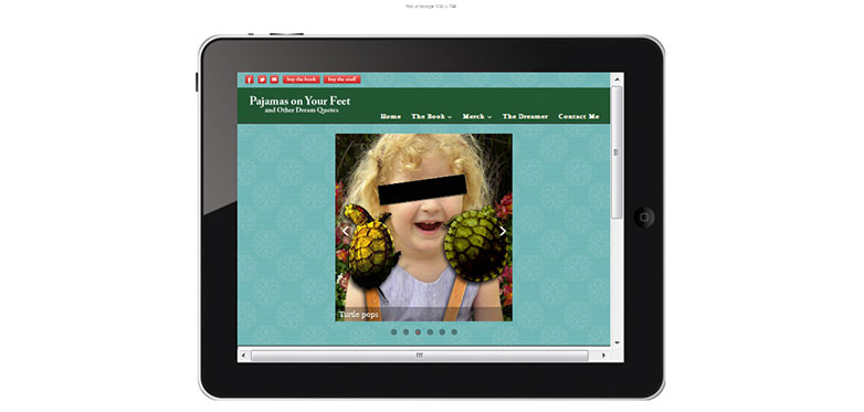
Like deviceponsive, responsive test displays your site in a variety of devices, but instead of displaying them all on the page at once, you choose which device to view from a simple menu at the top of the page. Viewing this site on a medium-sized laptop, I found zooming the page out works well, allowing you to see the entire test site within the test device's bezel.
Thirteen different viewports are offered here, ranging from a large desktop monitor to a what they call ‘Crappy Android’ (to be fair, they also have an option called ‘Nicer Android’).
Once again, Firefox is the browser that stumbles a bit on this site. Notice in the screenshot, between the green header and the white background content area, there is only a blue stripe where an image slider should be displayed.
responsive.is
Quite similar to the previous two entries, the one thing that sets responsive.is apart from them is the smooth animation from one device’s display to the next, and a semi-transparent overlay that shows the site real estate that falls outside of the viewport.
The only device options available here are auto, which fills your browser window, showing the site as you’d see it if you actually went there, Desktop; Tablet Landscape; Tablet Portrait; SmartPhone Landscape; and SmartPhone Portrait, pixel dimensions aren’t given.
Screenqueries
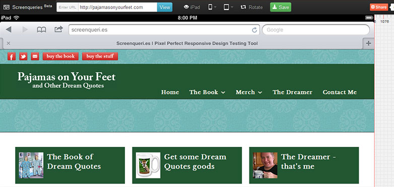
Once again, a few different features and options set Screenqueries slightly apart from the others. 14 handsets and 12 tablets are provided here, with a separate control to switch between portrait and landscape mode. They display on a numbered pixel grid, with the dimensions shown at the bottom right of the test display. The edges of the display are draggable so you can test custom sizes. Mouse over or click on the test area and the background switches to grey, giving you a less cluttered view.
An interesting feature of this site, for several of the devices there is a “Trueview” option which shows your site wrapped in the specified device’s browser chrome.
Unfortunately, and I’m getting used to it by now, Firefox fails to display the test site’s image slider. Don’t flame me, Firefox is actually my browser of choice, but thankfully we have options.
Screenfly
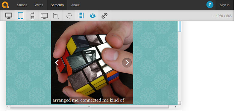
Screenfly really steps up the usability quotient. It offers nine bigger-than-tablet devices, from 10" notebook to 24" desktop, five tablets, nine smartphones, three television sizes, and a custom screen size option. Any option you choose can be rotated to portrait or landscape with a separate menu control. You can choose to allow scrolling or not, and you can generate a shareable link with the click of a button.
The site is proactively useful with how it presents pixel dimension information. Each device in the menus is shown with name and pixel dimensions, the dimensions of your own actual browser window are shown near the top right of the window, and the selected option’s dimensions are shown in a footer under the display, along with the URL of the site being tested. That little feature adds a nice touch for documenting screenshots and sharing the information with clients.
All the aforementioned would make this a perfectly good tool, but the developers of Screenfly saw fit to kick it up one major notch and provide a proxy server feature. Quoting from their site, “Screenfly can use a proxy server to mimic devices while you view your website. The proxy server mimics the user agent string of the devices you select, but not the behavior of those devices.”
All the other tools covered here deal solely with CSS. Screenfly is the only one that allows testing based on agent string.
Testing with the one site I’ve made that provides a mobile version based on agent string, the results for the mobile site were very good. Things displayed exactly as I expected and functions were testable. Admittedly, testing for agent strings is old school, but this site was made “back in the day”, and the proxy server feature does make a useful addition to this site.
Conclusion
So we see there are quite a few resources for testing your responsive sites. Differentiated by unique features, which sites you might use will be based on your own individual preferences and requirements, and I encourage you to explore and experiment with them. The more truly useful tools we have as web developers, the better.
Do you use any of these tools? How do you test your responsive designs? Let us know in the comments.

