


Responsive web design is popular and it’s absolutely no secret. It’s what experts are calling for and what many brands are switching to. It’s not just about creating a mobile-ready site, but about making your site visible to every browser size, whether via desktop, tablet or smartphone.
The tricky part about designing for responsiveness is creating a site that looks good big and small. You have to take lots into consideration before you break open your design program and go to work. It’s an extra step that typically ends up being well worth it in the finished product. It’s very evident when a designer doesn’t plan for responsiveness; sites tend to look really bare and boring.
It’s absolutely imperative that designers maintain their creativity throughout responsive sites. With more people using tablets and smartphones, you want to be sure everyone is able to view your site. Here are some tips to help you keep creative and effective when designing for the responsive web.
1. Use excellent typography
With responsive sites, you have to consider what’s going to look good on a smaller screen. Good typography is a staple of any good web design but it’s almost necessary in responsive web design. As screen sizes decrease, most of the elements should transform and shrink or move as well. First and foremost, your typography should have this capability.
Secondly, you should be using different headings and various sizes in text. Now, we usually use very large sized headlines and headers for our desktop designs. This does not have to discontinue in its entirety because you’re thinking about smaller sizes. Just making sure you’re using a plugin, like FitText, to decrease the sizes of your text. This helps.
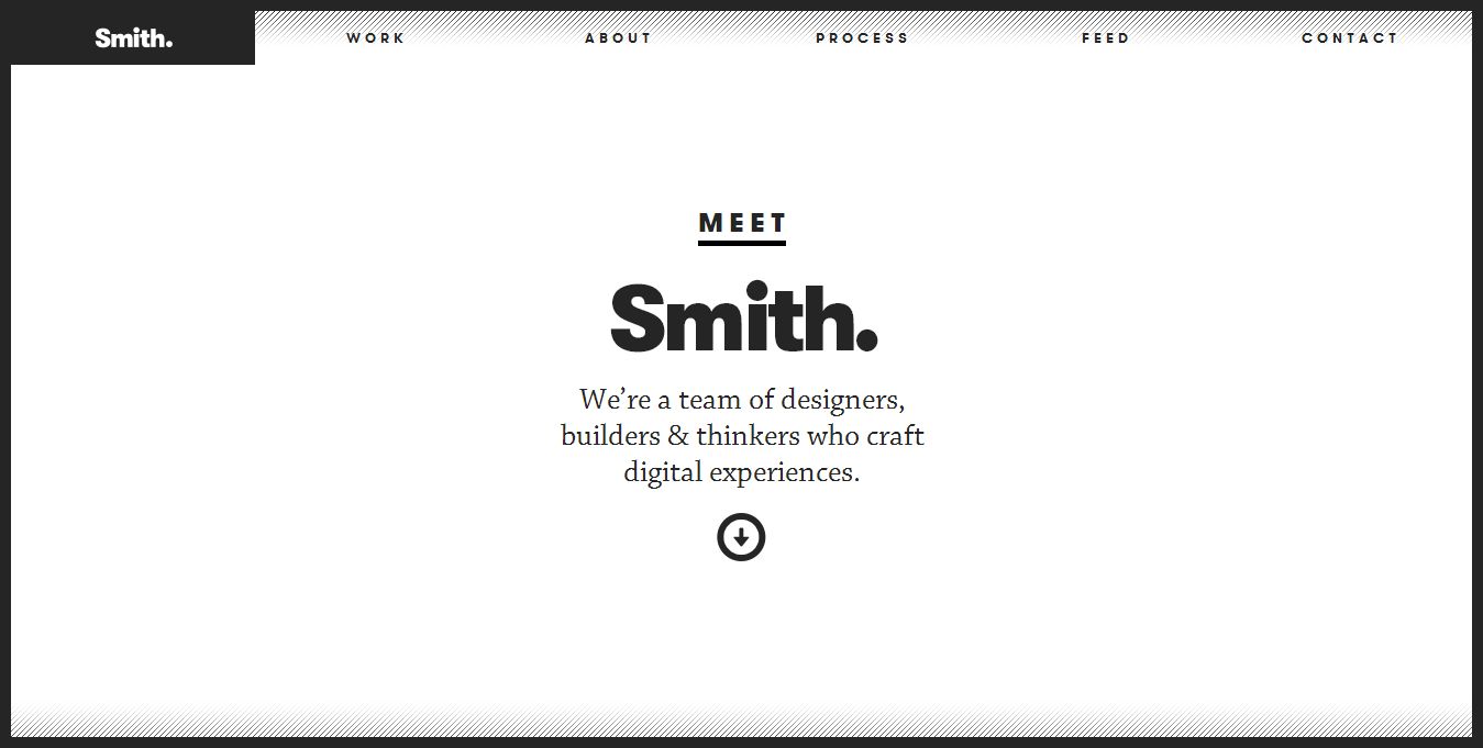
Smith uses many different typefaces to create a very interesting look and feel. They also vary the sizes of these fonts throughout the site. What’s interesting in the desktop mode, is the way the text and paragraphs are lined up in different columns. When the window is scaled down, the text collapses into one column. Fortunately, the text remains consistent by maintaining the same scale and style.
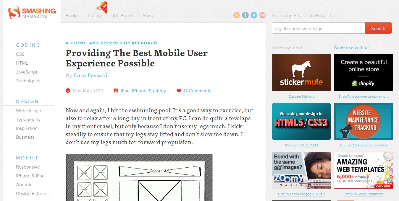
Smashing magazine tends to do the same. They get rid of the right side of the design (the advertisements) entirely when the window is scaled down. However, the text wraps inside the window and the styles, colors and sizes all remain consistent.
2. Use great images
Imagery, like typography, is extremely important in any website design. Also like typography, in responsive designs, when you view a site on smaller screens, your pictures should also appear smaller or scaled down. There are tons of different layouts and different image sizes that can be used in a responsive design. It’s important to pay attention to the images you choose and how you’re using them because they will undoubtedly change. As screens get bigger or smaller, images change shape and reveal or crop out certain portions of the image.
Ideally, you want to make sure your large, photographic images to have no graphical content on them that can be cropped out when windows change size. In addition, when you’re creating graphical images, you’ve got to make sure you’re creating an image that loads fast and will be visible on a smaller screen. This is why designers have embraced flat design. It's just easier.
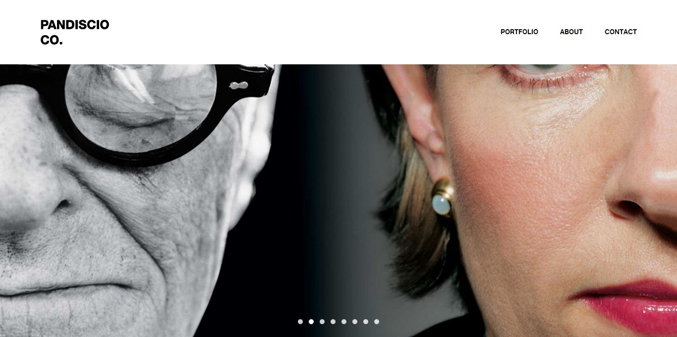
At Pandiscio, first you have to notice how the larger header image looks on a desktop. It’s full, extends to the sides and is pretty high quality. As you shrink the window size, the images get smaller, change shape (from rectangular to square) and get cropped. They’ve found images that look good when the screen changes size.
KinHR is a site that uses lots of different graphical elements as well as photographs. Notice that when large and when small, the header images become smaller like in the Pandiscio website. However, with the graphical elements in the body, the images get smaller yet maintain their shape and don’t get cropped.

3. Don’t sleep on the navigation
Point blank, if people have no clue how to get around your site, then they just won’t. Navigation is harder when dealing with responsive design because we are used to creating navigation for landscape designs. Now, we’ve got to create navigation that can be easily condensed to fit portrait dimensions.
It’s not a huge problem when you have a handful of links. You can either make your menu smaller or condensed near the top or you can create a drop down menu for viewers. Of major importance is how you handle navigation with more content heavy websites.
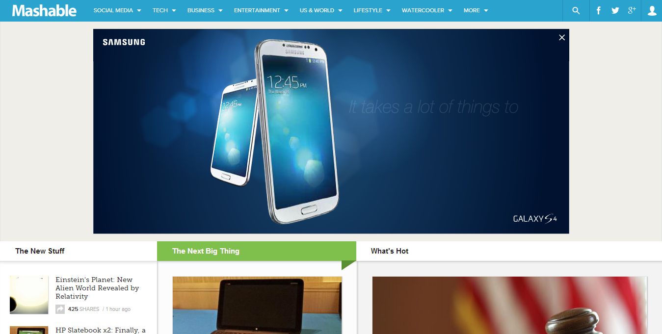
Mashable has tons of links because they have tons of categories and and even more articles. On top of that, they have their own company-centric pages that have to be linked to as well. Mashable decides to create a pop-out menu on the left side of the screen for smaller browsers.
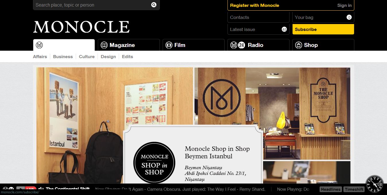
Monocle has two top tiers of extensive navigation for their site. For smaller browsers, they’ve created a slide down menu for the utmost content and have just condensed the second tier of navigation.
4. Make it fun to use
When you click on links online, you probably have to sit there and wait for things to load before you see a page. On phones, it’s extra annoying to have to precisely find the next button in order to move towards more content. Stuff like this isn’t fun nor is it intuitive.
Paying attention to the details and making your site more intuitive makes your site more shareable. Think about what it’s like to use a site on any browser size. Think about what websites should do when you call for an action. Find these things and fix them so your site is easy, fun and intuitive to use. It also makes it a bit more interesting!
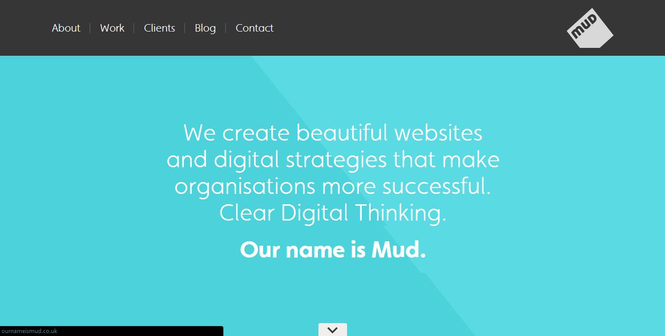
Mud makes their site more interesting by paying attention to their transitions. They create a very sleek feel by allowing many of their elements to slide down and fade in rather than just moving abruptly and showing up. It makes a world of difference.
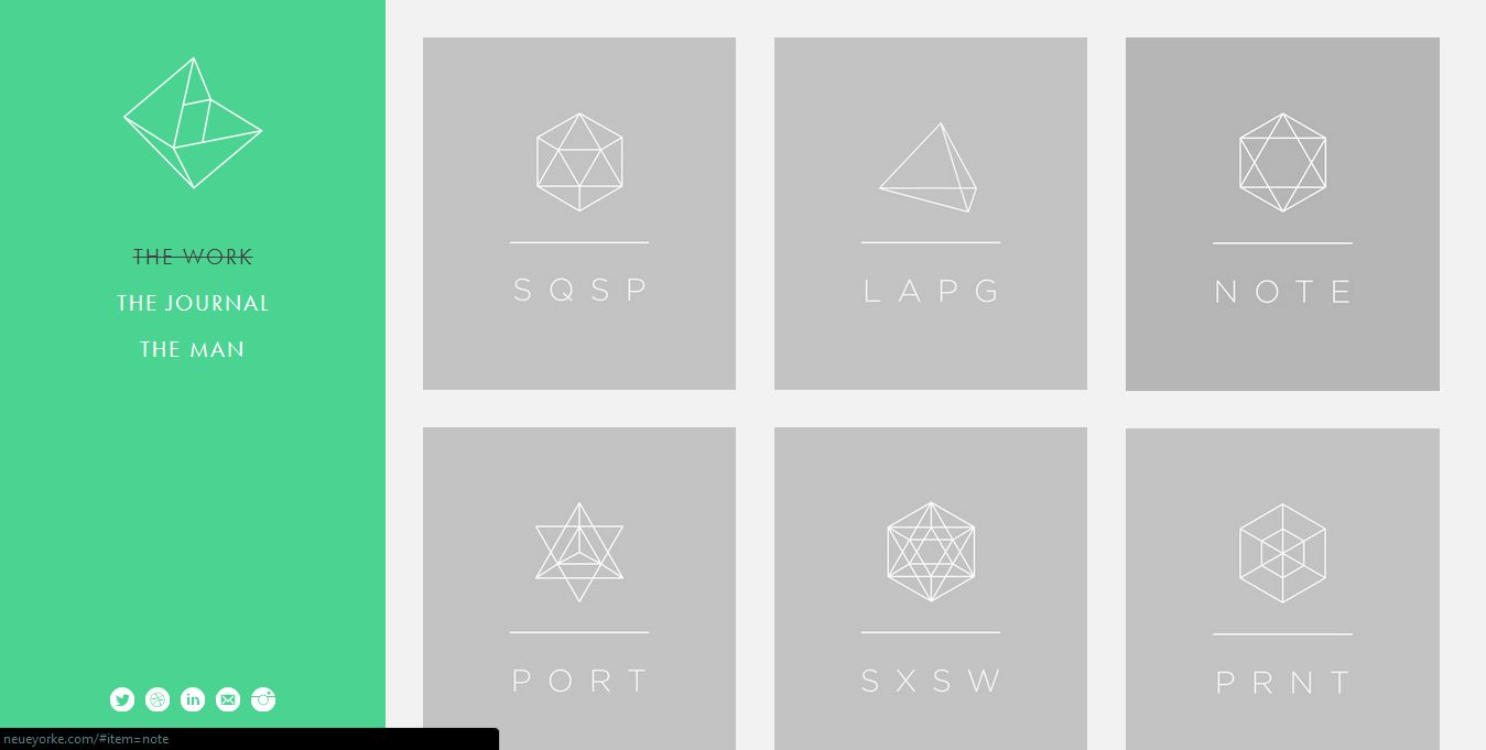
Neue Yorke uses lots of movement when going from portfolio item to item. Again, it creates a very high-end feel and keeps viewers interested in what’s soon to be revealed.
5. Think outside the box
When all else fails, just be creative. Responsive web design is not meant to be a constraint on the way we create websites. There’s always room to use creativity, whether it’s via coding or designing.
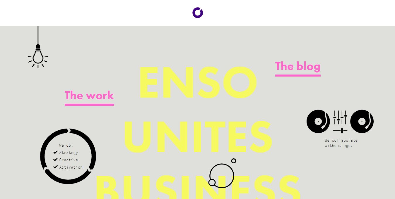
Enso has created a site that looks as if it has no chance of being responsive. Notice how they’ve changed the layout a bit when the size gets smaller, but they’ve maintained their brand and creativity.
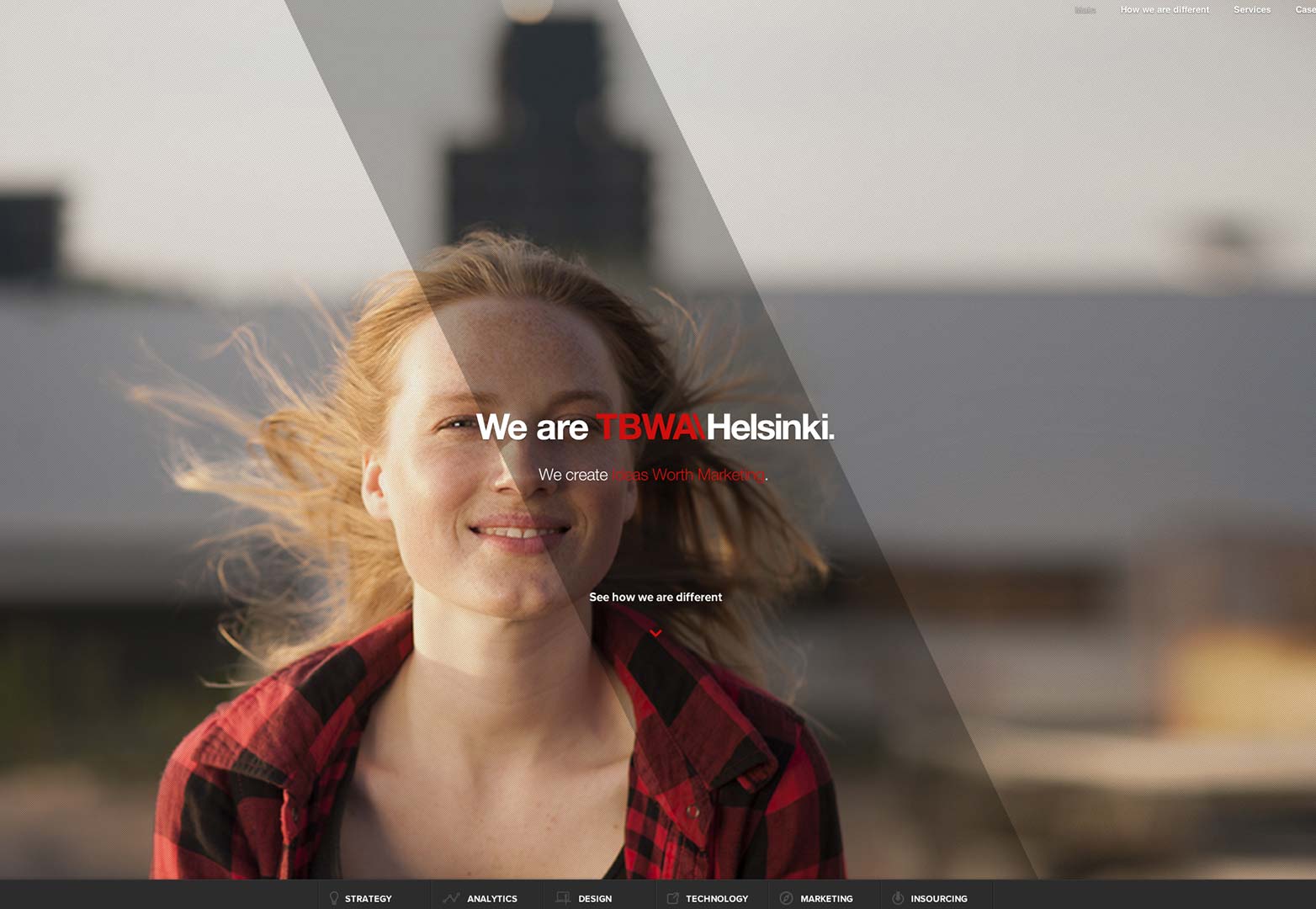
TBWA has a site that has some great design. But they also have great images. And they also have great typography! They’ve used it all here to make a very unique and interesting responsive web design.
Conclusion
Maintaining your creativity in responsive design, or in any web design is as simple as sketching out your concept and revising it to keep your goals. The fun stuff happens more easily as you begin to plan how you want your website to work and function, rather than starting out with that. Responsive web design doesn't have to be this big, almighty task that designers are afraid of. It's rather simple! Keep all the previous things we discussed in mind and create sites that are just out-of-this world! Good luck with your responsive web design.
What tips would you share for keeping responsive design engaging? Have you found a very creative responsive design? Let us know in the comments.
Kendra Gaines


Read Next

15 Best New Fonts, July 2024

20 Best New Websites, July 2024

Top 7 WordPress Plugins for 2024: Enhance Your Site's Performance

Exciting New Tools for Designers, July 2024

3 Essential Design Trends, July 2024

15 Best New Fonts, June 2024

20 Best New Websites, June 2024

Exciting New Tools for Designers, June 2024

3 Essential Design Trends, June 2024

15 Best New Fonts, May 2024

How to Reduce The Carbon Footprint of Your Website
