 Typography is a subject of two extremes: you love it, or you hate it.
Designers who love typography revel in all manner of archaic terminology like kerning, lining figures and ligatures. Designers who hate typography don't know what any of that means.
It seems inconceivable to many designers that in their midst are colleagues whose approach to typography is to stick with the defaults, but in actuality it's a common approach. Web designers have frequently relied on default browser settings for the simple reason that the control they had was minimal at best.
As web designers gradually gain access to the kind of control print designers have enjoyed for years, the need to understand the nuances of typography become increasingly urgent; as someone's uncle once said, with great power comes great responsibility.
Hundreds of resources claim to be able to teach you typography, but few are as authoritative or accessible as Matthew Butterick's Practical Typography.
A website in a book format, including a foreword by the omnipresent Erik Speikermann, Butterick's essay is offered as shareware; there are a variety of ways to pay, which range from buying his fonts to passing on word about the site.
Butterick opens his book with 5 basic rules that he expects you to master in under ten minutes, and this enticing claim:
This is a bold claim, but i stand behind it: if you learn and follow these five typography rules, you will be a better typographer than 95% of professional writers and 70% of professional designers. (The rest of this book will raise you to the 99th percentile in both categories.)
What sets Butterick's book apart from many typographic tomes is that Butterick doesn't feel the need to justify his rules with 1200 pages referencing the development of the Italian Humanism. Whilst type nerds, myself included, may enjoy such a history I suspect its inherent inaccessibility is why so many web designers never make it beyond Helvetica.
Simple rules are spelled out in plain English: "point size should be 10–12 points in printed documents, 15-25 pixels on the web" and "If you don't have real small caps, don't use them at all". The question of why isn't addressed, like a parent answering an overly inquisitive child, the implied explanation is just because.
If you'd like to know why you shouldn't use Times New Roman, how many fonts you should use in a document, or how to improve hierarchical numbering on the web, then read the full site. If on the other hand you're happy to be a better typographer than just 70% of your colleagues, read the Typography in ten minutes and Summary of key rules sections. Your work will be all the better for it.
Have you read Matthew Butterick's Practical Typography? Has it improved your craft? Let us know in the comments.
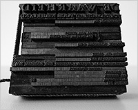
Featured image/thumbnail, typography image via David Navalha.


