

 When you think of minimalism in design, whitespace usually comes to mind. When the designer is strips a piece down to its bare essentials, and opts for less ornamentation and more core, one tends to see the amount of whitespace rise and become a prominent element in the design.
But what happens when they take it in a slightly different direction? What happens when they strip down and only focus on the basic necessary elements, but they use them so boldly, so expansively, that there is little whitespace left behind?
The answer is, this showcase of not-so-minimal, minimalist website designs. Below we have collected a sample of sites that have shied away from the calls of added ornamentation, but who have not shied away from going big! Filling the whitespace with what few essential elements they have kept. Tour the sites below and see which designs speak to you.
Frank Digital
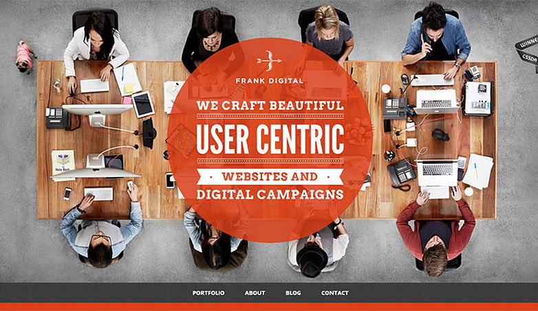
Frank Digital definitely goes minimal in their design, but with such an active, full image sprawling across the background, it has the feel of a much more constricted design, even though there is plenty of room for the elements to 'breathe'.
Marcs Design
Marcs Design is another where the full image background, leaves the viewer feeling less like they are wandering in the open whitespace, and more like they are contained in a finite environ. The elements included work well together to set up this space and use it to its full visual extent.
Clapperboarding
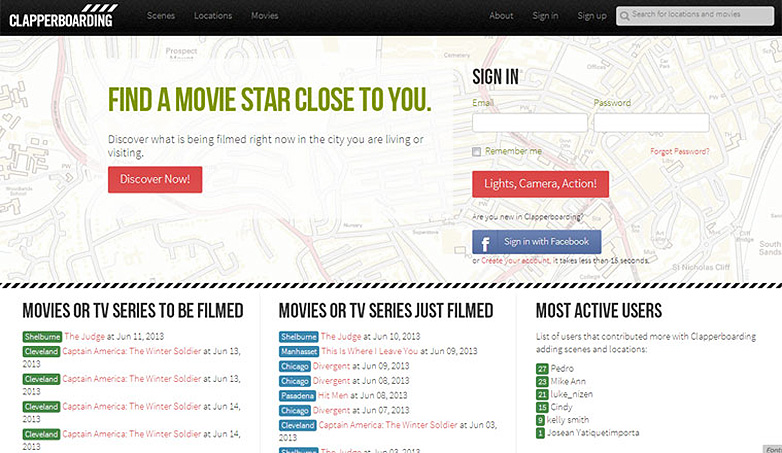
Clapperboarding is an example of using minimalist principles in theory, but as the large navigational element stands to showcase, the elements can be used with such broad strokes as to make the design's minimalist quality feel pushed to its limits.
Engagent
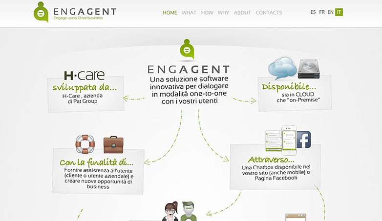
Engagent is one of the first sites on the showcase to really keep a large amount of the whitespace open, but as it gradiates into the main collage of illustrative content, the eyes are drawn away from the whitespace effectively focusing and holding the user's attention to the central content box.
Mighty Radio
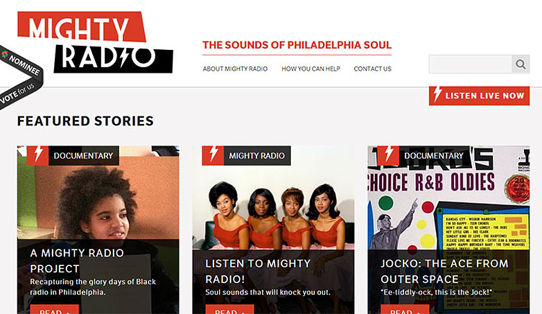
Mighty Radio does a mighty fine job of giving the site design the look of a scaled down to basics construction, but with such bold, active elements stretched across the visual canvas that the whitespace feels almost gone completely. The contrast of the light typographic navigation elements really pops in this visually ramped up layout.
Different Perspective
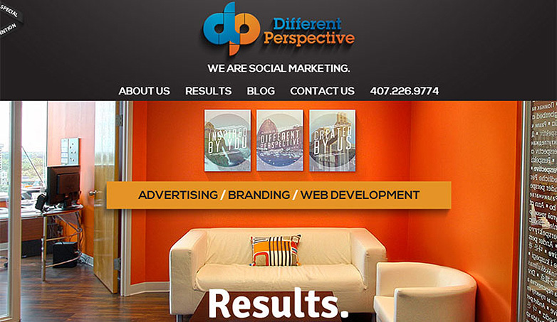
Different Perspective takes the showcase back to the large image background with plenty of fill and visual contrast to keep the eyes moving throughout the design. The focused header and navigation really do their part to carry the minimalist feel for the design which wonderfully walks this line.
Mohiuddin Parekh
Mohiuddin Parekh flawlessly dances between full on minimalist feel and tone, and the somewhat visually joined and focused tightness that makes the whitespace not feel as open as it could. This sort of visual unity isn't always the easiest to achieve with such varied texture and style, but here it happens with complete mastery.
Boy-Coy
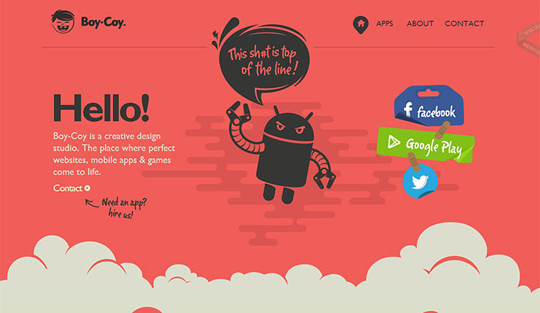
Boy-Coy takes the showcase back into the more traditional areas of minimalism, allowing expansive amounts of whitespace within the design. However, what brings it into this context with ease, is the powerful deep red background color that pours across the whitespace almost challenging the viewer visually, speaking boldly to the passion behind the brand.
Colour Rich
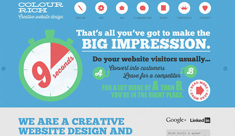
Colour Rich does leave its elements plenty of room to stretch out, but with the large header filled with a variety of fonts and stylishly complimentary images the design slides into this territory. Following that are the bold headlines that take command of the user's eyes and lead them down through the content keeping them from swimming through the whitespace.
Postable
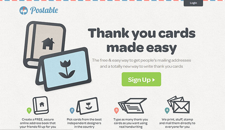
Postable's textured background that fills the whitespace, along with the alternating colors across the top of the page, gives the site a cohesive feel adding a finite and limited feel. This paper-eque design calls to mind envelopes and their confined space, releasing the eyes to focus strictly on the content presented, and not giving them cause to wander.
Kick My Habits
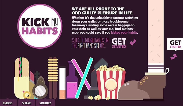
Kick My Habits once again uses a bold and daring dark color to fill the whitespace working with the design's overall tone and centered focus. Though the color filled illustrative design 'foot'er does attract attention, standing in stark contrast to the deep purple background, the small text paragraph intro does well holding its own and keeping the focus on the mission of the site.
RIT Online
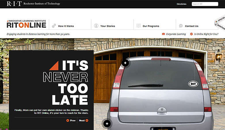
RIT Online (Rochester Institute of Technology) is another example of diving into a large cross-screen image below the header which gives the site less of a minimal feel, even though its ornamentation and superfluous elements are scaled way back. In the header area they once again employ light typographical navigation to add the sleek, open feel above the aforementioned image.
12 Spokes
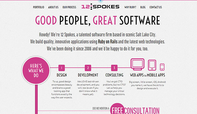
12 Spokes has a fantastic design whose ever-so-softly pink stained background full of whitespace compliments the hot pink highlights throughout the site pitch perfectly. Visually creating a unity that grabs hold of the user's focus and guides them through the content with intentional precision. Keeping the user's attention completely off of the whitespace surrounding them.
Top Web Hosting
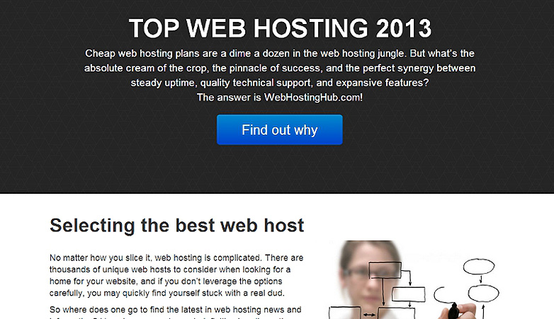
Top Web Hosting is another site that while providing plenty of whitespace that feels visually open and lets the other elements breath, still uses what bare elements they employ very bold and very big. With large typography sections that spread across the design with such reach, coupled with and seemingly pressing against soft, but sizeable images, the site feels very tight while still being very loose.
Master Plunger
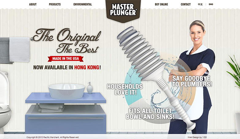
Master Plunger dives back into the use of a full background image that fills the space left open by the sparse use of other elements to build the site. The active image, adding more character and story to the product featured, gives more power to the voice the design is speaking to the users through.
Resumonk
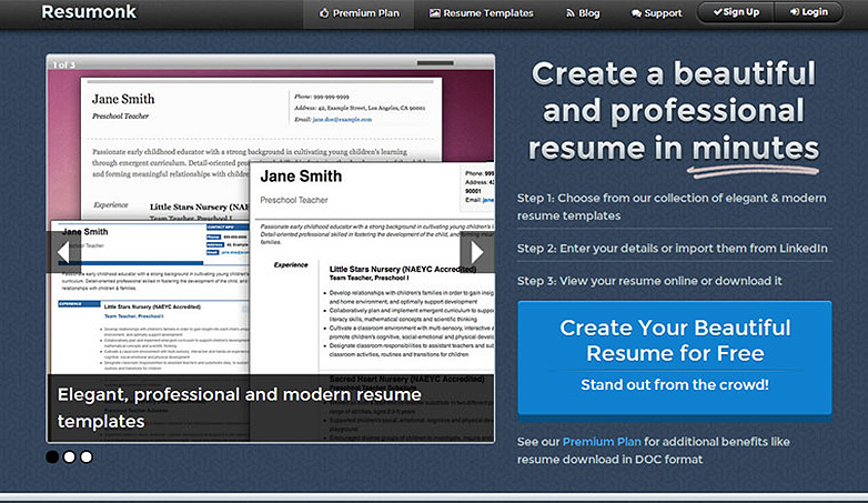
Resumonk splits up the design into distinct sections, using large bold elements to divide and conquer the various amounts of whitespace it allows to remain. The subtle texture in the background further works to limit the feel of open whitespace, even with its repetitive nature.
Laura Berman Fortgang
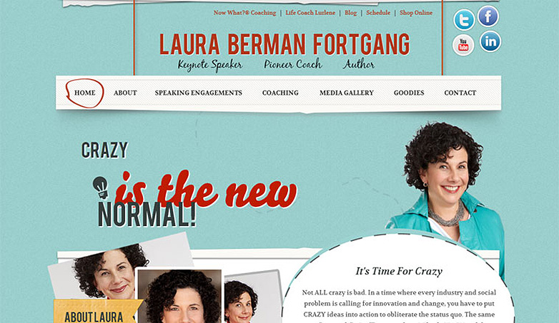
Laura Berman Fortgang, while playing with a bit of ornamentation to bring the various elements within the design to life, the site's vast amount of whitespace stands as another example of the color filling the background completing the visual cohesiveness of the design. The light blue hues, cut with the hard reds add so much tone and depth to the site.
Tweed Barbers
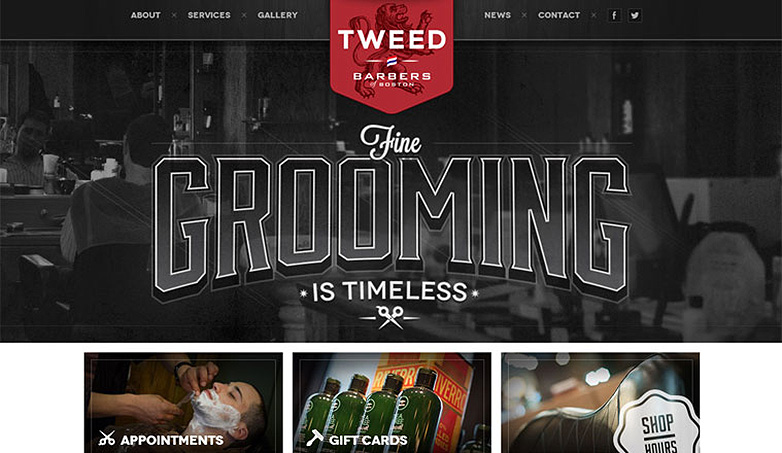
Tweed Barbers boldly launches into the viewers focus, with large imagery and typography expanding across the header. Leaving the whitespace feeling less than unoccupied and open, even though the faint image does more to complete the tone than to detract from the mission and purpose driving the brand behind it.
Secretkey
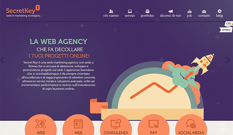
Secretkey is another finely crafted example of the deep, dark colors filling the background giving the whitespace much more purpose as part of the design than it normally has in a minimalist piece. While here it is used to actually mimic space, the whitespace is employed with light illustrative accents to texture the site and give the bolder elements more to contrast with.
Are these sites truly minimal? Which is your favorite? Let us know in the comments.
Rob Bowen


Read Next

15 Best New Fonts, July 2024

20 Best New Websites, July 2024

Top 7 WordPress Plugins for 2024: Enhance Your Site's Performance

Exciting New Tools for Designers, July 2024

3 Essential Design Trends, July 2024

15 Best New Fonts, June 2024

20 Best New Websites, June 2024

Exciting New Tools for Designers, June 2024

3 Essential Design Trends, June 2024

15 Best New Fonts, May 2024

How to Reduce The Carbon Footprint of Your Website
