
 Are you underestimating this deceptively "neutral" color? Either it's considered cheap (because it reminds us of putty colored school cabinets and our landlord's choice of budget "Navajo White" paint) or boring (for the same reasons, I suppose)... or it makes us think of something that started out snowy white, but yellowed in the weather. There are plenty of reasons to dismiss it as a color and miss out on some of the amazing magic beige can create for a design palette.
Used with thought and playfulness, beige can do surprising things for website design. The more consciously you pull it into a layout, the more you can do with it. It's more than just a "neutral" background. The strip of color chips below look like a rainbow, but look at one on its own or with a stronger color and it will seem to take a back seat. What it's really doing is establishing context.
Among other things, beige is used to add warmth, to evoke a historic period or luxury, or to give a space an organic feel. It changes dramatically when grouped with different colors, appearing to be nearly gray or surprisingly color-rich. It can make other colors pop or it can temper them, unifying a palette by both absorbing and reflecting the colors around it.
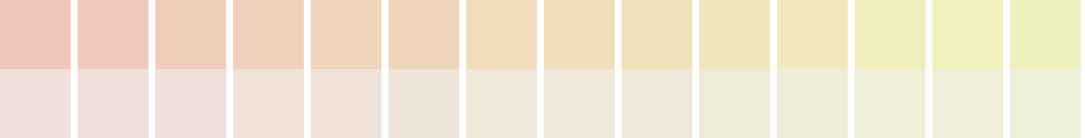
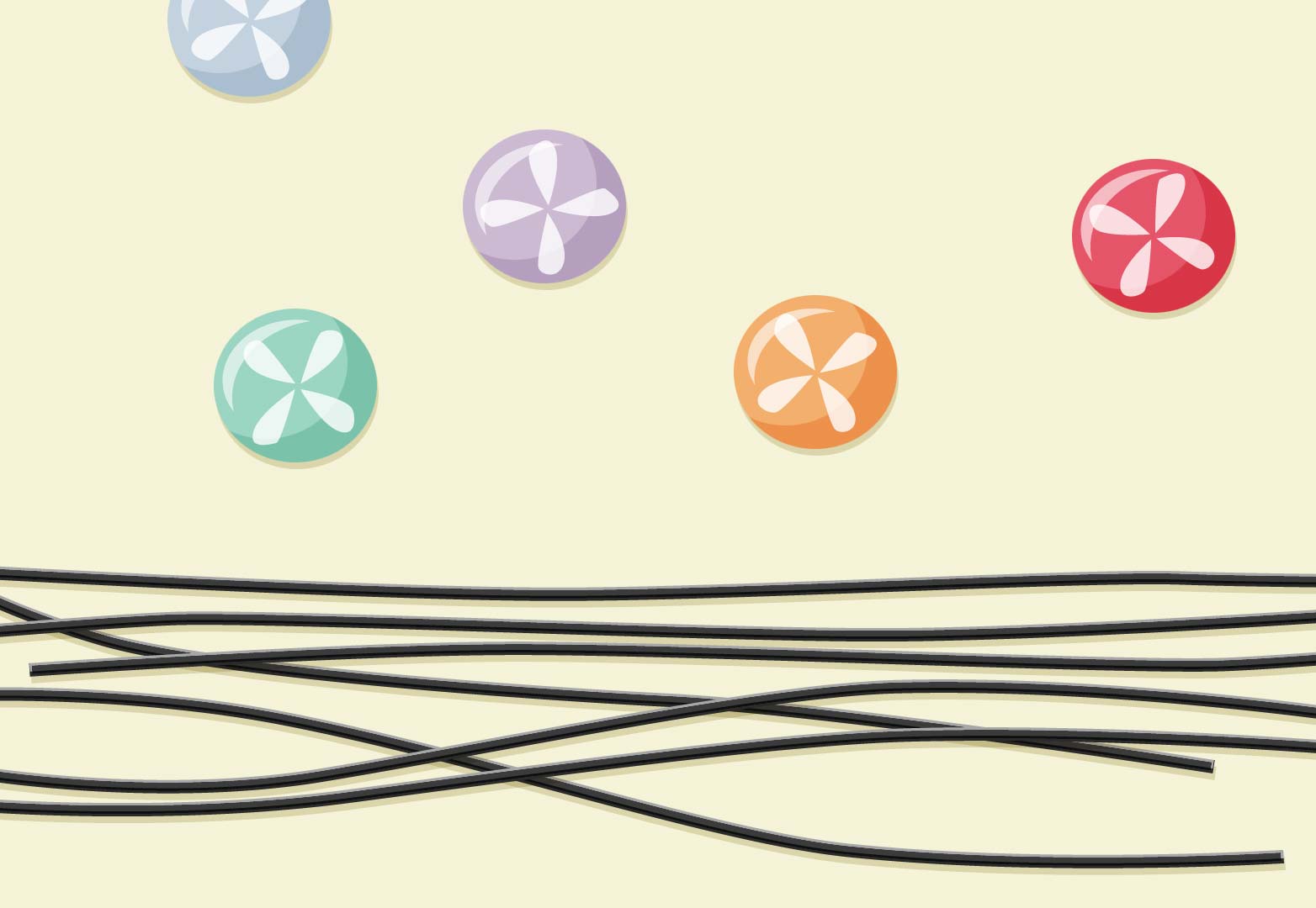
Designers and other colorists debate at what point beige stops being beige. It can turn up in a broad range of hues. The chip set above purposely veers out of range so you can get an overview of where it lives in the HSB color model. Pink or green can go beige as you desaturate them, but the colors in the middle will still come across as beige with even more saturation than shown here. Still, the very colors that look obviously un-beige in this example can take on some of its qualities in the right context.
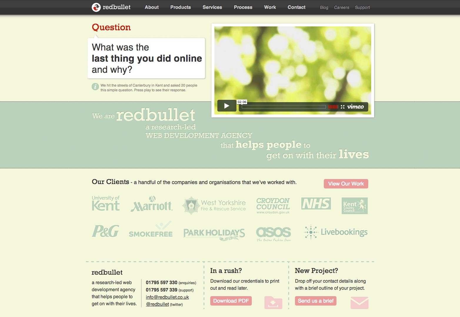
The Red Bulllet Web Design website is a good example. It's often included in collections of great beige site designs although it really pushes the green end of the scale.
Browsing the Japanese collections on the Los Angeles County Museum of Art collections website, I found even more beige inspiration than I expected, including bursts of translucent gem tones and rich blue hues, all made to really sparkle when paired with the warmth of beige. First, have a look at the range of colors you can call "beige" in the woodcut below.

Oiran in Summer Kimono, color on silk hanging scroll, attributed to Hosoda Eishi (18th-early 19th century).
Because the artist used white on the kimono fabric prints, it's even more clear how beige was consciously used elsewhere, from the woman's nearly pink fan to the gold clothes rack to her flesh tones, and more.
It might be said that we either ignore or misuse beige because we've seen it accomplish so many things.
Beige can be classy
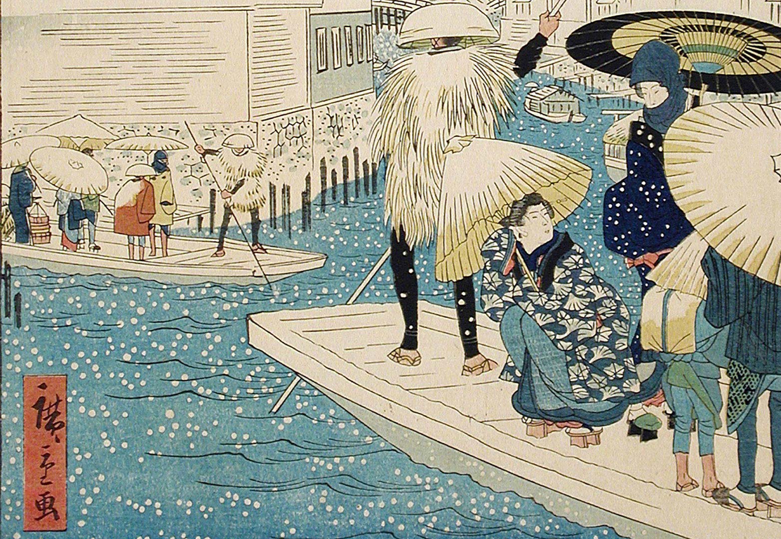
Beige and crimson are common to see in Asian art, and the impact is often luxurious. It's a popular palette for upscale food sites, as well as higher-end money sites. I emphasize crimson over red because in these context, I usually see it on the cool side, heading toward pink, rather than warmer true reds.
The woodcut below shows how nice both large and and very tiny areas of crimson can look with beige. Little spots of color, like the woman's lips, and larger areas, like her collar, are good suggestions for usage on a layout. This print also has examples of both warm and cool beige tones. The purples, greens and warm grays can be good jumping-off points for a palette, too.
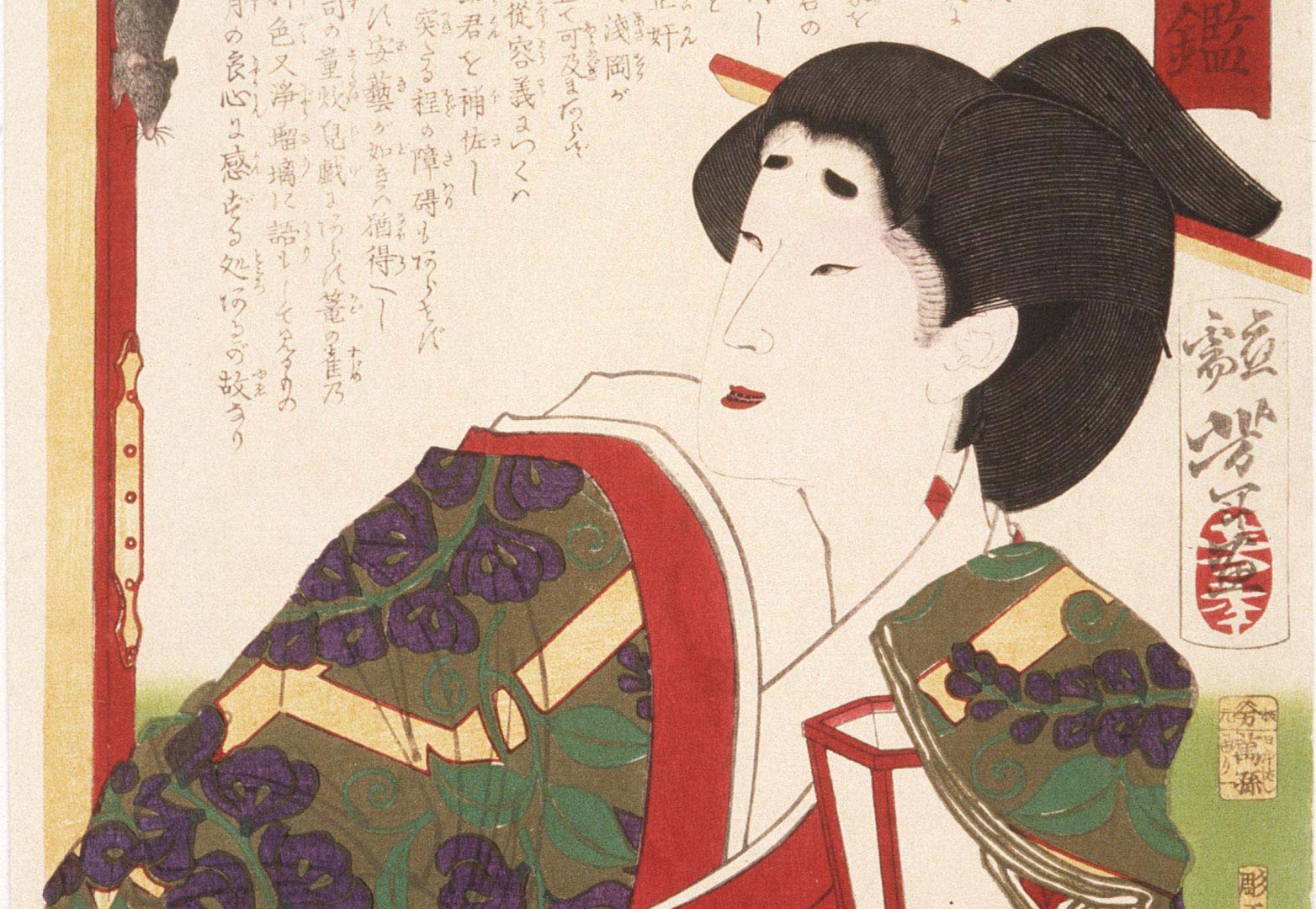
Asaoka Watching a Mouse on a Screen, woodcut by Tsukioka Yoshitoshi (circa 1875-1876).
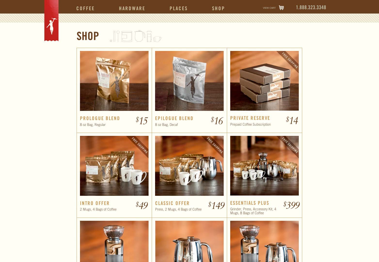
Here's a beautiful example of beige (yes, that's beige: #fffef6) and crimson for a luxury coffee brand. And that really is it: the ribbon is the only place on the entire page where crimson is used (I highly recommend their coffee, too).
The variety of blues in this next woodcut (and another example of both warm and cool beige) also grabbed me as I was browsing the LACMA collection. The secondary use of red and black are pretty smart, too. Warm beige starts to look gold, especially when grouped with deep crimson or navy blues. Cooler beiges tend to evoke winter (check out the snow in the print), as well as some urban sophistication, and will look just as classy in the right contexts.
The Ferry at Yoroi, woodcut by Utagawa Hiroshige II (1862).
Beige can be playful
Used with pastels and candy tones, beige can be used to keep the feeling light. White may be too contrasty and formal. A warm beige can help create colors that draw us in, and that we may even want to eat.
I threw a little licorice into the the sketch below to give a shout out to beige and black, which is an incredibly versatile combination that could probably fill its own entire post with applications as varied as luxury, retro, humor, even kids' brands.
Here's an inspiring website example that does beautiful things with candy-toned blue and beige. If you've done any research on beige for web design, you've probably seen this one, for good reason.

Beige can be natural or organic
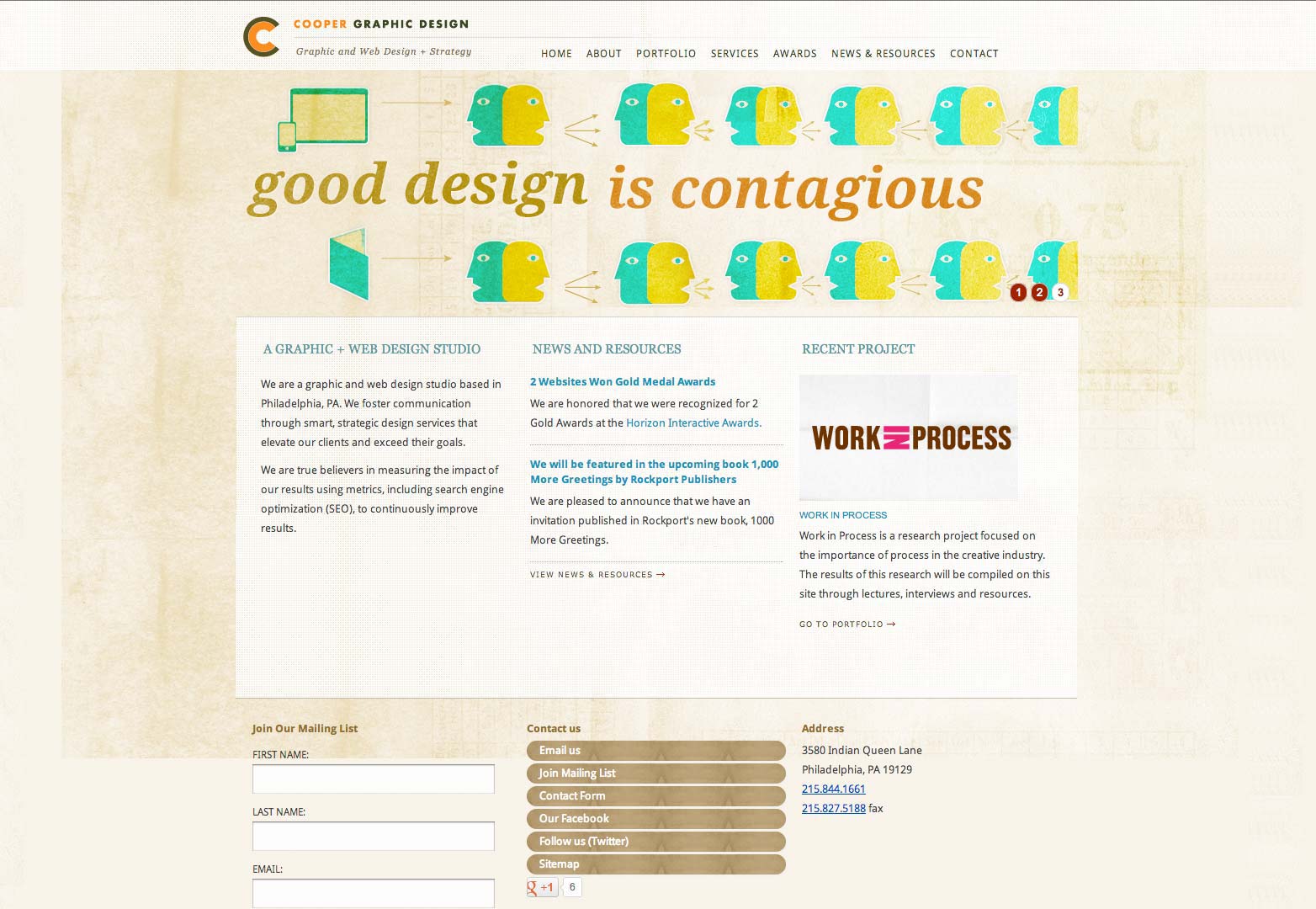
Groups of beige tones alongside other natural hue sets really benefit from the backlit computer monitor. A little finessing will evoke sunlight through leaves or flower petals, or a glistening ocean near the sand. I'll never stop taking cues from nature. I'm guessing the Cooper Graphic Design website design below does a bit of that, too.
Beige, especially when it's thoughtfully textured, also brings to mind a life "unbleached" — natural fabrics, unbleached sugar, unbleached paper and other things that industrialization has made unnaturally white.
Cautions
Because those of us who've grown up in the Western world have so many negative connotations with the color, it's important to proceed carefully. Take into account the audience, as well as the context within which your colors will be seen.
Beige is not only sensitive to social context, it's also very, very sensitive to color context. A shade that looks creamy on its own can, for example, unexpectedly pick up the yellow tones around it, and turn sallow or dull. If your colors start to lose their umph, try rebalancing the beige (add or subtract saturation, shift the hue toward the yellow end or toward the pink end), or, if that particular shade of beige is your priority, adjust your primary palette colors to harmonize better with it.
Do you use beige in your work? What colors do you find it works well with? Let us know in the comments.
WDD Staff


Read Next

15 Best New Fonts, July 2024

20 Best New Websites, July 2024

Top 7 WordPress Plugins for 2024: Enhance Your Site's Performance

Exciting New Tools for Designers, July 2024

3 Essential Design Trends, July 2024

15 Best New Fonts, June 2024

20 Best New Websites, June 2024

Exciting New Tools for Designers, June 2024

3 Essential Design Trends, June 2024

15 Best New Fonts, May 2024

How to Reduce The Carbon Footprint of Your Website
