
 Web Designers are typically thought to only solve design problems and create trendy sites. Little credit is given to the subtler role we play in commercial sites.
Viewers’ focus and time are an increasingly rare commodity that pays for the vast majority of free content online — through ads, sponsors, product placements, and other means. Though many don’t realize it, often one of our primary roles as designers is to direct focus to the advertisements and sponsors that monetises the site.
But what is the best way to go about doing that, without seeming excessively forceful? Below I’ll dive into what white noise is and how it affects your users’ experience.
White noise: How it affects your user’s experience
When you hear the term white noise, you typically think of the gray “fuzz” your TV presents to you when the signal is lost. However, the term can also apply to nearly anything:
White noise: noise containing many frequencies with equal intensities.
According to the Google definition, white noise can also be interpreted to mean a loss of focus or direction. In terms of web design, that would mean the user isn't correctly directed to your website content and thus, loses interest or focus.
It’s a popular notion within the web design & development community to present a content-first approach; with advocates such as Jeff Zeldman, Luke Wroblewski, and Alex Morris writing about the subject. The idea being that with a content-first approach, it’s less likely to have the content fight for attention among advertisements, or worse, the website design itself.
Everyone using the web with some frequency will have experienced this scenario at some point: You casually browse to a website, and immediately find yourself more drawn to the “extras” of the website rather than the stuff you actually came for.
Being assaulted with ads and product placements when you simply came to read an article is not a friendly user experience. At worst, the user may even leave the website with a bad image of the brand itself.
Commonly, users in these scenarios don’t even attempt to sort through the mess to find the content they came for — they leave almost immediately. So as you can see, effective placement of sponsorships and products is essential to the success of a website. Getting it wrong can result in a loss of website views, poor brand reputation, or an overall unprofessional demeanor.
While getting advertising wrong is quite easy, doing it right is actually fairly straight forward as well. Many popular websites employ advertising, and yet they still have very professional and appealing reputations to boot. It’s more a manner of approaching your own website as a viewer rather than the owner than anything else. Ultimately, you want to leave a website thinking about the brand and the content they provided, not the advertising it served up. Below are a few trends, with examples, of how websites do this today from the good... to the bad.
Common advertisement solutions
Advertisements have earned their place on the web as the primary means of paying for content. Users without an adblocking plugin will be bombarded with countless ads throughout their daily web surfing. Although it may sound like a miserable and poor experience, you may not even realize many of your favorite websites use ads as a revenue model. That isn't because those websites do it infrequently — it’s because they do it right.
When advertising and product placements don’t interfere with your users’ website experience, you've done it right.
Blending content and sponsorship
Frequently you’ll venture across websites, such as Twitter, that blend their ads in with the main content. This technique is generally well accepted if done correctly.
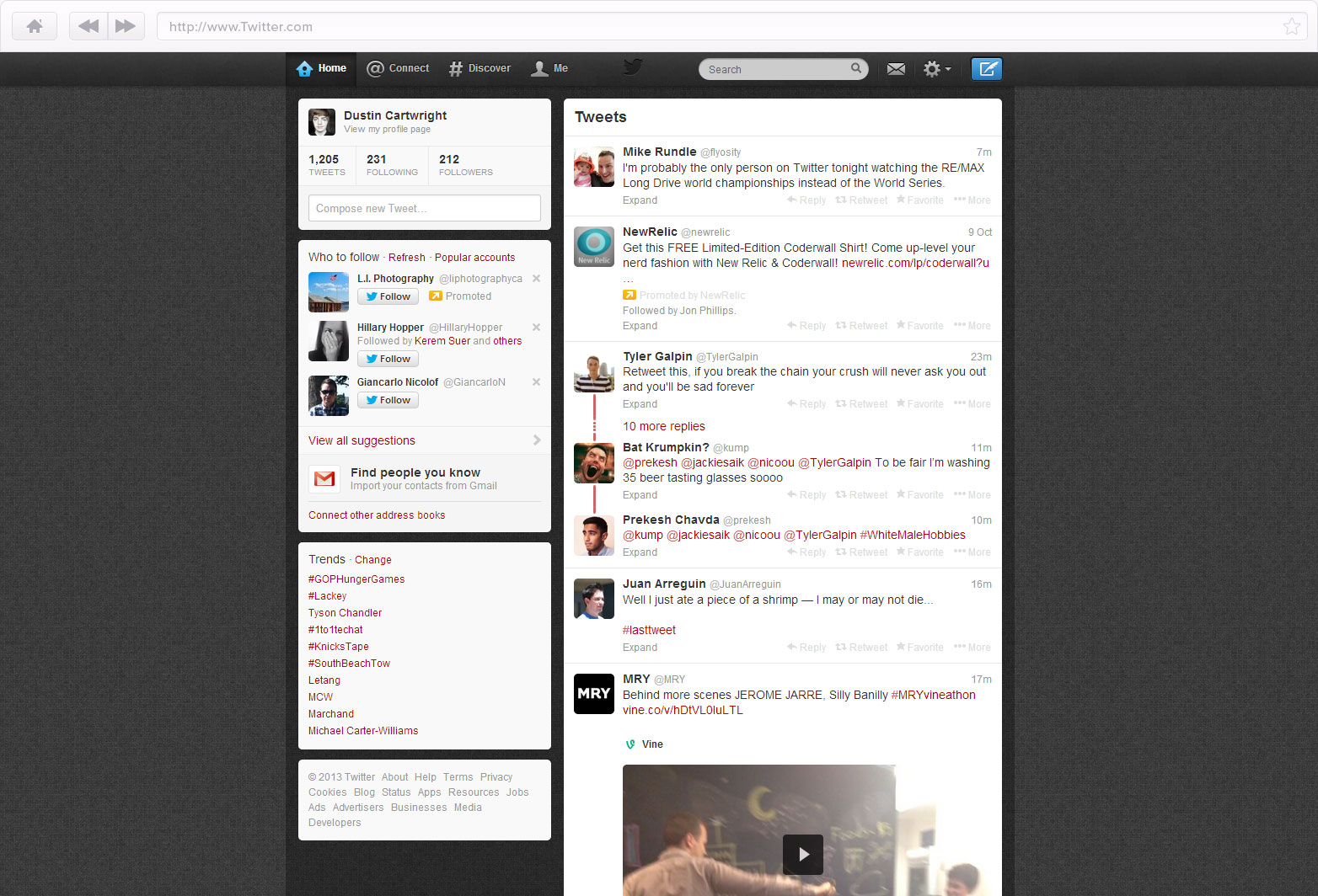
The key to getting this right, is making the advertisement look fairly similar to the content, but to obviously designate it as a sponsorship. Otherwise, users will feel mislead into visiting the sponsor and lose trust in the parent website.
Other popular websites to employ this technique are Reddit, Tumblr and Facebook.
Subtle placement outside content
While the blending techniques has grown to be a popular solution, many websites employ other solutions. Dribbble for instance, places advertisements in the footer and sidebar of their website. They’re tucked away enough and designed to not be noticeable to those in a hurry, but to casual visitors the ads are still hitting their mark.
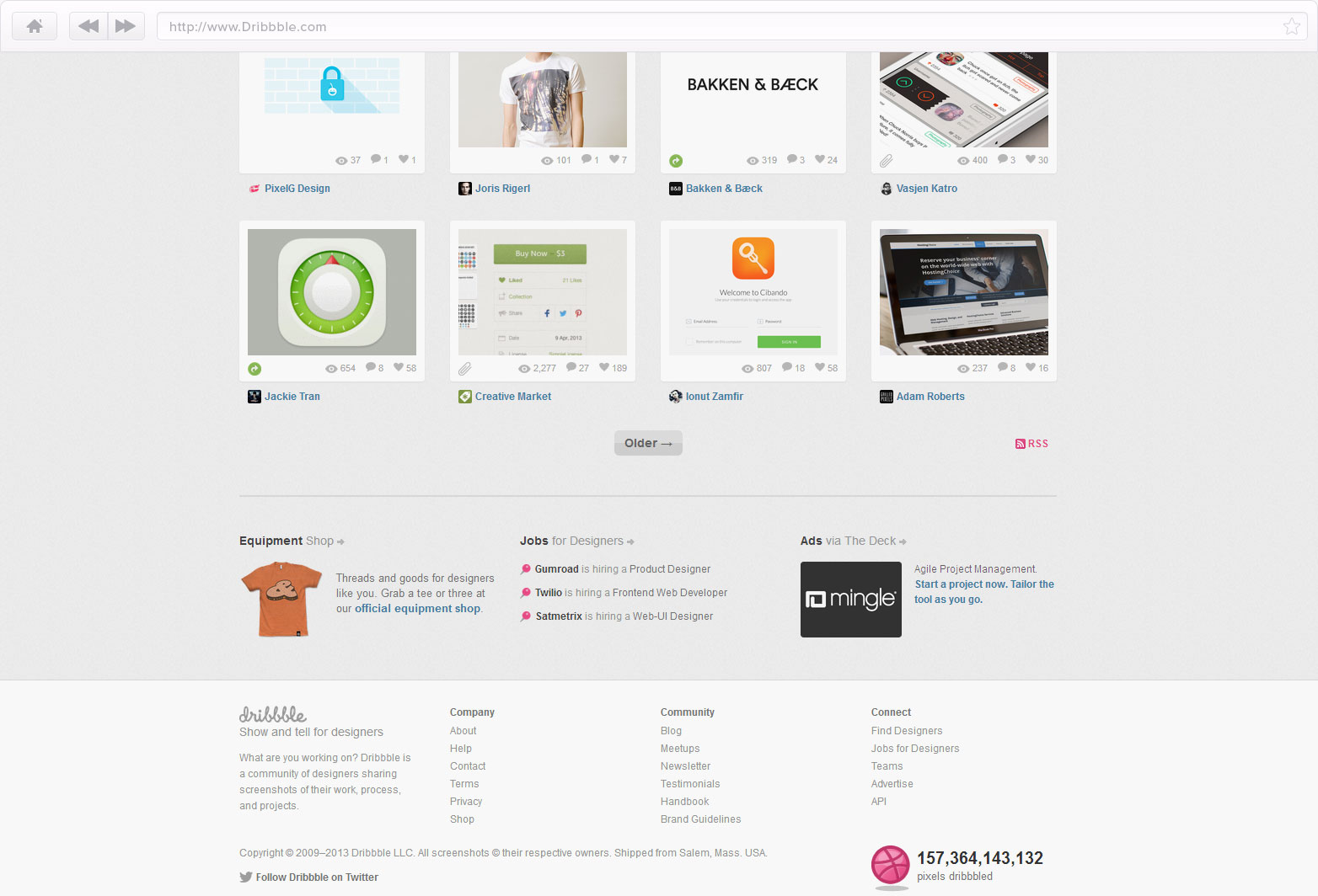
While this solution is generally well accepted, some sponsors feel it isn't a direct enough approach. These type of advertisements should still look like they belong, and not unreasonably encroach upon the main content. Dribbble does a great job of keeping the content as the main focus point, but also serving up ads in off areas to bring in revenue.
Commercial advertising
Some websites have kept the traditional advertisement feel to their sponsorship placement. Youtube has options for preroll, endroll, and “commercial” type placements. Generally speaking, these types of advertisement look and feel a lot like TV. They’re very commonly found on video hosting services and typically force the user’s focus rather than acquire it naturally.

While sometimes these types of solution leave a bad taste in users’ mouths, making sure the sponsorship content is relevant will go a long way to increasing interest. Hulu does a great job of surveying user’s interests to offer up more personalized advertisements.
Blatant, non-designed advertisements
These type of placements are generally the worst for a website viewer. Advertisements are thrown on wherever they fit, with minimal effort made to make them relevant or feel “included” with the website style.
Websites offering these type of placements typically have higher sponsorship revenue — but at the cost of a lower quality looking website. Frugally Sustainable is an example of this, with nearly the entirety of the sidebar dedicated to ads. This type of solution is almost always avoided by those looking to present a professional or welcoming demeanor for their website. Sometimes a website can scrape by with such poor placements, but the sense of ad space being oversold still may linger with the user like in Yahoo’s case.
In conclusion
A lot has changed over the last few years with web based advertising and the user experience. Now more than ever, websites are attempting to present ads in a more appealing and approachable manor. In turn, this pays the bills whilst keeping the user’s focus primarily on the content.
If you've had an adblocking plugin since the dawn of the web 2.0 days, I highly encourage you to disable it for a while.
Many websites now don’t simply plaster “personal” ads on every available area, but rather opt for more focused and content-relevant advertising techniques. Along with this emphasis on the UX of advertising, Web Designers have also grown to require vast skills in the User Experience area; which is a good thing for casual web browsers!
How do you handle adverts on your sites? Is advertising a good way to fund free content? Let us know in the comments.
Featured image/thumbnail, white noise image via Shuttrstock.
WDD Staff


Read Next

15 Best New Fonts, July 2024

20 Best New Websites, July 2024

Top 7 WordPress Plugins for 2024: Enhance Your Site's Performance

Exciting New Tools for Designers, July 2024

3 Essential Design Trends, July 2024

15 Best New Fonts, June 2024

20 Best New Websites, June 2024

Exciting New Tools for Designers, June 2024

3 Essential Design Trends, June 2024

15 Best New Fonts, May 2024

How to Reduce The Carbon Footprint of Your Website
