

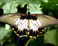
 Summer is just past, and sadly this means that I’ll no longer be able to look up from my keyboard and out the window, only to come face to face with one of the season’s prettiest offerings — the butterfly.
While I might be tempted to argue that I find such beauty in these winged creatures strictly because of their dainty features and vibrant coloring, Gestalt principles tell me something else entirely: namely, that it’s their symmetry my eye finds so appealing.
Symmetry
Gestaltism — a human behavior theory that describes how the mind structures and arranges visual data — suggests that human beings naturally create order out of the things we see.
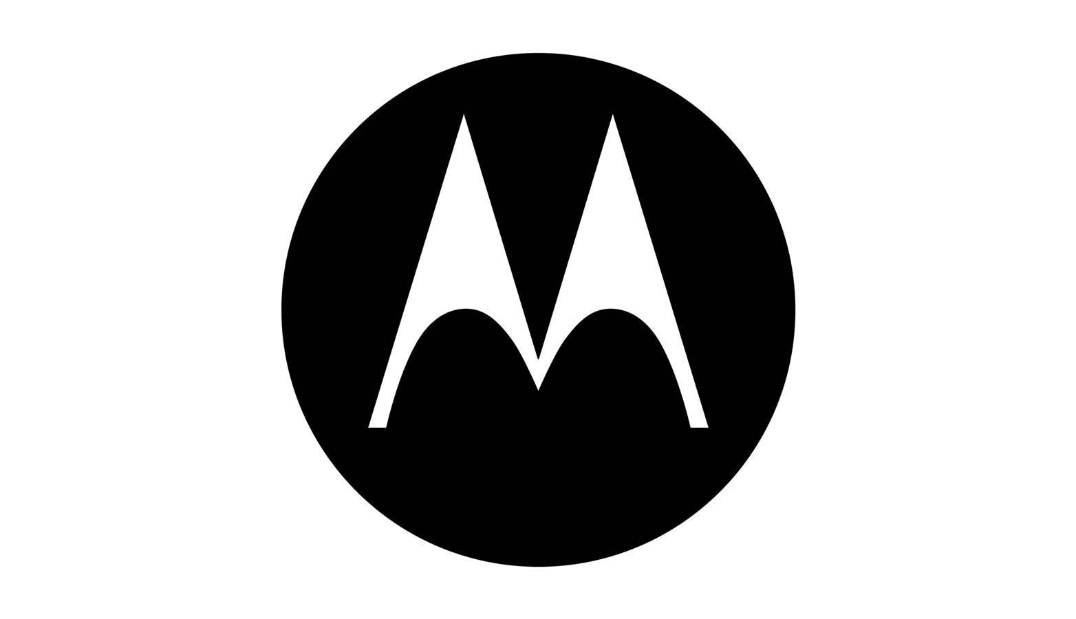
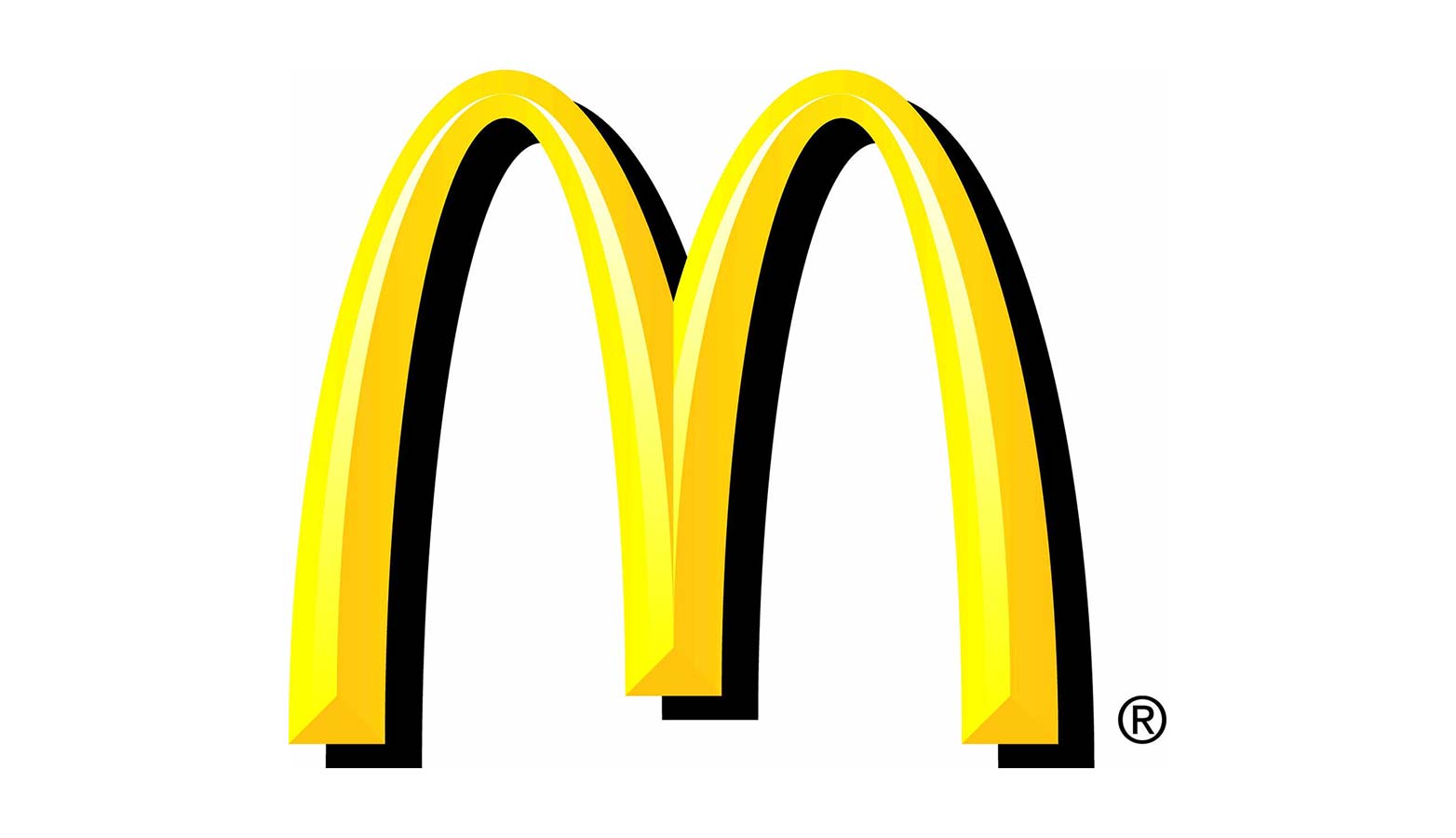
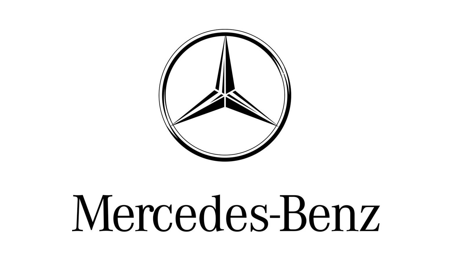
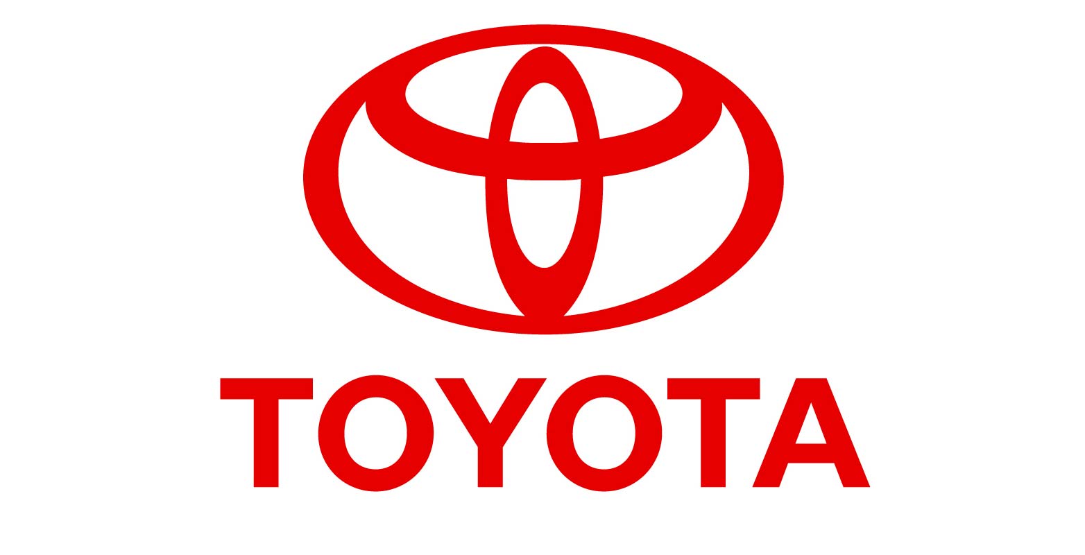
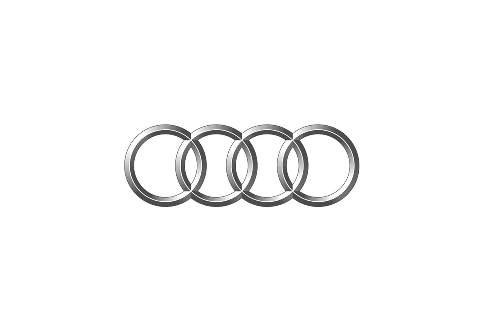
To put it another way, our eyes tend to crave completeness and organization. This brings us back to the idea of symmetry. By definition, there is a balanced, harmonious quality inherent in symmetry, and when it’s present in design the result is the kind of consistency, order, and stability that we find in some of the world’s most notable brands. It’s little wonder, then, that successful companies like Motorola, McDonald’s, and a myriad of car manufacturers employ symmetry in their logos.
Motorola
McDonald’s
Mercedes-Benz
Toyota
Audi
Asymmetry
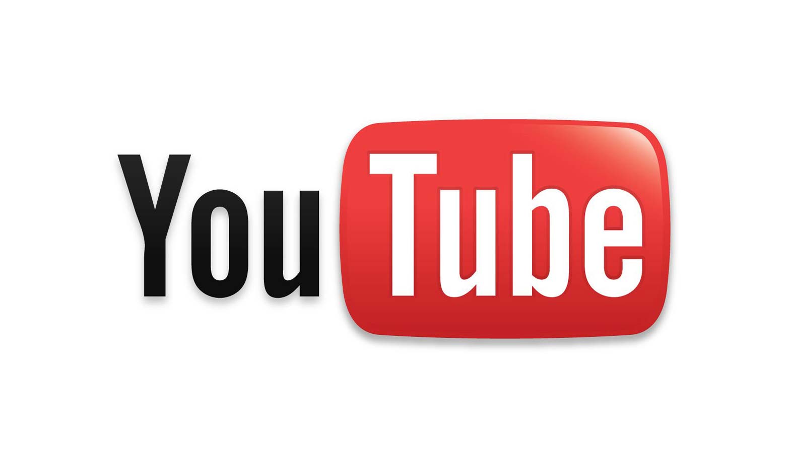
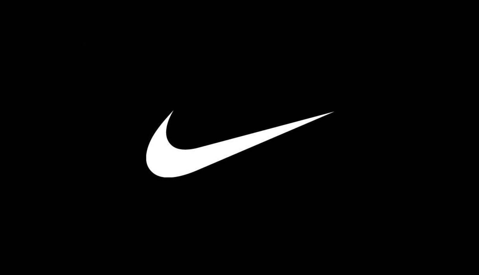
But while symmetry is aesthetically pleasing and even comforting, it also runs the risk of becoming too predictable. Asymmetry, by definition, lacks symmetry. It is characterized by imbalance and disorder, and this type of tension can be unsettling, but also profoundly interesting. Asymmetry tends to carry a kind of complexity that conveys emotion, from lighthearted and jovial to intense and moody, depending upon the execution.
YouTube
Nike
Virgin
Gatorade
Symmetry vs. asymmetry in design
A skilled, intuitive designer should therefore give adequate attention to the subliminal connotations that a symmetrical versus asymmetrical design potentially carries for a client. Whether it’s a logo, a website, or other branding materials, the use of symmetry will naturally evoke a sense of calmness and orderliness; asymmetry, on the other hand, will tend to communicate excitement and risk.
Consider two different versions of the Pepsi-Cola logo. Prior to 2008, the logo was symmetrical, with the red, white and blue swirls being horizontally and vertically balanced. The redesign, however, is the perfect example of asymmetry, with the red space considerably more dominant than the blue.
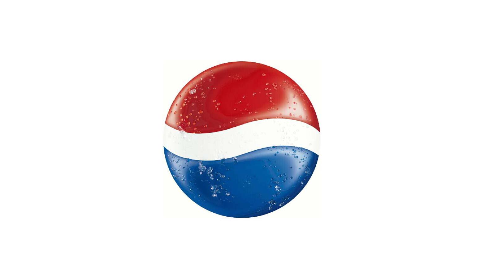
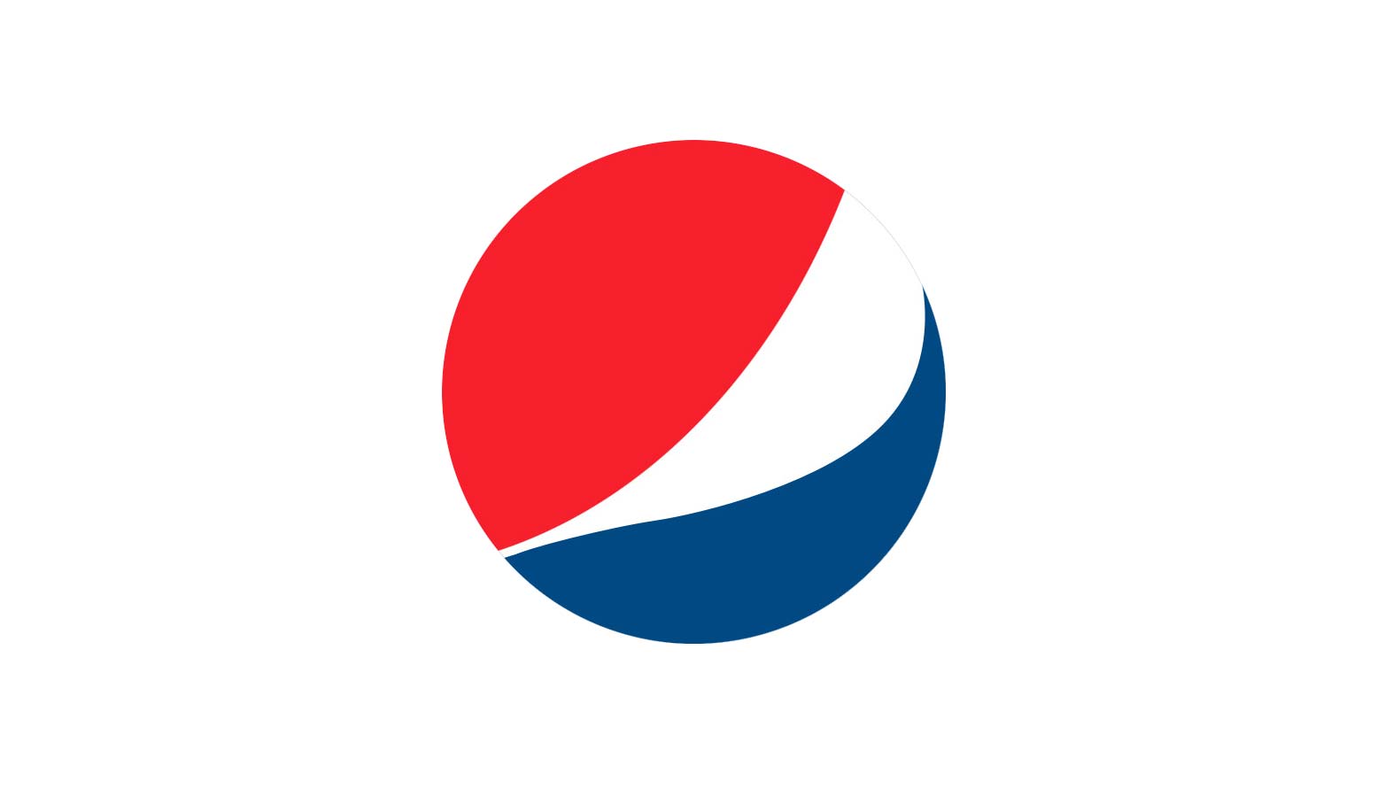
Perhaps it could be argued that the switch from the “perfection” of the formerly symmetrical Pepsi logo to an asymmetrical, unbalanced version could be seen as indicative of a changing of the times. In years past, steady predictability and trustworthiness were paramount brand qualities. As culture evolves, excitement and edge — dare I say even a “coolness” factor — might be moving up on a brand’s priority list.
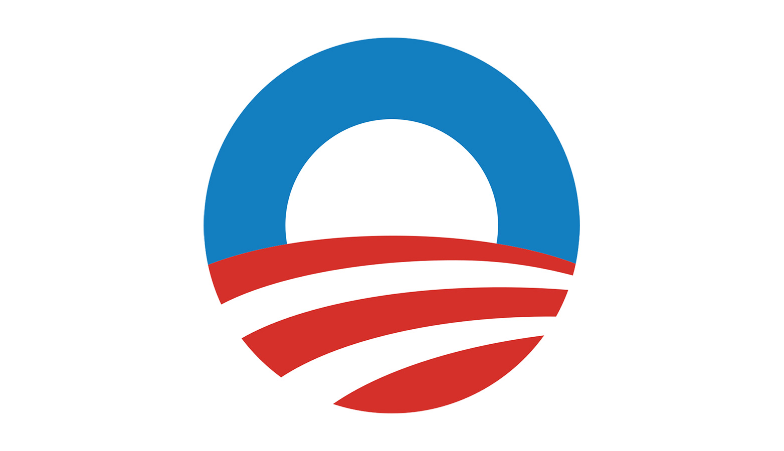
I’m struck by the similarity between the asymmetrical Pepsi swirl and the logo used by the Obama for President campaign. Like the cola company, the Obama logo employs asymmetry; but this is little wonder given that the President’s campaign presented itself as the “cool” choice. While his opponent, Mr. Romney, was seen as straight-laced and conservative, Mr. Obama was positioned as hip and trendy. Whether by design or not, his re-election logo bore this out.
Either or Both
Ultimately, when it comes to designing a logo, a choice between symmetrical or asymmetrical inevitably must be made. Luckily, it doesn’t have to be an either/or situation in web design — both elements can be incorporated into the same website to serve different purposes. For example, use asymmetry to draw attention to a particular component and to convey movement. Employ symmetry for passive elements, such as backgrounds and navigations.
The websites below are examples of how both elements can be used to create a successful design. Some rely heavily on one or the other, while many sites integrate symmetry and asymmetry for added impact.
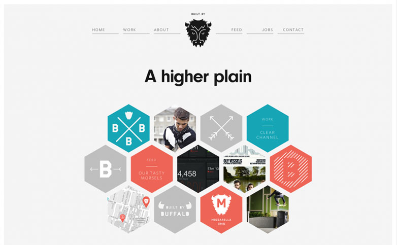
Symmetrical
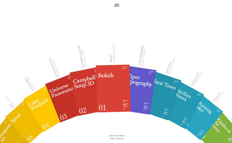
Form Follows Function
Buffalo
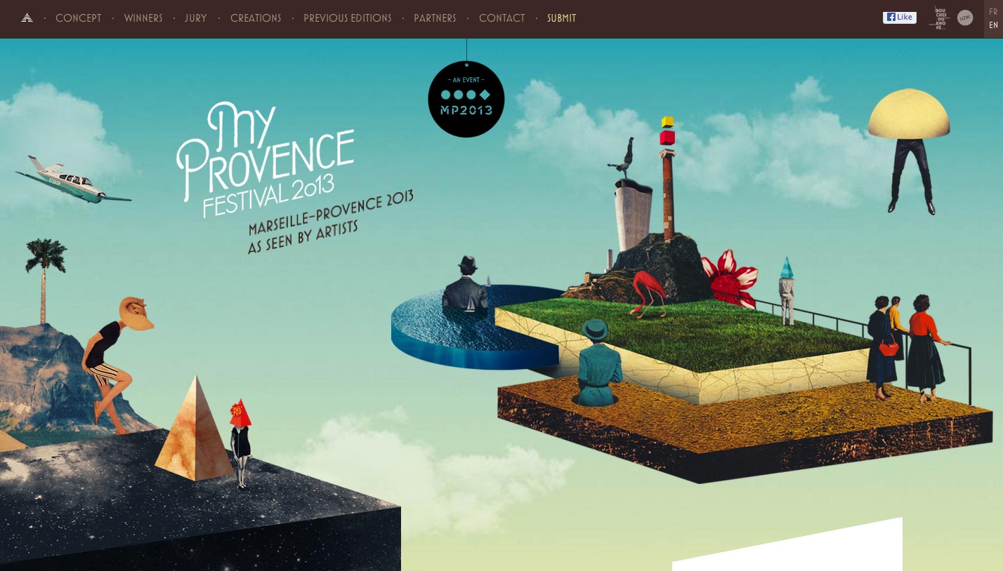
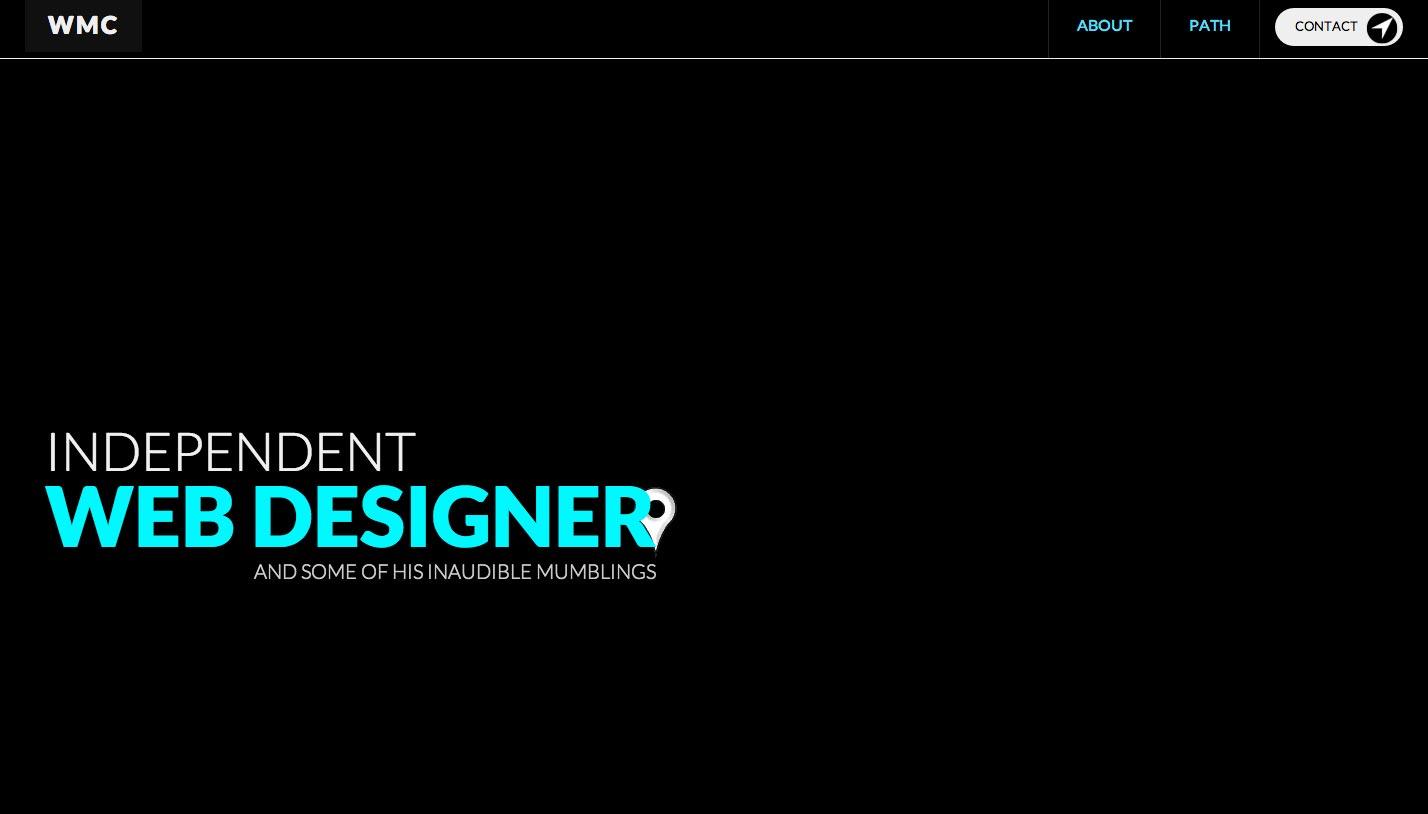
Asymmetrical
My Provence Festival
Will McMahan
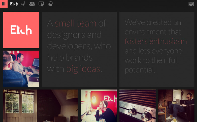
Both
Etch
Conclusion
Overall, there is much to be gained from using both symmetry and asymmetry in the design process. While the eye craves the order that is found in symmetry, the visual impact of asymmetry also has significant uses. It’s clear that the former communicates such virtues as consistency and integrity, while the latter carries elements of individuality and intrigue.
When both symmetry and asymmetry are strategically employed, it’s possible for the design to be refined and polished, while at the same time be visually engaging. Like Yin and Yang, these seemingly contradictory forces are interconnected and interdependent; it’s up to the designer to determine precisely how.
What other things do symmetry and asymmetry imply in design? How do you balance the two in your work? Let us know in the comments.
Featured image/thumbnail, butterfly image via Alain Picard.
Stacey Kole


Read Next

15 Best New Fonts, July 2024

20 Best New Websites, July 2024

Top 7 WordPress Plugins for 2024: Enhance Your Site's Performance

Exciting New Tools for Designers, July 2024

3 Essential Design Trends, July 2024

15 Best New Fonts, June 2024

20 Best New Websites, June 2024

Exciting New Tools for Designers, June 2024

3 Essential Design Trends, June 2024

15 Best New Fonts, May 2024

How to Reduce The Carbon Footprint of Your Website
