
 App design powerhouse, ZURB today launched Ink, a powerful new resource for designers to easily produce responsive HTML emails that look and work great across more mobile platforms than ever, including Outlook.
"If you're not considering mobile devices for your emails,” says Jonathan Smiley, Partner at ZURB and Creator of ZURB Foundation, “you're not just crazy, you're already irrelevant."
Email marketing is considered one of the most effective outreach channels on the web — in many cases, it’s still more effective than social media. However, over 40% of emails are now opened on a mobile device, and this is an upward trend. If your email doesn’t display correctly, a recent survey shows that nearly 70% of your recipients will just delete it.
Even after you nail Outlook, email’s biggest bane, you still need to factor for scores of other popular email clients. The folks at ZURB recognized that this problem has continued to have no truly satisfactory solution, and created Ink. According to ZURB, “Ink is a framework that let's you quickly build responsive HTML emails that work everywhere. Even Outlook.”
As the maker of responsive front-end framework, Foundation, ZURB is now bringing its advanced and influential expertise to email.
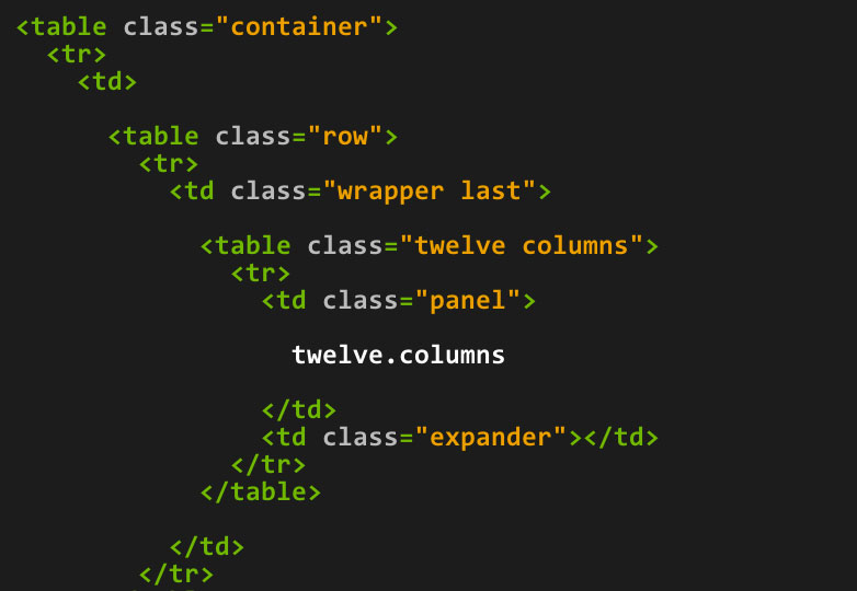
Ink’s “Outlook first” approach lets you to build for Outlook, and then progressively enhance your email for more capable clients. Today’s release arrives with comprehensive documentation for all its components, including a responsive twelve-column grid (with sub-grid), built using media queries to identify devices and stack layouts as needed, as well as visibility classes to show and hide content depending on the device.
The documentation also covers image-free buttons that can be easily implemented and updated to improve click-through and a block grid that can implement a simple Gmail-friendly two column layout.
The Ink launch also includes:
- A hosted CSS inliner for more Gmail-friendliness
- 5 sample templates to demonstrate the framework and use as a starting point
- A process that outlines best practices for building emails, starting with Outlook
Matt Kelly, Partner at ZURB and Creator of ZURB Ink adds, "There are lots of great individual solutions for responsive emails. Ink brings them all together into a single tested framework."
To that end, Ink is a flexible platform over which you can build more tools as needed. It also aims to give larger teams a set of conventions, making collaboration and consistency much easier to achieve.
Here’s the list of all the email clients supported with this launch:
- Apple Mail (5 and 6)
- Microsoft Outlook (2000, 2002, 2003, 2007, 2010, 2011, 2013)
- Mozilla Thunderbird (3, latest)
- Android Native (2.3, 4)
- iOS Native (6, 7)
- AOL Mail
- Gmail
- Yahoo! Mail
- Outlook.com
Have you designed responsive email, what problems did you encounter? Are you excited about Ink? Let us know in the comments.
WDD Staff


Read Next

15 Best New Fonts, July 2024

20 Best New Websites, July 2024

Top 7 WordPress Plugins for 2024: Enhance Your Site's Performance

Exciting New Tools for Designers, July 2024

3 Essential Design Trends, July 2024

15 Best New Fonts, June 2024

20 Best New Websites, June 2024

Exciting New Tools for Designers, June 2024

3 Essential Design Trends, June 2024

15 Best New Fonts, May 2024

How to Reduce The Carbon Footprint of Your Website
