
 Charts are far better for displaying data visually than tables and have the added benefit that no one is ever going to press-gang them into use as a layout tool. They're easier to look at and convey data quickly, but they're not always easy to create.
A great way to get started with charts is with Chart.js, a JavaScript plugin that uses HTML5's canvas element to draw the graph onto the page. It's a well documented plugin that makes using all kinds of bar charts, line charts, pie charts and more, incredibly easy.
To see how to use chart.js we're going to create a set of 3 graphs; one will show the number of buyers a fictional product has over the course of 6 months, this will be a line chart; the second will show which countries the customers come from, this will be the pie chart; finally we'll use a bar chart to show profit over the period.
Setting up
The first thing we need to do is download Chart.js. Copy the Chart.min.js out of the unzipped folder and into the directory you'll be working in. Then create a new html page and import the script:
<!DOCTYPE html>
<html lang="en">
 <head>
 <meta charset="utf-8" />
 <title>Chart.js demo</title>
 <script src='Chart.min.js'></script>
 </head>
 <body>
 </body>
</html>
Drawing a line chart
To draw a line chart, the first thing we need to do is create a canvas element in our HTML in which Chart.js can draw our chart. So add this to the body of our HTML page:
<canvas id="buyers" width="600" height="400"></canvas>
Next, we need to write a script that will retrieve the context of the canvas, so add this to the foot of your body element:
<script>
 var buyers = document.getElementById('buyers').getContext('2d');
 new Chart(buyers).Line(buyerData);
</script>
(We can actually pass some options to the chart via the Line method, but we're going to stick to the data for now to keep it simple.)
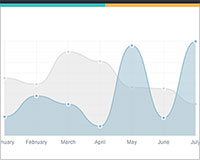
Inside the same script tags we need to create our data, in this instance it's an object that contains labels for the base of our chart and datasets to describe the values on the chart. Add this immediately above the line that begins 'var buyers=':
var buyerData = {
	labels : ["January","February","March","April","May","June"],
	datasets : [
		{
			fillColor : "rgba(172,194,132,0.4)",
			strokeColor : "#ACC26D",
			pointColor : "#fff",
			pointStrokeColor : "#9DB86D",
			data : [203,156,99,251,305,247]
		}
	]
}
If you test your file in a browser you'll now see a cool animated line graph.
Drawing a pie chart
Our line chart is complete, so let's move on to our pie chart. First, we need the canvas element:
<canvas id="countries" width="600" height="400"></canvas>
Next, we need to get the context and to instantiate the chart:
var countries= document.getElementById("countries").getContext("2d");
new Chart(countries).Pie(pieData, pieOptions);
You'll notice that this time, we are going to supply some options to the chart.
Next we need to create the data. This data is a little different to the line chart because the pie chart is simpler, we just need to supply a value and a color for each section:
var pieData = [
	{
		value: 20,
		color:"#878BB6"
	},
	{
		value : 40,
		color : "#4ACAB4"
	},
	{
		value : 10,
		color : "#FF8153"
	},
	{
		value : 30,
		color : "#FFEA88"
	}
];
Now, immediately after the pieData we'll add our options:
var pieOptions = {
	segmentShowStroke : false,
	animateScale : true
}
These options do two things, first they remove the stroke from the segments, and then they animate the scale of the pie so that it zooms out from nothing.
Drawing a bar chart
Finally, let's add a bar chart to our page. Happily the syntax for the bar chart is very similar to the line chart we've already added. First, we add the canvas element:
<canvas id="income" width="600" height="400"></canvas>
Next, we retrieve the element and create the graph:
var income = document.getElementById("income").getContext("2d");
new Chart(income).Bar(barData);
And finally, we add in the bar chart's data:
var barData = {
	labels : ["January","February","March","April","May","June"],
	datasets : [
		{
			fillColor : "#48A497",
			strokeColor : "#48A4D1",
			data : [456,479,324,569,702,600]
		},
		{
			fillColor : "rgba(73,188,170,0.4)",
			strokeColor : "rgba(72,174,209,0.4)",
			data : [364,504,605,400,345,320]
		}

	]
}
As you can see, the data is largely the same, except this time we've chosen to use RGBA to specify our colors which allows us to add transparency.
Conclusion
You can view a demo of this in action here, and if you prefer copy and paste, here is the full script:
<!DOCTYPE html>
<html lang="en">
 <head>
 <meta charset="utf-8" />
 <title>Chart.js demo</title>
 <!-- import plugin script -->
 <script src='Chart.min.js'></script>
 </head>
 <body>
 <!-- line chart canvas element -->
 <canvas id="buyers" width="600" height="400"></canvas>
 <!-- pie chart canvas element -->
 <canvas id="countries" width="600" height="400"></canvas>
 <!-- bar chart canvas element -->
 <canvas id="income" width="600" height="400"></canvas>
 <script>
 // line chart data
 var buyerData = {
 labels : ["January","February","March","April","May","June"],
 datasets : [
 {
 fillColor : "rgba(172,194,132,0.4)",
 strokeColor : "#ACC26D",
 pointColor : "#fff",
 pointStrokeColor : "#9DB86D",
 data : [203,156,99,251,305,247]
 }
 ]
 }
 // get line chart canvas
 var buyers = document.getElementById('buyers').getContext('2d');
 // draw line chart
 new Chart(buyers).Line(buyerData);
 // pie chart data
 var pieData = [
 {
 value: 20,
 color:"#878BB6"
 },
 {
 value : 40,
 color : "#4ACAB4"
 },
 {
 value : 10,
 color : "#FF8153"
 },
 {
 value : 30,
 color : "#FFEA88"
 }
 ];
 // pie chart options
 var pieOptions = {
 segmentShowStroke : false,
 animateScale : true
 }
 // get pie chart canvas
 var countries= document.getElementById("countries").getContext("2d");
 // draw pie chart
 new Chart(countries).Pie(pieData, pieOptions);
 // bar chart data
 var barData = {
 labels : ["January","February","March","April","May","June"],
 datasets : [
 {
 fillColor : "#48A497",
 strokeColor : "#48A4D1",
 data : [456,479,324,569,702,600]
 },
 {
 fillColor : "rgba(73,188,170,0.4)",
 strokeColor : "rgba(72,174,209,0.4)",
 data : [364,504,605,400,345,320]
 }
 ]
 }
 // get bar chart canvas
 var income = document.getElementById("income").getContext("2d");
 // draw bar chart
 new Chart(income).Bar(barData);
 </script>
 </body>
</html>
The great things about Chart.js are that it's simple to use and really very flexible. Plus, once you've mastered the basics here, you'll discover that there are tons of options listed in the documentation.
Have you used Chart.js? Do you prefer a different solution? Let us know in the comments.
WDD Staff


Read Next

15 Best New Fonts, July 2024

20 Best New Websites, July 2024

Top 7 WordPress Plugins for 2024: Enhance Your Site's Performance

Exciting New Tools for Designers, July 2024

3 Essential Design Trends, July 2024

15 Best New Fonts, June 2024

20 Best New Websites, June 2024

Exciting New Tools for Designers, June 2024

3 Essential Design Trends, June 2024

15 Best New Fonts, May 2024

How to Reduce The Carbon Footprint of Your Website
