
 When someone lands on your website for the very first time, what happens?
That’s the most critical point of conversion for any website: That moment when a new visitor takes their first glance at your page and decides whether or not they’ll stick around a little longer to learn more.
Hopefully they do. But what then? Are they engaged and compelled to go deeper and take the next step to subscribe, get in touch, or purchase something?
The goal of just about any website you design is to build traction with your target audience. Whether you’re designing a site for a client, or you’re designing one for your own startup — whether it’s a site for a product, an event, or a service — if it’s not building traction, then it’s not helping your business move forward and grow.
In this article, I’m going to share a few simple, but important tips to help you design a site that performs its primary duty: Build traction with your audience and convert them to customers.
Know your target audience
Hopefully, you know who your website’s intended target audience is. And hopefully it’s very specific.
For example, rather saying your product is targeted at small business owners, narrow it down even further: "It’s a product for small business owners with 10 to 20 employees working primarily within software as a service."
Don’t be afraid to niche down to the point you’re excluding periphery users. You’re better off focusing your message on your core audience, as this will help you resonate with them. The others will find ways to fit your product to their use if it really provides the solution they need.
But knowing who your audience is is only the first step. You also must know them. What do they care about? What is challenging them? What are their goals? How can you produce a “win” for them?
Through in-depth audience interviews, and keeping tabs on the common questions that are raised — either through support, your contact form, or in person — you can get to know your audience on a deep level. This will help you craft a website and message that cuts straight to the things that matter most to them.
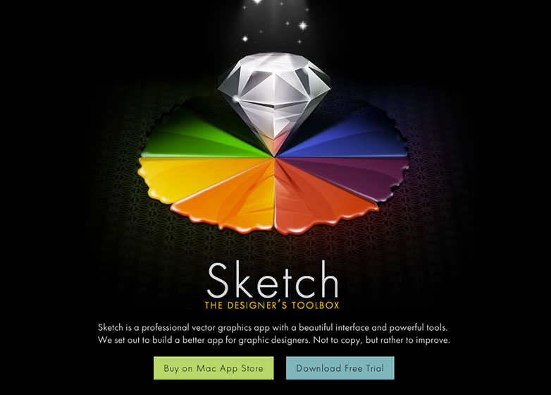
The website for Sketch, a design application, does a great job of speaking to their target audience: Graphic designers. They know designers are seeking an alternative to Photoshop so their message and content reflects this.
Speak to one person (not many)
We all want to design websites that receive thousands of unique visitors per day. So the common mistake that I see website owners make is they write their copy as if they’re speaking to a crowd of people.
That might make sense from your perspective as the website owner who sees thousands of hits in analytics. But to each individual visitor, your message feels impersonal and bland.
A better approach is to speak to one individual person — your target customer — and write as if you’re having an intimate one on one conversation. This is how you develop a deep relationship and build trust with your audience.
By speaking in terms they relate to, and talking about things they care deeply about (you know what those things are, don’t you?), you’re setting the stage for a successful visit or transaction.
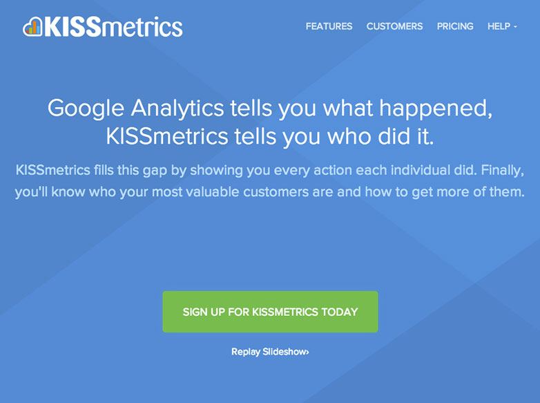
Notice how KISSmetrics speaks to “you” and connects with key pain points, matched with lofty goals that web business owners really care about.
Focus on a single call-to-action
You’ve seen those sites that bombard you with popups, slide-ups, sidebar opt-ins, bottom of page opt-ins, and oh-by-the-way — like us on Facebook, Follow us on Twitter, and while you’re at it, would you like to chat with us live right now?
If your visitor’s attention is pulled in too many different directions and none of those are the actual content of the page, you’re in bad shape. Very few people will decide to opt in or buy right away without reading something of value first. And those that do are not highly qualified and likely won’t ever purchase from you.
A more logical approach is to keep the focus on your content first. Clean, unobstructed views, with a limited number of callouts, links, and action buttons around.
With highly compelling content comes engagement. That means that once a visitor reads something thought provoking from you — it could be an article, an overview of a product’s benefits, a video, whatever — then they’re ready to take the next step. In fact, they want to.
That’s when you present one single, relevant, call to action. For example, if it’s a blog article about the latest CSS3 technique, the single call to action on that page could be a newsletter opt-in with a free email course about CSS3 essentials.
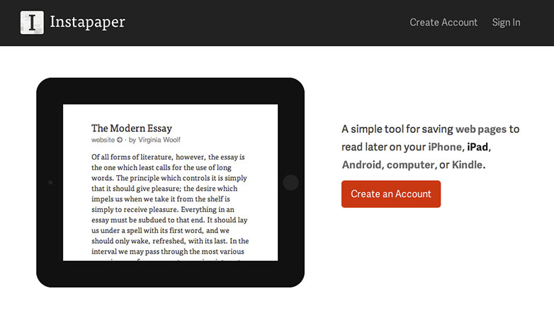
Instapaper focuses on a single call-to-action, “Create an Account”. They draw attention to it by making it the only element with a red color, among a very stripped-down black and white site.
Prioritize your navigation
If you’ve put together a site map, prior to designing and building out your site, you may find there are many different sections, with many pages within each section. From your product tour pages, to pages about your company, contact pages, and so on.
Don’t try and include every page in your main navigation. Split up your navs and prioritize.
In your main navigation, I like to include what I call “mission critical” pages. These are the pages that contribute to making the sale. For example, I consider a page about the product and its benefits a mission critical page. The pricing page is mission critical. A contact or signup page is mission critical.
The goal is to trim down the number of pages included in that primary navigation. Why? You don’t want your visitor scratching their head, asking themselves “where should I go next?” Make that decision easy and give them only a few choices.
The rest of your pages, such as your About page, frequently asked questions, and team bios, can fall into a secondary navigation, somewhere out of the way. Sure, these might be necessary pages to include in your website, but they don’t need to be front and center.
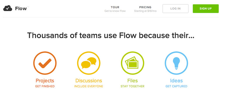
The main navigation for Flow is stripped down to just two page links (Tour and Pricing) along with a subdued login link and a bright green Sign Up button.
Is a particular design or messaging technique having a real impact with your audience? How do you design for traction? Let us know in the comments.
Featured image/thumbnail, targeting customers image via Shutterstock.
WDD Staff


Read Next

15 Best New Fonts, July 2024

20 Best New Websites, July 2024

Top 7 WordPress Plugins for 2024: Enhance Your Site's Performance

Exciting New Tools for Designers, July 2024

3 Essential Design Trends, July 2024

15 Best New Fonts, June 2024

20 Best New Websites, June 2024

Exciting New Tools for Designers, June 2024

3 Essential Design Trends, June 2024

15 Best New Fonts, May 2024

How to Reduce The Carbon Footprint of Your Website
