
 With all the terms that get thrown at us during our design education (be we self or institutionally taught), it is easy to understand why some land only glancing blows with barely any penetration into our psyches.
Those that will soon fade from our realm of full understanding without the constant reinforcement and attention being devoted to them. Which is what we are wanting to do today, devote a little attention to a staple of web design, negative space.
What is negative space?
For those who need a reminder, let us take a moment to break it down to basics: there are two types of space in design, positive and negative space. Positive space contains all of the elements of your site, content, navigation, images, etc. Negative space (often referred to as whitespace) is all of the empty space in between, the space around the content that separates the elements and helps to structure and define the way the user interacts with the content in the positive space.
Now that we have that, let's move on, shall we? There are also two types of negative space, micro and macro. Micro negative space is the space between the smaller elements of the design. Things like the space between paragraphs, individual lines of type, all the way down to the space between letters and words. Macro negative space is the space between the larger, core elements of the design such as your header and footer.
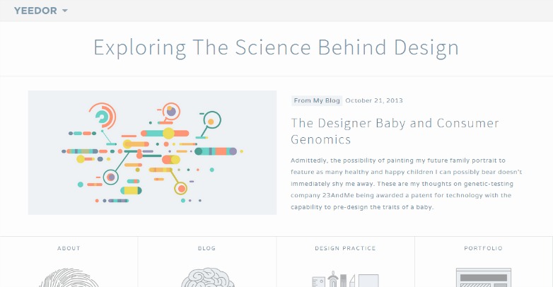
Yeedor
Friendship Hamburg

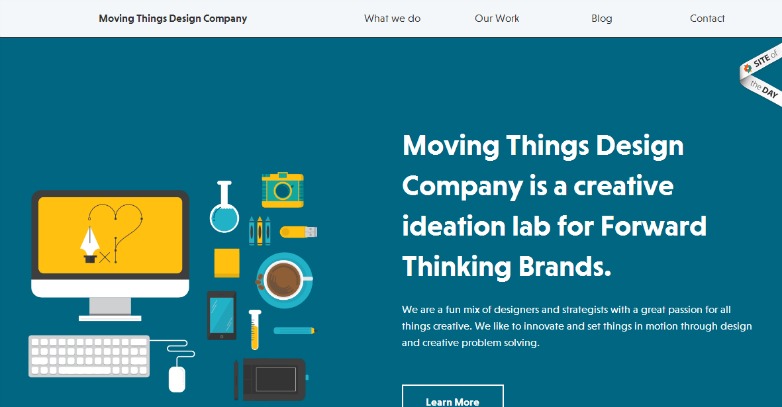
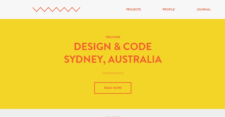
Moving Things Design Company
Micro negative space
First, we will take a look at the smaller end of the spectrum. Keeping in mind that size doesn't designate the micro side to a position of minimal importance. Far from it. Maintaining a good amount of whitespace within our blocks of text can go a long way toward making a site more readable, easier to scan, and it can even help people comprehend what they're reading better.
And we are talking Micro, so this focus and maintenance needs to go deep. We need to take care to ensure that all of the negative space in our text blocks is tight. Not in a crowded way, but tight in an aesthetically balanced and open way. You got that, right? This means tackling the space between headers and paragraphs. Giving special care to the line heights within the paragraphs. Making sure that the space between line items in lists is not over or under done. Even the space between words and letters.
This is not always an easy task. Deciding on the margins and padding for this type of micro negative space adjustment is a delicate art. One that must be crafted with each individual site we build. Each site will have its own balance to find. While you don't want too little whitespace, having too much will impact readability just as negatively.
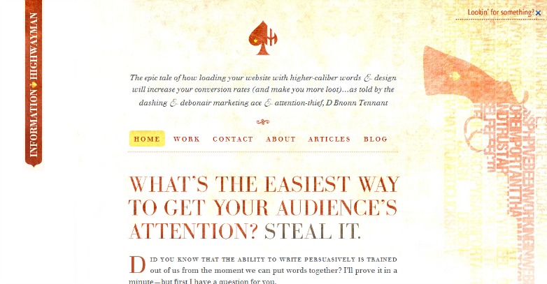
Information Highway
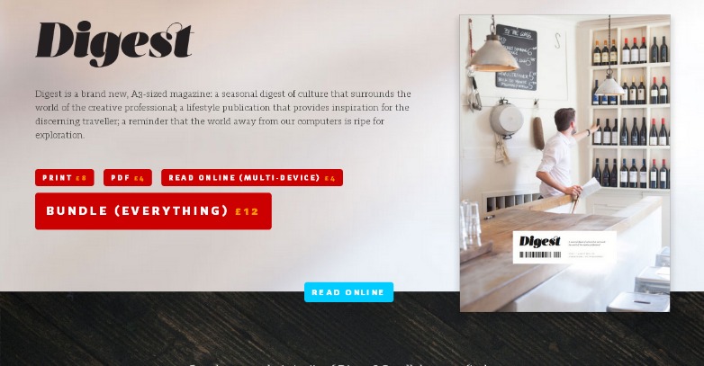
Digest
MakeMatter

Macro negative space
Now let's grow our scope a bit, and focus on the Macro side of this spectrum. Even though this side is the one we tend to give more attention, we still don't often give it more open space to breathe in. People like to clutter their headers with everything they can possibly fit since it's the first thing visitors see. Instead try to keep this area to a few key elements so users both know exactly where they are and aren't suffocated as soon as they enter the site.
Like the header, it is quite an easy trap to fall into viewing the footers and sidebars of a design as something as a content catch-all. A place to shove and dispose of as much information as possible. Unlike the header, it is true that one can get away with more content in these areas, but care should still be taken to make sure we leave ample whitespace both around and within these elements as well.
The more we leave adequate room and spacing, the more purposeful our inclusions seem. It is when we clutter (unless done stylistically, which is easy to distinguish from what we are speaking about here) that we often give the impression that we did not give enough attention to our planning stages. Granted, when we clutter, we can surely place much of the blame on our clients, knowing that much of the cluttering is done at their behest. A point we will get to and cover shortly.
So we want to be sure that the space is plentiful around each block element, around the entire section (make sure your sidebar isn't shoved right up against the main content of the site). Giving special care to ensure that there will be plenty of space around all calls to action. Let the CTA's stand out.
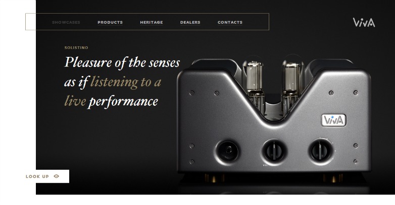
Viva Audio
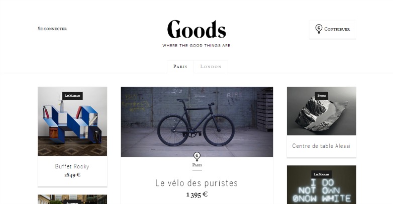
Goods
Do A Backflip
Why negative space matters
The use of negative space plays a huge role in usability. Which we have pointed to all along. Users not only need to be able to comfortably read all of the content on the site, but they also need to be able to easily find what they are looking for. Clutter keeps that from being an easy task. Many people, especially clients, tend to want to stuff every available inch of screen with information then wonder why the site looks so cluttered and unappealing. And, moreover, why users seem to have trouble navigating said site.
And this is where our powers of persuasion and trusting of our design sensibilities come in. As designers we have to get them to understand why this negative space is so essential and why making choices about what content to include in their site is equally important. This isn't a waste of their money. It isn't a waste of screen space either. But instead a needed element in making the important information already on the screen stand out in a clean and professional environ. We have to get them to see that.
We can still fit everything necessary within the site. Just make sure to give it all room to breath. It's okay for people to have to scroll through the site, in fact it's expected. "Above the fold" no longer holds the power that it used to. However, it's still important to remember that content (particularly front page content) should be chosen wisely. The more options given on the initial page, the more difficulty the user is going to have choosing where to go next without becoming overwhelmed and possibly giving up on the site all together.
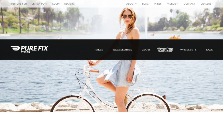
Pure Fix Cycles
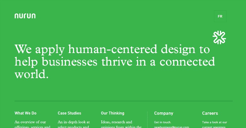
Nurun
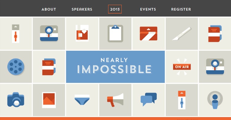
Nearly Impossible
How do you use negative space in your designs? Is 'negative' the correct term for whitespace? Let us know your thoughts in the comments.
WDD Staff


Read Next

15 Best New Fonts, July 2024

20 Best New Websites, July 2024

Top 7 WordPress Plugins for 2024: Enhance Your Site's Performance

Exciting New Tools for Designers, July 2024

3 Essential Design Trends, July 2024

15 Best New Fonts, June 2024

20 Best New Websites, June 2024

Exciting New Tools for Designers, June 2024

3 Essential Design Trends, June 2024

15 Best New Fonts, May 2024

How to Reduce The Carbon Footprint of Your Website
