
 As a website designer, I’ve always been fascinated by design (of any kind) that “works” and why.
Of late, I’ve become particularly appreciative of the power of photography to anchor a visually appealing design that tells the right story, triggers the desired emotions, engages the viewer, and enhances the content (whether by breaking it up or calling it out).
This newly refreshed appreciation for photos really took root in Venice this past fall.
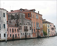
Venice: described as the “Most beautiful city built by man”
I’d always heard about Venice! And I had expectations I tell you! Expectations of a quaint, beautiful and romantic city built on the water -- utterly different than anything I’d ever seen.
But in reality? ... Venice is kind of a dump.
It’s weather-beaten, crumbling and run down. When you view it as a whole, you see a bunch of disparate scenery mish-mashed together. It doesn’t mean to be, but Venice is poorly dressed in rags and tatters.
But... When you look at Venice in tiny bits -- when you let your eye “crop” out the surroundings and focus on one finite area -- it’s a very different experience. There are so many details to delight the eye. Especially the eye of a designer who takes inspiration from everything that her gaze meets.
After realizing this, I could shift my focus from “the whole” to the details and back again and appreciate ALL of it. Venice really is a beautiful city.
The key takeaway here is, there is great power in cropping stuff out, so that what’s left in is a stronger.
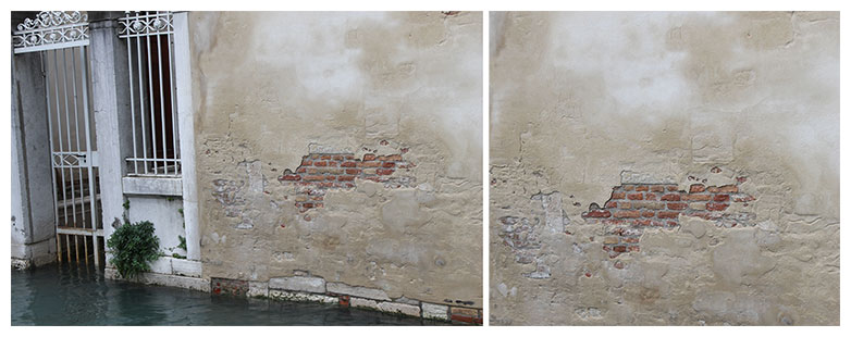
Picture of Venice, before cropping (left) and after cropping (right).
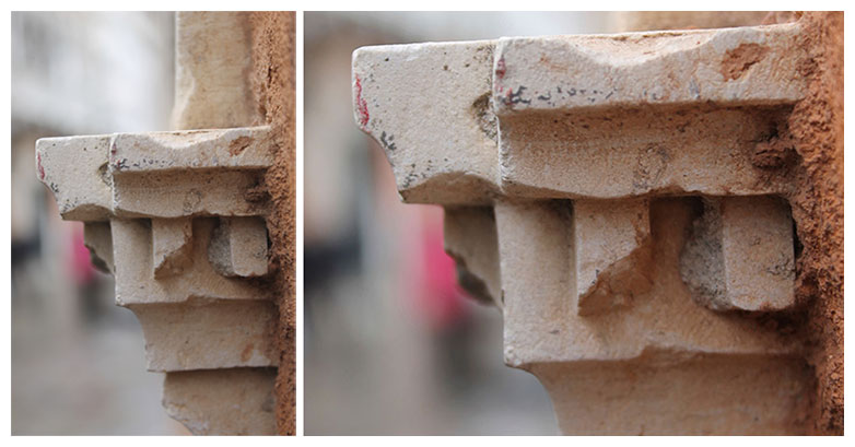
One of my favorite “details” of Venice. The photo on the left is the raw image off the camera. Here, I did the cropping with the camera by zooming in to this detail. On the right, is the same image cropped further.
Photo crops that work
In the rest of this article, I'll share some of my favorite photo crops from recent projects I’ve worked on.
Some are personal projects. Some are professional work through Gravity Switch (the web design and marketing agency where I’m cofounder). But all of them tell a story.
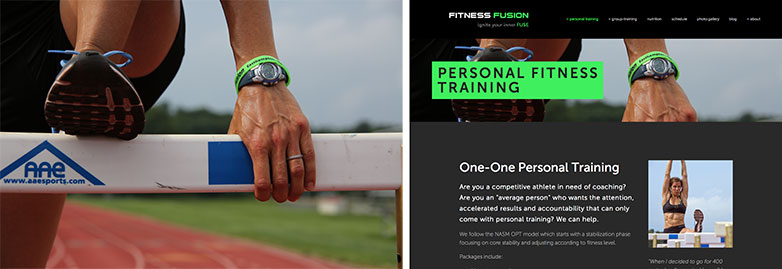
Fitness Fusion
Fitness Fusion is a niche studio gym known for intense, creative and fun group training and 1-1 personal training. When redesigning their site, I poured over 600+ photos in search of pictures that’d work in an extremely horizontal format — not an uncommon format for a web banner image, but always a challenge.
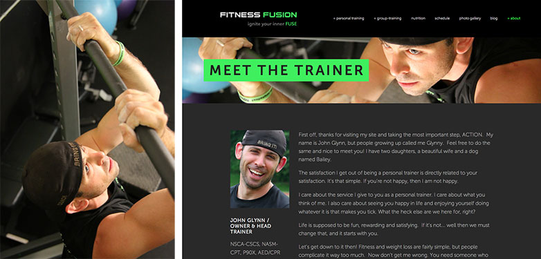
At first glance, the image on the left looks like an unlikely candidate. But when rotated 90 degrees counter-clockwise, flipped horizontally, and with the (now backwards) word “coach” on the cap stamped out, it’s a powerful banner image. Perfect for the “Meet the Trainer” page!
The crop above works because of:
- the warm lighting;
- the splashes of color;
- the genuine, focused, and approachable look in the eyes.
Together with the smiley photo of the page body content, the overall feelings conveyed are approachability, expertise, hardworking, a down-to-earth attitude, and fun!
Here’s another of my favorite banner image crops from this project. By removing parts of the original image (cropping it), we get a more dynamic, intimate, and interesting visual experience — a cool image that shows hard-work, dedication and sweat. The subtle touch of the gym’s branding on the wristband was an accidental bonus.
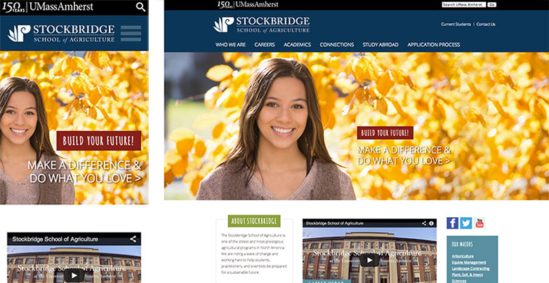
Stockbridge School of Agriculture
Stockbridge School of Agriculture at UMass Amherst is known as the top school of its kind in the country. It has diverse programs that attracts very different types of students (e.g. the prospective who’s interested in Turf Management is very different than the person who’s interested in Sustainable Food & Farming or Equine Management and so on.)
The challenge was finding a home page photo that:
- felt appropriate for a school of agriculture;
- was a strong image to draw the viewer in;
- didn’t alienate any potential prospect to any potential program; Do no harm!
On the technical side, we needed a photo that would work as a “floating crop” (i.e. the crop changes as the window is resized and it always needed to look good).
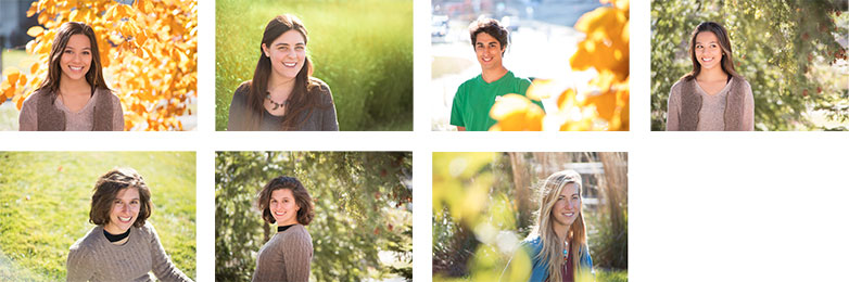
We did a specific photo shoot just to capture the image for the home page. We got many great shots. We narrowed it down to these 7:
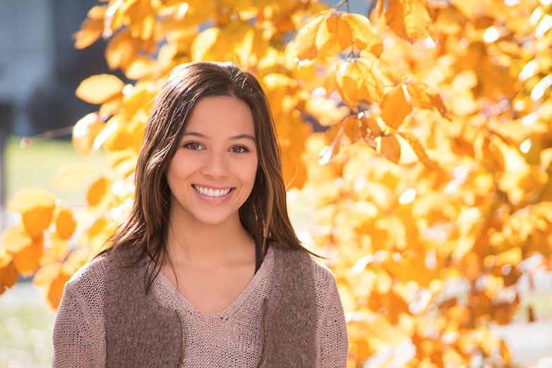
Then we picked this one to go with:
We played with the zoom level of the crop in PhotoShop, to confirm that the photo is strong as a floating crop. Here’s a few explorations:
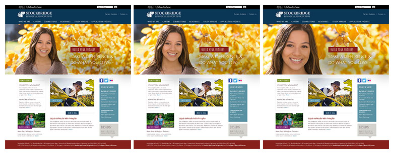
Here’s how it looks on mobile and desktop respectively:
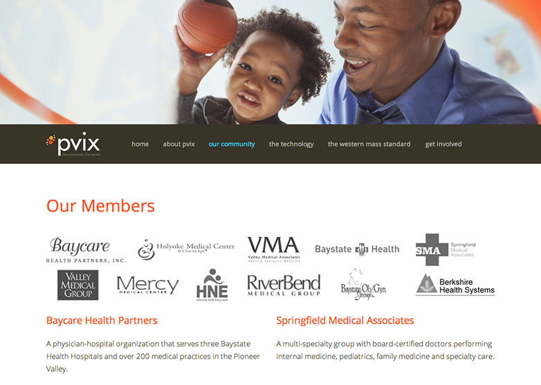
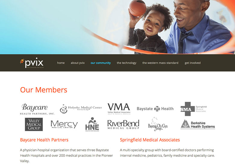
Pioneer Valley Information Exchange - PVIX
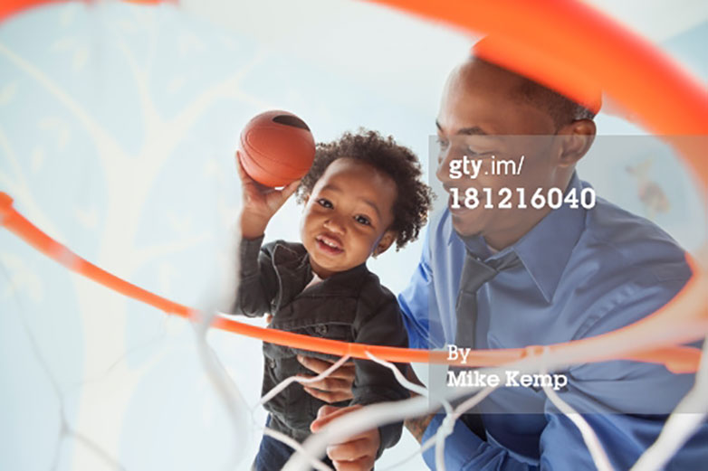
Here’s a stock image that was used for a website in the healthcare industry... trying to show teamwork, family, positivity, energy, optimism:
Here’s an image treatment I tried, but didn’t like. You lose too much context zoomed in this much:
As an alternative (that I also didn’t like). I zoomed all the way out so you could see the whole photo. To make the width work right, I added blue space on the left:
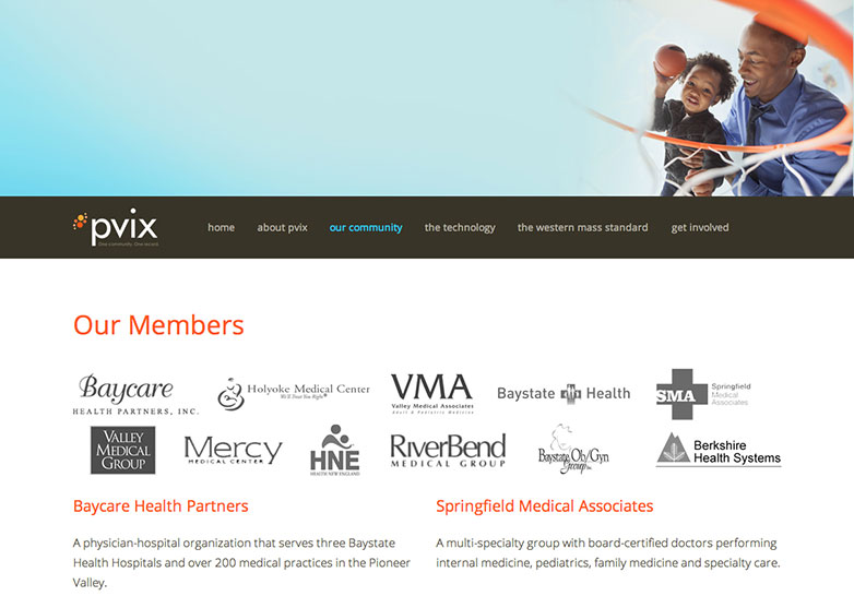
A happy medium (cropping some of the image) works best:
Parenting blog post
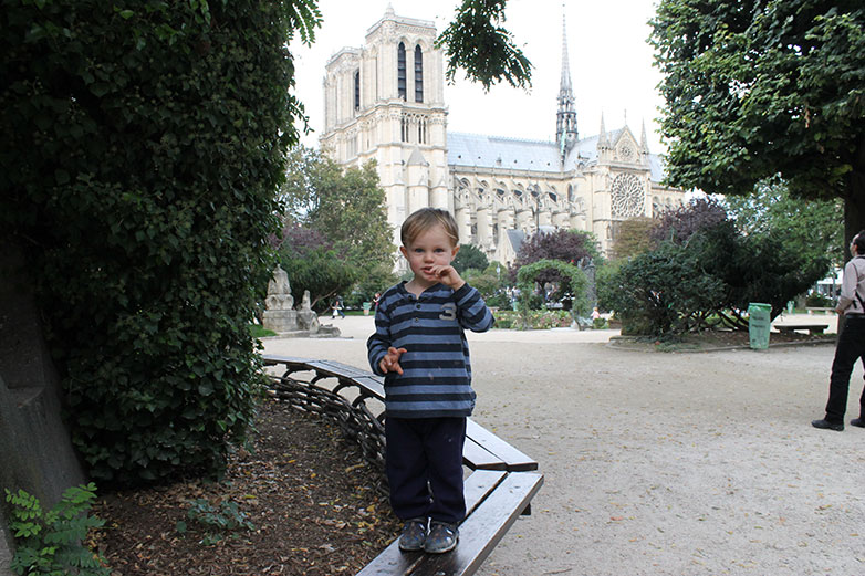
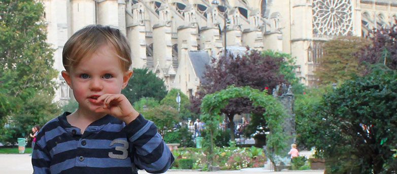
I was looking for a picture of my son to be the “banner image” in one of my blog posts.
I found this picture. I love the expression on my son’s face. But he’s so tiny in the image and you don’t appreciate that detail:
Here’s how I cropped it. Works much better:
Getting it right
We’ve all heard the saying, “A picture is worth 1,000 words.” But how do we craft our images so that they convey the 1,000 words that we want?
Getting it right requires:
Good raw photos: If you can, hire a professional photographer so you can get shots and compositions that look good and are customized to your purpose. If you can’t hire a professional, there are many stock photography options — some are good, some less so. It’s best to have someone you trust to have an “eye for it” handle the job of photo hunting.
Good post-production: Color-correction, Clean-up and Cropping. I call it the three C’s.
Good photo placement: Incorporate photos into the design in the right spot, next to the right content, on the right page, and then the they will help tell the right story. Location, location, location.
How do you select images for your designs? How do you choose which parts of images to crop? Let us know in the comments.
WDD Staff


Read Next

15 Best New Fonts, July 2024

20 Best New Websites, July 2024

Top 7 WordPress Plugins for 2024: Enhance Your Site's Performance

Exciting New Tools for Designers, July 2024

3 Essential Design Trends, July 2024

15 Best New Fonts, June 2024

20 Best New Websites, June 2024

Exciting New Tools for Designers, June 2024

3 Essential Design Trends, June 2024

15 Best New Fonts, May 2024

How to Reduce The Carbon Footprint of Your Website
