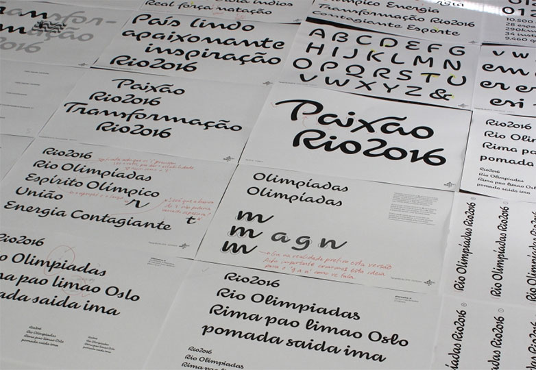
 Although the 2016 Olympics in Rio de Janeiro are still years away, the official typeface for the event has already been designed and unveiled.
Rio 2016 is a fluid and graceful script, inspired by the movements of past Olympians, which brings to life the ideas of “Passion and Transformation” that are so vital to the Olympic ideals.
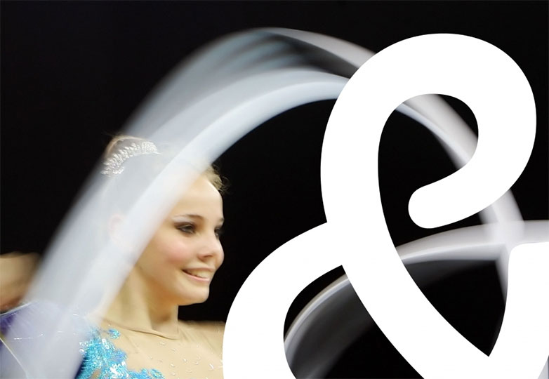
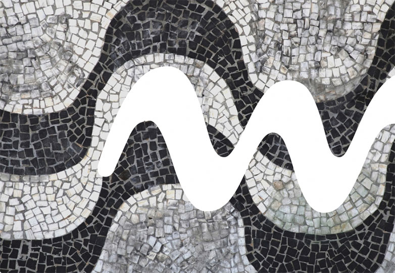
With Rio 2016, the Brazilian office of Dalton Maag designed a typeface that is entirely unique to the Olympics and, more importantly, to Brazil itself. Each letter is fashioned either after Olympic athletes and their movements, or certain aspects of Brazil’s geography. The letter “R”, as an example, represents the granite outcropping Pedra de Gávea which overlooks Rio from the Tijuca Forest. The characters were drawn in fast, fluid motions, in an effort to replicate sporting motion.
‘Harmonious Diversity’ is seen in the curves, as each one has a unique shape, but they work together as an integrated and unified set. The 'Olympic Spirit' and the ‘Paralympic Spirit’ are reflected in the fluidity of the lines, simulating the agility of the athletes’ movements. 'Contagious Energy' is also present in the character set, in the different height of the letters, and in the bold connections. ‘Exuberant Nature’ is present in the letters’ overall design, and finally, 'True Engagement' is present in the creation process, which included the participation and involvement of several different teams of people. (From the Rio 2016 website)
Rio 2016 is one of only a few fonts created entirely by a Brazilian team, resulting in a typeface that expresses the particular warmth and joyousness that embody the nature of the Brazilian people. We’re genuinely impressed with the results and look forward to seeing it in action leading up to the 2016 Olympics.
What do you think of the Rio 2016 font? How does it compare to previous Olympic Games brands? Let us know your thoughts in the comments.


