
 There are some companies out there that would have you believe that designing a logo is as simple as slapping together some type and a shape or two. But there is so much more to designing a good logo than just that, regardless of what some may say.
A lot goes into a great logo design. While a logo seems like just a little thing to create, it represents an entire company or brand, and must convey identity, values, and more. You can't think of it as just a "little" design job. It can be the most important design a company has, and one that guides future design and branding decisions. With this guide you'll learn all the steps necessary for creating a fantastic logo for your own project or a potential client's.
What makes a good logo?
A good logo is powerful. Whether it includes imagery or only type, a good logo has a certain power to it that makes it stand out.
On that note, a good logo is unique. It won't be confused with logos for other companies, particularly a business's competitors.

Along the same lines, a good logo is recognizable. It can become associated with a specific business quickly and easily.
A good logo is timeless, too. It should stand up and still look current 10, 20, or even 50 years down the road. That's a lot easier said than done.
A good logo also re-inforces your brand. It should convey the appropriate mood, tone, and feeling for your business. Whether you choose to make your logo literally represent your business type is up to you, as there are advantages and disadvantages to each approach. But in either case, it needs to support your brand.
A really good logo also conveys the core message of your company. It relays the qualities, skills, and values that your company believes in.
Types of logos
There are three main types of logos: there are logotypes, which are typography-based logos; there are literal logos, where the imagery used directly ties to the type of business (such as a dress for a clothing store); and abstract logos, where the logo imagery isn't obviously linked to the type of business and may be based more on a feeling or mood.
Logotypes
Logotypes are very common, and often include a distinctive twist or adaptation on an existing typeface or font. Logotypes can be particularly useful for diversified companies who are involved in more than one business (such as GE or DuPont).
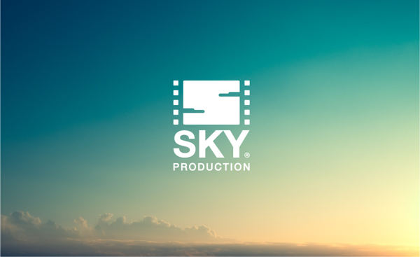
The Sky Production logo is a great example of a logotype that ties imagery into the lettering. The "S" is made from cloud shapes, while the side borders look like the edges of film. It's a great example of pushing the boundaries of what a logotype can be.

The simple triangle shapes that stand in for the A's in the SiO Athletica logo are bold and modern, and can be repeated throughout signage and other branding materials whenever an A appears, reinforcing the brand. Consider similar treatments when creating your own logos.
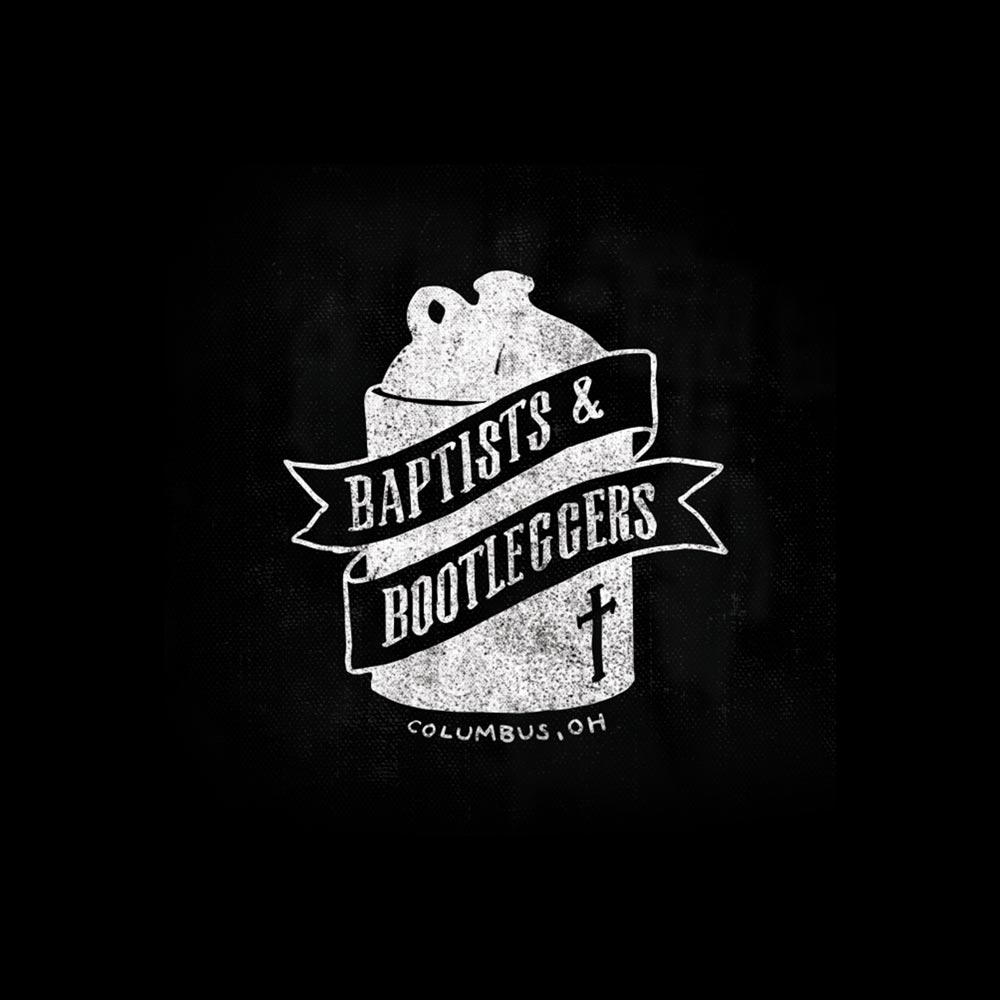
While this doesn't instantly strike one as a logotype, the shape of the logo is actually created by four B characters. It's creative and memorable, without being complicated.
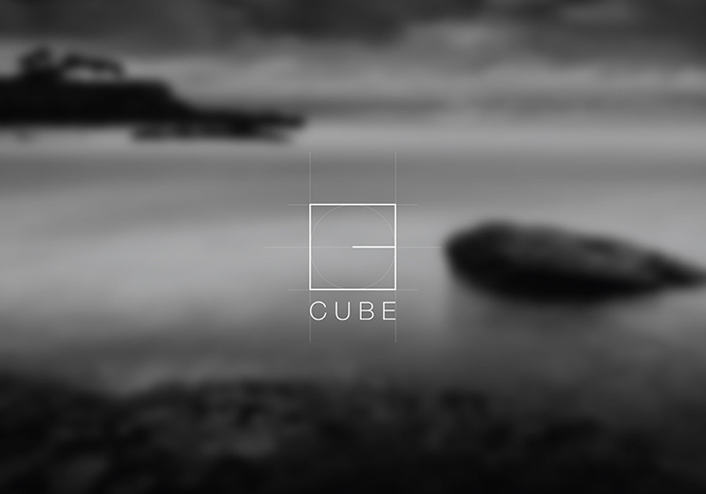
The Cube logo is simple and straightforward, with a single line turning a square into a stylized letter C.
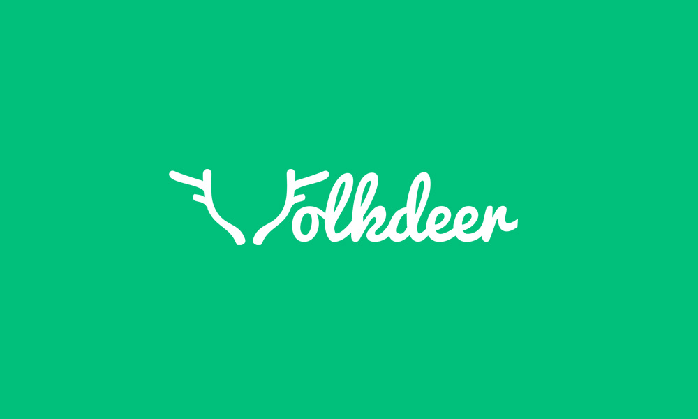
The Folkdeer logo incorporates antlers into the typography, blurring the line between a logotype and a logo with literal imagery.
Literal imagery
Literal logos are also very common, and can instantly lend meaning to a company's name, if it's not abundantly clear. Local and small businesses, in particular, seem to be particularly fond of this type of logo. This may be in part because these logos are easily recognizable and leave little open to interpretation (though some do make clever use of double meanings and hidden imagery).
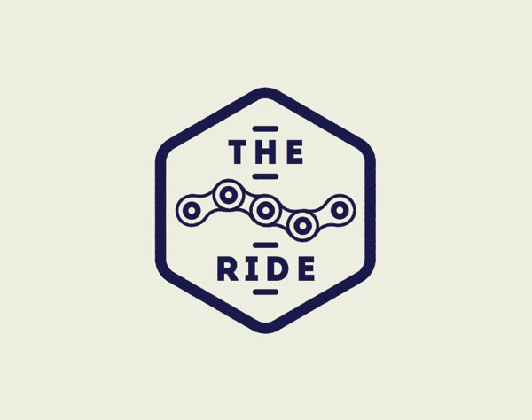
A bike chain is a very literal image for a bike shop or other bike-related business, as shown in this logo for The Ride.
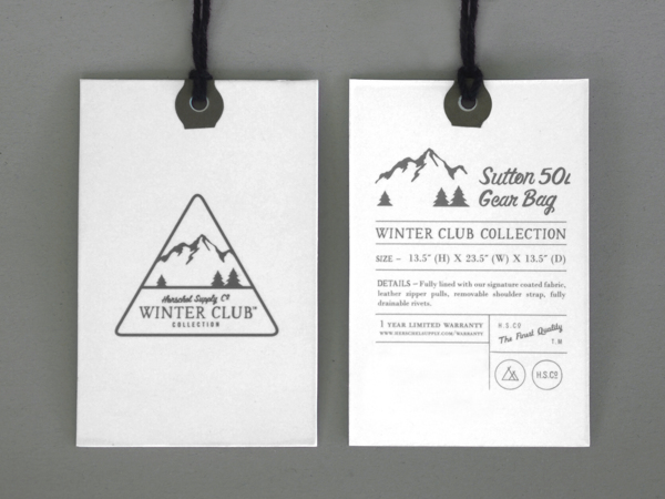
The Herschel Supply Co Winter Club Collection logo is another great example of literal imagery, this time in the form of mountains and trees.
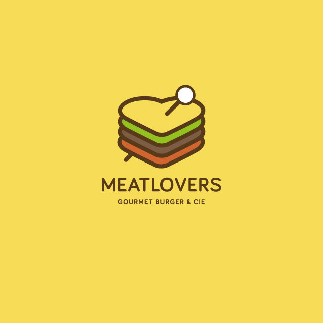
This Meatlovers Gourmet Burger & Cie logo with a sandwich in the shape of a heart is literal while remaining minimalist and modern. It shows that even logos with literal imagery can be fun and unexpected.
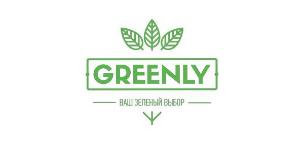
The Greenly logo uses leaves in their logo, which makes perfect sense for an eco-friendly company.
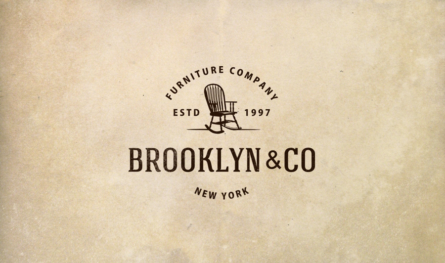
The rocking chair in the Brooklyn & Co logo makes perfect sense for a furniture company.
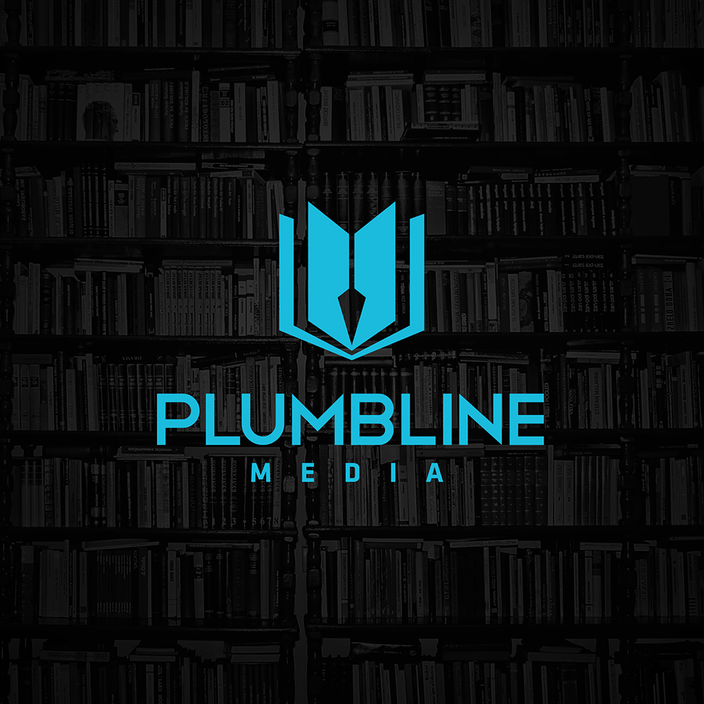
The Plumbline Media logo almost looks abstract, until you see that it's simply a book (representing media) with a simple plumbline in the spine.
Abstract imagery
Abstract logos are also very useful for diversified businesses, as they convey mood and tone much more than specific business type. A logo doesn't have to directly convey what a business does. Consider the Nike Swoosh, McDonald's Golden Arches, or the Apple logo.
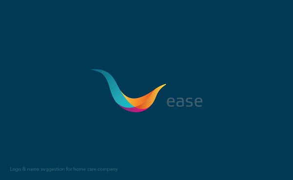
This Ease logo is a good example of an abstract image that conveys the appropriate mood.
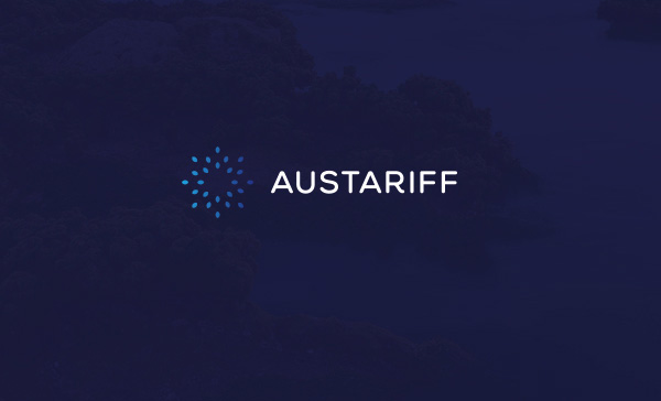
The logo for Austariff, which is an Australian solar feed-in incentive, is reminiscent of the sun, while also incorporating a leaf shape (which makes sense for the renewable energy industry). The shape is used in interesting ways throughout their branding materials.
The Stylish Eve logo is based on the form of an apple, but taken to an abstract end. It's a good example of taking something associated with a name (the name Eve has strong associations with apples) and stylizing it to create an evocative logo.
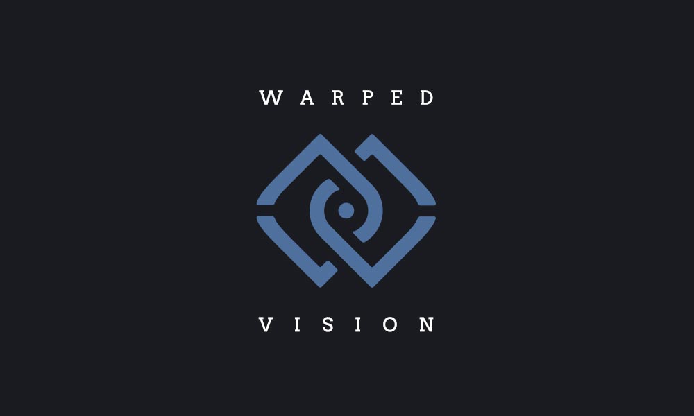
The Warped Vision logo uses abstract shapes that are reminiscent of a few things, and doesn't give any real indication of what the company does.
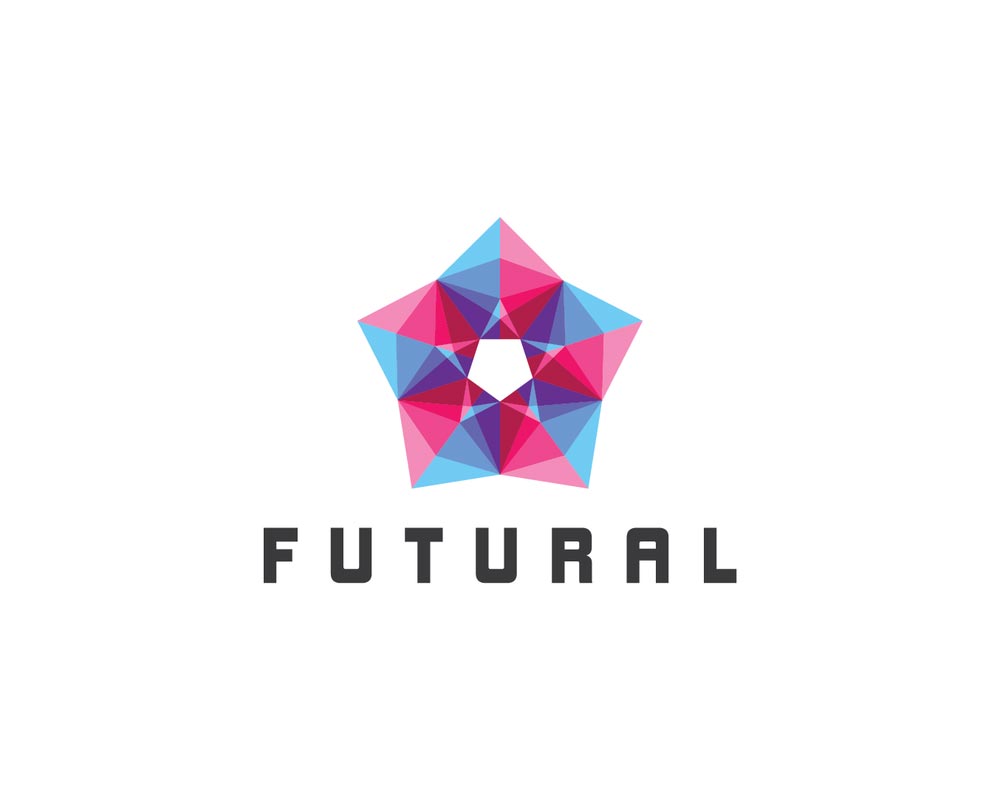
The Futural logo is completely abstract, and yet gives a sense of modernity and the future, making it an excellent choice based on the company's name.
Research, research, research
The first step in designing a great logo for your client is to get a good design brief. Your client should give you background information on their business, including any previous logos they've used. It's important for you to gather information beyond what your client provides though, both directly from them and on your own.
Ask your client specific questions to get clarification on anything you're not 100% sure of in the brief. It's better to ask questions and be clear on what your client expects and needs in the beginning, rather than spend countless hours on revisions down the road, or risk losing the client because they feel you didn't listen to them (even if they were the ones who were unclear).
You'll need to research your audience. Who is the logo going to be seen by? In other words, who are your client's customers? You'll also want to know where the logo is going to be used, and in what formats. This is important, as it can determine limitations on your designs, such as the necessity of the logo to work well in black and white (in case your client still uses newspaper advertising or the like).
How much is too much?
A lot of designers who have never designed logos before are probably wondering how much research they really need to do. At what point do you know too much about your client's business? How much research is really necessary just to design a logo?
The answer to that is that you really can't be too well-informed about your client when it comes to creating a logo. This is a major component to their brand, and their face to the world. Think about how recognizable some logos have become. No one needs to see the word "Nike" associated with their swoosh logo; they immediately recognize the swoosh and associate it with the brand. When you see the Starbucks mermaid, you know what company it represents. When you see an apple with a bite taken out of it, you know it's Apple.
Do you think the designers behind those logos thought they could just wing it based on nothing more than what's contained in the company's brochure or about page? Granted, sometimes a great logo can be created without a ton of back story from the company. But additional information in those cases almost certainly would not have hurt the process.
Spend the time to get to know the company you're designing for. Understand their values. Understand their position in the market. Understand how their customers view them. If it's a new business, then understand how they want their customers to view them, and where they want to be positioned in the market.
While it's certainly possible to design a logo based on nothing more than a two or three paragraph design brief, you'll produce better work if you take the time to delve deeper than that. Set aside an appropriate amount of time to research and plan your logo design process, and you'll see better results and have happier clients.
Inspiration
Once you've done all the research you can manage and know your client's business inside and out, it's time to look for some inspiration. Sure, in some rare cases you might come up with the perfect idea for the logo while still in the research stage, but in all likelihood, you won't. You'll need to go looking for some inspiration and ideas elsewhere.
When looking for logos to pull ideas from, look for logos from both similar companies and entirely different ones. Spend some time looking through inspiration galleries, logo roundups on blogs, and even just searching for logos in Google Images.
While you're looking at all these logos, resist the urge to imitate any of the ones you see. Imitation may be the sincerest form of flattery, but you're not doing yourself or your clients any kind of favor by imitating another company's logo.
Remember what I said about a good logo being unique? It's an important quality to remember as you're looking at the work of others. The idea here is to find ideas that you can use to inspire your own original design. Not ideas you can tweak but effectively copy.
When looking at these logos for inspiration, consider the different types of logos and which seem to be most prevalent in your client's industry. Are most of the logos abstract? Literal? Typographic?
Just because 80% of the companies in an industry have literal logos doesn't mean that your client has to. But it's important to think about whether breaking with the established standard fits with the client's values. If they're a very traditional company, then sticking with what's already been established might be wise. Then again, if they're trying to break in as a different option, or if they're trailblazers, then consider deviating from the established path.
Logo inspiration resources
There are tons of great galleries online for finding inspiration for your logo designs. Here are ten of our favorites:
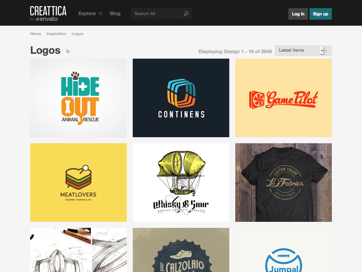
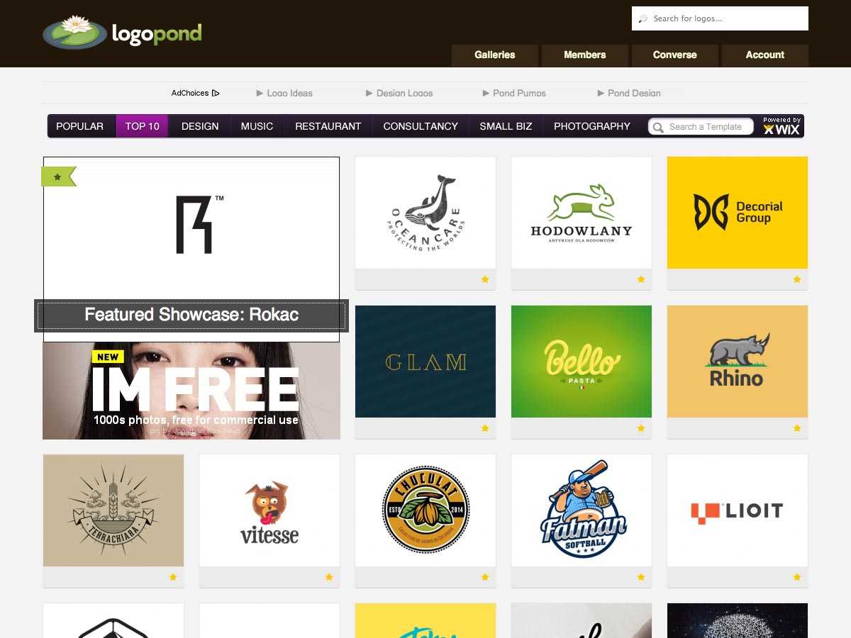
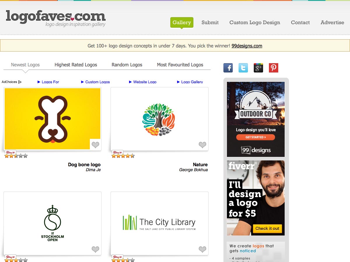
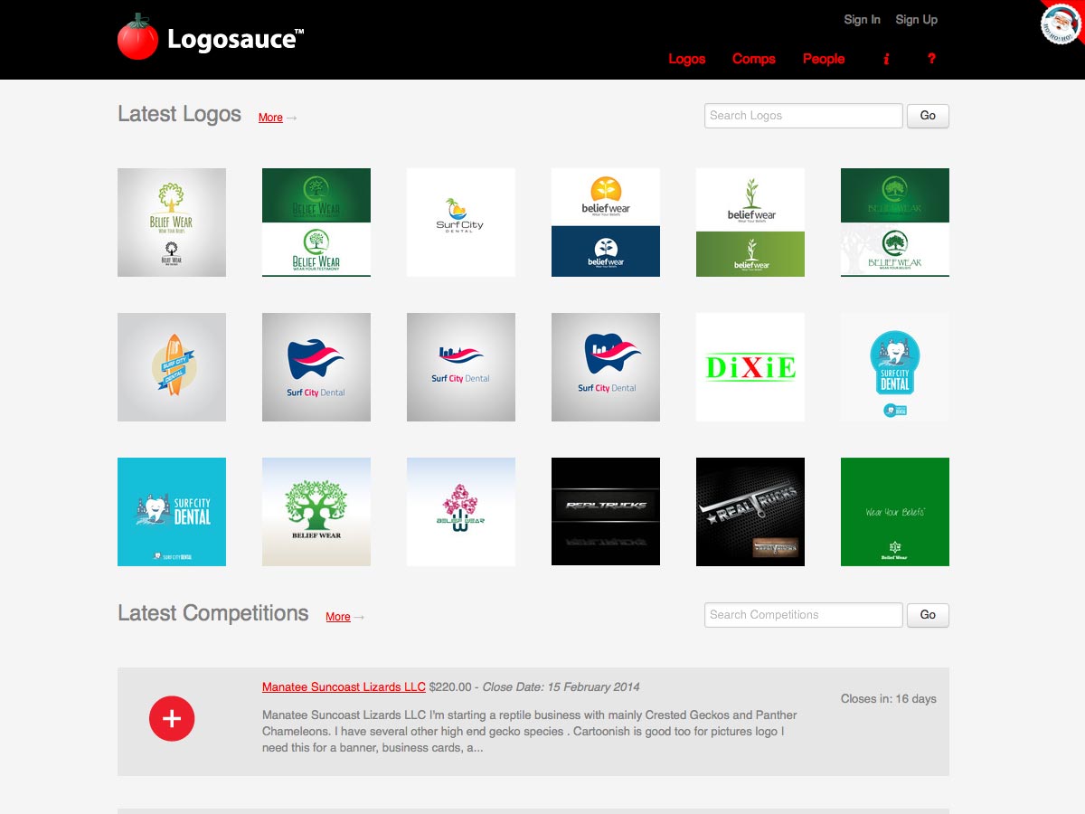
In addition to galleries, there are plenty of logo roundups out there to provide additional inspiration. And of course we're surrounded by logos in our everyday lives, on products, in advertising, online, and more.
Sketching initial designs
By now, you should be fully immersed in the brand. You should know them as well as you know your own business. This allows you to more easily create appropriate sketches for the initial designs.
Consider creating a matrix of possible design options, based on the different kinds of logos and the different symbology that might be appropriate for your client. For example, you may create a series of logotype ideas, a series of ideas based on pictograms tied to the company name, and a series of ideas tied to the industry in which they work. Creating quick sketches of these in a matrix format allows you to see them all at a glance, and may let you see ways to combine different ideas in interesting new ways.
One thing to keep in mind, right from the start, is that you should keep all of your sketches. What may seem like a bad idea on your first round of initial sketches might be the start of something brilliant later on. If you've tossed out your early sketches, thinking they were garbage, you might not be able to recapture the ideas later.
This is also the part of the process where you may be tasked with choosing a typeface for the logo and any accompanying slogans. Consider creating an entirely original type treatment for the logo, rather than using an existing font if you want to create something absolutely unique.
If designing completely original type isn't within the scope of the project, then consider making changes and customizations to an existing typeface. This can be a great way to get a custom look without investing the time and resources necessary for a completely original type design.
In some cases your client may already have an established typeface, and whether you can deviate from that or not will depend on the particular project. If you do opt to deviate from it, be wary of what the reaction from the company or their clients might be.
In these cases, making adjustments to the existing typeface being used can be an excellent solution. It can keep any established attachment to the existing logo or company identity, while still presenting something new and updated.
It's important to think about any double meanings or hidden meanings or imagery that might appear within a logo. These can be a clever way to make your logo very memorable and recognizable. Consider logos with dual meanings or hidden imagery. Here's an example of a great "hidden" second image in a logo:
While you may choose to purposely include (or not include) secondary imagery and meanings in your logo designs, you need to be aware of potential hidden meanings, words, or images. It's completely possible for words to escape our notice during the design process, only to be discovered by the client or the client's customers after the logo has been made public. These negative aspects can be amusing at best, or a real PR nightmare for your client at worst.
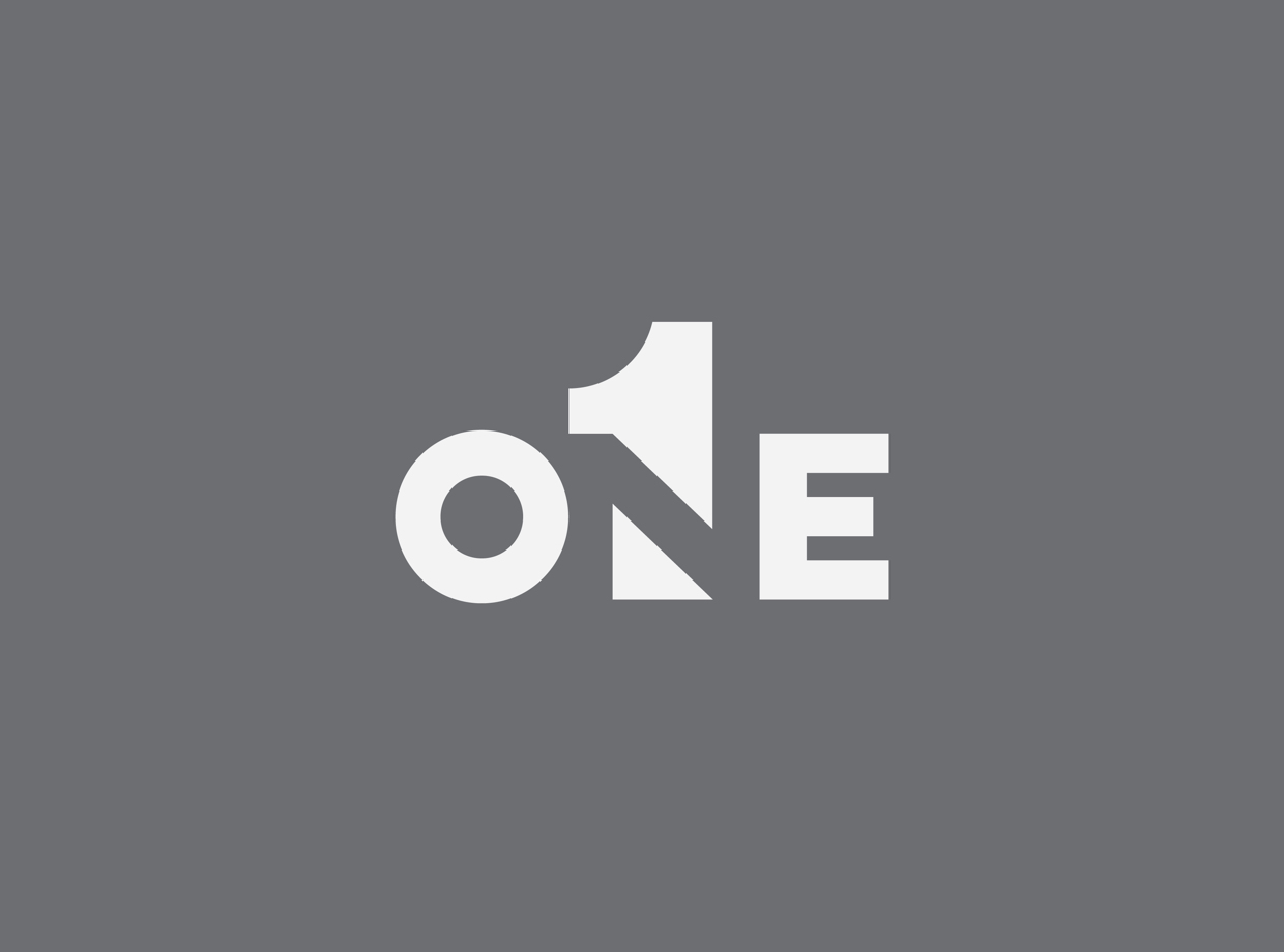
The negative space created by your logo design can be used to create secondary imagery, too, or to further simplify the main imagery in your design. Consider how the negative space can be used to better define your logo or to further reinforce your client's image and values in the design. Look at how negative space is used in the logo below to spell out the word "one" while also using the numeric character:
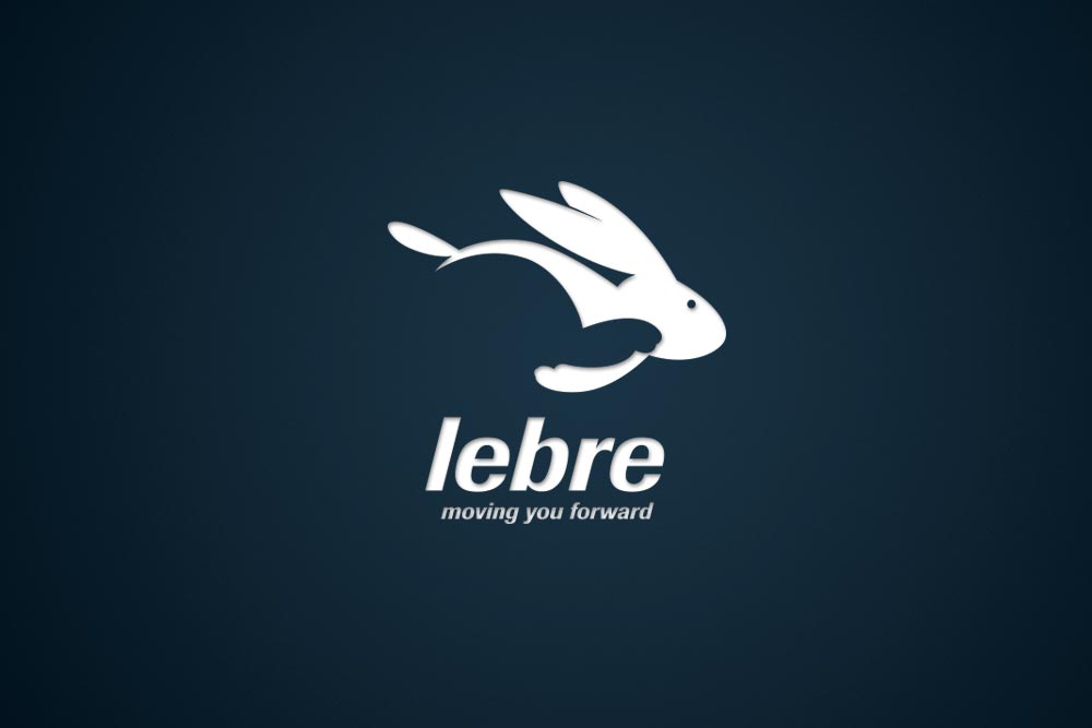
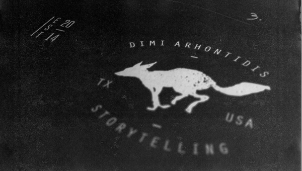
One common pitfall for designers is the use of passive imagery over active imagery. For example, a designer may choose to use an image of a bear in their logo. The designer's first instinct may be to just use a silhouette of a bear's head. This is passive imagery; it's just sitting there. By contrast, a silhouette of a bear doing something (such as catching a fish from a stream or standing on its hind legs) is active, and is more striking and memorable. It gives the sense that the company the logo represents is doing things, rather than just sitting there. Look at how dynamic and interesting the running fox is in the logo below:
Don't be afraid to experiment in your sketches. Try the unexpected. Try the crazy idea that you're sure won't work but can't stop thinking about. This is the time in the design process to humor every idea you have. Sure, you might set aside most of them, but you may stumble upon a great idea during the process. And one bad idea might lead you into a good idea, or even a great idea. So take the time during this initial sketching phase to play around and experiment.
Paper vs. screen
When you're sketching your designs, you may be wondering if it's better to sketch on paper or with your computer or tablet.
While it's really up to you as a designer which one you're more comfortable working with, you may find that sketching on paper is more efficient to start with. You're also less likely to erase and change things when working on paper.
The other benefit to paper is that it creates a disconnect that tells your brain that this is not the final work, and that it's okay to be messy and work quickly. Since most of us are used to polishing our designs on a computer and creating finished projects, we can have perfectionist tendencies when working on a screen versus working on paper.
Of course, if you feel you work more efficiently sketching on screen with a graphics tablet, then by all means do so. A nice in-between can be working in a drawing app on your tablet. The benefit here is that it's more streamlined to import your sketches into your graphics program of choice when you start on the refinement process.
Reflection and refinement
Once you have a bunch of sketches, you may want to immediately dive into perfecting one or more of them to show your client. Or, alternatively, you may find that you're completely overwhelmed by how many ideas you've come up with, and have no idea which one(s) to move forward with.
This is why it's so important to take some time away from your designs and reflect on them. If you can take a couple of days to think and step back, that's great. If not, try to at least sleep on your designs so you can approach them with fresh eyes. And if even that's not possible (and it might not be if it's a rush job or there are other time constraints), then at least go get a cup of coffee, have lunch, or take a walk.
Time allows you to distance yourself from your designs. You'll be less likely to choose your "favorite", or the one that took the most time, or the one that "just came to you" if you have this space. Instead, you'll be able to more easily look objectively at the logo sketches and see which one makes the most sense for your client, regardless of your own personal attachments.
Once you're back at your computer and looking at your sketches, you'll need to consider a few things before deciding which logo concepts are most appropriate to move forward with and present to your client or other decision makers.
First of all, make sure that you're aware of pertinent cultural differences. So many businesses are now global in scope that it's vital that they understand the potential symbology and meaning their logo might carry in other countries and cultures they do business with. Even purely local businesses need to be aware of these things, especially if there is a large immigrant population or ethnic group in their community.
For example, in many countries a "thumbs up" is considered a positive symbol, and that everything is okay. But in Sardinia, Greece, and some Islamic countries, it's a rude sexual sign. In other words, don't try to present a thumbs-up symbol in a logo for a Greek restaurant.
Once you've narrowed down which logo sketches you want to move forward with, it's time to make some refinements. The point of the sketching process was just to get your ideas in their roughest form onto paper (or pixels).
Make sure the logo concepts you choose work on dark and light backgrounds equally well. You never know where your logo design will end up, and changes down the road to the company's website or other branding materials shouldn't make the logo obsolete. Logos should transcend other brand design changes for the most part, unless an entire re-branding effort is undertaken (and even then sometimes the logo will persist). That means your logo needs to be as flexible as you can make it.
Your logo should be as simple as possible. Keep simplifying and removing elements until you're left with the minimum to get your message across. In fact, one useful strategy here is to keep removing things until the message is lost, then add back until it becomes clear again. In many cases, simplicity equals a certain timeless quality that will survive trends and fluctuations in what's popular from one year to the next.
When creating your initial sketches, you may not have taken into account the company's slogan or other phrases that might commonly be used adjacent to the logo. But it's important that your logo and slogan work well both together and separately. Try out different ways of combining the two, and different ways of styling each so that they work well in either situation.
The colors you use in the design can have a huge bearing on how the final logo design is perceived. You may be working with a strict established color palette that the client furnishes, or you may be free to use whatever colors you like. In all likelihood, the client will at least provide input on the color families they would like the logo to use (or that it must use).
In either of the last two cases, you need to carefully consider how using different tones of a color can impact the final perception. For example, using bright saturated colors is going to give a very different impression than using muted tones or pastels. When a logo design isn't quite working for you and you can't put your finger on why, consider tweaking the color palette first to see if that fixes the problem.
Color palettes should be among the last steps in the logo design process. Make sure that your designs can function in monochrome as well as color for the most versatility.
You should also make refinements to the typeface you've either chosen or designed specifically for this logo. Small adjustments to typography, like changing line weights, eliminating certain aspects of individual characters or elements, or similar changes can have a profound effect on the overall design, and turn it from good to great.
Choosing a logo
At this point, you probably have two or three logos in something close to a final state. In all likelihood, you'll want to present these to your client or other decision makers for a final decision on which logo will be used.
But, just because you have three designs doesn't mean you have to immediately present all three. Instead, you may choose to present just one logo at first, and see how your client reacts. This can be a particularly useful tactic if your client has been unfocused throughout the design process, and you worry they may be unhappy with whatever you present. Getting feedback on one design so that you can then either make adjustments to that design or know which of your other designs is most likely to please the client can be a good strategy.
Plus, giving your client too many choices may make it harder for them to make a decision. Or worse, they may ask you to scrap all three and do a fourth (and a fifth, and a sixth). After all, if you were able to design three logos so easily, then surely it's not a big deal for you to design a few more.
Make sure you have a well formed opinion about each logo, and why it's a good fit for your client. The best clients will ask for your guidance on which logo is truly the best fit for them, and being able to give them thoughtful insight into why each one works reinforces your expertise as a designer.
You may also want to consider presenting the logo in context so your client can better visualize how it will look in practice. Mock up the client's website, business cards, or other materials with the new logo. It's a big help to clients, who may not be able to easily visualize an end result like you can as a designer.
In the end, it's up to your client to choose which logo they think will best fit their company. And to request any changes or adjustments, per your design contract.
What to do with the final design
Once the final design has been chosen, you need to create the deliverables for your client. Make sure your design is responsive and looks good at both large and small sizes. Your logo design is likely to be used on screen in a variety of sizes, as well as possibly used in print (which means assets at a minimum of 300dpi will be required). Of course, you've designed the logo in a vector graphics program and have the vector files, but you should also provide your client other, more user-friendly file types that they can use. Be sure you take the time for proper hinting in your non-vector files, so that they appear cleaner and more polished. When you pull a vector file into Photoshop or another raster graphics program, you'll end up with all sorts of pixelation around the edges of your design, which should be removed for the cleanest end result.
You should also create a style guide for the final logo design and associated branding to show what adaptations are and are not acceptable. Create a list of dos and don'ts for how to use the logo, including whether it's okay to do things like outline it or place it in a box. For some great inspiration on how to compose a design style guide, check out 10 Magically Meticulous Design Style Guides from Creative Bloq.
Some words on typography
Here are some great tips for better using typography in your logo designs.
- Don't use a typeface that's already used in an iconic logo. Of course, there are exceptions to this rule, such as typefaces that are used in a lot of iconic logos (like Helvetica).
- Make sure your typeface matches the tone of the brand. Serious brand = serious typeface. Traditional brand = traditional typeface. Modern brand = modern typeface. You get the picture.
- Be wary of "trendy" fonts. What's trendy today is dated tomorrow.
- Likewise, avoid gimmicky fonts. There are tons of free decorative fonts out there, and it can be tempting to use them. In a word: don't. For one, they're probably already being used in crappy logos the world over. Second, most of them aren't designed all that well (there's a reason they're free).
- Make adaptations to existing typefaces in your designs. Add a curve, change the aspect ratio, remove some elements, or whatever else you need to do to make it your own and make it better fit your client's brand.
- Look at how other logos are using typography. While you shouldn't steal ideas from other designers, looking at how another designer approaches a specific design challenge is smart. Take the strategies that make sense in the context of your project and adapt them to suit your specific needs.
- Avoid using multiple fonts. It's best to stick to one, two if you absolutely have to. Anything more than that and you're taking a huge risk that is unlikely to pay off except in the most exceptional circumstances.
- Experiment with things like kerning, letter spacing, and line height in your logo design, and see how merging letterforms can add interest and make your logo stand out. Here's a great example of how positioning characters along two different planes can add interest and a sense of whimsy to your logo:
What clients (should) look for
Now that you know what goes into a good logo, you might wonder what a potential client, who needs a new logo, will be looking for in a designer (or at least what they should be looking for).
Do you have proven experience? And happy past clients? Those are both key. Testimonials can go a long way toward giving your potential client peace-of-mind in choosing to work with you. It's all about social approval and validation. Other things that give clients some reassurance are things like design awards you may have won or work you've had published. Don't be shy about including these things in your portfolio.
Your timeframe and price are also going to be big factors in whether a potential client chooses to work with you over your competition. While being the lowest-priced designer isn't doing you or your client any favors, being the highest-priced means you better have the skills and credentials to back it up. Because honestly, if it comes down to you and another designer, and your potential client is fine with the quality of your work and the other designer's work, it's almost certainly going to come down to price and turnaround. Make sure you're providing appropriate value for the cost.
How you communicate and your level of professionalism is also key. Make sure that you respond promptly to any communication from your client, and that you present yourself in a professional way at all times. It doesn't matter if this is your first paid logo project or your ten thousandth, as far as your client is concerned, how you interact with them is the only thing that matters.
Logo design case studies
Looking at case studies that spell out exactly how a logo was designed can be a great help to new logo designers. It gives you clearer insight into how these steps apply in the real world. Here are a few to check out:
Logo Design Process for Just Creative Design's Award Winning Logo covers how the logo for this iconic company was created, with handy images along the way.
Dache: Logo Design Process covers how famous Swiss logo designer David Pache, of Dache, goes about creating a logo.
This Logo Design Process and Walkthrough for Vivid Ways from Spoon Graphics shows how they created this colorful logo, including client feedback.
This post on the Duoh! blog, Logo Design for Social Signal, details the process for creating this logo, from the design brief on.
Check out Just Creative's process for the A-List Blogging Bootcamps Identity Design, including how they got the job in the first place.
The Bounty Bev Logo Design Process gives a quick rundown of how Centresource created a fantastic logo in just a week.
Logo Process - Apple & Eve [nude] Identity Development is a fascinating look at what was a very challening and potentially disastrous logo design.
Logo Design Process for FITUCCI is another great case study from JUST Creative.
Creating a Rockstar Brand, Logo & Styleguide in Illustrator is a more tutorialized look at the creation of a logo and associated branding materials for Rockable Press, from VectorTuts+.
This Mentaway Logo Design Case Study from Abduzeedo shows how the Mentaway logo was designed, from initial inspiration and conception to the final design.
Resources and tools
While many designers are likely going to want to break out Adobe Illustrator or another vector graphics program to create their logos, you might be wondering whether there are any free apps or other tools out there for creating logos. The good news is that there are plenty; the bad news is that not all of them create great (or even good) results. But on that note, here are some of the better logo apps online.
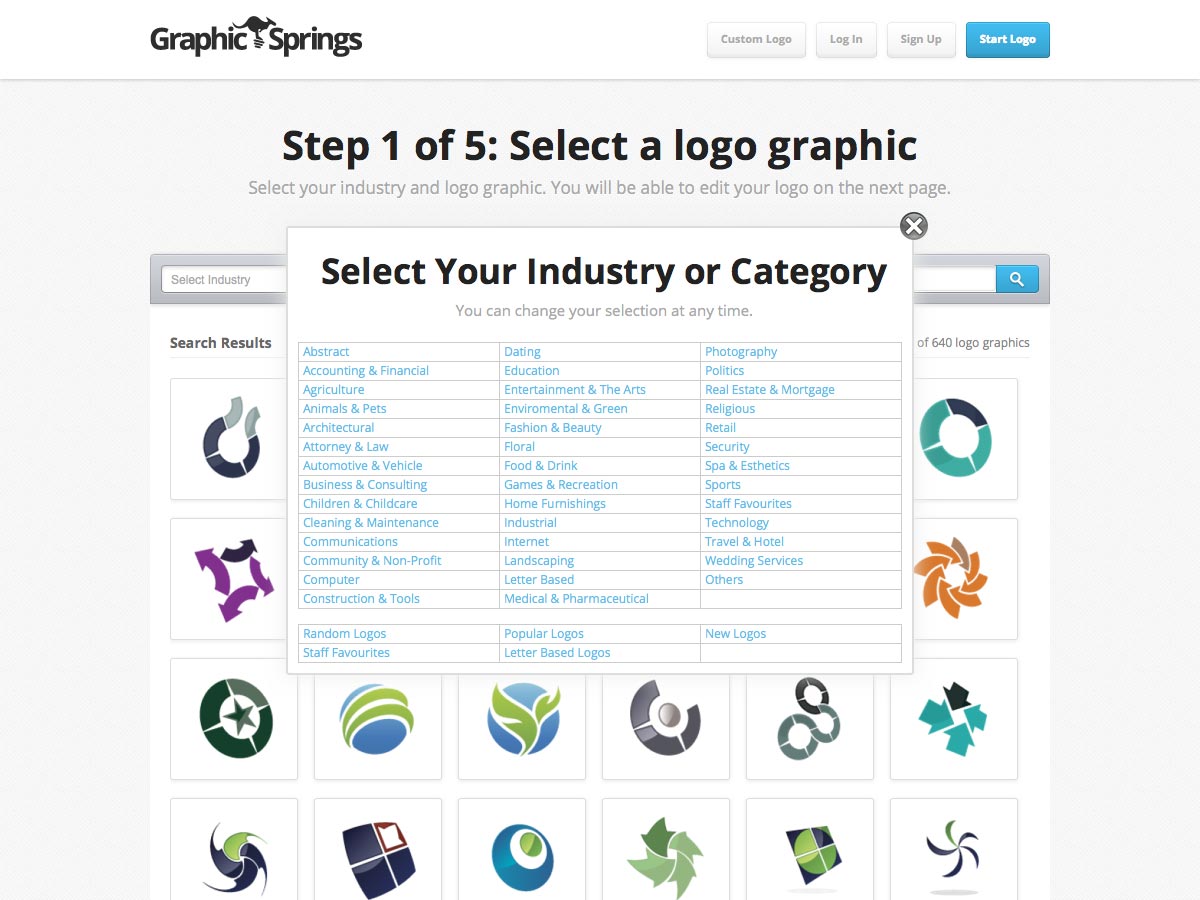
Graphic Springs makes it simple to create a logo in just five steps. They offer a fairly extensive collection of stock images to choose from.
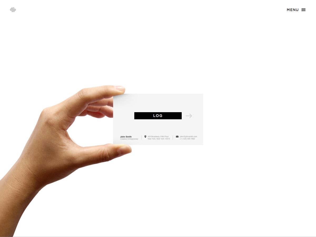
Squarespace Logo is a new tool from the popular website provider. It's a decidedly more modern and streamlined design tool than most of the others here.
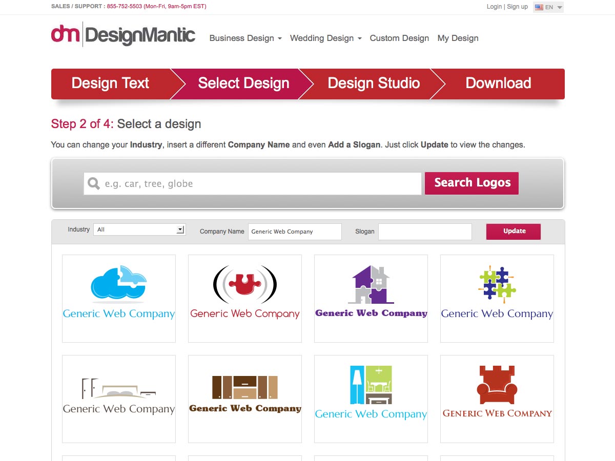
DesignMantic offers a large selection if images you can incorporate into your logo design. Just enter your company name and they'll generate a number of mockups you can customize, or sort the designs by industry.
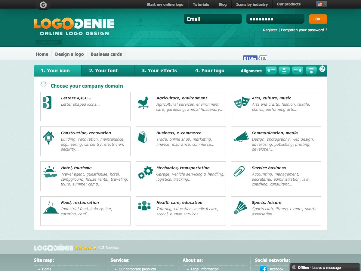
LogoGenie lets you create a logo in just three steps: pick your industry and icon, choose your font, add effects, and you're done.
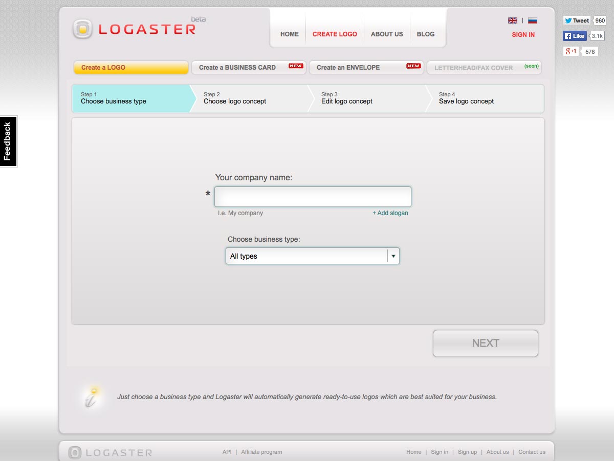
Logaster is an easy to use logo design app. Just enter your business name and type, choose your logo concept, edit it, and download your final design.
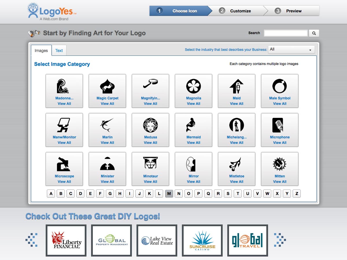
LogoYes makes it fast and easy to create logos, with a ton of stock images to choose from.
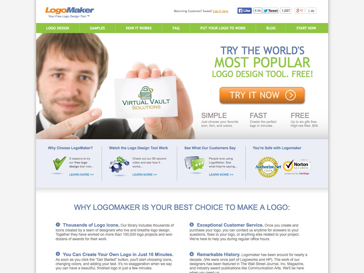
LogoMaker is a simple and fast logo creator. You can get up to 6 gif files for free, or pay for high resultion files.
Conclusion
The creation of a logo may seem like a very straightforward proposition to the novice designer, but creating a truly exceptional logo, one that can stand the test of time, is a much more involved process. It's key to take the time necessary to properly create a logo, whether it's for yourself or a client.
Not doing so can result in creating a poorly-designed logo that doesn't properly represent the brand and doesn't present a positive image to the public. It's damaging to your reputation, and will quickly lead to a loss of clients.
Following the advice above will help you avoid that, and help you create excellent logos that will bolster your reputation and improve your clients' businesses.
Do you design logos professionally? What advice would you offer prospective logo designers? Let us know in the comments.
WDD Staff


Read Next

15 Best New Fonts, July 2024

20 Best New Websites, July 2024

Top 7 WordPress Plugins for 2024: Enhance Your Site's Performance

Exciting New Tools for Designers, July 2024

3 Essential Design Trends, July 2024

15 Best New Fonts, June 2024

20 Best New Websites, June 2024

Exciting New Tools for Designers, June 2024

3 Essential Design Trends, June 2024

15 Best New Fonts, May 2024

How to Reduce The Carbon Footprint of Your Website
