

Web design tastes change so fast that it's hard to keep up. As with all trends, it’s hard to tell what will be a short-lived fad from what will be around for a long time: there was a time when a Flash introduction was the hottest thing going around; just a few short years ago glossy buttons were everything; both of those things are now design relics, and frankly, a little embarrassing.
Don’t let the graveyard of design fads convince you that anything new or popular is just a passing fad. Some trends have lasting effects on design culture because they actually contribute to user experience and serve some purpose.
There’s a slew of design articles right now telling you what will be big in 2015, but this one’s here to identify what will be big throughout 2015 and still be going strong into 2016 and beyond. These are trends with so much momentum, they start to redefine web design as we know it…
1. Fewer pages
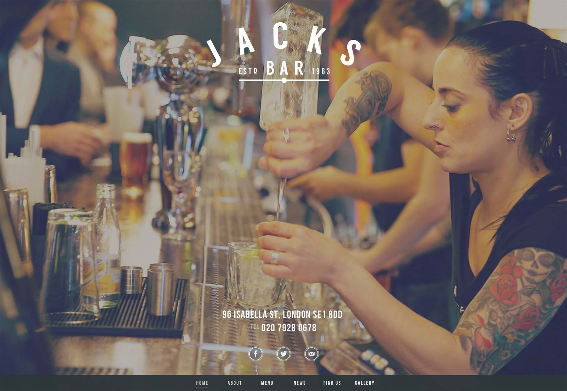
Remember that one time someone said “Less is more?” He was talking about the number of pages on your website these days. Many sites are using one page design or a simplified multi-page design. There are two reasons brands are loving this trend: first, users like simplicity, the easier it is for them to find what they’re looking for on your site the better; second, mobile traffic is reportedly responsible for more than 40 percent of all Internet traffic. If the website in question is more geared to mobile users — say, a restaurant site — it could be a lot more. A great example of this style is Jacks Bar, a restaurant and bar in London. As more mobile devices hit the market, scrolling will become more useful than clicking.
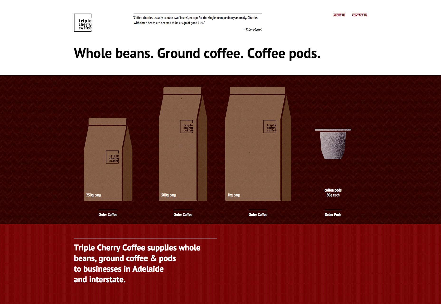
Triple Cherry Coffee is another great example of a one page design that has all of the information visitors need without any of the clutter. It only has two navigation links and the both link to areas on that one page.
2. Nothing less than responsive
Responsive websites — those that fit to the screen of whatever device the user is viewing the site on — are huge and they aren’t going anywhere soon. In the past, brands would sometimes design separate sites for mobile device users and for desktop users. With so many mobile devices on the market with varying screen sizes, that’s just not an efficient way to do it. In terms of SEO, search engines prefer to index only one URL for one site. Those who aren’t using responsive design need to have separate SEO campaigns for each URL. At this point, any designer working on current projects will look dated offering anything that's not responsive.
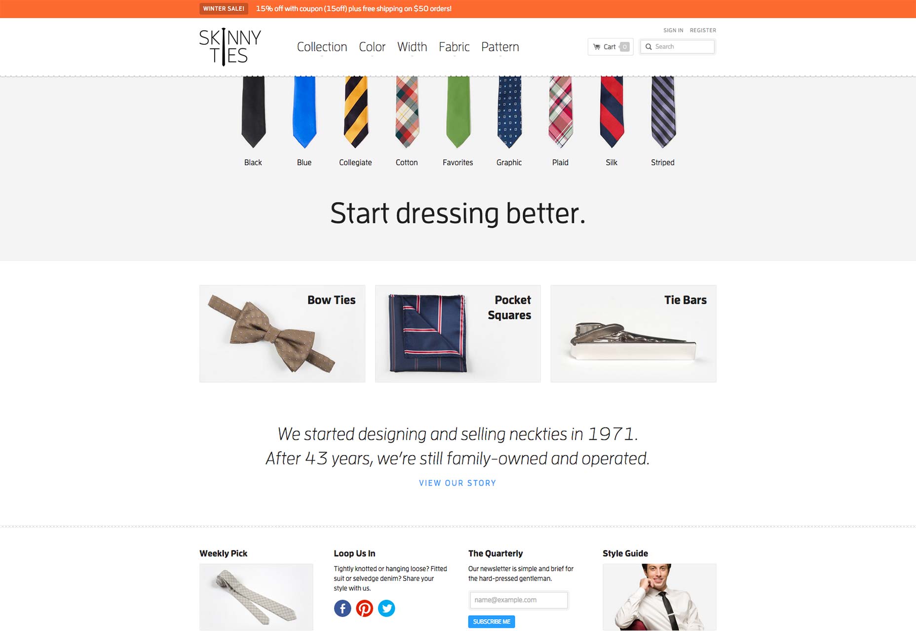
Skinny Ties is an extremely responsive website design that works well on any screen size. From the images to the copy, the site retains its look and feel for the discerning tie shopper.
3. Personalized user experiences
Website cookies are nothing new but their use has evolved over the years. Now designers are using them to make pop-ups work more effectively, customize advertising experiences, and personalize the overall user experience. Online retailers are especially well-positioned to take advantage of this.
Let’s say you have a website that sells promotional gifts. Your core customer is an office manager or a small business owner looking for items for their clients or employees. That’s not a decision that necessarily gets made the first time he visits your site. By taking advantage of personalized user experience design, you can make sure that the experience picks right back up where he left off on each return visit.
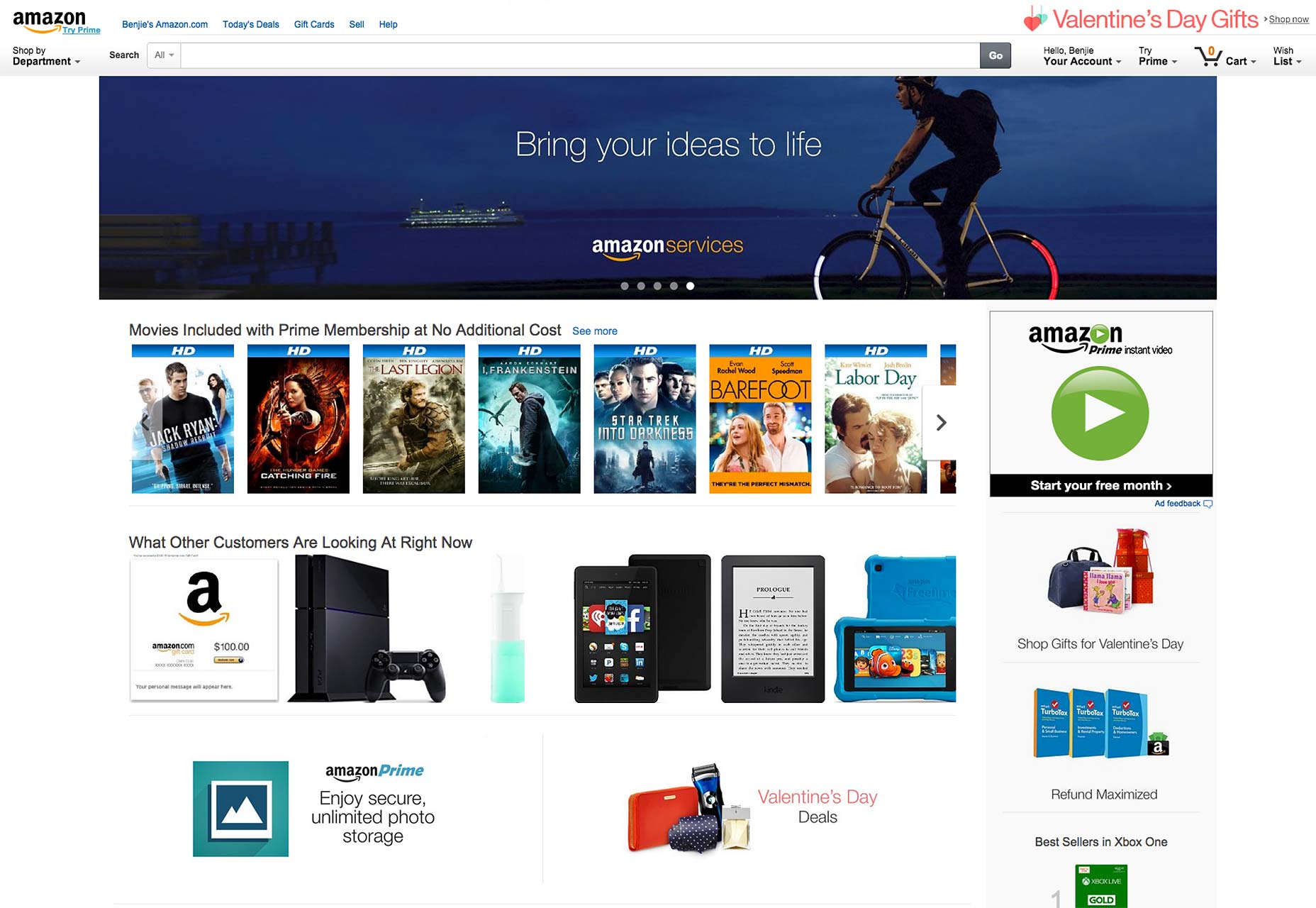
If you’re looking for an example of a website that trades on personal user experiences, you couldn’t do any better than Amazon.com. Each time a user visits the site he’s shown items he has already viewed, items related to what he’s viewed, and items Amazon has picked out personally for him. It uses location, buying activity, and other data to make this happen.
4. Big photographic elements
Storytelling is huge in design. Using content and images to lead users on a journey from point A to point B has proven beneficial to conversion rates. Overlaying large photo elements with text and user interface elements also gives a texture that makes it more interesting to look at and interact with. The proliferation of devices with high resolution displays has made this more effective than ever.
Wide Eye Creative is an excellent example of a brand telling its story with bold photographic elements. Both as backgrounds and in its portfolio section, the images draw your eye and set the tone.
Portfolio sites particularly benefit from this design tool but retail sites can use it in smart ways, too. The trick is to use high resolution images of eye-catching shots that also tell the brand’s story using the product or inspiration in an interesting way.

Richard Larson


Read Next

15 Best New Fonts, July 2024

20 Best New Websites, July 2024

Top 7 WordPress Plugins for 2024: Enhance Your Site's Performance

Exciting New Tools for Designers, July 2024

3 Essential Design Trends, July 2024

15 Best New Fonts, June 2024

20 Best New Websites, June 2024

Exciting New Tools for Designers, June 2024

3 Essential Design Trends, June 2024

15 Best New Fonts, May 2024

How to Reduce The Carbon Footprint of Your Website
