

1. Give yourself space
Contrary to popular belief, typography isn’t about the arrangement of little squiggly lines on a screen; typography is largely about the space within and around them. [pullquote]Typography owes far less to letterforms themselves, than to the space that they frame[/pullquote] To understand this, it helps to understand where fonts came from: the hole in the middle of an ‘o’ (and a ‘b’, ‘c’, ‘p’, etc.) is called a “counter.” When fonts were being carved out of metal for use in the original printing presses, those counters were created by a metal punch that was carved and then driven into a plate. The first type designers were actually working with the shapes that wouldn’t print. Typography owes far less to letterforms themselves, than to the space that they frame. When we talk about hierarchy, we usually mean <h1> through to <p>, and possibly on to <h6>. But there’s an additional hierarchy that affects the flow of a line, or paragraph, and that’s the spacial hierarchy: the space between letters is less than the space between words, the space between words is less than the space between lines, and forth. For optimum readability on mobile, pay special attention to spacial hierarchy, the gestalt-style grouping of characters into words, lines, and paragraphs is all the more essential in natural light.2. Get the measure
Measure is the length of a line of text. Or, more accurately it’s the ideal length for a line of text, as it’s rare that every line fits exactly. The generally accepted, ideal measure for comfortable reading is around 65 characters. The physical length of the measure will depend on the design of the typeface, the tracking (see below), and the exact text you’re using. The first 65 characters of this article, set in PT Serif are 26.875em wide, in Open Sans, 28.4375em, in Ubuntu, 27.3125em; if I’d added italics, small caps, or a dozen other typographic details it would vary further. It’s rare that 65 characters extend to the edge of a desktop browser, but on most mobile devices 65 characters (if displayed large enough to be legible) extends beyond the boundaries of the browser. Consequently, for mobile devices you’re forced to shrink your measure. There’s no commonly accepted standard for measure on a mobile screen, however traditionally, narrow columns of text in newspapers or magazines aspire to 39 characters. As this ideal measure has been tested over centuries, it serves us well for mobile typography.3. Loosen, then tighten leading
Leading is the space between lines, and when set too tightly, makes the saccade jump from the end of one line to the start of the next difficult to follow. When set too loosely, gaps between words will start to line up, creating what are usually referred to as rivers, interrupting the smooth flow of the line.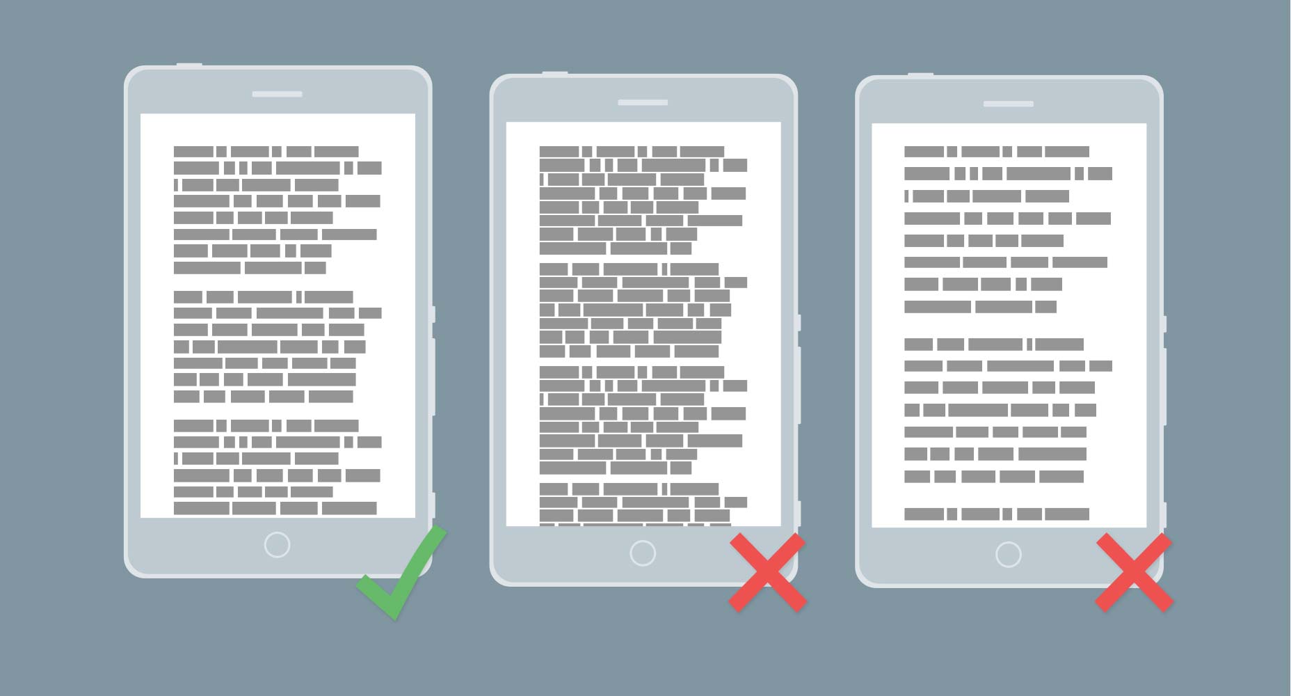 l–r: ideal leading, too tight, too loose.
The usual standard for leading is around 1.4em, however in my experience that’s too tight for screens: one of the key characteristics of a typeface that works well on screen is large counters, and large counters require a little extra leading to maintain the spacial hierarchy.
Reversing that rule, a shorter measure requires less leading. So whilst you’ll probably set your leading a little looser for desktop styles, remember to tighten it for mobile screens.
l–r: ideal leading, too tight, too loose.
The usual standard for leading is around 1.4em, however in my experience that’s too tight for screens: one of the key characteristics of a typeface that works well on screen is large counters, and large counters require a little extra leading to maintain the spacial hierarchy.
Reversing that rule, a shorter measure requires less leading. So whilst you’ll probably set your leading a little looser for desktop styles, remember to tighten it for mobile screens.
4. Find the sweet spot
All fonts have at least one sweet spot; a combination of the size at which they reproduce best on screen, and the point at which the anti-aliasing applied in the browser distorts the design of the typeface as little as possible. The sweet spot is usually the point at which most strokes line up with the pixel grid — pixel fonts, if you remember those, only worked when sized to their sweet spot. Setting a font to its sweet spot results in greater contrast. Contrast is particularly important when designing for mobile because of the potential for distracting glare outside of your subtly lit device lab. You’ll find that minor adjustments to leading will push and pull lines off whole pixels. In my opinion, contrast trumps leading for mobile screens, so if you have to compromise leading to keep lines on whole pixels, do so. The standard approach for designers is to lay type out using a baseline grid, but for mobile we need to use the x-height instead (the x-height is literally the height of the lowercase ‘x’). We know from legibility studies that the brain recognizes the top of words, not the bottom, so to achieve a greater saccade flow, we need to ensure that the top of our characters are most closely aligned to pixels.5. Don’t lose your rag
A rag, is the edge of a block of text. Most of what you read is aligned left (at least for latin-based languages) resulting in a ragged right edge. When your eyes jump from one end of a line to the next, the brain is better able to judge the angle and distance of the next jump, if all the jumps are consistent — think of it as running across stepping-stones, it’s a lot faster if they’re spaced consistently. For this reason, the left edge of your text should be flat, with each line beginning in the same place (the exact opposite is true for languages that read right to left). As a result you should never center align more than two or three lines of text. Often, text is justified, meaning that the words on the line are spaced equally so that there’s no rag on either side. (I suspect that justified text is fashionable because responsive design has taught designers to think in blocks.) Justified text results in inconsistent whitespace, and in the worst cases leads to a couple of words on a line, which is seriously jarring. The problem with justified text is exacerbated by shorter measure, so justified text can be unreadable on mobile.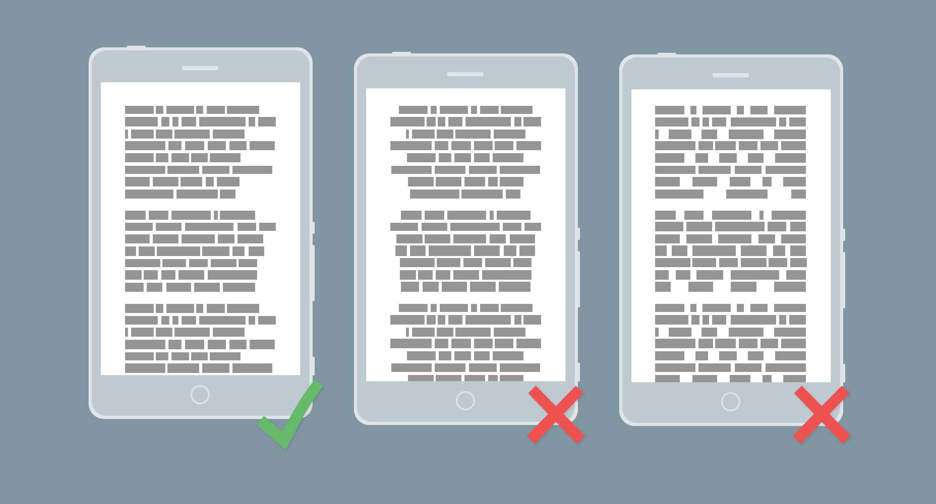 l–r: left aligned, center aligned, justified.
If neatness is really important to you then hyphenate the text to soften the rag, but never justify text on mobile.
Ragged right text has an additional benefit on mobile: text is often read in distracting situations and readers frequently glance away from text — to check a station name, or answer a call. A rag creates a random shape down the right-hand column that helps the eye relocate its last position, with minimal re-reading.
l–r: left aligned, center aligned, justified.
If neatness is really important to you then hyphenate the text to soften the rag, but never justify text on mobile.
Ragged right text has an additional benefit on mobile: text is often read in distracting situations and readers frequently glance away from text — to check a station name, or answer a call. A rag creates a random shape down the right-hand column that helps the eye relocate its last position, with minimal re-reading.
6. Reduce contrast
Whilst we want to encourage contrast between text and background, we want to reduce it between different levels of type. [pullquote]On mobile, substantially less text is visible and so contrast becomes exaggerated[/pullquote] The reason for this is that our brains judge importance based on context. Your headings may be two, or even three, times the size of your body text on desktop, and that works because more text is on the screen. On mobile, substantially less text is visible and so contrast becomes exaggerated. Most designers use a Fibonacci sequence of some kind to size text. For mobile, tighten the ratios up to reduce the contrast of type sizes. For example, if you’re using the golden ratio to increase size you’re multiplying by 1.618. For mobile, take the smaller proportion and multiply by 1.382 instead.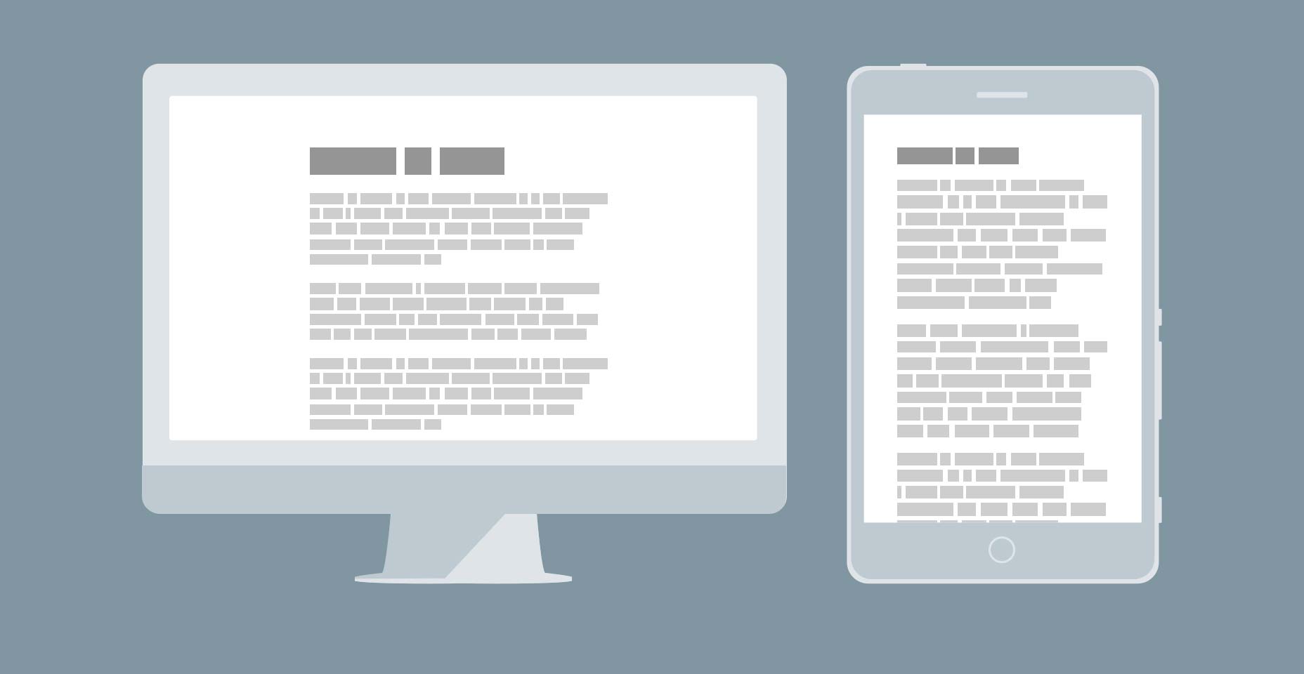 Desktop screens tolerate more extreme typographic scales than mobile screens.
7. Adjust tracking to scale
When we adjust our font sizes for mobile, we need to be aware of the necessary changes in tracking. (Let me preface this by saying that you should not be adjusting kerning. Kerning is the spacing of two letter pairs so that the space between them is optically consistent with the space between the other characters. Kerning was added to the font when it was built, and it probably took months. If you’ve selected a professionally built font, then it’s been done correctly, and if you believe that it hasn’t been done correctly, find a different font.) Tracking is not kerning. Tracking is the letter spacing applied to all characters in the font. You usually shouldn’t adjust tracking either. The exceptions to that rule are for large text, such as headings and small text, such as footnotes. Larger text requires less tracking, and smaller text requires more tracking. The former is due to grouping, and the latter is to benefit contrast. If you’ve made changes to headings, or if you’re using a display typeface that typically have tighter tracking, you may need to loosen the tracking a little as you scale it down.Summary
Typography is a craft that designers spend a lifetime honing, precisely because every text, every typeface, and every technology brings new challenges. There are no hard and fast rules that will always work in every given situation. When you’re aspiring to readability, there are three principles you need to bear in mind: a smooth flow along lines, a clear spacial hierarchy, and adequate contrast. This is especially true for the mobile web. There’s no rule that can’t be overruled on the evidence of your own eyes, but the guidelines here will serve as an ideal starting point for beautifully laid out text on mobile devices.Ben Moss
Ben Moss has designed and coded work for award-winning startups, and global names including IBM, UBS, and the FBI. When he’s not in front of a screen he’s probably out trail-running.


Read Next

15 Best New Fonts, July 2024
Welcome to our monthly roundup of the best fonts we’ve found online in the last four weeks. This month, there are fewer…
By Ben Moss

20 Best New Websites, July 2024
Welcome to July’s round up of websites to inspire you. This month’s collection ranges from the most stripped-back…

Top 7 WordPress Plugins for 2024: Enhance Your Site's Performance
WordPress is a hands-down favorite of website designers and developers. Renowned for its flexibility and ease of use,…
By WDD Staff

Exciting New Tools for Designers, July 2024
Welcome to this July’s collection of tools, gathered from around the web over the past month. We hope you’ll find…

3 Essential Design Trends, July 2024
Add some summer sizzle to your design projects with trendy website elements. Learn what's trending and how to use these…

15 Best New Fonts, June 2024
Welcome to our roundup of the best new fonts we’ve found online in the last month. This month, there are notably fewer…
By Ben Moss

20 Best New Websites, June 2024
Arranging content in an easily accessible way is the backbone of any user-friendly website. A good website will present…

Exciting New Tools for Designers, June 2024
In this month’s roundup of the best tools for web designers and developers, we’ll explore a range of new and noteworthy…

3 Essential Design Trends, June 2024
Summer is off to a fun start with some highly dramatic website design trends showing up in projects. Let's dive in!

15 Best New Fonts, May 2024
In this month’s edition, there are lots of historically-inspired typefaces, more of the growing trend for French…
By Ben Moss

How to Reduce The Carbon Footprint of Your Website
On average, a web page produces 4.61 grams of CO2 for every page view; for whole sites, that amounts to hundreds of KG…
By Simon Sterne

20 Best New Websites, May 2024
Welcome to May’s compilation of the best sites on the web. This month we’re focused on color for younger humans,…