

Branding for the Web
The new look of the publication primarily centered on three, crucial areas:- its logo;
- its suite of fonts;
- its abbreviated social media logo.
Revised logo
Readers will be taken by the most notable of all three changes, which is the update to the magazine’s logo. Whereas the old logo had letters that were spaced together very tightly — and, as a result, was harder to read — the new logo design features more generous tracking. This greatly increases legibility on the Web. According to an editorial by editor Jake Silverstein that takes readers behind the scenes of the revamping, “…the new logo is more modern, more graciously spaced.” Credit for this logo update goes to typographer Matthew Carter.
New typefaces
The changes to typeface didn’t stop at the logo of the magazine. The publication has also introduced a whole new suite of original fonts. The typefaces were the creation of Henrik Kubel from A2-Type. The magazine got rid of their entire slew of old fonts to make room for this sweeping design change. As you can see, the new collection of fonts boasts slab serifs a more modern sans serif face and pleasing serifs.
According to the same editorial by Silverstein, “Not a single letter in this relaunch issue has ever seen the light of day. They are infants. Treat them gently.” Interestingly, none of the new fonts has even been named yet. The inside joke at the magazine is that they were close to christening their new typeface “really crappy font” to prevent another outfit from ever using it, should the magazine somehow let its exclusivity get compromised.
All jokes aside, though, the reason behind the new direction in typeface is a practical one: The editor wanted to ensure that The New York Times Magazine had a more literary feel — that makes sense when you consider how the magazine is substantially different from its sister newspaper.
Unlike the paper, whose stock in trade is shorter, more journalistic articles that focus on reporting and features, the magazine’s aim has always been to publish “work with more writerly ambition than you usually see in newspapers.” By using this new collection of fonts for this publication, Silverstein is able to make readers distinguish between it and coverage found in The New York Times’ online editions. Surprisingly, Silverstein admits that, up to this point, many of the magazine’s readers had a hard time understanding that they were reading content separate from The New York Times’ articles.
As you can see, the new collection of fonts boasts slab serifs a more modern sans serif face and pleasing serifs.
According to the same editorial by Silverstein, “Not a single letter in this relaunch issue has ever seen the light of day. They are infants. Treat them gently.” Interestingly, none of the new fonts has even been named yet. The inside joke at the magazine is that they were close to christening their new typeface “really crappy font” to prevent another outfit from ever using it, should the magazine somehow let its exclusivity get compromised.
All jokes aside, though, the reason behind the new direction in typeface is a practical one: The editor wanted to ensure that The New York Times Magazine had a more literary feel — that makes sense when you consider how the magazine is substantially different from its sister newspaper.
Unlike the paper, whose stock in trade is shorter, more journalistic articles that focus on reporting and features, the magazine’s aim has always been to publish “work with more writerly ambition than you usually see in newspapers.” By using this new collection of fonts for this publication, Silverstein is able to make readers distinguish between it and coverage found in The New York Times’ online editions. Surprisingly, Silverstein admits that, up to this point, many of the magazine’s readers had a hard time understanding that they were reading content separate from The New York Times’ articles.
Redesigning for the Web
That brings us to the next goal that the editor wanted to accomplish in this redesign: making the magazine more friendly to readers on the Web, one thing that the magazine struggled to successfully pull off…until now, they hope. [pullquote]an increasing number of Times’ readers have switched to digital-only[/pullquote] Traditionally, The New York Times Magazine, for all its longevity, has only always been a so-called “in-betweener.” It was both trapped in the middle of the Times’ bulky Sunday print edition, as well as being a “long-form subsite” on the Times’ website. Because an increasing number of Times’ readers have switched to digital-only, Silverstein wanted to build up the magazine’s branding on the Internet, through its web edition. That’s where having a new family of custom typeface will prove so instrumental.Shorter social media logo
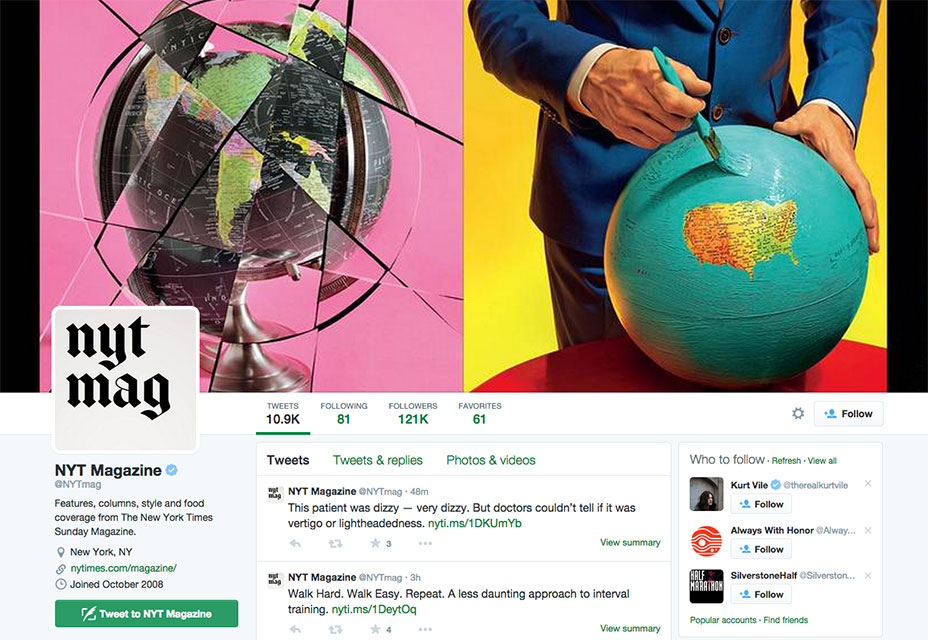
As part of this new strategy to build up the web presence of the publication, it’s no surprise that Silverstein also focused on social media in the redesign, particularly the magazine’s social media logo. Such a condensed version of the magazine’s logo is perfect for more casual settings like its Twitter page. Whereas the longer, redesigned logo with the more generous tracking would be overwhelming for a smaller profile photo, the condensed version is nicely truncated for a social media audience that’s looking for brevity.
Cleaner page layout
Now, a part of the redesign of the magazine also goes beyond just the typography. In keeping up with the design trends of minimalism in the last, few years, Silverstein also decided to introduce a much cleaner layout to the magazine’s pages. Sporting a more stripped-down look, the publication’s pages now feature fewer columns than in the past. Currently, readers will only see seven columns, but past editions featured as many as 12. The redesign team decided that having 12 columns on a page made the magazine appear too congested and excessively symmetrical. By reducing the number of columns, each page can now “breathe,” which is vital to providing the design with a cleaner appearance. [pullquote]trying to make itself more friendly to Web readers, the magazine is striving to reflect the environment around it[/pullquote] For a publication that’s been around for more than a century—and with no signs of slowing down—The New York Times Magazine sure hasn’t been resistant to change, to its credit. Its last redesign was almost four years ago, and the editor’s decision for another redesign so soon after is a sign of the publication’s commitment to keeping up with the times (no pun intended). The mission of the redesign was to make the magazine stand out and emerge from the shadow of its more well-known parent, The New York Times. By constantly evolving in its design approach, The New York Times Magazine ensures that it still stays relevant to readers, even 119 years after first being published. By updating its look to simpler and cleaner minimalism while also trying to make itself more friendly to Web readers, the magazine is striving to reflect the environment around it.Marc Schenker
Marc’s a copywriter who covers design news for Web Designer Depot. Find out more about him at thegloriouscompanyltd.com.


Read Next

15 Best New Fonts, July 2024
Welcome to our monthly roundup of the best fonts we’ve found online in the last four weeks. This month, there are fewer…
By Ben Moss

20 Best New Websites, July 2024
Welcome to July’s round up of websites to inspire you. This month’s collection ranges from the most stripped-back…

Top 7 WordPress Plugins for 2024: Enhance Your Site's Performance
WordPress is a hands-down favorite of website designers and developers. Renowned for its flexibility and ease of use,…
By WDD Staff

Exciting New Tools for Designers, July 2024
Welcome to this July’s collection of tools, gathered from around the web over the past month. We hope you’ll find…

3 Essential Design Trends, July 2024
Add some summer sizzle to your design projects with trendy website elements. Learn what's trending and how to use these…

15 Best New Fonts, June 2024
Welcome to our roundup of the best new fonts we’ve found online in the last month. This month, there are notably fewer…
By Ben Moss

20 Best New Websites, June 2024
Arranging content in an easily accessible way is the backbone of any user-friendly website. A good website will present…

Exciting New Tools for Designers, June 2024
In this month’s roundup of the best tools for web designers and developers, we’ll explore a range of new and noteworthy…

3 Essential Design Trends, June 2024
Summer is off to a fun start with some highly dramatic website design trends showing up in projects. Let's dive in!

15 Best New Fonts, May 2024
In this month’s edition, there are lots of historically-inspired typefaces, more of the growing trend for French…
By Ben Moss

How to Reduce The Carbon Footprint of Your Website
On average, a web page produces 4.61 grams of CO2 for every page view; for whole sites, that amounts to hundreds of KG…
By Simon Sterne

20 Best New Websites, May 2024
Welcome to May’s compilation of the best sites on the web. This month we’re focused on color for younger humans,…