

1) Directional cues
As human beings, we’re just hardwired to respond to eye direction as a powerful way of cuing us. Think of it: When you see someone looking at something not in your field of vision, you’re automatically curious about just what he’s looking at. This same principle of directional cuing can be applied seamlessly to the website you build for your clients. Yes, directional cues can be the more obvious arrows and even fingers pointing at call to action buttons, but for something truly unique and relatable to your site visitors, go with a picture of a person looking at your call to action buttons instead. You can’t go wrong. For a clever example of this, we turn to Salesforce’s homepage. Salesforce is the worldwide, cloud computing company from San Francisco. In particular, we want you to glance at the one mega image on the homepage: It seems like a woman looking at her smartphone, about to perform a mobile transaction.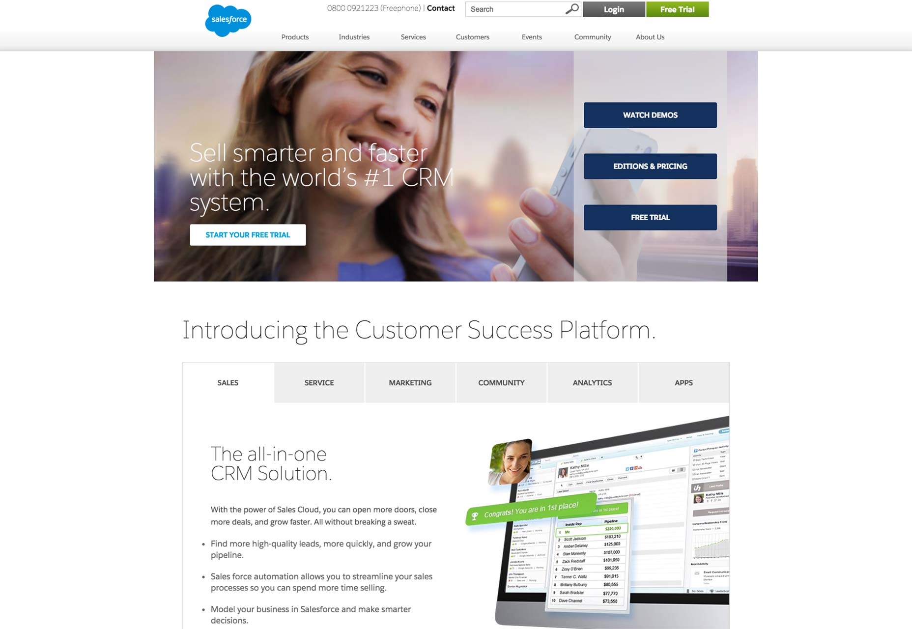 While this is certainly a plausible interpretation, the image also doubles as a stealthy-yet-powerful directional clue. When site visitors see the woman looking at the phone in her hand, their eyes will naturally follow her gaze to the right of the homepage. As they do, their eyes will inevitably land on the three call to action buttons next to her face and hand.
Thanks to where her gaze is pointing, leads will be likelier to notice the call to action buttons. At the end of the day, that brings more conversions and a greater number of sales to the website.
While this is certainly a plausible interpretation, the image also doubles as a stealthy-yet-powerful directional clue. When site visitors see the woman looking at the phone in her hand, their eyes will naturally follow her gaze to the right of the homepage. As they do, their eyes will inevitably land on the three call to action buttons next to her face and hand.
Thanks to where her gaze is pointing, leads will be likelier to notice the call to action buttons. At the end of the day, that brings more conversions and a greater number of sales to the website.
2) Really simple button design
When you make your buttons as simple as possible, you eliminate chances that your site visitors, buyers, and readers will get confused. When they get confused, they usually won’t follow through on the action that your button copy wants them to. So keeping the client’s button design minimal is what all web designers should aim for. Let’s look at Twining’s site to see how a brand can do this right.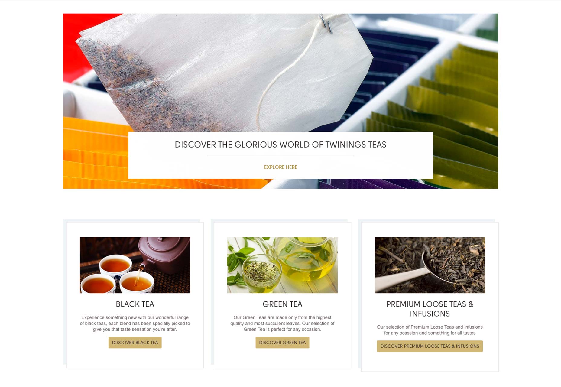 On the homepage above the fold, we see a range of simple buttons in brand colors, that clearly communicate exactly what you’ll achieve by clicking on them. The buttons also look like buttons, thanks to their rounded-rectangular design, and the color contrast of black on gold makes them as minimal as possible.
In short, it’s going to be nearly impossible for Twining’s shoppers to misunderstand that the buttons are call to action buttons.
On the homepage above the fold, we see a range of simple buttons in brand colors, that clearly communicate exactly what you’ll achieve by clicking on them. The buttons also look like buttons, thanks to their rounded-rectangular design, and the color contrast of black on gold makes them as minimal as possible.
In short, it’s going to be nearly impossible for Twining’s shoppers to misunderstand that the buttons are call to action buttons.
3) Well-defined microcopy
Microcopy is the star of the call to action because it uses action-oriented verbs to inspire people to move. The amount of real estate that web designers have to plan intelligent labels is very limited, so microcopy has to be short and to the point. Microcopy that lets site visitors know exactly what they’re clicking on is a winner because it doesn’t waste their time. Sometimes, microcopy can be neglected, which is unfortunate. In spite of all the attention given to the button design, colors and affordances, the copy shouldn’t have to suffer. Sites whose microcopy suffers are sites whose conversion rates suffer, too. You know you have successful microcopy when you have different call to action buttons next to each other, yet site visitors can instantly tell what the purpose of each button is.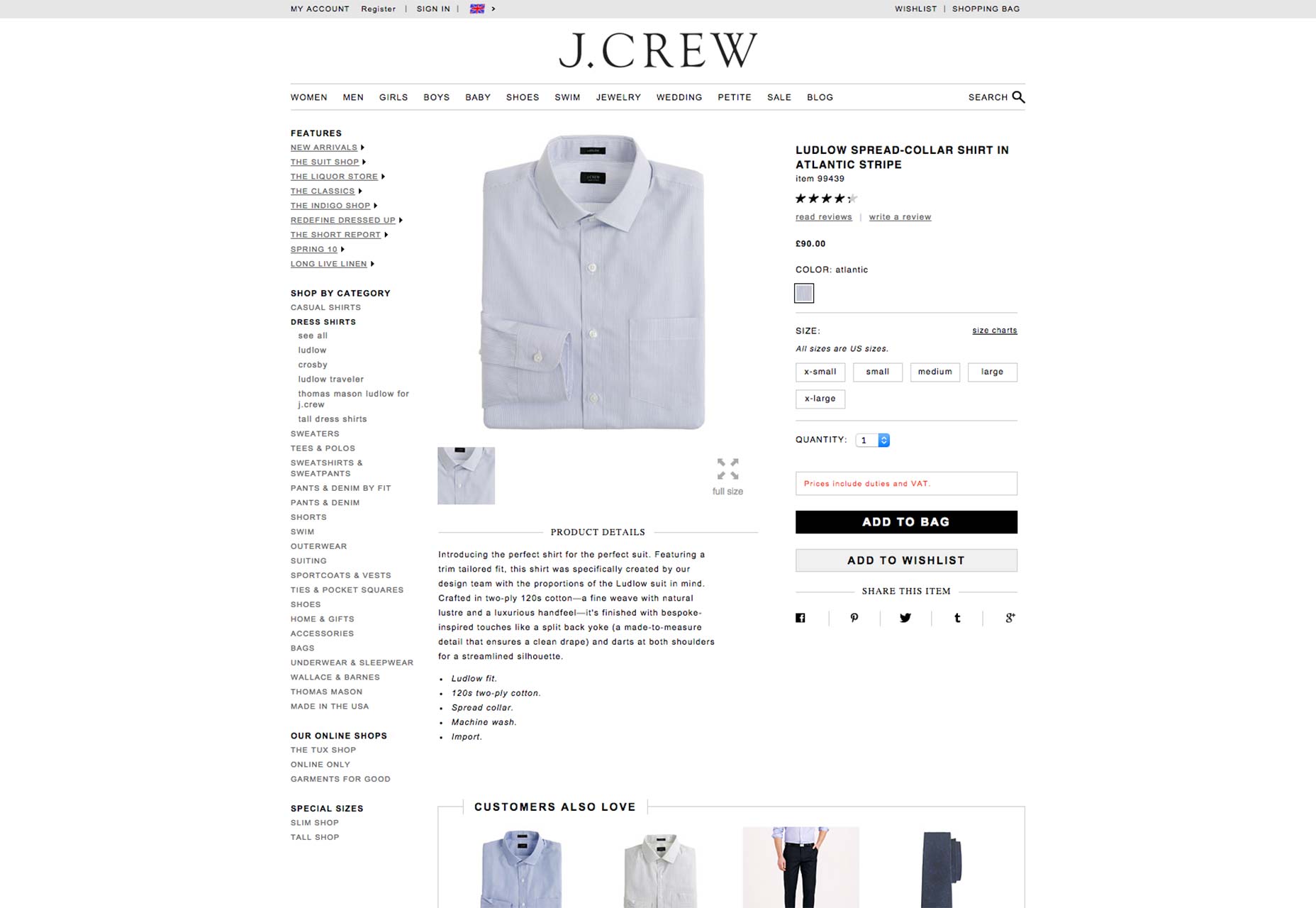 A helpful illustration of this can be found on the J. Crew product page for its spread-collar shirt. There are two buttons competing for the buyers’ attention: the “Add To Bag” and “Add To Wishlist” buttons.
Because both are very clearly labeled, though, buyers aren’t confused and can achieve their goals with more certainty than ever. Well-defined button copy that leaves no doubt as to what a user’s action will achieve is always a winner.
A helpful illustration of this can be found on the J. Crew product page for its spread-collar shirt. There are two buttons competing for the buyers’ attention: the “Add To Bag” and “Add To Wishlist” buttons.
Because both are very clearly labeled, though, buyers aren’t confused and can achieve their goals with more certainty than ever. Well-defined button copy that leaves no doubt as to what a user’s action will achieve is always a winner.
4) Color contrast
Shoppers are an unreliable bunch, which is why the user experience has to be tailored to them. In other words, buying something from your client’s e-commerce store should be the easiest and clearest thing in the world. Something as basic as color contrast can vastly improve the shopping experience for site visitors. Color contrast that works can draw your shoppers’ eyes to the call to action button and make it stand out from an otherwise noisy background. When shoppers can easily find what they need to click on to make a purchase, obviously a site’s conversion rates are going to shoot up drastically.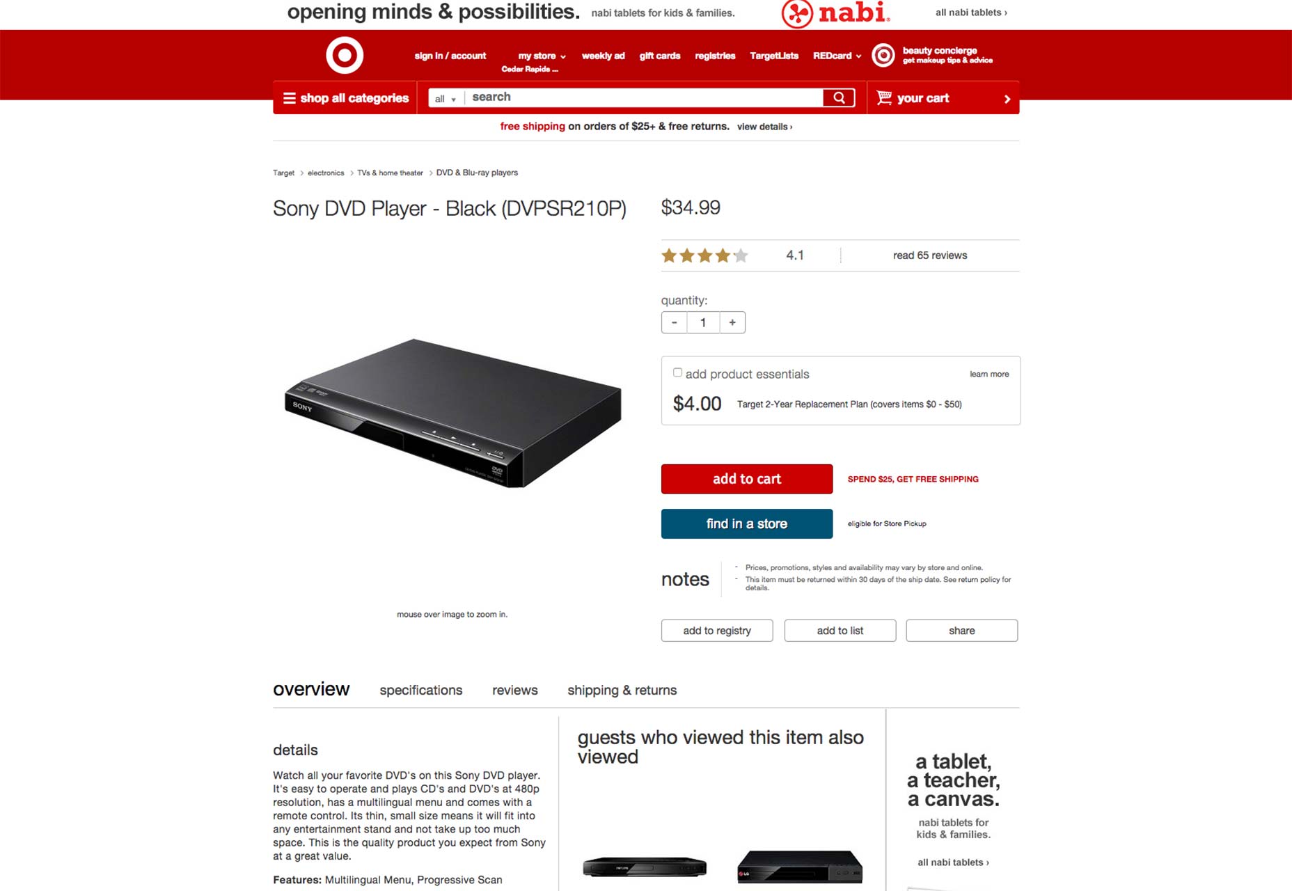 On the Target product page for a Sony DVD player, the call to action buttons — “add to cart” and “find in a store” — use color contrast to great effect. Not only is the color contrast easy to spot—white on red and white on blue, respectively—but it succeeds in drawing the buyer’s eye to the button. The fact that the background is full of white space only helps make this contrast stand out even more effectively.
The bottom line
Call to action buttons are vital to how much money your client’s site will make. All web designers have to realize that their design’s goal should always be to support more conversions. For e-commerce sites, that will be sales. For news sites, that will be sign-ups to things like newsletters and the like. The point is that conversions matter most, and call to action buttons have to support this goal all the time. That’s why a great deal of thought has to be invested in designing a call to action button. Even though it occupies a really small space on a webpage, its importance is immeasurable. Anything from the colors to the button copy to any directional cues nearby will make or break its effectiveness. To deliver for their clients, designers must look beyond just the appearance and layout of their buttons all the way to the practical side of things. Will this button increase the likelihood that leads will click through and become actual conversions? Designers who think like that do a great service to their clients, and they should be commended. Designers who don’t think this far need to improve their priorities and come through for their clients every time they’re working on a project.Marc Schenker
Marc’s a copywriter who covers design news for Web Designer Depot. Find out more about him at thegloriouscompanyltd.com.


Read Next

15 Best New Fonts, July 2024
Welcome to our monthly roundup of the best fonts we’ve found online in the last four weeks. This month, there are fewer…
By Ben Moss

20 Best New Websites, July 2024
Welcome to July’s round up of websites to inspire you. This month’s collection ranges from the most stripped-back…

Top 7 WordPress Plugins for 2024: Enhance Your Site's Performance
WordPress is a hands-down favorite of website designers and developers. Renowned for its flexibility and ease of use,…
By WDD Staff

Exciting New Tools for Designers, July 2024
Welcome to this July’s collection of tools, gathered from around the web over the past month. We hope you’ll find…

3 Essential Design Trends, July 2024
Add some summer sizzle to your design projects with trendy website elements. Learn what's trending and how to use these…

15 Best New Fonts, June 2024
Welcome to our roundup of the best new fonts we’ve found online in the last month. This month, there are notably fewer…
By Ben Moss

20 Best New Websites, June 2024
Arranging content in an easily accessible way is the backbone of any user-friendly website. A good website will present…

Exciting New Tools for Designers, June 2024
In this month’s roundup of the best tools for web designers and developers, we’ll explore a range of new and noteworthy…

3 Essential Design Trends, June 2024
Summer is off to a fun start with some highly dramatic website design trends showing up in projects. Let's dive in!

15 Best New Fonts, May 2024
In this month’s edition, there are lots of historically-inspired typefaces, more of the growing trend for French…
By Ben Moss

How to Reduce The Carbon Footprint of Your Website
On average, a web page produces 4.61 grams of CO2 for every page view; for whole sites, that amounts to hundreds of KG…
By Simon Sterne

20 Best New Websites, May 2024
Welcome to May’s compilation of the best sites on the web. This month we’re focused on color for younger humans,…