

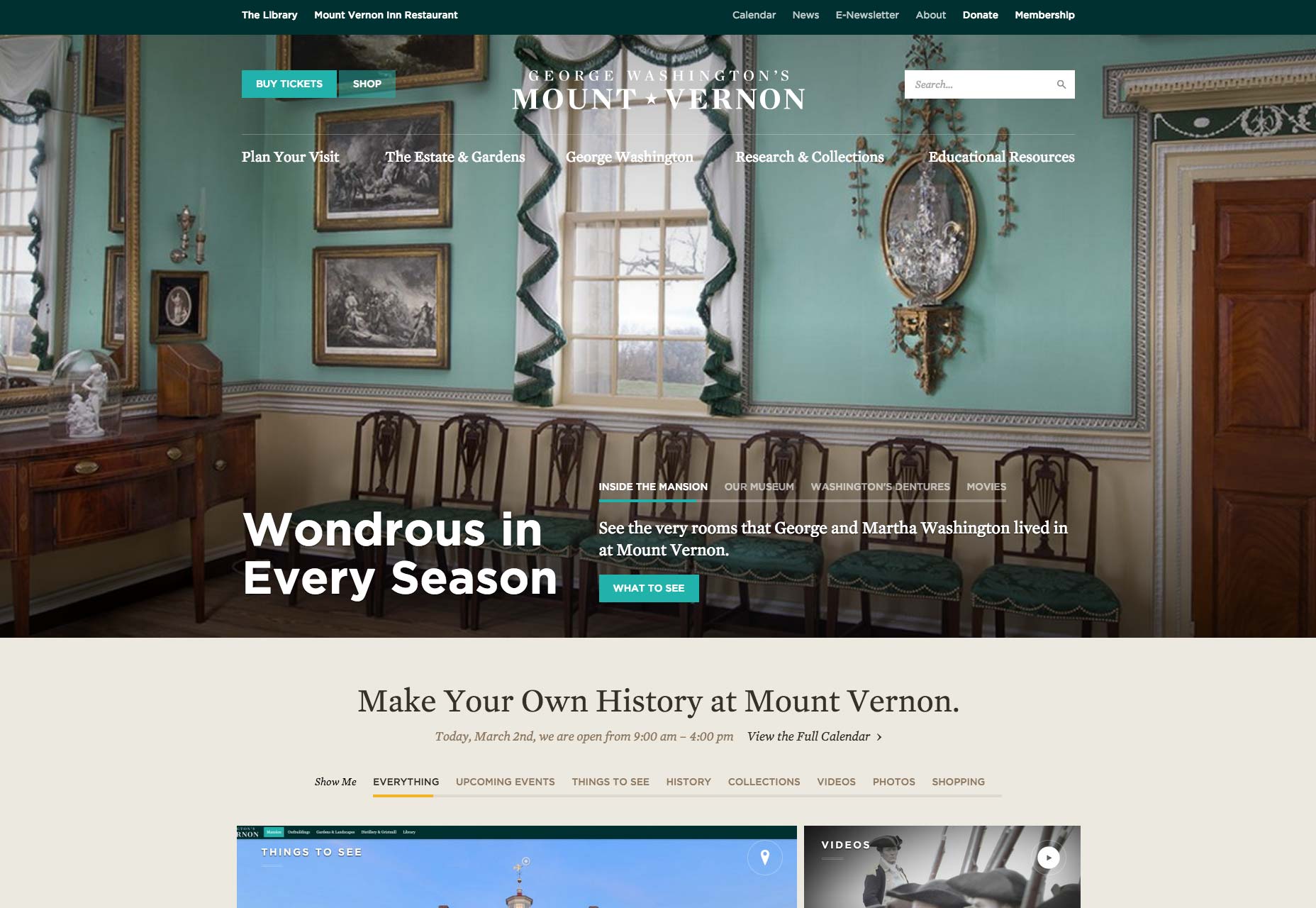
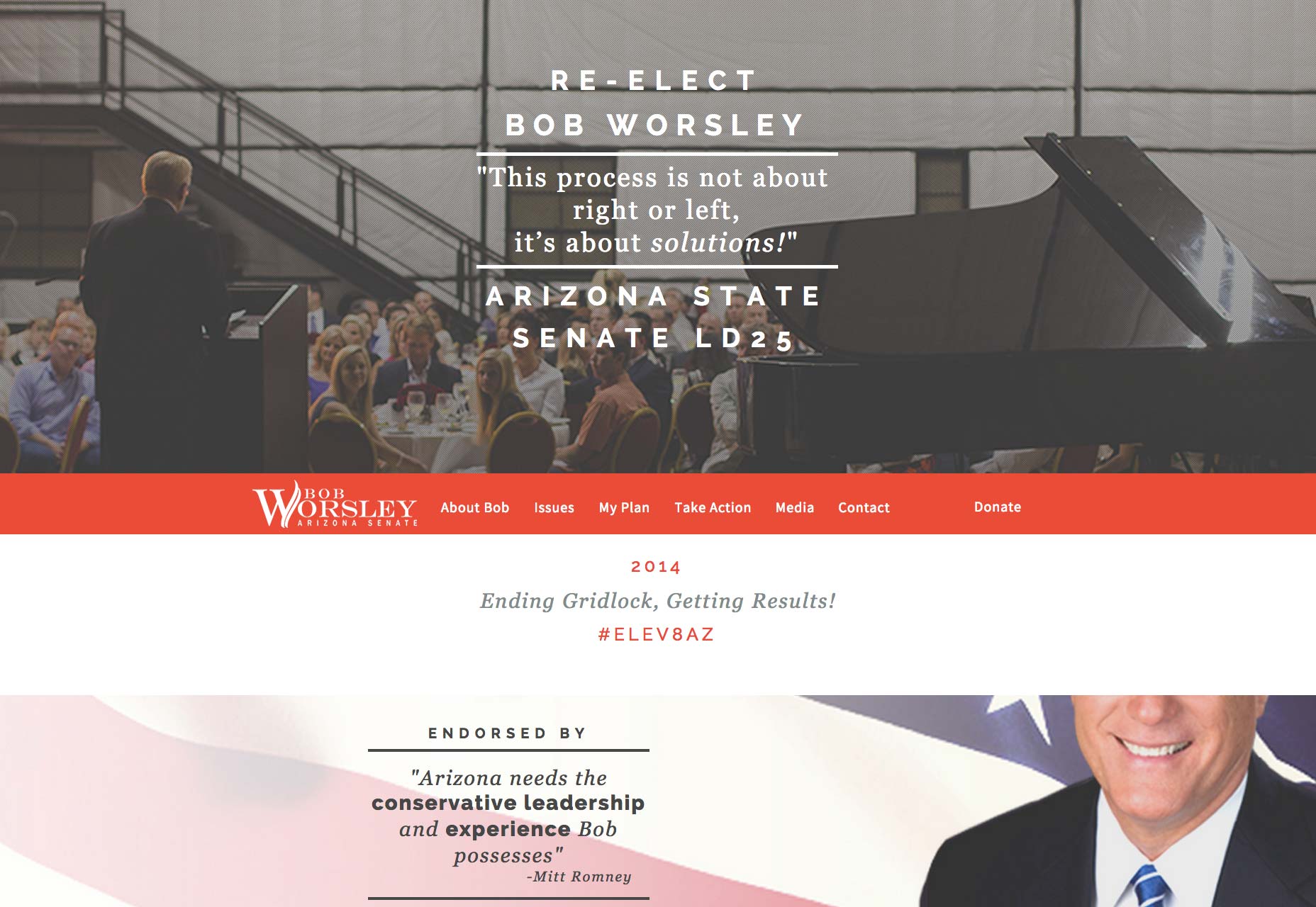
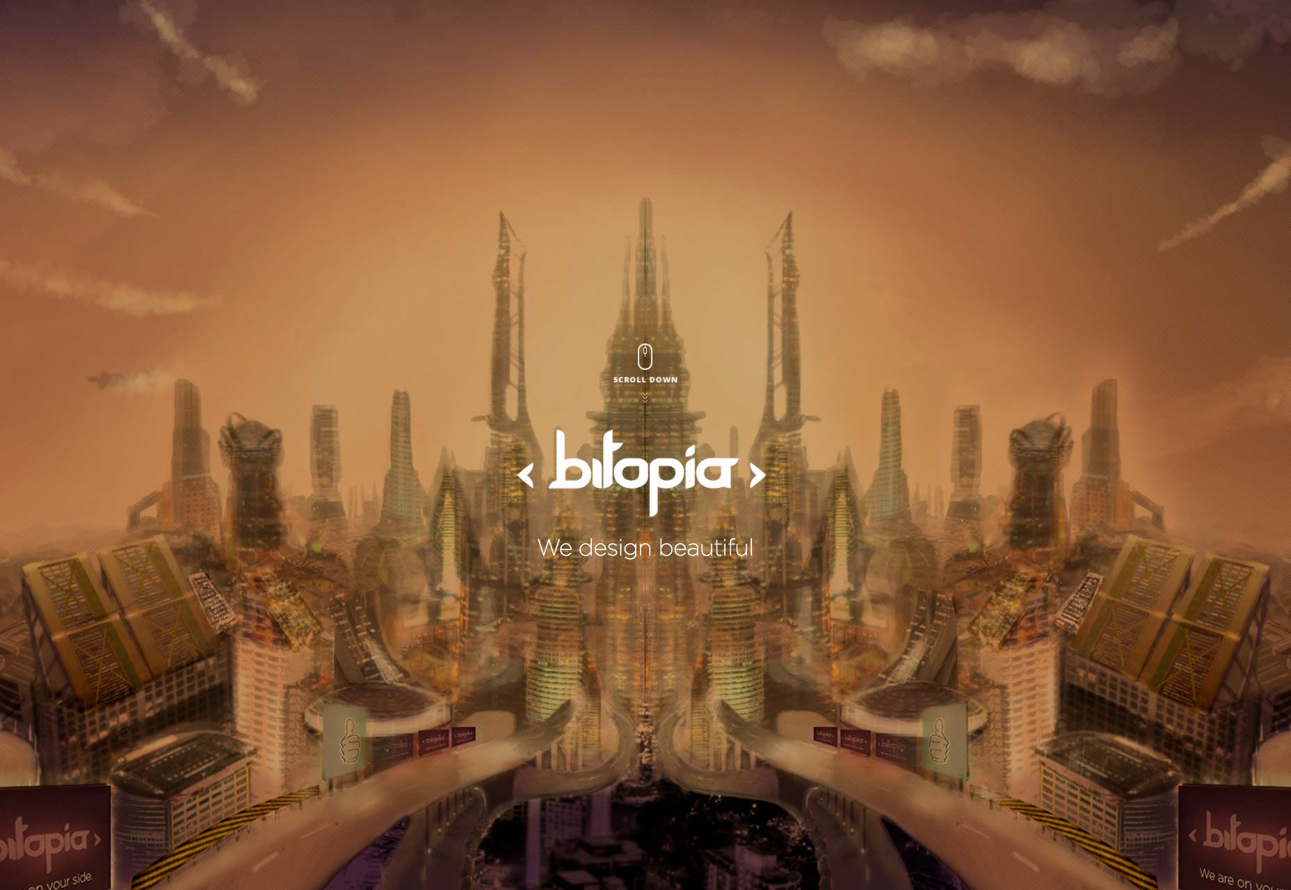
1) Super sized backgrounds
The first trend I want to consider is among the most popular. Below is a set of sites that make use of very large background photos. This is an approach that has literally been beaten to death. But that isn't to say that it should be abandoned. Like all good trends it has its place. My mission when filling this section was to find sites that didn't use the style as a crutch. Instead I wanted sites that used it with purpose, where the background photograph played a powerful roll in communicating the message of the site. Consider this as you browse these samples.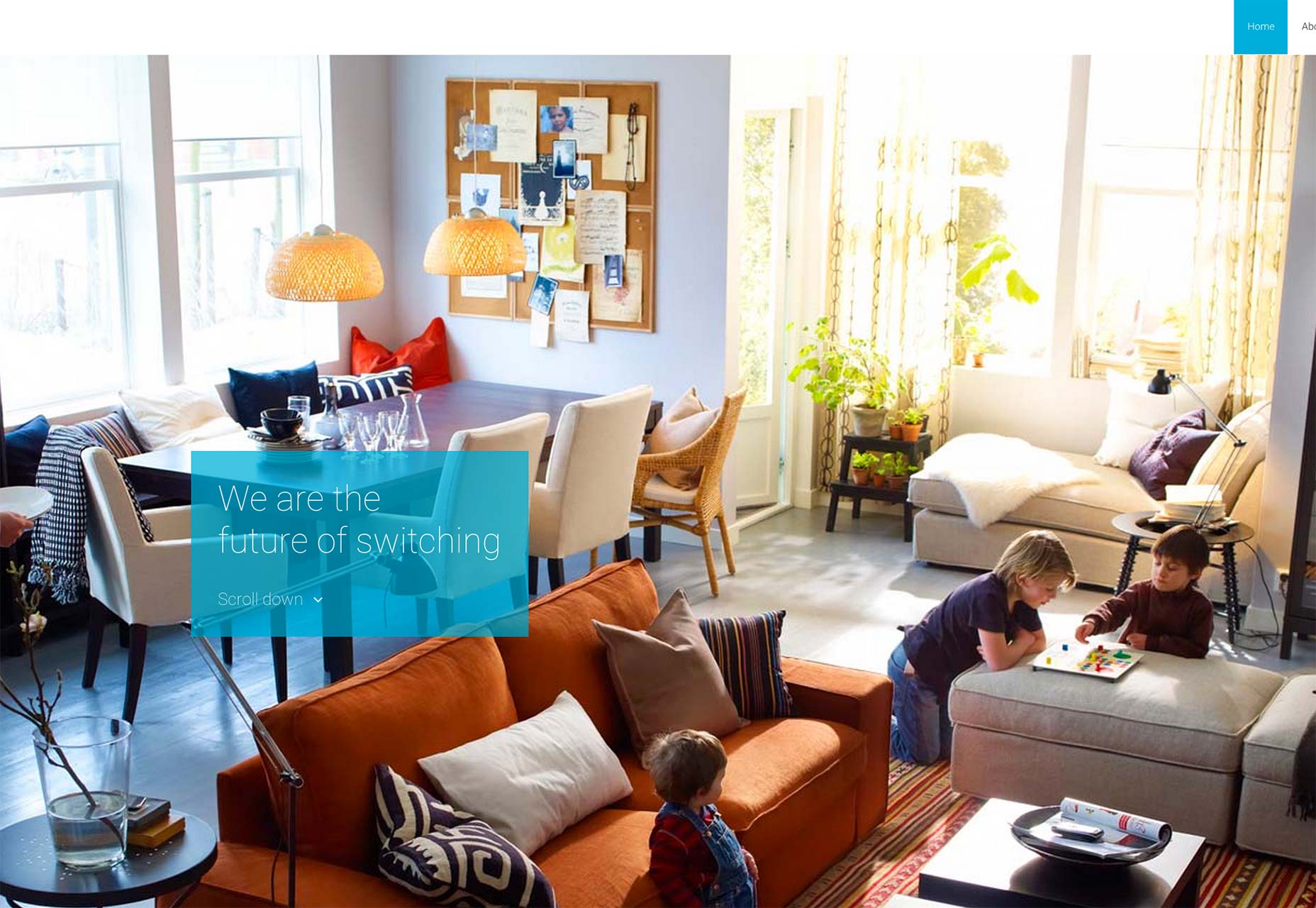

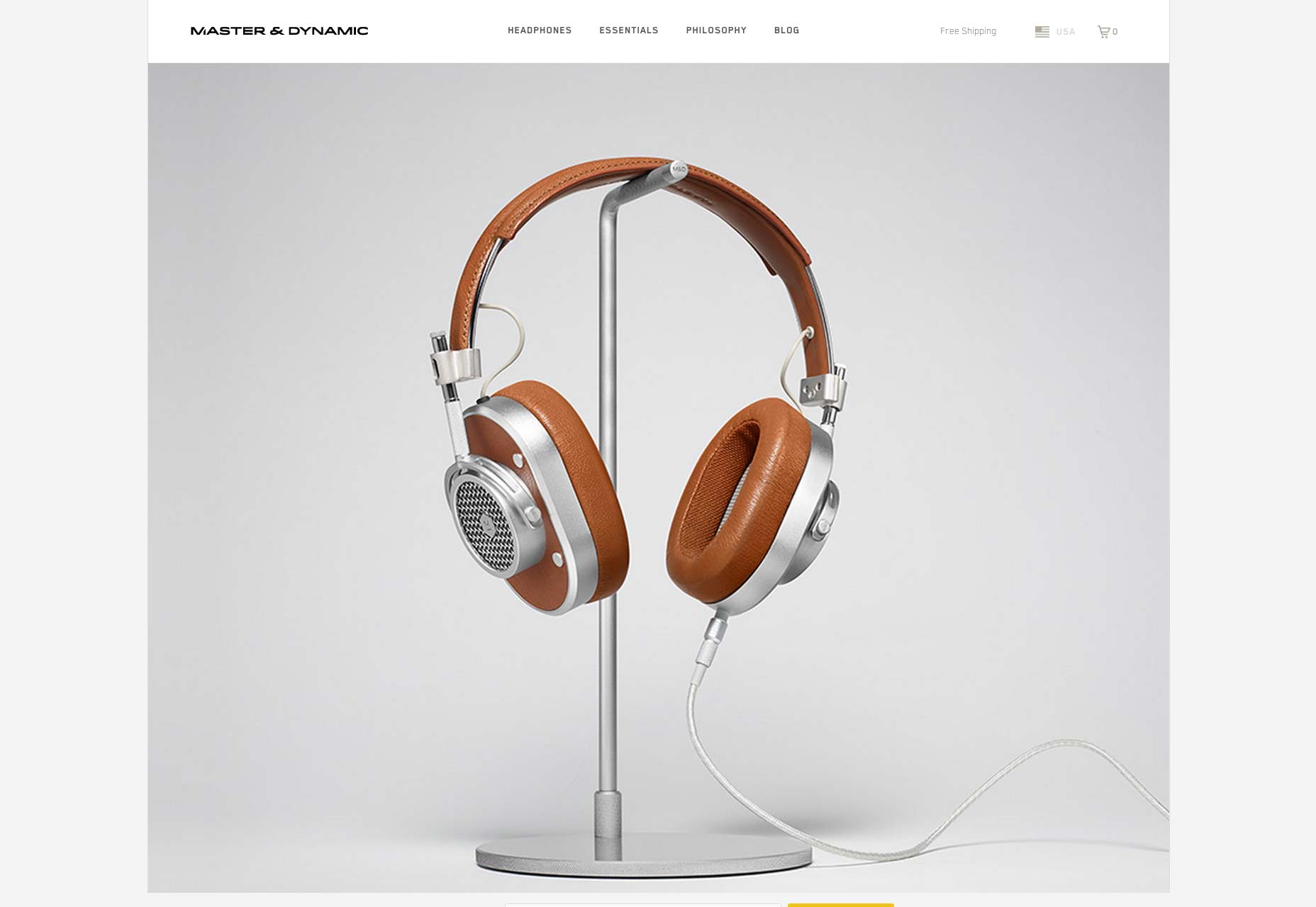
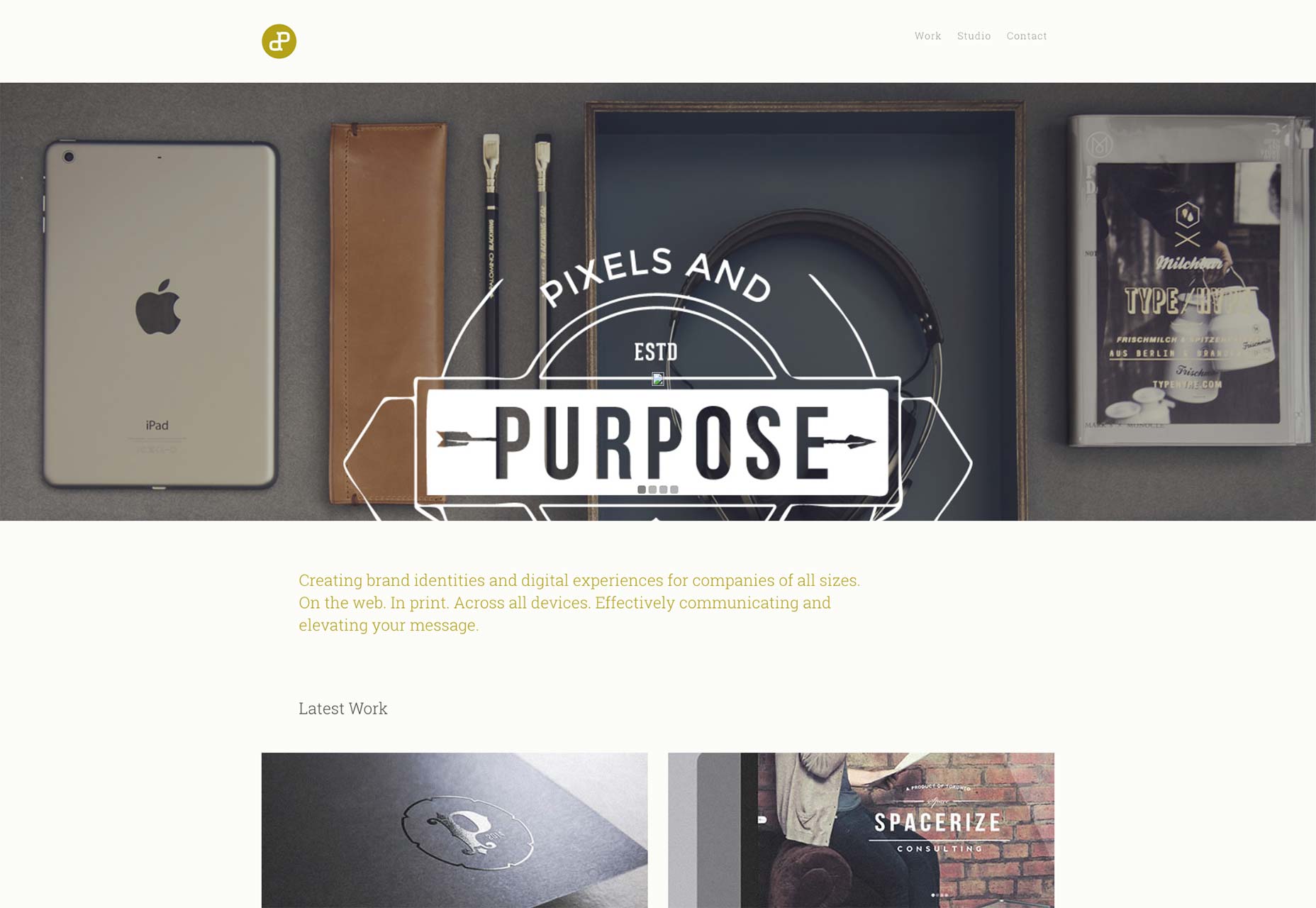
2) Backgrounds as foreground content
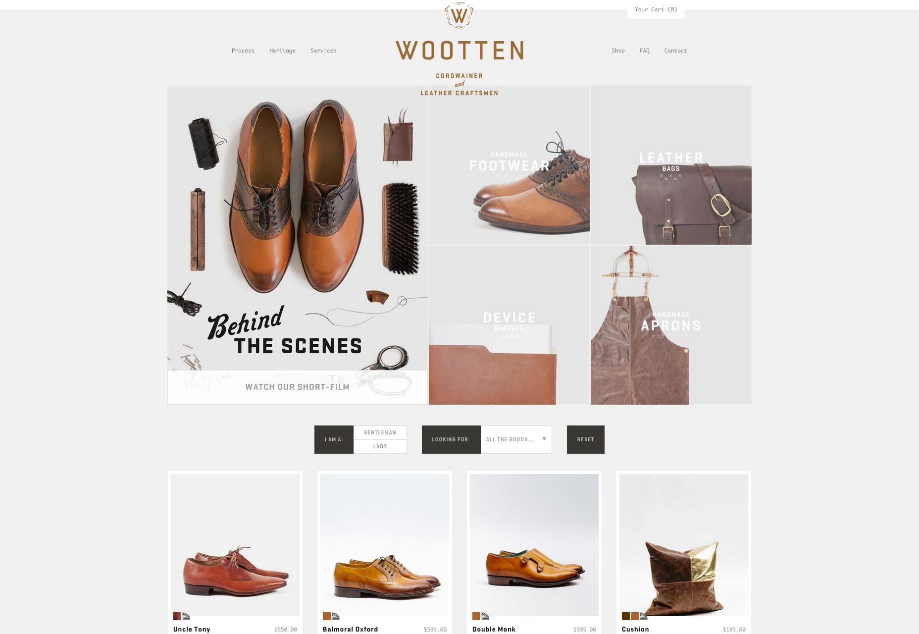
My favorite twist on the super sized background photo is when the designer cleverly uses a photograph as both a background and foreground element. In these designs the photograph fills in the background in a somewhat decorative way. And at the same time some element of the photograph is brought to the foreground. Most frequently this is accomplished using depth of field where a product or foreground element is in focus. This blending of viewing fields allows the photograph to create a sense of style, while the contents have a very real purpose in the actual content. This challenging approach requires planning and coordination with your photographer, but the results are among my favorite.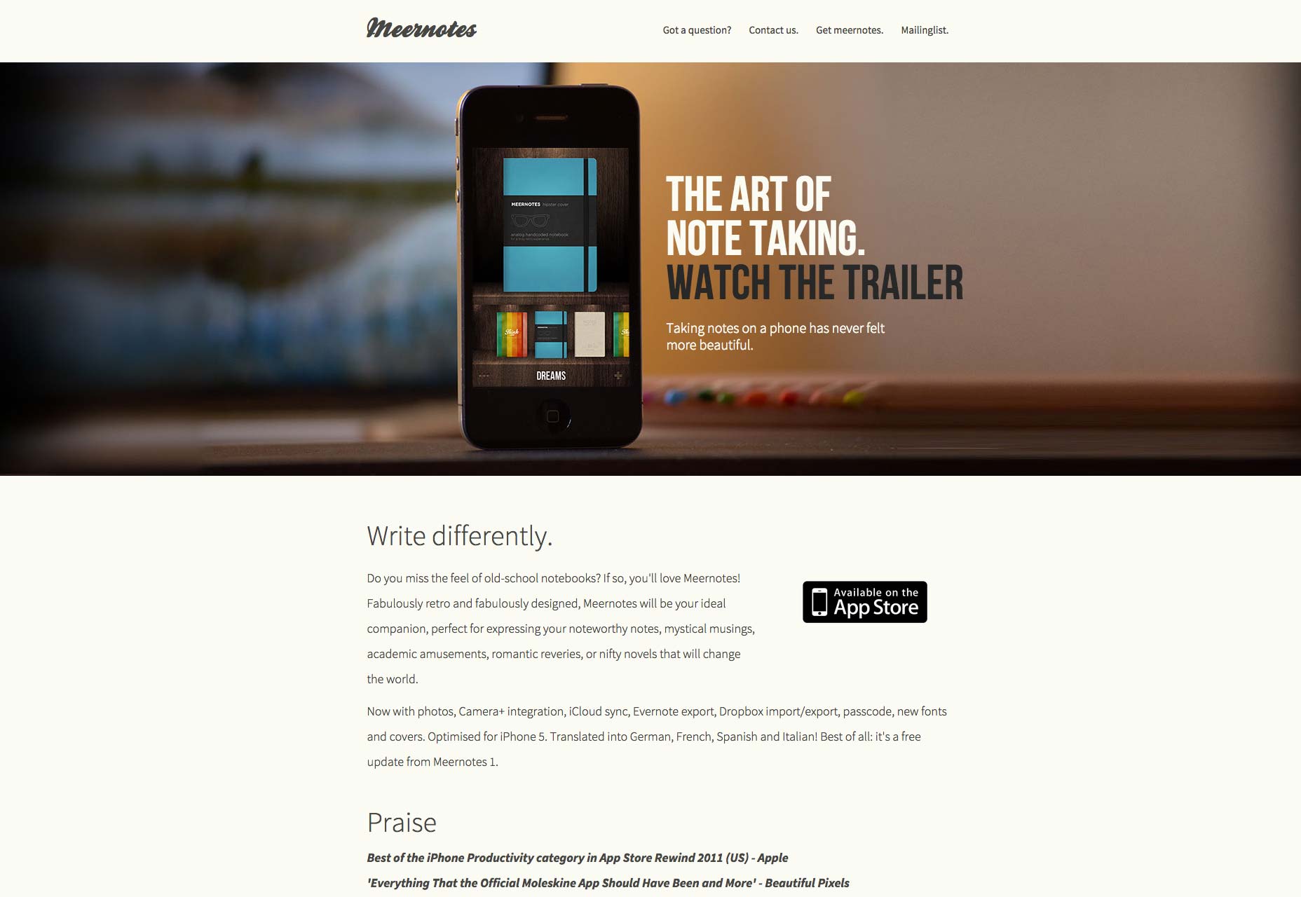
3) Monochrome photos
As designers the idea of "photoshoping" a photograph to fit our design style is not surprising. This sub set takes the idea to a radical end in one particular way. Here the designers have turned the photos into monochrome ones; in particular non black and white variations. While this might appear to be a mostly stylistic decision, I think there is more to it. Color can be used to set a tone and communicate subtle meaning. By leveraging a single tone in the photograph the designer can reflect that single emotion in the design. Blue feels safe, stable and corporate. Red feels vibrant, alive and energetic, and so on. By switching to a monochrome style the photographs take on a new type of communication through pure color.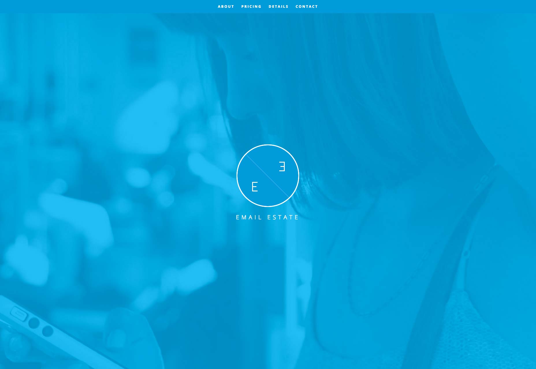
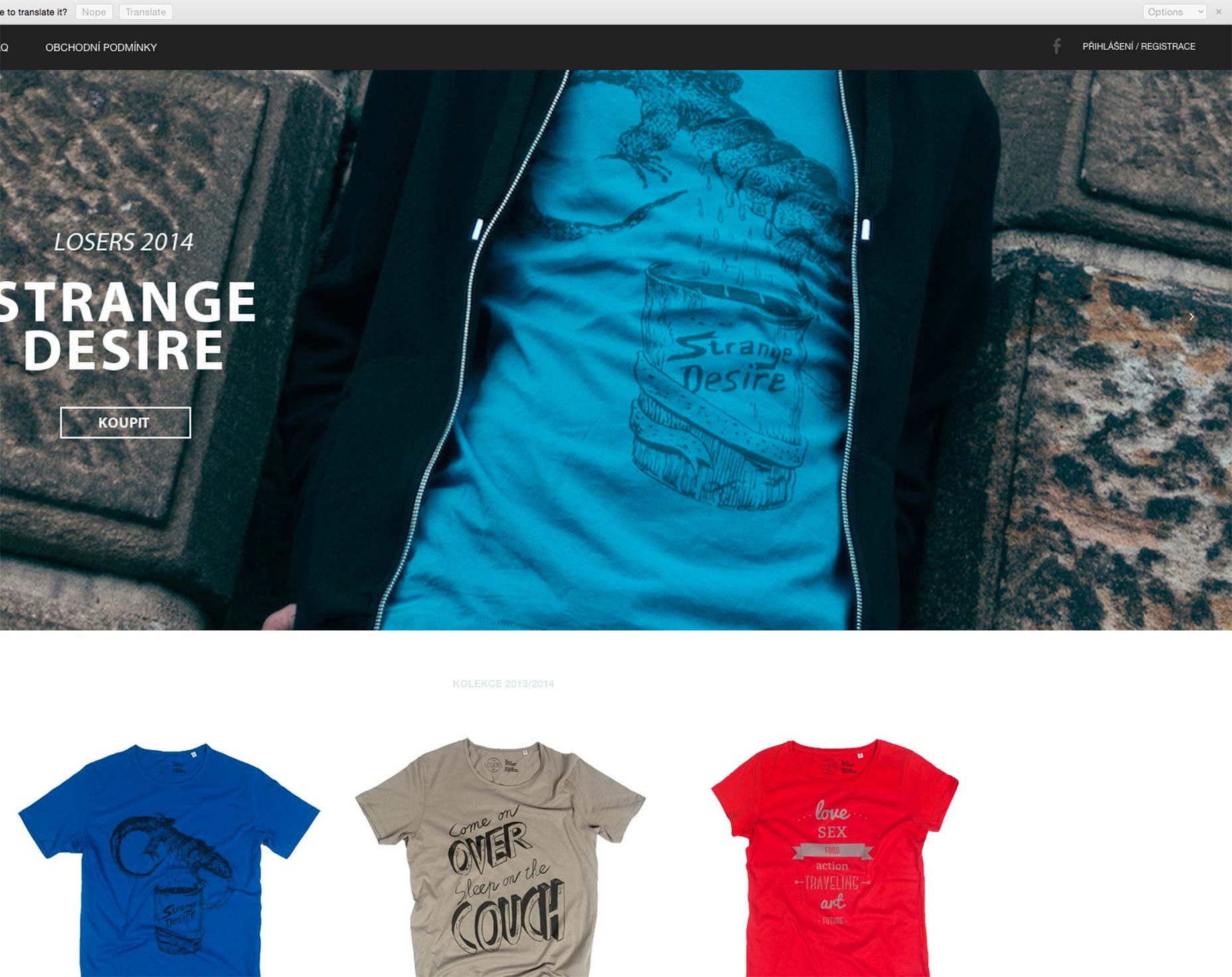
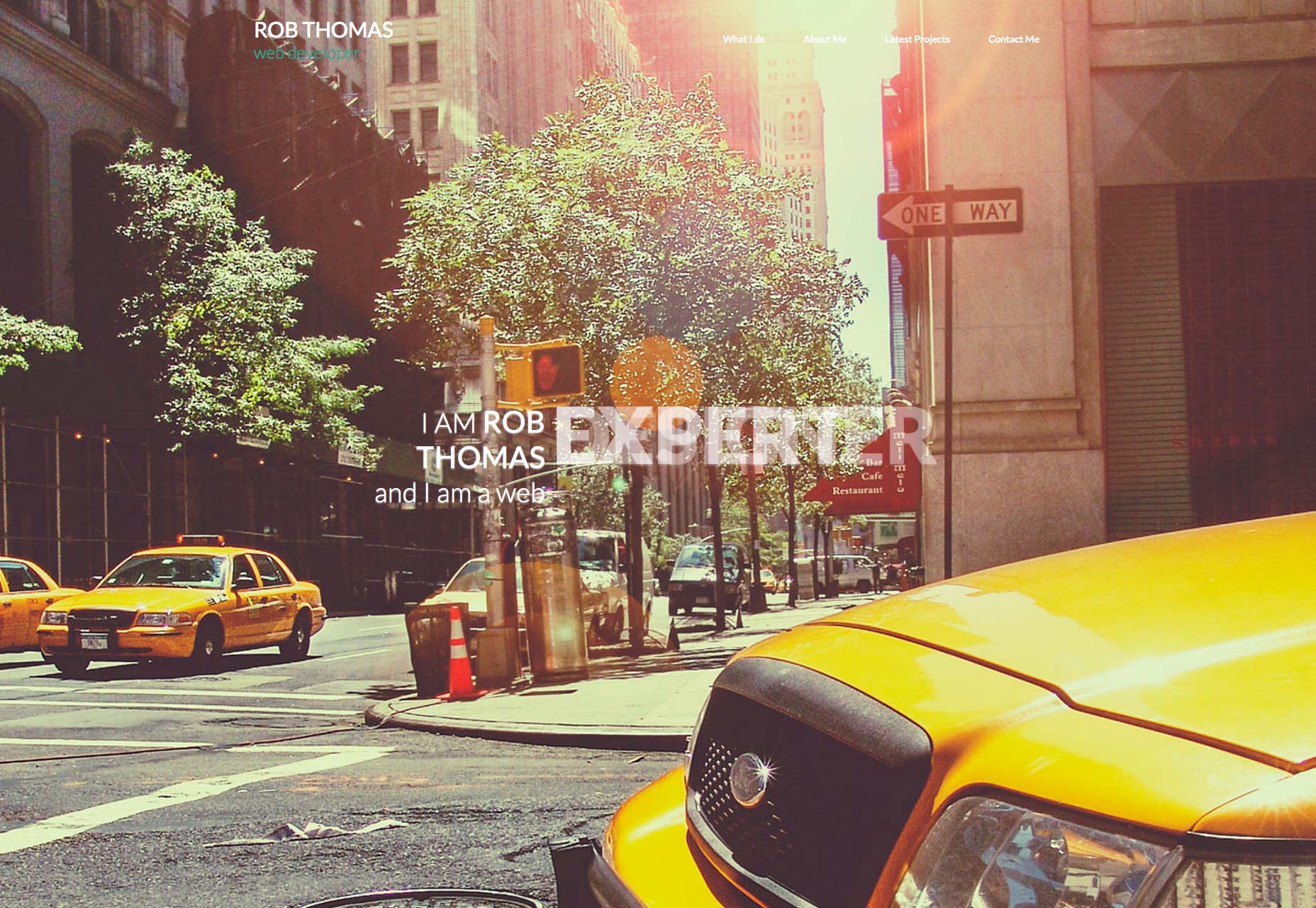
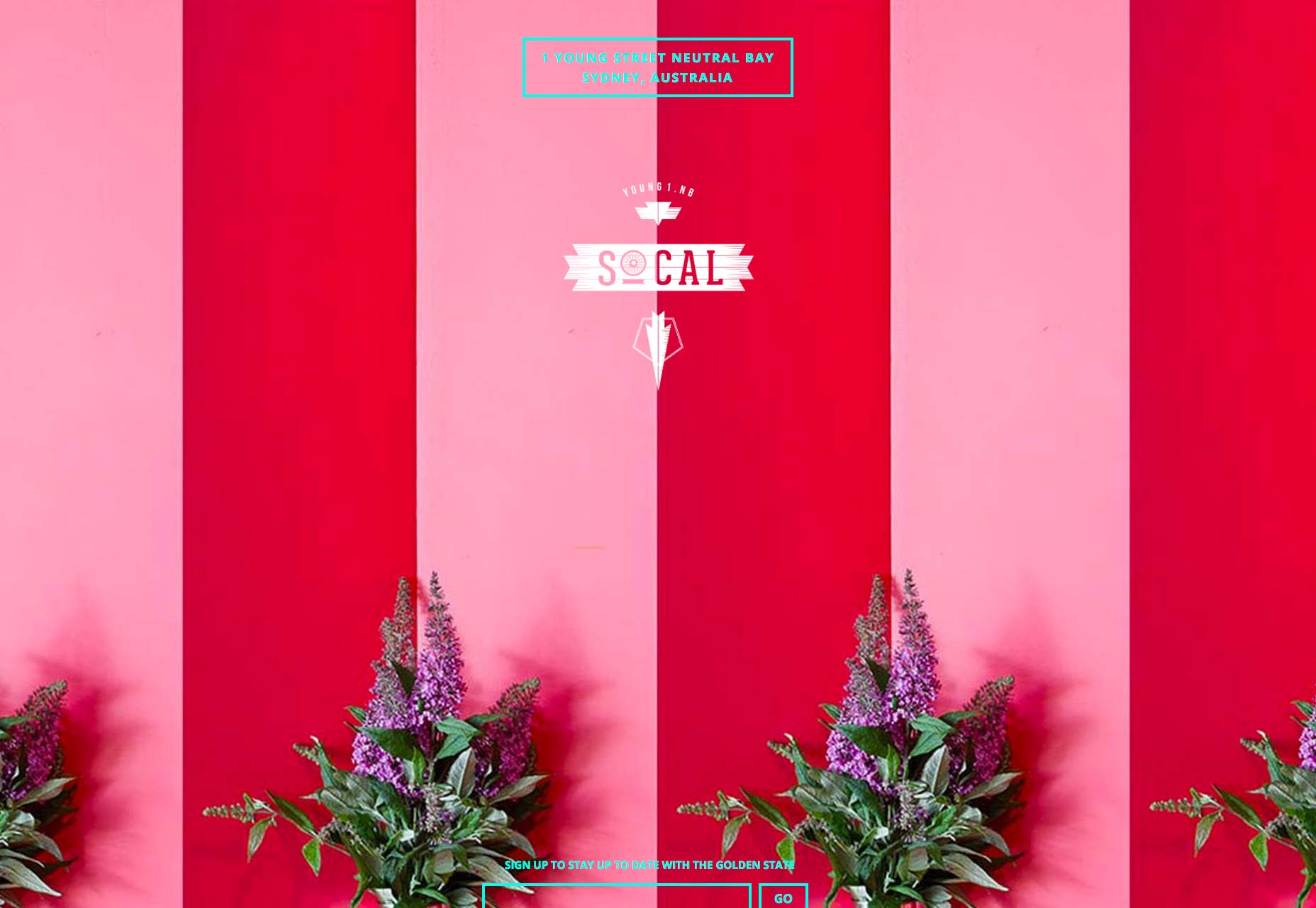
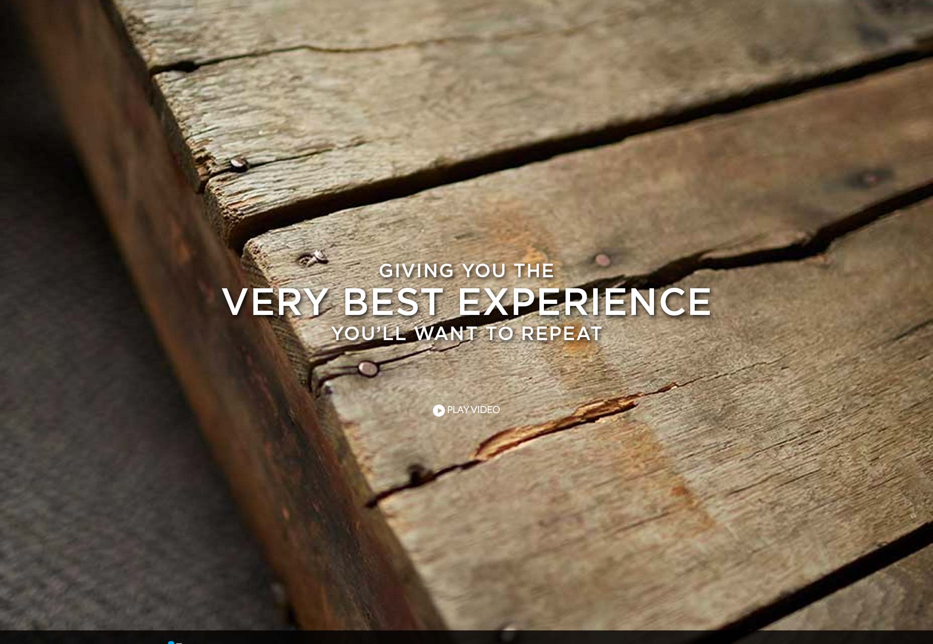
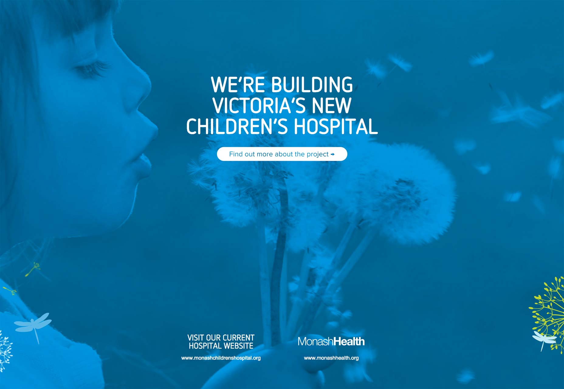
4) Muted photographs
Collected here are examples of a style that we might think of as extremely popular, and to be fair it does feel trend and over used. And yet, when I go digging for examples of this style at work I have found that it isn't nearly as popular as one might think. These sites are designed around muted photography. And more specifically then that these photos have a faded, almost vintage style to them. This is quite frequently combined with white text over the top of the photo (as can be found in all 5 samples here). This approach is actually quite frequently connected to the hipster style, which has been really popular in the last year. Finally, I was surprised to find that nearly every example I found in this style made use of decorative type faces in the text overlaid onto the photo.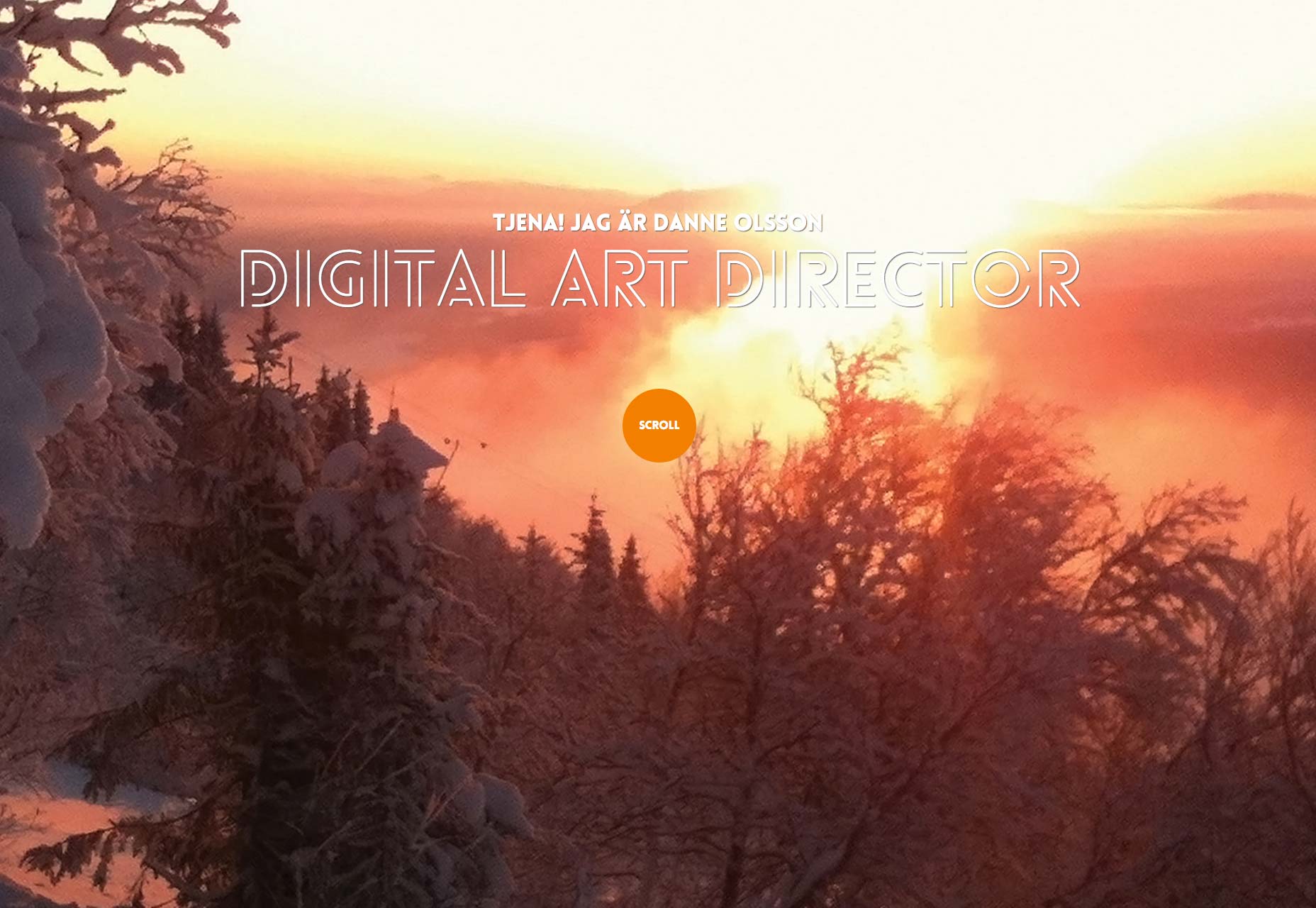
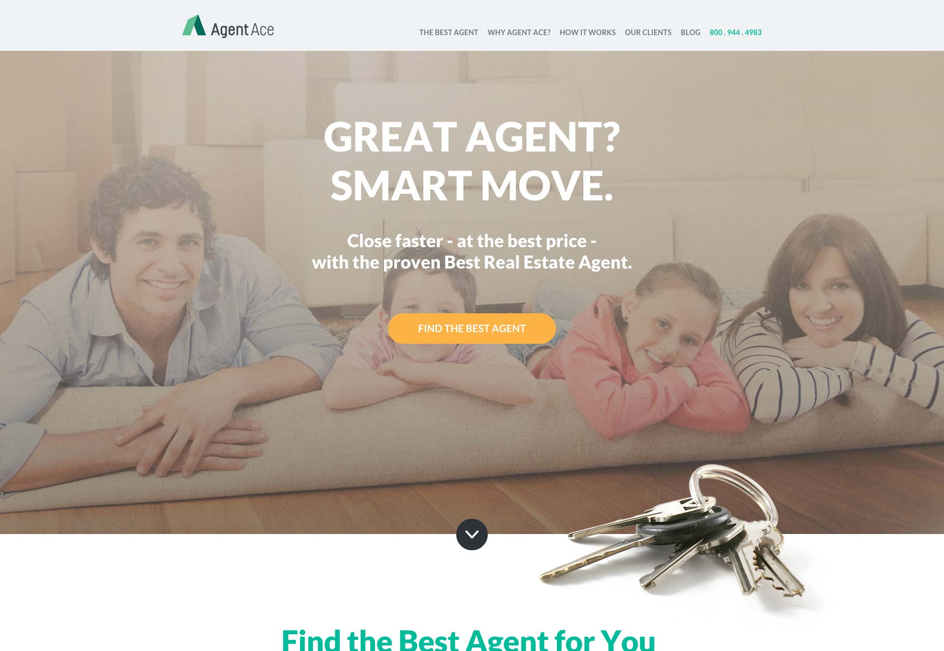
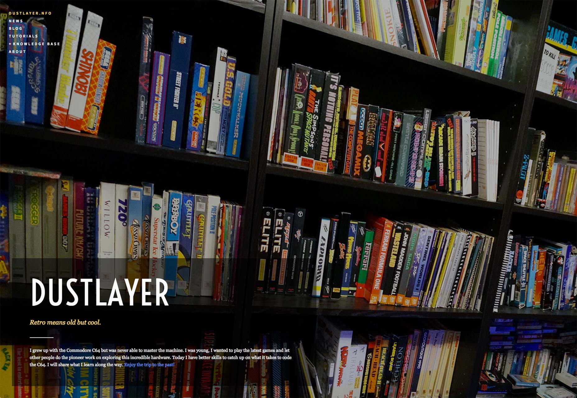
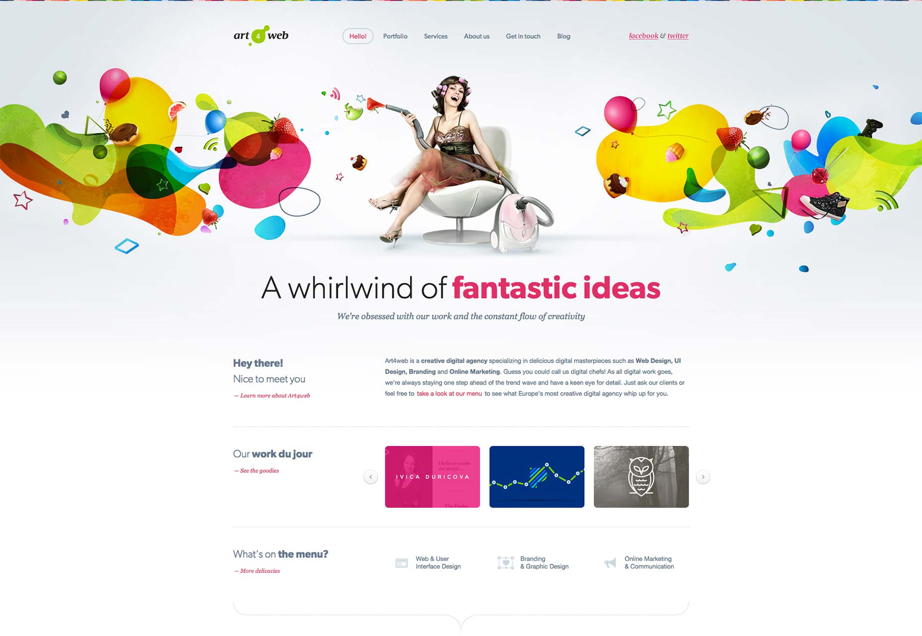
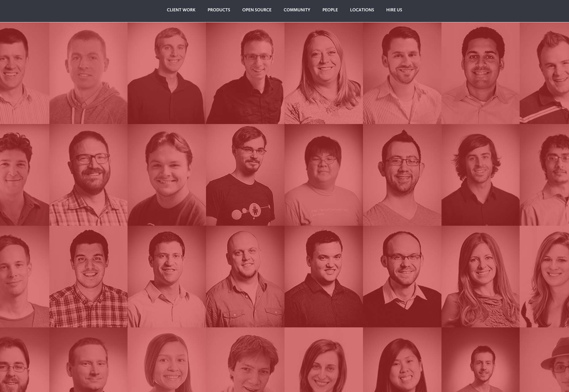
5) Photography for tone and atmosphere
As a teacher I find myself getting onto students for certain things time and time again. One of those is related to how they use photography. Often times designers want to leverage decorative photos that don't really directly communicate anything regarding the content of the site. For example, the first sample below is a portfolio site with a space photograph. It doesn't say anything literal about the individual. I have had a rather rigid opinion of decorative photos like this in the past, and I have found that in exploring the use of photography more intensely those views have softened. And this is what I really love about dissecting trends; by doing so we can break down our assumptions and discover fresh new ways to craft our designs. These samples prove that a decorative photo establishing tone and atmosphere can be a meaningful part of a design’s success. Dig into these samples and see if you agree.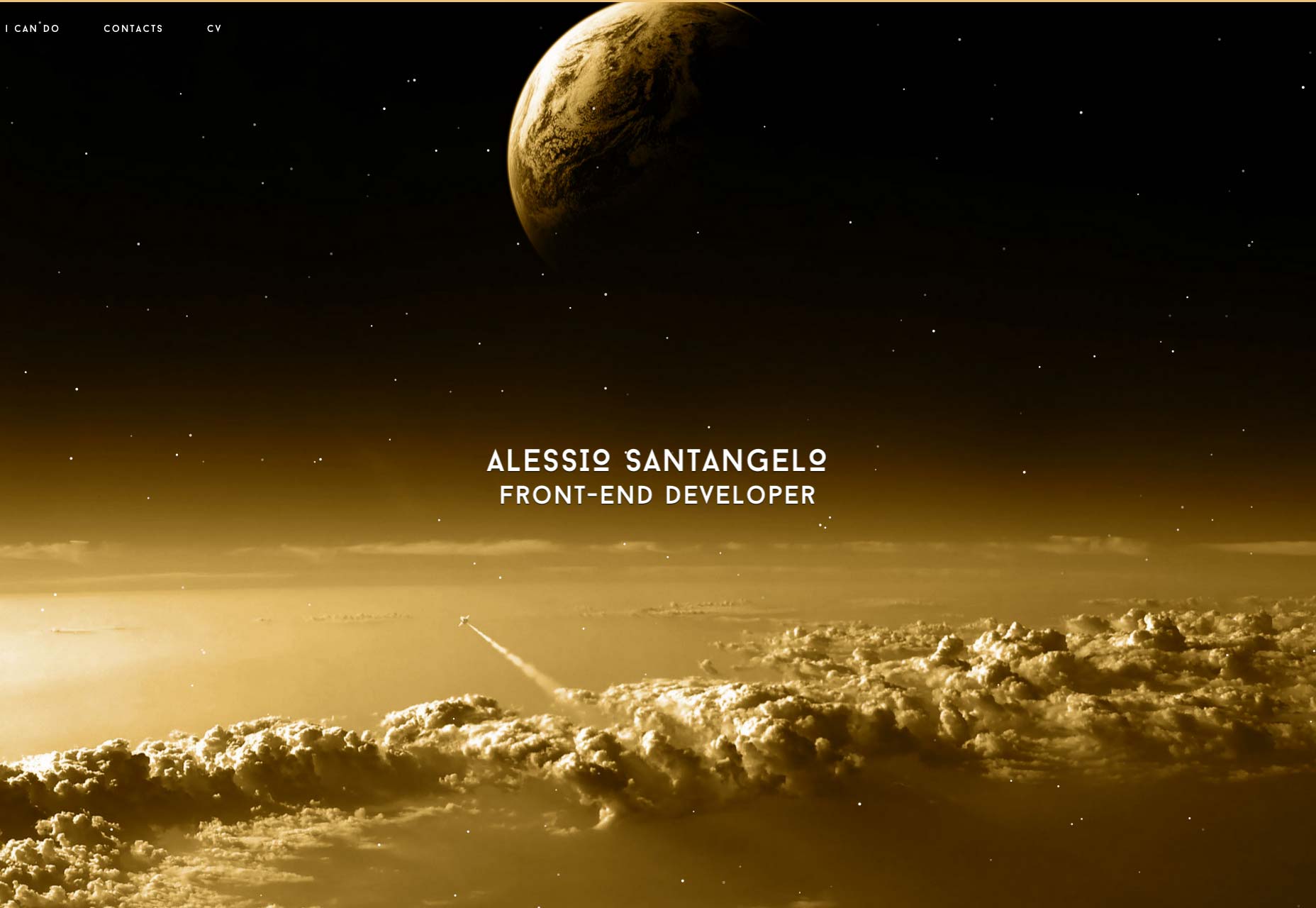
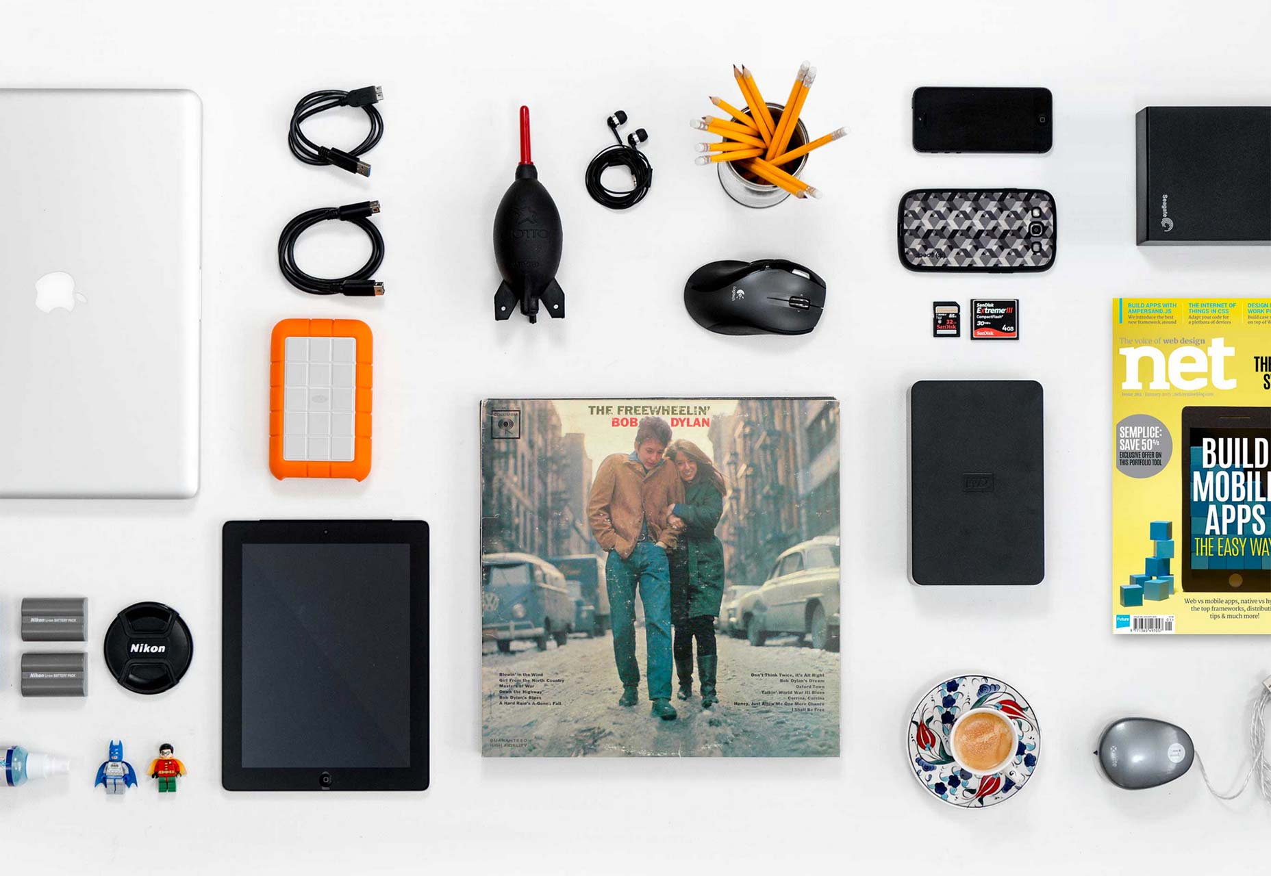
6) Knolling
Finally I want to look at a set of sites that rely on photographs using knolling. Knolling is the process of aligning objects into parallel or 90 degree angles to create a sense of organization. This approach is a rather fringe and unique style that designers will seldom use. Again, the style is often associated with a hipster style of design, but there is more to it than that. These photographs reflect a meaning that goes beyond the contents of the photos themselves (which also have meaning of course). They hint at the qualities of those behind the photos, they suggest a sense of order, process and organization. These are all good qualities, especially when it comes to representing designers and agencies.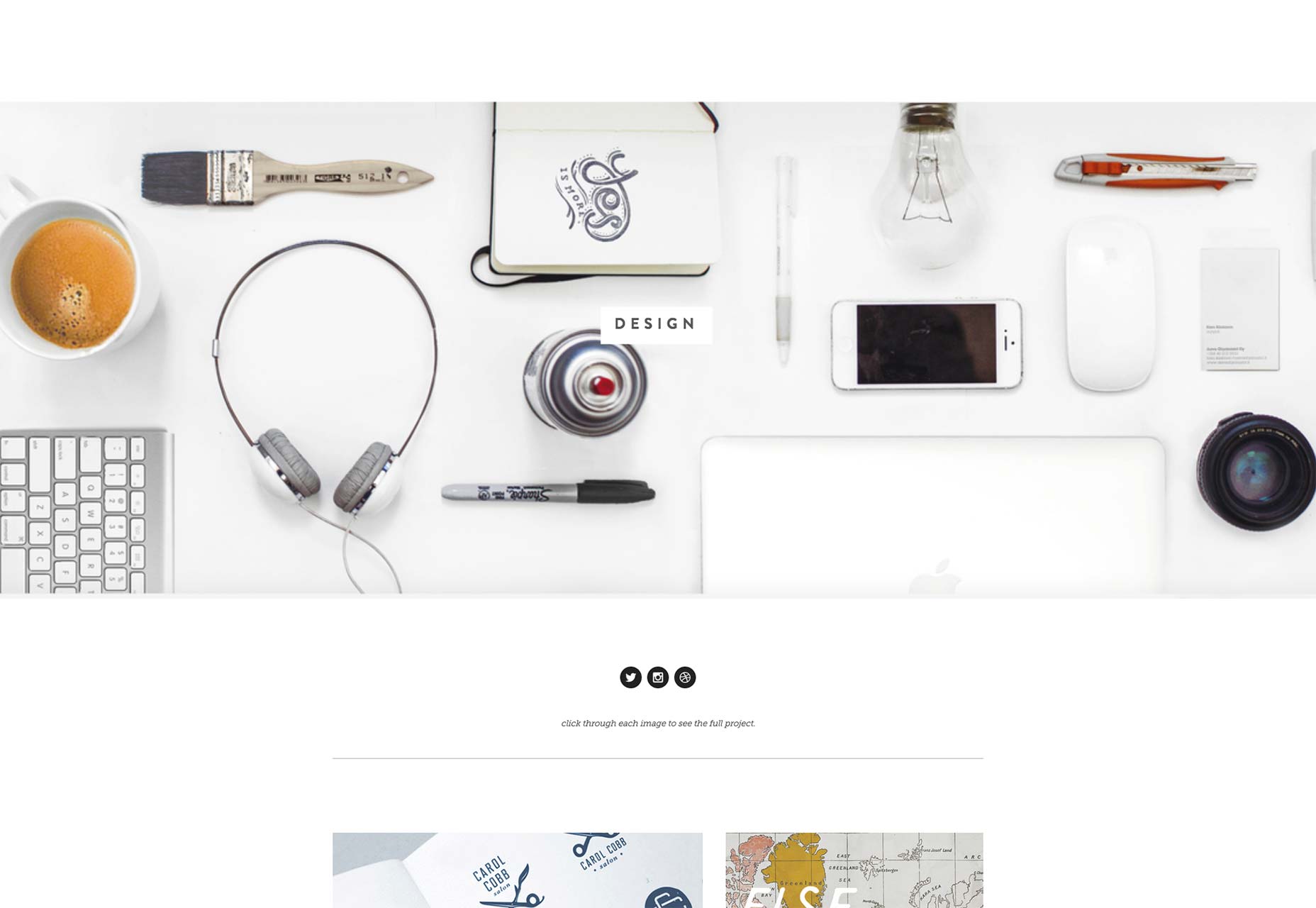
Conclusion
Photography is a natural tool in the designer’s tool belt. Hopefully by observing the many ways they are being used and the various styles that can be applied you will find fresh inspiration. And above all things, I hope this humble collection helps you find fresh ideas that inspire and challenge the work you do.Patrick McNeil
Patrick McNeil is a designer, developer and writer; but above all things he is a passionate educator. He is a Professor of Graphic Design at the University of Missouri St. Louis where he focuses on teaching UX Design methods and front end development techniques. Patrick is also the author of the bestselling book series The Web Designer's Idea Book and the curator of DesignMeltdown.com. For more information about Patrick visit his personal site, pmcneil.com, or follow him on Twitter @designmeltdown.


Read Next

15 Best New Fonts, July 2024
Welcome to our monthly roundup of the best fonts we’ve found online in the last four weeks. This month, there are fewer…
By Ben Moss

20 Best New Websites, July 2024
Welcome to July’s round up of websites to inspire you. This month’s collection ranges from the most stripped-back…

Top 7 WordPress Plugins for 2024: Enhance Your Site's Performance
WordPress is a hands-down favorite of website designers and developers. Renowned for its flexibility and ease of use,…
By WDD Staff

Exciting New Tools for Designers, July 2024
Welcome to this July’s collection of tools, gathered from around the web over the past month. We hope you’ll find…

3 Essential Design Trends, July 2024
Add some summer sizzle to your design projects with trendy website elements. Learn what's trending and how to use these…

15 Best New Fonts, June 2024
Welcome to our roundup of the best new fonts we’ve found online in the last month. This month, there are notably fewer…
By Ben Moss

20 Best New Websites, June 2024
Arranging content in an easily accessible way is the backbone of any user-friendly website. A good website will present…

Exciting New Tools for Designers, June 2024
In this month’s roundup of the best tools for web designers and developers, we’ll explore a range of new and noteworthy…

3 Essential Design Trends, June 2024
Summer is off to a fun start with some highly dramatic website design trends showing up in projects. Let's dive in!

15 Best New Fonts, May 2024
In this month’s edition, there are lots of historically-inspired typefaces, more of the growing trend for French…
By Ben Moss

How to Reduce The Carbon Footprint of Your Website
On average, a web page produces 4.61 grams of CO2 for every page view; for whole sites, that amounts to hundreds of KG…
By Simon Sterne

20 Best New Websites, May 2024
Welcome to May’s compilation of the best sites on the web. This month we’re focused on color for younger humans,…