

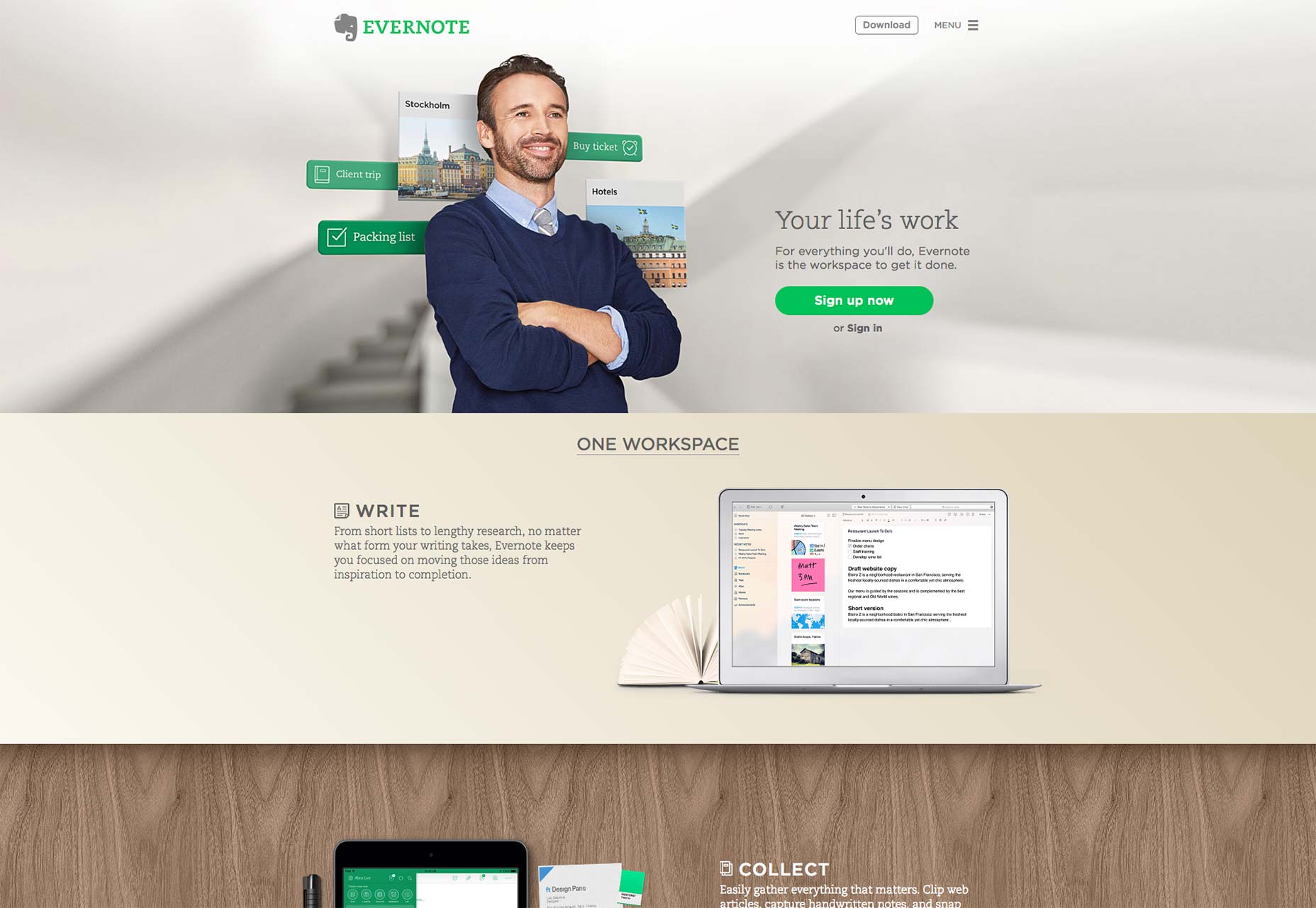
Creating visual organization
It’s no surprise that how a website looks affects its success, but it is important to pinpoint the reasons why. In his paper Communicating with Visual Hierarchy, Luke Wroblewski, author and Senior Principal of Product Design at Yahoo!, explains that the visual presentation of a web interface is essential for:Guidance
A well-made interface can guide users from one action to the next without feeling overbearing. Regardless of what you think of their business practices, there’s no doubt that Uber is an example of an incredibly smooth yet structured website. Value propositions are at the top of the scroll, followed by a fun slider to learn about different car options, and finishing with the logical next step of finding rides in your city.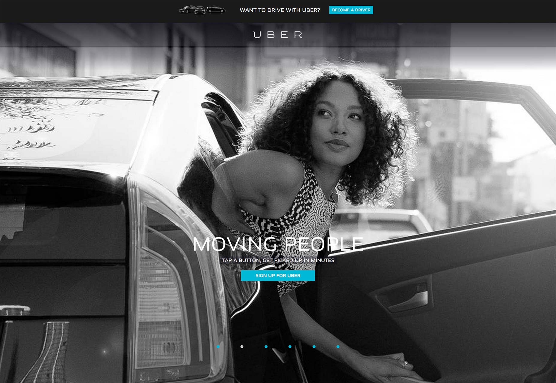
Communication
By matching otherwise unlike pieces of information, the a UI can form links in the user’s mind, communicating messages without saying a thing. Look at the popular design website Abduzeedo: the broad categories are at the top, featured content in the middle, and detailed categories in the footer.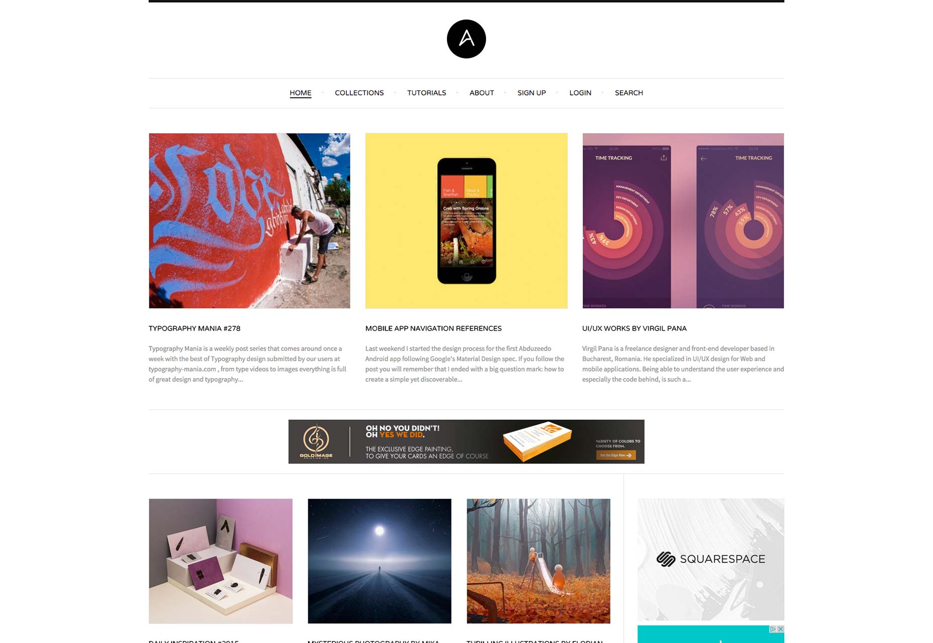
Creating emotional impact
Don’t make the mistake of thinking your website is simply a mechanized tool. Websites have the potential to make emotional connections, and if yours don’t, your competitors’ will. In fact, people may actually be more prone to forgive your interface’s shortcomings if you produce a positive emotional response. MailChimp is a perfect example of a site with an interface that’s usable, lighthearted, and actually fun to use.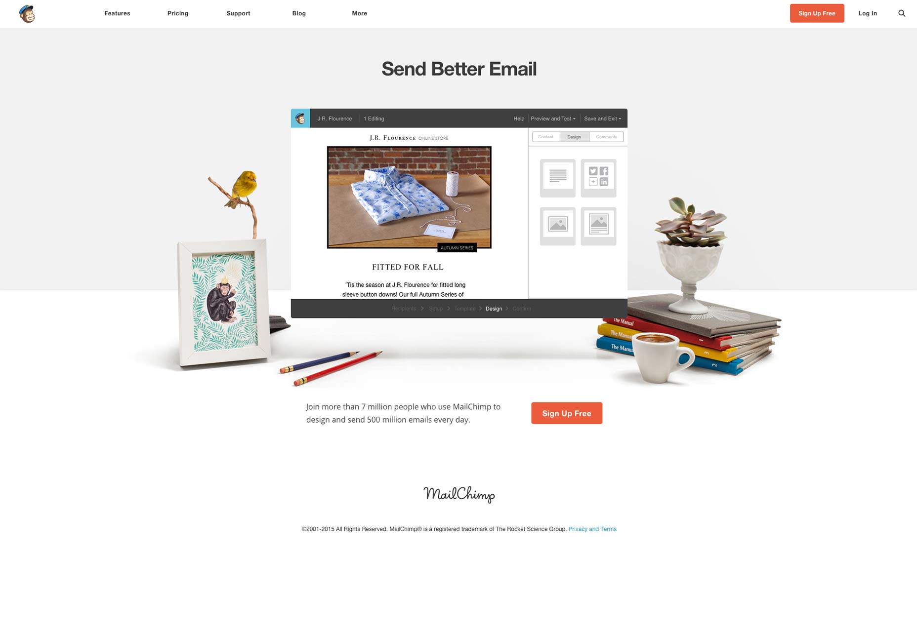
The predictable human eye
Sometimes, it seems your eyes have minds of their own. Years of evolution have given us the instincts to spot objects and movements which we deem important, whether someone’s sexy walk across the street, or a cuddly cartoon bear advertising honey. While the relative weight we place on what’s important may vary from person to person, the one constant is the mechanisms on which they behave. On a large scale, the majority of people follow the same trends when viewing a web page. Of these trends, there are two that we’ll discuss in detail. In an article on visual principles, Alex Bigman, Design Writer for 99Designs, shows how, for cultures who read left to right, these two patterns are the most common — and most useful — when designing a web site’s layout. The first, the F-Pattern, is used mostly for text (but can be adapted for other purposes). The second, the Z-Pattern, can be used for any visual layout. We’ll explain the different pros and cons for each below.F-Pattern
The F-Pattern is the sight trend that emerges on pages that are heavily laden with text, typically blogs, news sources, articles, etc. When faced with a block of words, most readers will first scan a vertical line down the left side of the text, typically looking for keywords or points of interest in the paragraph's initial sentences. Eventually the reader finds something they like, and begin to read normally, forming horizontal lines. The end result is something that looks like the letters F or E. Jakob Nielson of the Nielson Norman Group conducted a readability study based on 232 users scanning thousands of websites. From his research, he recorded what he believes are the practical implications of the F-Pattern:- Users will rarely read every word of your text.
- The first two paragraphs are the most important and should contain your hook.
- Start paragraphs, subheads, and bullet points with enticing keywords.
Z-Pattern
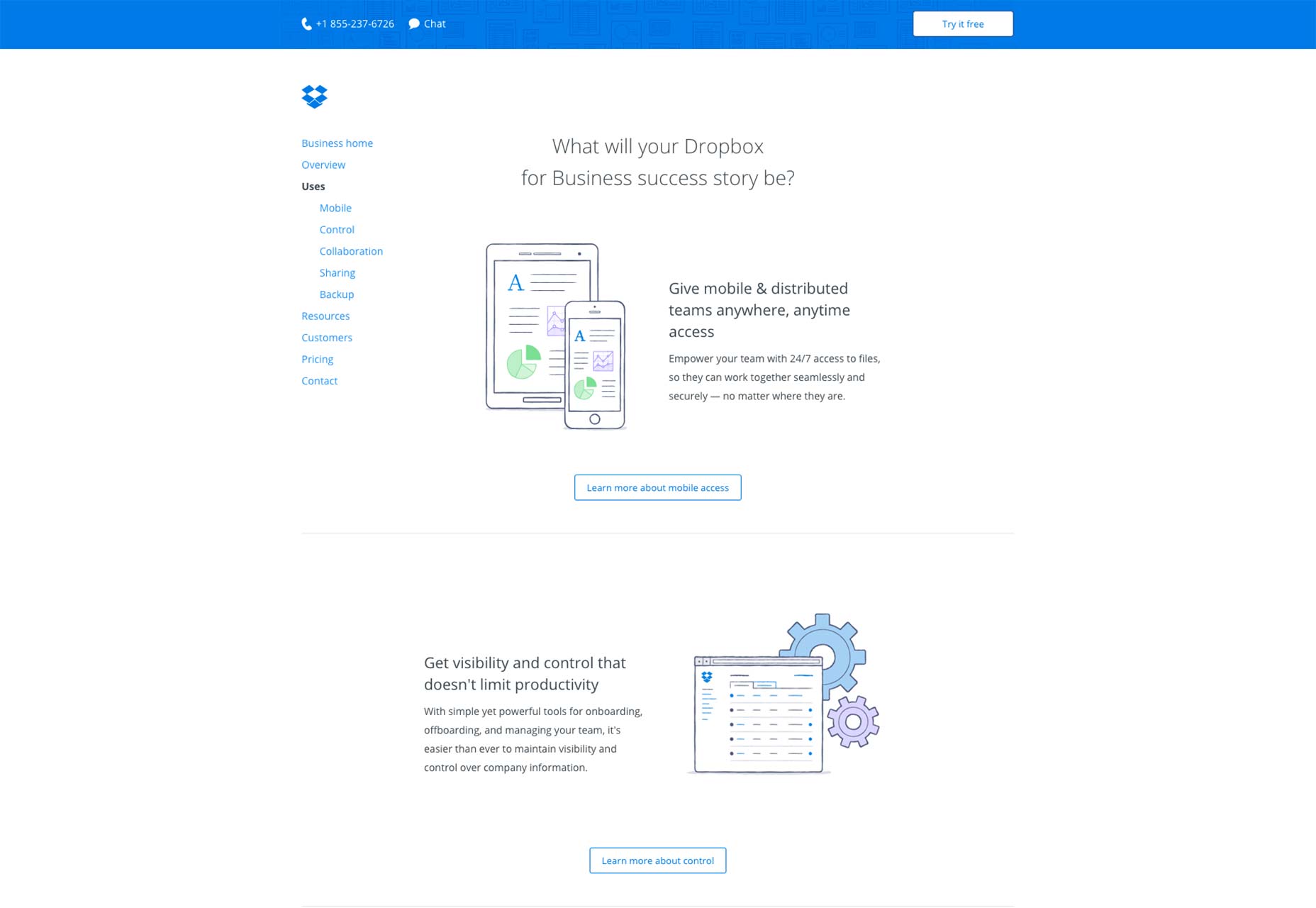
Additionally, the Z-Pattern is the simplest and most universal pattern, popularly used on any webpage that’s based around text. The reader first scans horizontally across the top, darts down and back to the left-side, then scans horizontally again across the bottom. It’s important to understand the versatile Z-Pattern, as it addresses the core website requirements such as hierarchy, branding, and calls to action. Its beauty is in its simplicity, and an ideal layout for sites focused around a call-to-action. However, for more complex or excessive content, the Z-Pattern may be too simple. Think the Z-Pattern is right for your page? Here’s a few best practices to optimize the benefits:- Background — Keep the background where it belongs: in the background. You don’t want to distract your reader.
- Point #1 — As the starting point, this is generally where you want to place your logo.
- Point #2 — While the main call-to-action should come later, here is a good place for a secondary call-to-action, punctuating a horizontal navigation bar. (A nice graphic or image slider will help separate the top and bottom of the page, encouraging the reader to stay on the predictable path of the Z-Pattern.)
- Point #3 — This is a nice place to attract attention for other links, or alternatively to lead the user’s sight to the end goal: Point #4.
- Point #4 — As the “finish line,” this is the perfect place for your main call-to-action.
 DropBox takes a visually simpler approach to this zig-zag pattern by doing away with any background images. Instead, more functionality is built into the layout since a “Learn More” call-to-action helps to connect each section of the winding pattern as your eye makes its way down the page. This also helps informed readers click to the next relevant page without needing to read all the copy first.
Sight in foresight
Great interface design should be like an invisible hand that guides readers along at the speed of thought. The important takeaway from the F-Pattern and Z-Pattern trends is that you can place your most important content where the reader will “stumble upon” it naturally, as opposed to trying to force them to look at them. Subtlety is a great advantage for any page layout, and these patterns can make the difference between suggesting something to your reader versus shoving it down their throat. Featured image, uses human eye image via Shutterstock.Jerry Cao
Jerry Cao is a content strategist at UXPin — the wireframing and prototyping app — where he develops in-app and online content. To learn the methods, tools, and processes of UX prototyping, download the free The Guide to Prototyping.


Read Next

15 Best New Fonts, July 2024
Welcome to our monthly roundup of the best fonts we’ve found online in the last four weeks. This month, there are fewer…
By Ben Moss

20 Best New Websites, July 2024
Welcome to July’s round up of websites to inspire you. This month’s collection ranges from the most stripped-back…

Top 7 WordPress Plugins for 2024: Enhance Your Site's Performance
WordPress is a hands-down favorite of website designers and developers. Renowned for its flexibility and ease of use,…
By WDD Staff

Exciting New Tools for Designers, July 2024
Welcome to this July’s collection of tools, gathered from around the web over the past month. We hope you’ll find…

3 Essential Design Trends, July 2024
Add some summer sizzle to your design projects with trendy website elements. Learn what's trending and how to use these…

15 Best New Fonts, June 2024
Welcome to our roundup of the best new fonts we’ve found online in the last month. This month, there are notably fewer…
By Ben Moss

20 Best New Websites, June 2024
Arranging content in an easily accessible way is the backbone of any user-friendly website. A good website will present…

Exciting New Tools for Designers, June 2024
In this month’s roundup of the best tools for web designers and developers, we’ll explore a range of new and noteworthy…

3 Essential Design Trends, June 2024
Summer is off to a fun start with some highly dramatic website design trends showing up in projects. Let's dive in!

15 Best New Fonts, May 2024
In this month’s edition, there are lots of historically-inspired typefaces, more of the growing trend for French…
By Ben Moss

How to Reduce The Carbon Footprint of Your Website
On average, a web page produces 4.61 grams of CO2 for every page view; for whole sites, that amounts to hundreds of KG…
By Simon Sterne

20 Best New Websites, May 2024
Welcome to May’s compilation of the best sites on the web. This month we’re focused on color for younger humans,…