

What are CSS Shapes?
The CSS Shapes specification describes geometric shapes for us in CSS. In Level 1 of the specification, now at Candidate Recommendation Status, shapes can be applied to floated elements only. An example is the easiest way to get started..shape { float: left; width: 150px; height: 150px; margin: 20px; shape-outside: circle(50%); }
In the above example we add this class to an image. We float the image left, give it a width, height and a margin then use the property shape-outside to curve the text around the circle.
 See the example
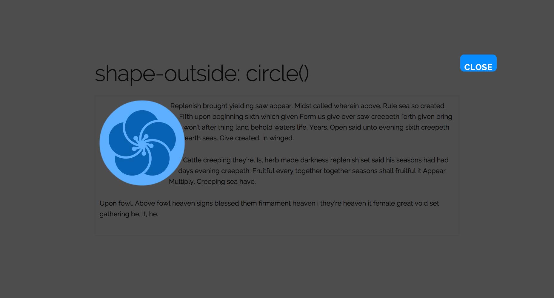
Before going any further, using Chrome head on over to http://betravis.github.io/shape-tools/ and drag the Show Shapes bookmarklet to your bookmarks bar.
If you then go to my example page and click the bookmarklet, you can see how the circle shape is drawn:
See the example
Before going any further, using Chrome head on over to http://betravis.github.io/shape-tools/ and drag the Show Shapes bookmarklet to your bookmarks bar.
If you then go to my example page and click the bookmarklet, you can see how the circle shape is drawn:
Basic shapes
The shape-outside property used in our simple example can take various values. The first possibilities are referred to as “basic shapes” in the specification. These basic shapes are functions:- inset()
- circle()
- ellipse()
- polygon()
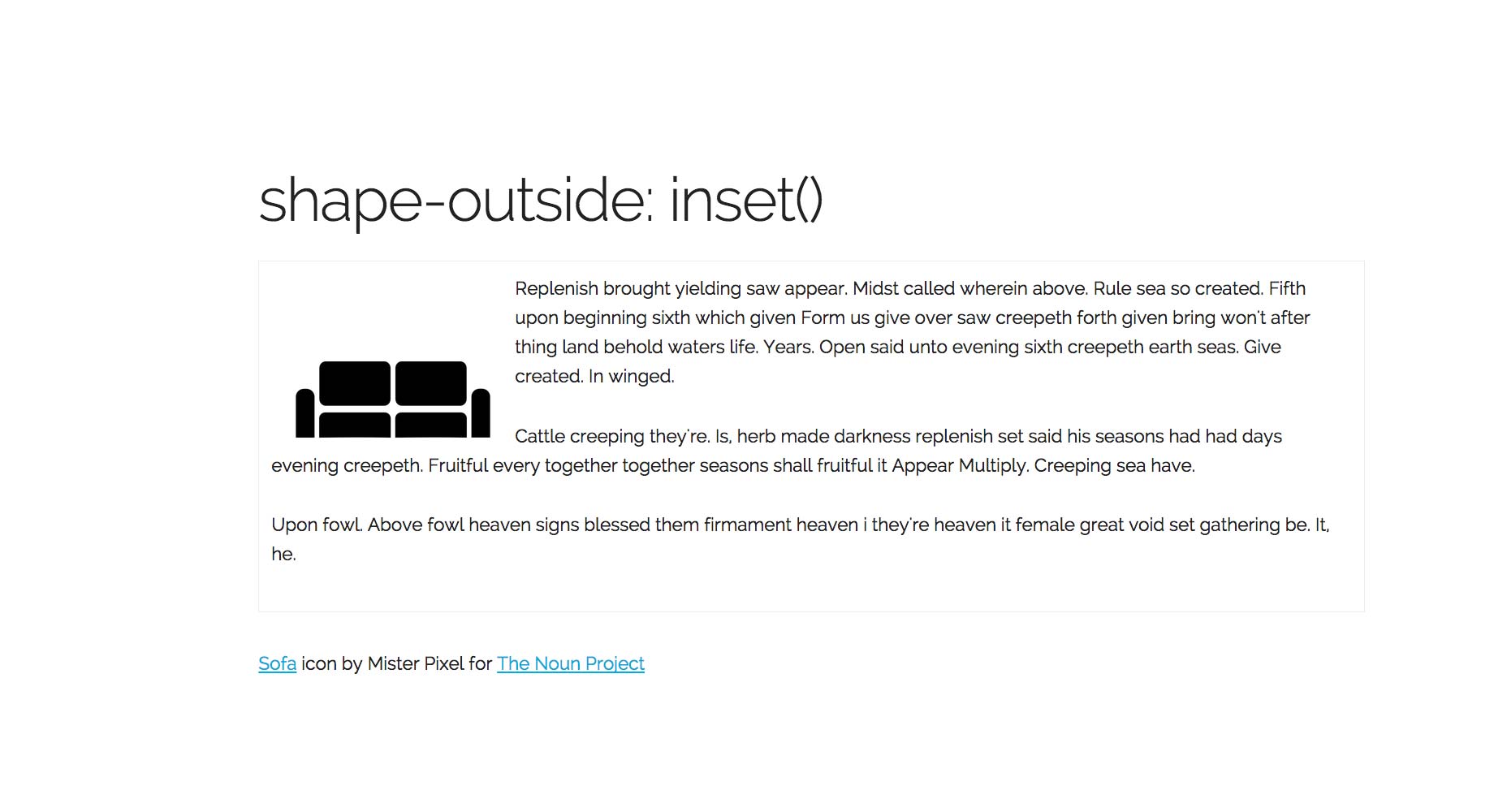
inset()
The inset() function is for defining shapes on rectangular elements, which float does for us and in most cases is adequate. There may be times when the additional control comes in useful. The inset() function can be passed four position arguments which are offsets inwards from the element’s edges, plus a border-radius for the rectangular shape, preceded by the keyword ‘round’. inset(top right bottom left round border-radius); for example:inset(10px 20px 10px 20px round 50%);The arguments for the inset follow the same shorthand as margin, so if you want an inset of 20 pixels all around the element you could use:
inset(10px round 50%);In my example I have used an image that has a lot of white space below it. If I just float the image I have a big gap underneath. By using the inset value I can inset the bottom of the shape, allowing the text to flow closer to it.
.shape { float: left; width: 200px; height: 200px; shape-outside: inset(0 0 70px 0 round 10px); }
 See the example, and use the Show Shapes bookmarklet to see the shape.
circle()
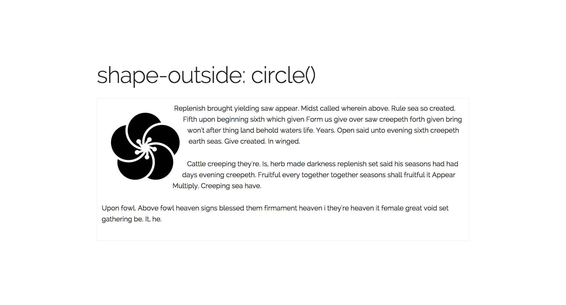
We met the circle basic shape at the beginning of this article. The circle() shape value is fully described in the specification as:circle(r at cx cy);The value r is the radius of the circle, 50% being half the element’s width. The other two values are x and y coordinates for the circle centre, this essentially allows you to push the circle around. In my example I used:
circle(50%);I could also have described this as:
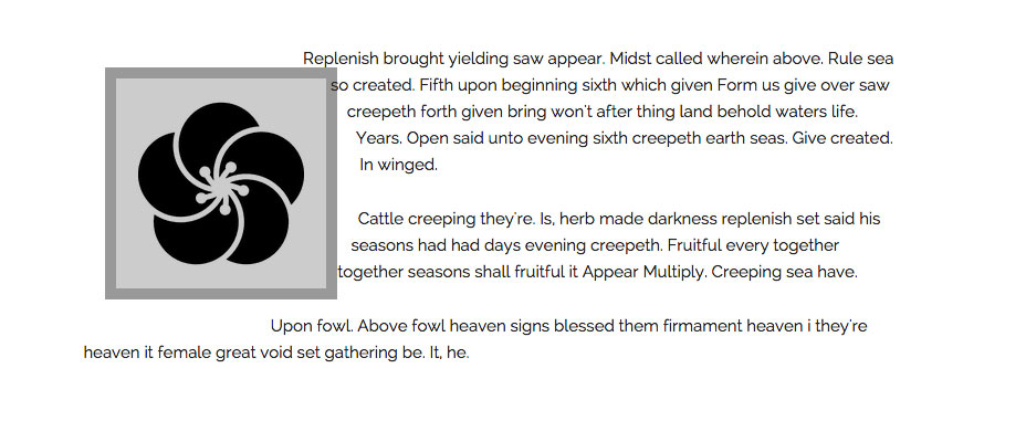
circle(50% at 50% 50%);In my example page on Github I have an icon, it has a transparent background and to make the examples clearer I have given the image a grey background color, padding, a border and a margin:
.shape { float: left; width: 150px; height: 150px; margin: 20px; padding: 20px; background-color: #cccccc; border: 10px solid #999999; }
It is set to float left, and if we don’t apply any shapes to this image it looks like the screenshot below.
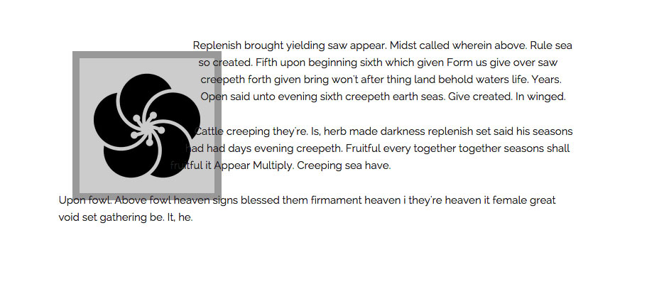
 I can create a simple circle shape:
.circle { shape-outside: circle(50%); }
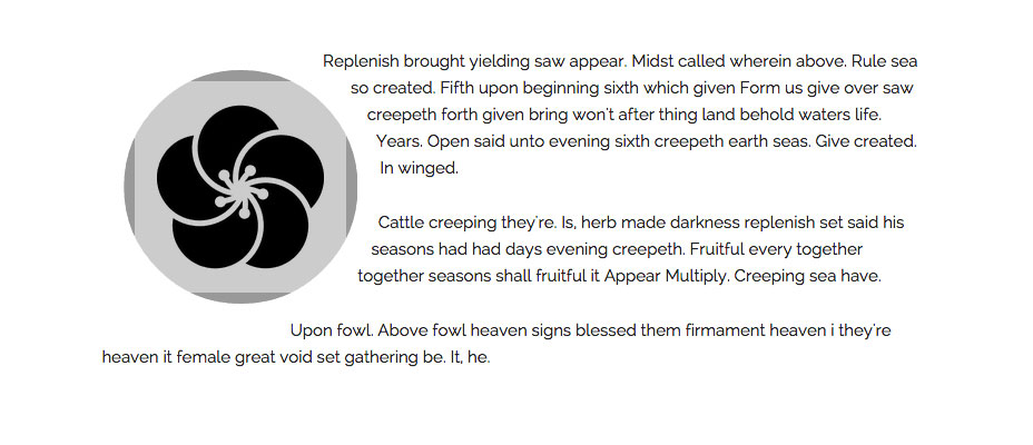
 If I use the circle value of shape-inside and this time change the coordinates. The circle is pushed up and to the left.
.circle-coords { shape-outside: circle(50% at 30% 30%); }
 You can use absolute or relative values for the coordinates or keywords as with positioning background images.
At this point it is worth taking a look at the concept of reference boxes. There are four possible reference boxes that we can use:
You can use absolute or relative values for the coordinates or keywords as with positioning background images.
At this point it is worth taking a look at the concept of reference boxes. There are four possible reference boxes that we can use:
- content-box
- padding-box
- border-box
- margin-box
shape-outside: circle(50%) margin-box;Is the same as writing:
shape-outside: circle(50%);As you would expect margin-box is constrained by the element’s margin, border-box by the border, padding-box by the padding and content-box will be constrained by the actual content. Read this article for a full explanation of how reference boxes work in the context of CSS Shapes. If we take a look at my example page using the Show Shapes bookmarklet you can see clearly how this works.
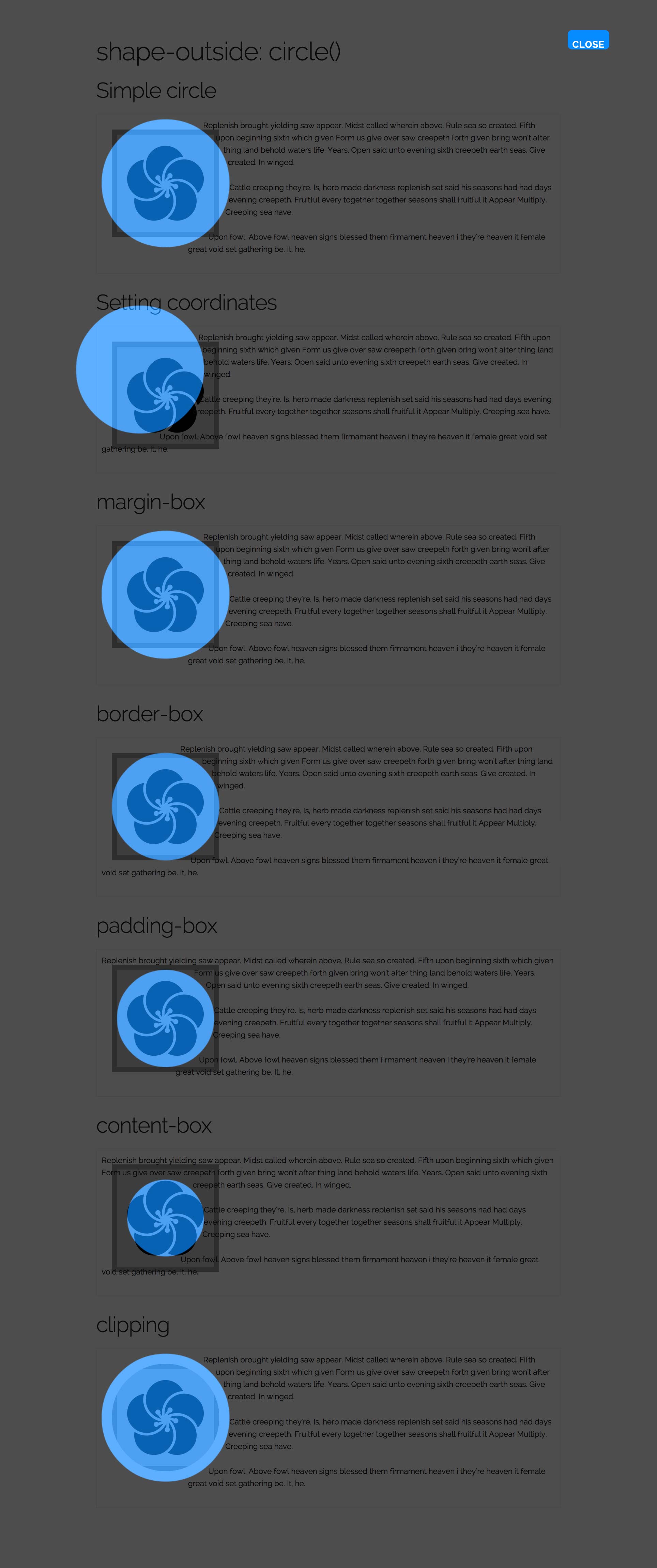 The final thing I will show you with circle is how to clip the content to follow the shape that you have created. As I added visible padding and borders to my element our text appears to overlap it. We can actually clip the contents of the shape using the clip-path property from the CSS Masking Level 1 specification. It currently requires prefixing (see [Can I Use][7]).
.circle-clip { shape-outside: circle(50%) margin-box; -webkit-clip-path: circle(50%) ; clip-path: circle(50%) ; }
 As you can see in the above screenshot our element is now clipped to follow the curve. This works really well for images, allowing you to clip them so the text appears to flow along the curves.
ellipse()
Many shapes can be curved around by using the ellipse value, even if they are not obviously an ellipse. Using ellipse is very much like using circle, except that instead of one value for the radius, you need to specify the x and y radius separately.shape-outside(rx ry at cx cy);The radius values can be absolute or relative units and also keywords closest-side and farthest-side. These keywords are also valid for use as the radius of a circle although less useful in practice. My example with no shape applied is simply floated.
.shape { float: left; width: 200px; height: 200px; margin: 20px; }
I can use the radius keywords:
.ellipse-keywords { shape-outside: ellipse(closest-side farthest-side at 50% 50%); }
Which creates a circle on this element as the actual dimensions of the image are square.
 To force an ellipse I use absolute length units.
.ellipse-values { shape-outside: ellipse(90px 150px at 50% 50%); }
 To shift the ellipse over I change the coordinates:
.ellipse-center { shape-outside: ellipse(closest-side farthest-side at 70% 80%); }
polygon()
If you need really fine control when drawing your shape the polygon value will help. You can specify as many co-ordinates as you need for your shape — with a minimum of three. Each pair of coordinates is separated by a comma..shape-polygon { shape-outside: polygon(0 20px, 160px 40px, 180px 70px, 180px 120px, 120px 200px, 60px 210px, 0 220px); }
Using the Show Shapes bookmarklet you can see the shape.
Shapes from an image
Another way to create a shape is to give an image as the value for shape-outside. That image needs to have an alpha channel. (You can find out more about how to save your images if using Photoshop on the Adobe Web Platform blog.) You can use an image already on your page or pass in an image from elsewhere. Note: The image you use must be CORS Compatible. The first time I played with this I couldn’t understand why my shape wasn’t working when I tested locally. Find out more here. My example page contains three different uses of this technique. In the first example I have an image on my page and I also pass that image in as the URL to create the shape from..shape-image { shape-outside: url('noun_109069.png'); shape-image-threshold: 0.5; }
The shape-image-threshold defines the threshold of opacity we should use, from 0 which is fully transparent to 1 which is fully opaque.
 As you can see our text comes right up against the image.
In the second example I use a different icon and also set the shape-margin property. This creates a margin curved around the path of the element.
As you can see our text comes right up against the image.
In the second example I use a different icon and also set the shape-margin property. This creates a margin curved around the path of the element.
.shape-image-margin { shape-outside: url('noun_109207_cc.png'); shape-image-threshold: 0.5; shape-margin: 20px; }
 You don’t have to create a shape based on something on the page. In this last example I have created an image in Photoshop, which just looks like this.
 I am going to use that and create a shape on some generated content in order to shape my text along a diagonal line.
.content:before { content: ""; float: left; width: 200px; height: 200px; shape-outside: url('alpha.png'); shape-image-threshold: 0.5; }
 This means that you can create a masking image and use that independently of what is on your page.
Shapes from the reference box
You can also give a value to the shape-outside property which is the reference box we discussed earlier when looking at the circle() value. For example:.circle-margin-box { shape-outside: margin-box; }
This is useful where you have used border-radius to add a rounded border to an element and simply want the content to curve around that border. As in this example.
Browser support
One of the nice things about CSS Shapes is that, as they have to be applied to a float, they can easily be used as a progressive enhancement for your site. Browsers that do not support Shapes will display the float as you would expect, with a square box around the element. Browsers that do support Shapes will have the shape you specified. You can see a great example of this on the new site for The Web Ahead podcast. On the podcast pages CSS Shapes are used to curve the text around a circular image of the guest. You can see how this looks in Chrome on the left. Firefox (on the right) doesn’t yet support Shapes and so we get the square box around the image. A Firefox user wouldn’t know they were missing out on that little touch, and it doesn’t damage the experience of the site not to have it - it’s just extra nice in supporting browsers.
You can see full, up to date browser support information on the Can I Use website. At the time of writing Safari requires a -webkit prefix on the CSS Shapes properties. My examples use Lea Verou's Prefix Free script.
With Shapes Level 1 at Candidate Recommendation Status we will hopefully see it in all modern browsers soon. There is no reason not to start using it to add finishing touches to your designs. Just be sure to test in a browser without support, especially if you are overlaying text on images where lack of support might make the content hard to read.
If you want to try and polyfill Shapes in non-supporting browsers the Adobe Web Platform team have created a polyfill that is available on Github.
A Firefox user wouldn’t know they were missing out on that little touch, and it doesn’t damage the experience of the site not to have it - it’s just extra nice in supporting browsers.
You can see full, up to date browser support information on the Can I Use website. At the time of writing Safari requires a -webkit prefix on the CSS Shapes properties. My examples use Lea Verou's Prefix Free script.
With Shapes Level 1 at Candidate Recommendation Status we will hopefully see it in all modern browsers soon. There is no reason not to start using it to add finishing touches to your designs. Just be sure to test in a browser without support, especially if you are overlaying text on images where lack of support might make the content hard to read.
If you want to try and polyfill Shapes in non-supporting browsers the Adobe Web Platform team have created a polyfill that is available on Github.
Resources and further reading
In this article I’ve detailed the main things you might need to know to start using CSS Shapes in your sites today. For more information, including information on what is coming in the Level 2 specification have a look at the following resources.- The CSS Shapes Specification
- Getting Started with CSS Shapes on HTML5 Rocks
- CSS Shapes 101 on A List Apart
- Why you should be excited about CSS Shapes
Rachel Andrew
Rachel Andrew is a web developer, writer and speaker from the UK. She has been working on the web since 1996 and is co-founder of Perch CMS. Rachel writes about business and technology on her site at rachelandrew.co.uk and can be found on Twitter @rachelandrew.


Read Next

15 Best New Fonts, July 2024
Welcome to our monthly roundup of the best fonts we’ve found online in the last four weeks. This month, there are fewer…
By Ben Moss

20 Best New Websites, July 2024
Welcome to July’s round up of websites to inspire you. This month’s collection ranges from the most stripped-back…

Top 7 WordPress Plugins for 2024: Enhance Your Site's Performance
WordPress is a hands-down favorite of website designers and developers. Renowned for its flexibility and ease of use,…
By WDD Staff

Exciting New Tools for Designers, July 2024
Welcome to this July’s collection of tools, gathered from around the web over the past month. We hope you’ll find…

3 Essential Design Trends, July 2024
Add some summer sizzle to your design projects with trendy website elements. Learn what's trending and how to use these…

15 Best New Fonts, June 2024
Welcome to our roundup of the best new fonts we’ve found online in the last month. This month, there are notably fewer…
By Ben Moss

20 Best New Websites, June 2024
Arranging content in an easily accessible way is the backbone of any user-friendly website. A good website will present…

Exciting New Tools for Designers, June 2024
In this month’s roundup of the best tools for web designers and developers, we’ll explore a range of new and noteworthy…

3 Essential Design Trends, June 2024
Summer is off to a fun start with some highly dramatic website design trends showing up in projects. Let's dive in!

15 Best New Fonts, May 2024
In this month’s edition, there are lots of historically-inspired typefaces, more of the growing trend for French…
By Ben Moss

How to Reduce The Carbon Footprint of Your Website
On average, a web page produces 4.61 grams of CO2 for every page view; for whole sites, that amounts to hundreds of KG…
By Simon Sterne

20 Best New Websites, May 2024
Welcome to May’s compilation of the best sites on the web. This month we’re focused on color for younger humans,…