

Scaling vs. fluid vs. responsive
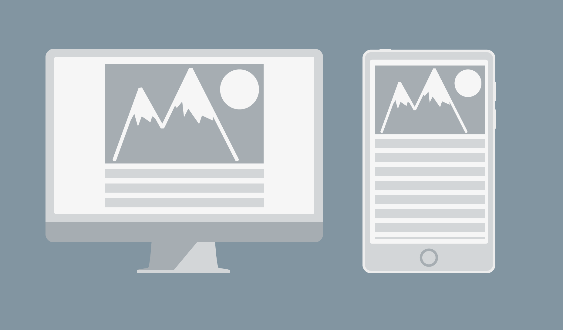
There is a lot of confusion over these terms and designers often incorrectly use them interchangeably. In truth, each of these are distinct evolutionary steps in layout technique that have emerged over time in line with advances in technology. Scaling layouts are designed to scale every element relative to every other element. They are responsive in the sense that they will scale the content dynamically in response to changes in the size of the viewport. The layout itself remains static, changing the size of every element to maintain a consistent appearance.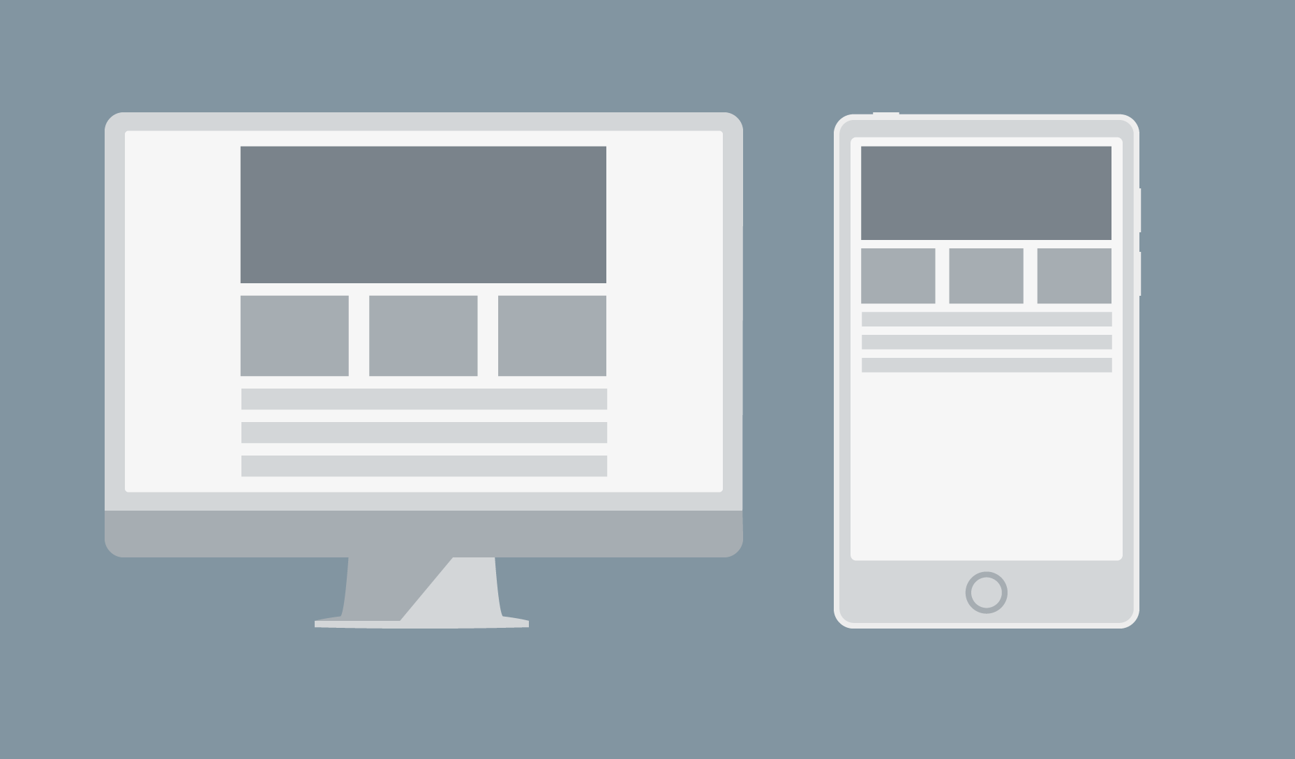 Above: example of a scaling layout at different resolutions: the design sacrifices readability for consistency.
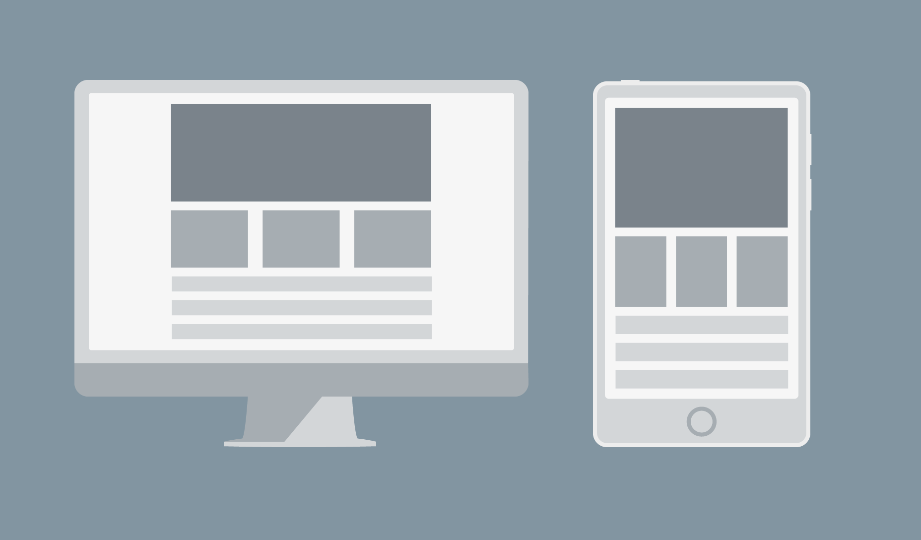
Fluid layouts are different because they scale container elements relative to the size of the viewport. This is achieved by using relative units such as ems to overcome the problem of shrinking text. The design can be broken by the user scaling it.
Above: example of a scaling layout at different resolutions: the design sacrifices readability for consistency.
Fluid layouts are different because they scale container elements relative to the size of the viewport. This is achieved by using relative units such as ems to overcome the problem of shrinking text. The design can be broken by the user scaling it.
 Above: example of a fluid layout at different resolutions: the design sacrifices consistency for readability.
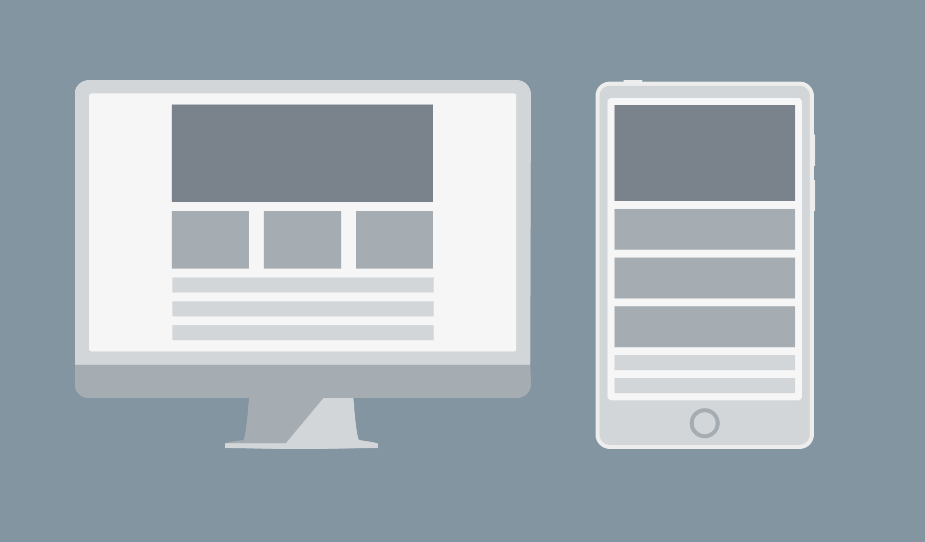
Responsive layouts don’t scale anything. Instead, they change what is displayed depending on the size of the viewport.
Above: example of a fluid layout at different resolutions: the design sacrifices consistency for readability.
Responsive layouts don’t scale anything. Instead, they change what is displayed depending on the size of the viewport.
 Above: an example of a responsive layout at different resolutions.
Disaster 1) Wrapping menus
If you use a navbar at the top of your page, a responsive design is supposed to “snap” it to a more compact format when the page is displayed on a small screen. But this does not always work perfectly if the display area is wider than the break point, but too small to display all the menu items in a single line. The result is a menu that wraps.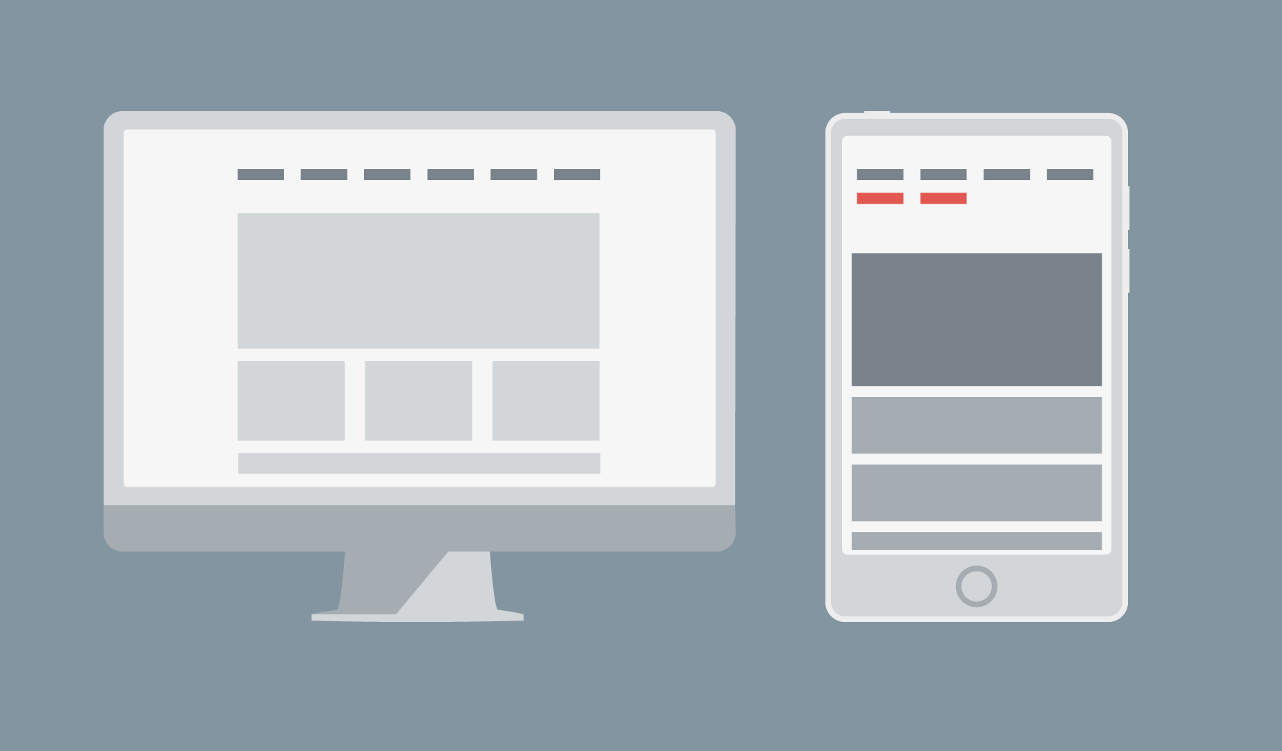 There are several ways to solve this problem. The first is to reduce the number of items displayed horizontally on the navbar by sorting them into categories and sub-categories. You can then use drop-down items to display the sub-categories when a category is selected.
The second way is to change the break point to a lower value. The actual number to use is the width at which your navbar starts to fail, not a specific device size.
The third way is to use a different menu for devices, such as a sliding drawer.
There are several ways to solve this problem. The first is to reduce the number of items displayed horizontally on the navbar by sorting them into categories and sub-categories. You can then use drop-down items to display the sub-categories when a category is selected.
The second way is to change the break point to a lower value. The actual number to use is the width at which your navbar starts to fail, not a specific device size.
The third way is to use a different menu for devices, such as a sliding drawer.
Disaster 2) Using fixed width images
Content areas are usually set to a size relative to the viewport. So when a fixed-width image is wider than the size of the area, image cropping occurs. Above: example of a bad fixed-width image that is too large: now it has scroll bars and content is pushed off-screen.
You can avoid this problem by using relative units to set the width of the image, or if you use a framework that supports it (such as Bootstrap) you can use a responsive image class (eg: class="img-responsive").
Above: example of a bad fixed-width image that is too large: now it has scroll bars and content is pushed off-screen.
You can avoid this problem by using relative units to set the width of the image, or if you use a framework that supports it (such as Bootstrap) you can use a responsive image class (eg: class="img-responsive").
 Above: The same element with a responsive image class approach: now scroll bar is gone.
Disaster 3) Element distortion
This one is a bit more obscure, but essentially what happens when your layout is displayed on a small viewport is that any unhandled columns behave like rows. This is a problem because the distortion of the content unintentionally changes the hierarchy of your design.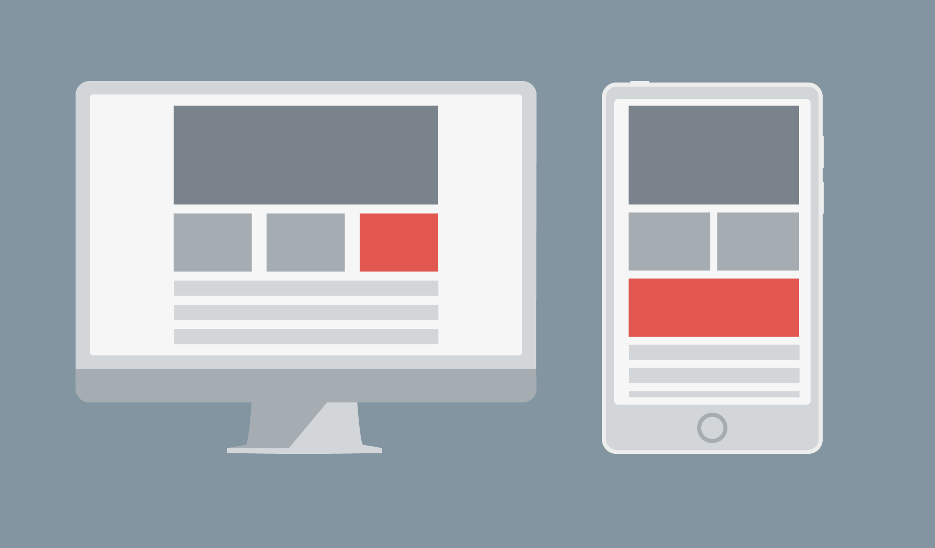 Above: column becomes a row, distorting content.
The solution is obvious, yet it is surprising how many people struggle with it: simply set the height, width, and padding of the element explicitly. If it moves out of position and covers other elements, you can force it to be where you want by wrapping it in a div and setting margins.
Above: column becomes a row, distorting content.
The solution is obvious, yet it is surprising how many people struggle with it: simply set the height, width, and padding of the element explicitly. If it moves out of position and covers other elements, you can force it to be where you want by wrapping it in a div and setting margins.
Planning helps avoid mistakes
This article has discussed only the 3 most commonly encountered responsive design disasters, but there are plenty of other ways for a good design to go wrong. Preventing errors is not too difficult. Modern browsers have built-in responsive layout testing, so plan your design well and test often.Emma Grant
Emma Grant is a professional freelance content writer from Ireland. Over the past three years she has travelled the world while running her business from her laptop. You find her at www.florencewritinggale.com


Read Next

15 Best New Fonts, July 2024
Welcome to our monthly roundup of the best fonts we’ve found online in the last four weeks. This month, there are fewer…
By Ben Moss

20 Best New Websites, July 2024
Welcome to July’s round up of websites to inspire you. This month’s collection ranges from the most stripped-back…

Top 7 WordPress Plugins for 2024: Enhance Your Site's Performance
WordPress is a hands-down favorite of website designers and developers. Renowned for its flexibility and ease of use,…
By WDD Staff

Exciting New Tools for Designers, July 2024
Welcome to this July’s collection of tools, gathered from around the web over the past month. We hope you’ll find…

3 Essential Design Trends, July 2024
Add some summer sizzle to your design projects with trendy website elements. Learn what's trending and how to use these…

15 Best New Fonts, June 2024
Welcome to our roundup of the best new fonts we’ve found online in the last month. This month, there are notably fewer…
By Ben Moss

20 Best New Websites, June 2024
Arranging content in an easily accessible way is the backbone of any user-friendly website. A good website will present…

Exciting New Tools for Designers, June 2024
In this month’s roundup of the best tools for web designers and developers, we’ll explore a range of new and noteworthy…

3 Essential Design Trends, June 2024
Summer is off to a fun start with some highly dramatic website design trends showing up in projects. Let's dive in!

15 Best New Fonts, May 2024
In this month’s edition, there are lots of historically-inspired typefaces, more of the growing trend for French…
By Ben Moss

How to Reduce The Carbon Footprint of Your Website
On average, a web page produces 4.61 grams of CO2 for every page view; for whole sites, that amounts to hundreds of KG…
By Simon Sterne

20 Best New Websites, May 2024
Welcome to May’s compilation of the best sites on the web. This month we’re focused on color for younger humans,…