

 What’s more Neue Haas Unica has been drawn for the screen, in which process, many of the limitations that make Helvetica so poor as a UI face have been corrected. The design has a modernist simplicity that Apple would surely love to have uncovered when developing San Francisco.
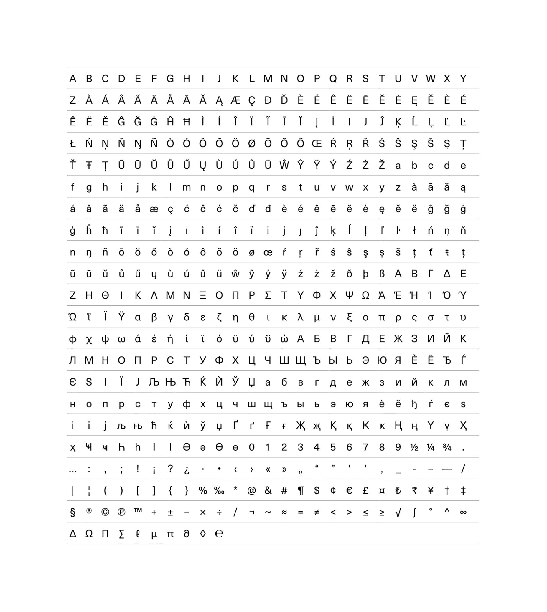
A little more spacious, and a little rounder, than Helvetica, Neue Haas Unica is a very tempting grotesk to keep handy. It has 18 different fonts, the lightest of which is available free, the rest of which are available at a discount until 7th May. It also features extended language support, including Greek and Cyrillic.
As well as working for UI design, Neue Haas Unica is tolerable for body text, although there are certainly still better options available.
[pullquote]it couldn’t be more mid-century modern if it were sat in a Knoll armchair, in a Frank Lloyd Wright office building, sipping martinis with Don Draper[/pullquote]
Like its parents, Helvetica and Univers, Neue Haas Unica really excells at display sizes. It perfectly evokes modernism; in fact it couldn’t be more mid-century modern if it were sat in a Knoll armchair, in a Frank Lloyd Wright office building, sipping martinis with Don Draper.
And that may be Neue Haas Unica’s single undoing. Like an ad-exec who’s just bought his first pair of skinny jeans and started growing a beard, Neue Haas Unica may find that particular boat has sailed. Whilst Neue Haas Unica is beautiful in its own right, it evokes both the design of the 1950s, and the spirit of 1980s corporate America, but it does it so well, that it’s hard to see it working in any other context.
It’s a truth universally acknowledged, that we only want what we can’t have. For over a decade web designers struggled to make gradients work, even going as far as relying on site-bloating transparent pngs; as soon as CSS3 introduced gradient support in browsers, we embraced flat design.
What’s more Neue Haas Unica has been drawn for the screen, in which process, many of the limitations that make Helvetica so poor as a UI face have been corrected. The design has a modernist simplicity that Apple would surely love to have uncovered when developing San Francisco.
A little more spacious, and a little rounder, than Helvetica, Neue Haas Unica is a very tempting grotesk to keep handy. It has 18 different fonts, the lightest of which is available free, the rest of which are available at a discount until 7th May. It also features extended language support, including Greek and Cyrillic.
As well as working for UI design, Neue Haas Unica is tolerable for body text, although there are certainly still better options available.
[pullquote]it couldn’t be more mid-century modern if it were sat in a Knoll armchair, in a Frank Lloyd Wright office building, sipping martinis with Don Draper[/pullquote]
Like its parents, Helvetica and Univers, Neue Haas Unica really excells at display sizes. It perfectly evokes modernism; in fact it couldn’t be more mid-century modern if it were sat in a Knoll armchair, in a Frank Lloyd Wright office building, sipping martinis with Don Draper.
And that may be Neue Haas Unica’s single undoing. Like an ad-exec who’s just bought his first pair of skinny jeans and started growing a beard, Neue Haas Unica may find that particular boat has sailed. Whilst Neue Haas Unica is beautiful in its own right, it evokes both the design of the 1950s, and the spirit of 1980s corporate America, but it does it so well, that it’s hard to see it working in any other context.
It’s a truth universally acknowledged, that we only want what we can’t have. For over a decade web designers struggled to make gradients work, even going as far as relying on site-bloating transparent pngs; as soon as CSS3 introduced gradient support in browsers, we embraced flat design.
It seems like for the past decade foundries have been searching for the Holy Grail of alternative geometric sans serifs to the old staples. Unica got there first. — Stefanie Weigler & David HeastyPerhaps we craved a successful grotesk face for the Web, only so long as we didn’t have one. If it had been released five years ago it would certainly be the sans serif of choice, but whether Neue Haas Unica survives longer than its non-Neue predecessor, we’ll have to wait and see.
Ben Moss
Ben Moss has designed and coded work for award-winning startups, and global names including IBM, UBS, and the FBI. When he’s not in front of a screen he’s probably out trail-running.


Read Next

15 Best New Fonts, July 2024
Welcome to our monthly roundup of the best fonts we’ve found online in the last four weeks. This month, there are fewer…
By Ben Moss

20 Best New Websites, July 2024
Welcome to July’s round up of websites to inspire you. This month’s collection ranges from the most stripped-back…

Top 7 WordPress Plugins for 2024: Enhance Your Site's Performance
WordPress is a hands-down favorite of website designers and developers. Renowned for its flexibility and ease of use,…
By WDD Staff

Exciting New Tools for Designers, July 2024
Welcome to this July’s collection of tools, gathered from around the web over the past month. We hope you’ll find…

3 Essential Design Trends, July 2024
Add some summer sizzle to your design projects with trendy website elements. Learn what's trending and how to use these…

15 Best New Fonts, June 2024
Welcome to our roundup of the best new fonts we’ve found online in the last month. This month, there are notably fewer…
By Ben Moss

20 Best New Websites, June 2024
Arranging content in an easily accessible way is the backbone of any user-friendly website. A good website will present…

Exciting New Tools for Designers, June 2024
In this month’s roundup of the best tools for web designers and developers, we’ll explore a range of new and noteworthy…

3 Essential Design Trends, June 2024
Summer is off to a fun start with some highly dramatic website design trends showing up in projects. Let's dive in!

15 Best New Fonts, May 2024
In this month’s edition, there are lots of historically-inspired typefaces, more of the growing trend for French…
By Ben Moss

How to Reduce The Carbon Footprint of Your Website
On average, a web page produces 4.61 grams of CO2 for every page view; for whole sites, that amounts to hundreds of KG…
By Simon Sterne

20 Best New Websites, May 2024
Welcome to May’s compilation of the best sites on the web. This month we’re focused on color for younger humans,…