

Switch some themes
In an ideal situation, you’ll be able to choose a WordPress theme (or have one made) that works perfectly on all screens. Unfortunately, this is not always the case. A theme might be responsive, but not show your content on large screens the way you want it to. Or maybe the mobile navigation is wonky. Whatever the problem, you might find another theme that gives you what you the first one is missing. In the world of free themes, the one-size fits all solution almost doesn’t exist. And here’s where we come to theme switchers. These plugins will switch between themes of your choosing based on the device that the user has. They may not be a perfect solution, but anything, and I do mean anything, is better than ignoring your mobile users.Any Mobile Theme Switcher
Any Mobile Theme Switcher is one of the simpler solutions out there. It’s free, with a Pro version, but the free features are more than enough for most purposes. You can set individual theme choices for all of these device and software categories separately: iPhones/iPod Touches, iPads, Android phones, Android tablets, Blackberrys, Windows Mobile devices, Opera Mini, Palm OS, and “Other”. You can also display a theme switcher to allow mobile users to swith to the “desktop theme” if they so desire.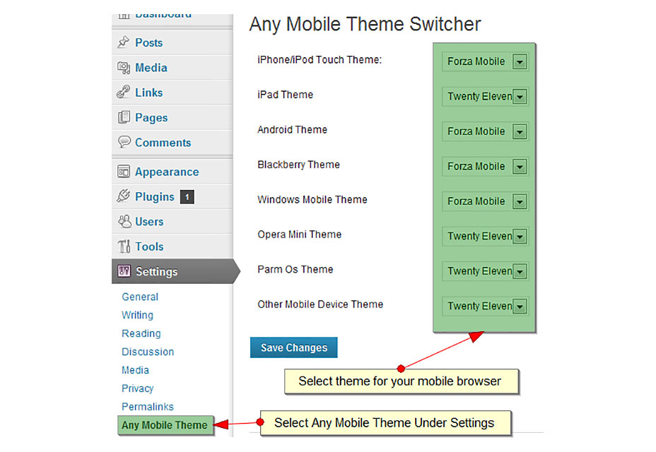
Mobile Smart
Mobile Smart takes a less specific approach to switching themes. You can choose to enable your mobile-specific theme for phones, and optionally for tablets, and that’s it. It also comes with an optional manual switcher. What makes it different is a feature called transcoding. Basically, if your WordPress setup is done right, Mobile Smart can automatically resize your images for faster delivery to mobile devices. This feature is currently in development. If you like this plugin enough that you’d actually spend money on it, the pro version offers the option to deliver mobile-specific page content, mobile-specific menus, and more.Or make an app, sort of
This option is a bit like switching themes. The design that your mobile users will see is very different from that shown on desktop or laptop screens, but this time, it's more like an app. Instead of just switching to another theme, a plugin like the WordPress Mobile Pack will take all of your content and display it as a web app. Your new mobile app can be customized with alternate color schemes, fonts, your own logo, and more. Sadly, if you want to use a theme other than the default, you’ll have to get (you guessed it), the pro/premium version. But if the default app theme works for you, then the WordPress Mobile Pack is a great way to make sure that your mobile users are taken care of.Make your content mobile too
Obviously, your content has to adapt to whatever platform it’s on. If you’re just using text and images, your theme can probably handle itself just fine. But, if you want to introduce more complex interface elements elements, or just get more control over how your content looks across all platforms, we’ve got plugins for that too:Responsive images
You can save yourself and your users some bandwidth by only serving pictures at the size they actually need. This means that using your website literally costs mobile users with limited data plans less to use, and they can use it faster. For this purpose, you could use Post Script Responsive Images. It automatically creates multiple versions of all images on your site: in your theme, in your content, and your featured images too, including all existing images on your site. It serves them to the browser with the srcset attribute, and the browser picks which image to download. This method is at least partially supported by the big mobile browsers. It may not benefit everyone yet, so think of this as future-proofing your site.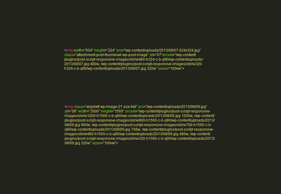
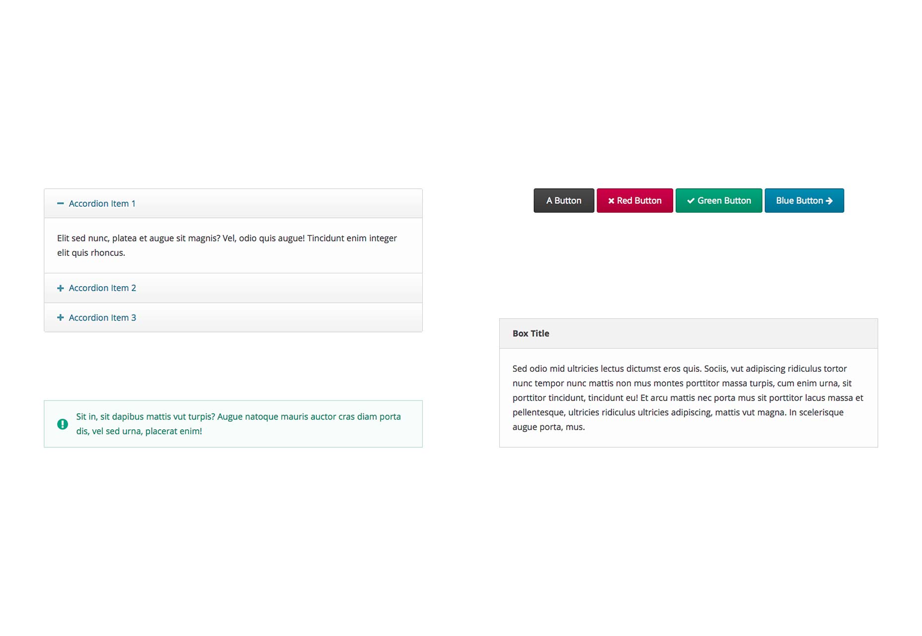
Buttons, columns, tabs, accordions, and more
Sometimes you just want to add more than plain text to your site. Sometimes, you’d like the choice to organize your content a little better. Sometimes you’ll want to embed a video. Well, you can, and it’ll work on all screen sizes too. Easy Responsive Shortcodes is a collection of layout options and user interface elements to help you add some extra style/organization to your posts and pages. What’s more, you don’t have to worry about whether they’ll work on small screens, because they do. Here’s the full list of components:- Accordions
- Alerts
- Boxes
- Buttons
- Calls-to-action
- Clear floats
- Columns
- Highlights
- Icons (via Font Awesome)
- Tabs
- Toggles
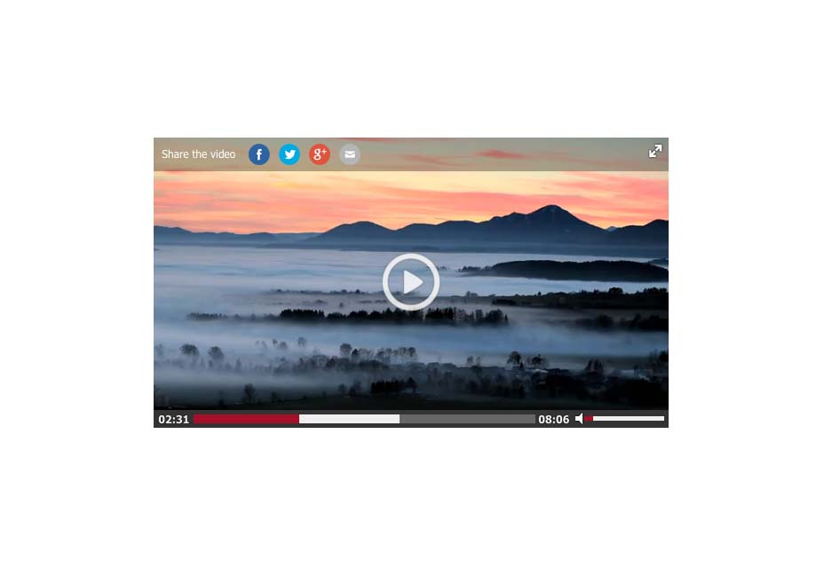
 As for embedding video in your posts, check out FV WordPress Flowplayer. It’s an HTML5-based video player with support for embedding videos from Youtube, Vimeo, or raw URLs. It also comes with a Flash-based fallback for older browsers.
It’s also completely free, unless you want to put your own logo on it, and remove the Flowplayer branding. That’ll cost you a pro upgrade, but all of the actual functionality is there for your use.
As for embedding video in your posts, check out FV WordPress Flowplayer. It’s an HTML5-based video player with support for embedding videos from Youtube, Vimeo, or raw URLs. It also comes with a Flash-based fallback for older browsers.
It’s also completely free, unless you want to put your own logo on it, and remove the Flowplayer branding. That’ll cost you a pro upgrade, but all of the actual functionality is there for your use.
Fix the navigation
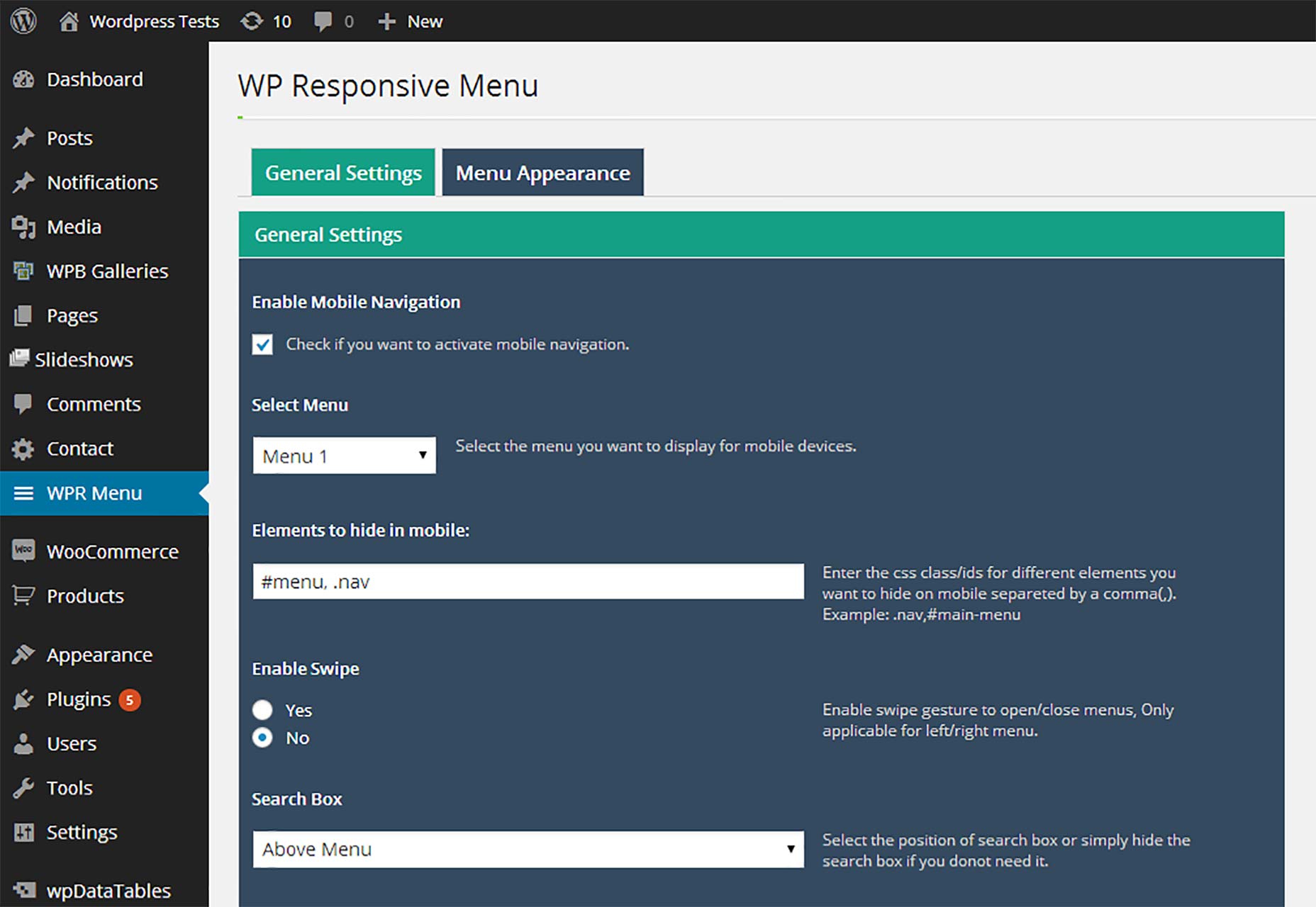
If you like your theme in general, but the theme’s built-in navigation isn’t doing it for you, you might look at these alternatives. After all, your users can’t buy what you’re selling if they can’t find it. Mobile Navigation will create a full-screen navigation menu that only shows up on small screens. You can customize the breakpoint that makes it show, the colors, the fonts, and more. It’s mostly install-n-go.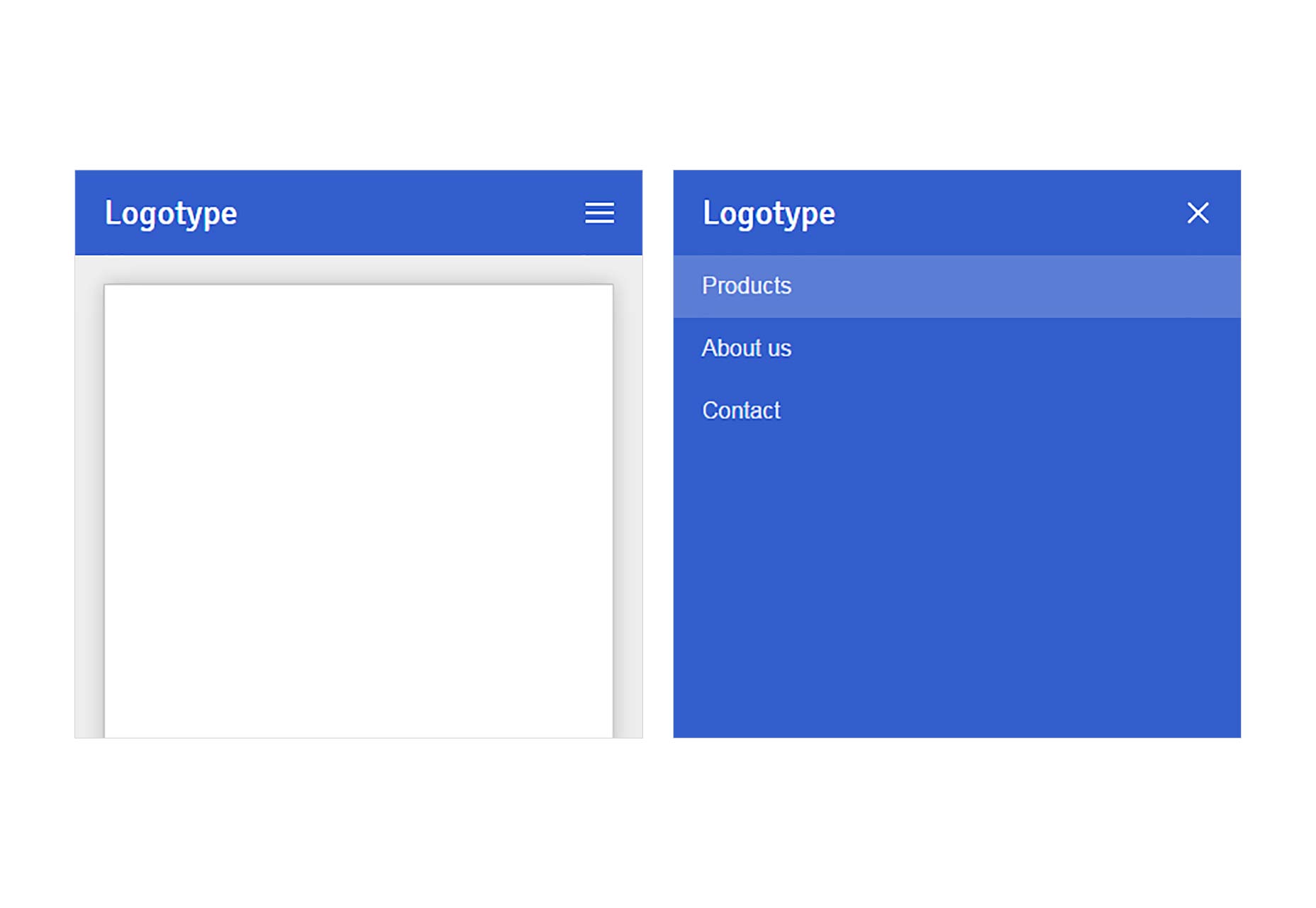 WP Responsive Menu, does much the same thing, only it creates a menu that slides in from the side. Again, you can customize the look and feel of the menu to your heart’s content.
See the differences side by side
Want to see what your responsive theme will look like while you work on it? Just install Mobile Previewer. When you browse your site (logged in) you’ll be able to launch a small preview of it at a variety of mobile sizes in the lower right-hand corner of your browser. This won’t work with the theme switchers listed above, but in any other case, it works just fine.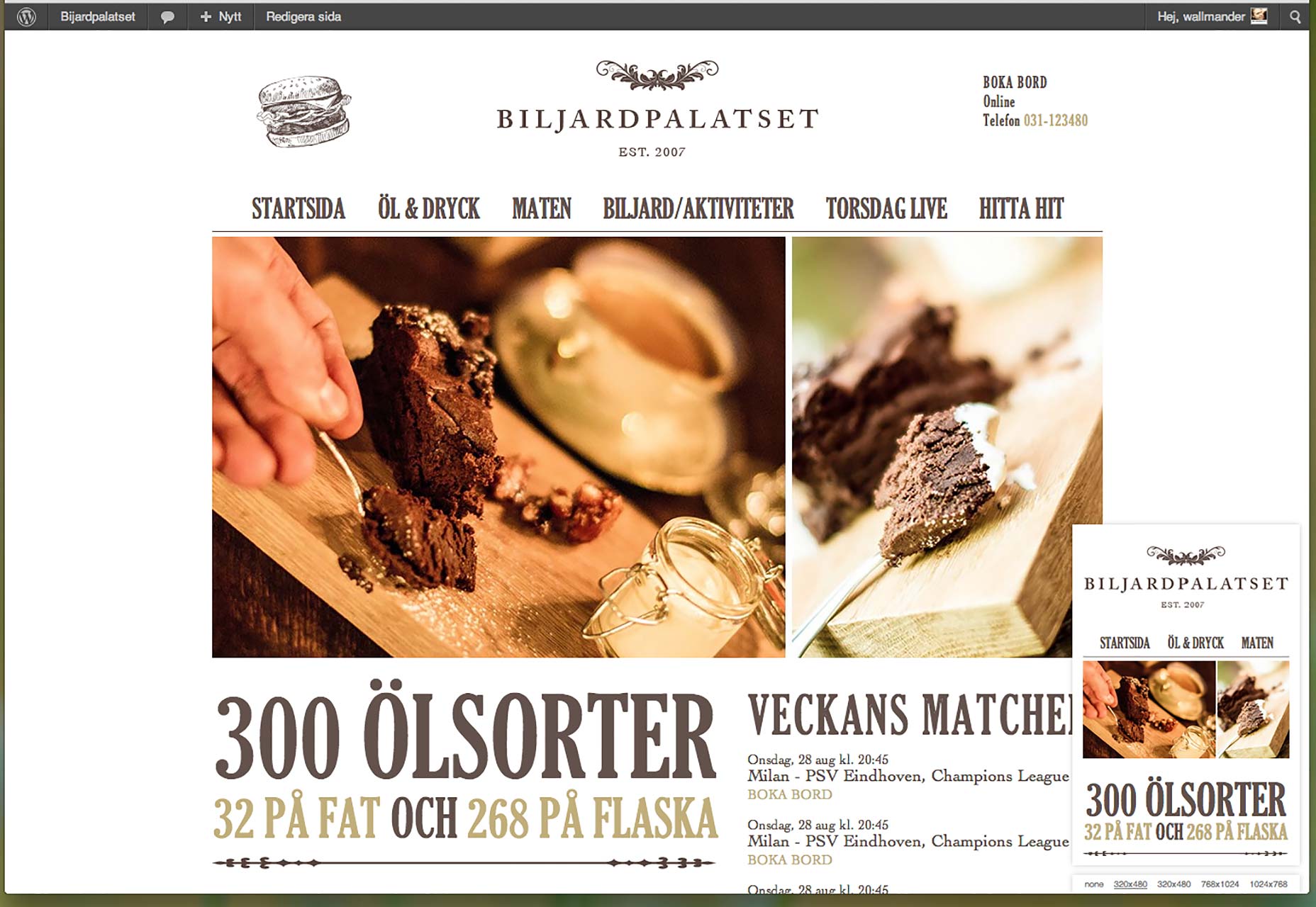
Fin
So there you have it. There's a lot you can do to make your WordPress website look good on all devices, even without any coding knowledge. Go forth, and make the mobile Web! Featured image uses mobile image via Shutterstock.Ezequiel Bruni
Ezequiel Bruni is a web/UX designer, blogger, and aspiring photographer living in Mexico. When he’s not up to his finely-chiselled ears in wire-frames and front-end code, or ranting about the same, he indulges in beer, pizza, fantasy novels, and stand-up comedy.


Read Next

15 Best New Fonts, July 2024
Welcome to our monthly roundup of the best fonts we’ve found online in the last four weeks. This month, there are fewer…
By Ben Moss

20 Best New Websites, July 2024
Welcome to July’s round up of websites to inspire you. This month’s collection ranges from the most stripped-back…

Top 7 WordPress Plugins for 2024: Enhance Your Site's Performance
WordPress is a hands-down favorite of website designers and developers. Renowned for its flexibility and ease of use,…
By WDD Staff

Exciting New Tools for Designers, July 2024
Welcome to this July’s collection of tools, gathered from around the web over the past month. We hope you’ll find…

3 Essential Design Trends, July 2024
Add some summer sizzle to your design projects with trendy website elements. Learn what's trending and how to use these…

15 Best New Fonts, June 2024
Welcome to our roundup of the best new fonts we’ve found online in the last month. This month, there are notably fewer…
By Ben Moss

20 Best New Websites, June 2024
Arranging content in an easily accessible way is the backbone of any user-friendly website. A good website will present…

Exciting New Tools for Designers, June 2024
In this month’s roundup of the best tools for web designers and developers, we’ll explore a range of new and noteworthy…

3 Essential Design Trends, June 2024
Summer is off to a fun start with some highly dramatic website design trends showing up in projects. Let's dive in!

15 Best New Fonts, May 2024
In this month’s edition, there are lots of historically-inspired typefaces, more of the growing trend for French…
By Ben Moss

How to Reduce The Carbon Footprint of Your Website
On average, a web page produces 4.61 grams of CO2 for every page view; for whole sites, that amounts to hundreds of KG…
By Simon Sterne

20 Best New Websites, May 2024
Welcome to May’s compilation of the best sites on the web. This month we’re focused on color for younger humans,…