

Secret 1: We stopped using those headlines
“My name is Joe Freelancer”, “We work on Sundays”, “We yell loudly”, “We craft digital experiences”; if I see that last headline one more time, I might cry… These are all headlines I’ve seen in researching countless freelancers and digital agencies. But do you see something in common? For starters, they’re very obscure and don’t say much about what the individual/company actually does. Then, they’re all about “we” or “me”. They’re not about “you”, the reader. They don’t talk about what they can do for “you”, or how they’ll help “you” reach your goals or solve your problems. According to advertising legend John Caples, in his book Tested Advertising Methods, there are two classes of headlines that really succeed:- Self-interest. These immediately tell the reader what they get out of it.
- News. These promise insightful / fresh news that’s of interest to the reader.
“… the effectiveness of the average curiosity headline is doubtful. For every curiosity headline that succeeds in getting results, a dozen will fail.”
So, as we need to pay the rent and put food on the table, let’s scrap that one altogether until we have some room for testing and failing. Also, let’s stop headlines that just talk about “us”. Two of the three headline types need to appeal to the reader’s interest. In my experience, that’s the key to really making a portfolio site that sells: talking about what’s in it for your clients. Instead, let’s get our message across clearly and powerfully. Once we’re booked solid with high-paying gigs, we can go back and tinker with things and get “crazy” with it. So enough with the cleverness, the convoluted-ness, and creating messages that require Alan Turing to decrypt. Let’s state who we are and how we can help loudly and clearly; and then go from there.
Secret 2: We started using these headlines instead
We’ve seen examples of self-serving headlines that are cryptic. But what do headlines that achieve the opposite look like? “Intuitive, User-Friendly UI Design That Helps Apps Take Off”, “Finally. Bold, beautiful web design - that gets people in the door”, “Online marketing that looks awesome. And sells. A lot.” Agency Lunar Gravity, while their main headline is a bit obscure, clarifies who they are and what they do if you scroll a page down: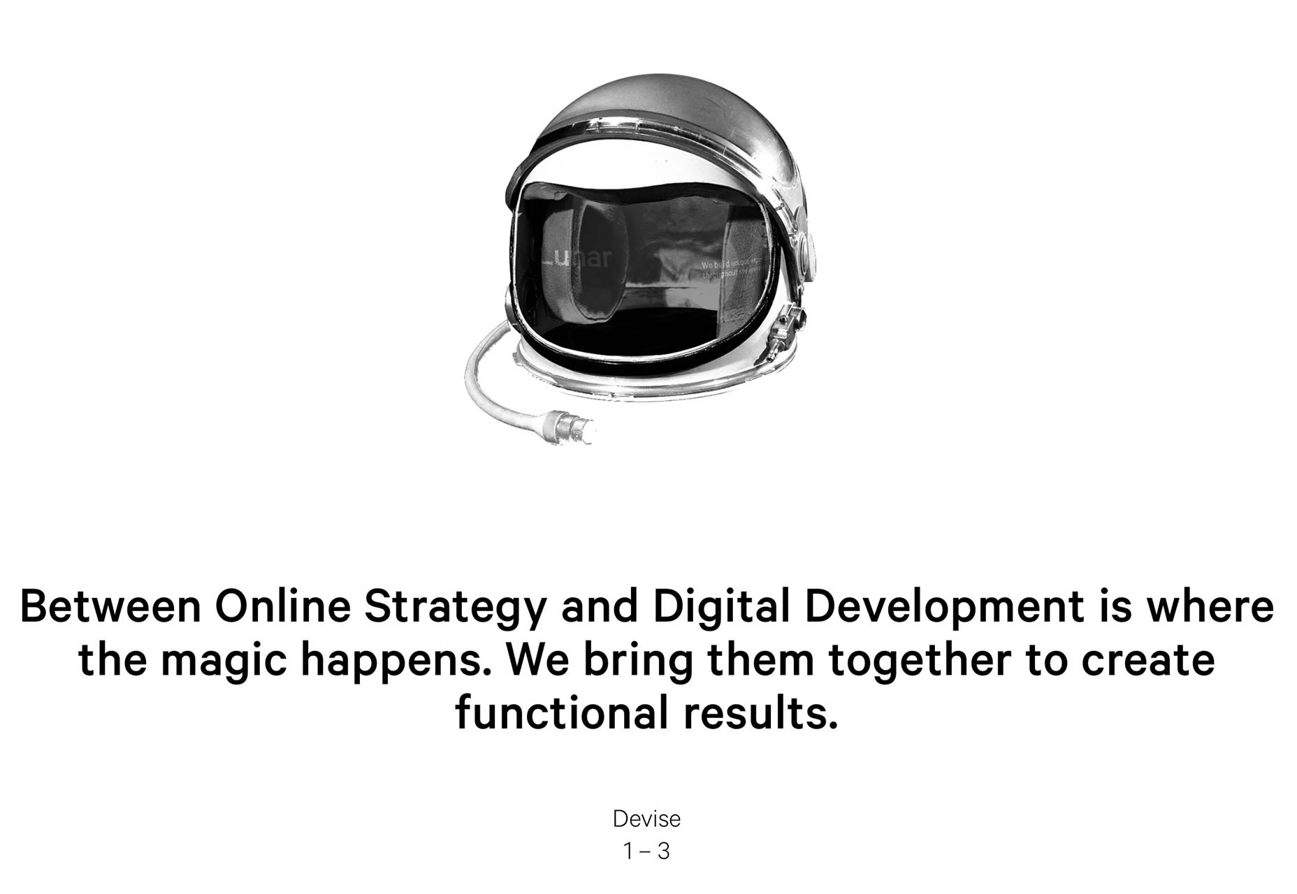 These kinds of headlines instantly communicate what you do, and what benefits you provide your clients with. Maybe they’re not as “creative” or “fun” as “Monkey Flips!” or “Cats Dance a Lot?” or “We Love Rock & Roll”, but they do have personality and flare. They also speak to “you”. They address the reasons someone is Googling a designer in the first place.
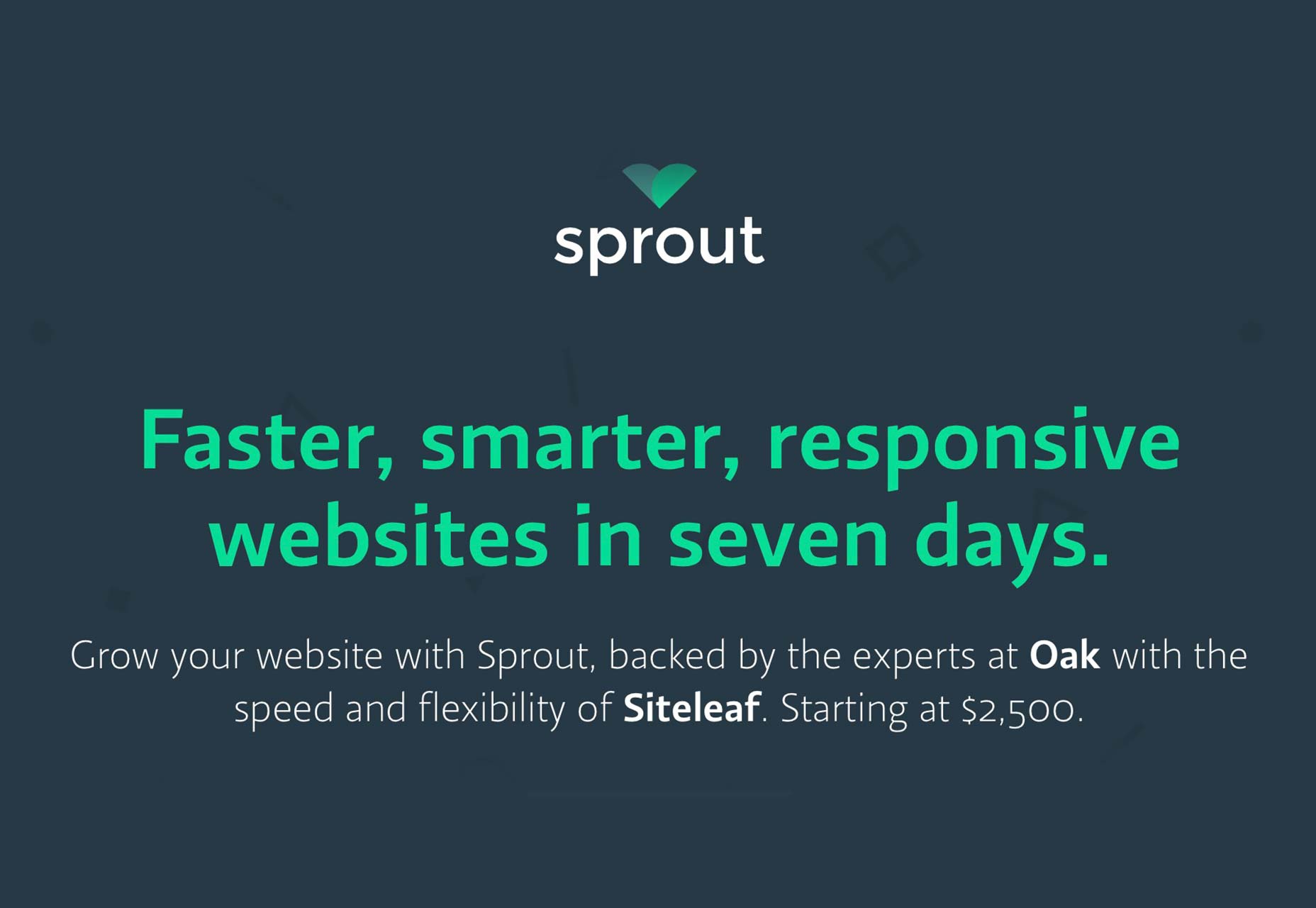
Sprout recognizes the importance of this:
These kinds of headlines instantly communicate what you do, and what benefits you provide your clients with. Maybe they’re not as “creative” or “fun” as “Monkey Flips!” or “Cats Dance a Lot?” or “We Love Rock & Roll”, but they do have personality and flare. They also speak to “you”. They address the reasons someone is Googling a designer in the first place.
Sprout recognizes the importance of this:
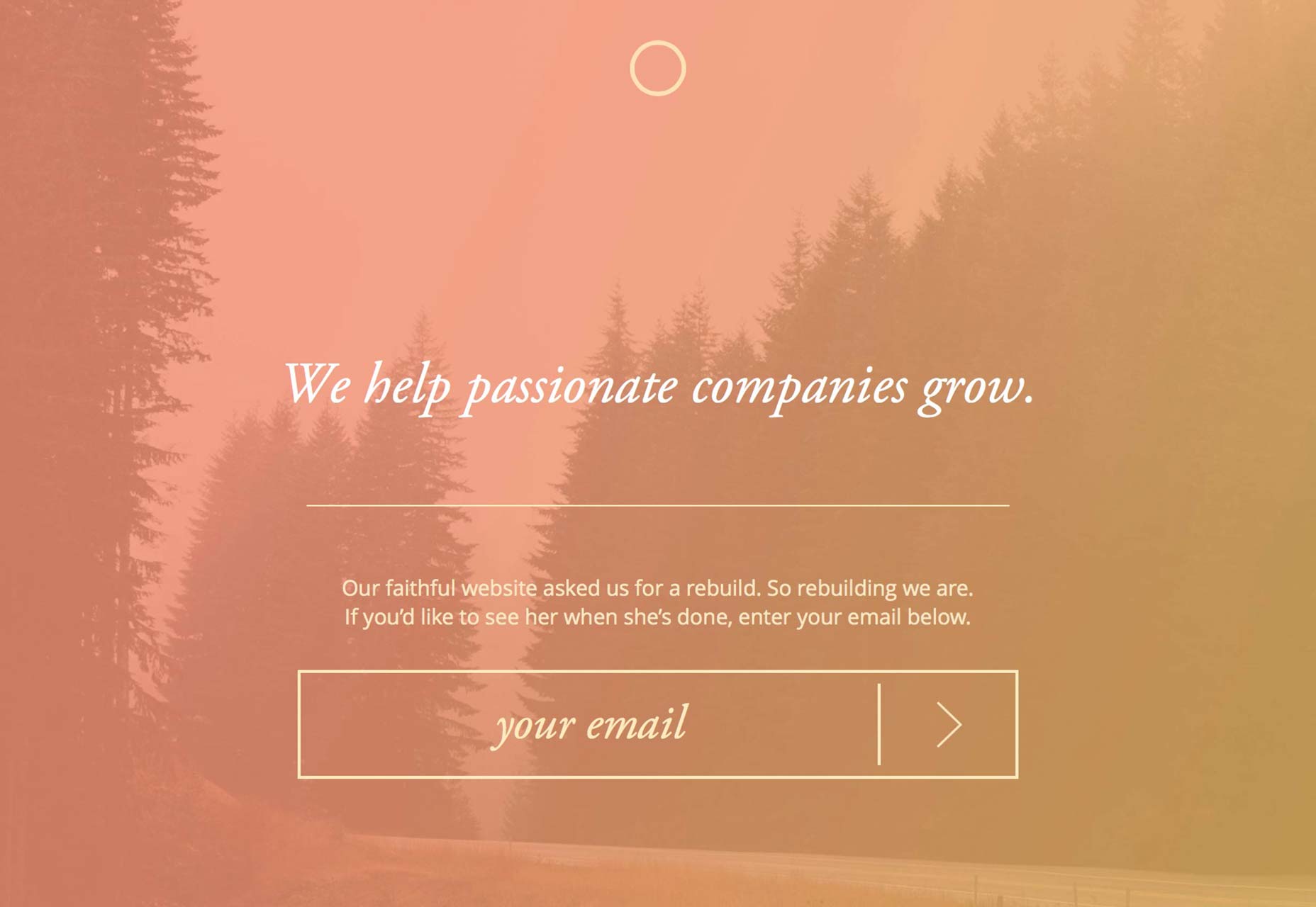
 Our own agency’s website is under construction, but we kept the headline from our previous site that worked wonders for us, and plan on using it again:
 Not everything has to be about selling or “getting customers in the door”. But it does have to be about whatever it is that your customers want. If your customers want responsive design, you need to communicate that. If they want something fast, you have to communicate that. You can communicate it with personality; but your website needs to talk about “them”, not “us”.
Let’s go back to our examples above and see what happens when we actually care about telling our visitors that we can solve their problems: “My name is Joe Freelancer. I’ll take your brand to the next level.” and “We yell loudly. We tell the world who you are, and why you rock, through stunning web design.”
Suddenly, these headlines feel very different. They feel like they understand the customer, and want to help. They might lose a few “cool points”, but if you ask me, landing good design jobs is a lot cooler than a cool headline. I’m sure you’d agree.
So make sure your headline says what you do, and how you help your customers. Once you’ve got those two down, have fun with it.
For example: “We’ll design & develop an app that your users will love. Then we can all grab brunch.”
Jokes and cleverness are good when you first show that you “get it” — “it” being what your customers truly need and want.
This leads to a question though. How do you decide what goes in your headline?
Not everything has to be about selling or “getting customers in the door”. But it does have to be about whatever it is that your customers want. If your customers want responsive design, you need to communicate that. If they want something fast, you have to communicate that. You can communicate it with personality; but your website needs to talk about “them”, not “us”.
Let’s go back to our examples above and see what happens when we actually care about telling our visitors that we can solve their problems: “My name is Joe Freelancer. I’ll take your brand to the next level.” and “We yell loudly. We tell the world who you are, and why you rock, through stunning web design.”
Suddenly, these headlines feel very different. They feel like they understand the customer, and want to help. They might lose a few “cool points”, but if you ask me, landing good design jobs is a lot cooler than a cool headline. I’m sure you’d agree.
So make sure your headline says what you do, and how you help your customers. Once you’ve got those two down, have fun with it.
For example: “We’ll design & develop an app that your users will love. Then we can all grab brunch.”
Jokes and cleverness are good when you first show that you “get it” — “it” being what your customers truly need and want.
This leads to a question though. How do you decide what goes in your headline?
Secret 3: How to decide which benefits go in your headline (and on your site)
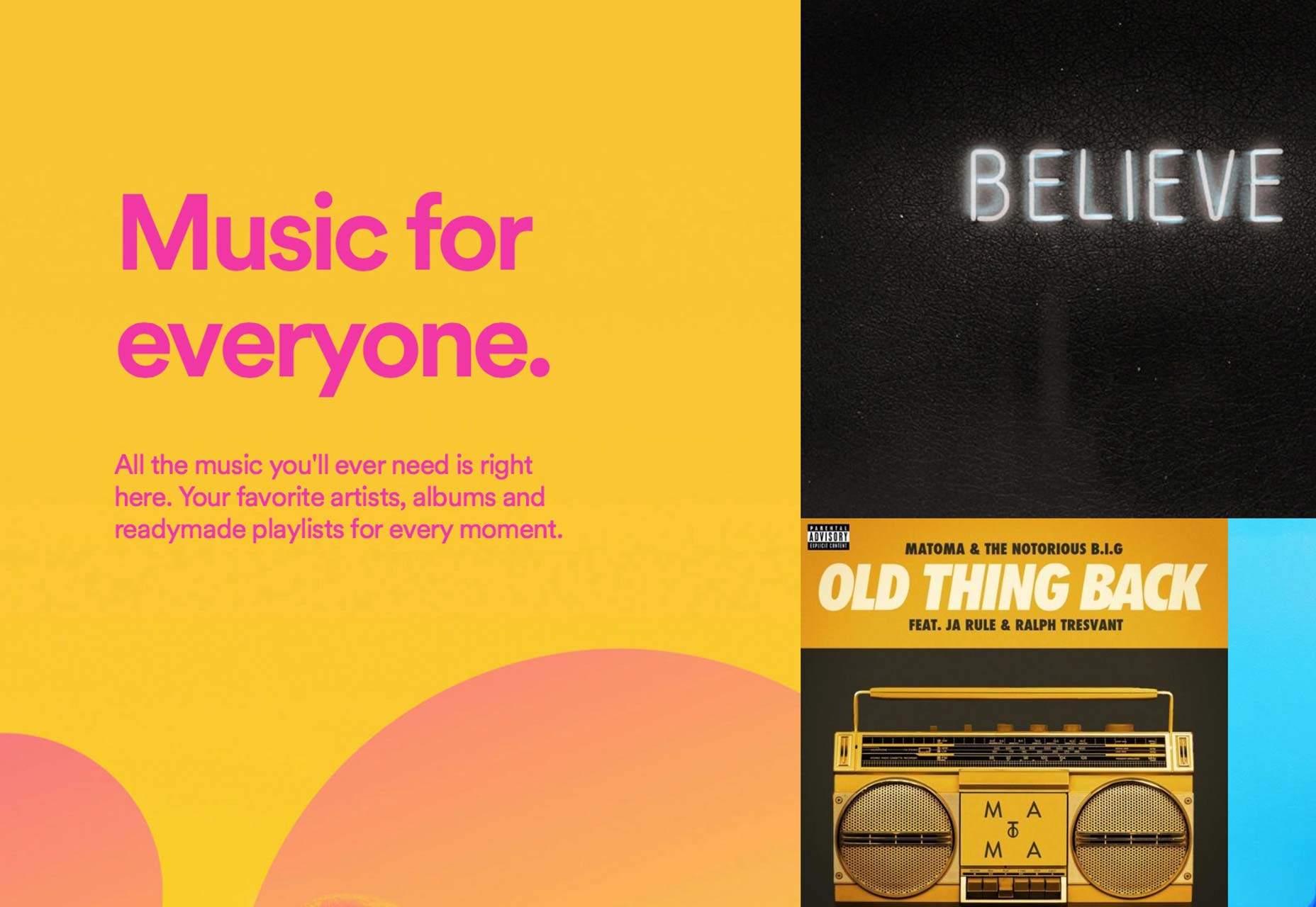
In approaching this question, some people say, “Why choose? Let’s throw ‘em all in there!” However, when you throw them all together, each one loses its strength. When you isolate them, though, and pick just one (two at most), you give them clarity and the center stage. It’s like negative space for writing. So how do you decide? You don’t. Your market does. You ask your clients what they enjoy most about working with you, and what results they always look forward to the most as well. You pore through forums where your market hangs out and see what problems they face, what goals they aim for. You read book reviews on Amazon for books that your market reads to solve those problems, and you absorb their stories. As you do this, you’ll begin to see “patterns”. You’ll notice some problems and goals being repeated more than the others. These “patterns” are what formulate the copy on your website. From your own clients and your own experience, you’ll learn what your strengths are. From your outside research, you’ll learn what your market is looking for. Then, you just pair them together. For example, Spotify learned that their market wants ease, freedom, and a good deal. So look at their headline and sub-headline: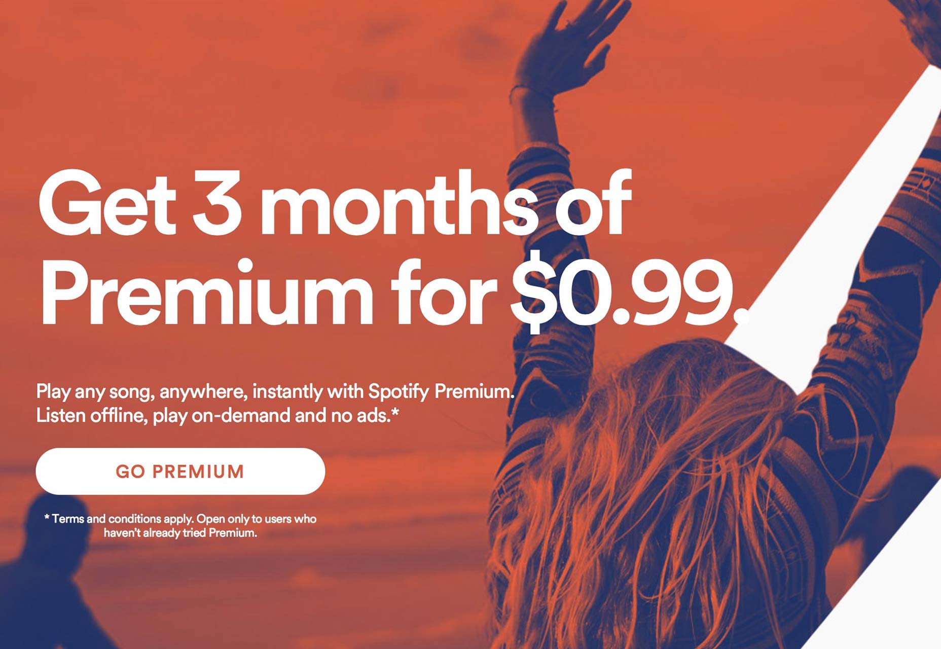 No “fluff” or “cleverness”. It’s right to the point. However, it still carries a lot of personality and fun because of the design and the simple language.
Apple is taking more of a “curiosity” approach, but there are implied benefits. They understand that creatives are a big purchaser of the Mac Pro, so they’re implying that the Mac Pro will help you take your creativity to “epic” levels:
No “fluff” or “cleverness”. It’s right to the point. However, it still carries a lot of personality and fun because of the design and the simple language.
Apple is taking more of a “curiosity” approach, but there are implied benefits. They understand that creatives are a big purchaser of the Mac Pro, so they’re implying that the Mac Pro will help you take your creativity to “epic” levels:
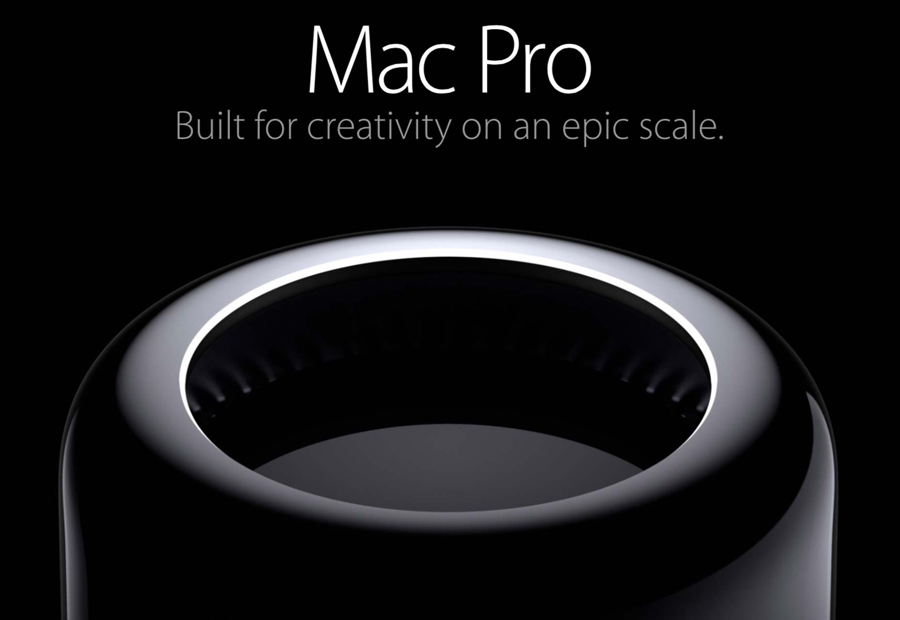 Apple has honed and refined the “curiosity” / “benefit-driven” combo. This is the hardest to get good results with, though, as we learned from Mr. Caples earlier in the post. If you like that style, I would suggest starting with the basics and building up to it over time.
However, you also don’t have to “choose” which benefits “make the cut”, and which ones don’t.
That’s because, for every important benefit you provide, you want it expressed; and you can express it throughout your website. But give each benefit its own spotlight. Your most important one or two get the center stage in your headline. The rest get their own paragraphs / sub-headlines. You can even go into further detail on your headline’s benefits later on your site too. If they’re that important, you’re going to want to make sure they’re really expressed.
For example, right after Spotify’s headline, when you scroll down, they reiterate the benefit of playing “any song”:
Apple has honed and refined the “curiosity” / “benefit-driven” combo. This is the hardest to get good results with, though, as we learned from Mr. Caples earlier in the post. If you like that style, I would suggest starting with the basics and building up to it over time.
However, you also don’t have to “choose” which benefits “make the cut”, and which ones don’t.
That’s because, for every important benefit you provide, you want it expressed; and you can express it throughout your website. But give each benefit its own spotlight. Your most important one or two get the center stage in your headline. The rest get their own paragraphs / sub-headlines. You can even go into further detail on your headline’s benefits later on your site too. If they’re that important, you’re going to want to make sure they’re really expressed.
For example, right after Spotify’s headline, when you scroll down, they reiterate the benefit of playing “any song”:
Secret 4: Start with some classic prompts. Then build from there
Try starting your headline with these prompts. You don’t have to stick to them to the T, but they can help get the juices flowing to create your perfect headline:- New
- Announcing
- Finally
- Yes
- How
- Discover
- Get
- They want to feel proud of their image. So that’s where the beauty comes in.
- They want results. That’s why they went into business. They have families and dreams and all the rest, just like you and me. That’s where selling / conversions come in.
Secret 5: Keep your home page simple
Our home page used to have a lot of options. You could see our latest work, read testimonials, and more. We had cool images and sliders and stuff. We got rid of all that and just put a big, bold headline, with a small paragraph. Our results soared. In my opinion, the best home pages communicate who you are and how you’re different. And nothing else. For example, here’s the home page of Reliable PSD: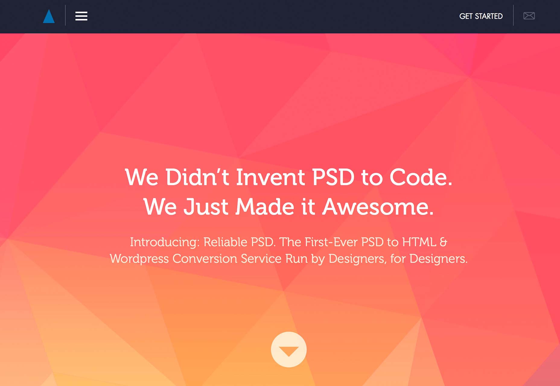 This is one of the highest-converting websites we’ve ever created. It follows only the rules I’ve spelled out for you above. Namely: It shows the customer what’s in it for them.
Secret 6: Don’t ask fellow designers for their opinion on your site
Design your site for your clients, not your peers. That’s the problem with too many design agency websites in my opinion. They’re created to impress their peers, and they fail to address what their clients are truly looking for. Many are absolutely stunning. I envy how crisp and clean they are. But the language makes my inner-marketer want to hit something. Don’t fall into this trap. There’s only one opinion that counts: your inbox. If it’s filled with requests for proposals, your website is good, even if another designer says it isn’t. The only exception is a designer who you know, for a fact, is a whiz at getting clients. They’ll have a different “eye” for your website than other designers. They’ll understand the importance of marketing and conveying sales messages. But otherwise, anyone else you ask won’t be giving you constructive criticism. It’s just their own 2 cents.David Tendrich


Read Next

15 Best New Fonts, July 2024

20 Best New Websites, July 2024

Top 7 WordPress Plugins for 2024: Enhance Your Site's Performance

Exciting New Tools for Designers, July 2024

3 Essential Design Trends, July 2024

15 Best New Fonts, June 2024

20 Best New Websites, June 2024

Exciting New Tools for Designers, June 2024

3 Essential Design Trends, June 2024

15 Best New Fonts, May 2024

How to Reduce The Carbon Footprint of Your Website
