Combining typefaces is one of the most challenging skills for a designer to master. Setting two fonts together in the same design brings out unexpected flavors in them both. What’s more, there’s rarely a right or wrong answer.
There are dozens of different ways to combine typefaces, some more useful than others, but the most practical place to start is to understand the role of each typeface and to focus on its qualities.
How many fonts is too many fonts?
You rarely need more than one typeface. One is almost always adequate to create a hierarchy and convey your message.
In practical terms single typeface design is rare, if only because most designs feature a logo, and most logos feature text, and by its nature a typeface used for a logo will probably not work for body text. There is a rule of thumb that says that you shouldn’t use more than three typefaces in a single design, given that the logo uses one (or two!) typefaces, you’re probably restricted to two faces.
Normally, in order for our headings to stand out when the page is scanned, we use one typeface for body text and one for display. However, you can make headings stand out by using a bold variation, or an accent color, you don’t necessarily need an additional typeface for this.
Font files tend to clock in at around 65kb, if you’re using italic and weight variants then that’s almost 200kb of download added to your site. What’s worse are the additional http requests being made to the server.
So the answer is, the fewer fonts the better. Each typeface has to earn its keep, if you don’t have a good reason for using it, then don’t.
How to select a practical font
Frequently, your initial font choice is taken out of your hands; companies often specify a typeface, or even a set of fonts, as part of their brand guidelines. Occasionally you’ll find a job has specific requirements, such as limited room that might require a condensed face, or a lot of legal text that might require a face that’s highly legible at small sizes. However, if you find yourself with an entirely blank page, with unlimited options, the natural place to start is the largest proportion of text, and that is probably your body copy.
When selecting a typeface for body text, your primary concern should be readability. Don’t concern yourself with personality at this stage.
I’m of the school of thought that believes that you’re better off mastering a few typefaces that you know well and can rely on, than reinventing the wheel with every design. So I advocate having a few reliable choices that you can call on. My current go-to typefaces for body text (on Google fonts) are Droid Sans, Noto Serif, and Cabin.
How to select a personality font
Here’s where the craft comes in…
Selecting your first typeface for readability is usually a case of picking up a reliable tool, like an artist picking up a 2B pencil. However, when selecting a second typeface, there are two things to bear in mind:
Firstly, your second typeface is not selected for practicality, but for personality. And it’s vital to understand that it’s not just selected for its own personality, the second typeface draws out the personality of the first. All typefaces have a personality of some kind, most have numerous characteristics, such as feeling friendly, or ergonomic, or stoic. If two faces share the same characteristic, then when combined the characteristic will be multiplied.

Secondly, your second typeface needs to look as though it is intended to work with the first, in order to create a consistent voice. Look for faces with similar proportions: the shape of the counters should be similar, the ratio of the x-height to the ascenders should similar.
With those two concerns in mind, you have three options for selecting a second typeface:
Option 1: The safe bet
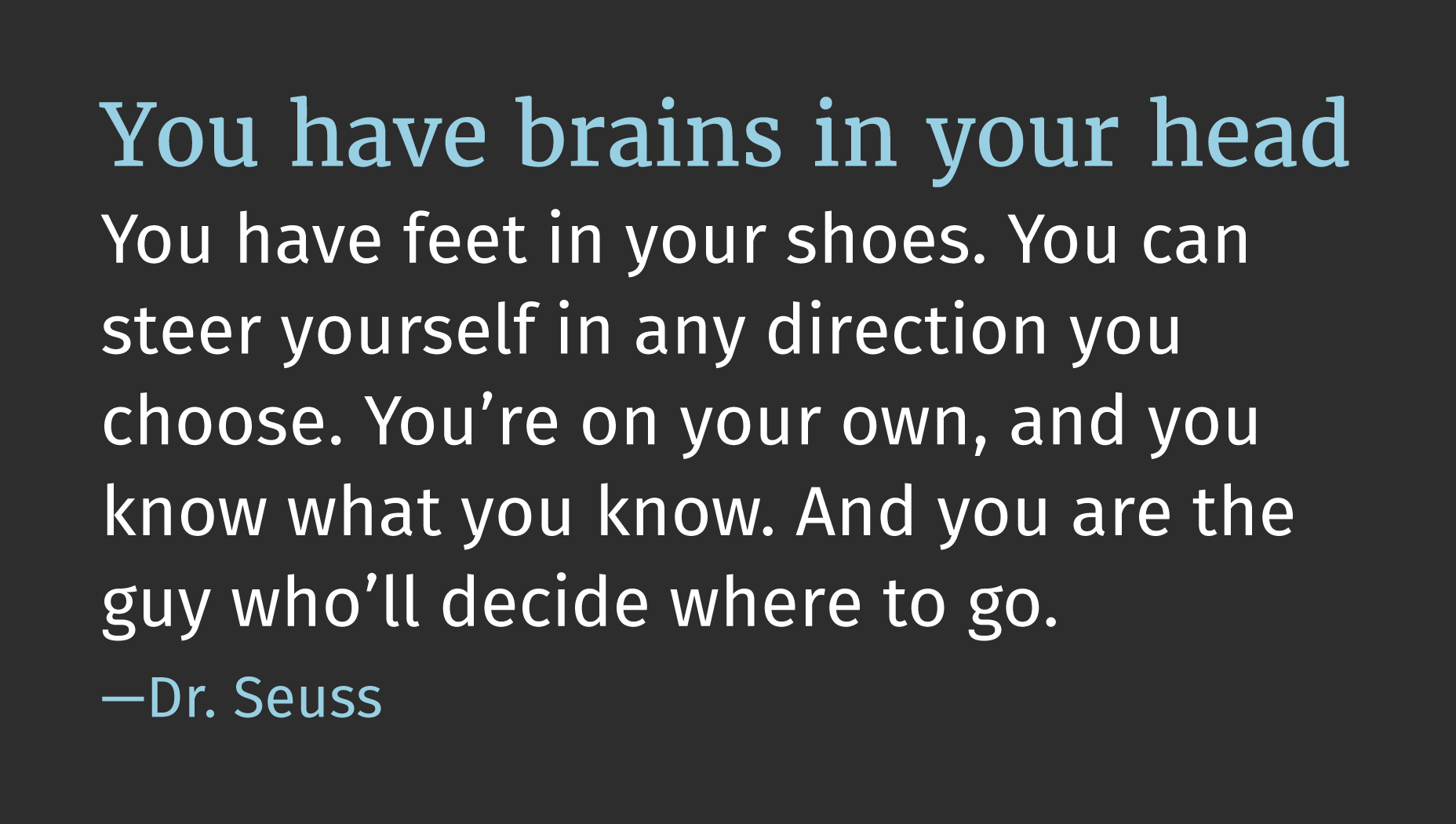
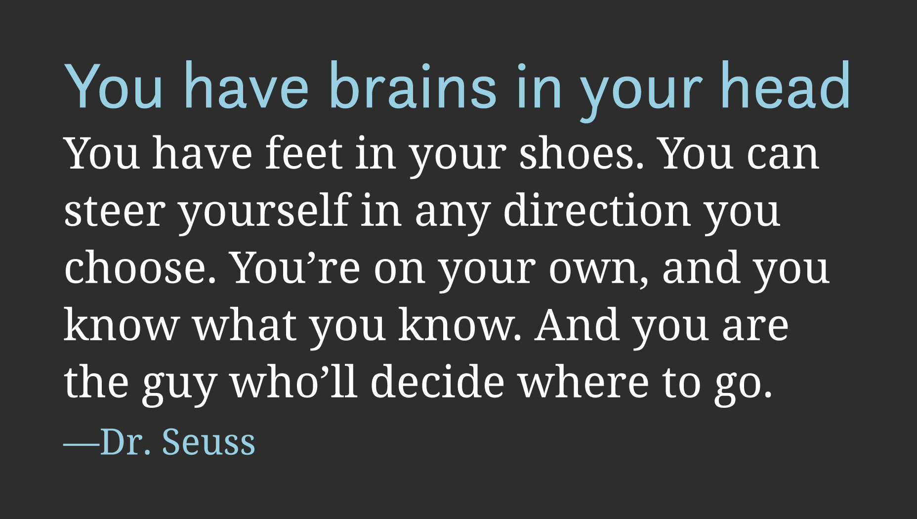
Many typefaces are designed with a companion serif or sans-serif — Scala Sans has Scala Serif, Meta has Meta Serif. My favorite body font of the moment, Droid Sans, has Droid Serif.
The value of combining companion fonts is that the basic letterforms are usually identical. The degree of contrast is minimal, but sufficient to warrant the extra http request.
If you’re not super-confident in your ability to blend typefaces, then this is a really reliable option.

Companion typefaces Droid Sans and Droid Serif
Option 2: Contrasting a characteristic
If you’ve picked a highly legible body face, then perhaps you can pick a display face that isn’t. If you’ve picked a geometric body face, then consider a humanist display face. If your body face is warm and inviting, try a display face that is strong and aloof.
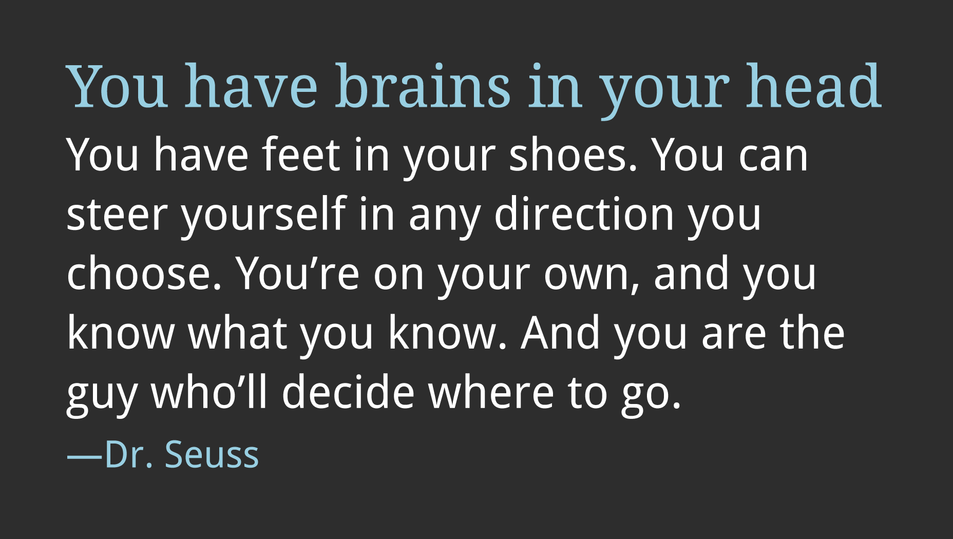
Noto Serif has nice round counters (the spaces in letters like ‘c’ and ‘o’) and the brackets on its serifs are equally nice and round. It’s open and friendly, it feels confident, and contemporary, with little expressive flairs. To contrast with that you might choose a typeface like Questa Sans. Questa Sans is also contemporary, also confident, also rounded. But Questa Sans doesn’t have expressive flairs, it’s far more matter-of-fact.

Typefaces with contrasting flair, Noto Serif and Questa Sans
Option 3: Contrasting styles
Whilst it’s possible to contrast a single characteristic, you can also take the opposite approach and contrast all the characteristics but one.
The way to do this, is to identify the main character of your first typeface, and then find a second that shares only that characteristic. This is by far the most challenging approach, because so much here is subjective, but it can also be the option that produces the most surprising and pleasing combinations.
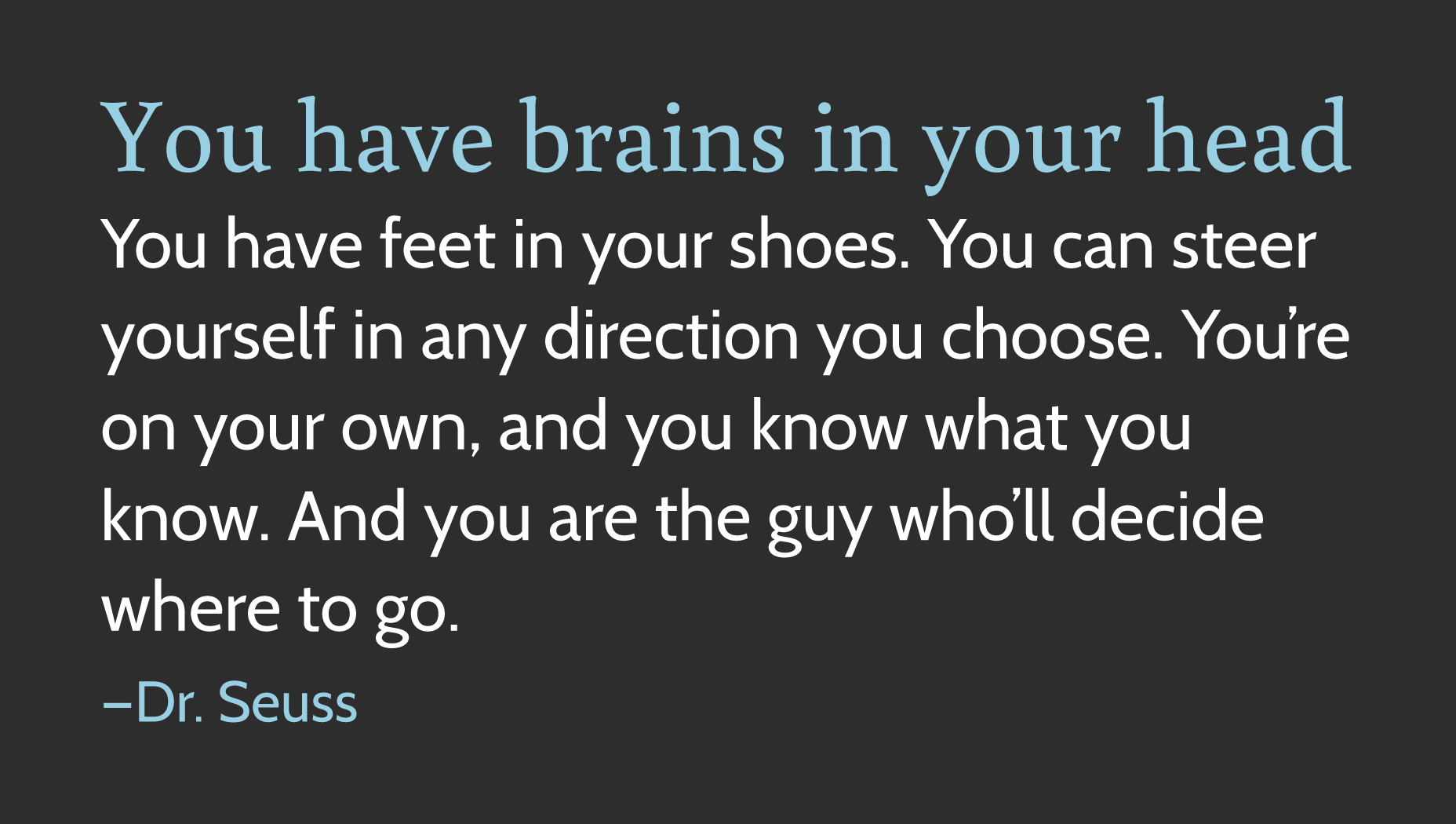
Cabin is a simple sans-serif, with very little contrast. It’s about as close to a geometric sans-serif (meaning a typeface constructed mathematically) as I’m comfortable going for a body face. It’s not academic at all, and isn’t that media friendly, but it is a very successful corporate face.
To contrast with Cabin, you might choose a typeface like Buenard. Buenard is equally corporate, it has similar proportions to Cabin, but its more traditional forms serve to emphasize Cabin’s geometry.

Typefaces with contrasting forms, Cabin and Buenard
Conclusion
Different typefaces, in different proportions, draw out different flavors in your designs. As with many things, restraint is often advisable because combining typefaces is an exponentially complex process.
How you choose to combine typefaces doesn’t really matter, what counts is the end result. However, it’s when you take risks, and look for unexpected pairings, that you’ll discover the most satisfying results.
Ben Moss
Ben Moss has designed and coded work for award-winning startups, and global names including IBM, UBS, and the FBI. When he’s not in front of a screen he’s probably out trail-running.


