

 The aol.com redesign old (left) and new (right).
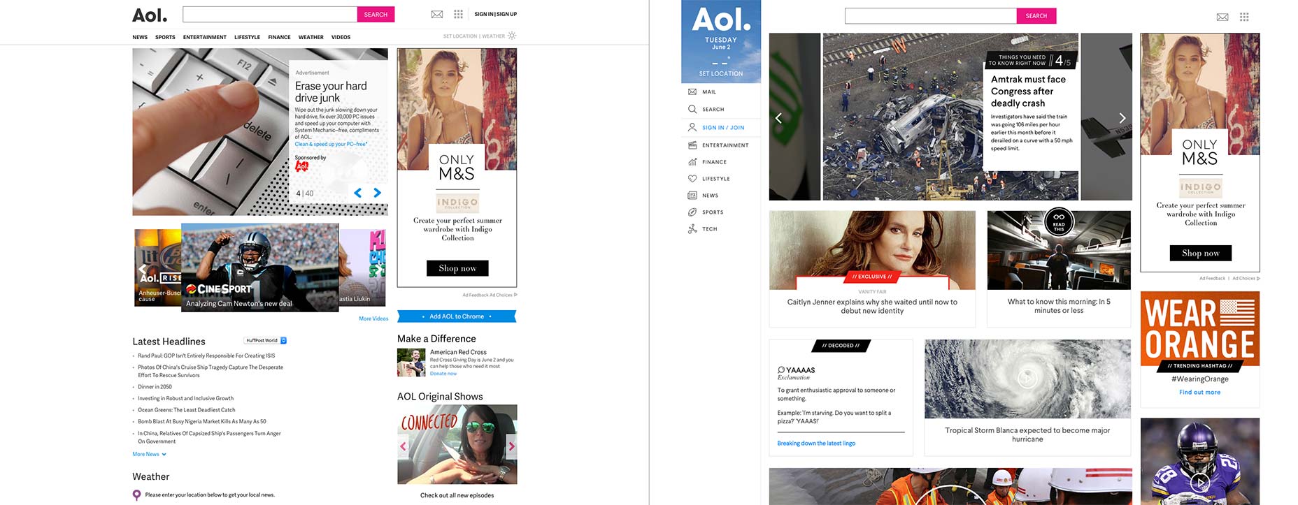
Clearly no one has told Aol. that carousels are bad because the new site retains the hero slider of the original design, complete with 40 slides. Each slide lasts around 8 seconds, so if you’d like to review all of the content that they want to ‘prioritize’ you’ll be staring at the homepage for over five minutes.
Any site, designed for mobile, needs to balance screen real estate with usability. The tablet size of the design adopts a dashboard style approach, replacing the vertical menu bar with a strip of icons. Dropping down to mobile size, the strip of icons is replaced with a hamburger menu, a common tactic that is probably the least worst solution in the majority of cases. However given that the navigation is already using icons it seems preferable in this case to keep the strip of icons right down to mobile. In all mobile cases, the navigation itself opens as a sliding drawer.
An interesting issue is that the in-house team that designed the site have chosen not to make the header sticky, so when you’ve scrolled through a lot of content, you have to scroll back to the top to change sections.
The aol.com redesign old (left) and new (right).
Clearly no one has told Aol. that carousels are bad because the new site retains the hero slider of the original design, complete with 40 slides. Each slide lasts around 8 seconds, so if you’d like to review all of the content that they want to ‘prioritize’ you’ll be staring at the homepage for over five minutes.
Any site, designed for mobile, needs to balance screen real estate with usability. The tablet size of the design adopts a dashboard style approach, replacing the vertical menu bar with a strip of icons. Dropping down to mobile size, the strip of icons is replaced with a hamburger menu, a common tactic that is probably the least worst solution in the majority of cases. However given that the navigation is already using icons it seems preferable in this case to keep the strip of icons right down to mobile. In all mobile cases, the navigation itself opens as a sliding drawer.
An interesting issue is that the in-house team that designed the site have chosen not to make the header sticky, so when you’ve scrolled through a lot of content, you have to scroll back to the top to change sections.
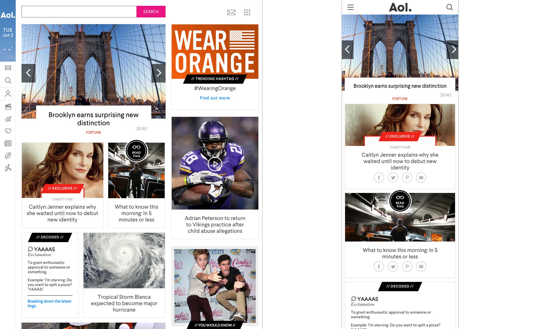 The aol.com redesign for tablet (left) and phones (right).
A significant problem is not the navigation’s dependency on icons — the addition of text in the sliding drawer minimises that issue — but the icons that have been selected. The mail and search icons are clear, as are the sign in, entertainment, finances, and news icons. The football used to represent sports is clear, but very US-centric (a corporation with global ambitions might have used a more global sport, such as tennis or golf). The lifestyle link is represented by a heart, which given Aol.’s demographic could be mistaken for dating or romance. Tech, seems more like a social media icon.
The typeface being used is Larsseit, of which I’m not a fan for body text on screens. Its counters are generous and there isn’t too much contrast, but its apertures are small and there’s too little variety in its letterforms for my taste.
Aol.’s biggest challenge has been the integration of video. Video has been key to Aol.’s continued prosperity; according to The Next Web they’ve experienced a 93.8% growth in video views over the last year. It feels like a missed opportunity therefore that videos can’t be played right on the homepage.
The logo block, that features the logo, the date, and the temperature at your location, uses as its background an image of the current weather conditions. It’s an intellectually clever idea, but results in a very pale blue block. I’d like to have seen this block colored neon pink to match the search button. A shock of color would have gone some way to livening up a page that is presently quite dull.
The biggest issue with Aol.’s redesign is that it lacks personality. It’s rare that I would ever level this accusation at anyone, but: it’s too minimal.
Aol. is undoubtedly a success story on the Web, owed in large part to their role as early adopters. Their new redesign is clearly an attempt to adopt the ever-growing mobile web. In many ways they’ve sacrificed desktop experience for a more satisfying mobile experience. Browsing the new aol.com on mobile feels more elegant than browsing it on desktop, and the whole site feels as if it was designed mobile-first.
Aol. should be applauded for embracing change and fully committing to the mobile web even if, as is probably the case, the resulting site is too utilitarian to ever fall in love with. It’s a great starting point for the company’s future, but I doubt it will last as long as those free installation disks currently residing in the world’s landfill.
Featured image uses smart phone image via Shutterstock.
The aol.com redesign for tablet (left) and phones (right).
A significant problem is not the navigation’s dependency on icons — the addition of text in the sliding drawer minimises that issue — but the icons that have been selected. The mail and search icons are clear, as are the sign in, entertainment, finances, and news icons. The football used to represent sports is clear, but very US-centric (a corporation with global ambitions might have used a more global sport, such as tennis or golf). The lifestyle link is represented by a heart, which given Aol.’s demographic could be mistaken for dating or romance. Tech, seems more like a social media icon.
The typeface being used is Larsseit, of which I’m not a fan for body text on screens. Its counters are generous and there isn’t too much contrast, but its apertures are small and there’s too little variety in its letterforms for my taste.
Aol.’s biggest challenge has been the integration of video. Video has been key to Aol.’s continued prosperity; according to The Next Web they’ve experienced a 93.8% growth in video views over the last year. It feels like a missed opportunity therefore that videos can’t be played right on the homepage.
The logo block, that features the logo, the date, and the temperature at your location, uses as its background an image of the current weather conditions. It’s an intellectually clever idea, but results in a very pale blue block. I’d like to have seen this block colored neon pink to match the search button. A shock of color would have gone some way to livening up a page that is presently quite dull.
The biggest issue with Aol.’s redesign is that it lacks personality. It’s rare that I would ever level this accusation at anyone, but: it’s too minimal.
Aol. is undoubtedly a success story on the Web, owed in large part to their role as early adopters. Their new redesign is clearly an attempt to adopt the ever-growing mobile web. In many ways they’ve sacrificed desktop experience for a more satisfying mobile experience. Browsing the new aol.com on mobile feels more elegant than browsing it on desktop, and the whole site feels as if it was designed mobile-first.
Aol. should be applauded for embracing change and fully committing to the mobile web even if, as is probably the case, the resulting site is too utilitarian to ever fall in love with. It’s a great starting point for the company’s future, but I doubt it will last as long as those free installation disks currently residing in the world’s landfill.
Featured image uses smart phone image via Shutterstock.
Ben Moss
Ben Moss has designed and coded work for award-winning startups, and global names including IBM, UBS, and the FBI. When he’s not in front of a screen he’s probably out trail-running.


Read Next

15 Best New Fonts, July 2024
Welcome to our monthly roundup of the best fonts we’ve found online in the last four weeks. This month, there are fewer…
By Ben Moss

20 Best New Websites, July 2024
Welcome to July’s round up of websites to inspire you. This month’s collection ranges from the most stripped-back…

Top 7 WordPress Plugins for 2024: Enhance Your Site's Performance
WordPress is a hands-down favorite of website designers and developers. Renowned for its flexibility and ease of use,…
By WDD Staff

Exciting New Tools for Designers, July 2024
Welcome to this July’s collection of tools, gathered from around the web over the past month. We hope you’ll find…

3 Essential Design Trends, July 2024
Add some summer sizzle to your design projects with trendy website elements. Learn what's trending and how to use these…

15 Best New Fonts, June 2024
Welcome to our roundup of the best new fonts we’ve found online in the last month. This month, there are notably fewer…
By Ben Moss

20 Best New Websites, June 2024
Arranging content in an easily accessible way is the backbone of any user-friendly website. A good website will present…

Exciting New Tools for Designers, June 2024
In this month’s roundup of the best tools for web designers and developers, we’ll explore a range of new and noteworthy…

3 Essential Design Trends, June 2024
Summer is off to a fun start with some highly dramatic website design trends showing up in projects. Let's dive in!

15 Best New Fonts, May 2024
In this month’s edition, there are lots of historically-inspired typefaces, more of the growing trend for French…
By Ben Moss

How to Reduce The Carbon Footprint of Your Website
On average, a web page produces 4.61 grams of CO2 for every page view; for whole sites, that amounts to hundreds of KG…
By Simon Sterne

20 Best New Websites, May 2024
Welcome to May’s compilation of the best sites on the web. This month we’re focused on color for younger humans,…