

- call to action buttons;
- icons;
- web form fields;
- links;
- images.
Physical affordance
Physical affordance is based on an object’s physical appearance. Visually, this type of affordance makes instantly clear to a user what action is expected of him in a design’s interface. These are the most straightforward of affordances, and you’ve likely encountered them many times without even knowing what they were called. The whole point with physical affordances is that anyone ought to be able to guess what action they can perform just by looking at the affordances, especially those people who don’t have much experience browsing websites. That’s why physical affordances have to be pretty blatant.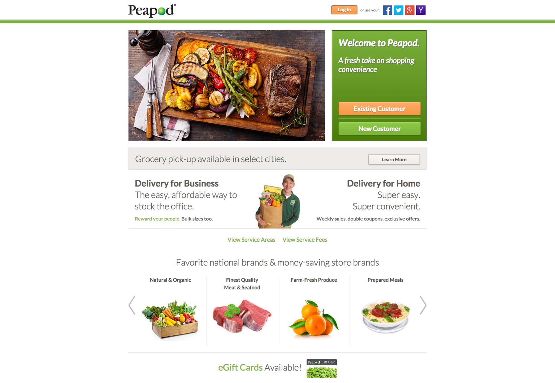 Peapod, the home grocery delivery service, uses physical affordances on its homepage. Two huge call to action buttons feature rounded corners and slight shading so they look clickable.
Language affordance
A language affordance is another very straightforward kind of affordance. Essentially, it directly communicates to the user that a button or a field affords a specific kind of action. This leaves absolutely no room to the imagination as to what the intended action is, also making this affordance perfect for people with very little, or even no, site browsing experience. Language affordance is ideal in interface design when mere, visual communication is insufficient to effectively symbolize what action should be performed. For instance, people who haven’t seen many websites are likely not familiar with the magnifying glass symbol indicating “search” at the end of a search field. Smart designers will understand this and therefore supply an explicit, language affordance to leave no doubt what the action should be.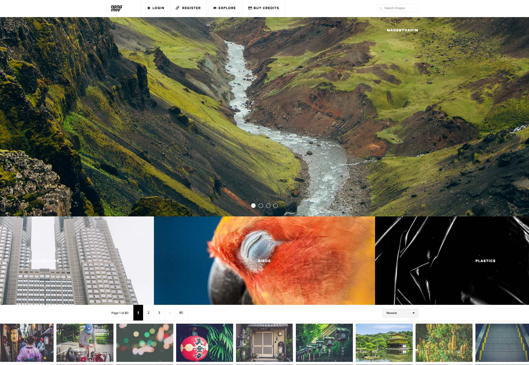 Nanamee.com uses language affordance in the search field because there’s a hard-to-miss “Search Images” spelled out. This affordance makes it explicitly clear how to interact with this feature, and is far clearer than simply “Search” or even just an icon.
Pattern affordance
Pattern affordance is perhaps more common in web design than even the aforementioned, explicit affordances. That’s because, as the name implies, designers of all stripes utilize these affordances in their designs without so much as a second thought. Users are able to recognize and understand these types of affordances due to their commonality. Here are some examples of widely used pattern affordances:- navigation menu or bar;
- magnifying glass icon;
- links;
- downward arrow next to word or phrase.
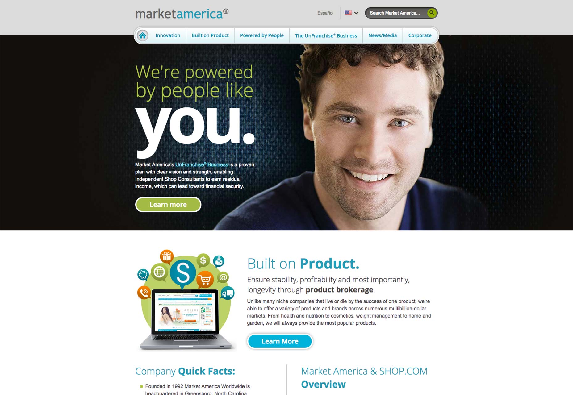 Market America features a very noticeable navigation bar across the top of the homepage. The magnifying glass icon is at the end of the search bar, which also features the language affordance of “Search Market America.” Then, there’s the downward arrow next to the American flag, which offers users the chance to pick a different site language.
Symbolic or iconic affordance
The affordance in an interface can be communicated simply through a symbol or icon. Sometimes called metaphorical affordances, these affordances rely on real-life, physical objects as icons to quickly tell users what action is expected of them. They work well in many, different instances, some of which you’re undoubtedly familiar with already:- an envelope to afford sending an email;
- a house to afford going back to a site’s homepage;
- a social media button to take you to a social media stream or channel.
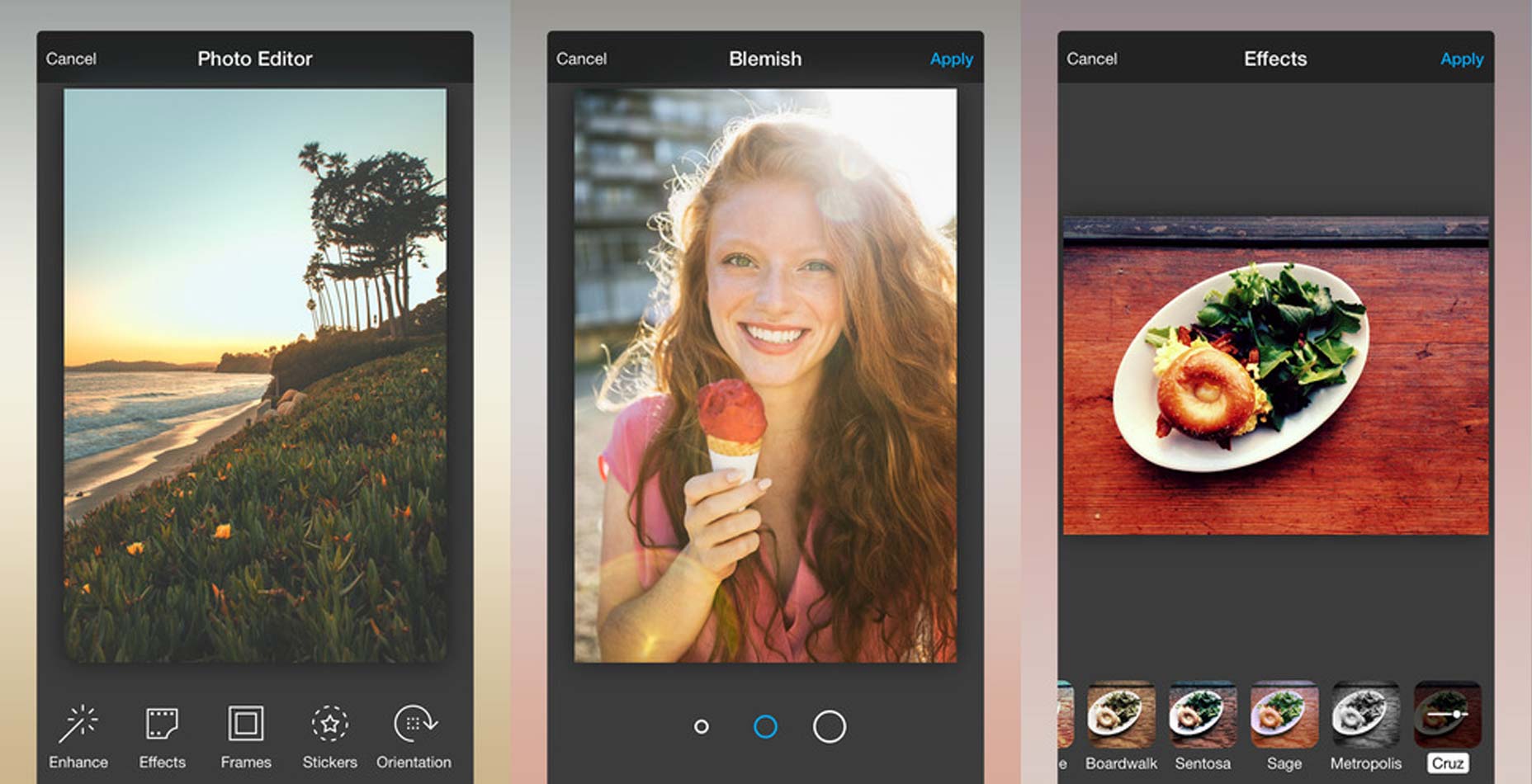 One app that could use some work on its affordances is Photo Editor by Aviary. Unless you’re super-familiar with this app or with photo editors in general, you’re not going to understand how to touch up blemishes when you only have a choice between three circles of different size.
Affordances are the key to great UX
Understanding what an affordance is — as well as the specific uniqueness between one type and another — can really distinguish you from other web designers. Think of affordances as the gateway to communication for your users. Without them, even the nicest-looking design would be totally useless because users wouldn’t be able to make sense of it one bit! Since the user experience is the highest priority for designers, making sure you have a solid understanding of affordances is essential. When your design’s done, it should be affordances that easily and effective empower users to use your design with the least friction possible.Marc Schenker
Marc’s a copywriter who covers design news for Web Designer Depot. Find out more about him at thegloriouscompanyltd.com.


Read Next

15 Best New Fonts, July 2024
Welcome to our monthly roundup of the best fonts we’ve found online in the last four weeks. This month, there are fewer…
By Ben Moss

20 Best New Websites, July 2024
Welcome to July’s round up of websites to inspire you. This month’s collection ranges from the most stripped-back…

Top 7 WordPress Plugins for 2024: Enhance Your Site's Performance
WordPress is a hands-down favorite of website designers and developers. Renowned for its flexibility and ease of use,…
By WDD Staff

Exciting New Tools for Designers, July 2024
Welcome to this July’s collection of tools, gathered from around the web over the past month. We hope you’ll find…

3 Essential Design Trends, July 2024
Add some summer sizzle to your design projects with trendy website elements. Learn what's trending and how to use these…

15 Best New Fonts, June 2024
Welcome to our roundup of the best new fonts we’ve found online in the last month. This month, there are notably fewer…
By Ben Moss

20 Best New Websites, June 2024
Arranging content in an easily accessible way is the backbone of any user-friendly website. A good website will present…

Exciting New Tools for Designers, June 2024
In this month’s roundup of the best tools for web designers and developers, we’ll explore a range of new and noteworthy…

3 Essential Design Trends, June 2024
Summer is off to a fun start with some highly dramatic website design trends showing up in projects. Let's dive in!

15 Best New Fonts, May 2024
In this month’s edition, there are lots of historically-inspired typefaces, more of the growing trend for French…
By Ben Moss

How to Reduce The Carbon Footprint of Your Website
On average, a web page produces 4.61 grams of CO2 for every page view; for whole sites, that amounts to hundreds of KG…
By Simon Sterne

20 Best New Websites, May 2024
Welcome to May’s compilation of the best sites on the web. This month we’re focused on color for younger humans,…