

Memorable visual design
If there’s one thing that these long-scrolling pages are getting a reputation for, it’s featuring a memorable, visual design. Hey, you have to when you show site visitors a long page…that has to keep their interest and motivate them to scroll down for more content, after all! One of the best examples of a long-scrolling page that does this is Bounty Beverages’ site. With a striking background, attractive images, and easy-to-read headlines and subheadings, intelligent section spacing to guide the eyes, and chunked copy to facilitate scanning, this page illustrates how effective and appealing these types of pages can be if done right.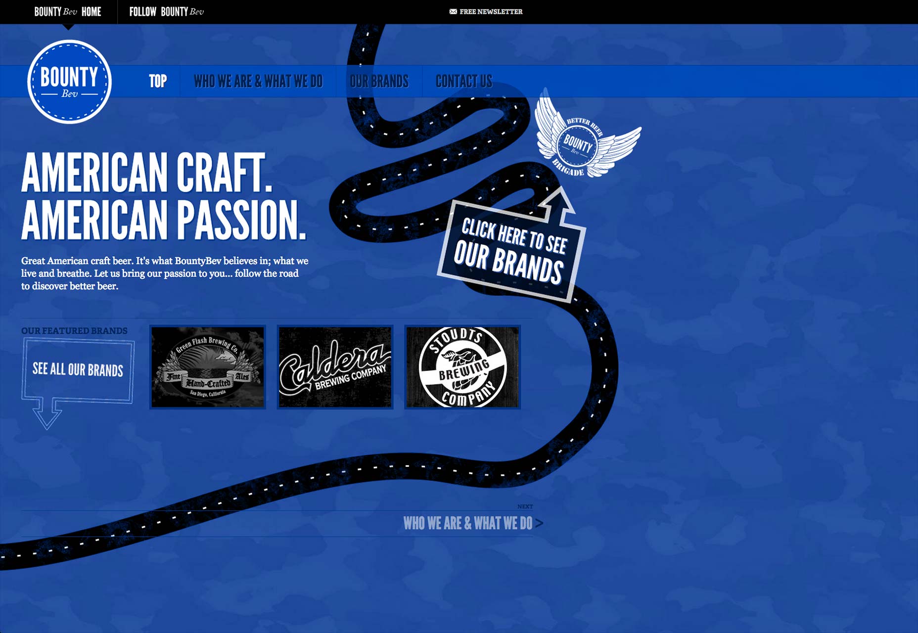 Of course, the entire point of a long-scrolling page is getting the visitor to take some form of action via the call to action buttons. Bounty Beverages’ page is replete with them. Above the fold, you see a helpful directional cue pointing up to where visitors should click to learn more about its beers. At the bottom of the page, you also see calls to action prompting visitors to leave feedback and spread the brand’s message on social media.
Having a superbly designed page leads to the main benefit of long-scrolling pages, which your clients can’t get enough of, namely…
Of course, the entire point of a long-scrolling page is getting the visitor to take some form of action via the call to action buttons. Bounty Beverages’ page is replete with them. Above the fold, you see a helpful directional cue pointing up to where visitors should click to learn more about its beers. At the bottom of the page, you also see calls to action prompting visitors to leave feedback and spread the brand’s message on social media.
Having a superbly designed page leads to the main benefit of long-scrolling pages, which your clients can’t get enough of, namely…
An increase in conversions
When the way the page has been conceived and executed is strong, visitors will enjoy spending more time on it, and when your bounce rates drop, your conversions increase, as research shows time and again. It just stands to reason: the longer visitors stay on a site, the more chance they’ll be persuaded to respond to your calls to action. Your visitors spend more time on a site if they are fully engaged engaged with it. This is the key aspect of capitalizing on a great long-scrolling design. That begs the question, how can designers increase the user engagement level in the first place? There are numerous factors that measure a user’s engagement level. They include:- page views per session;
- time spent on a site;
- frequency of site visits;
- interactions with on-screen elements;
- bounce rate;
- conversion rate;
- abandonment rate.
Laying out long-scrolling pages
Nailing the placement of specific elements on the page is key to its success. The order really matters because, as we explained, long-scrolling pages tend to tell brand stories, so the elements have to unfold logically. If there’s a common bond among all long-scrolling pages regarding what first catches your eye, it’s the presence of mega images that are in the header. Sometimes these mega images are part of an automatic carousel or stretch across the entire width of the page. Together with these images, you’ll usually see the name of the company in the header, along with a value proposition for whatever’s being sold. All this is above the fold. When you start to scroll, though, that’s when things get all the more interesting!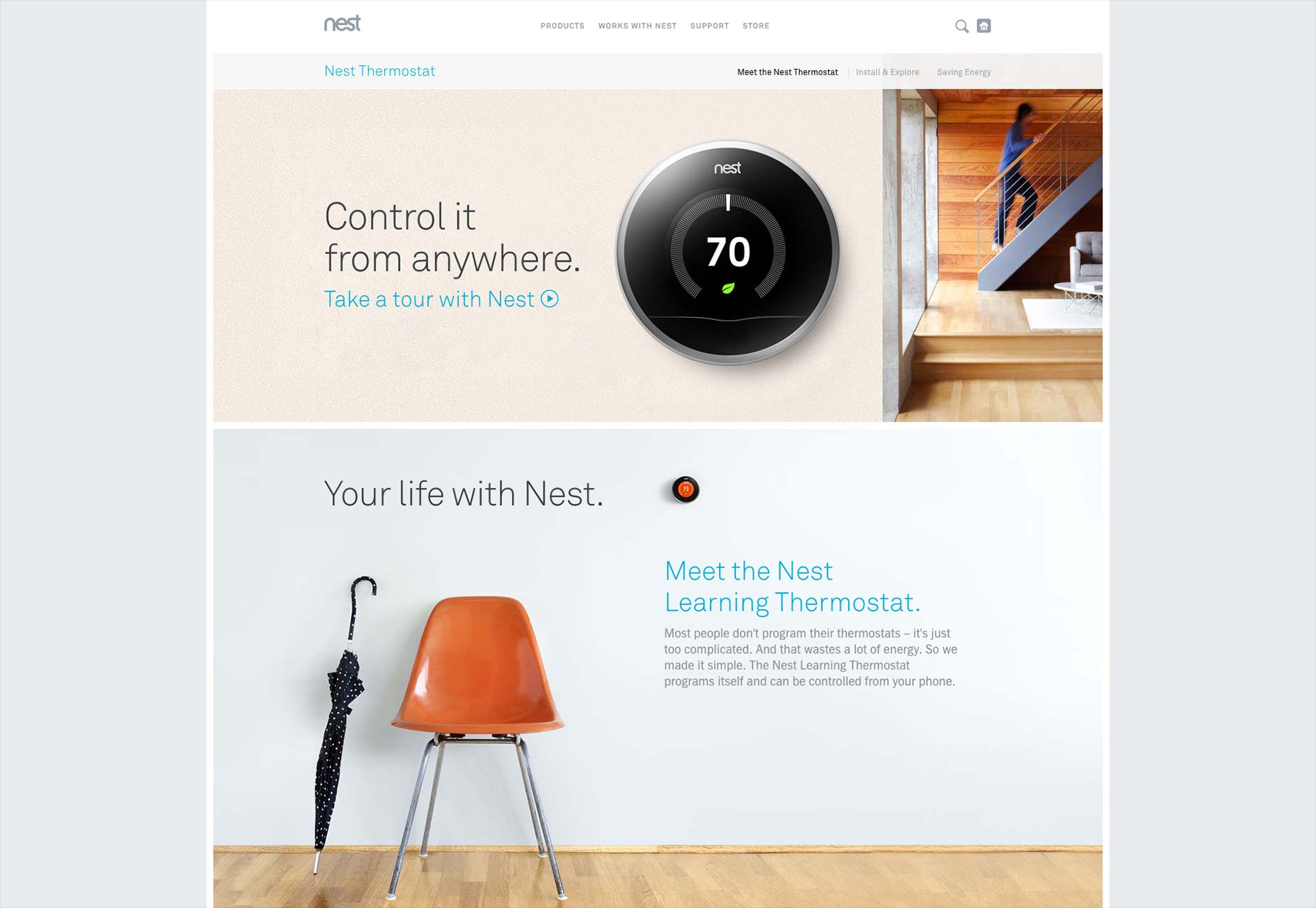 See, that’s when the storytelling begins in earnest, as in the case of Nest, the control-it-from-anywhere thermostat. When you begin to scroll, you get invited to take a tour of the product and how your life can change because of it. In fact, each time you scroll, you see another short section that invites you to explore Nest from a unique angle.
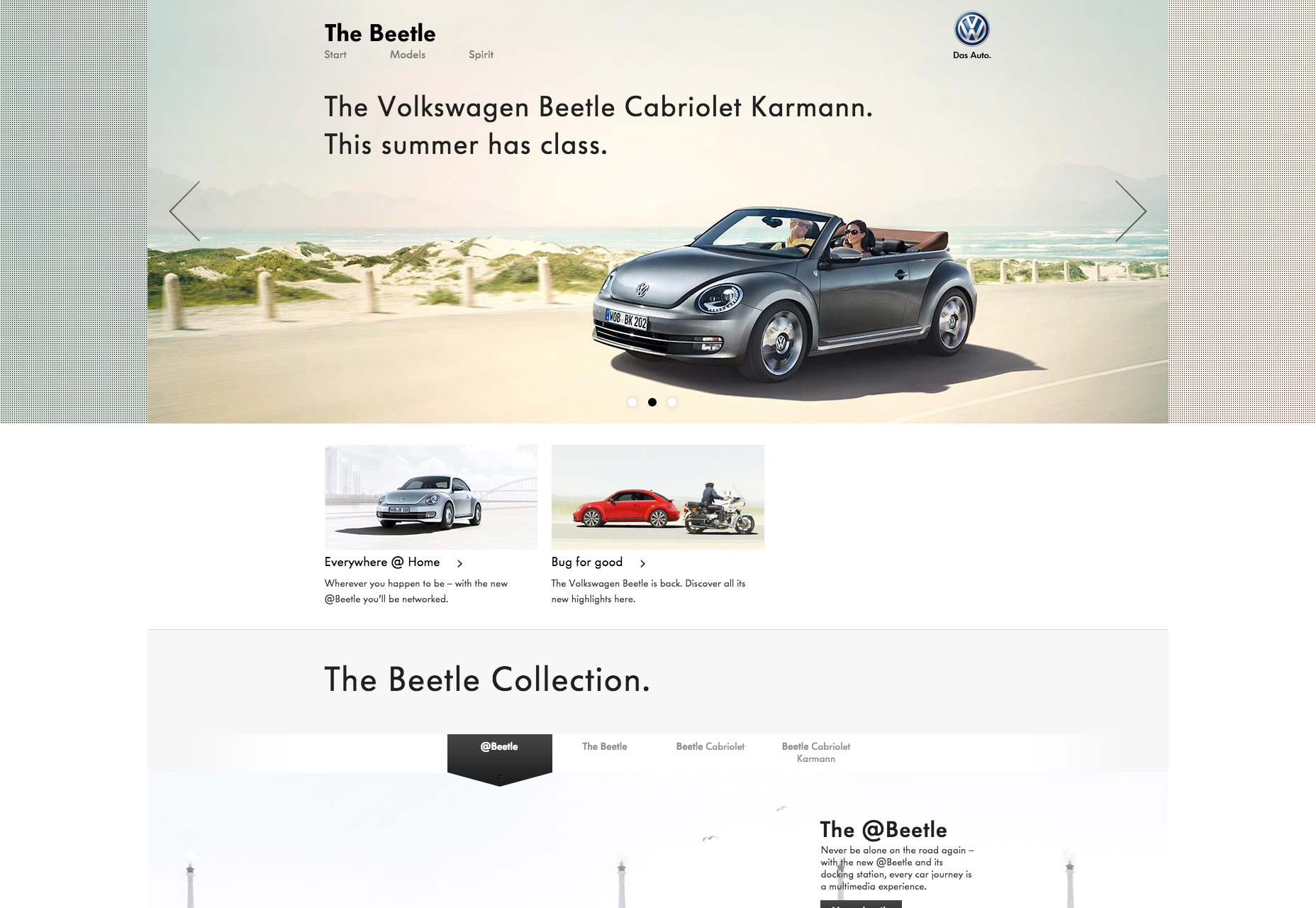
Other long-scrolling pages, like The Beetle’s, feature videos, so that visitors can see the car in action. Besides this, there’s a collection spotlight that invites visitors to take a glance at all the cars in the Beetle collection. It’s a slightly different approach, but, again, the gist is the same: it’s still about storytelling to introduce the product to visitors and get them excited about it.
See, that’s when the storytelling begins in earnest, as in the case of Nest, the control-it-from-anywhere thermostat. When you begin to scroll, you get invited to take a tour of the product and how your life can change because of it. In fact, each time you scroll, you see another short section that invites you to explore Nest from a unique angle.
Other long-scrolling pages, like The Beetle’s, feature videos, so that visitors can see the car in action. Besides this, there’s a collection spotlight that invites visitors to take a glance at all the cars in the Beetle collection. It’s a slightly different approach, but, again, the gist is the same: it’s still about storytelling to introduce the product to visitors and get them excited about it.
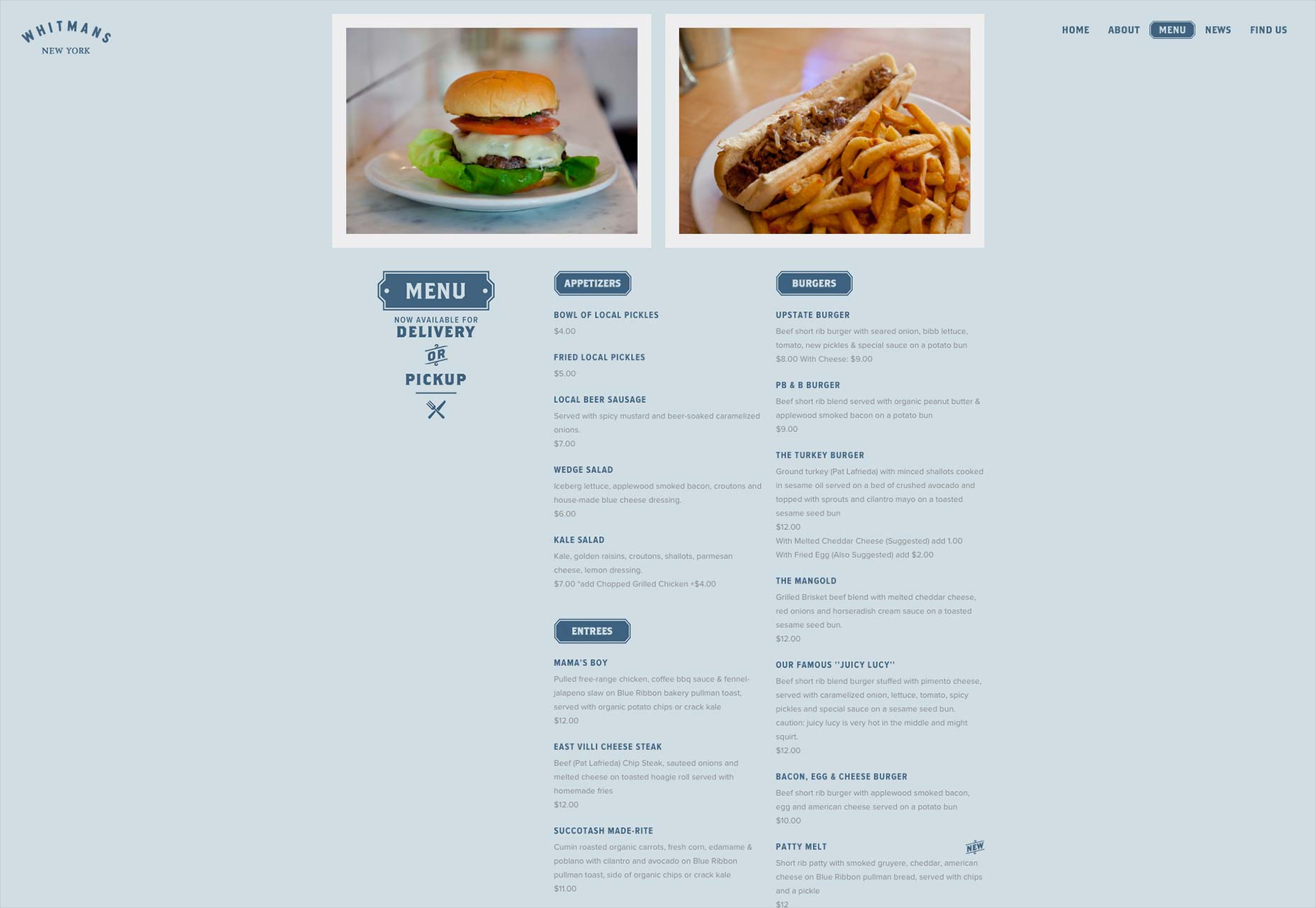
 Sometimes, a long-scrolling page can be the ideal place to showcase a restaurant’s menu items, as is the case with Whitmans’ restaurant in New York City: its long-scrolling page is basically an excuse for customers and those thinking about going to Whitmans for the first time to preview what they can order.
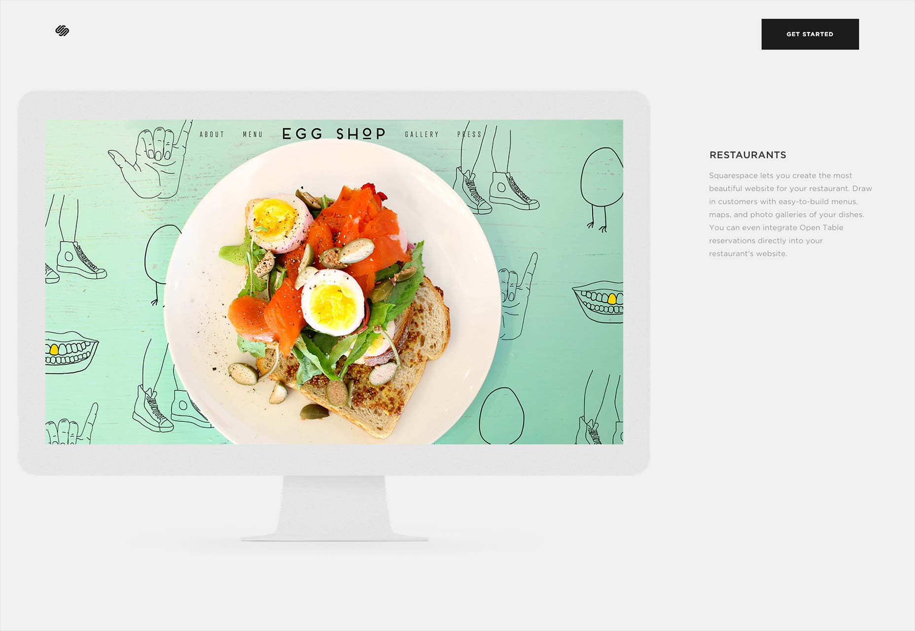
 Storytelling can also be a vehicle for efficiently moving visitors through the many services and features of a company, such as with Squarespace’s page. This content-management system that lets people create websites and blogs needed a page to show off its many services. When you scroll down, you see everything from the various types of sites you can create to the different things you can do on Squarespace.
Why long-scrolling?
Long-scrolling is a trend that’s only going to get bigger, especially with many big brands using it for their prominent products and services. If you like this new design approach, you can thank mobile for bringing this more to the mainstream. With more and more users depending on mobile, designers had to find a way to efficiently and neatly display content on a smaller and narrower screen. Just think of how you scroll down with your thumb when you’re looking at a site on your mobile device. The good thing about these pages is that they work equally well on desktop as they do on mobile. You can expect to see designers continue to embrace this trend as we move forward.Marc Schenker
Marc’s a copywriter who covers design news for Web Designer Depot. Find out more about him at thegloriouscompanyltd.com.


Read Next

15 Best New Fonts, July 2024
Welcome to our monthly roundup of the best fonts we’ve found online in the last four weeks. This month, there are fewer…
By Ben Moss

20 Best New Websites, July 2024
Welcome to July’s round up of websites to inspire you. This month’s collection ranges from the most stripped-back…

Top 7 WordPress Plugins for 2024: Enhance Your Site's Performance
WordPress is a hands-down favorite of website designers and developers. Renowned for its flexibility and ease of use,…
By WDD Staff

Exciting New Tools for Designers, July 2024
Welcome to this July’s collection of tools, gathered from around the web over the past month. We hope you’ll find…

3 Essential Design Trends, July 2024
Add some summer sizzle to your design projects with trendy website elements. Learn what's trending and how to use these…

15 Best New Fonts, June 2024
Welcome to our roundup of the best new fonts we’ve found online in the last month. This month, there are notably fewer…
By Ben Moss

20 Best New Websites, June 2024
Arranging content in an easily accessible way is the backbone of any user-friendly website. A good website will present…

Exciting New Tools for Designers, June 2024
In this month’s roundup of the best tools for web designers and developers, we’ll explore a range of new and noteworthy…

3 Essential Design Trends, June 2024
Summer is off to a fun start with some highly dramatic website design trends showing up in projects. Let's dive in!

15 Best New Fonts, May 2024
In this month’s edition, there are lots of historically-inspired typefaces, more of the growing trend for French…
By Ben Moss

How to Reduce The Carbon Footprint of Your Website
On average, a web page produces 4.61 grams of CO2 for every page view; for whole sites, that amounts to hundreds of KG…
By Simon Sterne

20 Best New Websites, May 2024
Welcome to May’s compilation of the best sites on the web. This month we’re focused on color for younger humans,…