

Hamburger minimalism
One of the most enduring design trends of the last few years has been minimalism due to its focus on clean, simple and easy-to-navigate aesthetics. It comes as no surprise, then, that hamburger menus are popular because they promote minimalism on any site, both in terms of design and function.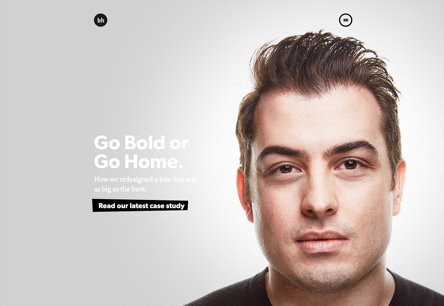 Designer Brian Hoff understands this well on his site. Note the hidden menu near the top right portion of the homepage. It’s clean and simple from a design standpoint because it sits there inconspicuously until the user decides he wants to move on and clicks it to open the navigation options. Yet from a function standpoint, it’s also a study in minimalism because all it takes to interact with it is for the user to hover the cursor on the icon and click on it. Then, a fly-out menu appears from the right side of the screen with just a few navigational options. Easy-peasy!
Of course, this also bleeds into the user experience, as anybody trying to navigate Brian’s site is going to enjoy doing so with this minimalist hidden menu than with a menu that’s brash and huge, which would distract from easy navigation and overwhelm with too many options.
Designer Brian Hoff understands this well on his site. Note the hidden menu near the top right portion of the homepage. It’s clean and simple from a design standpoint because it sits there inconspicuously until the user decides he wants to move on and clicks it to open the navigation options. Yet from a function standpoint, it’s also a study in minimalism because all it takes to interact with it is for the user to hover the cursor on the icon and click on it. Then, a fly-out menu appears from the right side of the screen with just a few navigational options. Easy-peasy!
Of course, this also bleeds into the user experience, as anybody trying to navigate Brian’s site is going to enjoy doing so with this minimalist hidden menu than with a menu that’s brash and huge, which would distract from easy navigation and overwhelm with too many options.
Hamburger focus
Web design is all about laying out elements and stressing some over others in an attempt to prioritize how site visitors absorb information. It’s part of how information architecture works: if you want visitors to understand what your site’s all about from the moment they lay eyes on it, then you’ll design to draw attention to the site’s tagline or value proposition while scaling down the importance of other elements.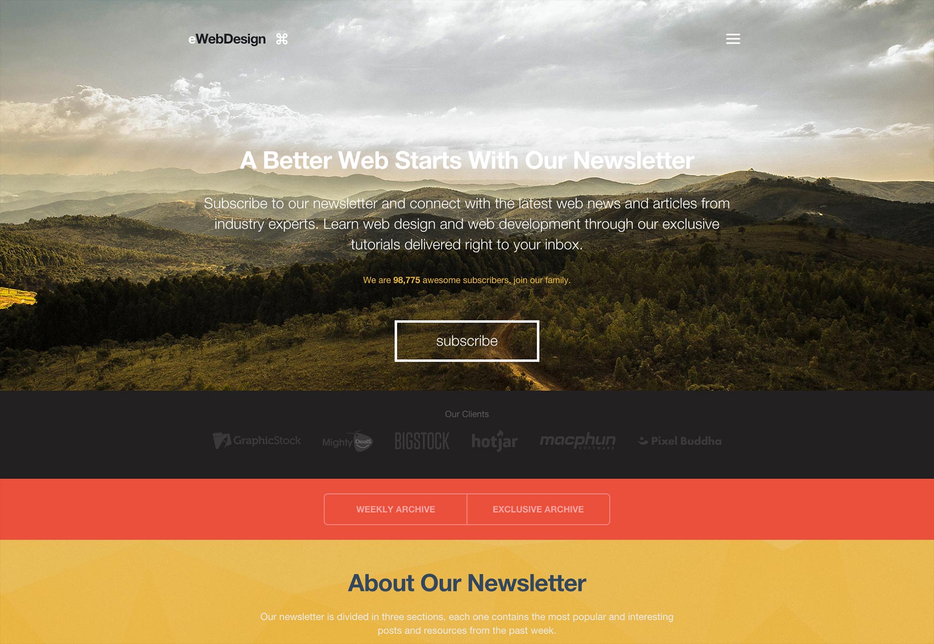 eWebDesign understands this and has designed its site accordingly. Note how the hidden menu is very discreet at the top right of the homepage. It’s not even sticky, so scrolling down will make it disappear. This unobtrusive presence of the hidden menu means that the visitor’s attention is immediately drawn to the site’s unique value proposition, which is that subscribers to its blog receive web news straight from industry experts. This also seamlessly segues to the call to action button of “subscribe,” right below the proposition.
If the menu was laid out traditionally—in the form of a horizontal navigation menu above this proposition—chances are that visitors would instead be immediately distracted by a myriad of things to click on! That would harmfully impact the number of people signing up to the site.
eWebDesign understands this and has designed its site accordingly. Note how the hidden menu is very discreet at the top right of the homepage. It’s not even sticky, so scrolling down will make it disappear. This unobtrusive presence of the hidden menu means that the visitor’s attention is immediately drawn to the site’s unique value proposition, which is that subscribers to its blog receive web news straight from industry experts. This also seamlessly segues to the call to action button of “subscribe,” right below the proposition.
If the menu was laid out traditionally—in the form of a horizontal navigation menu above this proposition—chances are that visitors would instead be immediately distracted by a myriad of things to click on! That would harmfully impact the number of people signing up to the site.
Creative problem solving
Every site that’s built faces a big problem right off the bat: how does a designer plan things so that the site is both functional and still aesthetically attractive? Getting the navigation right from the get go—both in terms of the user experience and usability—is key. The hamburger menu allows creative and practical designers to come up with navigation solutions that serve both function and beauty. Sometimes, the solution isn’t what you’d ever really expect, and visitors tend to be blown away by a navigation layout that delights them with something they’ve rarely or never seen before.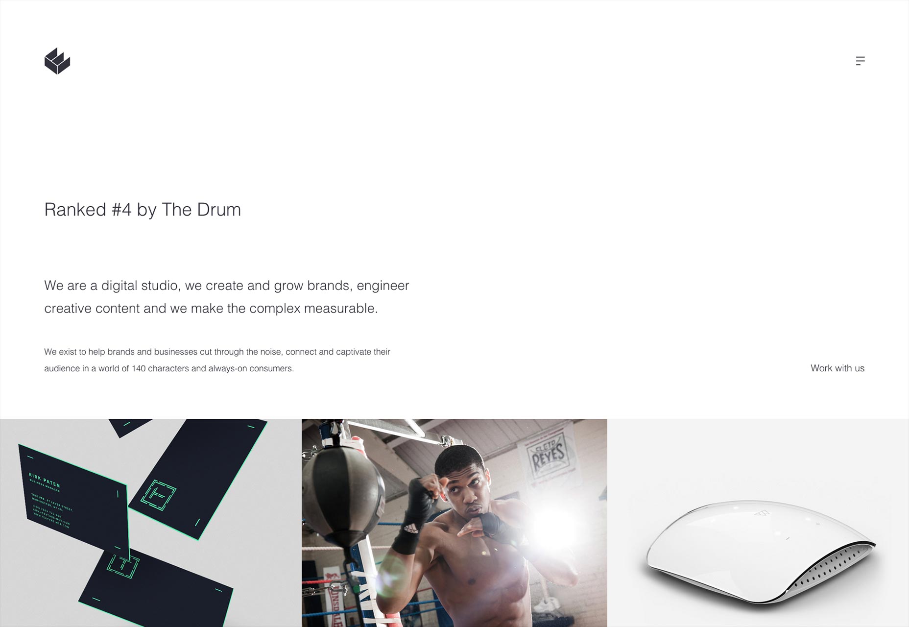 Case in point: digital studio We Are Empire, from Manchester. Its website relies heavily on concepts like white space, huge images and cleanness, yet that just scratches the surface. When users click on the hidden menu—again, discreetly placed at the top right corner of the homepage—they’re absolutely delighted with a creative solution to functional navigation.
As soon as the hamburger menu’s clicked, no fly-out menu appears from any side. Instead, the entire screen switches over to the navigation menu, which appears by itself on the entire screen; the change in color from white to pink reinforces this change. From there, users are free to find exactly what they want on the site.
Case in point: digital studio We Are Empire, from Manchester. Its website relies heavily on concepts like white space, huge images and cleanness, yet that just scratches the surface. When users click on the hidden menu—again, discreetly placed at the top right corner of the homepage—they’re absolutely delighted with a creative solution to functional navigation.
As soon as the hamburger menu’s clicked, no fly-out menu appears from any side. Instead, the entire screen switches over to the navigation menu, which appears by itself on the entire screen; the change in color from white to pink reinforces this change. From there, users are free to find exactly what they want on the site.
Straightforward communication
The goal of any website is to have visitors use the site with ease and efficiency from the moment they begin browsing it. One of the most powerful ways of enabling this is through affordances, which communicate to visitors what various elements of a site mean and how they can be used. Pattern affordance uses familiarity to tell visitors immediately what an icon, for instance, can be used for. Ergo, pattern affordance quickly tells a visitor how they can interact with an icon to get a desired result. The hamburger menu has become nearly ubiquitous on mobile in recent years. Therefore, it’s a safe bet that a large number of users are familiar with it: how it looks, how they can use it (by tapping it to open a menu), and even where on the screen it’s usually to be found. Its presence on any website affords instant communication on how to navigate said site.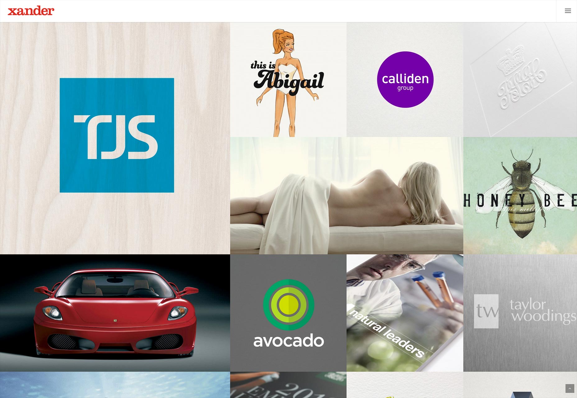 Digital ad agency Xander demonstrates this on its website. Though the homepage is so bare to be almost extreme in its minimalism—note the absence of anything, really, that grabs the eye above the fold—users can immediately look for the hidden menu and find it in the top right corner, a usual location. This obedience of pattern eliminates confusion from the standpoint of users and empowers them to start finding what they want on the site immediately.
Not just a fad
Even now, in spite of the hamburger menu’s ubiquity, it still attracts criticism from some circles. Its wide adoption on many sites both mobile and desktop indicates that there’s a demand for it, yet doubts persist. By this point, it’s more than obvious that the hamburger menu is a permanent fixture on many homepages, both small and large. It’s more than a passing fad because designers understand that it solves navigational problems efficiently, smartly and easily. And that’s exactly why this approach to the navigational menu is now firmly rooted in our web-browsing habits.Marc Schenker
Marc’s a copywriter who covers design news for Web Designer Depot. Find out more about him at thegloriouscompanyltd.com.


Read Next

15 Best New Fonts, July 2024
Welcome to our monthly roundup of the best fonts we’ve found online in the last four weeks. This month, there are fewer…
By Ben Moss

20 Best New Websites, July 2024
Welcome to July’s round up of websites to inspire you. This month’s collection ranges from the most stripped-back…

Top 7 WordPress Plugins for 2024: Enhance Your Site's Performance
WordPress is a hands-down favorite of website designers and developers. Renowned for its flexibility and ease of use,…
By WDD Staff

Exciting New Tools for Designers, July 2024
Welcome to this July’s collection of tools, gathered from around the web over the past month. We hope you’ll find…

3 Essential Design Trends, July 2024
Add some summer sizzle to your design projects with trendy website elements. Learn what's trending and how to use these…

15 Best New Fonts, June 2024
Welcome to our roundup of the best new fonts we’ve found online in the last month. This month, there are notably fewer…
By Ben Moss

20 Best New Websites, June 2024
Arranging content in an easily accessible way is the backbone of any user-friendly website. A good website will present…

Exciting New Tools for Designers, June 2024
In this month’s roundup of the best tools for web designers and developers, we’ll explore a range of new and noteworthy…

3 Essential Design Trends, June 2024
Summer is off to a fun start with some highly dramatic website design trends showing up in projects. Let's dive in!

15 Best New Fonts, May 2024
In this month’s edition, there are lots of historically-inspired typefaces, more of the growing trend for French…
By Ben Moss

How to Reduce The Carbon Footprint of Your Website
On average, a web page produces 4.61 grams of CO2 for every page view; for whole sites, that amounts to hundreds of KG…
By Simon Sterne

20 Best New Websites, May 2024
Welcome to May’s compilation of the best sites on the web. This month we’re focused on color for younger humans,…