

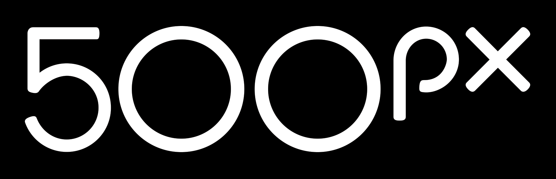
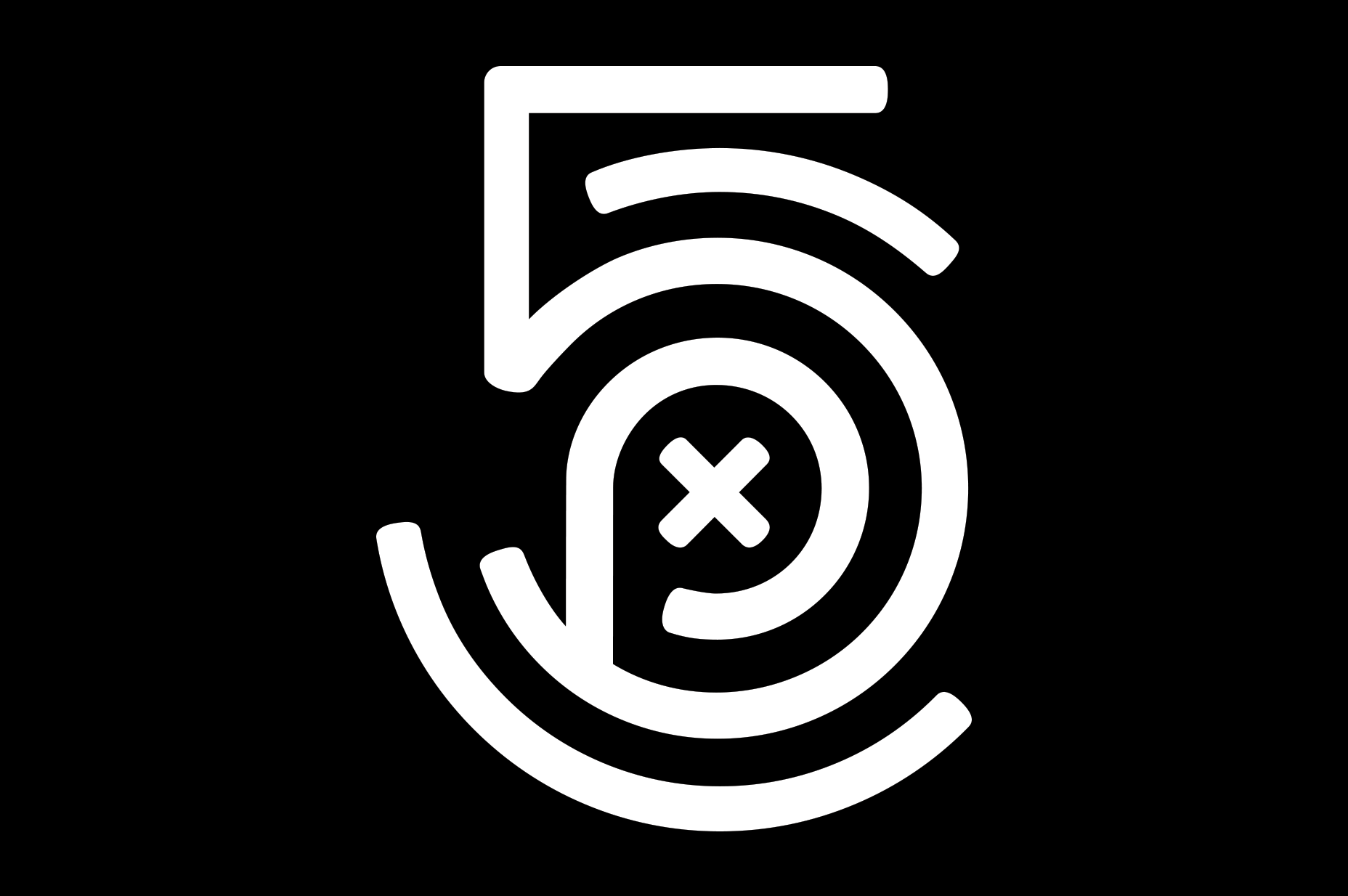
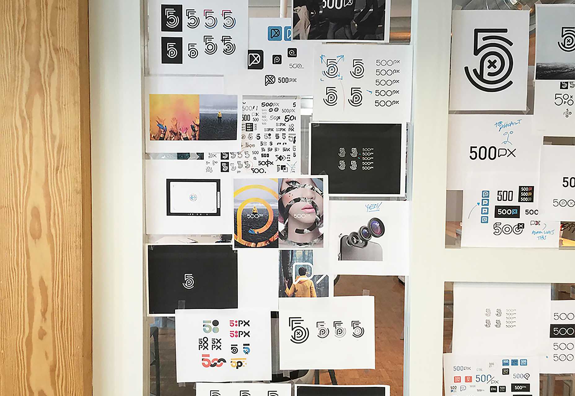
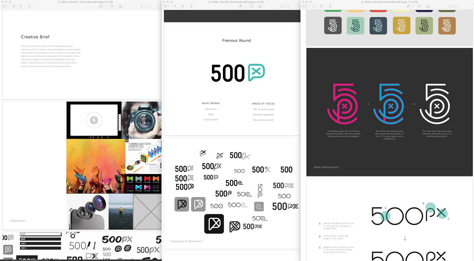
 However the more engaging element of 500px’s rebrand is the logo mark. Built from the different characters in the logotype, and resembling a ’70s soccer shirt number, the mark is distinct and original.
 It’s clear that 500px elected to develop both a logotype and a logo mark because the former performs badly in square layouts, like app icons or social media avatars. It’s a happy accident because the mark they’ve ended up with is by far the strongest aspect of the identity.
Usable as a mark, and as a graphic element within design, the finger print-like mark features circles that seem to rotate — even in the static version — reminiscent of the lens of a camera.
It’s clear that 500px elected to develop both a logotype and a logo mark because the former performs badly in square layouts, like app icons or social media avatars. It’s a happy accident because the mark they’ve ended up with is by far the strongest aspect of the identity.
Usable as a mark, and as a graphic element within design, the finger print-like mark features circles that seem to rotate — even in the static version — reminiscent of the lens of a camera.
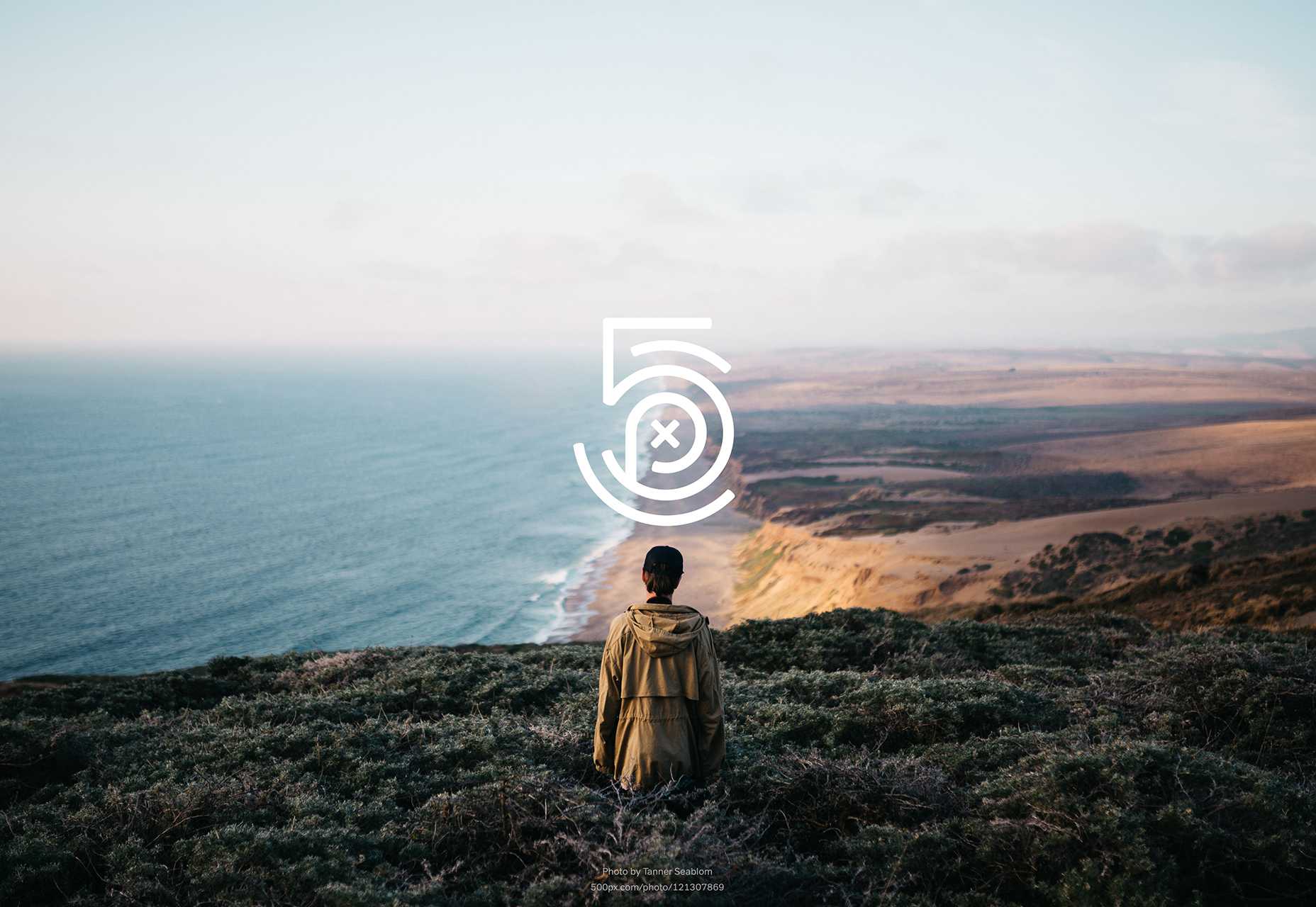 Both the logotype and the mark are rolling out across desktop, iOS and Android apps right now.
Ben Moss
Ben Moss has designed and coded work for award-winning startups, and global names including IBM, UBS, and the FBI. When he’s not in front of a screen he’s probably out trail-running.


Read Next

15 Best New Fonts, July 2024
Welcome to our monthly roundup of the best fonts we’ve found online in the last four weeks. This month, there are fewer…
By Ben Moss

20 Best New Websites, July 2024
Welcome to July’s round up of websites to inspire you. This month’s collection ranges from the most stripped-back…

Top 7 WordPress Plugins for 2024: Enhance Your Site's Performance
WordPress is a hands-down favorite of website designers and developers. Renowned for its flexibility and ease of use,…
By WDD Staff

Exciting New Tools for Designers, July 2024
Welcome to this July’s collection of tools, gathered from around the web over the past month. We hope you’ll find…

3 Essential Design Trends, July 2024
Add some summer sizzle to your design projects with trendy website elements. Learn what's trending and how to use these…

15 Best New Fonts, June 2024
Welcome to our roundup of the best new fonts we’ve found online in the last month. This month, there are notably fewer…
By Ben Moss

20 Best New Websites, June 2024
Arranging content in an easily accessible way is the backbone of any user-friendly website. A good website will present…

Exciting New Tools for Designers, June 2024
In this month’s roundup of the best tools for web designers and developers, we’ll explore a range of new and noteworthy…

3 Essential Design Trends, June 2024
Summer is off to a fun start with some highly dramatic website design trends showing up in projects. Let's dive in!

15 Best New Fonts, May 2024
In this month’s edition, there are lots of historically-inspired typefaces, more of the growing trend for French…
By Ben Moss

How to Reduce The Carbon Footprint of Your Website
On average, a web page produces 4.61 grams of CO2 for every page view; for whole sites, that amounts to hundreds of KG…
By Simon Sterne

20 Best New Websites, May 2024
Welcome to May’s compilation of the best sites on the web. This month we’re focused on color for younger humans,…