

Creating an effective contact page
Creating an effective contact page is a key process for most sites, here are 9 elements to focus on, to ensure that the “send” button doesn’t sit idle:1) Limit the number of required fields
The more information you ask for from a user, the less likely they are to complete a contact form. Only ever ask for the information you absolutely need.2) Place a bounding box around forms
By placing a bounding box around forms you make them easy to identify at a glance, and help users gauge what parts of the page are interactive.3) Embed Google maps
For bricks-and-mortar businesses, helping users find the location is obviously beneficial. Even for online businesses, displaying a physical location adds credibility.4) Add social proof
Speaking of credibility, add elements that will give customers confidence, such as testimonials, BBB emblems, the number of years you’ve been in business, and so on.5) Add branding
It might sound foolish, but most potential customers are browsing numerous sites, often in multiple tabs. It pays to remind them exactly who they’re about to contact.6) Guide user input
Use UI elements like selects, and option fields, to guide user input. The easier it is to give you the information you want, the more likely it is you’ll get it.7) Keep it simple
Simple always wins, especially on mobile. Remember that on mobile, your form may need to be larger in order to be usable.8) Include your phone number
Many businesses don’t want to include a phone number because they think they’ll be fielding calls all day. The reality is a phone number is like Google maps, it gives you credibility and makes the customer feel safe handing over their personal details.9) Add a privacy statement
Add the guarantee that your company will keep users’ details confidential. This builds trust.Grain and Mortar
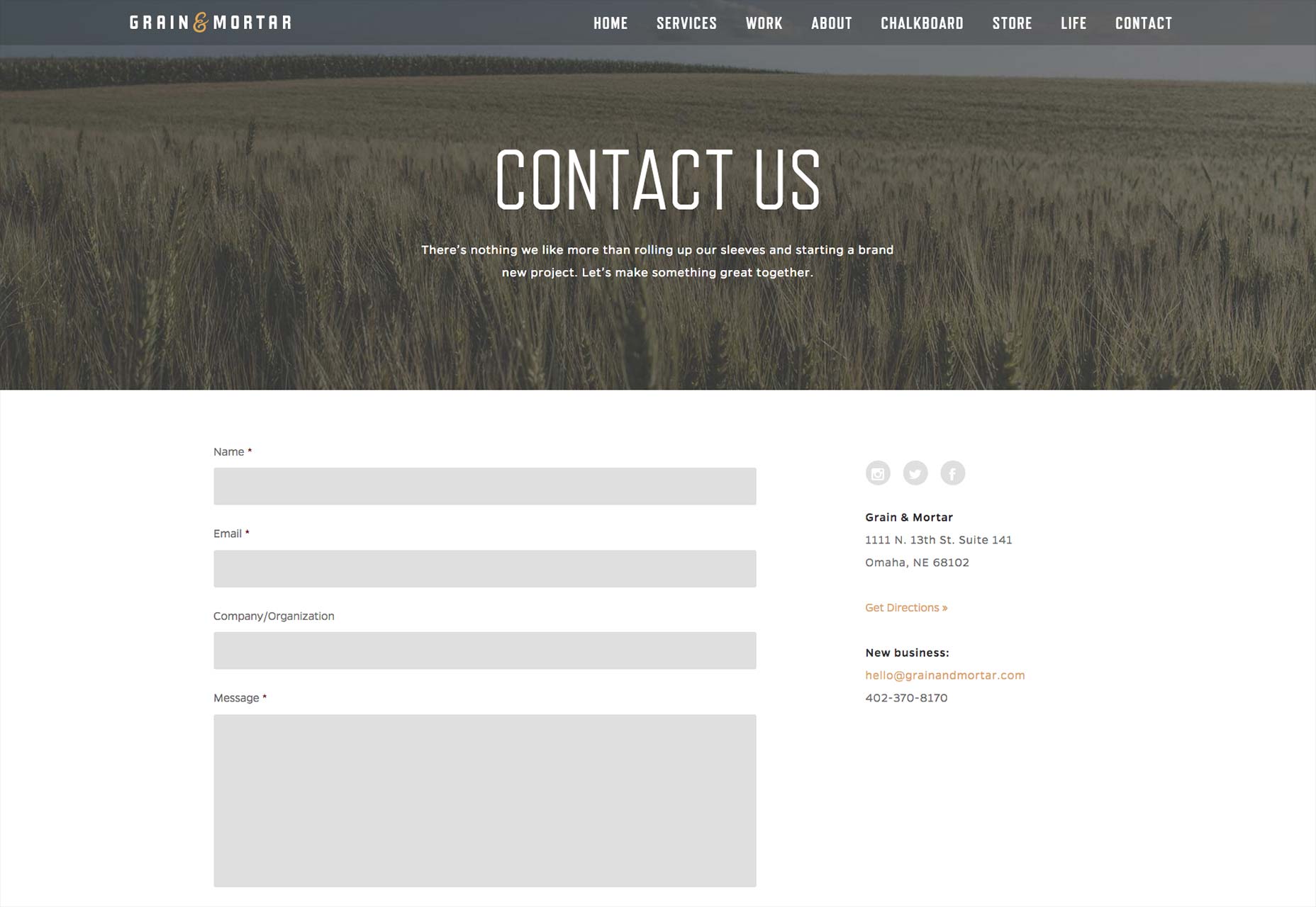
- The Human Test is easy, but keeps out spam. When spam tests are difficult to decipher, users get frustrated and click off.
- Putting the FAQs on the page saves users time and results in higher quality inquiries.
- Only three required fields — it can’t get much simpler.
- The overall simplicity of design, with over-sized fields for mobile UX, is generally pleasant to view and work with.
Evoke
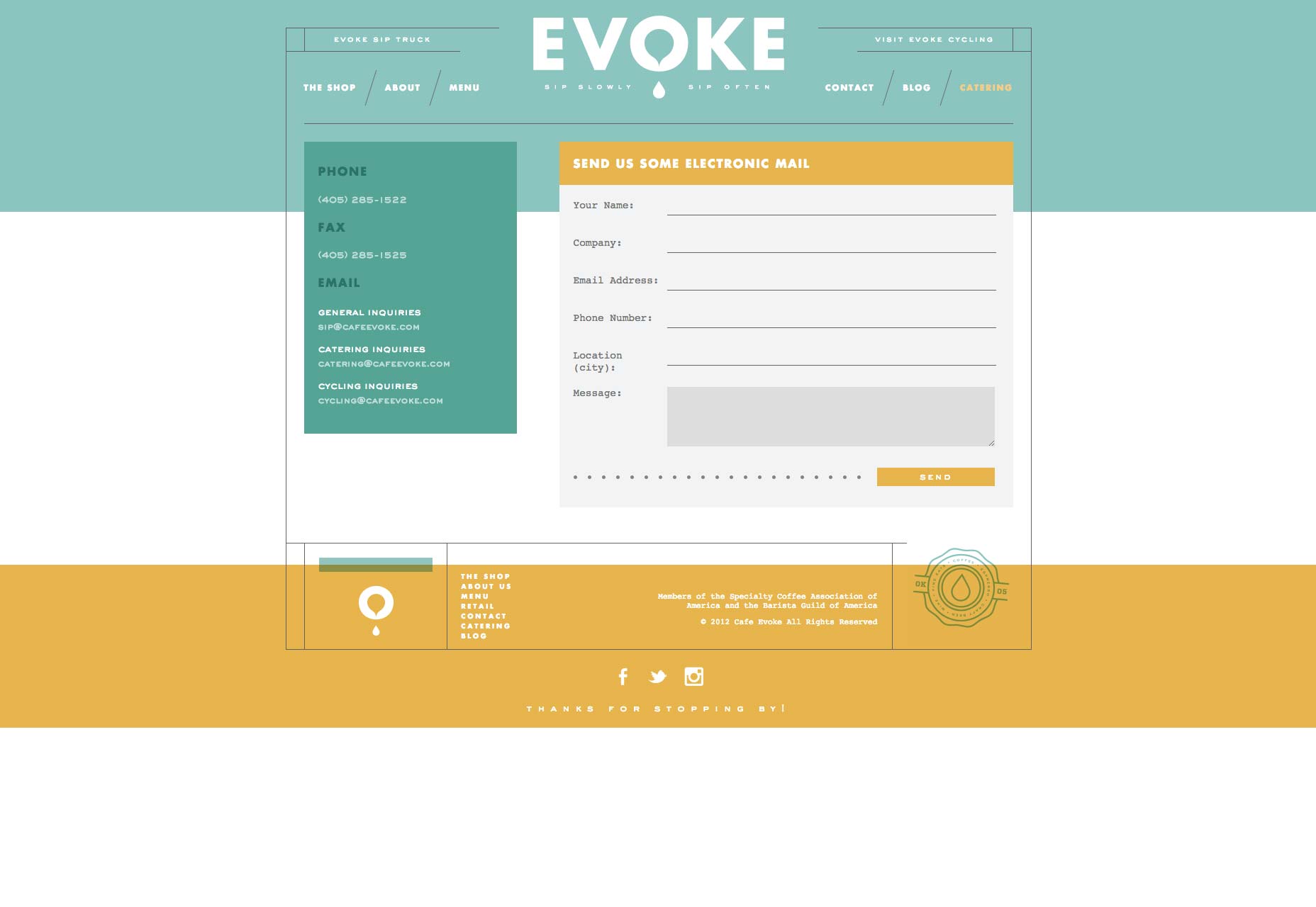
- This design is non-traditional, made to look like a postcard. Because the design is also simple and has a bit of fun woven into it, user interest is heightened.
- The bounding box around the inquiry form makes it stand out from the rest of the page.
- The color scheme, logo and credibility elements in the footer (associations) combine for a strong presentation of branding. This contact page definitely has its own character, gourmet yet down to earth. The form should resonate with people looking for these qualities.
Shiner
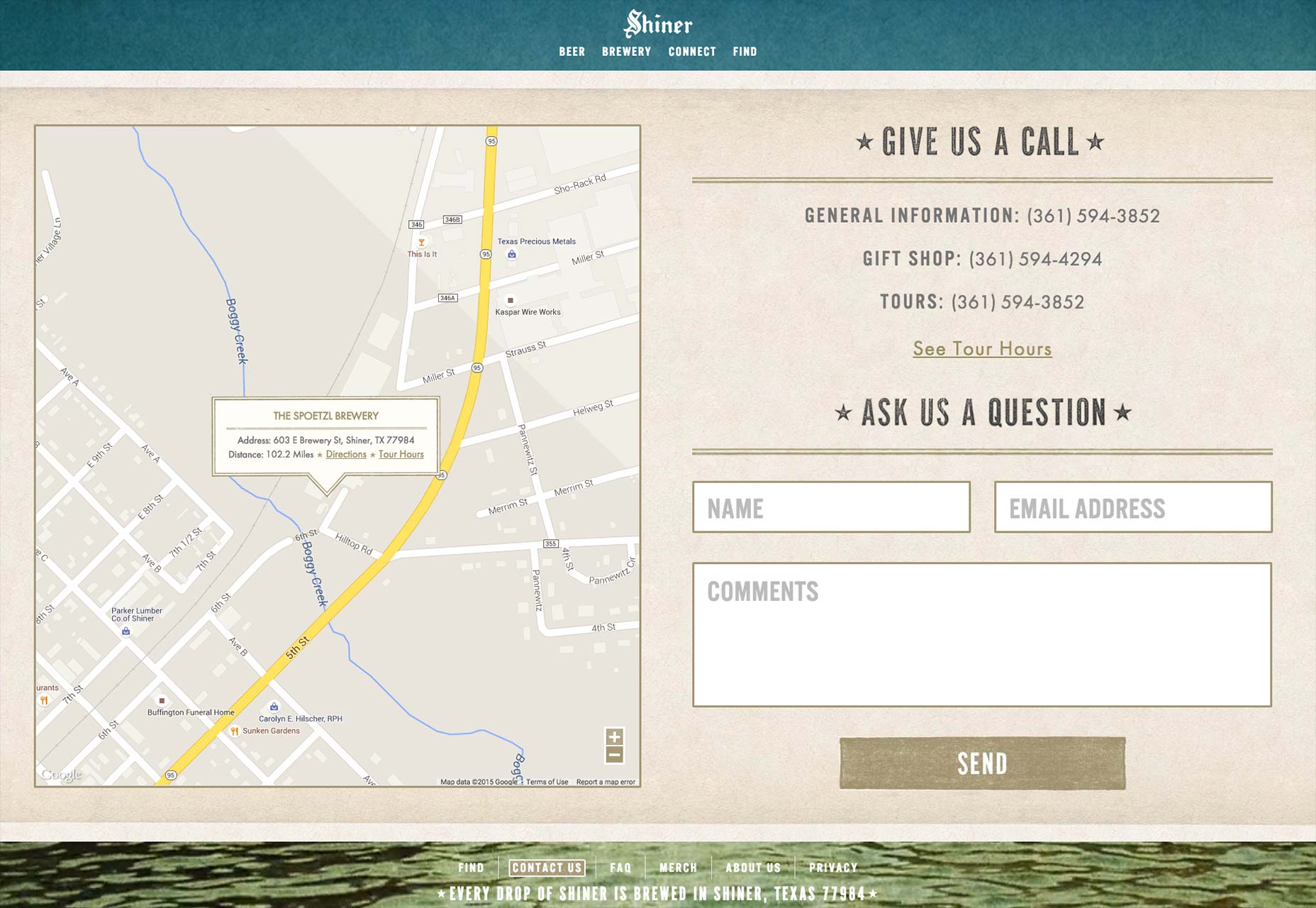
- Strong borders around the form fields make it impossible for users to get confused.
- Again, we see a small number of over-sized form fields.
- The design has a bit of old world, traditional flavor — no doubt exactly how their beer tastes. Brand consistency makes visitors thirsty!
- The large Google Maps embed is a nice convenience for users, lessening the need to enlarge or reduce it.
Knowing the business + knowing the customer = great contact page
Notice that all of these examples are effective, but use different design techniques. Crafting an effective design page requires an understanding of the brand, what potential customers want to know, and the key website user influencers. Universally, website users want simplicity, so it’s not surprising that all of these featured contact pages ooze “easy”. However, insight, imagination and a unique approach are needed to create, strengthen or sustain brand interest when users hit the contact page.Brad Shorr
Brad Shorr is the B2B Marketing Director of Straight North, an Internet marketing firm helping middle market companies build responsive websites that are designed around lead generation.


Read Next

15 Best New Fonts, July 2024
Welcome to our monthly roundup of the best fonts we’ve found online in the last four weeks. This month, there are fewer…
By Ben Moss

20 Best New Websites, July 2024
Welcome to July’s round up of websites to inspire you. This month’s collection ranges from the most stripped-back…

Top 7 WordPress Plugins for 2024: Enhance Your Site's Performance
WordPress is a hands-down favorite of website designers and developers. Renowned for its flexibility and ease of use,…
By WDD Staff

Exciting New Tools for Designers, July 2024
Welcome to this July’s collection of tools, gathered from around the web over the past month. We hope you’ll find…

3 Essential Design Trends, July 2024
Add some summer sizzle to your design projects with trendy website elements. Learn what's trending and how to use these…

15 Best New Fonts, June 2024
Welcome to our roundup of the best new fonts we’ve found online in the last month. This month, there are notably fewer…
By Ben Moss

20 Best New Websites, June 2024
Arranging content in an easily accessible way is the backbone of any user-friendly website. A good website will present…

Exciting New Tools for Designers, June 2024
In this month’s roundup of the best tools for web designers and developers, we’ll explore a range of new and noteworthy…

3 Essential Design Trends, June 2024
Summer is off to a fun start with some highly dramatic website design trends showing up in projects. Let's dive in!

15 Best New Fonts, May 2024
In this month’s edition, there are lots of historically-inspired typefaces, more of the growing trend for French…
By Ben Moss

How to Reduce The Carbon Footprint of Your Website
On average, a web page produces 4.61 grams of CO2 for every page view; for whole sites, that amounts to hundreds of KG…
By Simon Sterne

20 Best New Websites, May 2024
Welcome to May’s compilation of the best sites on the web. This month we’re focused on color for younger humans,…