
Somehow, we’ve come to accept the notion that digital technology is the answer to all of life’s problems. That conclusion has resulted in more and more app ideas, which are uploaded to the web, and to stores, everyday.
But there are dozens of options for consumers, which makes it difficult for potential customers to find your product. What’s worse, your potential customer probably already has an app that solves the problem you’re tackling; many people never download apps, because they already have what they need—why keep trying solutions if they already have a solution?
If your marketing is strong, and your proposition is sound, they might give you a chance. But this opportunity could be briefer than you think, if the opening screens of your app or service present a problem, they’ll abandon you. You won’t get a second chance.
So it’s imperative that you put your best foot forward, and focus on UX from the start.
Sign up and login
There are very, very few apps or services where the prospective customer has arrived already decided to sign up and hand over their personal information, no matter how little time or effort it may take. Perhaps this is the case for Facebook, or Twitter, or other indispensable apps we use everyday — the first apps you download when you buy a new phone.
The bad news is: your app is not going to be one of them.
A sign up form as an initial screen is the first thing that is going to make the user think twice about whether it’s worth handing out their personal information (yet again) to an app provider they don’t know. Trust is a scarce commodity these days. And we’re not even talking about what happens if the form has too many fields, or special requirements that weren’t properly communicated beforehand.
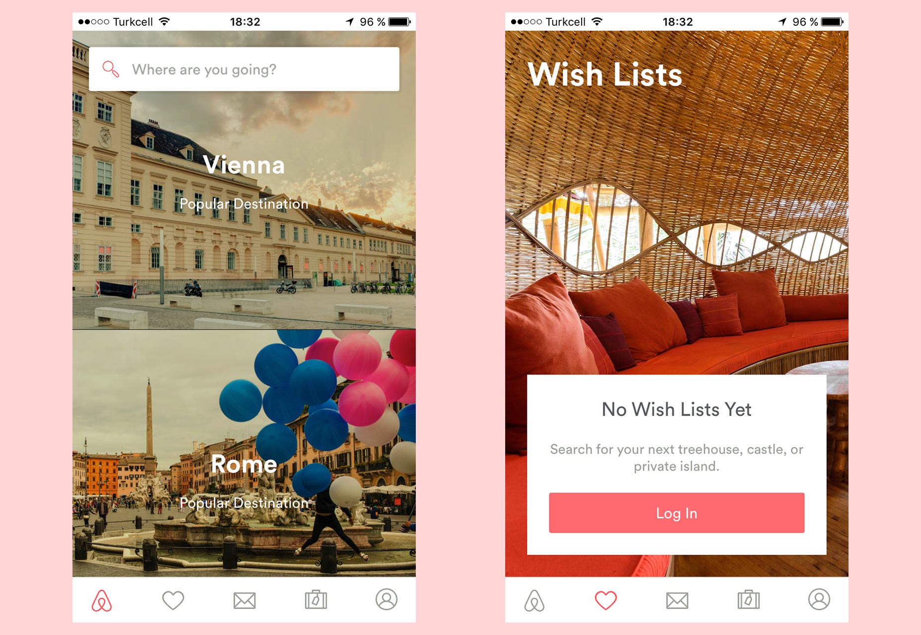
Airbnb allows basic use of the app without signing up (left), only asking you to log in to use some of the sections (right).
If we’re honest, there are very few apps that really need you to sign up to use them. We want people to sign up, but it’s not necessary. The ones that need you to sign up are the ones that are pointless without an account. For example, ones that need you to create a profile to connect with fellow members and enrich your experience, or those that need to sync data among devices.
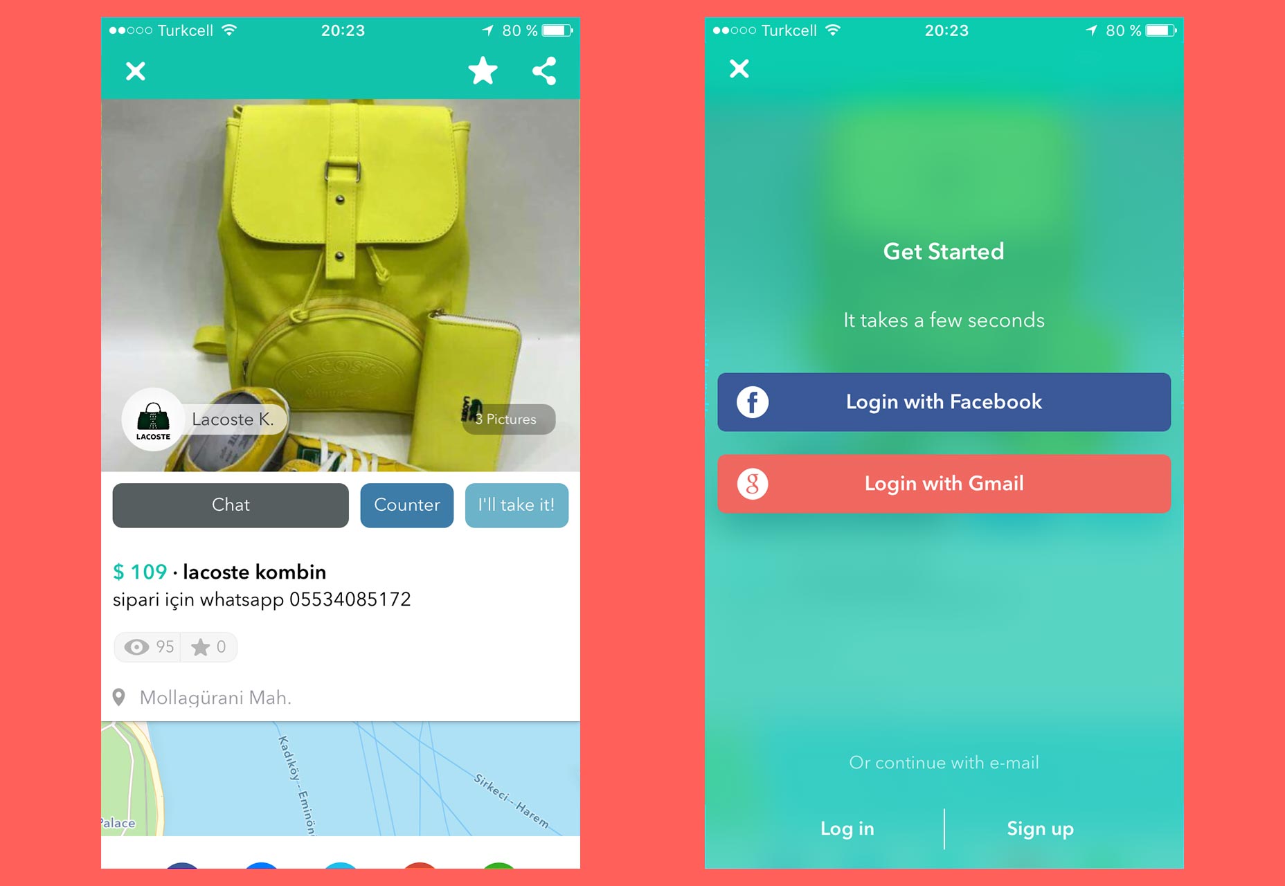
You can test drive Wallapop (left), and it shows you the Login and Signup screen only when it really needs it to continue, in this case, after taping on “Chat” (right).
If at all possible, consider deferring the sign up until it is unavoidable in order to continue. Some apps offer basic functionality limited to an essential set of features that is effectively a test drive.
If the potential user is satisfied with the initial experience, and can clearly see the value that they’ll get from signing up, it’s more likely that they’ll do so. My recommendation is to delay the sign up process as long as you can.
Walkthroughs and other welcome screens
When someone finally visits, or downloads your app, they already have some information about it. If they made this decision it’s because they read a review on a blog, or someone recommended it to them, for example. It may be that they ran into your app by chance when searching for a different solution. However even in this last case, before downloading, or using it, they took a look at the description, possibly reviews, maybe some screenshots.
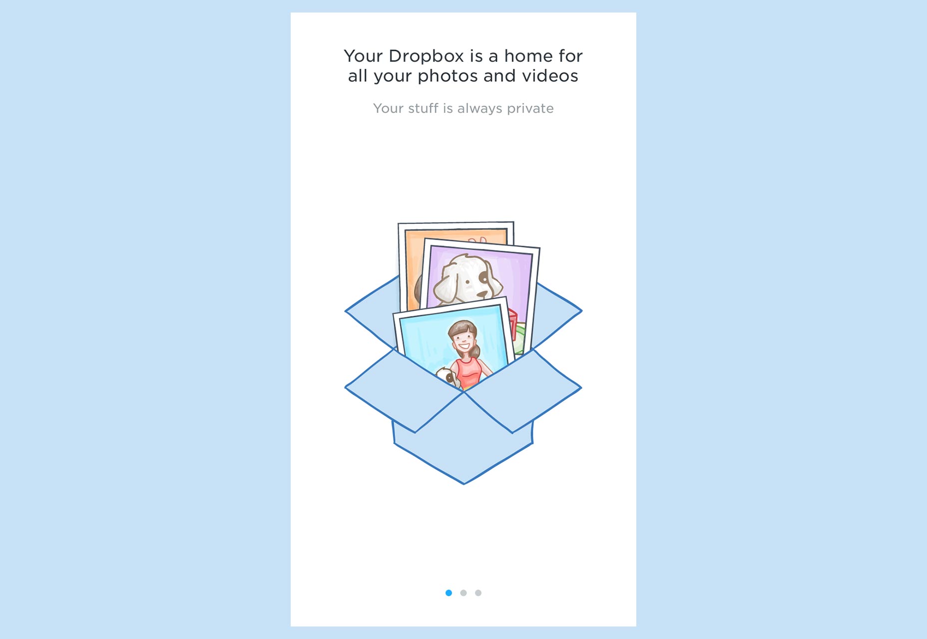
Your users already know what your application is about. You don’t need to remind them by forcing them to swipe through introductory screens.
They already know the basics of your app, they don’t need this information again in the form of explanations and feature highlights. They know what it does, they want to see it in action for themselves.
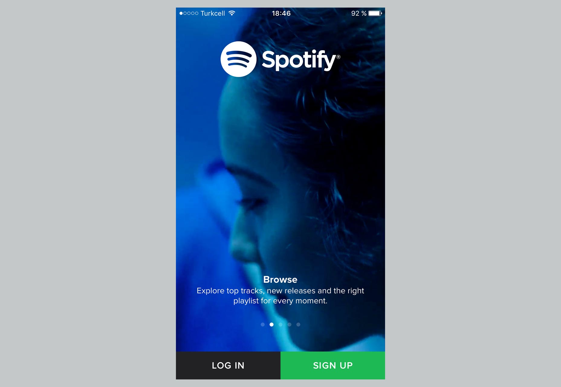
Spotify explains about the app, but giving the option to log in or sign up right away, without making you go swipe through tedious instructions.
In the real world, when you buy a new TV, do you read the manual before using it? I bet you don’t. I don’t either. You plug it in, turn it on, and start pressing buttons on the remote.
Walkthroughs are the digital equivalent of a user manual, but in some cases we are forced to go through the manual pages, all of them, before we’re allowed to use the product. I once listened to someone who was part of a development team say something like: “It’s not really important if the user doesn’t understand how to use this, we’ll put an explanation in the walkthrough”!
A good product doesn’t need instructions. Walkthroughs are for lazy designers that didn’t take the time to figure out a good way to do something. It’s pointless to use this tour to explain basic usage, or the meaning of specific elements such as buttons or icons.
Chances are that with the anxiety of reaching the “first screen” users won’t even pay attention to what you are saying, and skip through quickly without even reading your helpfully written instructions. Even if they do read, by the time they come to the app itself they’ll have forgotten what you wrote.
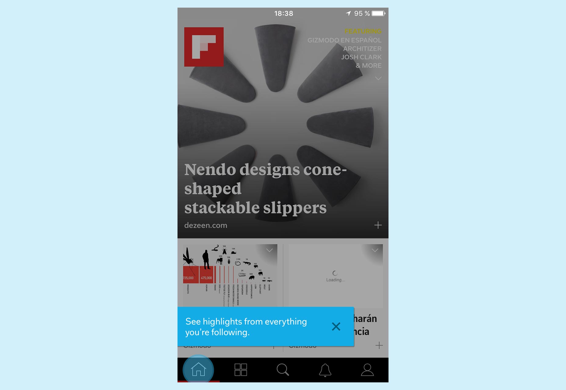
Flipboard shows contextual help, so it tells you how to use a particular element right in context, when you really need it.
Instead of using walkthroughs, I would advise you to use contextual help, at the moment when the user really needs it. In that way, you will ensure that what you are explaining is more relevant and effective. To do this, you can fragment or split the information that you consider essential, and spread it across different screens during the first uses of your app.
Don’t underestimate users that want to explore, and learn how to use your app by themselves. Curiosity is something that you could benefit from if you want to. Some users even want to make mistakes, and figure out by themselves how everything works.
Asking for permission
The same sense of time and opportunity that I’ve been referring to above also applies to when you want to ask a user for permission to show notifications, access to their contacts, or their location, for example. This situation is even worse if you need the user to grant more than one of those permissions. We could risk scaring an unprepared user that doesn’t really understand why your app needs these things.
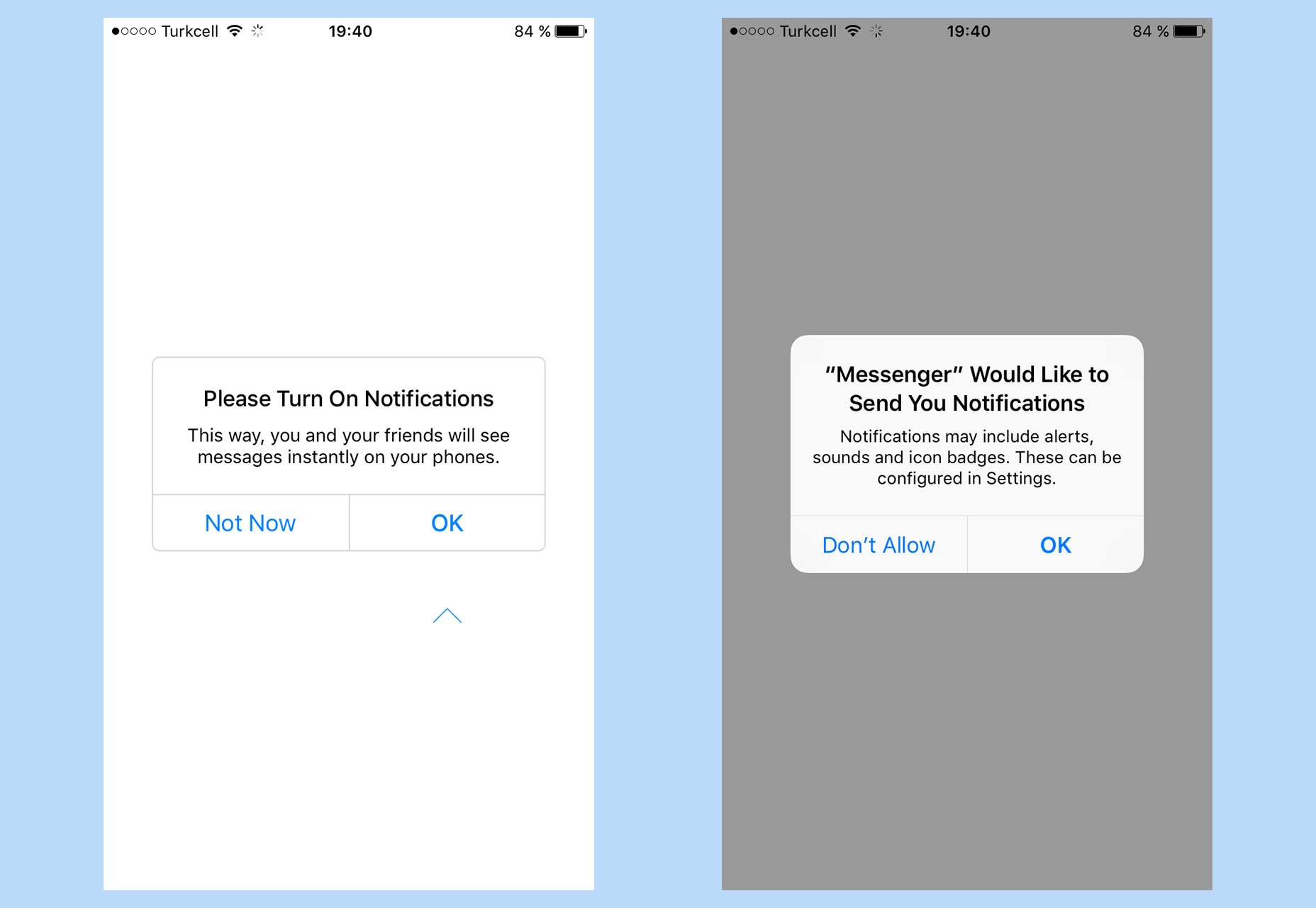
Facebook Messenger prepares the user, showing an explanatory screen (left) prior to the one actually asking for permission (right), to guide the user on what to do.
In those cases, instead of asking for permission in a dramatic way and all at once, you can ask them in the moment when you are really going to need it.
You can also set this crucial moment by adding an extra, previous screen explaining what is about to happen. This has to be concisely and clearly explained in terms that benefit not just you, but the user too — so that the user understands the value of accepting.
Conclusion
Many of our mistakes, when a potential user is trying out an app or service for the first time, boil down to placing obstacles in their way. Users almost always just want to take our app for a spin. This is often caused by our anxiety about business goals or improved metrics, when what we should be concerned with is the user’s needs.
So fragmenting information and disclosing it in a gradual manner at an appropriate time, are keys to an effective initial experience that, hopefully, the prospective user will choose to repeat.


