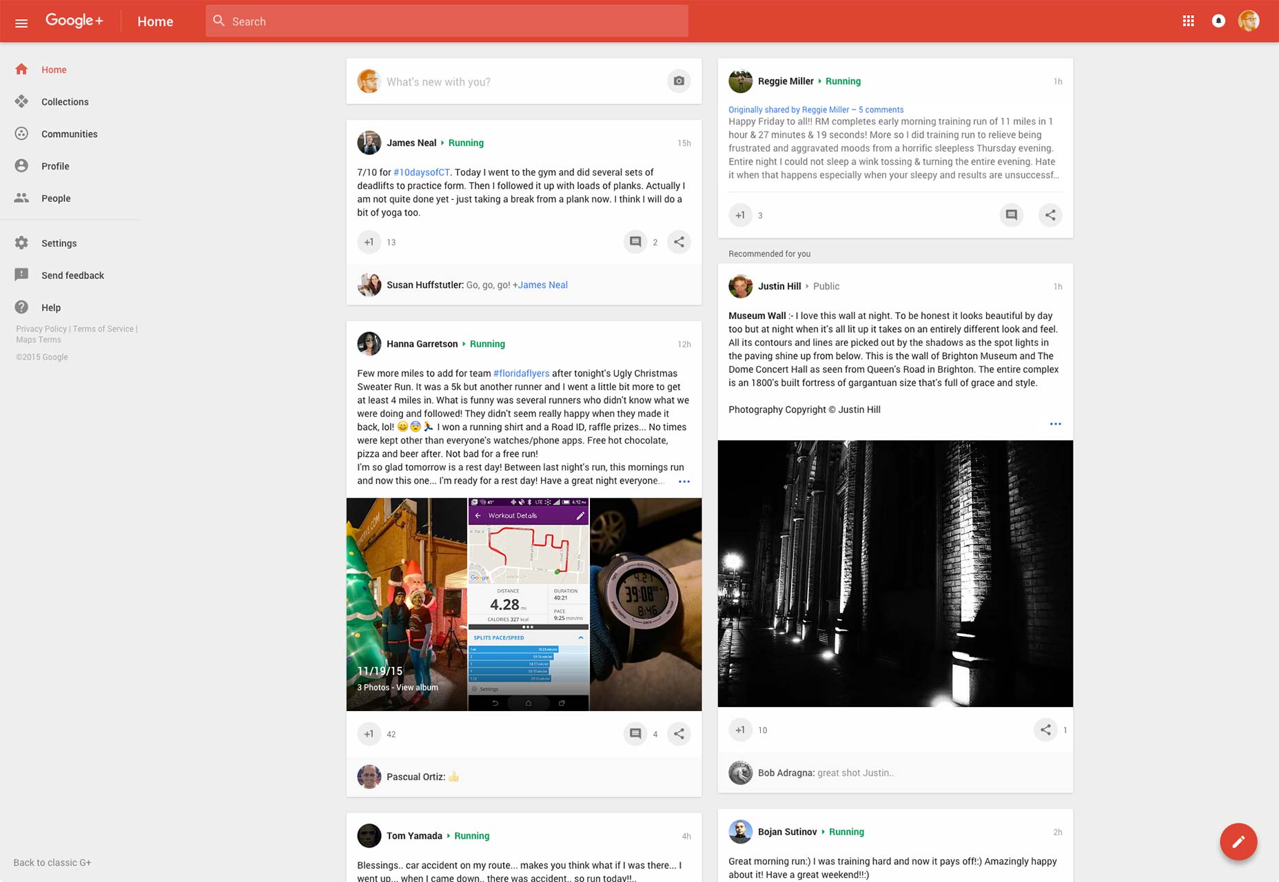
 The use of a Floating Action Button in the Google+ redesign encourages you to post content, rather than helping you consume it. What’s more, being diametrically opposite the rest of the navigation is an inconvenience on larger screens.
As the Floating Action Button finds its way into designs for screens larger than a phone, the convenience of bottom right placement increasingly becomes a hindrance. Like the Hamburger Menu before it, the Floating Action Button is discovering that mobile-first solutions don’t always translate to desktop.
Their shape, position, and color ensure Floating Action Buttons stand out from the rest of a UI, mainly because the current trends for flat, semi-flat, and Material Design style all other elements as regular rectangles. But it’s important to recognize that just as the Floating Action Button is visually distinct on a page, it’s visually recognizable across a range of different projects. Material Design is first and foremost a corporate brand; with brand identity such a vital business asset, mimicking Google’s is unlikely to add value to your client’s business.
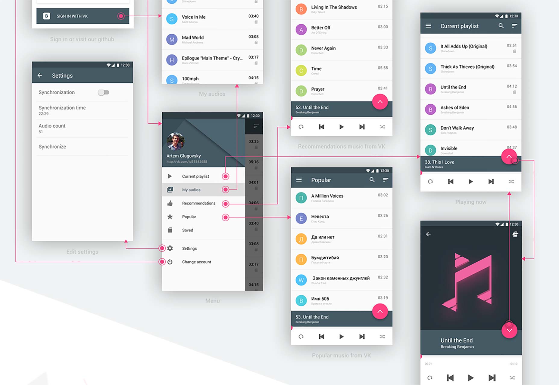
 The VKPlayer app uses a Floating Action Button to toggle controls, which looks cool, but wouldn’t a play/pause button be the primary action here?
According to the Material Design specification Floating Action Buttons are used as a shortcut to the primary action on a page; adding a new item, or initiating a new search. In that scenario the icons for the function are relatively canonical, and the action the button is associated with is clear. However, often a single icon does not adequately represent a function.
What’s more problematic is the drive to reduce a site or app to a single use. As highlighted in Teo Yu Siang’s detailed critique of the Floating Action Button the use of Floating Action Buttons imposes a designer’s intentions on the user; they are encouraged to compose an email when they want to read through their inbox; they are encouraged to take a new photo, when they want to review their past images.
The Floating Action Button is intended to pull a primary action out of the UI as a convenience, but if the UI necessitates a primary action, why isn’t it more focused?
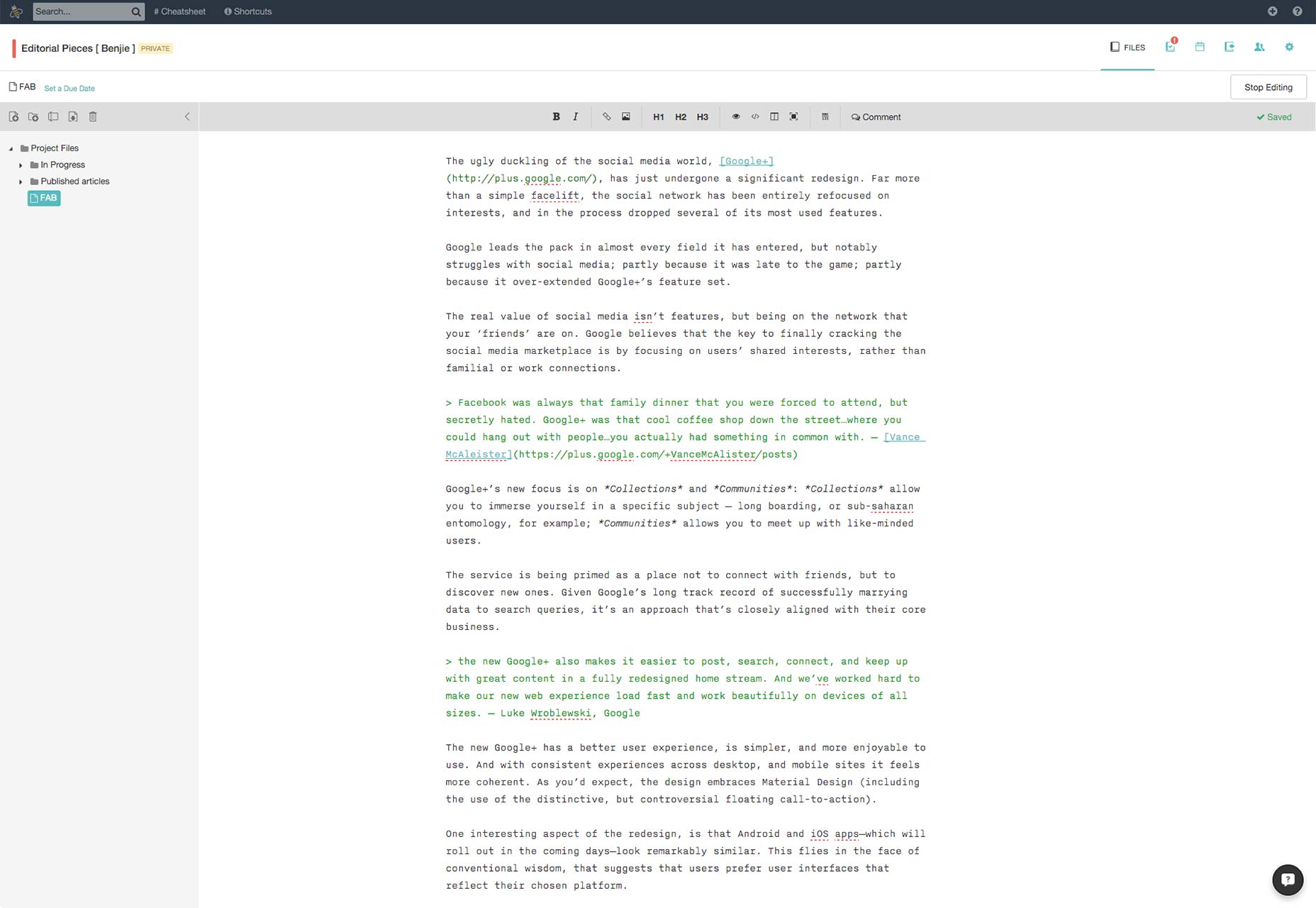
 The otherwise excellent Beegit uses a Floating Action Button to provide quick access to help messages and news updates on the platform. Is that really the primary function of a composition page?
To paraphrase a common design truism, there are no bad design patterns, only bad designers. Like the Hamburger Menu, the Floating Action Button has a good use-case, but that use-case rarely occurs; like the Hamburger Menu, the Floating Action Button’s achilles heel is frequent mis-use. The MD section on Floating Buttons stipulates that the functionality mapped to Floating Action Buttons are “important and ubiquitous enough”, however they’re more commonly used as a style, when the better option would be a more focused UI.
Like the Hamburger Menu, the Floating Action Button solves the designer’s problem, not the users’.
http://polarb.com/232113
Ben Moss
Ben Moss has designed and coded work for award-winning startups, and global names including IBM, UBS, and the FBI. When he’s not in front of a screen he’s probably out trail-running.
Read Next
15 Best New Fonts, July 2024
Welcome to our monthly roundup of the best fonts we’ve found online in the last four weeks. This month, there are fewer…
By Ben Moss
20 Best New Websites, July 2024
Welcome to July’s round up of websites to inspire you. This month’s collection ranges from the most stripped-back…
Top 7 WordPress Plugins for 2024: Enhance Your Site's Performance
WordPress is a hands-down favorite of website designers and developers. Renowned for its flexibility and ease of use,…
By WDD Staff
Exciting New Tools for Designers, July 2024
Welcome to this July’s collection of tools, gathered from around the web over the past month. We hope you’ll find…
3 Essential Design Trends, July 2024
Add some summer sizzle to your design projects with trendy website elements. Learn what's trending and how to use these…
15 Best New Fonts, June 2024
Welcome to our roundup of the best new fonts we’ve found online in the last month. This month, there are notably fewer…
By Ben Moss
20 Best New Websites, June 2024
Arranging content in an easily accessible way is the backbone of any user-friendly website. A good website will present…
Exciting New Tools for Designers, June 2024
In this month’s roundup of the best tools for web designers and developers, we’ll explore a range of new and noteworthy…
3 Essential Design Trends, June 2024
Summer is off to a fun start with some highly dramatic website design trends showing up in projects. Let's dive in!
15 Best New Fonts, May 2024
In this month’s edition, there are lots of historically-inspired typefaces, more of the growing trend for French…
By Ben Moss
How to Reduce The Carbon Footprint of Your Website
On average, a web page produces 4.61 grams of CO2 for every page view; for whole sites, that amounts to hundreds of KG…
By Simon Sterne
20 Best New Websites, May 2024
Welcome to May’s compilation of the best sites on the web. This month we’re focused on color for younger humans,…


