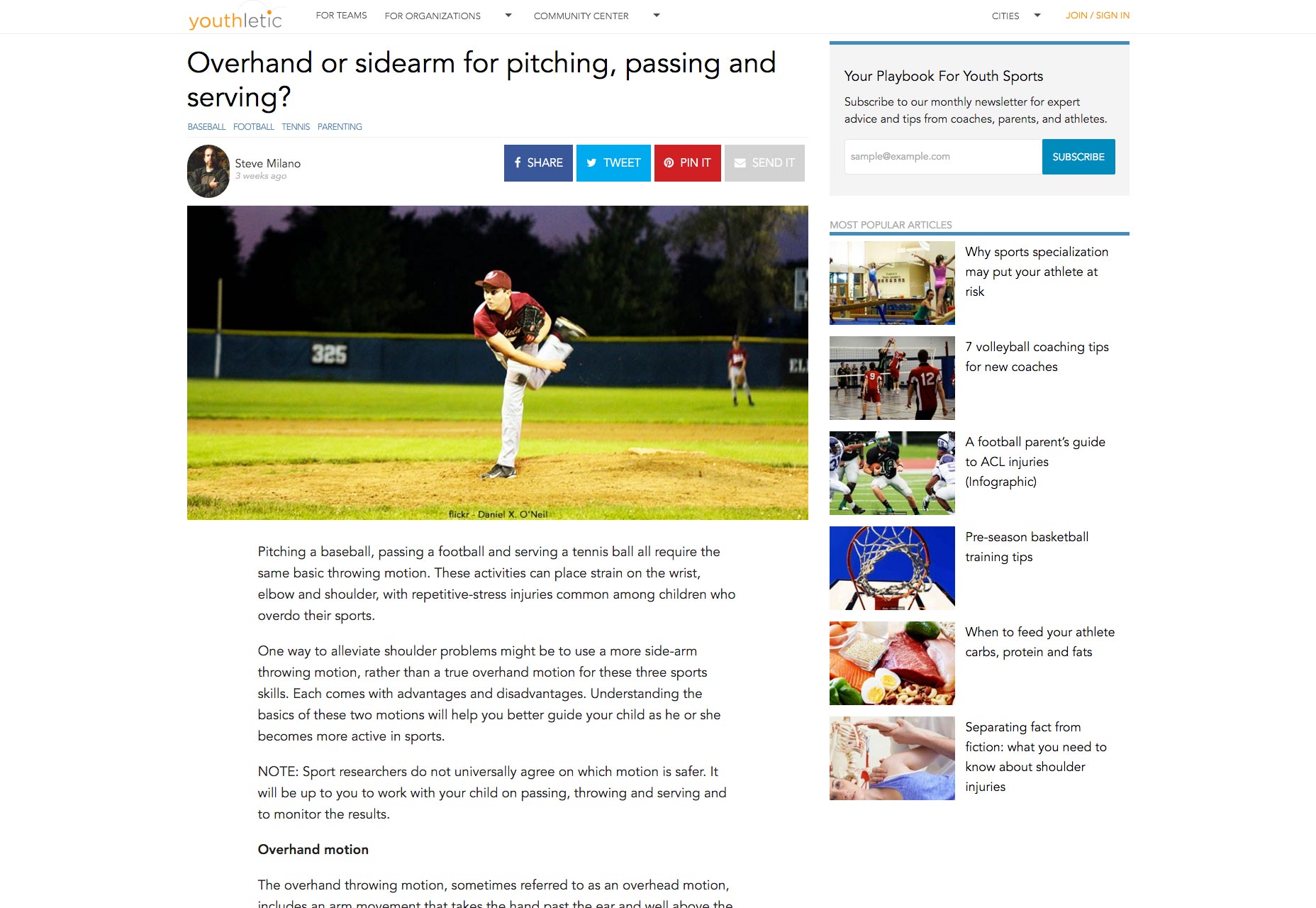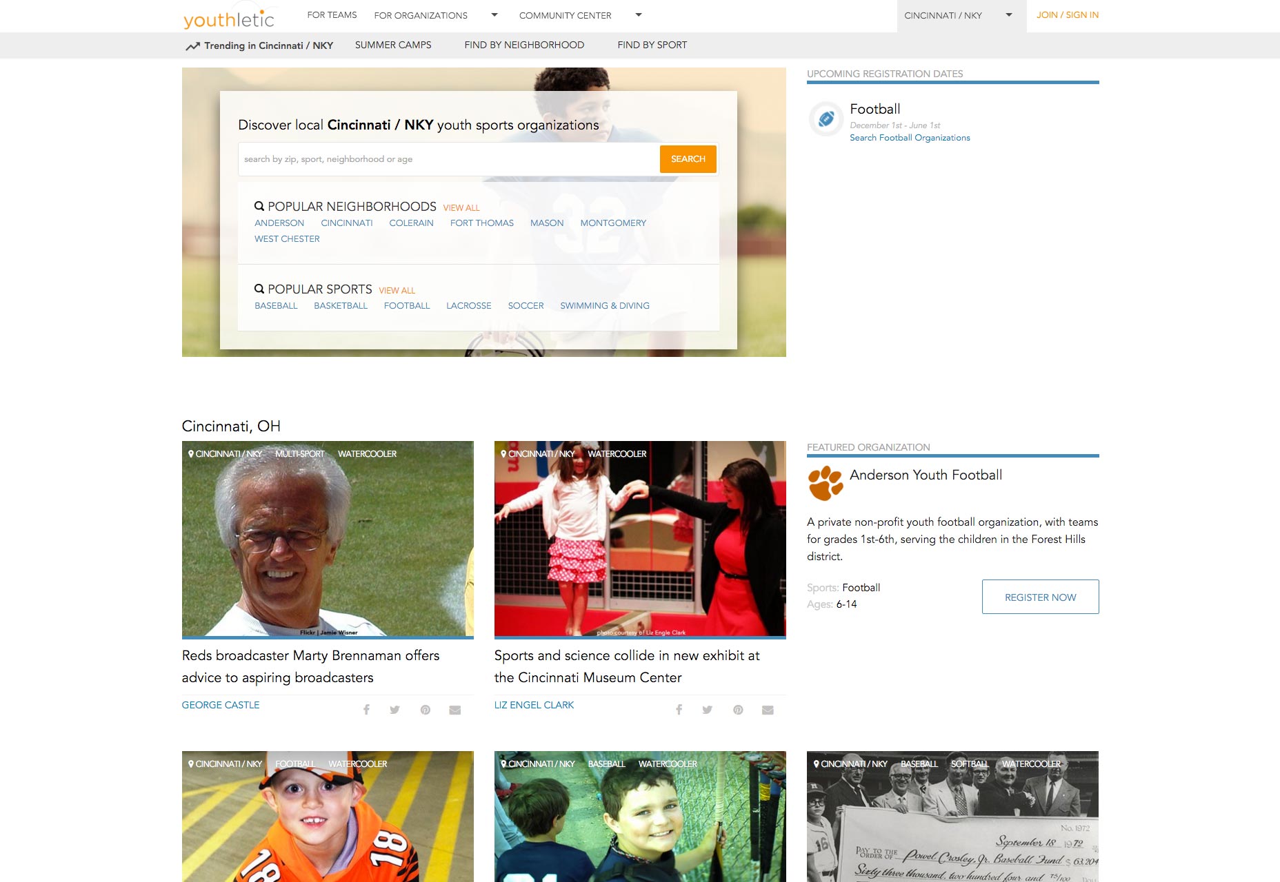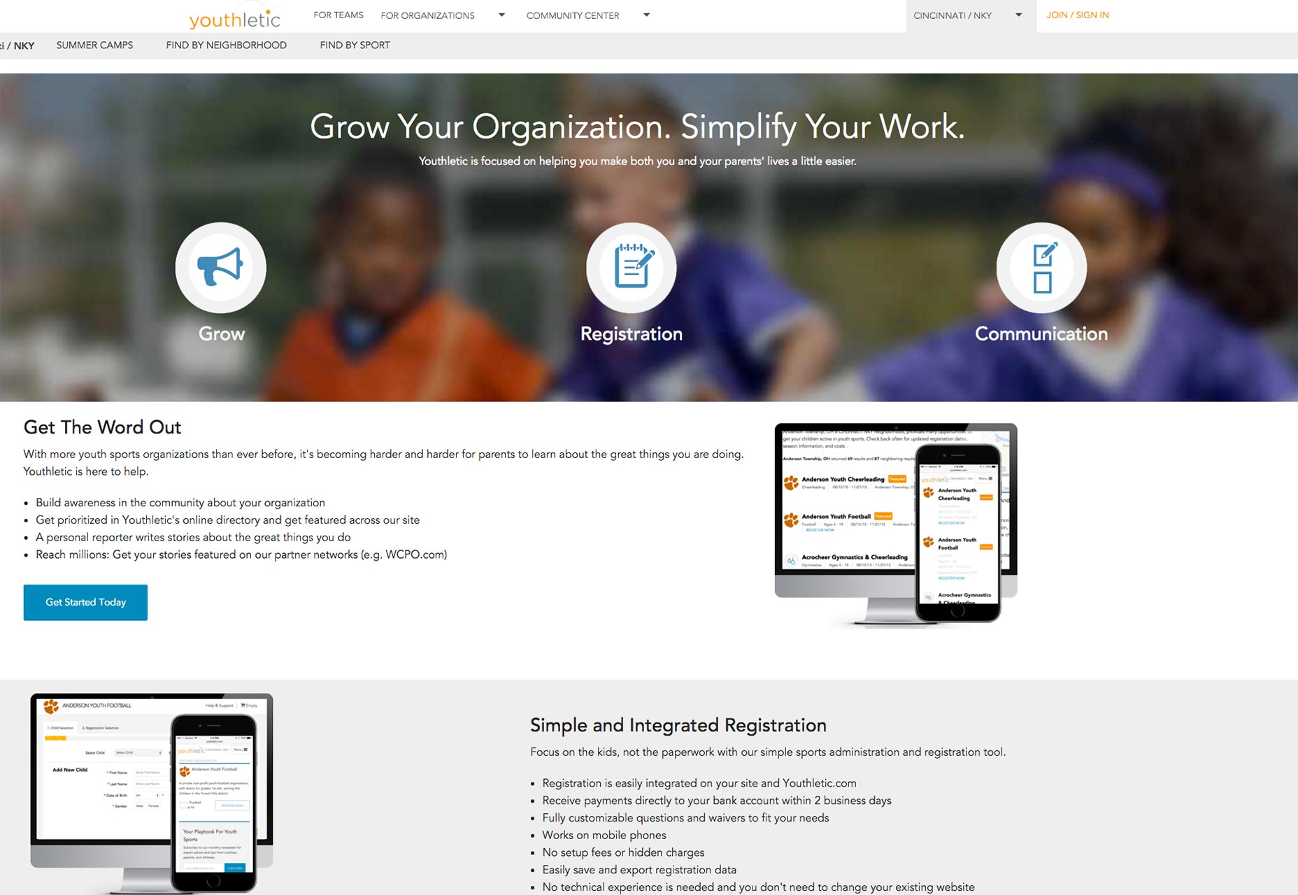
- The project depended on youth sport organization commitment and this proved to be more difficult than planned. Most youth sport organizations are run by non-profits and volunteers so communication and developing relationships is challenging.
- Organization data is fragmented — gathering and maintaining data is a tedious and time consuming process.
- There were legal hurdles when accepting payments and gathering information about children. Many hurdles would take serious time and financial investment.
- The project depended on several third parties add-ons and services, such as payment processing. Many of these third parties proved to be buggy and problematic.
1. A parallel approach towards content
With organization search and registration not gaining as much traction as initially expected, more youth sports articles were published to keep the site active. They say “content is king” and this proved to be evident on Youthletic, as proven by the direct correlation between number of articles published and site traffic. To cement the change further was the fact that YL’s parent company is a media company at its core so the move to a content focus made even more sense.
2. Becoming agile
Initially, there was a group of four creating the entire project: a business owner, a project manager, a UX/UI designer, and a back end developer. The separation of duties was strictly defined and the project followed a waterfall methodology. This proved to be problematic as the project was meant to be brought to life quickly. Waterfall methodology is ideal for some companies and products, but the issue with a waterfall process is that the project requires the fulfilment of one phase, before proceeding to the next. Switching to an agile methodology encouraged collaboration among team members and allowed for the product to evolve quicker.3. Designing a better user experience
There were four principles that we wanted to make sure to get correct when designing a better user experience:Thinking mobile-first
We knew that a majority of site users were accessing the site on mobile devices (roughly 65%). Mobile usage continues to grow so the design needed to be consistent and beautiful across devices. To accomplish this, we used site-wide, mobile-friendly navigation (a slide-in from the side).Developing a light site
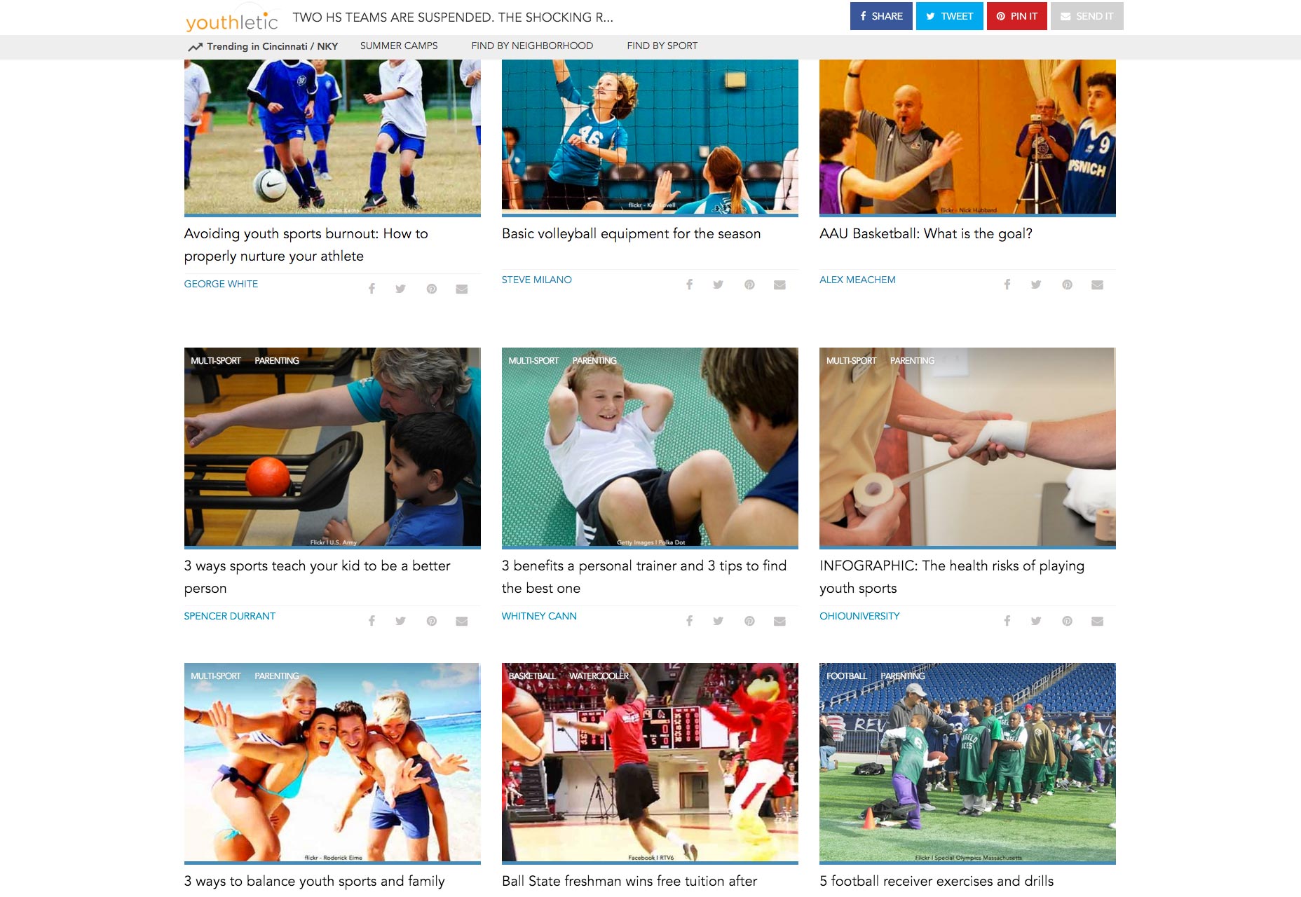
If users want content, we need to give it to them and do so quickly. Speed matters. Page abandonment goes up dramatically for every second a page takes to load. To avoid abandonment we implemented a content feed that makes ajax calls to load content at vertical scroll distances. This decreased page load time dramatically (in our case by 400%) and helped drop the site’s bounce rate by 30%.
Making sharing prominent
A social media analysis showed that parents loved sharing Youthletic articles. On the previous design, sharing was enabled but it was only accessible on one area of the story page. But sharing is caring. With article pages in the new design, parents could share from 3 separate places, and sharing capabilities were omni-present. Chartbeat data suggests that users will share content without reading it, so the new design also allowed users to share without going into an article.Giving users other means of navigation besides the top nav bar
Through Google Analytics and Google Tag Manager, we knew that users were not using the top navigation very often, thus shortening site visit length and increasing bounce rate. To counter this, we added author, sport and category tagging for easier access to information users may be interested in. Not only did this provide additional means for users to travel around the site, it more neatly organized our content in the CMS and made it easier to give users related content. Tag activity has been used more and more since its implementation and we expect that trend to continue as users become more familiar with the new design.
4. Altering the definition of “success”
Looking at expectations from a higher level, the site’s initial goals were flawed. They were driven by registrations and other bullshit metrics — page views, page visits, pages per visit, etc. We wanted to measure quality over quantity. Planning for the future and laying a groundwork for the rest of the Scripps organization (YL’s parent company), we knew that companies buying advertising would soon catch on to the fact that site metrics were often misleading and didn’t measure quality. Modeled after Medium’s Total Time Reading metric we began gathering user data like scroll distance on article pages and visit depth. As we gathered information we were able to establish realistic, relative goals while learning about users’ experiences.
Moving forward
As a result of the redesign, total sessions are up by 98.54%, the average session duration has increased by 20%, and mobile usage is up by 217%; at the same time, the average page load time is down by 6%, and the bounce rate is down by 17%.
New challenges arise everyday as we continue to build the product out. Local youth sports will continue to be a huge focus and area of opportunity but content will also be a driving force. The roadmap includes new feature implementation, a mobile application and continued growth towards creating a quality user experience, so there may be updates as we go on.
Jordan Crone
Jordan is a Cincinnati-based digital designer and UX enthusiast. He's worked extensively with clients ranging from national corporations to local non-profits. You can follow his tweets at twitter.com/jordantheleast and writings at medium.com/@jordantheleast.
Read Next
15 Best New Fonts, July 2024
Welcome to our monthly roundup of the best fonts we’ve found online in the last four weeks. This month, there are fewer…
By Ben Moss
20 Best New Websites, July 2024
Welcome to July’s round up of websites to inspire you. This month’s collection ranges from the most stripped-back…
Top 7 WordPress Plugins for 2024: Enhance Your Site's Performance
WordPress is a hands-down favorite of website designers and developers. Renowned for its flexibility and ease of use,…
By WDD Staff
Exciting New Tools for Designers, July 2024
Welcome to this July’s collection of tools, gathered from around the web over the past month. We hope you’ll find…
3 Essential Design Trends, July 2024
Add some summer sizzle to your design projects with trendy website elements. Learn what's trending and how to use these…
15 Best New Fonts, June 2024
Welcome to our roundup of the best new fonts we’ve found online in the last month. This month, there are notably fewer…
By Ben Moss
20 Best New Websites, June 2024
Arranging content in an easily accessible way is the backbone of any user-friendly website. A good website will present…
Exciting New Tools for Designers, June 2024
In this month’s roundup of the best tools for web designers and developers, we’ll explore a range of new and noteworthy…
3 Essential Design Trends, June 2024
Summer is off to a fun start with some highly dramatic website design trends showing up in projects. Let's dive in!
15 Best New Fonts, May 2024
In this month’s edition, there are lots of historically-inspired typefaces, more of the growing trend for French…
By Ben Moss
How to Reduce The Carbon Footprint of Your Website
On average, a web page produces 4.61 grams of CO2 for every page view; for whole sites, that amounts to hundreds of KG…
By Simon Sterne
20 Best New Websites, May 2024
Welcome to May’s compilation of the best sites on the web. This month we’re focused on color for younger humans,…


