

A UI without UX is like a painter slapping paint onto canvas without thought.Rahul was right on with this analogy. You may have the most appealing, user-friendly, unique, and functional desktop version of your website, but if you’re not taking the mobile experience into consideration, you are just painting without any thought. So, what separates a good mobile experience from a bad one? It’s not too difficult to separate the key components that make up a highly effective, optimized, and user-focused design. But here are a few best practices that should guide you along the way:
1) Don’t dismiss mobile-first
If your website is aimed at mobile UX, you might want to break the tradition by following the “mobile first” strategy. There is no harm in embracing this technique when you are positive that most of your users will access your website through a mobile device. Just as codemyviews suggests that mobile web design isn’t a niche, there are in fact, “1.2 billion mobile web users worldwide” and the number doesn’t seem to be dropping any time soon (it is likely to increase in the near future). This may be a bit challenging at first; but if you’re willing to put your user first, it’s worth a shot. Just because you’ve aimed at designing a simple, clean, or mobile-focused website doesn’t mean it shouldn’t be sophisticated. Karimrashid.com is a perfect example of how simplicity and sophistication can be blended into creating a clean and responsive, yet classy design.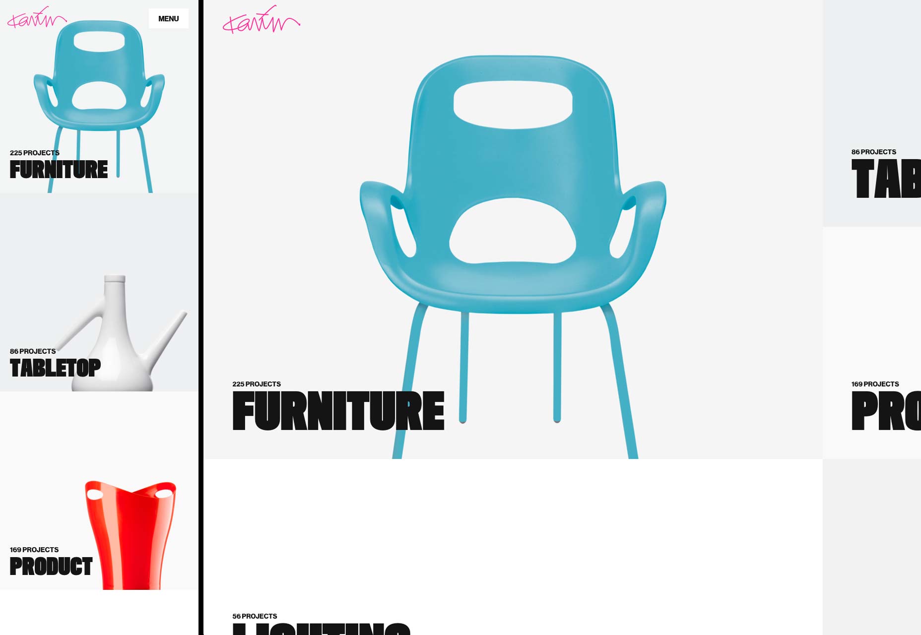
2) Create fluid layouts
There are simply far too many possible screen sizes out there to pick and choose which ones you’ll design for. You’ll need to create a layout that adapts as seamlessly as possible to all of them. Luckily, fluid layouts are here to save the day! Based on percentages rather than definite measurements like pixels, fluid layouts have become the standard among web professionals. They can be tricky, but making sure that as many people as possible can actually use your site is well worth the effort.3) Aim for functionality
What is functionality? It’s what you offer your visitors to get things done, and done fast. Based on the purpose of your website, all tools such as nearest store locations, product search, product reviews, or currency converters, should help users perform intended “functions” and achieve goals much faster. Purina, a pet food provider, is a perfect example of how to make “functions” easier on a web page. The home page has a search box where you can search the thing that you’re looking for. Below are two separate columns for the kind of animal food they specialize in. The whole website is easy to navigate with column, buttons, tools, and design elements that make deciding on the best kind of pet food — and then buying — a breeze.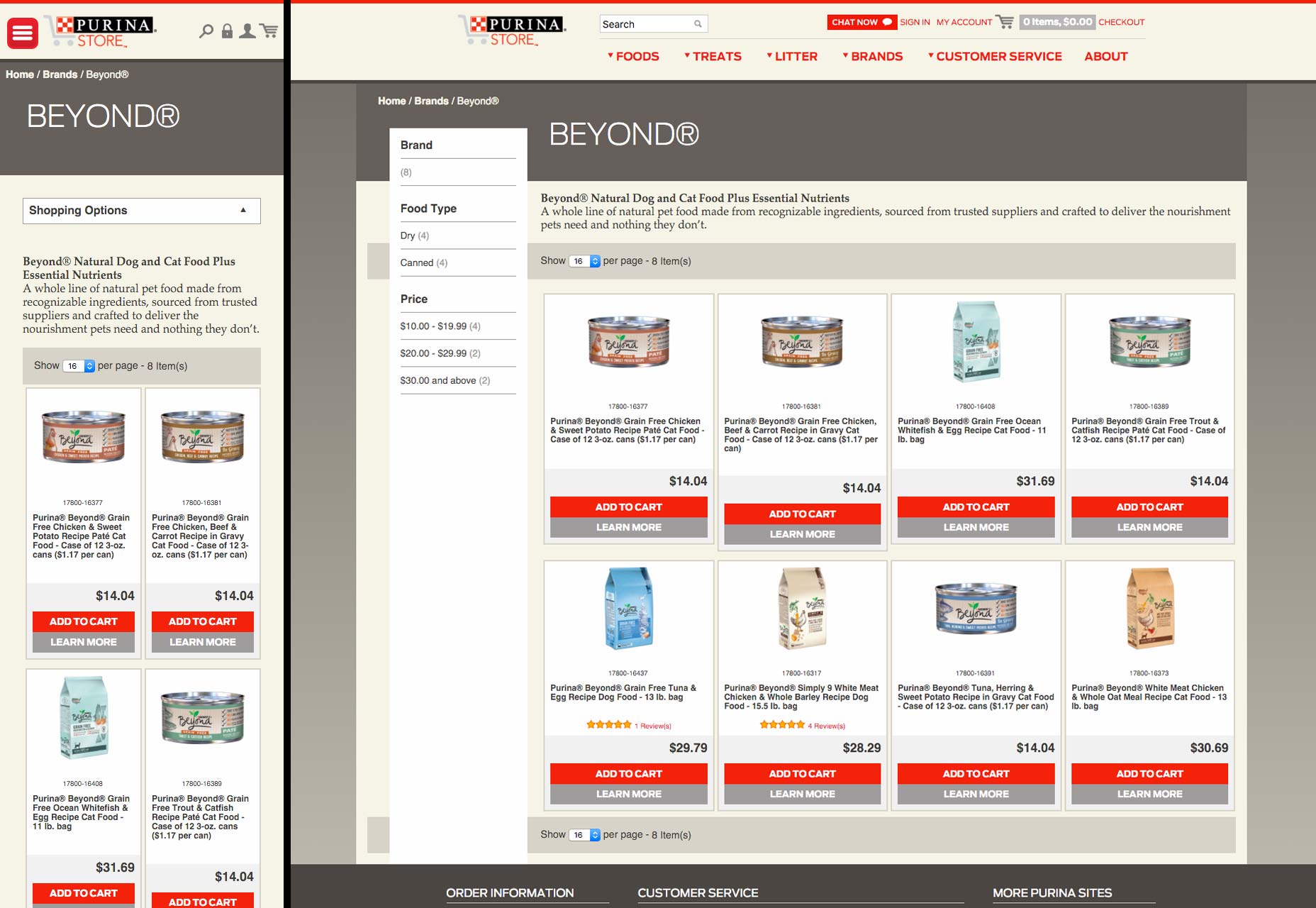
4) Identify your users
Don’t try to become a jack of all trades, because it may cost you a typical user, and no one wants that. First find out who your users are. Then figure out their typical web browsing behavior. Once that’s set aside, find out what makes them tick. Modern users are of two major types: those who are browsing without a goal in mind, and those who are looking to perform a task. Each of these groups would require different “functions” based on their needs. It’s not difficult to guess the demographics of The Body Shop website’s users since it leaves hints all over the page. Since The Body Shop is highly focused on “natural ingredients” and social activism, the monochromatic green variations, a slider of natural ingredients, “green” choice of images, as well reports on fair trades, pledges, and other social events is an understandably well-developed design concept.5) Always look up the developer’s libraries and guidelines
Based on the platform you will be using, it is essential to give the UI guidelines a close look. Some platforms allow more flexibility than others. Whichever the case, some key components of brand or “signatures” should remain. An Apple app developer should have a look at iOS Human Interface Guidelines and follow Apple standards when it comes to designing basics, design strategies, UI elements, Icon/image design, etc. The Android developer, on the other hand, should learn all about the components, style, usability, and layout of typical Android applications with the help of the Android developers guide.6) Make all content available to all users
Some designers, instead of making all their content work in fluid layouts, will simply opt to hide some of it from mobile users. Sometimes it’s because the layout is tricky, or they feel like there’s just too much content for a mobile layout. This is the wrong approach. Giving users a “stripped-down” version of your site or app is not only unfair to mobile users, but can seriously backfire, and lose you customers. You might have to simplify the layout to the extreme, move some content to other screens to reduce clutter, or just try to organize it all better; but it needs to be there. Compare the desktop version of the BBC site to the mobile version. While simpler than it used to be, it still puts all sorts of information all over the screen. The mobile version, by contrast, drops some of the images (which are still available in the articles themselves), but keeps all of the headlines, dramatically simplifying the experience on a phone-sized screen.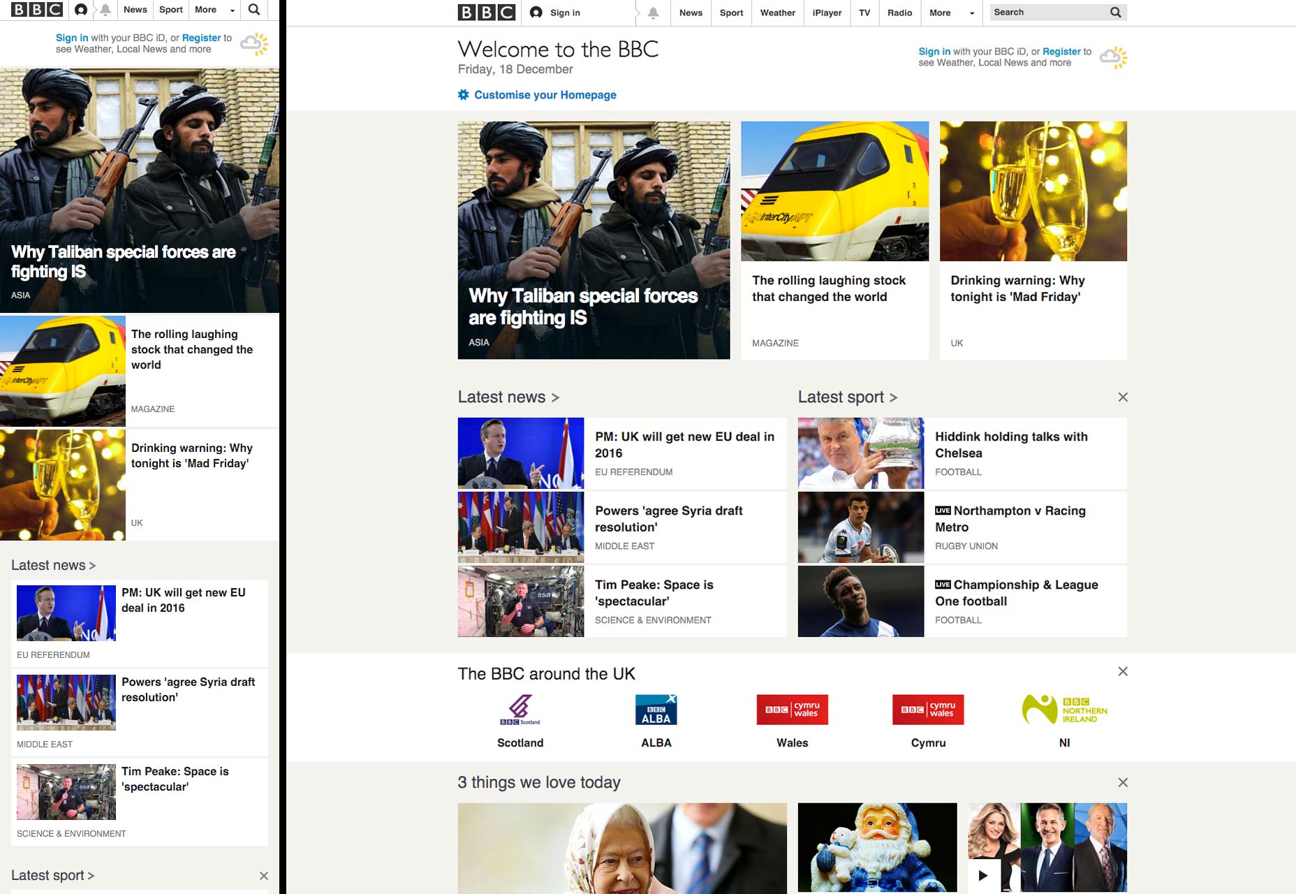
7) Design for touch
It is also useful to have in mind the fact that a mobile-device user will be using fingers instead of precision-friendly mouse pointers. Your design should be easy to navigate with fingers of all sizes and shapes, considering all mobile devices are now touch-screen. A user shouldn’t have to pinch too much or zoom in to tap on something or fill out a form or tap on a button. Inaccurate taps are also very common on small devices which should be accounted for in the design with large enough touch inputs or gestures to get the job done. Here’s a touch table by Peter-Paul Koch that might help. Notice how touch events (and other actions) may vary depending on browser compatibility and device.8) Use compression tools
The amount of tools available today for making a designer’s work less burdensome is unfathomable. You’ll find script compressors such as HTML compressor or Gzip compression that will automatically remove unnecessary comments, white space, or code. CSS minifier and CSS compressor and some more tools that will allow you to concatenate CSS code and improve performance. Image compression is also equally important; some that will reduce the size of your .jpeg and .png files while still keeping the quality intact include EWWW Image Optimizer, smush.it, optiPNG, and jpegtran. Here’s an example of a highly responsive portfolio design by RyJohnson. The website is full of spectacular images no different from the desktop version. The secret to fast loading here is, without a doubt, image optimization.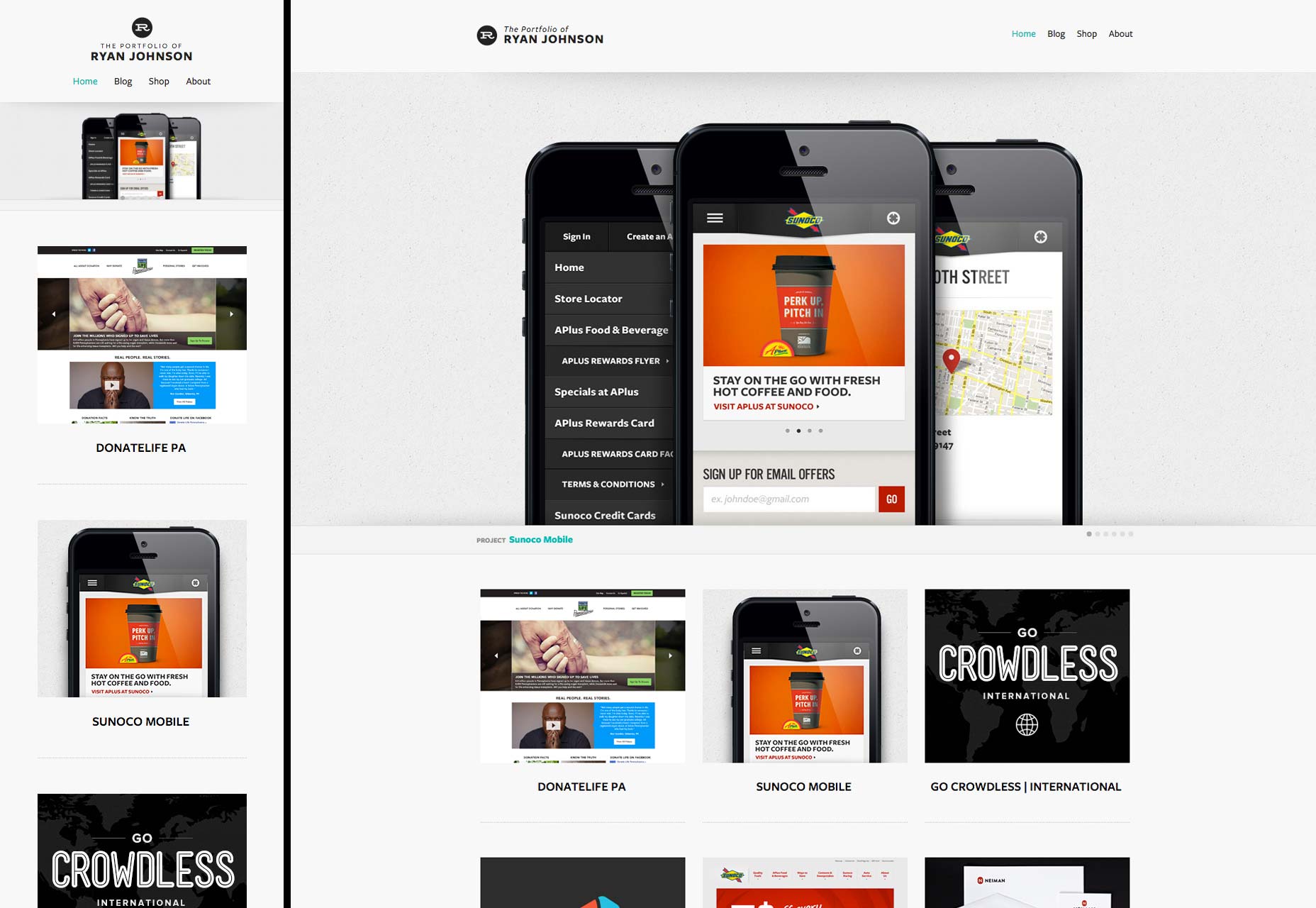
Preston Pierce
Preston Pierce is a blogger and manager of brand identity design team at Logo Ping, a company that provides logo design service. He has done graduation in marketing and certifications in graphic designing. He mainly blogs on topics like UX, web design, branding and freelancing. Follow him on Twitter for more articles.


Read Next

15 Best New Fonts, July 2024
Welcome to our monthly roundup of the best fonts we’ve found online in the last four weeks. This month, there are fewer…
By Ben Moss

20 Best New Websites, July 2024
Welcome to July’s round up of websites to inspire you. This month’s collection ranges from the most stripped-back…

Top 7 WordPress Plugins for 2024: Enhance Your Site's Performance
WordPress is a hands-down favorite of website designers and developers. Renowned for its flexibility and ease of use,…
By WDD Staff

Exciting New Tools for Designers, July 2024
Welcome to this July’s collection of tools, gathered from around the web over the past month. We hope you’ll find…

3 Essential Design Trends, July 2024
Add some summer sizzle to your design projects with trendy website elements. Learn what's trending and how to use these…

15 Best New Fonts, June 2024
Welcome to our roundup of the best new fonts we’ve found online in the last month. This month, there are notably fewer…
By Ben Moss

20 Best New Websites, June 2024
Arranging content in an easily accessible way is the backbone of any user-friendly website. A good website will present…

Exciting New Tools for Designers, June 2024
In this month’s roundup of the best tools for web designers and developers, we’ll explore a range of new and noteworthy…

3 Essential Design Trends, June 2024
Summer is off to a fun start with some highly dramatic website design trends showing up in projects. Let's dive in!

15 Best New Fonts, May 2024
In this month’s edition, there are lots of historically-inspired typefaces, more of the growing trend for French…
By Ben Moss

How to Reduce The Carbon Footprint of Your Website
On average, a web page produces 4.61 grams of CO2 for every page view; for whole sites, that amounts to hundreds of KG…
By Simon Sterne

20 Best New Websites, May 2024
Welcome to May’s compilation of the best sites on the web. This month we’re focused on color for younger humans,…