

Problem 1: The old site wasn’t even responsive
It’s true, and I was pretty embarrassed about it. When the site was first designed in 2011, responsive websites were already in full swing. But bootstrapped as we were, it seemed more like a “nice to have.” The past few years of user data have shown us this was no longer the case. While I would still say that most businesses looking for a web design company are probably not doing it from a mobile device, that’s no excuse.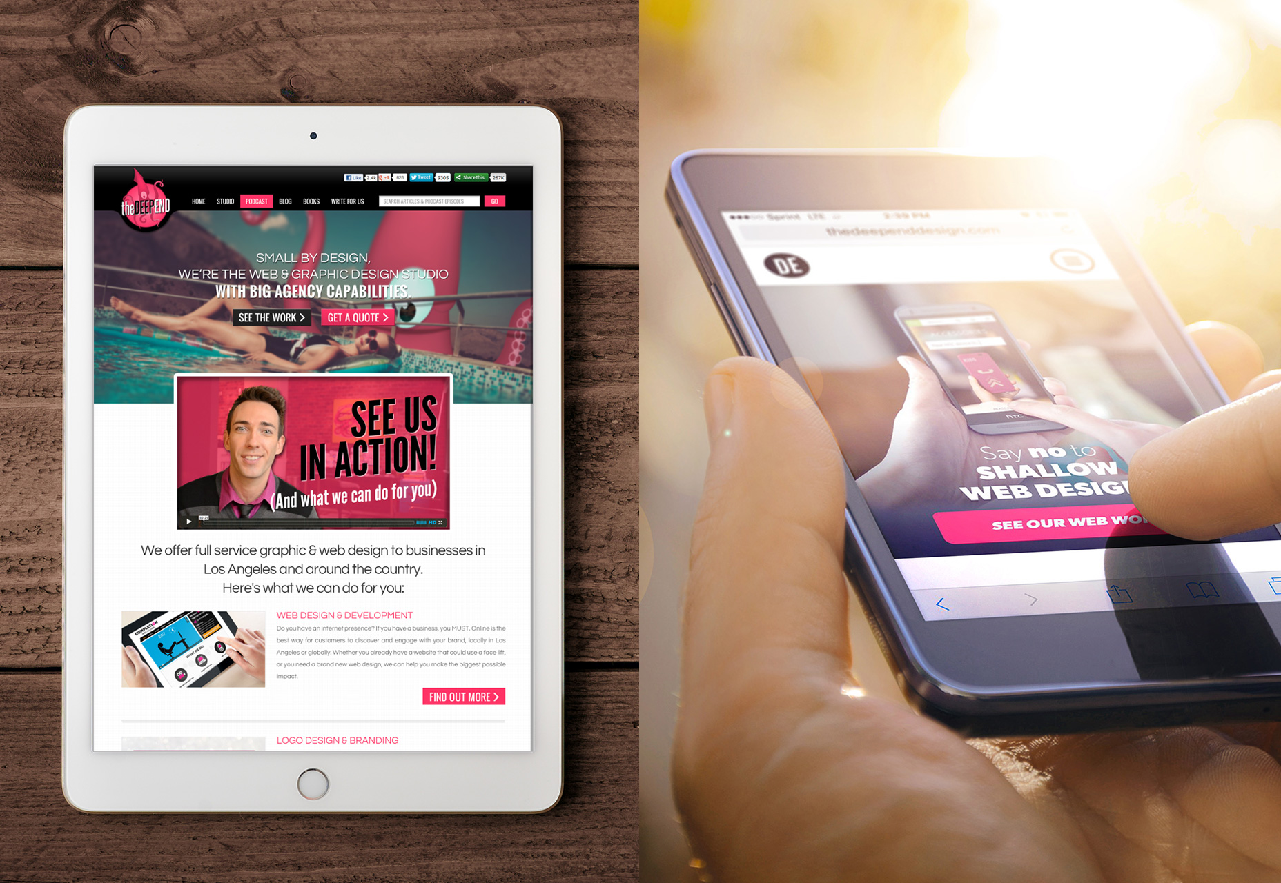 The truth is, as a web design agency who firmly advocates for responsive (even a mobile-first approach in some cases) the fact that we missed this boat was unacceptable. To compound the problem, we actually have a blog and podcast aimed at the design community. Even if our clients aren’t accessing the site on mobile, our designer audience most likely is.
The responsive issue was what originally spurred the redesign in the first place. Then we figured as long as we’re under the hood, we might as well fix a few other issues, and make some more improvements.
The truth is, as a web design agency who firmly advocates for responsive (even a mobile-first approach in some cases) the fact that we missed this boat was unacceptable. To compound the problem, we actually have a blog and podcast aimed at the design community. Even if our clients aren’t accessing the site on mobile, our designer audience most likely is.
The responsive issue was what originally spurred the redesign in the first place. Then we figured as long as we’re under the hood, we might as well fix a few other issues, and make some more improvements.
Problem 2: No user flow
One thing I’ve really come to understand over the past few years is the concept of landing pages that convert. So I naturally wanted to bring that knowledge to the new site. [pullquote]when given too many options, people are 10x as likely to take no action at all[/pullquote] As it stood, our site had no real ‘plan’. No clear goal, and no pre-set funnel for our potential clients to be lead through. We had a traditional navigation bar in the header, allowing people to click around to view our portfolio, testimonials, about us, etc. The problem with that is people only have so much patience, and very short attention spans. Studies have also shown that when given too many options, people are 10x as likely to take no action at all. In other words, without a clear path, our prospects were being lost. So we came up with a plan. We would treat the site much more like a funnel, with the following elements:Prioritized navigation
In a fairly risky move, we decided to tuck away all secondary navigation links in a hidden drawer menu, accessible by clicking a hamburger icon. Deciding to use the hamburger icon with a hidden menu is quite risky from a user experience perspective, and we knew this going in. Any time you intentionally hide content from users, you should have a very good reason for doing so; better than “because it looks cleaner.” Hidden menus are generally frowned upon for a few reasons:
- It makes users go through an extra step; by having to click an icon just to be able to see the menu, you are essentially creating a barrier.
- It inhibits discoverability; let’s say your site’s conversion rates rely on some page or piece of content that people might not even be thinking to look for. For this example, let’s say it’s a testimonials page. If it’s out in the open, people are likely to find it, and those testimonials might just be what pushes them over the top into a conversion. Take that same page, and hide it away, site visitors are unlikely to ever find it. And you lose out on a phone call.
A clear, singular call-to-action
We would place this button on key landing pages within the page body, as well as in a sticky header, so it is always accessible.Self-contained landing pages
In order to combat clients wandering aimlessly around the site, and due to the fact that navigation was now somewhat hidden, we would convert our portfolio pages into persuasive, conversion-driven landing pages. Each of these pages follow the same template, but there are multiple versions for our different city locations, and services. Each contains portfolio projects, an ‘about us’ video, a video testimonial, and sales copy designed to convince clients to click through to ‘Get a No-Strings Consultation.’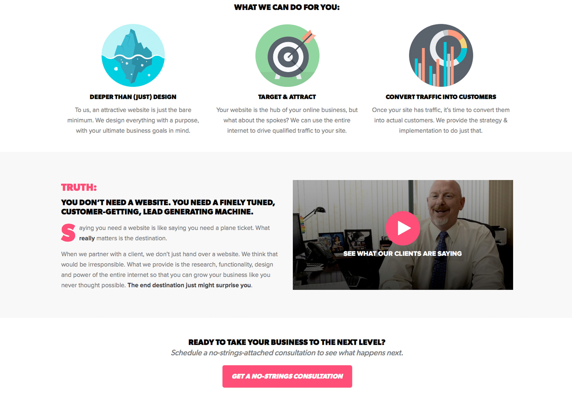 Since the redesign is fairly recent, we have limited analytics to go off of, but it looks like a few things are happening so far:
- Bounce rates are higher; this makes complete sense, because without the need for people to click around to a bunch of different pages, they tend to spend their time on the landing page. If they don’t convert, they bounce.
- Conversions are higher; for our site, we consider a filled-out form to be a conversion. With our CTA on our landing pages in several key areas, we have managed to increase those click-throughs by about 20%.
Problem 3: Service offerings in flux
In the design business, there’s a lot of talk about niches. Sometimes you go after a niche, and sometimes a niche just works itself out naturally. In our case, we began as a full-service design agency, offering web, logo and print design. Over the last four years, what we were actually hired for was mostly web design, followed by logo design, with print as a distant third. Subsequently, we got good and streamlined with our web process. Our logo process was fairly worked out, and our print process became non-existent. So when it came time to redesign, we decided to phase out our print offering altogether, eliminating that portfolio page. We just 301-redirected it back to our homepage in order to salvage any link juice that may be pointing toward it. We also eliminated ‘print’ as an option in our consultation request form. We are still offering logo design and branding as a secondary service, so we wanted to treat it that way in the navigation. Our homepage goal is to entice prospects to click-through to our web design landing page, and the logo option is styled as a secondary option, with a plain text link.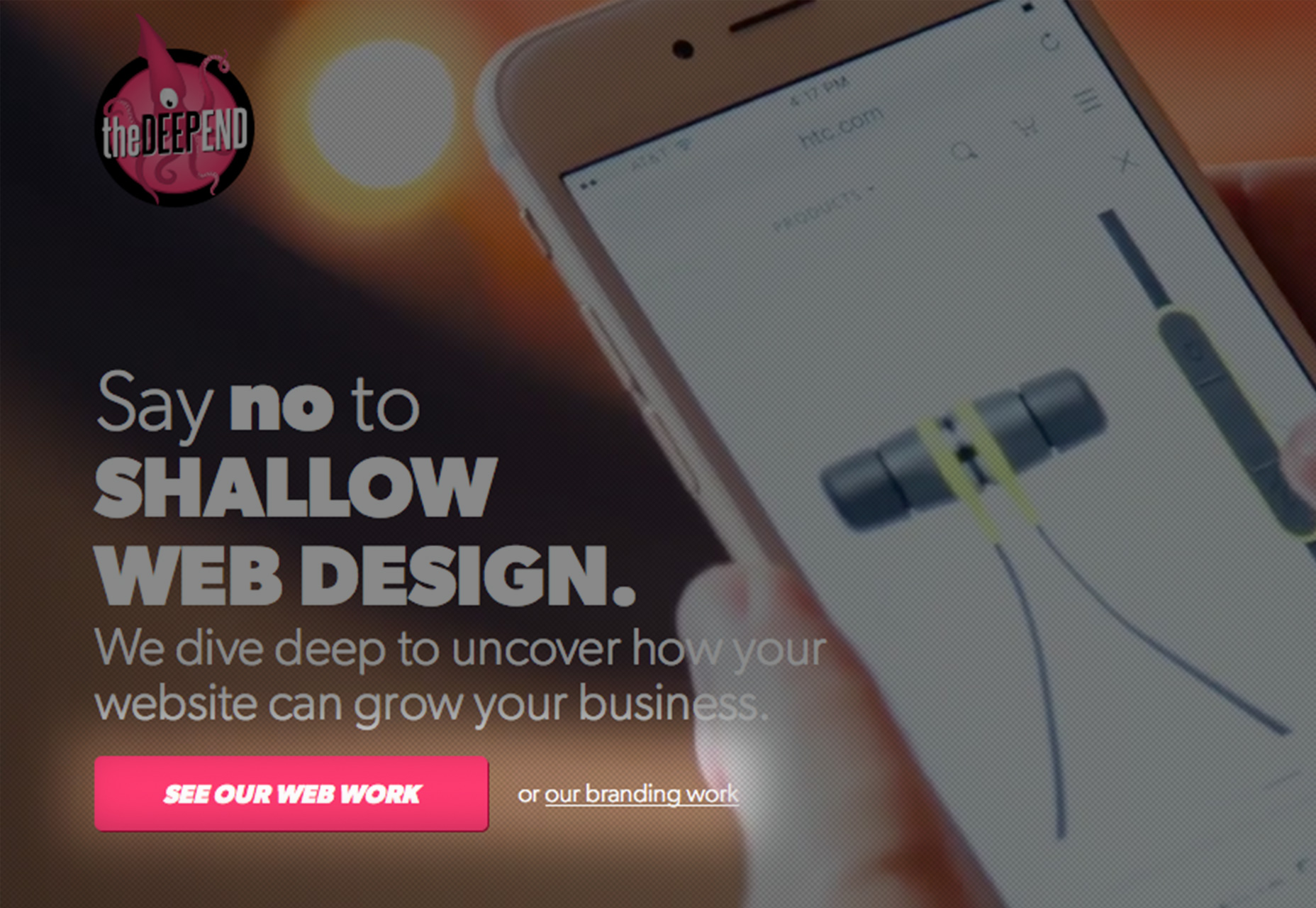
Problem 4: Unqualified leads
One problem design businesses of all sizes suffer from is having to spend time qualifying the leads who contact them. It’s no secret that the population at large devalues design services. We would regularly get leads from our ‘get a quote’ form, saying they need a website, and their budget is under $1000. This may not sound like a huge time-waster, but it can be when you spend face-time with a prospect only to find out mid-meeting that their budget is seriously out-of-whack with your pricing. In order to attract bigger fish, we needed better bait. Here is what we did:- We tweaked our copy; talking about delivering “websites,” and going into the technologies required for such projects made us sound like a commodity business, rather than a high-value consultancy. So we replaced certain sections of copy, to drive the point that we don’t just hand over websites. We research and develop web-based strategies that will actually make our clients money.
- We changed our CTA; prior to the redesign, or call-to-action was “Get a Quote.” So essentially we were emphasizing price as a motivating factor. We replaced that with “Get a No-Strings Consultation.” This allows us to schedule a call with a prospect in order to qualify them, and see if there is an opportunity for us to actually make them more money.
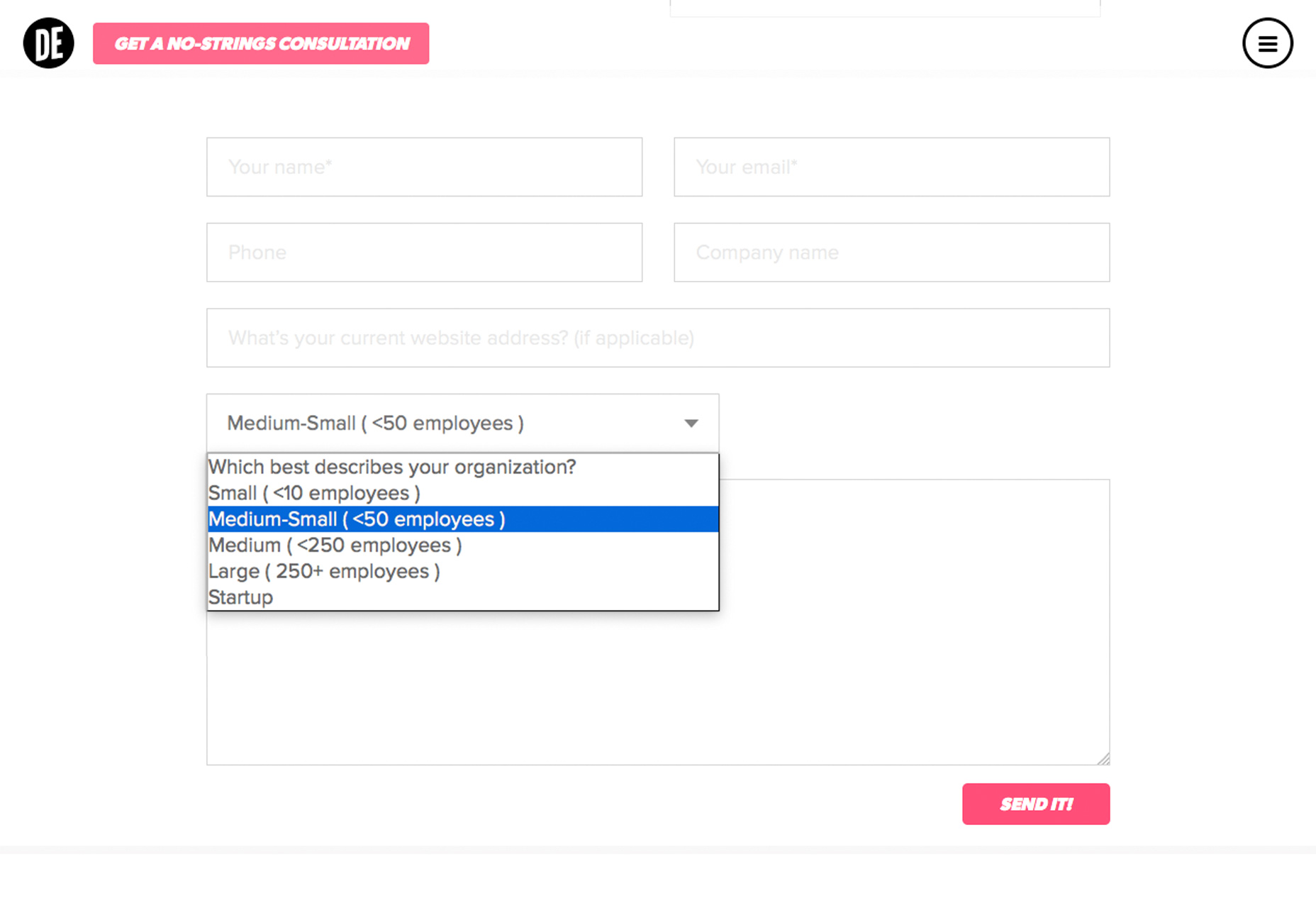
- We eliminated the “Budget” form field on the lead-gen form; again, we are trying to de-emphasize price from the equation. We changed the field to a dropdown of different company types, (small, medium, large, startup, etc,) which will give us a good idea of if they are a big enough company to afford our services.
 So far, it seems that we are still attracting our fair share of startups, and smaller clients, but knowing each company’s size going in helps us prioritize who we can actually meet with. We will continue to A/B test different CTAs and copy until we achieve the desired outcome.
In order to make this as streamlined as possible, we built our site to have a single CTA text input field on the backend, so we can easily swap out the text sitewide for A/B testing.
So far, it seems that we are still attracting our fair share of startups, and smaller clients, but knowing each company’s size going in helps us prioritize who we can actually meet with. We will continue to A/B test different CTAs and copy until we achieve the desired outcome.
In order to make this as streamlined as possible, we built our site to have a single CTA text input field on the backend, so we can easily swap out the text sitewide for A/B testing.
Going forward
[pullquote]While it may have been a risk to redesign, it would have been far riskier to stick with the status quo[/pullquote] While it may have been a risk to redesign, it would have been far riskier to stick with the status quo. No site (even well designed ones) can stay stagnant forever. New research, functionality and even trends will dictate how a website changes over time to accommodate its audience and goals. In the case of The Deep End, something as basic as a responsive conversion opened a whole can of worms, prompting us to think a little bigger. There are always ways to improve a website and make it work better for your business. We preach it to our clients, so it was about time we put it into effect for ourselves. As with any website, the real work is never done. While the results so far aren’t perfect, it’s a definite improvement, and we will continue to monitor the analytics to make sure we keep pushing it in the right direction until we hit a sweet spot.Wes McDowell
I work as creative director for The Deep End Design in Chicago. When not working with clients, I also oversee our blog, and co-host “The Deeply Graphic DesignCast,” a podcast for graphic and web designers.


Read Next

15 Best New Fonts, July 2024
Welcome to our monthly roundup of the best fonts we’ve found online in the last four weeks. This month, there are fewer…
By Ben Moss

20 Best New Websites, July 2024
Welcome to July’s round up of websites to inspire you. This month’s collection ranges from the most stripped-back…

Top 7 WordPress Plugins for 2024: Enhance Your Site's Performance
WordPress is a hands-down favorite of website designers and developers. Renowned for its flexibility and ease of use,…
By WDD Staff

Exciting New Tools for Designers, July 2024
Welcome to this July’s collection of tools, gathered from around the web over the past month. We hope you’ll find…

3 Essential Design Trends, July 2024
Add some summer sizzle to your design projects with trendy website elements. Learn what's trending and how to use these…

15 Best New Fonts, June 2024
Welcome to our roundup of the best new fonts we’ve found online in the last month. This month, there are notably fewer…
By Ben Moss

20 Best New Websites, June 2024
Arranging content in an easily accessible way is the backbone of any user-friendly website. A good website will present…

Exciting New Tools for Designers, June 2024
In this month’s roundup of the best tools for web designers and developers, we’ll explore a range of new and noteworthy…

3 Essential Design Trends, June 2024
Summer is off to a fun start with some highly dramatic website design trends showing up in projects. Let's dive in!

15 Best New Fonts, May 2024
In this month’s edition, there are lots of historically-inspired typefaces, more of the growing trend for French…
By Ben Moss

How to Reduce The Carbon Footprint of Your Website
On average, a web page produces 4.61 grams of CO2 for every page view; for whole sites, that amounts to hundreds of KG…
By Simon Sterne

20 Best New Websites, May 2024
Welcome to May’s compilation of the best sites on the web. This month we’re focused on color for younger humans,…