

A little intro.
Hello, I’m Andrew. I am the lead product designer and creative director of Adobe Portfolio. I’m going to share with you what myself and a great team of developers at Behance (Adobe) have been working on this past year.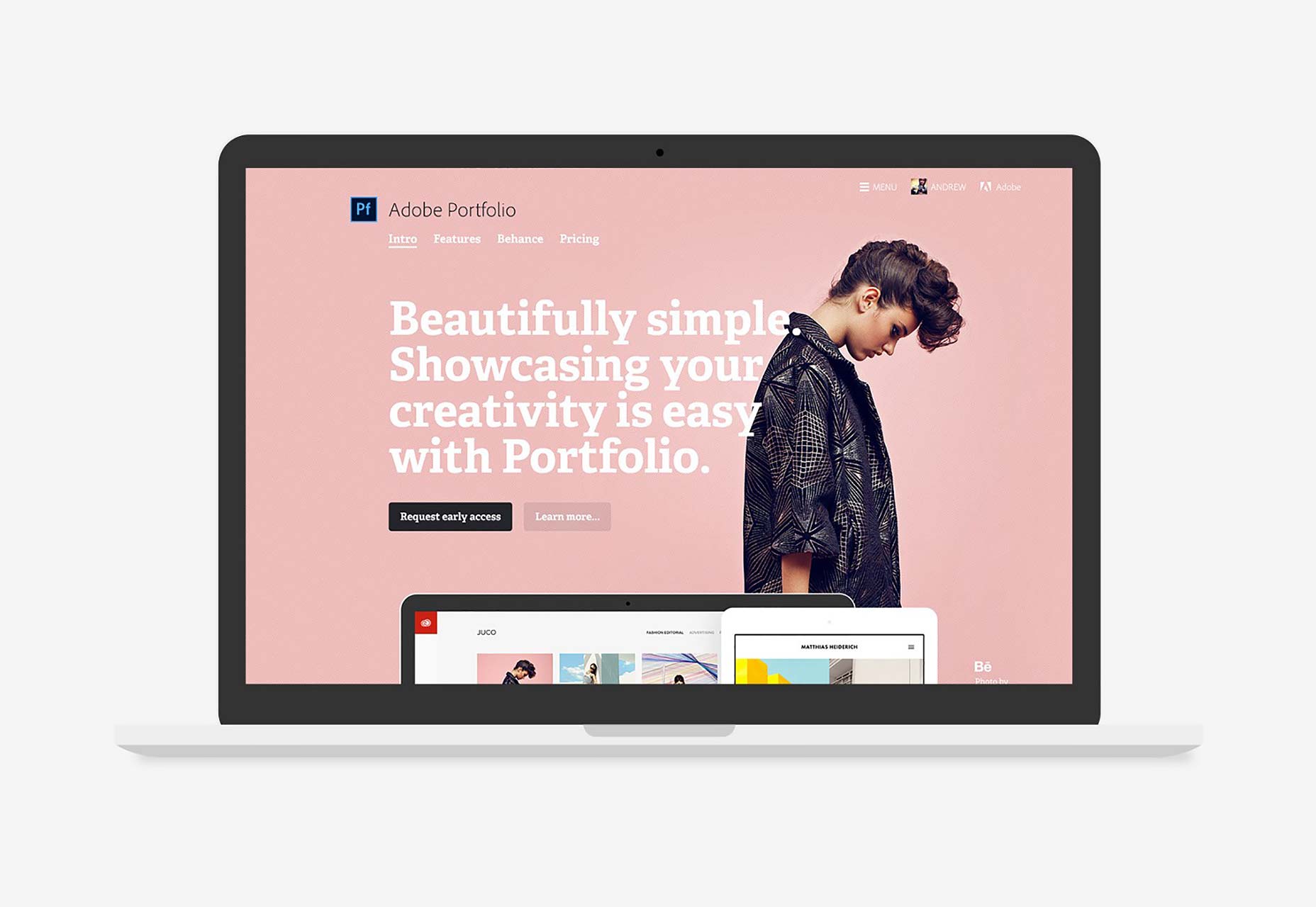 The Adobe Portfolio marketing site
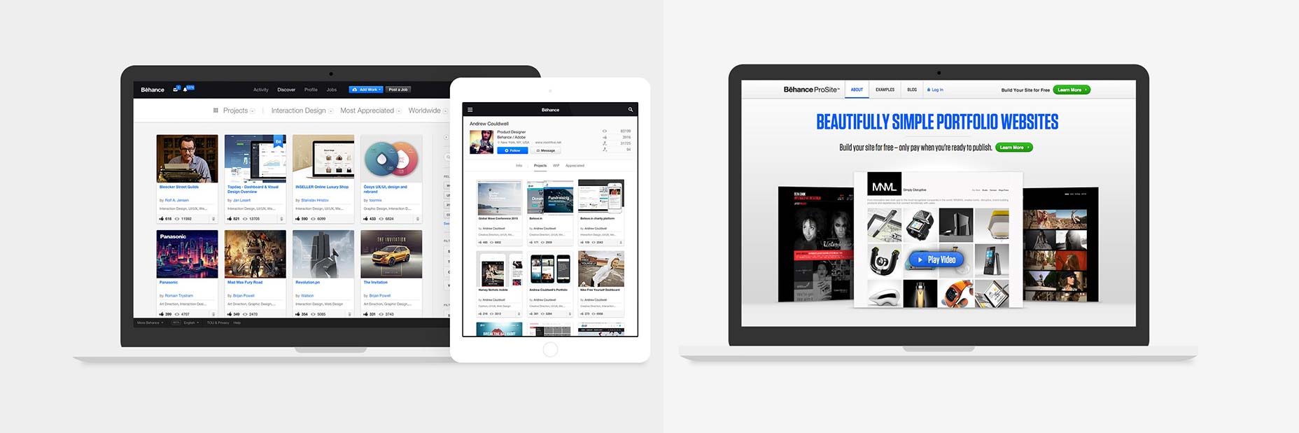
What is Adobe Portfolio?
Basically it’s a product that allows you to quickly and simply create a website to showcase your work, and customise it to suit your style and needs. It’s not a new concept, there are dozens of products out there that do just that. But Portfolio has some key differences:- It’s designed specifically for creatives to showcase their portfolio. Meaning it does what you need it to do, simply and quickly.
- It’s FREE with all Adobe Creative Cloud plans.
- You can access all of Typekit’s library of fonts, to use on your website.
Portfolio syncs with Behance.
The thing that makes Portfolio most unique is that it syncs with Behance. The idea being that you create a beautiful custom website with Portfolio, and sync your projects to your Behance profile. There you can gain invaluable exposure for your work on a creative platform used by millions of creatives, and people recruiting creatives! But you don’t have to use Behance if you don’t want to — you can use Portfolio on its own and choose not to sync with Behance. The choice is yours.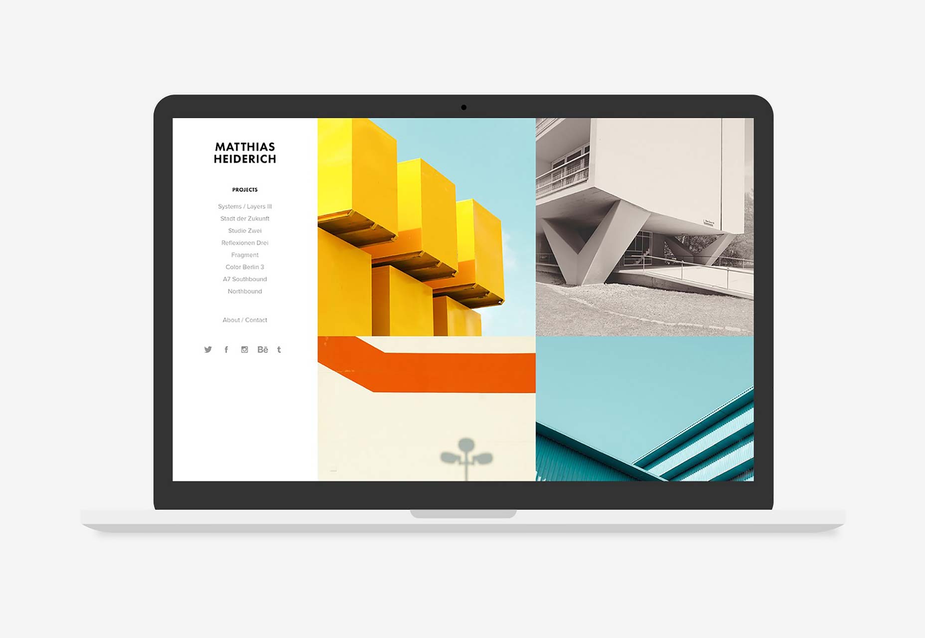
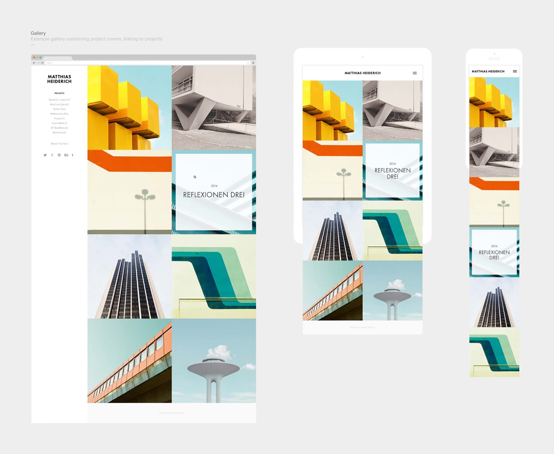
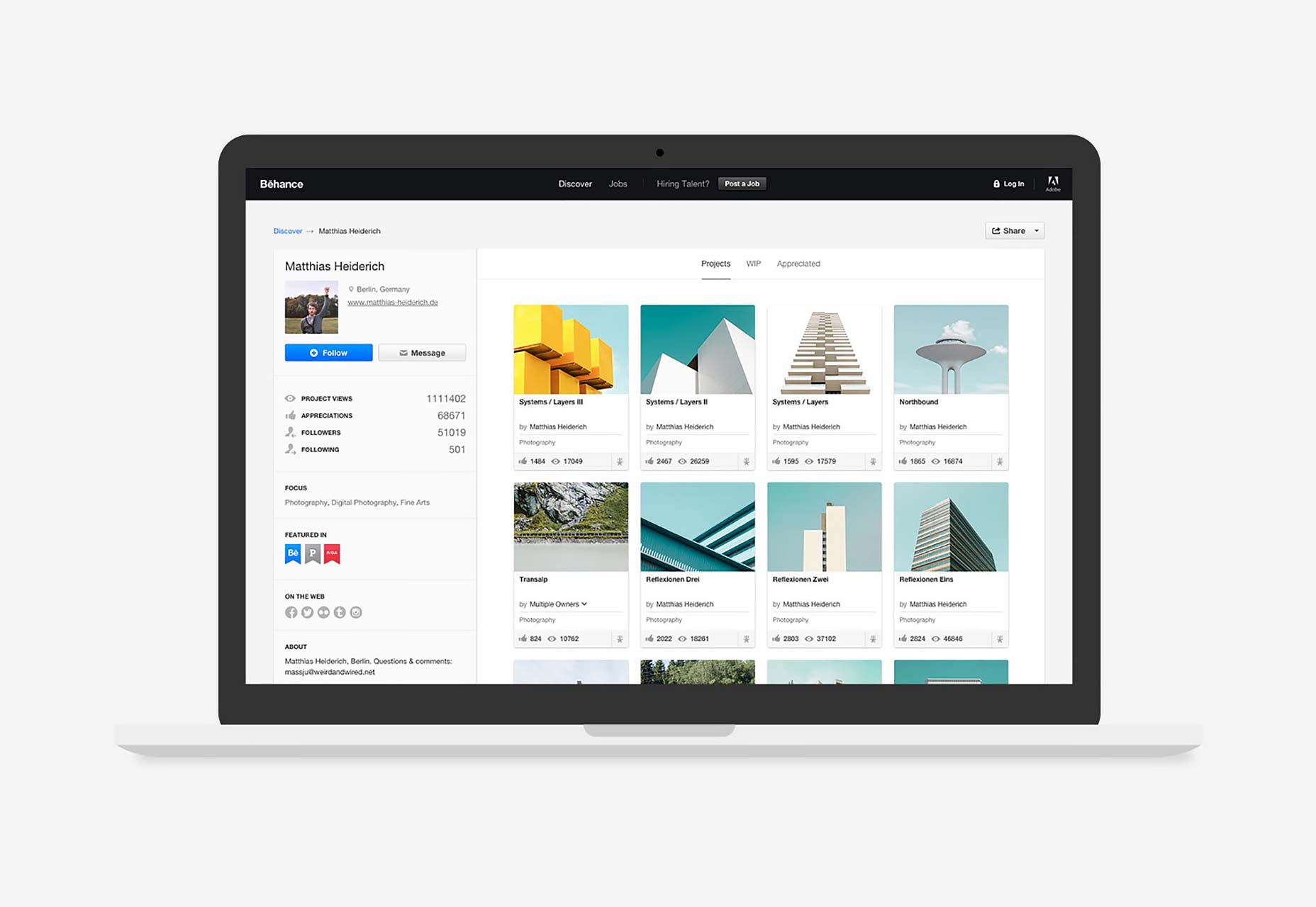 The photography of Matthias Heiderich — as seen on Portfolio and Behance
Responsive layouts.
Like any website builder, you need a starting point. So one of the many things we needed to design were layouts geared specifically for showcasing creative work, to act as a foundation that you can easily customise and populate with projects. The layouts aim to cover a variety of styles to suit different creative fields. They can either be used as an off-the-shelf solution to quickly populate with your projects and publish a website (in minutes), or use the editor’s features to change the structure and appearance to suit your style.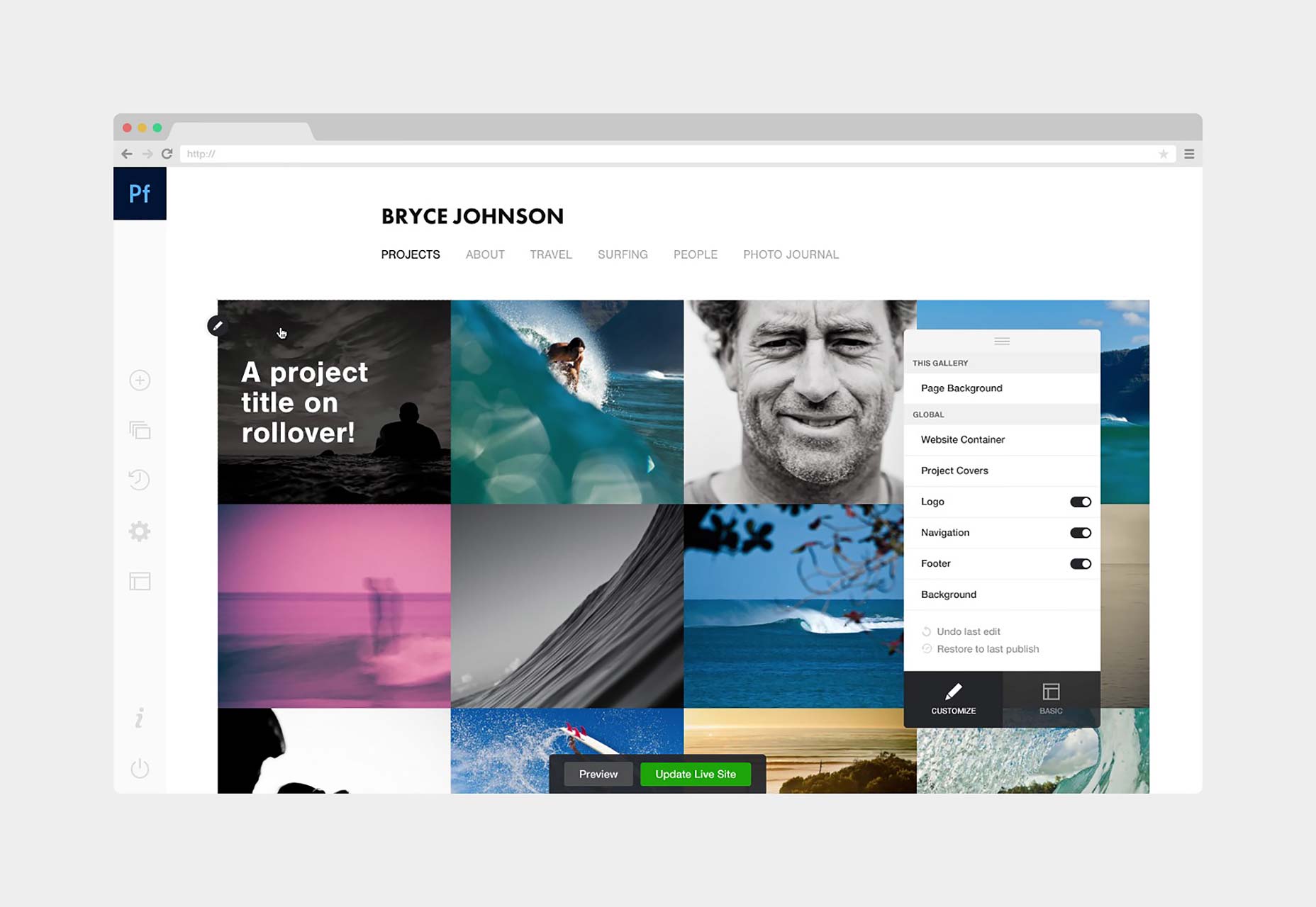
 Easily customise the same layout to look very different. Featuring photography by Bryce Johnson
Below are the layouts we’re launching with. The initial layouts (for the public beta and product launch) are very simple, focussing on project covers, galleries and projects. The product will of course grow to offer more features like fullscreen cover images, HTML & CSS editing, blog integration etc… in time. And as the features expand, so too will the variety and number of layouts to choose from as a starting point.
Easily customise the same layout to look very different. Featuring photography by Bryce Johnson
Below are the layouts we’re launching with. The initial layouts (for the public beta and product launch) are very simple, focussing on project covers, galleries and projects. The product will of course grow to offer more features like fullscreen cover images, HTML & CSS editing, blog integration etc… in time. And as the features expand, so too will the variety and number of layouts to choose from as a starting point.
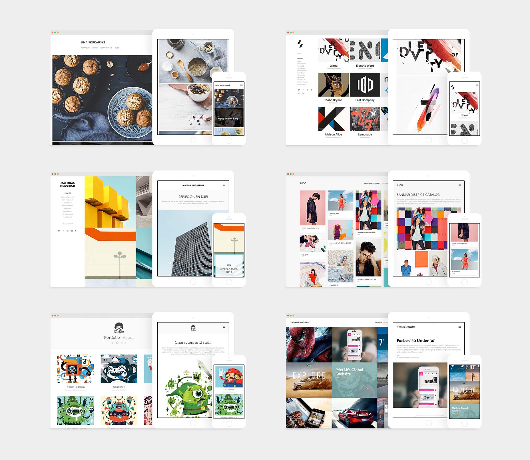 Layouts and the creatives they are named after: Lina, Sawdust, Matthias, Juco, Mercedes and Thomas
We chose to name the layouts after creatives on Behance. We shortlisted creatives whose work lent itself well to a particular layout, and of course was also visually stunning.
I should say, that these layouts were one of the last things to be designed (pre-beta), but I’m leading with them for the sake of this article, to introduce you to what the product does, or at least, its ‘end product’.
Layouts and the creatives they are named after: Lina, Sawdust, Matthias, Juco, Mercedes and Thomas
We chose to name the layouts after creatives on Behance. We shortlisted creatives whose work lent itself well to a particular layout, and of course was also visually stunning.
I should say, that these layouts were one of the last things to be designed (pre-beta), but I’m leading with them for the sake of this article, to introduce you to what the product does, or at least, its ‘end product’.
The editor.
The product (itself) must enable the user to quickly and simply edit their website, using one of the layouts above as a starting point. The UI is very minimal — it gets out of the way and allows you to focus on the design of your website. All changes you make happen live in the editor. It sounds kinda corny, but I had three things in mind while designing everything from the brand, marketing site, and especially the editor:Simple, clean and beautiful.It should empower the user to:
- Easily edit anything they can see.
- Manage and add content.
- Responsively preview their website.
- Publish and update a live website.
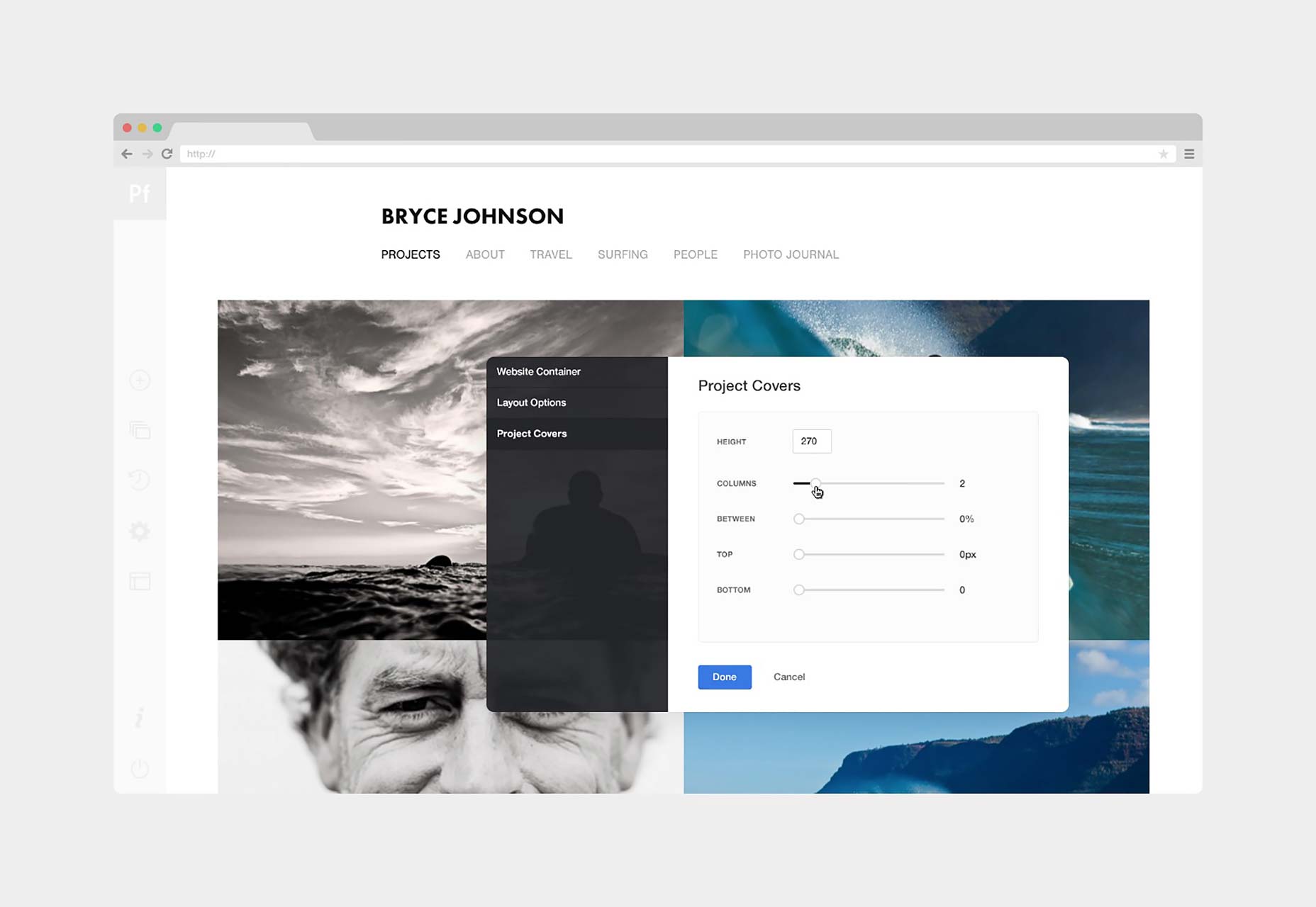
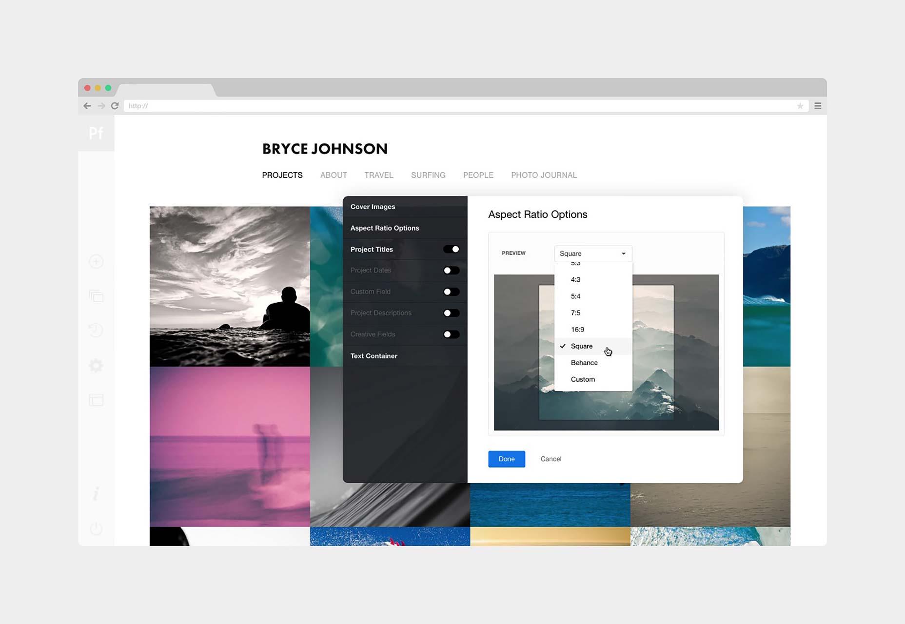
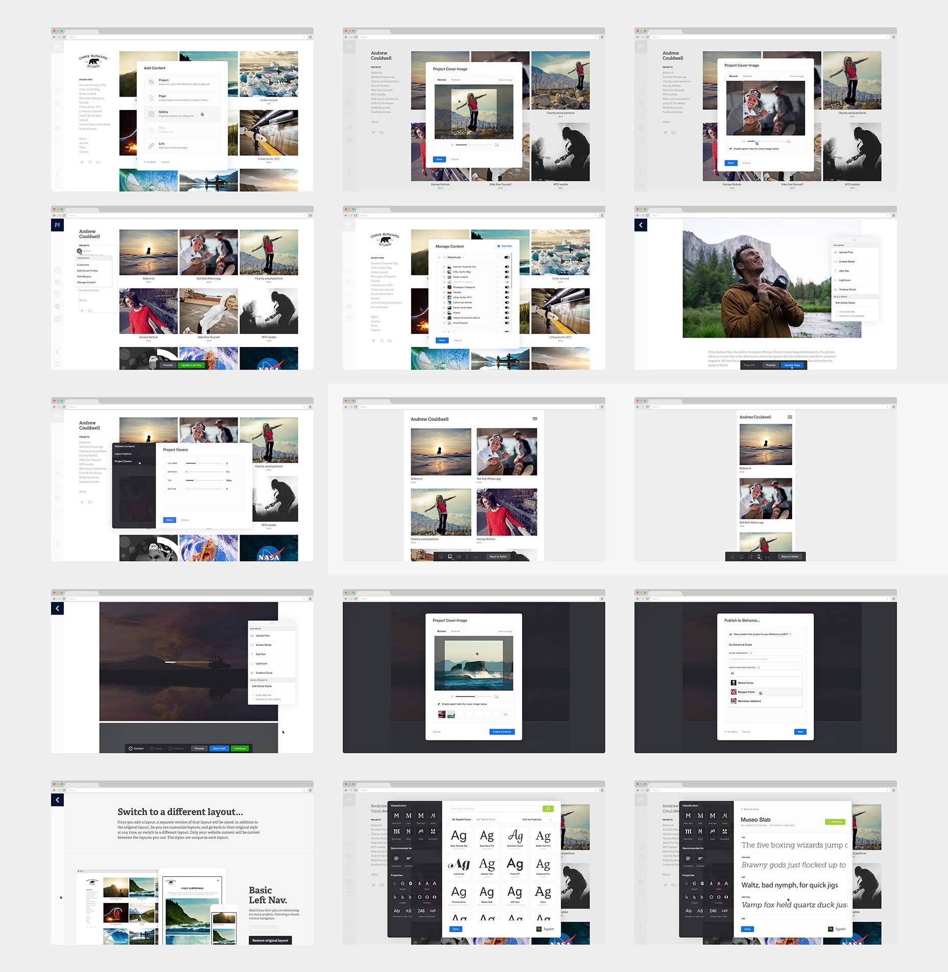 Various screens from the editor. Featuring photography by Chris Burkard and design by Andrew Couldwell
The role of a product designer.
My own role as a designer on Portfolio changed pretty dramatically over the year, from concept to launch. As a digital product progresses, so too does your role as a product designer. So to go back to the start:ProSite.
Portfolio is actually the evolution of an existing Behance product (being retired) called ProSite. It’s 5 years old, so there was a lot that we could learn from that product: What worked well? What didn’t?Behance Network.
Also, what we’ve learned about the creative community and showcasing work, through designing, curating (and using!) the Behance Network is invaluable in understanding how to build a product like Portfolio.Understanding your audience is a great starting point.So I spent a good deal of time absorbing all this knowledge Behance had acquired over the years, and also studying their initial designs for the evolution of ProSite. Asking questions. Making notes. Sketching ideas.
 The Behance Network, and ProSite
I always start with a pencil and a sketchbook.
Writing and sketching really helps me to focus, and ideas flow from there. Sometimes I simply write words I associate with the product, or list what it needs to do, just to get it out of my head. It helps to un-clutter the mind and focus on what’s important. This sketchbook work naturally evolves into UI sketches. Sometimes I’ll sketch a feature, or a small UI detail, or a new approach to the UI entirely. It’s a quick way of purely and simply just designing and exploring ideas. Perhaps most importantly, you don’t get distracted by pixel perfection, fonts, colour, grids, guides etc… like you do while using computer software. There’s always a point when you know you have enough to take it that step further, and actually start fleshing out these ideas. In the past I’ve used Adobe Illustrator or Omnigraffle for this, to wireframe. But time was tight on this project, so I went straight into Photoshop. Below are some scans from my sketchbook. Some relate to the product (editor), some to the marketing site and brand: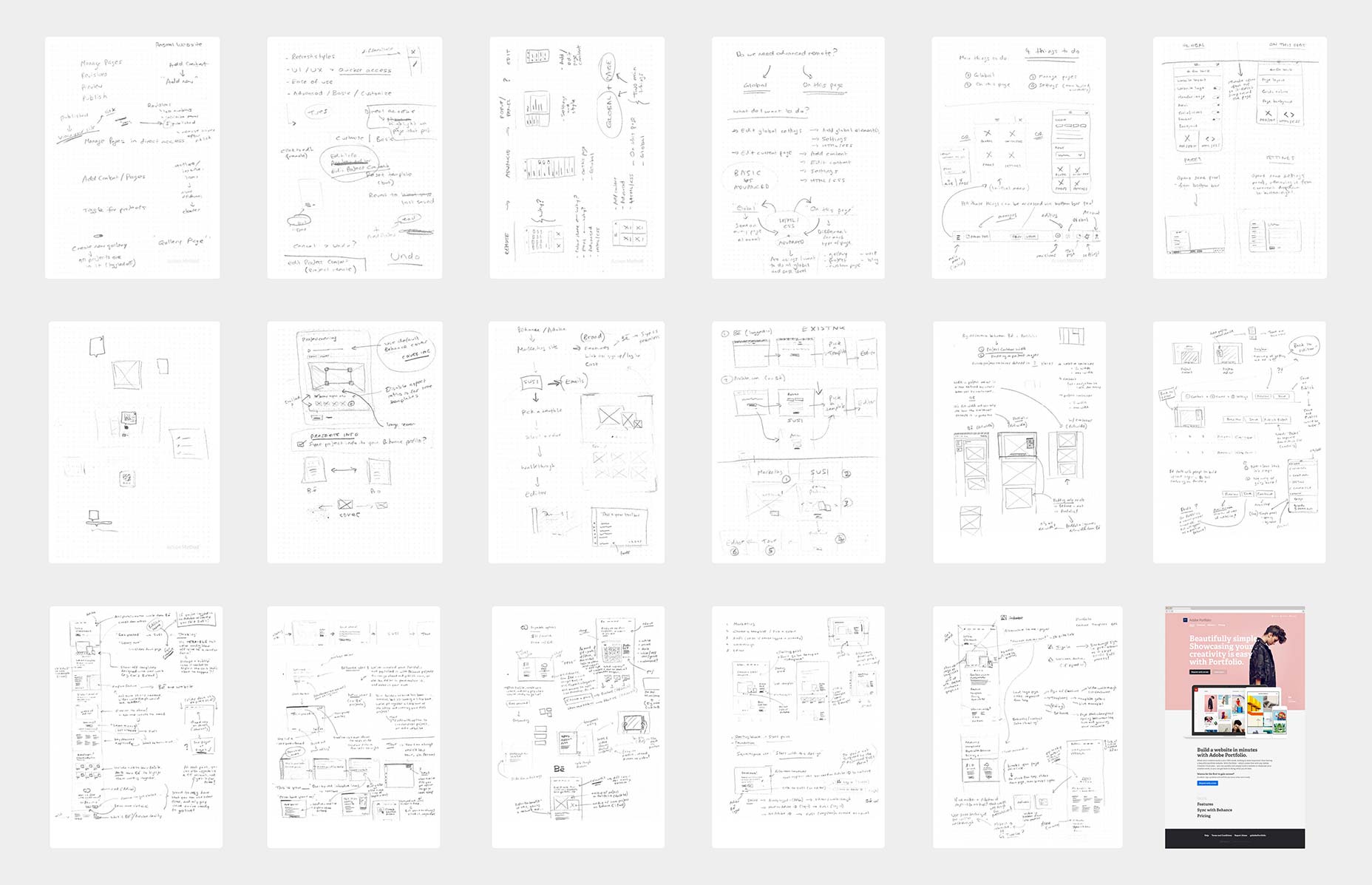 A few scans from my sketchbook
An interesting image to point out above is the last one (bottom-right). You can see that my sketch is close to what I ultimately designed.
A few scans from my sketchbook
An interesting image to point out above is the last one (bottom-right). You can see that my sketch is close to what I ultimately designed.
Concepting & prototyping.
All of these ideas and designs are informed and evolved by concepting, prototyping and discussing with the team. It’s good to chat through ideas with other designers and developers, and even the target audience when possible. For example: One particular idea came from me discussing an early (product) design with an MFA illustration student at SVA. A fresh perspective always helps, especially for a product of this complexity. We were working to pretty intense timeframes on this project. There simply wasn’t time to build any complex prototypes. But what I did do was to create a series of PDF walkthroughs using Layer Comps in Photoshop, showing the mouse cursor move around the screen, demonstrating every interaction, feature and user flow within the product. These allowed developers (and other stakeholders) to critique and/or understand all functionality and the user flow — so they knew what was to be built, and also identify any potential flaws in the UI/UX, prior to the build and testing. Below is (a video of) one example of these PDF walkthroughs: Prototype/walkthrough showing global customisation in the project editorDetail in design.
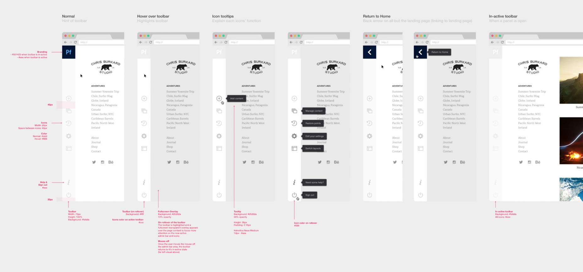
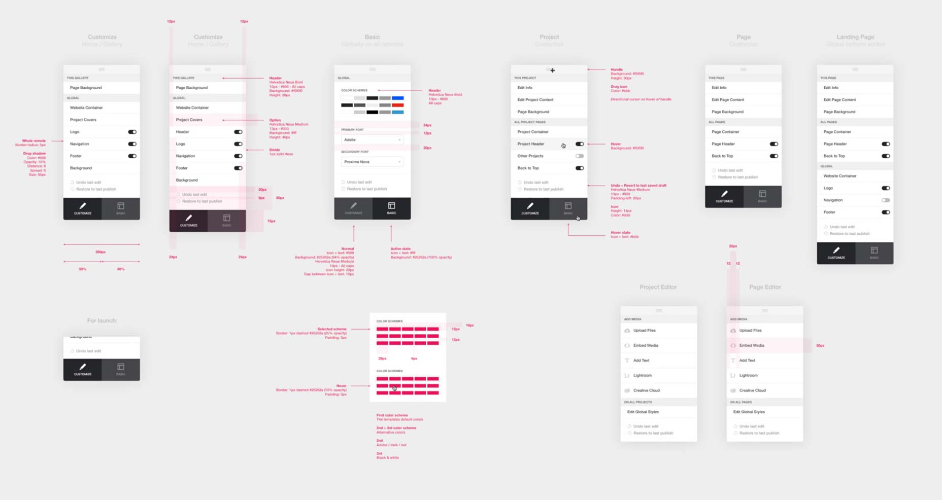
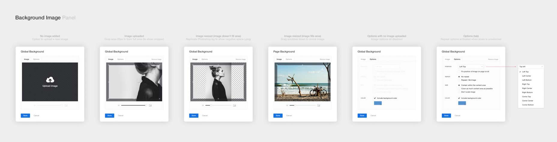
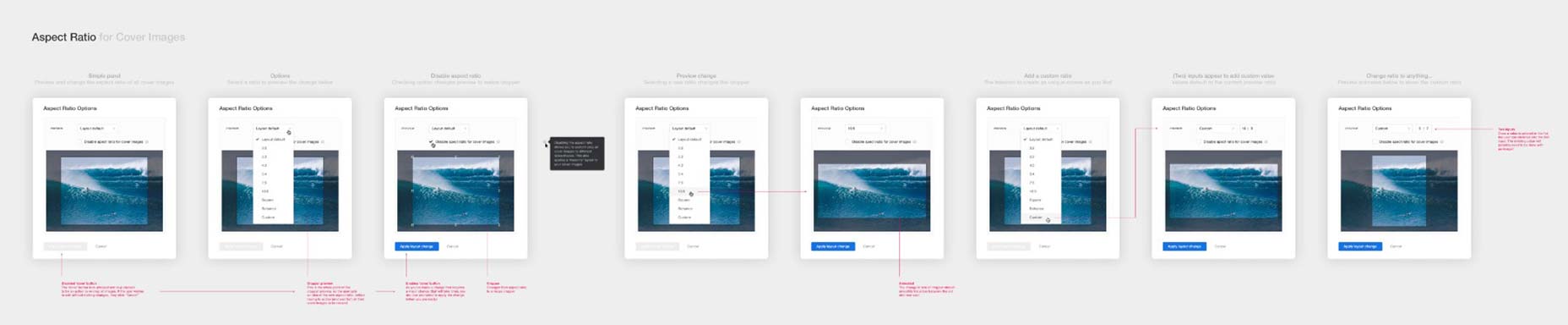
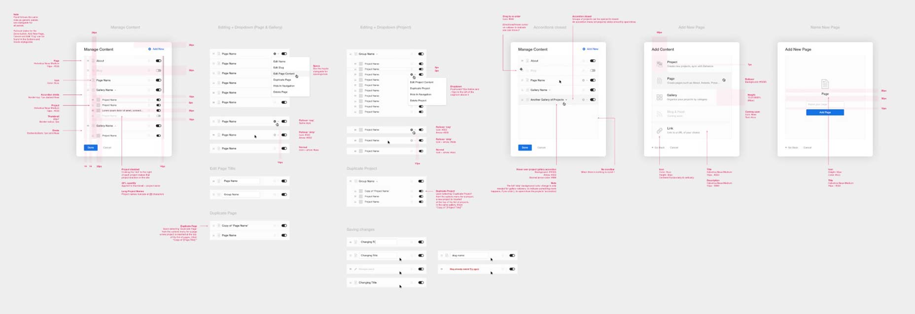
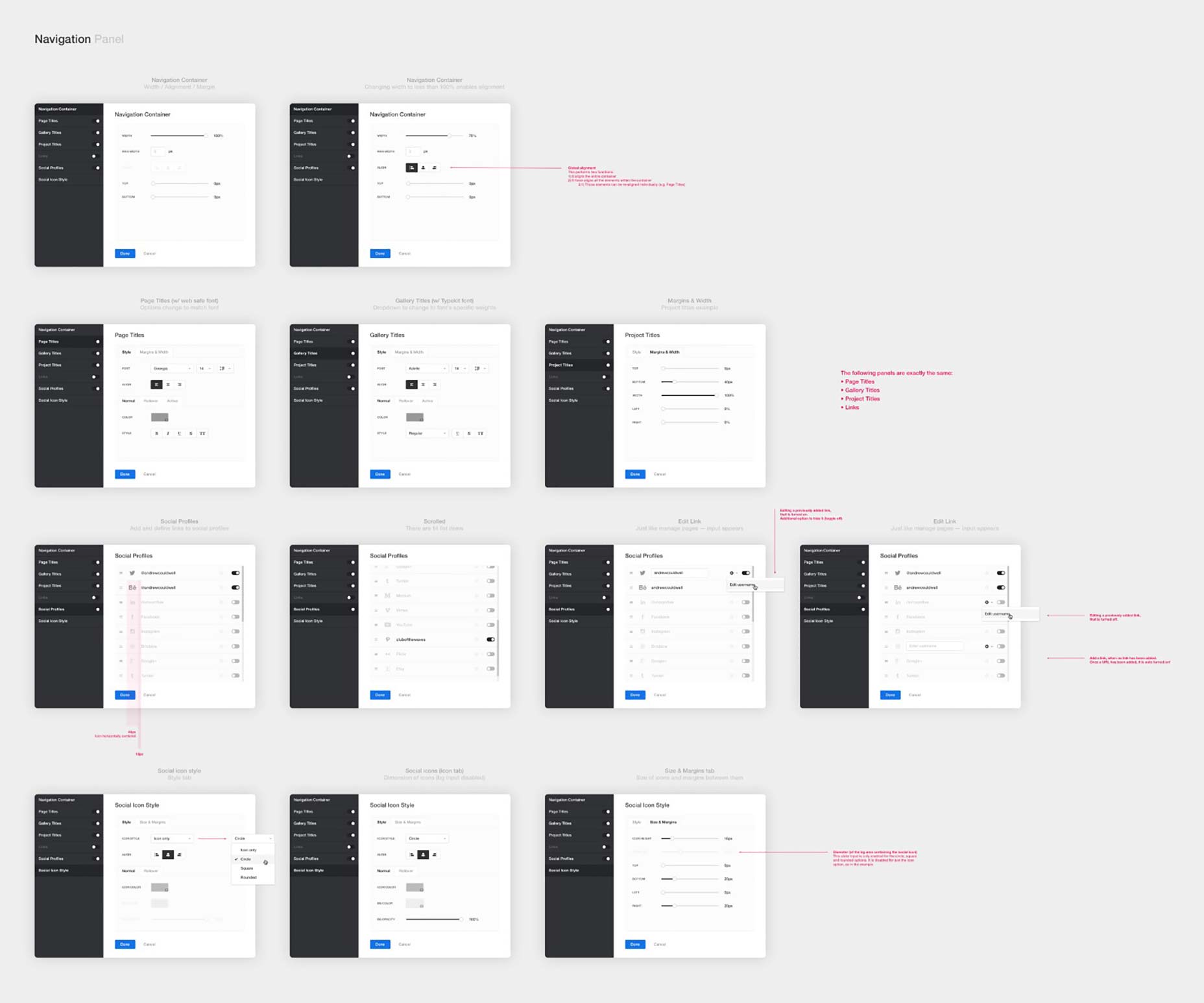
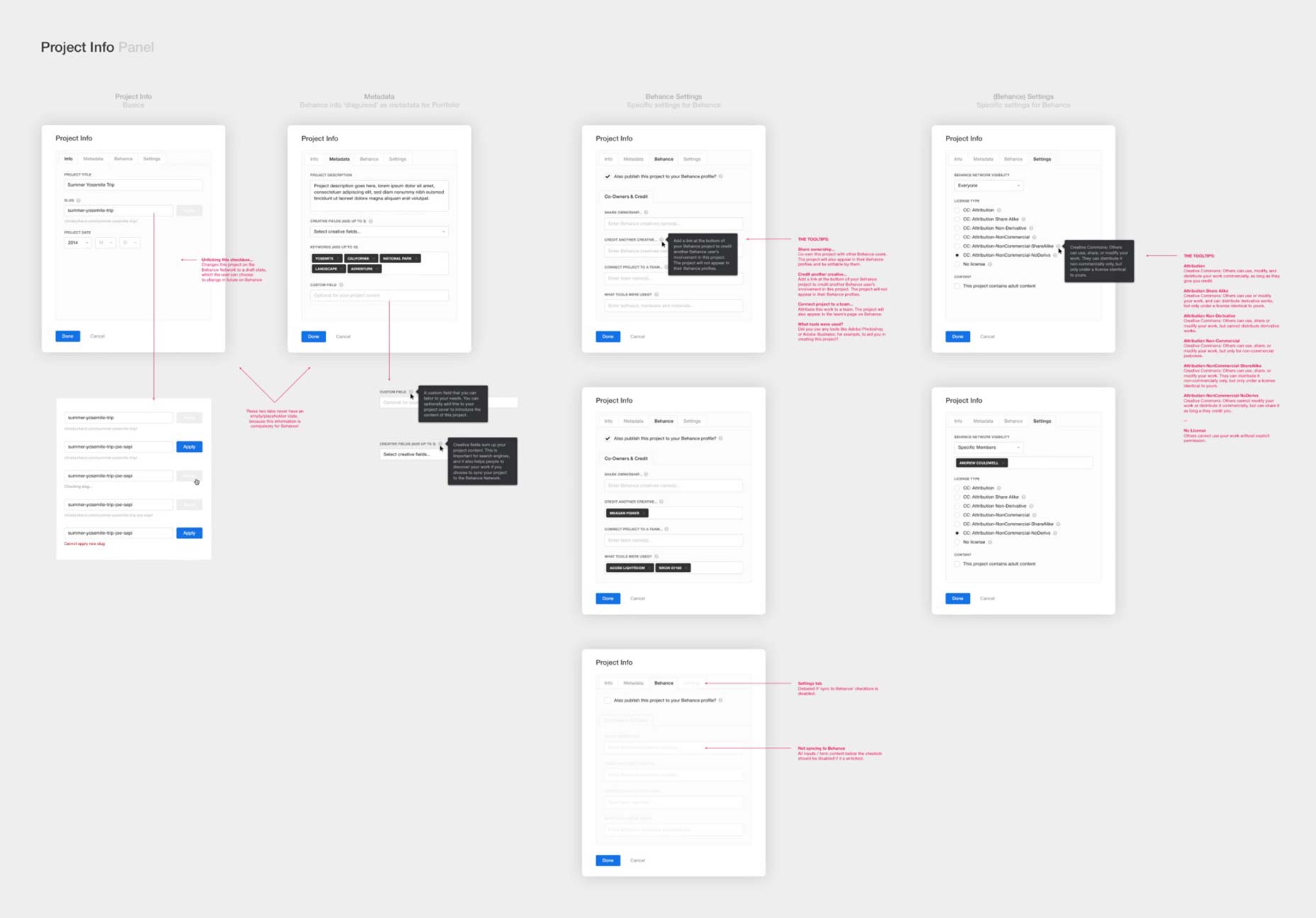
Simply put: Take the guesswork out of it for the developers. Your team needs to understand what needs to be built. It is not their job to fill in the blanks, make it responsive, or guess what happens in any given scenario. I can’t overstate this enough — I’ve experienced so many designers designing and considering 20% of a product, and not thinking things through. In addition to the walkthroughs, user flows and prototypes I talked of earlier, I also like to create detailed specs for all the UI components, features and brand. I feel these are important when you have a large team, so everyone is on the same page, with one central point(s) of reference. The specs aim to cover all scenarios, from rollover states, to errors, active/inactive states etc…, and also cover px values and dimensions (I even go as far as including basic CSS).Promote/encourage pixel perfection in the build. Lead by example, and set the bar high.The more detail you include in your designs, the less questions the developers will have, and the less time you will spend managing the build. So you can focus on designing, testing and improving the product. Also, the nice thing about taking the time to create these ‘UI kits’, is that it’s easier to update the product (design) in the future. There’s no need to update hundreds of mockups, you just update the specs. Below are a few examples of these styleguides and specs:
Marketing and brand.
Months in now, with the product (editor) designed and being built, I re-focussed my attention to marketing, onboarding and brand. What is this product? How do you get started using it? It needed a voice. An identity.The name.
When I first joined Behance, this project was somewhat jokingly being called “Prosite 2.0” internally. The ProSite product served its time, but its successor had grown into a different beast. Besides their connection with Behance, they were very different products and had no 1:1 correlation. This was not a re-design/launch. We were building an exciting new product from the ground up, and retiring ProSite. That was important to convey — and that starts with the name. I went back to my sketchbook, and went through a word association exercise of writing down everything this product did, and also what language every similar product on the market was using. The natural progression of all these kept coming back to “Portfolio”. So after some thought, I concluded: ‘Why not?!’ — it does exactly what it says on the tin. It’s a website creator/editor designed specifically for creating a portfolio. The simplicity and boldness of the name married up well to the design and values of the product. And so we called it ‘Portfolio’, which soon became ‘Adobe Portfolio’ to fit with Adobe’s suite of products.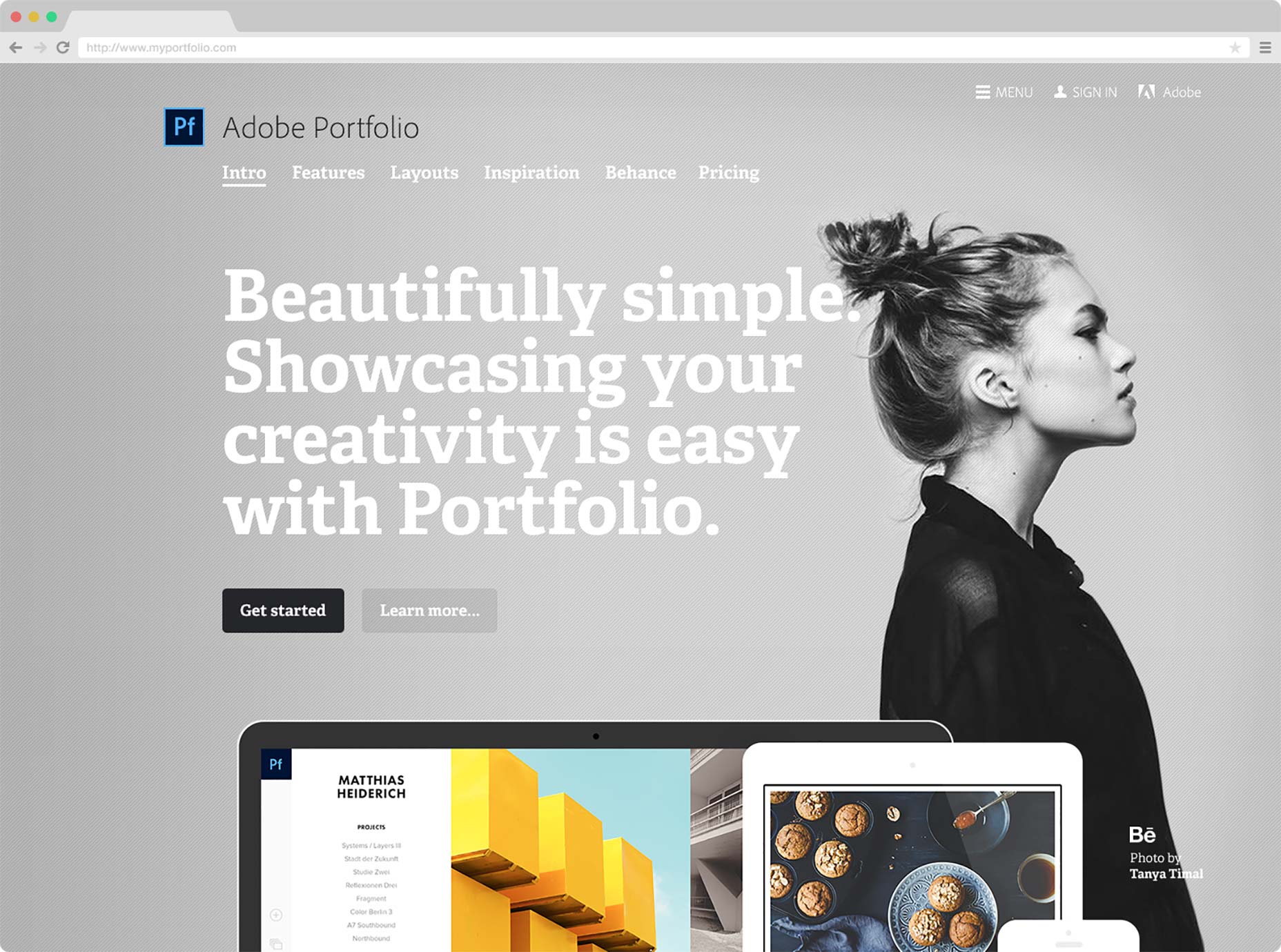 The marketing site home page featuring a photo by Tanya Timal
The brand.
Portfolio very much has its own identity and personality. Portfolio is not a corporate product (so to speak). It’s white label. It’s yours, to make your own. It’s friendly, simple and approachable. The brand, marketing site, onboarding, copywriting and messaging throughout the (product) user experience all attempt to convey this through the language used, typography, grid, imagery and colours.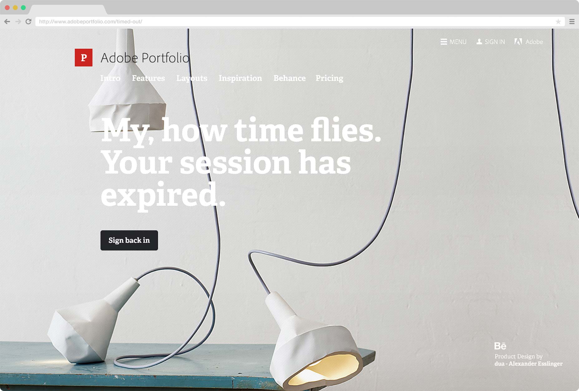 Other scenarios include lighthearted messaging and humorous imagery. Project photo by dua — Alexander Esslinger
Responsive design.
Going back to my earlier point about detail in design: Web design, just like product design, should have the same attention to detail. In this case, it’s of course important that the marketing site is responsive, but it’s not the developers’ job to figure out how a website responds at different screen sizes.You’ll be the developer’s best friend if you take the guesswork out of it for them. Believe me :)Below are a few examples of the responsive designs, delivered to the developers to build myportfolio.com:
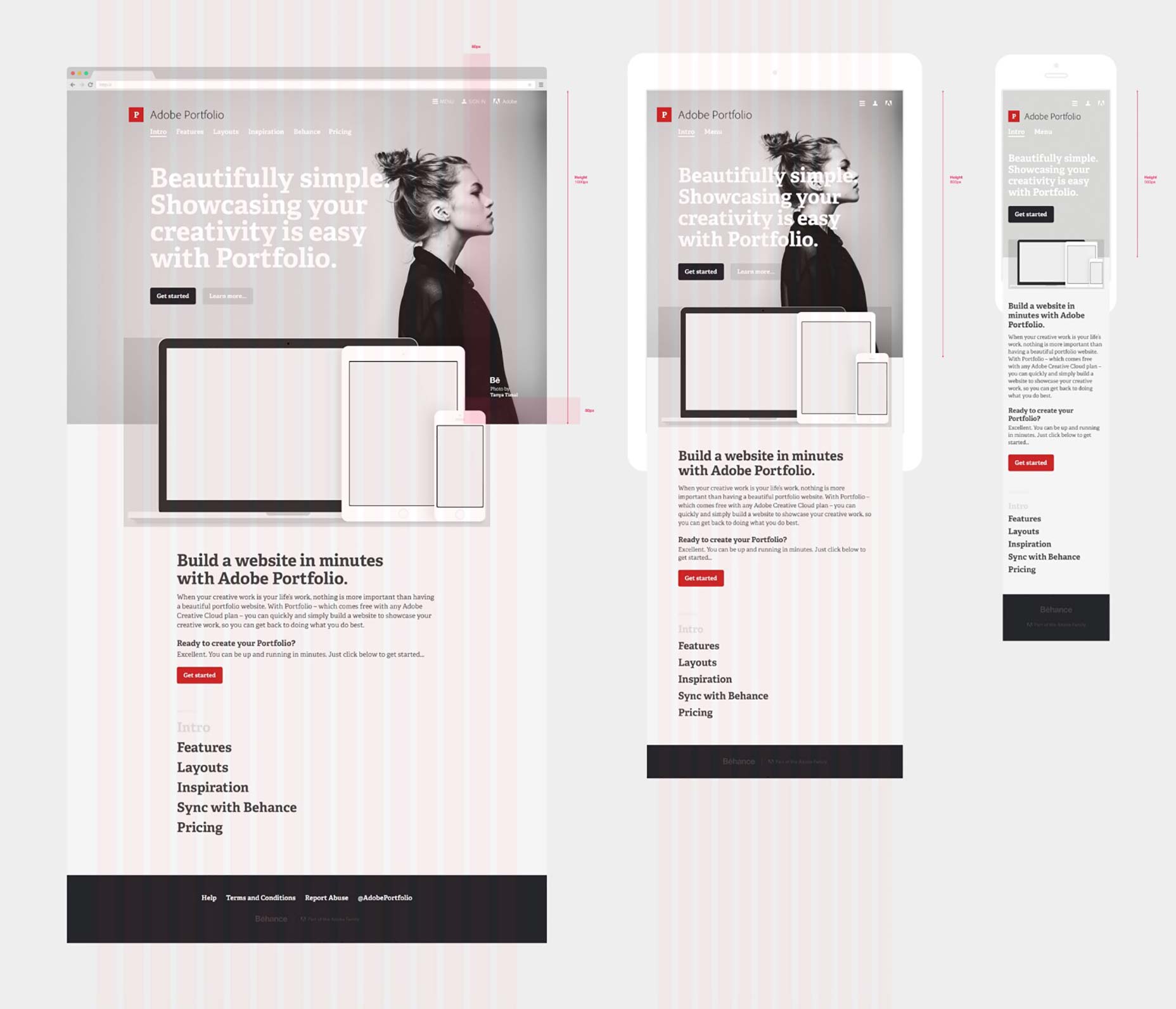
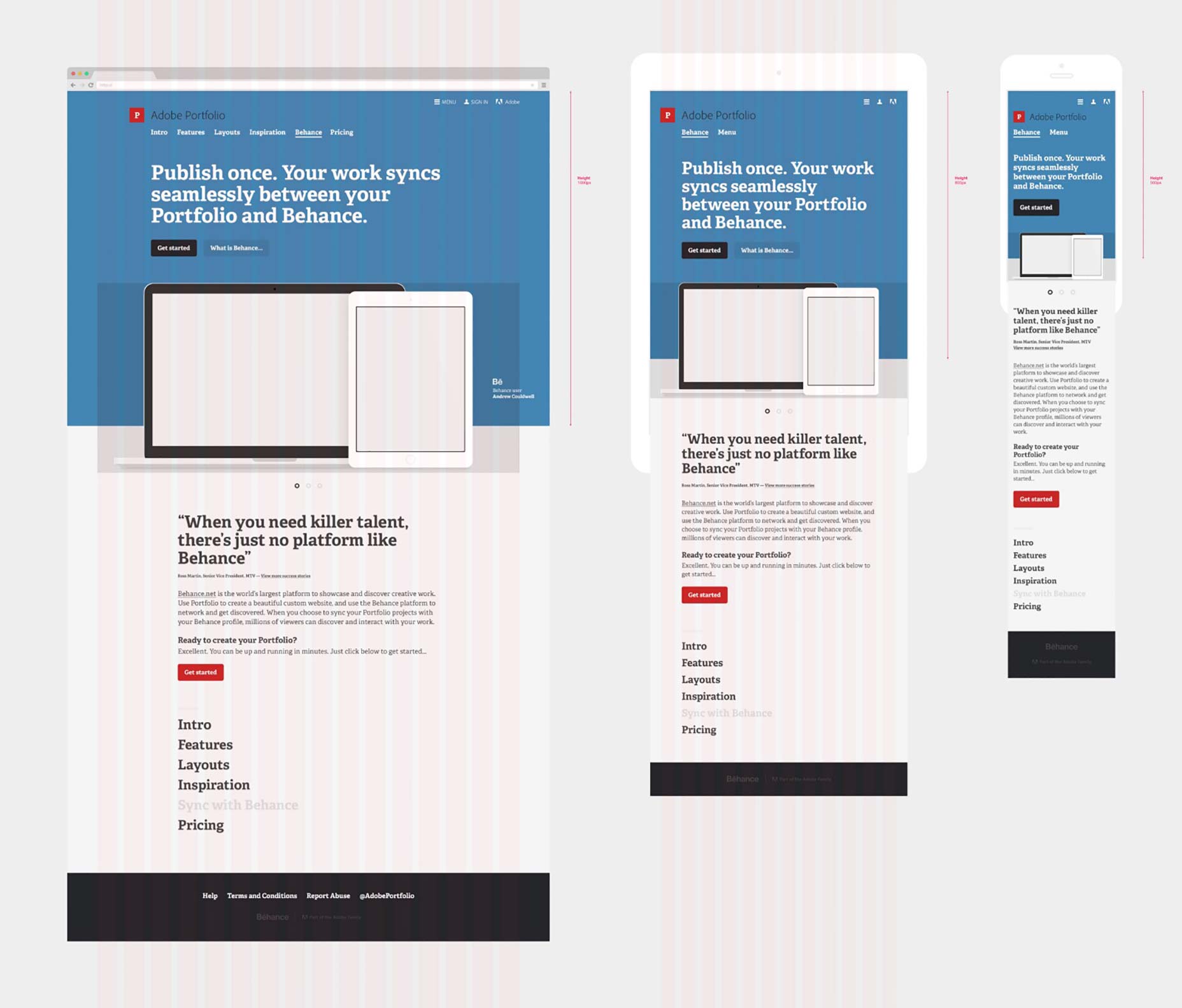 Responsive designs for the marketing site, showing an early version of the brand identity
View a full case study of the marketing site here
Responsive designs for the marketing site, showing an early version of the brand identity
View a full case study of the marketing site here
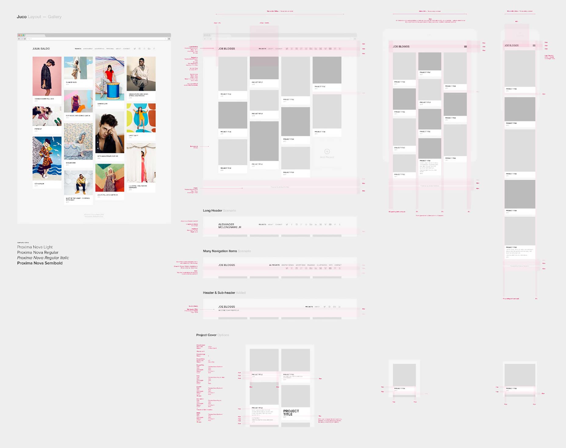 Responsive designs for a couple of the layouts, covering different scenarios
View a full case study of the layouts here
Responsive designs for a couple of the layouts, covering different scenarios
View a full case study of the layouts here
User testing.
A digital product should evolve to suit the people using it, accounting for user behaviour, to give the best user experience. Ideally, products will go through an alpha/beta phase (limited releases) before they launch to everyone. We did this with Portfolio. This helped us to weed out issues, learn if the UI/UX ‘worked’ and gain real user feedback with the intention of improving the product. It’s best to test, learn and refine with a limited user group, than to launch to thousands/millions of people and discover problems when it’s too late.Test. Learn. Revise. Repeat.
This is important in product design. You learn so much from people using the product.The best way to know if it works is to use it.You’ll be amazed what you discover:
 …People don’t always use a product how you anticipated they would!
- You learn,
- You improve,
- You iterate on the product,
- You keep testing,
- And repeat this process.
 …But the product will be better for it.
In conclusion.
If I was to take anything away from this it would be:Slow down.
Get inspired. Understand your audience. Make notes. Sketch ideas.Concept.
Work with your team. Explore ideas. Think it through.Detail in design.
Someone (else) needs to build what you design.Test and improve.
Does it work? How can it be improved? It can always be improved.Learn.
Always. Every experience in design is a good learning experience. [-- This article was originally posted at Medium.com, republished with the author’s permission --]Andrew Couldwell


Read Next

15 Best New Fonts, July 2024
Welcome to our monthly roundup of the best fonts we’ve found online in the last four weeks. This month, there are fewer…
By Ben Moss

20 Best New Websites, July 2024
Welcome to July’s round up of websites to inspire you. This month’s collection ranges from the most stripped-back…

Top 7 WordPress Plugins for 2024: Enhance Your Site's Performance
WordPress is a hands-down favorite of website designers and developers. Renowned for its flexibility and ease of use,…
By WDD Staff

Exciting New Tools for Designers, July 2024
Welcome to this July’s collection of tools, gathered from around the web over the past month. We hope you’ll find…

3 Essential Design Trends, July 2024
Add some summer sizzle to your design projects with trendy website elements. Learn what's trending and how to use these…

15 Best New Fonts, June 2024
Welcome to our roundup of the best new fonts we’ve found online in the last month. This month, there are notably fewer…
By Ben Moss

20 Best New Websites, June 2024
Arranging content in an easily accessible way is the backbone of any user-friendly website. A good website will present…

Exciting New Tools for Designers, June 2024
In this month’s roundup of the best tools for web designers and developers, we’ll explore a range of new and noteworthy…

3 Essential Design Trends, June 2024
Summer is off to a fun start with some highly dramatic website design trends showing up in projects. Let's dive in!

15 Best New Fonts, May 2024
In this month’s edition, there are lots of historically-inspired typefaces, more of the growing trend for French…
By Ben Moss

How to Reduce The Carbon Footprint of Your Website
On average, a web page produces 4.61 grams of CO2 for every page view; for whole sites, that amounts to hundreds of KG…
By Simon Sterne

20 Best New Websites, May 2024
Welcome to May’s compilation of the best sites on the web. This month we’re focused on color for younger humans,…