

Apps are everywhere. They have become an integral part of our daily lives thanks to the number of smartphones and wearable devices that we own.
And because of that, apps are one of the single biggest driving factors when it comes to website design trends. Let’s take a look.
Return of the scroll
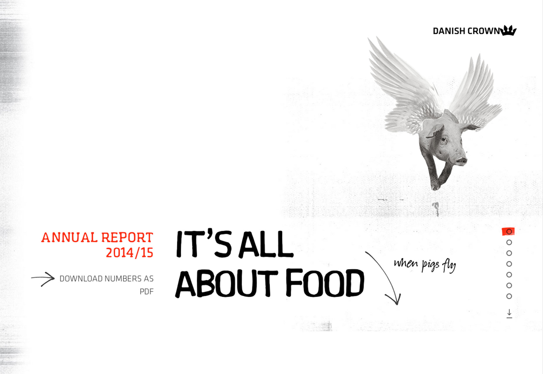
Small, vertically oriented screens have brought the scroll back in a major way. Once thought to be something you wanted to avoid because users would not move down the screen, scroll is a pretty integral part of the design process again.
And scrolling now is better than it’s ever been. Thanks to great animations, parallax effects and plenty of creative content ideas, scrolling is a lot of fun and a good way to engage users.
Don’t stop with an ordinary down the page scroll; consider a horizontal scroll or animated option that can delight users thanks to the small surprise. Just make sure to include a visual cue to two for users with scrolling effects that are outside the norm, so that they don’t get confused or abandon your website because they don’t understand how to use it.
Material Design goes mainstream
Google’s Material Design concept started as a mobile interface. The flat inspired, physics-based layered interface started as the aesthetic for Android devices, but quickly spread to iOS-based apps as well.
Designers are expanding the concept for use on full-screen websites as well.
The Material concept is simple, intuitive and rooted in realistic elements so it’s easy to use and understand. Designers are having a lot of fun with the interface style with bright colors and plenty of nifty animations.
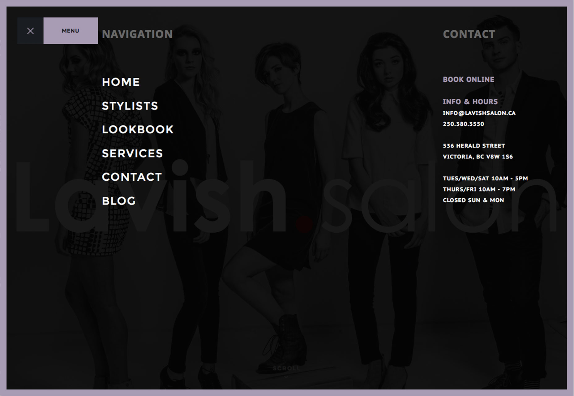
Hidden navigation is everywhere
This is one of those carryovers that is really changing the way you think about homepage design. Hidden navigation is having a major moment right now.
The debatable design of the hamburger icon is the most widely-used application, with a icon that pops out a full menu. Website designers are opting for one of two options: A menu that pops out over part of the screen or full screen navigation. The full screen option works almost identically to how slide out styles work in apps, and with the extra real estate designers have a lot of room to create a navigation page that’s more than just a few internal links.
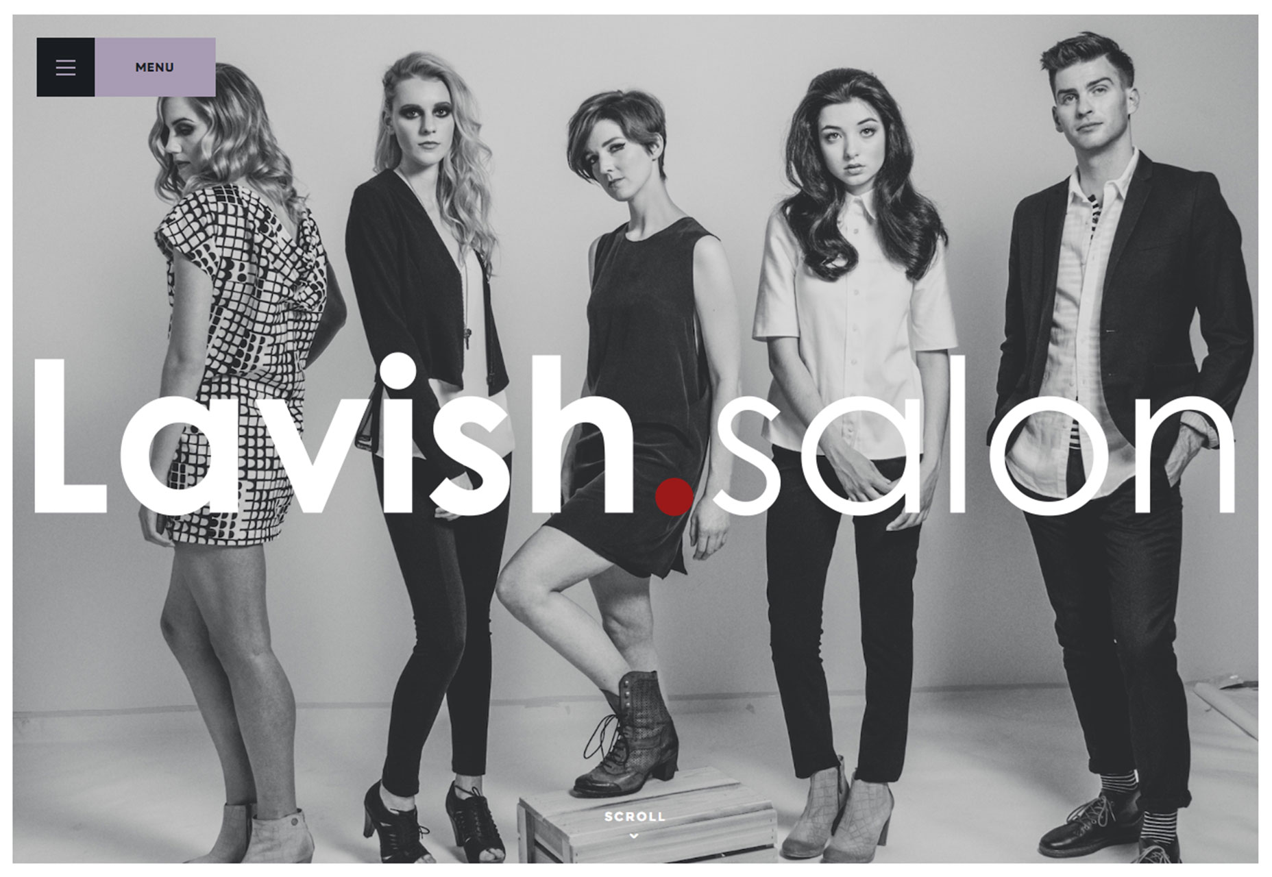
What’s especially nice about oversized navigation styles is that they are easy to read and click through. (Nothing is worse than tiny navigation elements that are designed almost as an afterthought.)
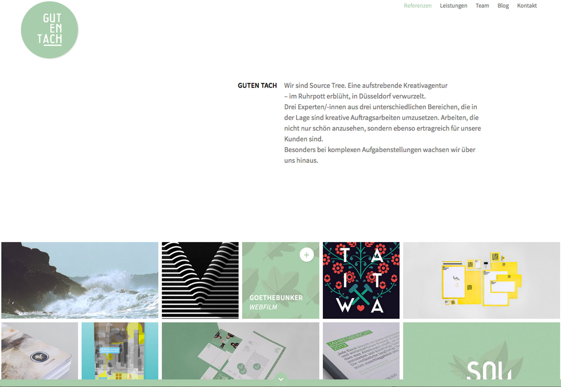
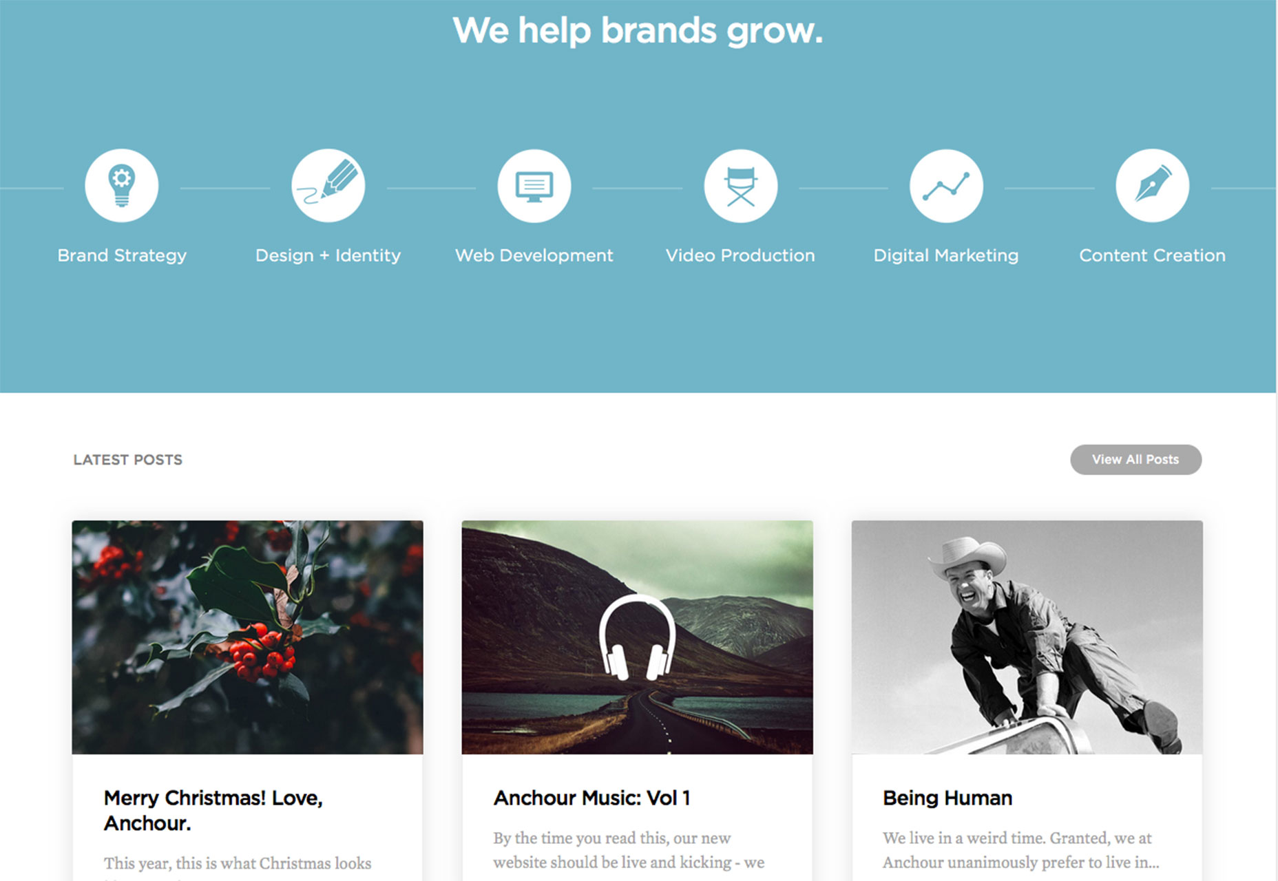
Cards, cards and more cards
You can hardly surf the web without coming across a card-style interface. These content containers are highly usable and stack well in responsive frameworks.
Cards are a popular option because they can be a lot of fun to design as well. Cards can be custom-tailored to fit any design style and work with almost any content type. They one thing to remember about cards is that each container should hold once piece of content and connect to one click. This one “thing” can activate a video, submit a form, move to another page, buy an item or any other number of single actions. Different cards in the same website can all do different things. (As long as users understand the actions.)
It’s an interface style that needs very little explanation as well. Social media websites such as Facebook, Twitter and Pinterest are rooted in card-style interfaces with infinite scrolling so that new content is ever-populating. Users overwhelming seem to like and accept this design pattern.
Micro-interactions are essential
Not that long ago, micro-interactions were almost exclusively an app element. You might want to rethink that idea. The line between apps and websites is completely blurred. Users want to visit an app and then maybe the website later on and get the exact same experience.
This applies to micro-interactions as well. A micro-interaction is anything that helps the user communicate with the interface, see an action take place or manipulate the interface. Each of these bits of communication are so tiny the user hardly thinks about it, such as an alarm, text message or swipe to refresh content. (Just think of how many meeting notifications you get on your work computer or phone; those are micro-interactions.)
The linking factor to making this seamless transition is a touch of personalization and plenty of options for user customization. Using micro-interactions is tricky because there is a fine line between wanted notifications or alarms or messages and overwhelming the user.
When integrating micro-interactions stick to some of the most basic functions first to see how users react. Then you can add to the mix if your user-base is accepting of it.
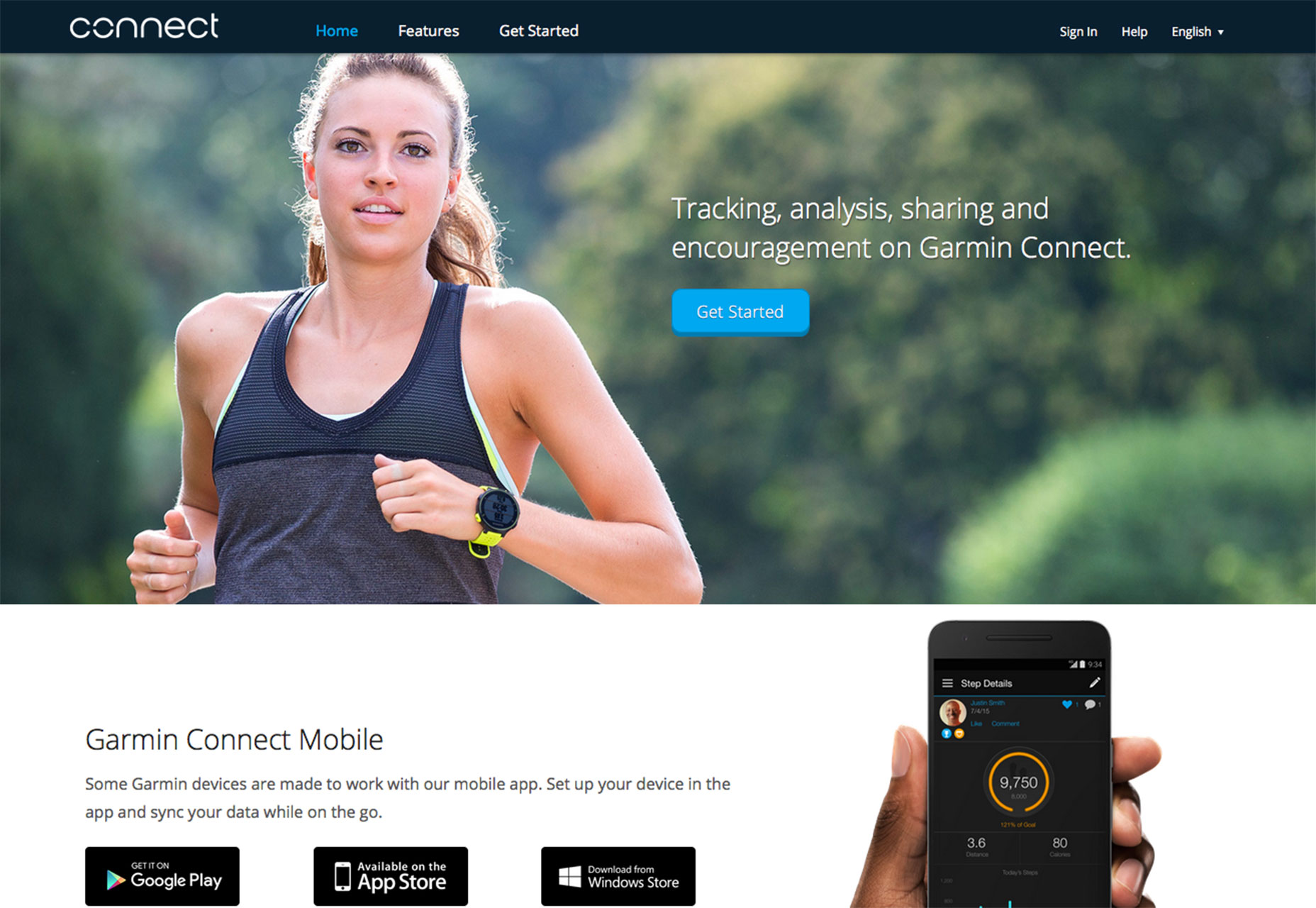
And now…wearables
The next phase of website design is already happening. As wearable devices increase in popularity, so will design elements from these tiny screens.
Elements that will have an impact include small, status-based animations, such as scrolling wheels that fill up to show accomplishments, more micro-interactions and plenty of trackers. (Users are practically obsessed with data right now, from fitness-based data to earning points for shopping.)
Wearables also add another layer of gamification to daily life. This will likely carryover to website design as well.
What wearables will really do is further the line between all of our devices. Websites, apps, wearables – they all need to provide integrated experiences for users so that moving from device to device is seamless and the experience is consistent.
Conclusion
As screens change size, so does the way we design for them. To create immersive interactions that users want to engage with, regardless of device, each interface must work in the same way. The idea is dramatically influencing the way all websites are designed (even those that don’t necessarily have app or wearable counterparts).
By creating something that users like on the smallest of screens and expanding that to larger devices, designers can build interfaces that are easy to understand. It also makes your interface a little more in-demand.
Carrie Cousins


Read Next

15 Best New Fonts, July 2024

20 Best New Websites, July 2024

Top 7 WordPress Plugins for 2024: Enhance Your Site's Performance

Exciting New Tools for Designers, July 2024

3 Essential Design Trends, July 2024

15 Best New Fonts, June 2024

20 Best New Websites, June 2024

Exciting New Tools for Designers, June 2024

3 Essential Design Trends, June 2024

15 Best New Fonts, May 2024

How to Reduce The Carbon Footprint of Your Website
