

Sticky navigation
Sticky navigation is an essential component of navigation since it empowers your users to instantly access the menu and easily find what they want on your site. Sticky navigation stays locked in place as users scroll down a page. There’s nothing more frustrating—especially in the case of long-scrolling pages—than to have to scroll all the way up again to navigate to another page on the site. Remember that, on the Web, speed is everything (loading pages, finding desired content, etc.) so allowing users to access the navigation menu more quickly is a best practice. By including a sticky navigation bar, you’re also helping to reduce cognitive load on your users by constantly putting their navigation choices right in front of them. Alternative Press features a good example of how to incorporate sticky navigation into your pages. Note how all the most important sections are easily accessible and identifiable, by effective color contrast, in the navigation bar, no matter how far you scroll down the page.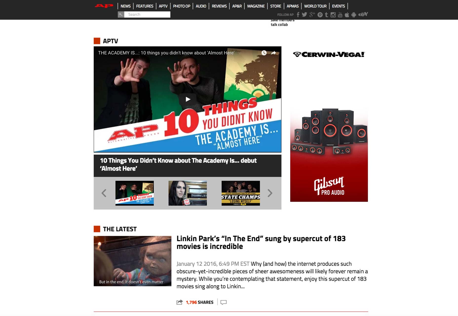
Obvious hypertext
Hypertext is any text reference on your pages that users can click on to get additional info, usually on another page, whether it’s on the same site or off-site. Hyperlinks are probably the most identifiable example of hypertext. Since hypertext contains information that’s going to help the user experience by providing more information, it only stands to reason that such helpful references are made very noticeable. Overall, this adds to the navigability of the site you build. I recommend making hypertext blatant by two, simple, design features:- Underlining
- Changing the color
Mega menus
Mega menus are a great idea for navigation, especially if the site you’re designing for your client has a lot of content and categories. eCommerce stores come to mind. These are essentially huge, drop-down panels that open up additional layers of navigation to help your users find specifically what they want more quickly. Such menus improve the user experience by including benefits like:- elimination of scrolling;
- tooltips;
- orderly structuring of content by icons, layout or typography.
Pattern and language affordances
A pattern affordance is using a conventional symbol that the majority of site visitors will understand immediately, such as a house icon to represent the homepage of your site. A language affordance is the explicit use of a word, like “home”, to clarify that clicking on that tab will bring users to the homepage of the site. Affordances communicate to users how they can interact with the elements in your design. While this is certainly Design Basics 101, it’s still as important to practice today as it was in the very early days of the Internet. A functional navigation menu should have the house symbol or the word “home” positioned on the very first navigation tab on the left. While some designers may instead opt to include a company logo as the “home” icon or button, that still leaves too much room for user error. eTailer Frame Warehouse demonstrates this design principle to a tee, with its use of “home” to leave no doubt where that tab will take site visitors.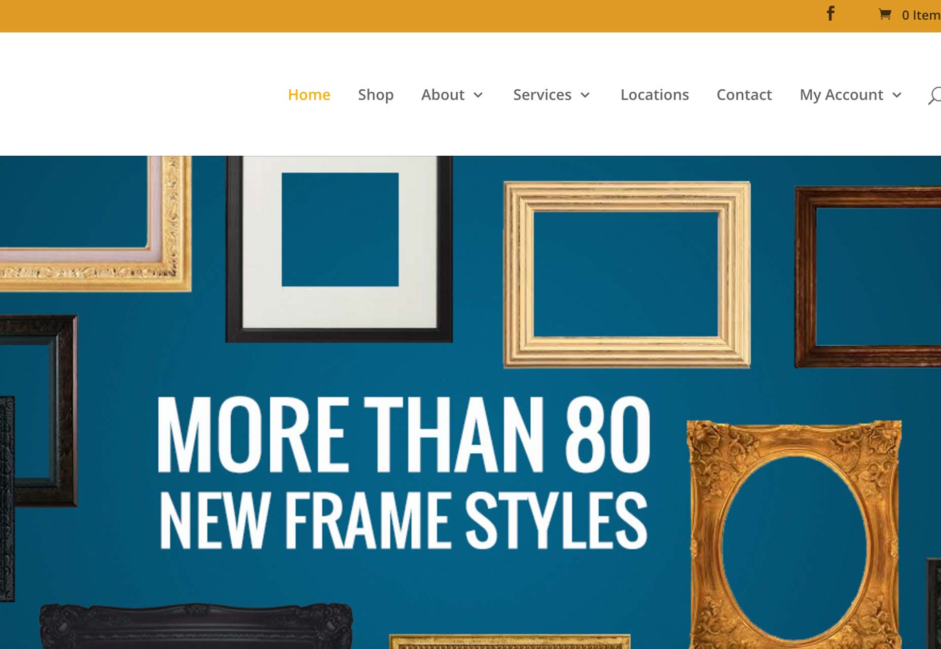
Fast load time
Speed = great user experience. Designers of all stripes should jot that down as one of the most crucial design rules that they simply can’t and shouldn’t relegate. According to Wired Magazine, almost 50% of shoppers want the average page to load in two seconds or less! Put another way, if the pages you design for your clients take longer than two seconds to load…there’s a really good chance that they’ll leave your clients’ sites and never return, thus causing severe conversion nightmares. This is a worrisome statistic, to be sure, but there’s something designers can do about it to ensure they’re providing high-quality page performance to their clients. Simply test the page speed of pages you design. There are a number of reliable tools to help you determine page load times: For an example of a very fast page load time, we go to Enchanted Learning’s What Is a Whale? page. The design could use some work, but the page loads in just over one second, according to the Alexa analytics toolbar.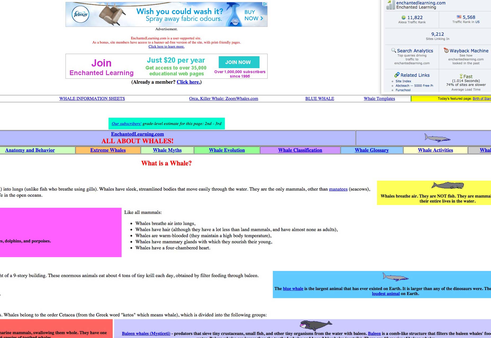
Great navigation is great UX
A huge part of a great user experience is your site’s navigation. It is the foundation on which the entire user experience rests, if you really think about it. When your users can’t find their way around your client’s site with ease, then it becomes frustrating for them, causing them to leave in a hurry. Thus, excellent navigation should make it easy for people to use any site you create; that’s the benchmark of a fine user experience. While it can be tempting to give the navigation the short shrift in the design stages—because of new design trends popping up all the time—it’s not advisable. Your users will notice, as will your clients. To please your clients, you must please their users. You can only do that when you design for a great user experience first and foremost, with a primary emphasis on getting the navigation right from the get go.Marc Schenker
Marc’s a copywriter who covers design news for Web Designer Depot. Find out more about him at thegloriouscompanyltd.com.


Read Next

15 Best New Fonts, July 2024
Welcome to our monthly roundup of the best fonts we’ve found online in the last four weeks. This month, there are fewer…
By Ben Moss

20 Best New Websites, July 2024
Welcome to July’s round up of websites to inspire you. This month’s collection ranges from the most stripped-back…

Top 7 WordPress Plugins for 2024: Enhance Your Site's Performance
WordPress is a hands-down favorite of website designers and developers. Renowned for its flexibility and ease of use,…
By WDD Staff

Exciting New Tools for Designers, July 2024
Welcome to this July’s collection of tools, gathered from around the web over the past month. We hope you’ll find…

3 Essential Design Trends, July 2024
Add some summer sizzle to your design projects with trendy website elements. Learn what's trending and how to use these…

15 Best New Fonts, June 2024
Welcome to our roundup of the best new fonts we’ve found online in the last month. This month, there are notably fewer…
By Ben Moss

20 Best New Websites, June 2024
Arranging content in an easily accessible way is the backbone of any user-friendly website. A good website will present…

Exciting New Tools for Designers, June 2024
In this month’s roundup of the best tools for web designers and developers, we’ll explore a range of new and noteworthy…

3 Essential Design Trends, June 2024
Summer is off to a fun start with some highly dramatic website design trends showing up in projects. Let's dive in!

15 Best New Fonts, May 2024
In this month’s edition, there are lots of historically-inspired typefaces, more of the growing trend for French…
By Ben Moss

How to Reduce The Carbon Footprint of Your Website
On average, a web page produces 4.61 grams of CO2 for every page view; for whole sites, that amounts to hundreds of KG…
By Simon Sterne

20 Best New Websites, May 2024
Welcome to May’s compilation of the best sites on the web. This month we’re focused on color for younger humans,…