

Origins of Flat Design
Look at flat design as a sort of rebellion against the then-popular design style of skeuomorphism. It relied on 3D effects to copy the real-life properties of 3D objects as a way to use familiarity to help the user experience. For instance, in initial iterations of Amazon’s Kindle Fire, there was a 3D bookshelf in the background to reinforce the purpose of the tablet for reading.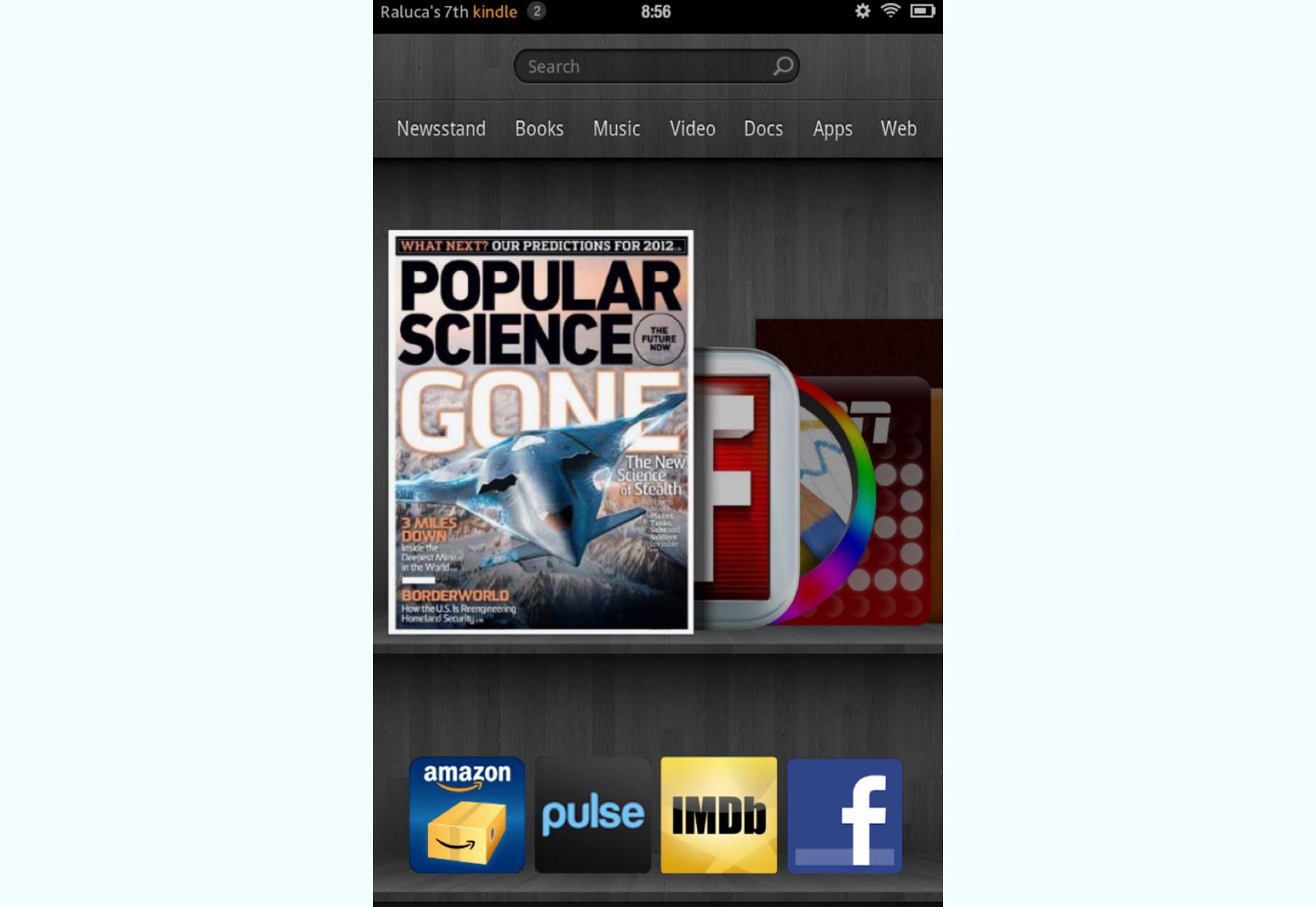 When Apple, a huge proponent of skeuomorphic design, decided, in 2012, to abandon skeuomorphism, that heralded a full swing to flat, which has remained very popular for the last few years. Its emphasis on minimalism has also helped to propel it to its current ubiquity.
Flat is characterized by its absence of:
When Apple, a huge proponent of skeuomorphic design, decided, in 2012, to abandon skeuomorphism, that heralded a full swing to flat, which has remained very popular for the last few years. Its emphasis on minimalism has also helped to propel it to its current ubiquity.
Flat is characterized by its absence of:
- raised elements that signify to users that they can be clicked;
- hollow or sunken elements that signify to users that they can be filled (think search fields and other input fields).
Transition to 2.0
In spite of flat’s success, some designers started noticing legitimate flaws that weren’t being addressed in the design community. While flat gained a lot of steam due to its welcome minimalism, it went a bit too far in the austere direction. The characteristics of some 3D effects turned out to be excessive and adversely impacted the user experience. Thus, it was inevitable that another change would occur. That’s where we are today with the dawn of flat design 2.0.Flat Design’s usability problems
All of flat’s usability problems can be summed up in the following statement: Flat typically trades in a user’s needs for hip aesthetics. In other words, designers designing for an interface to be “flat” will put a greater emphasis on keeping things minimal, non-3D, and vibrant/bold instead of putting the user experience first. That’s usually where all bad things in the design world start, and that’s why flat has evolved to 2.0. Here are the common usability problems with flat:- absence of all-important signifiers (gradients, shadows, underlines, etc.);
- absence of familiar patterns (blue, underlined text for links, etc.);
- absence of contextual indications (CTA placement, actionable copy, etc.).
 The user experience was so bad because a completely flat design means that users aren’t being given the necessary clues to tell them what can be clicked and what can’t be on an interface. As a result, users are naturally forced to spend extra time figuring this out by experimentation or, worse still, perform actions out of error that they didn’t want in the first place!
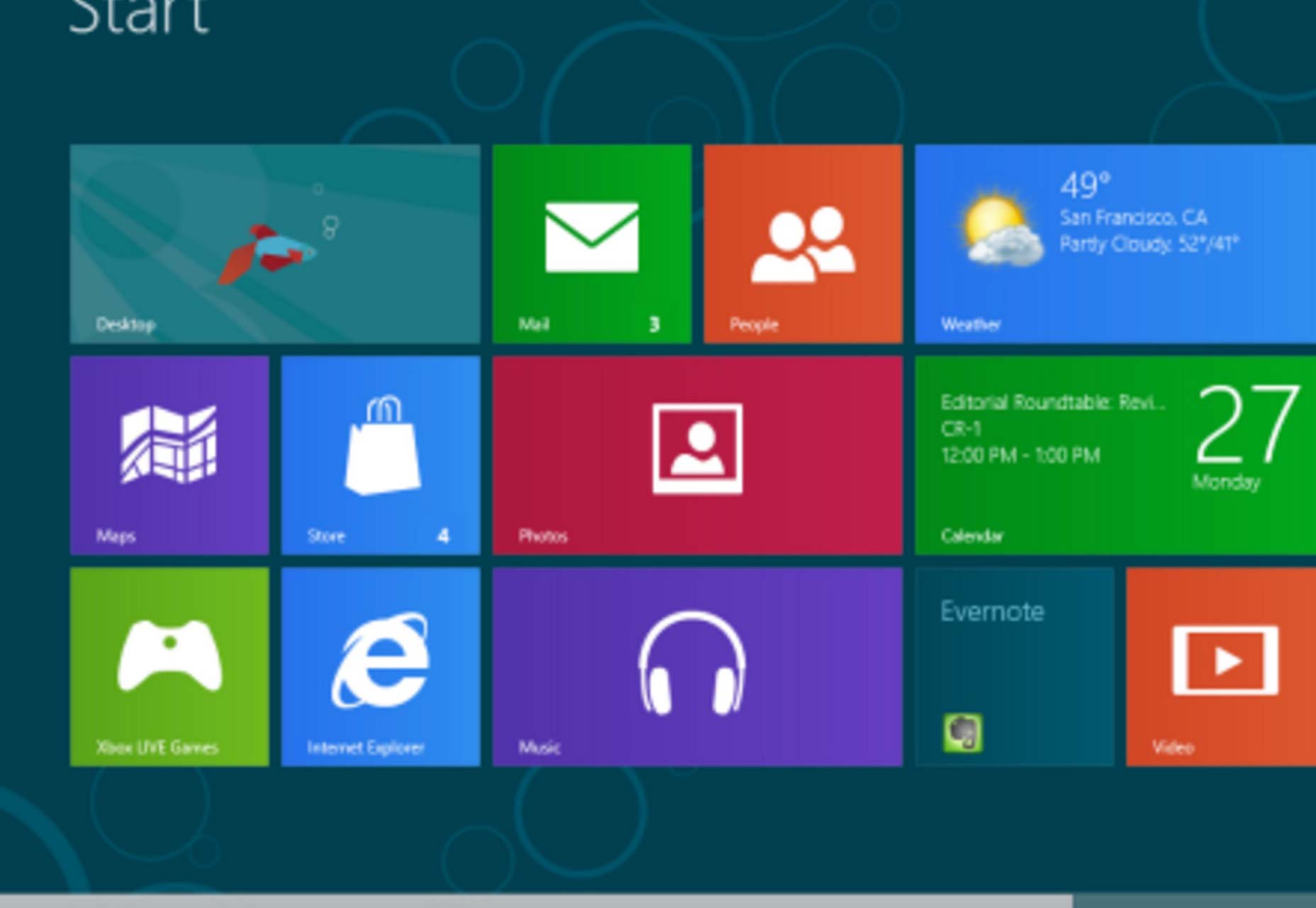
As you can see, the Windows 8 screen is so flat that it’s impossible for people to tell what to click and what not to click. Even if users are already familiar with basic site navigation, that doesn’t mean that it’s a good idea to remove all signifiers (clues that tell users that they can interact with page elements) and hints of affordances (indications of how users can interact with page elements).
The user experience was so bad because a completely flat design means that users aren’t being given the necessary clues to tell them what can be clicked and what can’t be on an interface. As a result, users are naturally forced to spend extra time figuring this out by experimentation or, worse still, perform actions out of error that they didn’t want in the first place!
As you can see, the Windows 8 screen is so flat that it’s impossible for people to tell what to click and what not to click. Even if users are already familiar with basic site navigation, that doesn’t mean that it’s a good idea to remove all signifiers (clues that tell users that they can interact with page elements) and hints of affordances (indications of how users can interact with page elements).
Great examples of Flat Design 2.0
2.0 is a subtle change or improvement over flat, so it may take more concentration to spot true 2.0 in websites and interfaces. That’s why we’re going to walk you through some current, big examples of 2.0 that are already in full operation.The Dropbox Guide
Dropbox’s guide may at first look really flat, but if you look more closely, you’ll see 3D suggestions that clearly communicate to users that some elements are raised over others. This is primarily evident in images of the boy’s head (on the left side) and the screwdrivers (on the right side). Both images have strong, though subtle, black borders, which communicate depth and the impression that they’re sitting on top of the background instead of blending in with it.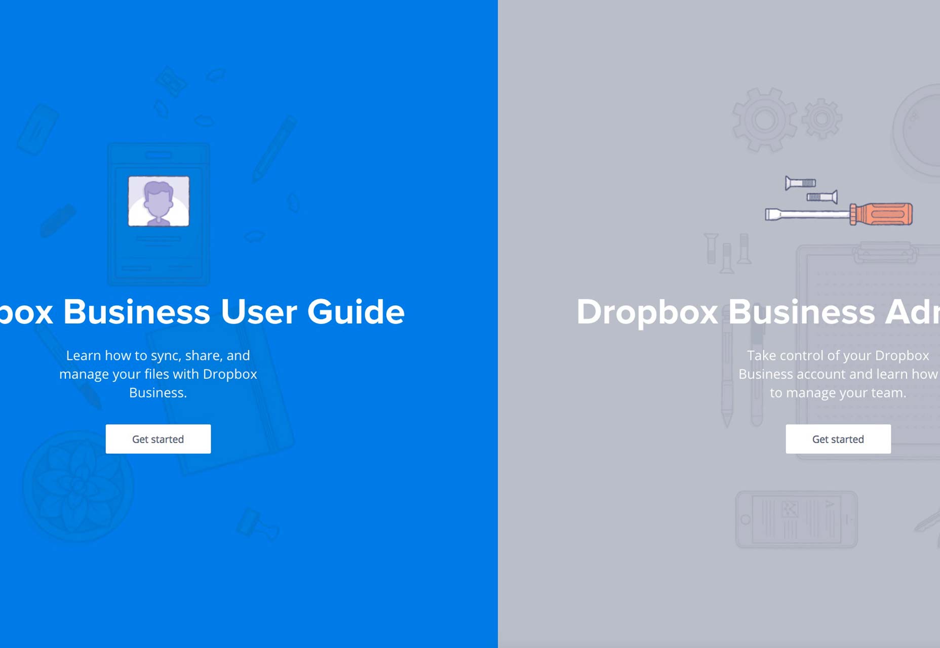
Tolia Ice Cream
Tolia’s site is full of subtle, raised effects that give the distinct impression of 3D while the overall design is still flat and minimal. The raised impression is present in the headline, the sub-headline and the description (ie., the page copy). It’s also present in the call to action button and the CTA copy inside the button. You can thank the subtle use of fine shadows all around the edges of these elements for giving this raised impression.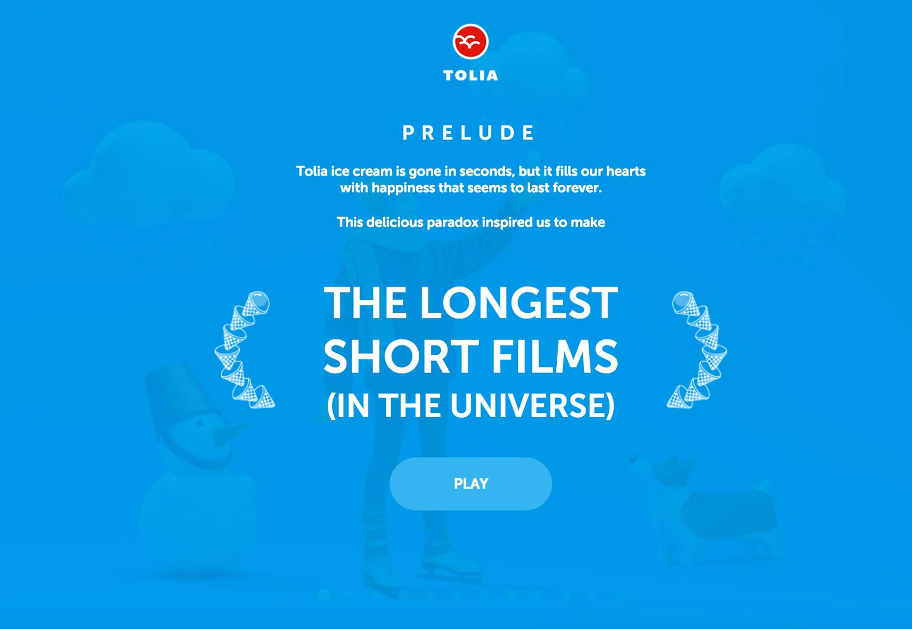
Google Santa Tracker
Unsurprisingly, Google is on the 2.0 bandwagon, and its Santa Tracker page shows off how one can integrate 2.0 in a fun and useful way. The subtleties of 2.0 abound on the page in everything from the gradients and shadows on the various buildings and pop-up bubbles (when users hover on any building) to the headline’s 3D impression at the top of the page.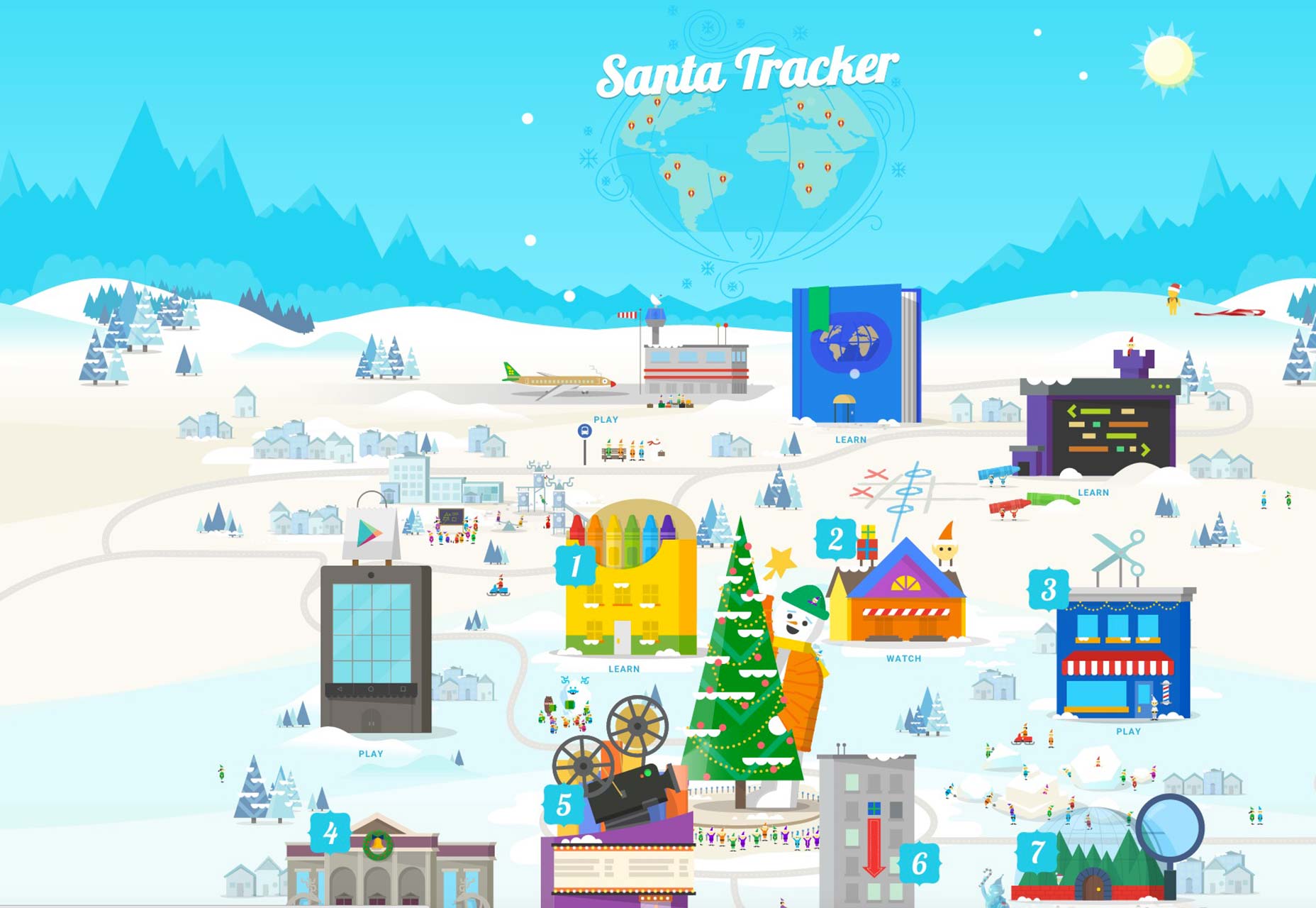
Publicis Groupe
Publicis Groupe’s 90th anniversary page boasts 2.0 influence in a pretty obvious way. If you look at the left side of the page, you’ll see the combination of shadows and gradients coming down and radiating outward from the pale circle and on the blue section beneath it. The stark minimalism also indicates that its design aesthetic is still strongly rooted in pure flat.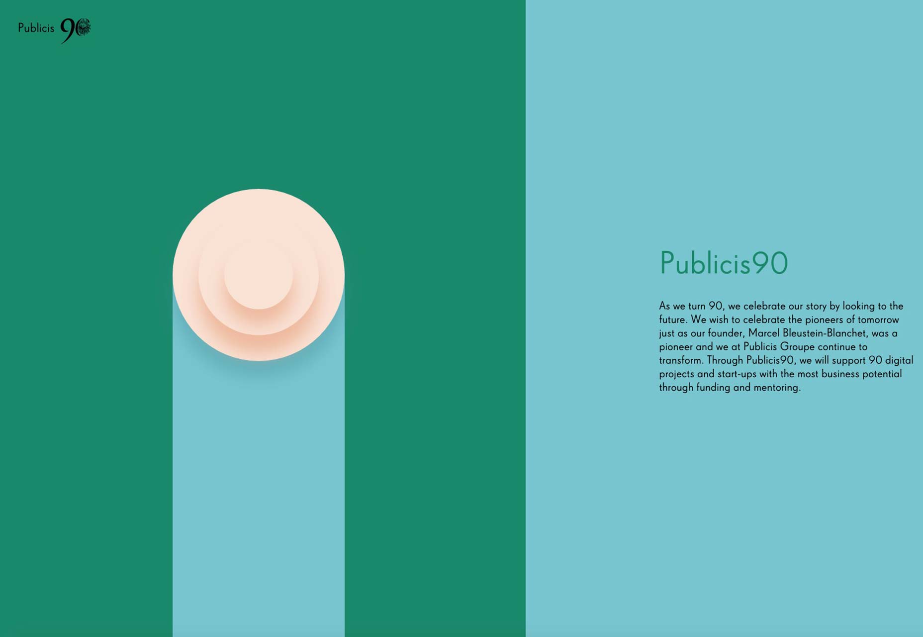
Jumeirah
This site for a luxury hotel in the United Arab Emirates is mostly dominated by giant video in the background, yet don’t let that distract you from taking in the subtlety of its 2.0 contribution. The “Jumeirah Inside” headline features oh-so-subtle shading that successfully gives the impression of 3D while still retaining the overall, flat look.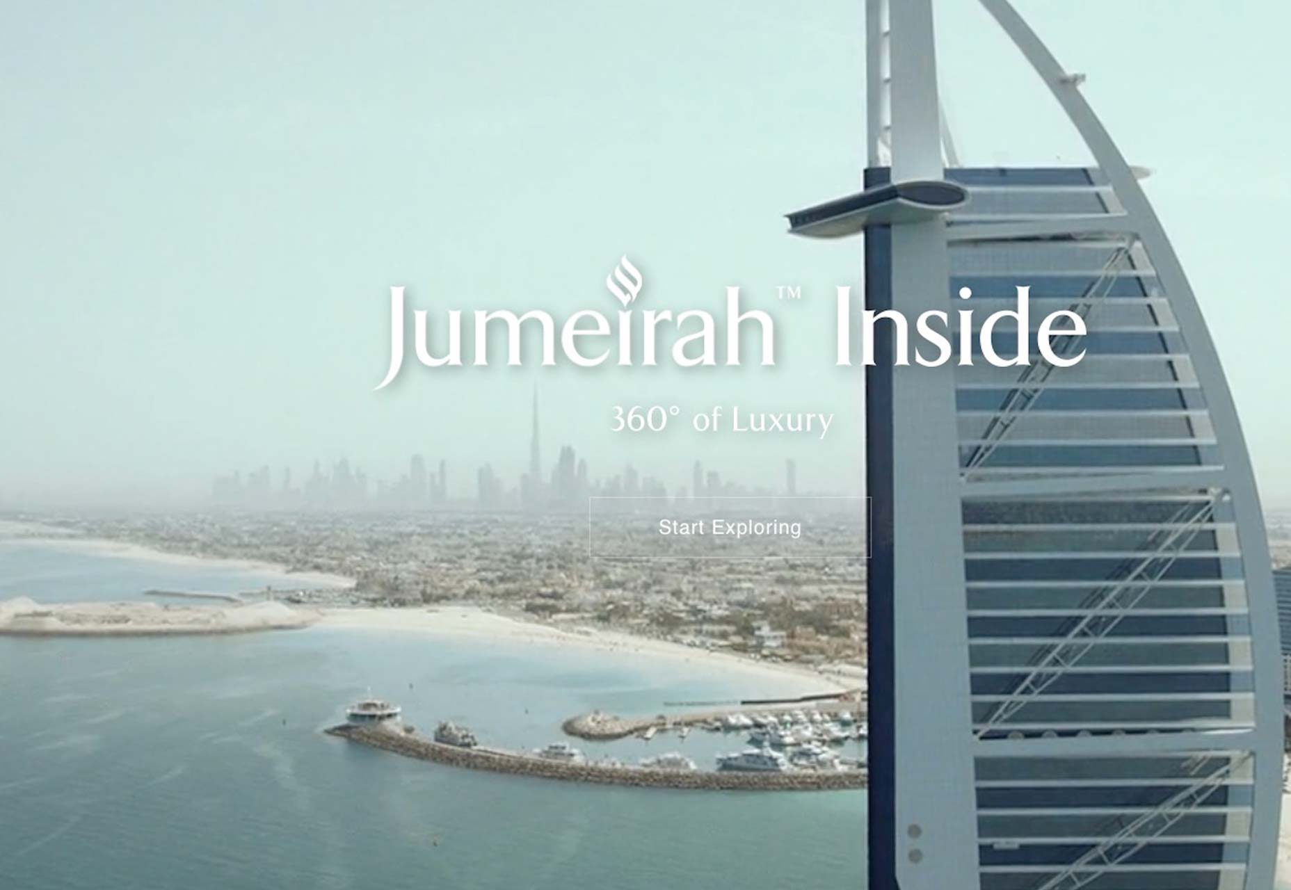
An evolution by demand
In the design world, things usually change because there’s a demand for it. Someone will notice that something’s lacking and find a way to improve things, or somebody else will take a concept and take it to another level that logically builds on a certain concept. As far as 2.0 goes, it’s definitely a combination of both, as flat’s usability shortfalls are fixed by extending the original concept in a way that still honors the principles of minimalism that flat’s defined by.Marc Schenker
Marc’s a copywriter who covers design news for Web Designer Depot. Find out more about him at thegloriouscompanyltd.com.


Read Next

15 Best New Fonts, July 2024
Welcome to our monthly roundup of the best fonts we’ve found online in the last four weeks. This month, there are fewer…
By Ben Moss

20 Best New Websites, July 2024
Welcome to July’s round up of websites to inspire you. This month’s collection ranges from the most stripped-back…

Top 7 WordPress Plugins for 2024: Enhance Your Site's Performance
WordPress is a hands-down favorite of website designers and developers. Renowned for its flexibility and ease of use,…
By WDD Staff

Exciting New Tools for Designers, July 2024
Welcome to this July’s collection of tools, gathered from around the web over the past month. We hope you’ll find…

3 Essential Design Trends, July 2024
Add some summer sizzle to your design projects with trendy website elements. Learn what's trending and how to use these…

15 Best New Fonts, June 2024
Welcome to our roundup of the best new fonts we’ve found online in the last month. This month, there are notably fewer…
By Ben Moss

20 Best New Websites, June 2024
Arranging content in an easily accessible way is the backbone of any user-friendly website. A good website will present…

Exciting New Tools for Designers, June 2024
In this month’s roundup of the best tools for web designers and developers, we’ll explore a range of new and noteworthy…

3 Essential Design Trends, June 2024
Summer is off to a fun start with some highly dramatic website design trends showing up in projects. Let's dive in!

15 Best New Fonts, May 2024
In this month’s edition, there are lots of historically-inspired typefaces, more of the growing trend for French…
By Ben Moss

How to Reduce The Carbon Footprint of Your Website
On average, a web page produces 4.61 grams of CO2 for every page view; for whole sites, that amounts to hundreds of KG…
By Simon Sterne

20 Best New Websites, May 2024
Welcome to May’s compilation of the best sites on the web. This month we’re focused on color for younger humans,…