

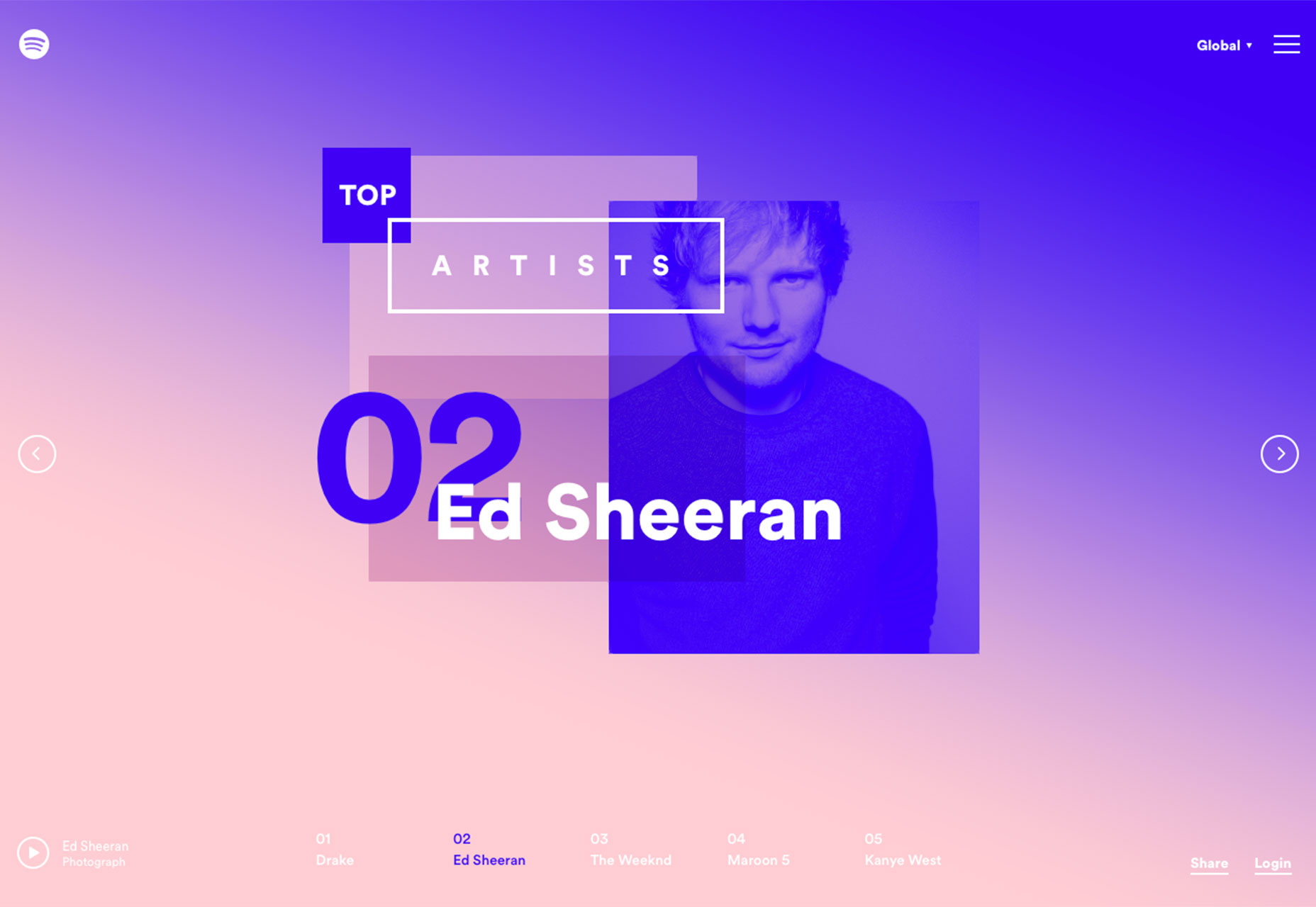
1. Duotone color schemes
Duotone color palettes have been around for a long time, but the recent take adds a color wash effect to a duotone gradient for a full-screen, high impact effect. It’s something that trended out in a major way with flat design, but thanks to stunning usage by Spotify duotone is back. So what exactly is duotone? It is the use of two colors to form a palette. In the most basic form, duotone is a complementary combination from the color wheel. In more complex uses, designers are using all kinds of color combinations and breaking the rules with pairings. Most of the duotone effects feature a brightly-colored overlay on top of an image. The duotone effect highlights darks and lights and creates visual impact with stunning color. Spotify uses it in a great way to make standard artist photos that you’ve likely seen dozens of times look just different enough to be attention grabbing. It’s a technique that you can use in a variety of ways. It works with almost any design concept and can be used as a full-screen element, such as many of the examples above, to create dominant art. It can also be used to create an interesting background, to accent user interface elements or to help add emphasis to a specific part of the design. Duotone works best when used for a single design element. The technique can be overpowering and should be used in moderation.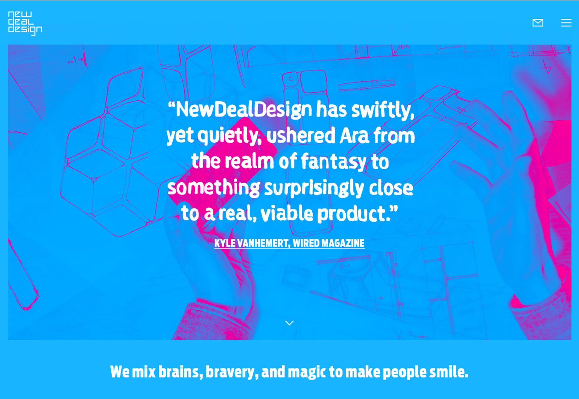
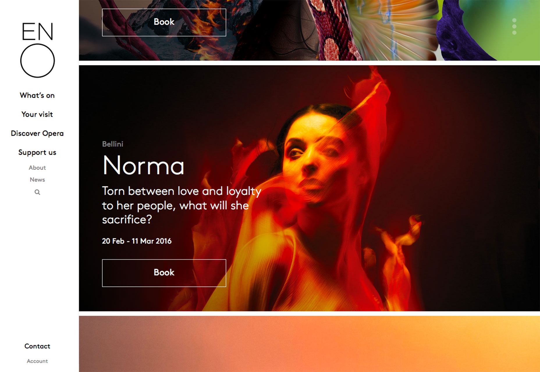
2. Spilt-screen design
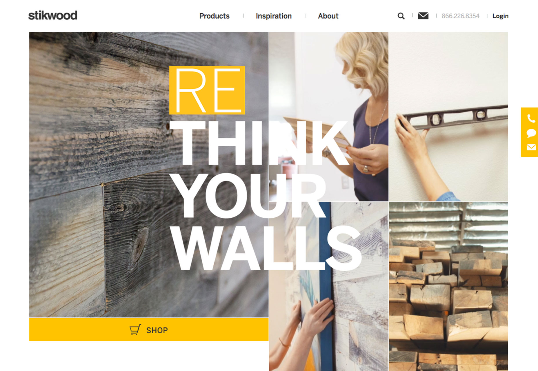
Websites featuring a split-screen design are growing exponentially. The design technique features two panels of content side-by-side. Most of these concepts use a symmetrical outline so that each side of the screen has the same size and shape. The result is a cool, dual content experience on desktop computers and (when coded properly) a great screen-by-screen experience on smaller devices, where the panels collapse and are stacked scrolling elements. The design opportunities with the split-screen trend are limitless—half and half splits, splits with cards or grid-style elements, a subtle split and the list goes on. Each side of the design can also drive users to different types of content and help you glean valuable user analytics about the type of content that people want to see and click on. Split-screen designs are user-friendly, work well in responsive frameworks and don’t overpower other design techniques that you might want to use. Here are a few ways to split the screen effectively:- Pair color and typography when you don’t have strong visuals.
- Focus the attention of the user with left to right movement that results in an action.
- Use color blocking to split the screen and give your message plenty of room while increasing readability.
- Think of a split-screen as oversized cards. Stack container elements in a mosaic or masonry style pattern to showcase different pieces of content.
- Keep each “screen” simple. The trick to this design concept is the split screen. A minimal style can help add emphasis to the content therein.
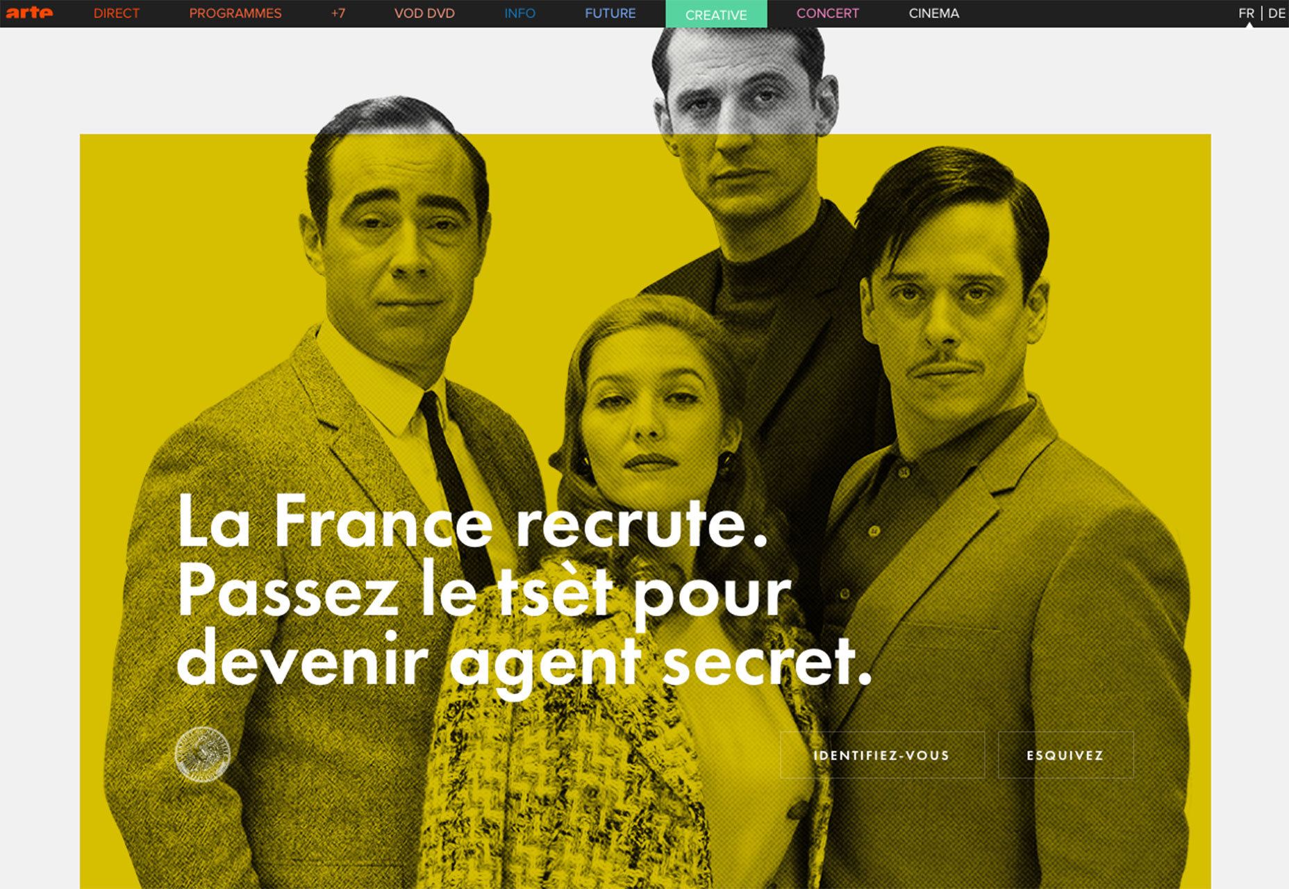
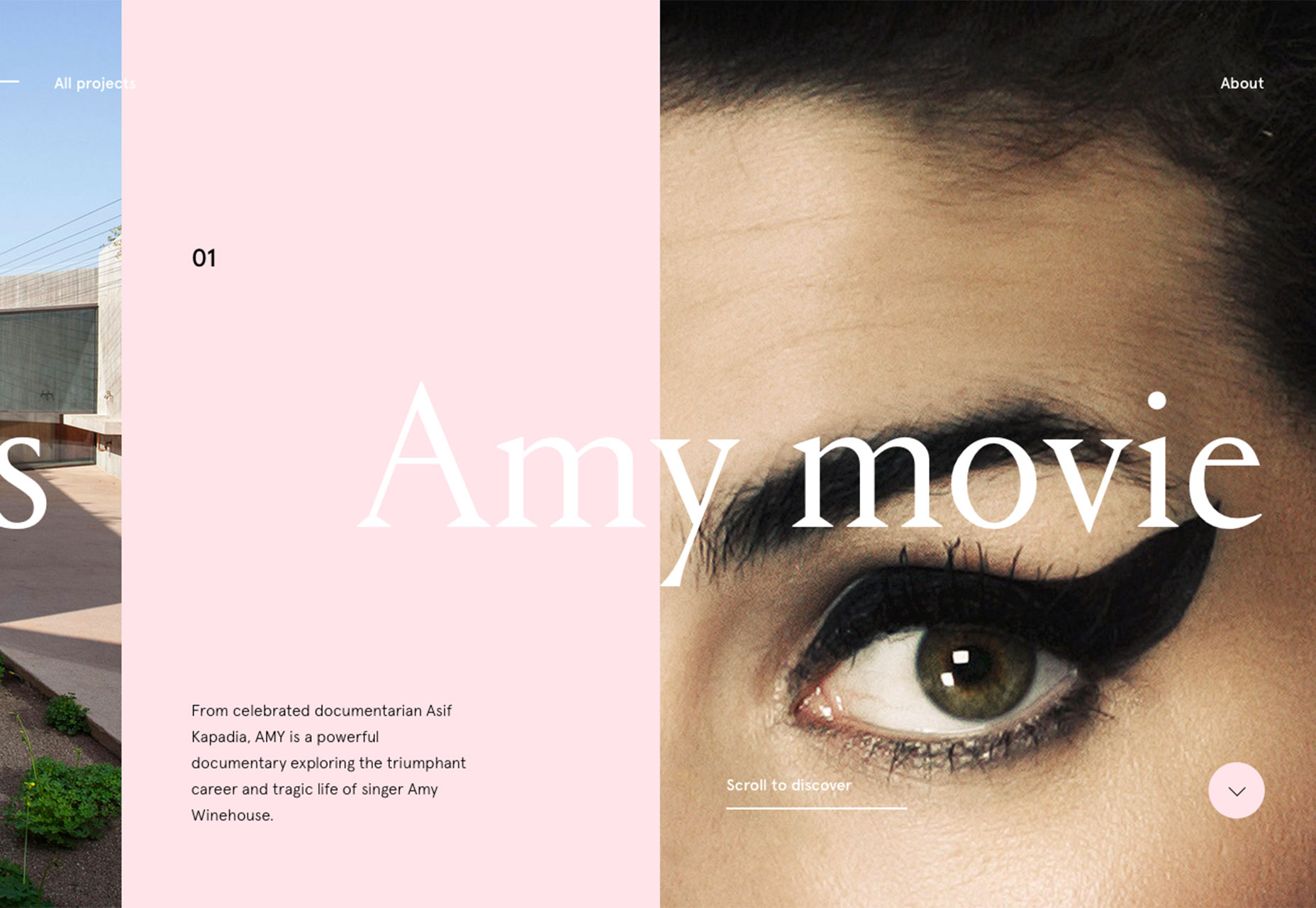
3. Typography in a shared space
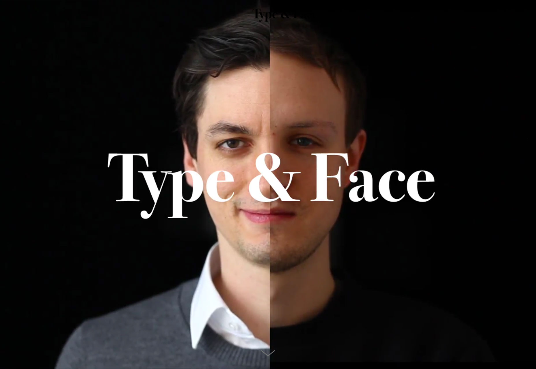
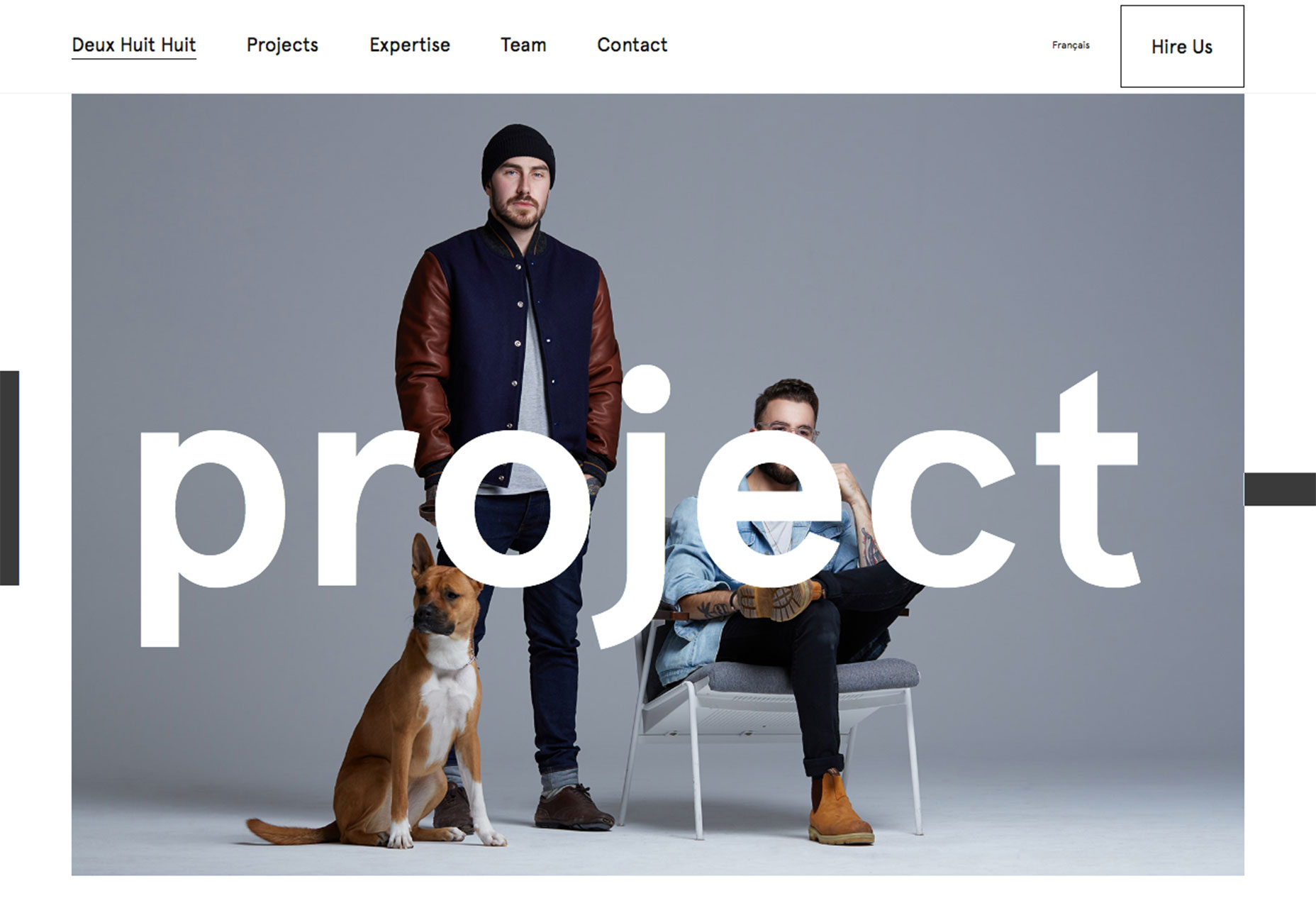
This is one of those trends you almost have to see, to understand: typography is extending into shared spaces in the design. Look at most websites and there are images and backgrounds and type. Elements are either made together, such as type on an image, or they are completely separated. More designers are breaking out of that format and creating projects where type extends into the spaces of other elements. It’s interesting and fun to look at. It can also be a challenge to create, because of concerns about readability. The technique works best with simple typography, such as a medium-stroke sans serif. Text should have plenty of contrast to stand out from the background and any elements it crosses into or across. For this reason, most of the designs using this technique use white or black lettering. Text also needs to have some size for this to work. Almost as important as color contrast, is contrast in size and space. You also have to take special care in how the text moves with different screen sizes or breakpoints so that letters do not cover areas of the image that are vital to your message. One of the most stunning examples of this is from Deux Huit Huit (you’ll want to visit the site for the full effect). Lettering moves across and through the main image on the homepage. The words are readable as they “fall off” the image and cross the space between the photo and background.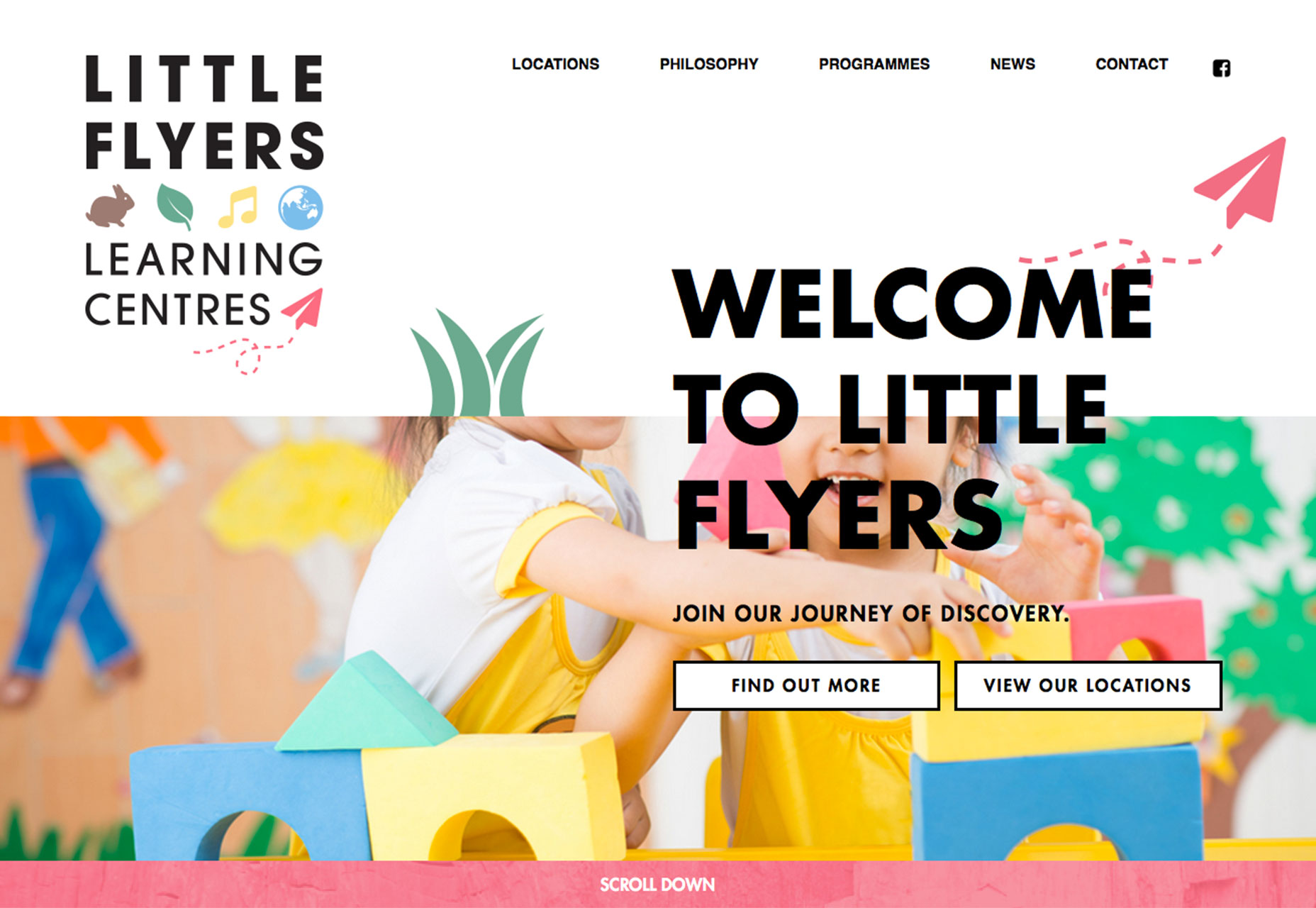
Conclusion
While a lot of design trends come and go almost as fast as you start to recognize them, the ones that stick around often work well with other time-tested techniques. That’s what stands out the most about this trio of modern styles. Each can be worked into a layout for a touch of newness. These techniques are fairly easy to implement (and remove later) without destroying your entire aesthetic. Try one of these techniques for a visual refresh. Think about getting out of your comfort zone a bit with bold color choices or a change just to your homepage. Or go a little more bold and try a combination of trendy techniques for a design that really stands out. (Did you notice the website for Stikwood uses two of the trends – split-screen design and typography in a shared space?) What trends are you loving (or hating) right now? I’d love to see some of the websites that you are fascinated with. Drop me a link on Twitter; I’d love to hear from you.Carrie Cousins
Carrie Cousins is a freelance writer with more than 10 years of experience in the communications industry, including writing for print and online publications, and design and editing. You can connect with Carrie on Twitter @carriecousins.


Read Next

15 Best New Fonts, July 2024
Welcome to our monthly roundup of the best fonts we’ve found online in the last four weeks. This month, there are fewer…
By Ben Moss

20 Best New Websites, July 2024
Welcome to July’s round up of websites to inspire you. This month’s collection ranges from the most stripped-back…

Top 7 WordPress Plugins for 2024: Enhance Your Site's Performance
WordPress is a hands-down favorite of website designers and developers. Renowned for its flexibility and ease of use,…
By WDD Staff

Exciting New Tools for Designers, July 2024
Welcome to this July’s collection of tools, gathered from around the web over the past month. We hope you’ll find…

3 Essential Design Trends, July 2024
Add some summer sizzle to your design projects with trendy website elements. Learn what's trending and how to use these…

15 Best New Fonts, June 2024
Welcome to our roundup of the best new fonts we’ve found online in the last month. This month, there are notably fewer…
By Ben Moss

20 Best New Websites, June 2024
Arranging content in an easily accessible way is the backbone of any user-friendly website. A good website will present…

Exciting New Tools for Designers, June 2024
In this month’s roundup of the best tools for web designers and developers, we’ll explore a range of new and noteworthy…

3 Essential Design Trends, June 2024
Summer is off to a fun start with some highly dramatic website design trends showing up in projects. Let's dive in!

15 Best New Fonts, May 2024
In this month’s edition, there are lots of historically-inspired typefaces, more of the growing trend for French…
By Ben Moss

How to Reduce The Carbon Footprint of Your Website
On average, a web page produces 4.61 grams of CO2 for every page view; for whole sites, that amounts to hundreds of KG…
By Simon Sterne

20 Best New Websites, May 2024
Welcome to May’s compilation of the best sites on the web. This month we’re focused on color for younger humans,…