

 The significance of Google entering the market with a solution is that through its sheer size, Google carries enormous weight within the design community. Whether it’s Google Fonts dominating font serving (a recent WebdesignerDepot poll showed 70% of our readers rely primarily on Google Fonts), or the supplanting of Flat Design by Material Design, anything Google says about web design is frequently taken as ‘best practice’.
So it’s a valid cause for concern when Google advocates an approach that’s contrary to established standards.
Google’s Material Design specification already offers guidance around breakpoints:
The significance of Google entering the market with a solution is that through its sheer size, Google carries enormous weight within the design community. Whether it’s Google Fonts dominating font serving (a recent WebdesignerDepot poll showed 70% of our readers rely primarily on Google Fonts), or the supplanting of Flat Design by Material Design, anything Google says about web design is frequently taken as ‘best practice’.
So it’s a valid cause for concern when Google advocates an approach that’s contrary to established standards.
Google’s Material Design specification already offers guidance around breakpoints:
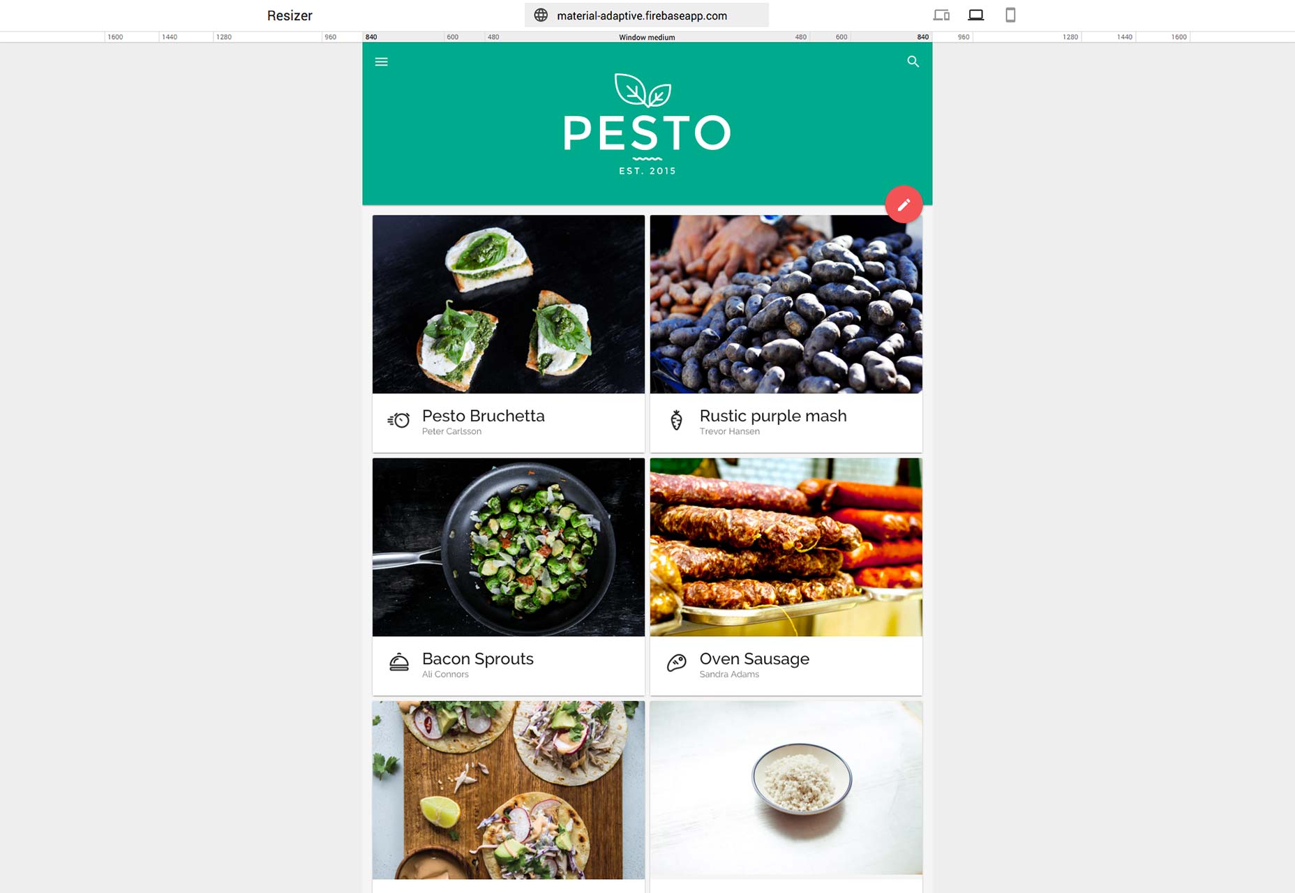
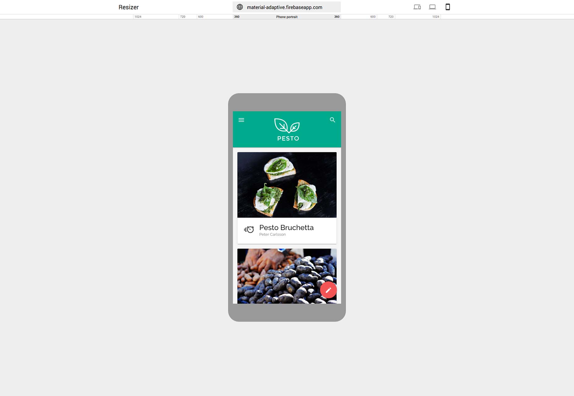
For optimal user experience, material design user interfaces should adapt layouts for the following breakpoint widths: 480, 600, 840, 960, 1280, 1440, and 1600dp.Resizer follows the same principle: it offers laptop and mobile previews at set breakpoints. Laptop (or desktop) screens can be 480px, 600px, 840px, 960px, 1280px, 1440px, or 1600px wide. Mobile screens can be 360px, 600px, 720px, or 1024px wide.
 Whilst that is a good cross-section of sizing—although notably doesn’t come close to the full range of Android devices—there is a fundamental error in the approach: Good responsive design uses content breakpoints, not viewport breakpoints; it shouldn’t matter what size Samsung makes its next phone, what matters is at what size your content breaks.
 Most site design applications—the latest Adobe Muse for example—correctly allow for custom breakpoints, which ensures that media queries are written for your content, not a hypothetical device.
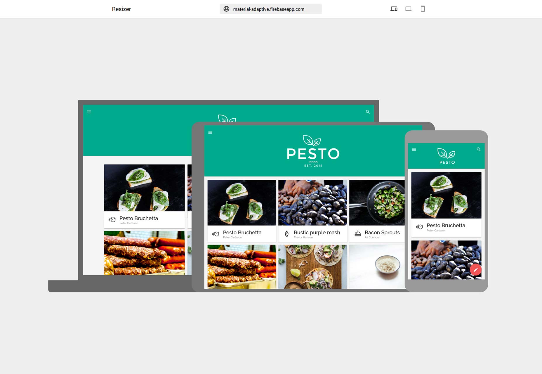
Resizer is specifically designed to test for (some of) Material Design’s viewport breakpoints. The danger is that Resizer, with Google’s endorsement, will perpetuate the myth of responsive sites as a series of viewport sizes, rather than as fluid device-agnostic content.
Most site design applications—the latest Adobe Muse for example—correctly allow for custom breakpoints, which ensures that media queries are written for your content, not a hypothetical device.
Resizer is specifically designed to test for (some of) Material Design’s viewport breakpoints. The danger is that Resizer, with Google’s endorsement, will perpetuate the myth of responsive sites as a series of viewport sizes, rather than as fluid device-agnostic content.
Ben Moss
Ben Moss has designed and coded work for award-winning startups, and global names including IBM, UBS, and the FBI. When he’s not in front of a screen he’s probably out trail-running.


Read Next

15 Best New Fonts, July 2024
Welcome to our monthly roundup of the best fonts we’ve found online in the last four weeks. This month, there are fewer…
By Ben Moss

20 Best New Websites, July 2024
Welcome to July’s round up of websites to inspire you. This month’s collection ranges from the most stripped-back…

Top 7 WordPress Plugins for 2024: Enhance Your Site's Performance
WordPress is a hands-down favorite of website designers and developers. Renowned for its flexibility and ease of use,…
By WDD Staff

Exciting New Tools for Designers, July 2024
Welcome to this July’s collection of tools, gathered from around the web over the past month. We hope you’ll find…

3 Essential Design Trends, July 2024
Add some summer sizzle to your design projects with trendy website elements. Learn what's trending and how to use these…

15 Best New Fonts, June 2024
Welcome to our roundup of the best new fonts we’ve found online in the last month. This month, there are notably fewer…
By Ben Moss

20 Best New Websites, June 2024
Arranging content in an easily accessible way is the backbone of any user-friendly website. A good website will present…

Exciting New Tools for Designers, June 2024
In this month’s roundup of the best tools for web designers and developers, we’ll explore a range of new and noteworthy…

3 Essential Design Trends, June 2024
Summer is off to a fun start with some highly dramatic website design trends showing up in projects. Let's dive in!

15 Best New Fonts, May 2024
In this month’s edition, there are lots of historically-inspired typefaces, more of the growing trend for French…
By Ben Moss

How to Reduce The Carbon Footprint of Your Website
On average, a web page produces 4.61 grams of CO2 for every page view; for whole sites, that amounts to hundreds of KG…
By Simon Sterne

20 Best New Websites, May 2024
Welcome to May’s compilation of the best sites on the web. This month we’re focused on color for younger humans,…