

[The atom] belied what Uber actually is—a transportation network, woven into the fabric of cities and how they move. — Uber
By reducing the company to an atomic level, it suggests that Uber can become anything; the flip side is that it’s also the ultimate non-committal statement. Uber doesn’t really know the direction it’s heading in, and is keeping its options open.
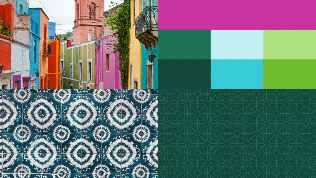 Uber’s Mexico-specific branding.
Where Uber is getting it right is with its country brands. Different textures, architectural features, and colors have been incorporated into national-variations on the brand. Something that works well in Australia, may not work well in Iceland, and it’s testament to the cultural variations (color especially) that need to be addressed by global businesses. Eventually Uber plans to extend these national identities to city-specific identities
Uber’s Mexico-specific branding.
Where Uber is getting it right is with its country brands. Different textures, architectural features, and colors have been incorporated into national-variations on the brand. Something that works well in Australia, may not work well in Iceland, and it’s testament to the cultural variations (color especially) that need to be addressed by global businesses. Eventually Uber plans to extend these national identities to city-specific identities
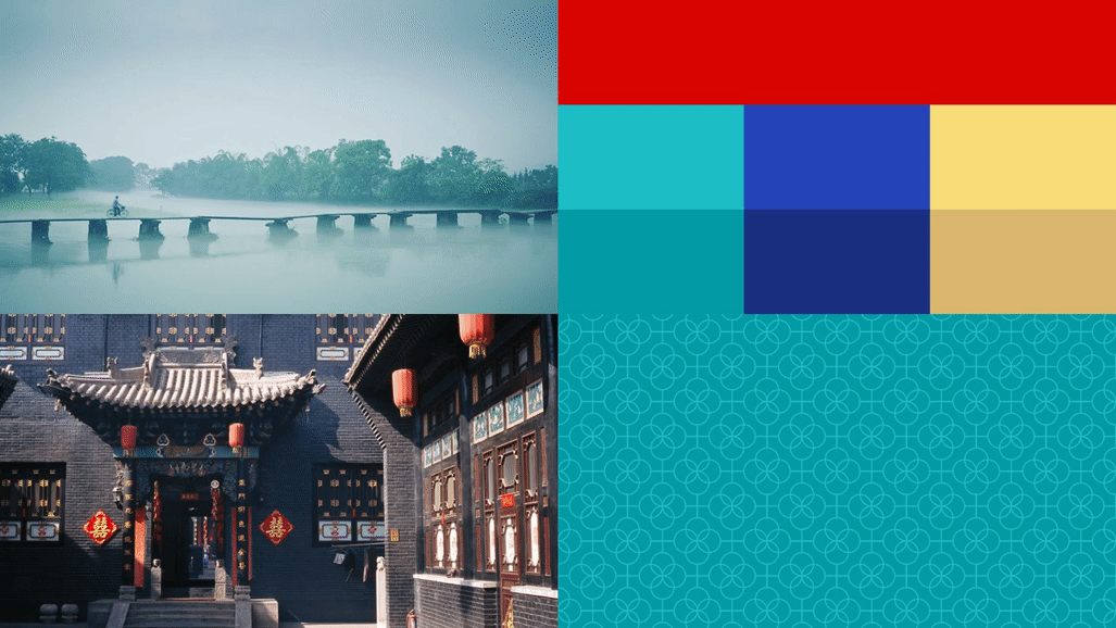 Uber’s China-specific branding.
Uber’s logotype has also been refined; removing finials, rounding corners, and adjusting spacing. It’s a nicely executed revision that feels more grown up, less startup. This aspect of the redesign is also successful.
Uber’s China-specific branding.
Uber’s logotype has also been refined; removing finials, rounding corners, and adjusting spacing. It’s a nicely executed revision that feels more grown up, less startup. This aspect of the redesign is also successful.
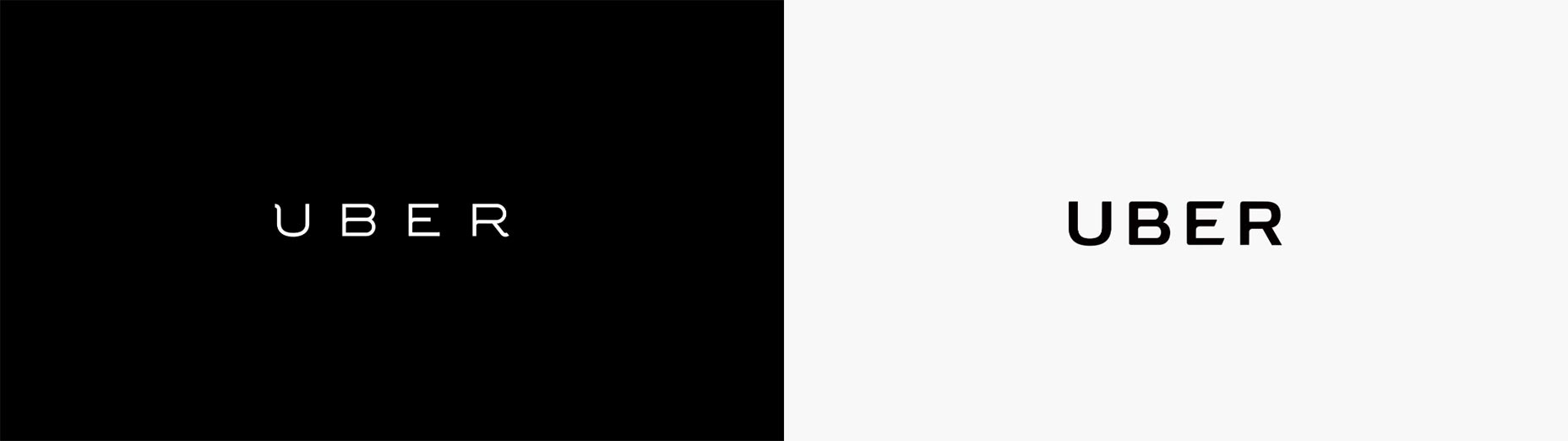 Uber’s old (left) and new (right) logotypes.
Uber’s website has also been updated, with fresh images and the new brand assets. It is extremely corporate, and heavily inspired by Google’s Material Design. It feels cold, and a million miles away from Uber’s brand statements about personal journeys. The website feels like a huge missed opportunity to create something personal — finding a ride for example, doesn’t even auto-detect what country you’re in, let alone your city. There has been a lot of discussion lately on whether parallax is a wise design decision. Parallax was overdone and dated at the start of 2015, but by the end of the year an increasing number of sites were rediscovering it. Uber has gone for it in a big way, on their brand guide microsite, whilst it’s not a site most people will visit, it’s interesting that they chose to embrace parallax here.
Uber is one of those startups that’s no longer really a startup. And the rebrand released this week is a lot like a band’s notoriously difficult second album: you put everything into the first release, and then struggle to find your identity with the follow-up.
Uber had the opportunity to define itself, and its role for the next decade or two, but in an effort to distance themselves from their exclusive old branding, their identity has become far too open ended.
Uber’s old (left) and new (right) logotypes.
Uber’s website has also been updated, with fresh images and the new brand assets. It is extremely corporate, and heavily inspired by Google’s Material Design. It feels cold, and a million miles away from Uber’s brand statements about personal journeys. The website feels like a huge missed opportunity to create something personal — finding a ride for example, doesn’t even auto-detect what country you’re in, let alone your city. There has been a lot of discussion lately on whether parallax is a wise design decision. Parallax was overdone and dated at the start of 2015, but by the end of the year an increasing number of sites were rediscovering it. Uber has gone for it in a big way, on their brand guide microsite, whilst it’s not a site most people will visit, it’s interesting that they chose to embrace parallax here.
Uber is one of those startups that’s no longer really a startup. And the rebrand released this week is a lot like a band’s notoriously difficult second album: you put everything into the first release, and then struggle to find your identity with the follow-up.
Uber had the opportunity to define itself, and its role for the next decade or two, but in an effort to distance themselves from their exclusive old branding, their identity has become far too open ended.
Ben Moss
Ben Moss has designed and coded work for award-winning startups, and global names including IBM, UBS, and the FBI. When he’s not in front of a screen he’s probably out trail-running.


Read Next

15 Best New Fonts, July 2024

20 Best New Websites, July 2024

Top 7 WordPress Plugins for 2024: Enhance Your Site's Performance

Exciting New Tools for Designers, July 2024

3 Essential Design Trends, July 2024

15 Best New Fonts, June 2024

20 Best New Websites, June 2024

Exciting New Tools for Designers, June 2024

3 Essential Design Trends, June 2024

15 Best New Fonts, May 2024

How to Reduce The Carbon Footprint of Your Website
