

How it works
When creating a new site, the option is front and center. Adobe redesigned the New Site dialog box giving you the option to create a fixed-width layout or a fluid width layout.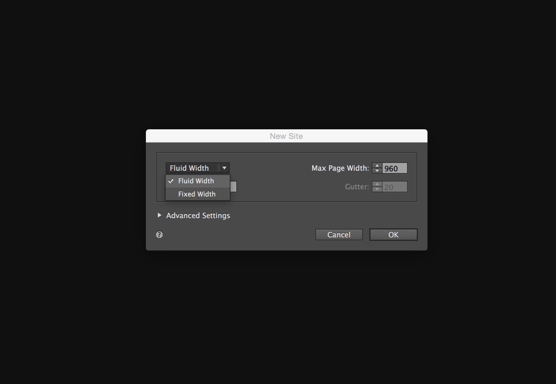 The obvious choice for responsive design is fluid width. Nothing has changed in the Plan Mode, but once in the Design Mode there’s a new interface feature specific for responsive design: the breakpoint bar. This workflow is similar to what Adobe offered in Edge Reflow and more recently Dreamweaver with its Bootstrap features.
Adding breakpoints
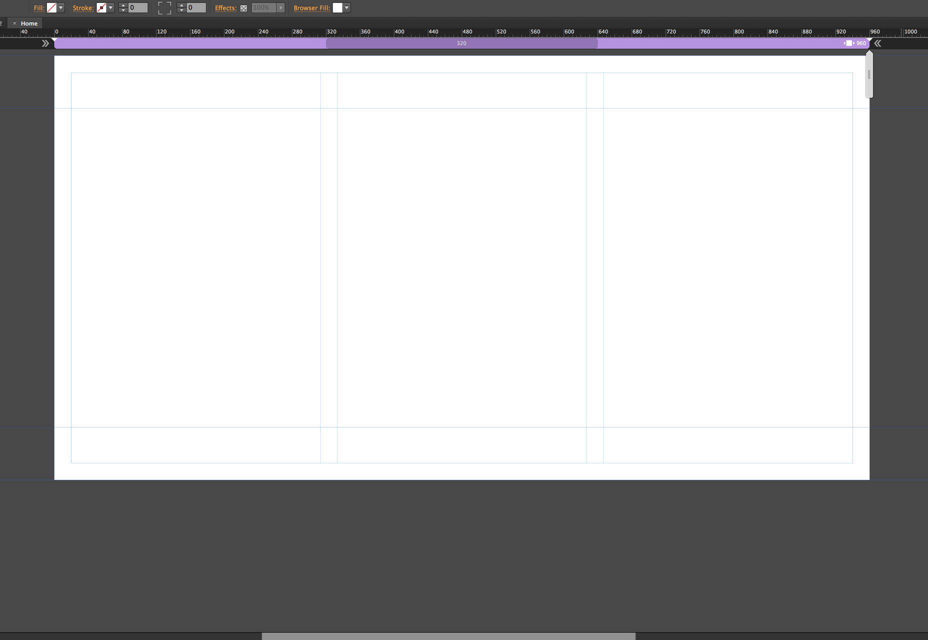
Adding breakpoints in Muse is simple and intuitive. On the right-hand side you will see a scrubber that allows you to resize the width of the page, simulating a browser resizing.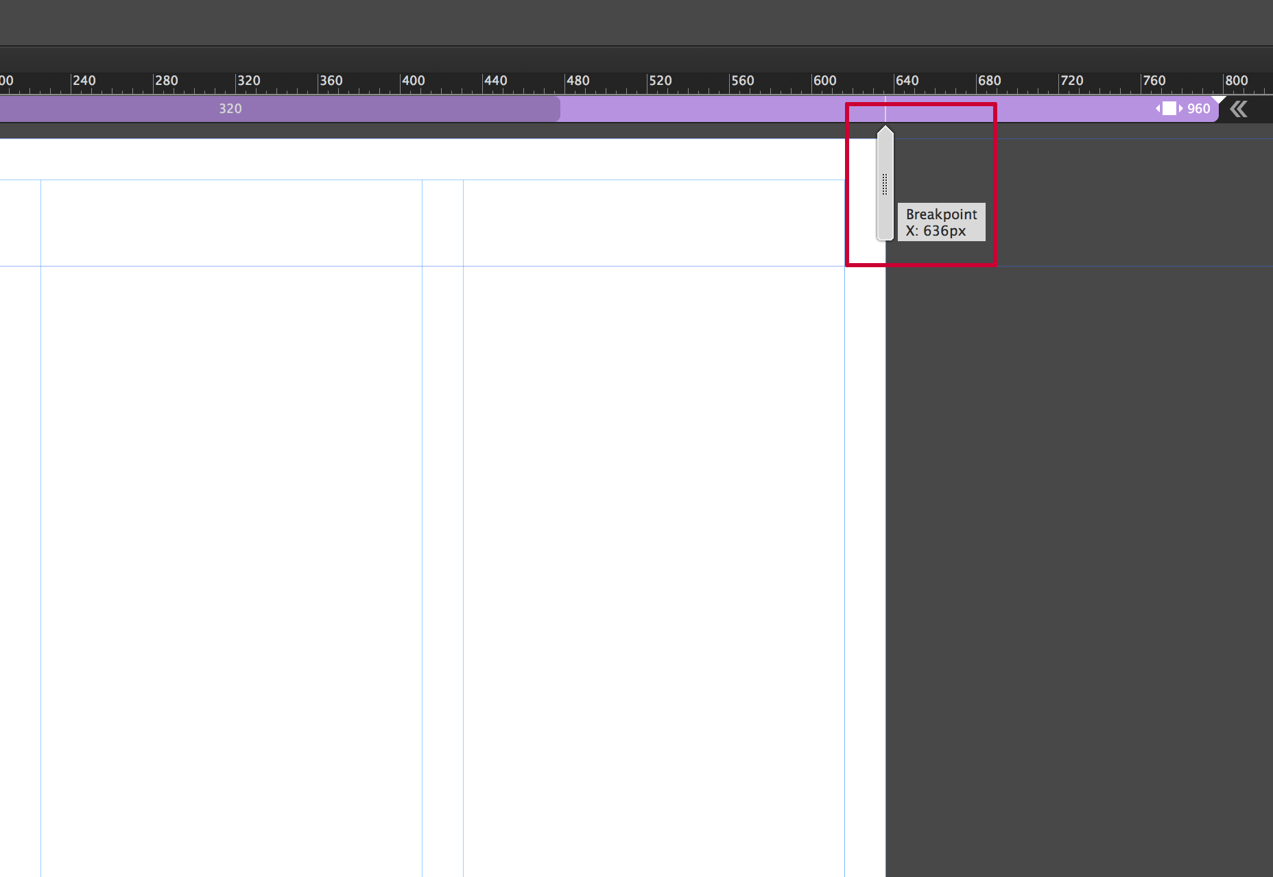 The idea is to add breakpoints when your design “breaks”, which could be elements overlapping, getting too small, or whatever the case may be. Ideally you would separate the idea of adding breakpoints for specific devices, and strictly focus on what the design requires. It’s really a balancing act; the main support for responsive design is to accommodate a wide range of screen sizes due to the proliferation of mobile devices. This is where being thoughtful and doing a little bit of planning can go a long way. You can add as many breakpoints as needed. Just be mindful that the more you have, the more you’ll have to manage.
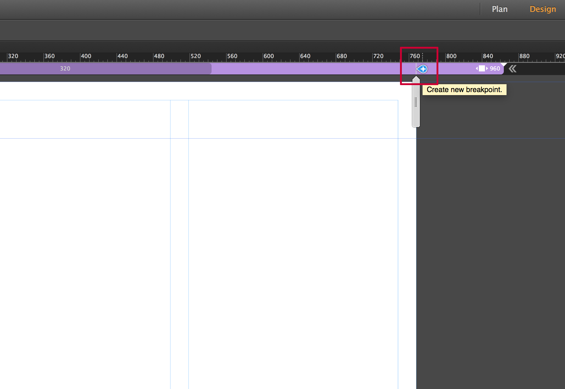
To add a break point, you can click the small plus sign that appears on the breakpoint bar.
The idea is to add breakpoints when your design “breaks”, which could be elements overlapping, getting too small, or whatever the case may be. Ideally you would separate the idea of adding breakpoints for specific devices, and strictly focus on what the design requires. It’s really a balancing act; the main support for responsive design is to accommodate a wide range of screen sizes due to the proliferation of mobile devices. This is where being thoughtful and doing a little bit of planning can go a long way. You can add as many breakpoints as needed. Just be mindful that the more you have, the more you’ll have to manage.
To add a break point, you can click the small plus sign that appears on the breakpoint bar.
 Once you add the breakpoint, the breakpoint bar becomes color-coded. You can manage breakpoint properties by right-clicking on the breakpoint bar and choosing the breakpoint properties option.
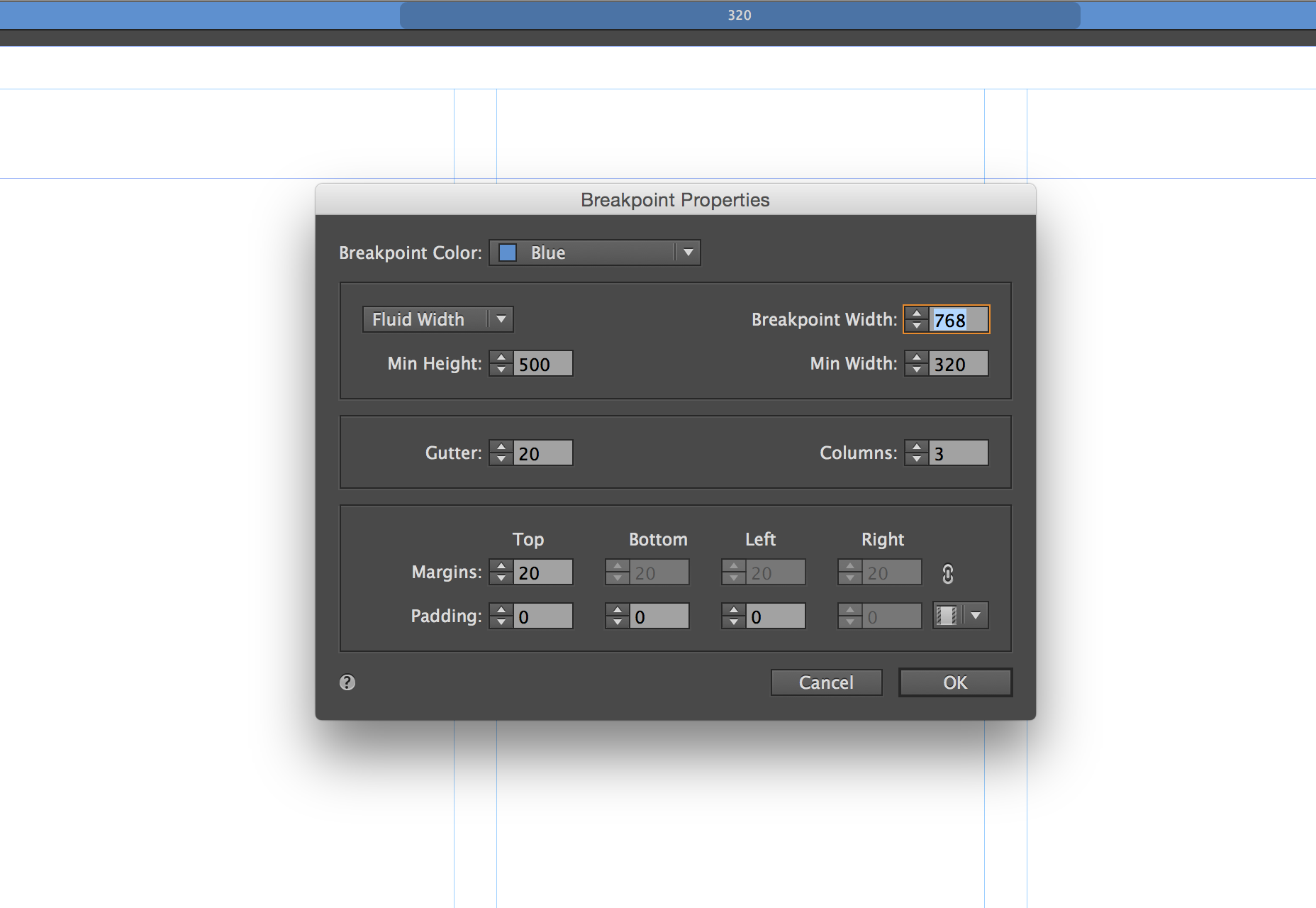
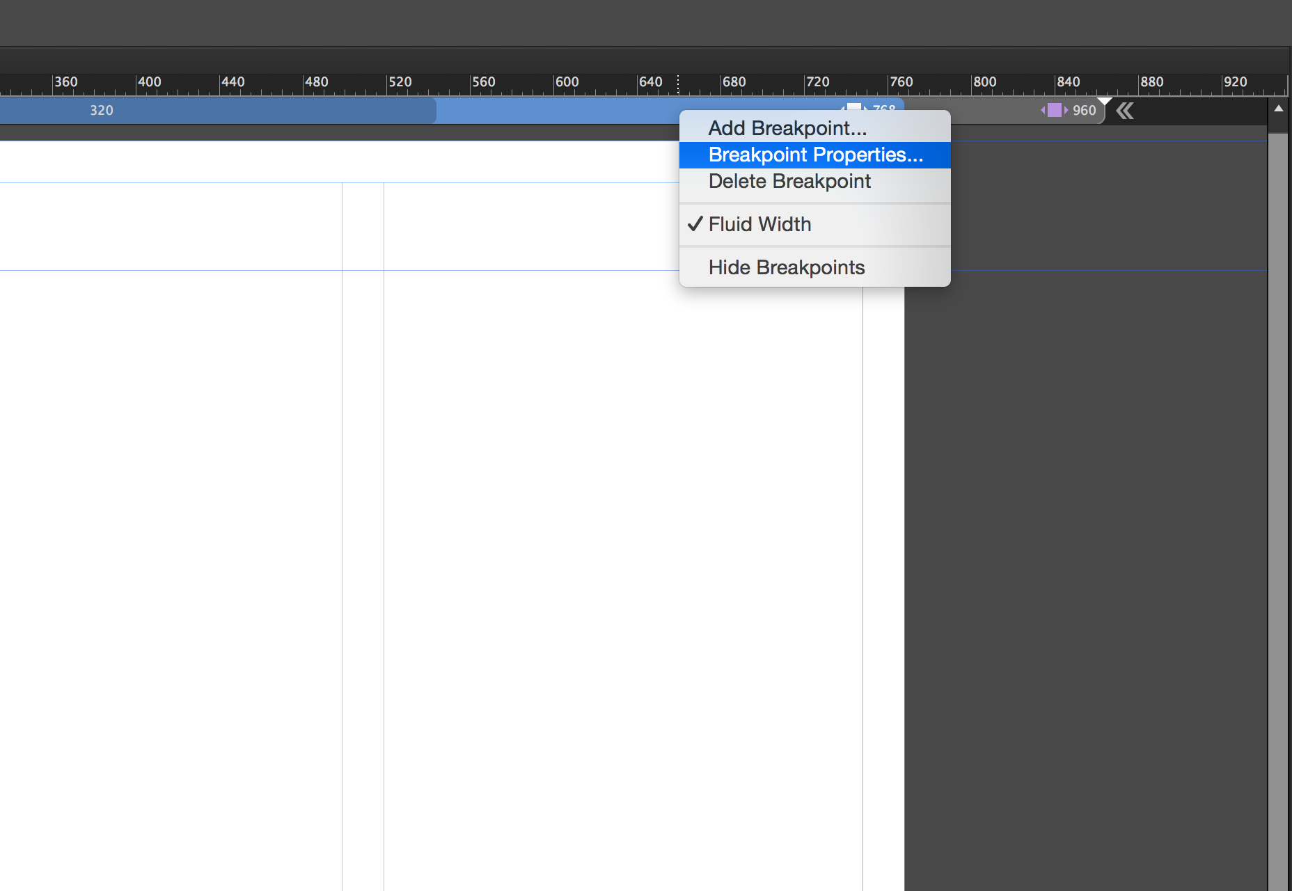 This will open the breakpoint properties dialog box. Here you can control specific properties, from the color and/or position of the breakpoint to adding column guides to appear for that breakpoint. Everything in this dialog box is specific to the current breakpoint and has no impact on any other breakpoints within the page.
 You can quickly navigate between breakpoints by clicking on different sections within it. On each breakpoint you can begin to reformat the content to make better use of the browser width.
Master pages
Master pages have their own breakpoints, which respond independently of the pages they are applied to. This gives you specific control over the master page content, typically a header and footer.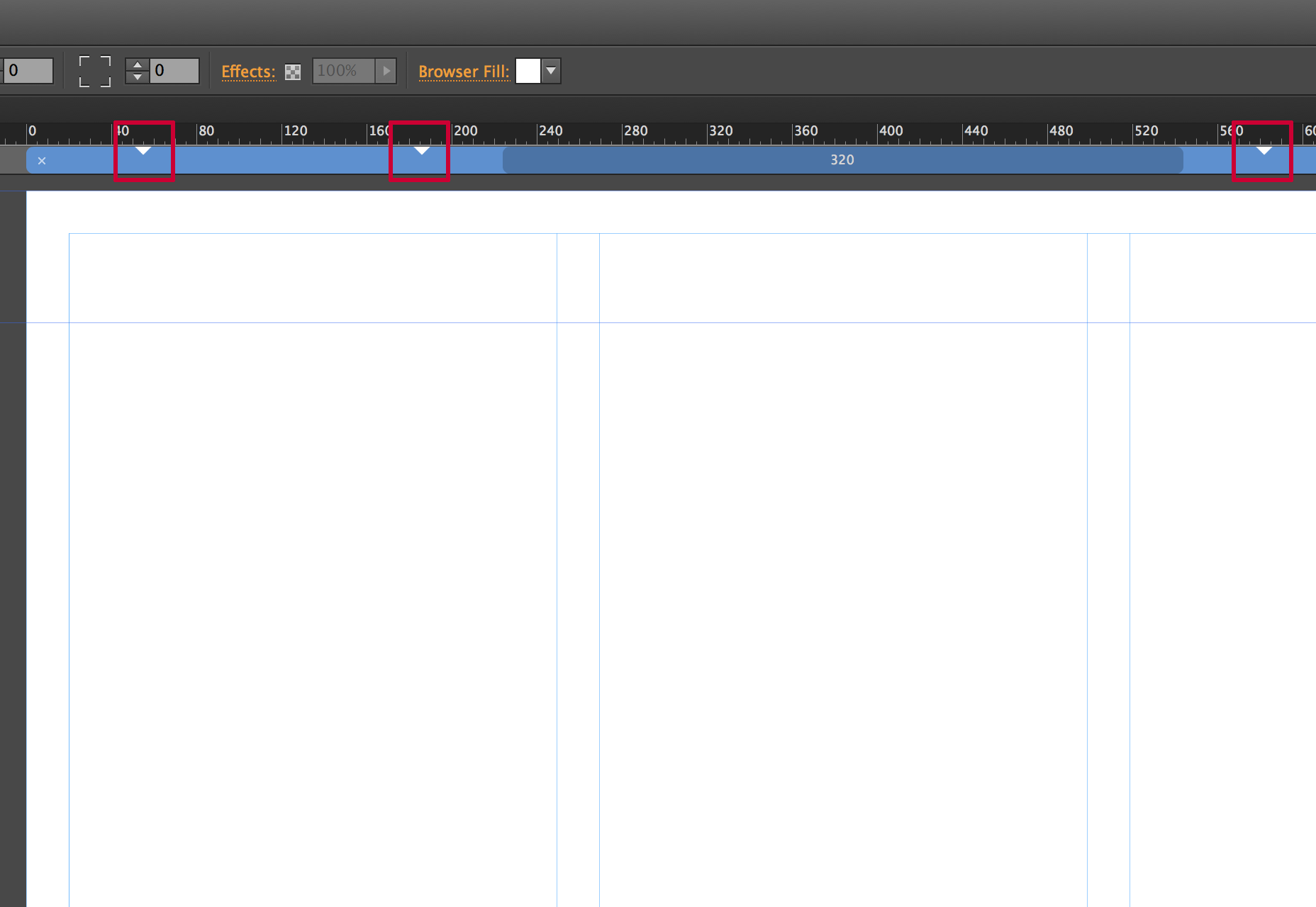 These breakpoints appear on the breakpoint bar as small triangles, to indicate where the breakpoints are in the master. You can click on the triangles to quickly position the scrubber to that location.
Formatting content at breakpoints
When you add a breakpoint, you can reflow the content any way you’d like. Often times you’ll take an approach where you stack content, or resize the content so it’s larger making it easier to view on smaller screens. It’s not uncommon to show less content. As the screen gets smaller the content should get more specific. In the example below, you’ll notice that I went from a three-column layout for the larger breakpoint to a two-column layout for a smaller breakpoint. The images and text become larger, making it easier to view on a smaller screen.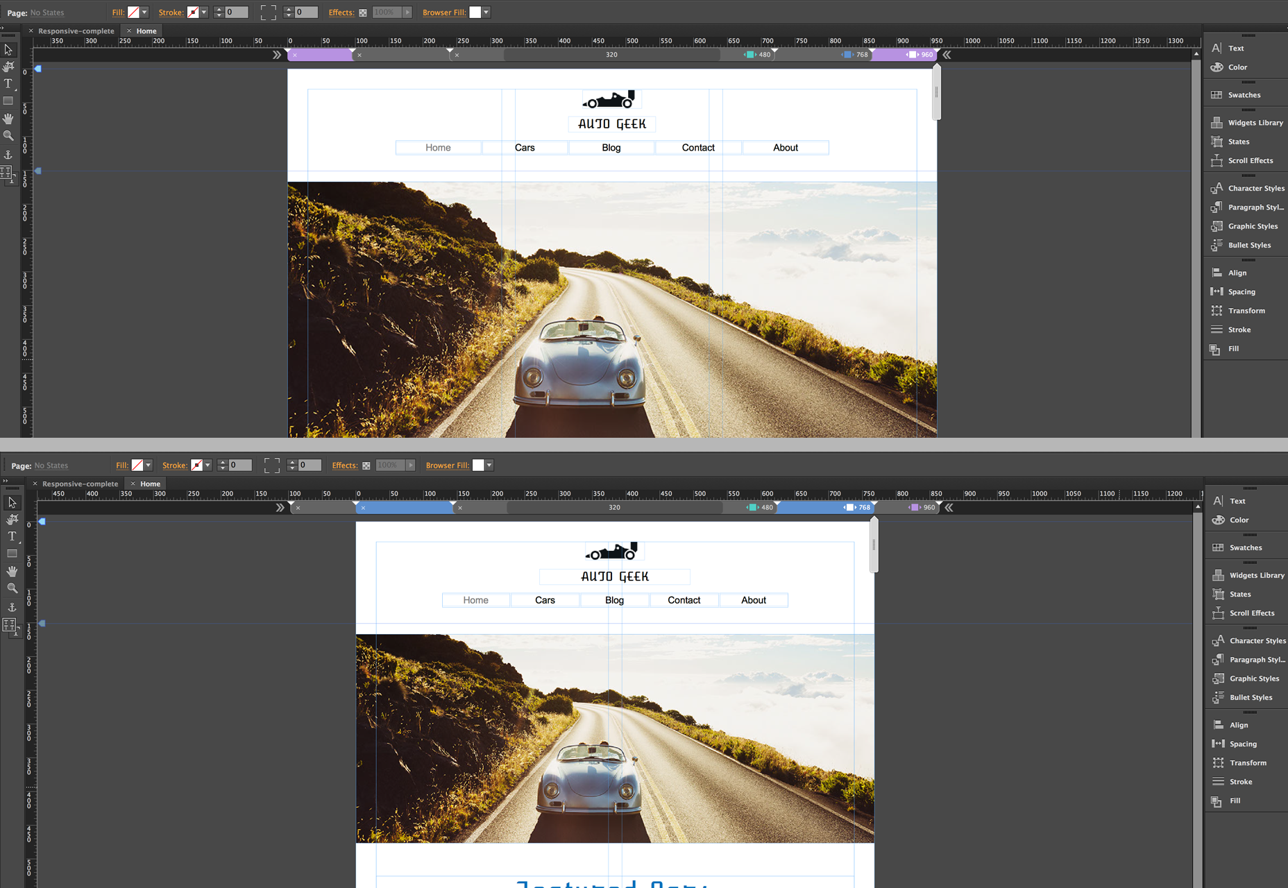 There are a couple of important things to keep in mind. First, if you want less content to appear, you should not delete the unwanted content at the smaller breakpoint. You have to remember that this is one page; it reflows to change its layout for various screen sizes, but it’s still one HTML document. So deleting it at any given breakpoint deletes it from the page. Instead you can hide the layers for the content on a specific breakpoint, or right-click on the element and choose Hide on Breakpoint. This will make that piece of content invisible at the selected breakpoint, but unaltered on others.
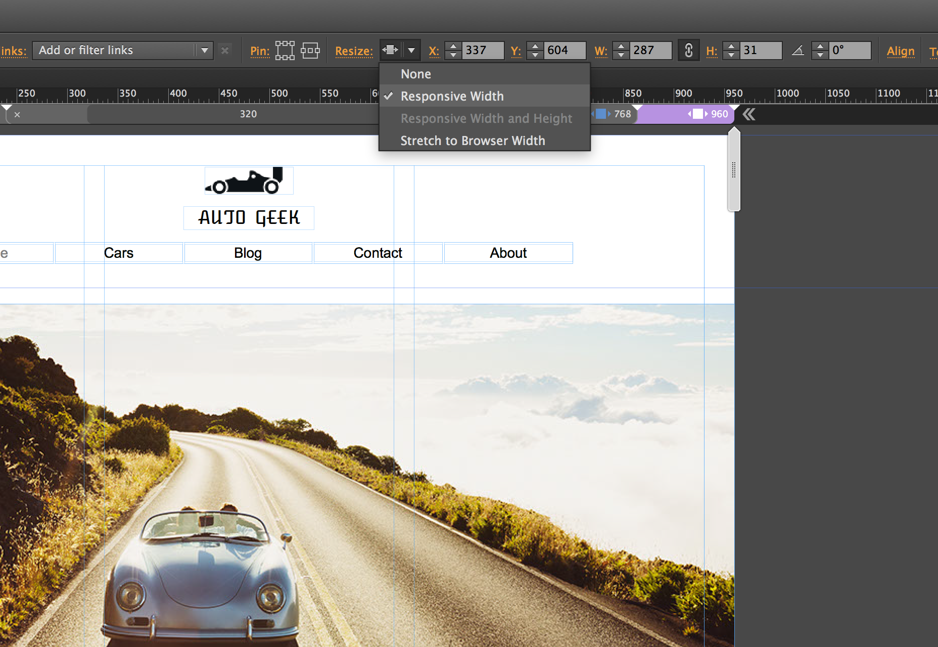
It’s also important to understand how content re-sizes in Muse when working with this responsive feature set. By default, elements you create in Muse will scale width-wise. Elements placed into the document, like an image for example, will scale the width and height proportionally. You can control these settings in the control bar when an element is selected.
There are a couple of important things to keep in mind. First, if you want less content to appear, you should not delete the unwanted content at the smaller breakpoint. You have to remember that this is one page; it reflows to change its layout for various screen sizes, but it’s still one HTML document. So deleting it at any given breakpoint deletes it from the page. Instead you can hide the layers for the content on a specific breakpoint, or right-click on the element and choose Hide on Breakpoint. This will make that piece of content invisible at the selected breakpoint, but unaltered on others.
It’s also important to understand how content re-sizes in Muse when working with this responsive feature set. By default, elements you create in Muse will scale width-wise. Elements placed into the document, like an image for example, will scale the width and height proportionally. You can control these settings in the control bar when an element is selected.
 A behavior you might encounter is objects “floating” a bit when the browser window is being resized. For these circumstances, Adobe has added a new option called Page Pinning. This is not to be confused with the Browser Pinning options available in previous versions, which would “pin” an element to the browser; if the user scrolled down the page, the pinned element would stay locked into position with content scrolling underneath it. Page pinning is a bit different. The element that is pinned using this option will still scroll with the browser, but if the element is located in the center of the page regardless of what the browser width is, the element will stay locked to the center of the page, albeit still scaling in size when the sizing properties are set as such.
Migrating a site to responsive
If you’ve worked with Muse in the past, and have a fixed-width site, it is possible to migrate it to a responsive layout. What’s important is changing your site properties. To do this, select File>Site Properties to open the Site Properties dialog box. Here you can change the layout from Fixed Width to Fluid Width. Next you need to change attributes of the elements that you want to be fluid. You can do this by removing any previously established pins. You should then right-click on the object and select resize. This will give you various responsive options to select from.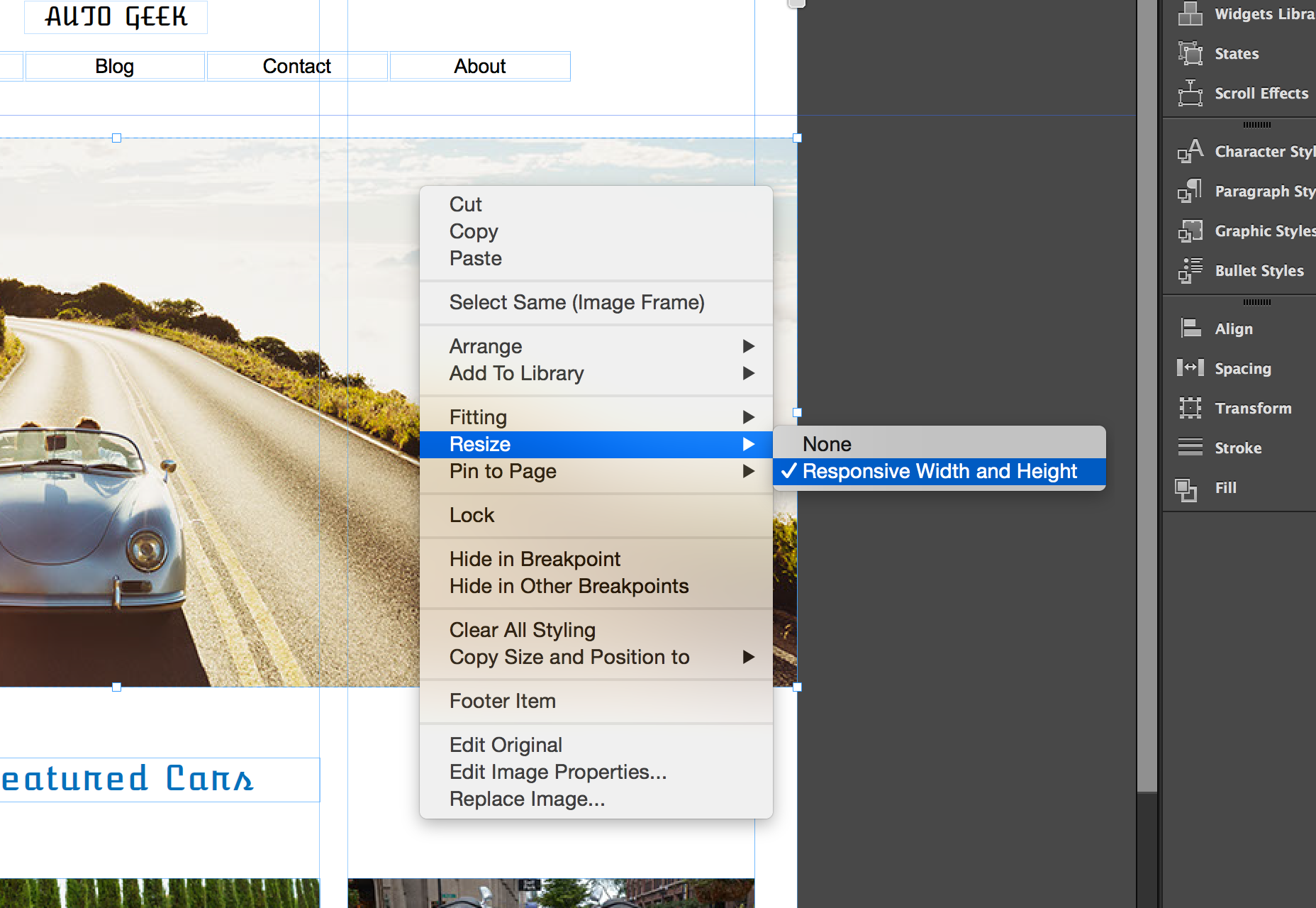
Conclusion
There are few things that aren’t ready for “responsive primetime” in Muse. Scroll effects are not supported just yet. Which means if you need to use these types of effects, you’ll be stuck with an adaptive solution for the time being. Also, not all widgets are responsive either, though the folks at Adobe are working on it and I would expect both of these limitations removed with future updates. The new responsive feature set in Adobe Muse CC is a welcome addition to an already powerful visual web design tool. It offers designers the ability to create responsive content visually and in an environment that is intuitive and familiar.Matthew Pizzi
Matthew Pizzi is an Adobe Certified instructor with over 15 years of experience teaching Adobe applications. He has been a speaker at industry events like Adobe MAX and Social Media Week and has authored several books on Adobe’s products. Matthew’s training videos are featured regularly on Adobe.com which demonstrate new and important features of their Creative Cloud offerings. You can visit Train Simple to view his online courses.


Read Next

15 Best New Fonts, July 2024
Welcome to our monthly roundup of the best fonts we’ve found online in the last four weeks. This month, there are fewer…
By Ben Moss

20 Best New Websites, July 2024
Welcome to July’s round up of websites to inspire you. This month’s collection ranges from the most stripped-back…

Top 7 WordPress Plugins for 2024: Enhance Your Site's Performance
WordPress is a hands-down favorite of website designers and developers. Renowned for its flexibility and ease of use,…
By WDD Staff

Exciting New Tools for Designers, July 2024
Welcome to this July’s collection of tools, gathered from around the web over the past month. We hope you’ll find…

3 Essential Design Trends, July 2024
Add some summer sizzle to your design projects with trendy website elements. Learn what's trending and how to use these…

15 Best New Fonts, June 2024
Welcome to our roundup of the best new fonts we’ve found online in the last month. This month, there are notably fewer…
By Ben Moss

20 Best New Websites, June 2024
Arranging content in an easily accessible way is the backbone of any user-friendly website. A good website will present…

Exciting New Tools for Designers, June 2024
In this month’s roundup of the best tools for web designers and developers, we’ll explore a range of new and noteworthy…

3 Essential Design Trends, June 2024
Summer is off to a fun start with some highly dramatic website design trends showing up in projects. Let's dive in!

15 Best New Fonts, May 2024
In this month’s edition, there are lots of historically-inspired typefaces, more of the growing trend for French…
By Ben Moss

How to Reduce The Carbon Footprint of Your Website
On average, a web page produces 4.61 grams of CO2 for every page view; for whole sites, that amounts to hundreds of KG…
By Simon Sterne

20 Best New Websites, May 2024
Welcome to May’s compilation of the best sites on the web. This month we’re focused on color for younger humans,…