

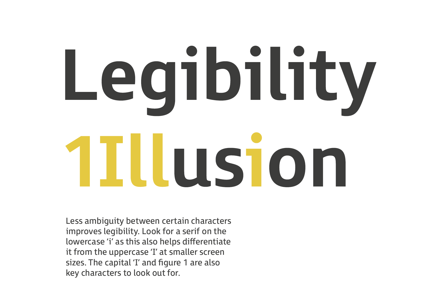
 3: If you’re using small amounts of text at 16pt and above (eg. for headings or captions), then a sans serif with large open counters is considered the most suitable.
4: Look for a typeface with a large x-height (this is important for webfont selection). Extended ascenders and descenders will help to make the letter shapes clearer. Ascenders should be slightly higher than the cap height.
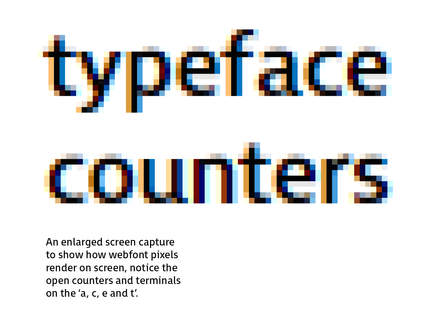
5: Look for open counters and terminals as they aid clarity, if they’re too closed they start to fill in at smaller sizes.
3: If you’re using small amounts of text at 16pt and above (eg. for headings or captions), then a sans serif with large open counters is considered the most suitable.
4: Look for a typeface with a large x-height (this is important for webfont selection). Extended ascenders and descenders will help to make the letter shapes clearer. Ascenders should be slightly higher than the cap height.
5: Look for open counters and terminals as they aid clarity, if they’re too closed they start to fill in at smaller sizes.
 6: Numbers need to be distinctive, in particular the “0” from the uppercase “O”. The “6” and “9” should also have open terminals.
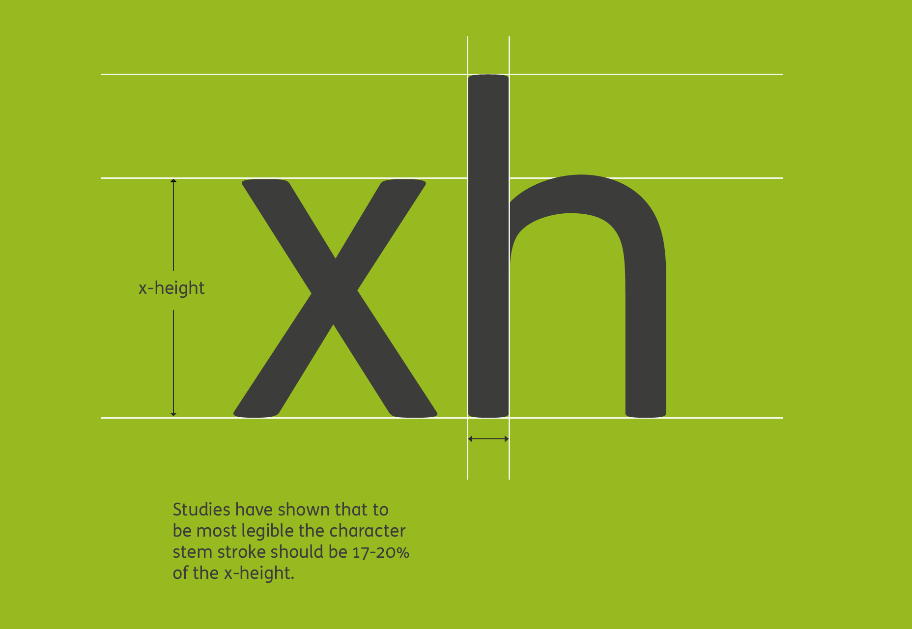
7: There is an optimal ratio between the x-height and the stroke width. To achieve maximum legibility the character stem stroke should be 17-20% of the x-height.
6: Numbers need to be distinctive, in particular the “0” from the uppercase “O”. The “6” and “9” should also have open terminals.
7: There is an optimal ratio between the x-height and the stroke width. To achieve maximum legibility the character stem stroke should be 17-20% of the x-height.
 8: A wider through bar on the lowercase “t” aids definition.
9: A capital “Q” tail that follows through the main bowl enhances legibility.
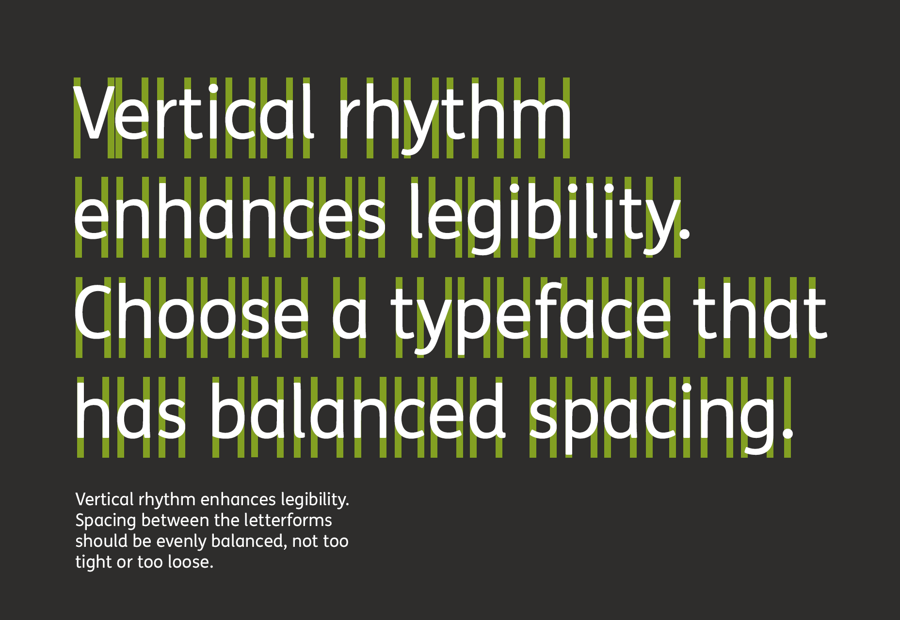
10: Spacing between the letterforms should be evenly balanced and rhythmic to aid character recognition.
8: A wider through bar on the lowercase “t” aids definition.
9: A capital “Q” tail that follows through the main bowl enhances legibility.
10: Spacing between the letterforms should be evenly balanced and rhythmic to aid character recognition.
 11: Test the typeface on a dark background to check how it performs. Spacing tends to look tighter, letter shapes appear to “glow” making the font seem heavier than it is, so you may need a lighter weight.
12: Choose a typeface that has a wide range of weights; as rendering on different devices will give varying results and a selection of weights can help to achieve the correct feel.
It’s important to remember that inclusive design shouldn’t mean a compromise in elegance or style. A well designed accessible typeface should be elegant and have personality, but at the same time have legibility at its core, in order to include as many end users as possible.
11: Test the typeface on a dark background to check how it performs. Spacing tends to look tighter, letter shapes appear to “glow” making the font seem heavier than it is, so you may need a lighter weight.
12: Choose a typeface that has a wide range of weights; as rendering on different devices will give varying results and a selection of weights can help to achieve the correct feel.
It’s important to remember that inclusive design shouldn’t mean a compromise in elegance or style. A well designed accessible typeface should be elegant and have personality, but at the same time have legibility at its core, in order to include as many end users as possible.
Stuart de Rozario
Stuart de Rozario is an award winning typeface designer and accessibility expert at Boutique type foundry Fontsmith. Their library of typefaces includes FS Me which was designed with Mencap and FS Millbank for wayfinding, both exceed accessibility standards.


Read Next

15 Best New Fonts, July 2024
Welcome to our monthly roundup of the best fonts we’ve found online in the last four weeks. This month, there are fewer…
By Ben Moss

20 Best New Websites, July 2024
Welcome to July’s round up of websites to inspire you. This month’s collection ranges from the most stripped-back…

Top 7 WordPress Plugins for 2024: Enhance Your Site's Performance
WordPress is a hands-down favorite of website designers and developers. Renowned for its flexibility and ease of use,…
By WDD Staff

Exciting New Tools for Designers, July 2024
Welcome to this July’s collection of tools, gathered from around the web over the past month. We hope you’ll find…

3 Essential Design Trends, July 2024
Add some summer sizzle to your design projects with trendy website elements. Learn what's trending and how to use these…

15 Best New Fonts, June 2024
Welcome to our roundup of the best new fonts we’ve found online in the last month. This month, there are notably fewer…
By Ben Moss

20 Best New Websites, June 2024
Arranging content in an easily accessible way is the backbone of any user-friendly website. A good website will present…

Exciting New Tools for Designers, June 2024
In this month’s roundup of the best tools for web designers and developers, we’ll explore a range of new and noteworthy…

3 Essential Design Trends, June 2024
Summer is off to a fun start with some highly dramatic website design trends showing up in projects. Let's dive in!

15 Best New Fonts, May 2024
In this month’s edition, there are lots of historically-inspired typefaces, more of the growing trend for French…
By Ben Moss

How to Reduce The Carbon Footprint of Your Website
On average, a web page produces 4.61 grams of CO2 for every page view; for whole sites, that amounts to hundreds of KG…
By Simon Sterne

20 Best New Websites, May 2024
Welcome to May’s compilation of the best sites on the web. This month we’re focused on color for younger humans,…